

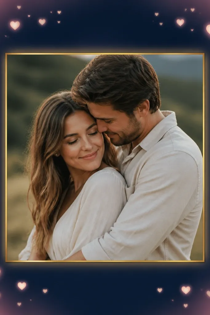
1. Blush Corner Heart Frame with Center Photo Window
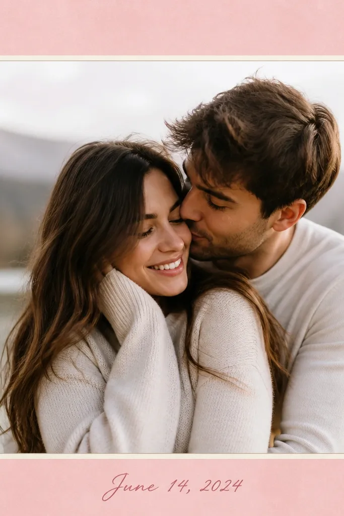
This template works because the hearts stay small and off to the corners, so your faces stay the focus. The blush background reads romantic without turning the whole image into a pink filter. A thin cream border makes the photo feel "mounted," like a print in a frame.
Use a 1:1 or 4:5 canvas depending on where you post, then place your photo in the center with 40-60 px breathing room from the border. Keep the hearts at about 6-8% of the canvas width each, and set the corner text (date or initials) in one line only. Pair blush #F5B7C8 with cream #FFF3E6 for the border and text.
Pro tipIf your photo is dark, switch the border to a slightly brighter cream and reduce heart opacity to 80% so it doesn't fight the shadows.
AvoidAvoid using multiple heart sizes - it looks messy fast and makes the frame look like a sticker pack.
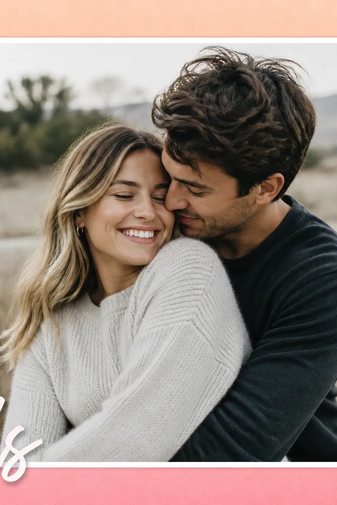
2. Rose-Gold Foil Border with Script Title Strip
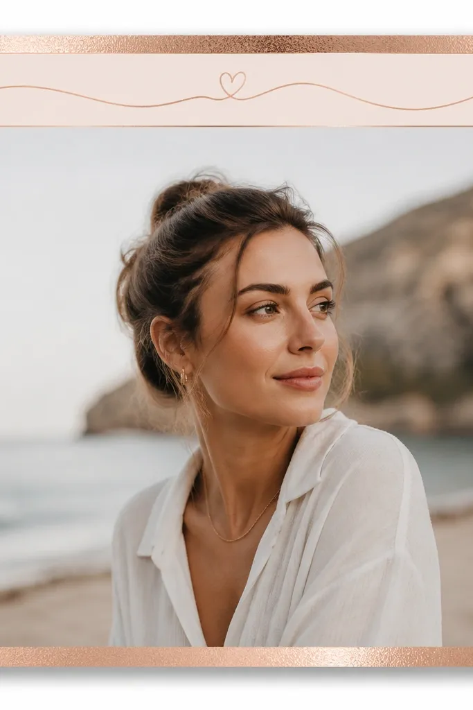
Foil-style borders feel romantic because they mimic the look of gift wrapping without covering the photo. The title strip at the top gives you a clear place for a love message, while the rest stays uncluttered. Script text reads best when it has a solid backing color, so the words stay readable.
Add an outer rectangle with a rose-gold gradient (#C9A24E to #B8860B). Place a top strip about 10-12% of the canvas height in deep rose #B23A5C, then set script text in cream #FFF3E6 with a slight shadow blur of 6-8 px. Keep the photo window inset by 35-50 px from the gold border.
Pro tipUse one short phrase only on the strip - two lines max - so your words don't look cramped.
AvoidSkip tiny script fonts; thin lettering turns fuzzy after export.
3. Cream Lace Frame with Soft Drop Shadow

Lace edges create romance because they add texture without loud color. Keeping the lace white-on-cream keeps it classy and lets your photo colors do the work. The rounded photo corners make it feel like a handmade keepsake.
Use a lace PNG overlay sized so it sits only on the edges - don't stretch it to fill the whole canvas. Set the photo frame as a rounded rectangle with radius around 24-32 px (for 1080x1080). Add a bottom heart at 2-3% of canvas width, in deep rose #B23A5C.
Pro tipIf your lace looks too strong, lower the lace layer opacity to 55-65% and add a light grain overlay on top of everything.
AvoidAvoid high-contrast lace (black lace on cream) - it reads harsh instead of sweet.
4. Matchbook Love Frame with Ticket-Stub Edges
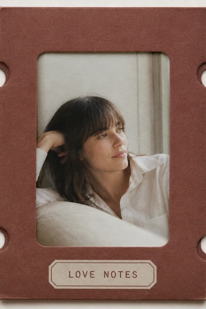
This one feels romantic because it looks like a physical keepsake, not a digital sticker frame. The ticket-stub edges add a handmade vibe, and the small label keeps the message grounded. Paper texture makes the whole layout feel like an object you could hold.
Pick a warm base color like #8B3A3A, then create side panels with small semicircle cutouts (or use a ticket-stub overlay). Place the photo window centered with a paper grain overlay at 20-30% opacity. Add a bottom label bar in a lighter cream (#FFF3E6) with "Love Notes" in a bold sans font.
Pro tipUse one "date" line on the label, like "07.01" - it looks intentional and doesn't steal attention from the photo.
AvoidDon't add multiple fonts; matchbook layouts look best with one bold type and one simple script at most.
5. Sunset Heart Vignette Frame with White Caption Line

A vignette frame works when your photo already has warm tones, because it makes the edges feel like part of the same scene. Hearts stay minimal, which keeps romance from overpowering your subject. The single caption line gives you a clean place for a short quote or location.
Create a radial gradient background: center transparent, edges #FF8A5B and #D64B7C. Add hearts at the top corners, scaled to about 4-5% canvas width. Put a white caption bar with 60-70% opacity behind the text so it stays readable over bright highlights.
Pro tipChoose one wordy caption max (like "our sunset") and keep it to 20 characters or fewer for crisp readability.
AvoidAvoid placing hearts near the faces; keep them in the top corners only.
6. Polaroid Stack Frame with Heart Scribble Border
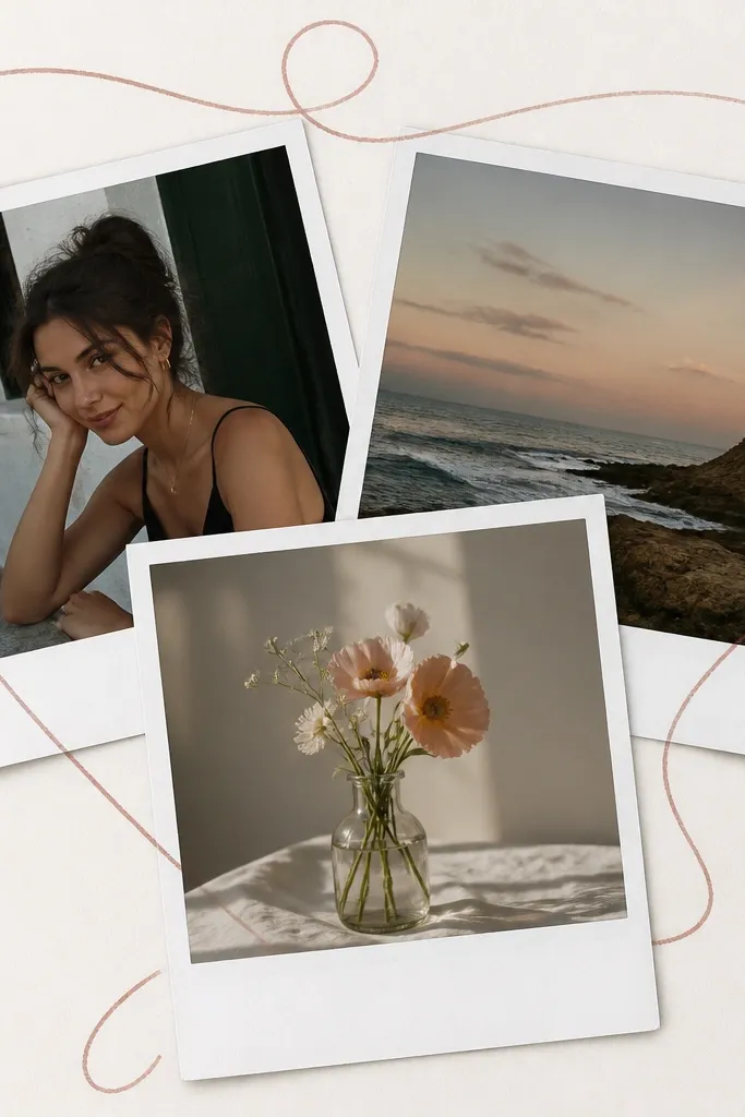
Polaroid stacks feel romantic because they look like memories you took on purpose. The heart scribble border adds emotion without covering the photos. Keeping the polaroid borders consistent makes the collage look curated instead of accidental.
Use three photo placeholders with slight rotations (about -4°, 0°, +4°). Keep each polaroid border width around 40-55 px on a 1080x1080 canvas. Add a single heart scribble line overlay that wraps the outside edge only, not across the photo borders. Write your caption on the bottom polaroid in a dark gray (#333333).
Pro tipMatch the photos' color temperature - if one is cool and one is warm, the stack looks disjointed.
AvoidSkip thick black scribbles; too bold turns childish and kills the romantic mood.
7. Midnight Navy Frame with Blush Glow Hearts
This looks romantic because the dark base makes the blush hearts feel like light from candles or string lights. The gold outline gives a luxe contrast, and the glow stays subtle so the photo remains readable. It's perfect for date-night pictures with low light.
Set background to midnight navy #0B1A33. Add a blush glow layer using a gradient or blur effect in #F5B7C8 and keep it at 20-30% opacity. Outline the photo window with a thin gold line (#C9A24E) and add two heart shapes at about 5% canvas width each, one top corner and one bottom corner.
Pro tipIf your photo is already bright, lower the glow opacity to 15-20% so the frame doesn't wash it out.
AvoidDon't use heavy sparkles; glitter particles make the image look noisy on Instagram.
8. Heart Confetti Border with Clean Typographic Footer

Confetti hearts add a playful romantic feel without turning into a full background pattern. Keeping the confetti small and edge-only keeps the center photo sharp. The typographic footer gives structure, so your message looks designed even with a simple font.
Use a white background #FFFFFF or soft white #FFF7F0. Place a heart confetti overlay sized to the edges only, and keep it around 15-25% opacity. Add a bottom footer bar in blush #F5B7C8 with text in deep gray #2B2B2B. Use two short lines max so it doesn't crowd the photo.
Pro tipUse a bold sans font for the footer and keep the text centered with equal line spacing.
AvoidAvoid confetti across the whole photo - it makes skin tones look textured.
9. Vintage Love Letter Frame with Wax Seal Emblem
Wax seals read romantic instantly because they feel like an old-fashioned letter. The parchment background gives warmth and hides small image imperfections. The stamped seal stays as a focal point while the photo remains the main event.
Set the background to parchment #F2E6D6 and add a paper fiber texture overlay at low opacity (10-20%). Place the wax seal at the top center, about 7-9% of canvas width, in deep red #7A1F2B. Keep the photo window inset by 45-60 px and add a thin border in warm brown #B08A63.
Pro tipWrite your bottom message like a signature - one line only, and keep it short enough to fit on one sweep.
AvoidSkip more than one "vintage" element; seal + lace + confetti all together looks overdone.
10. Minimal Heart Border with Negative Space Quote
Minimal frames are romantic because the restraint makes your photo feel intentional. Negative space keeps your message calm, and tiny hearts give emotion without clutter. This template is great when your photo is already beautiful and you don't want extra noise.
Use an off-white background #FAF7F2 and a thin border line in pale blush #E9A1B7 (stroke weight around 2-4 px depending on your tool). Place two hearts at mid-left and mid-right, each about 3-4% canvas width. Add a quote in a small serif in deep gray #3A3A3A, centered and kept to one line.
Pro tipIf your photo has busy patterns, keep the quote line smaller and lower the border opacity to 85% so it doesn't compete.
AvoidAvoid thick borders; heavy lines make minimal frames look like a template template.
11. Blush Ribbon Frame with Tiny Bow at Top
Ribbon frames feel romantic because they look like fabric, not graphics. The bow gives a clear "gift" vibe, and the nameplate makes your caption feel like part of the design. Soft haze around the photo makes the whole piece look cohesive.
Create a ribbon border using a gradient: lighter blush #F7C3D2 at the top edges and #EAA1B9 at the bottom edges. Add a bow graphic at top center with width about 12-14% of canvas width. For the nameplate, use a cream rounded rectangle about 25-30% canvas width in the bottom center, with text in deep rose #B23A5C.
Pro tipChoose photos with soft lighting; harsh flash makes the ribbon look like a filter sticker.
AvoidSkip oversized bows - if it takes up more than 15% of the canvas width, it dominates.
12. Two-Person Silhouette Frame with Heart Cutout Window
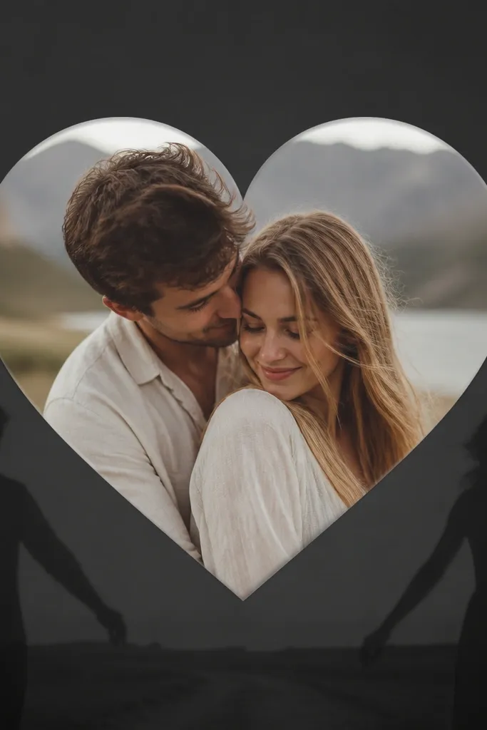
Silhouette + heart cutout looks romantic because it turns the photo into a symbol, not just a picture. The heart window creates instant focus. The faint holding-hands silhouette adds story without covering the center.
Place a heart-shaped mask on top of your photo in the center, sized to about 55-60% of the canvas width. Use a charcoal background #1F1F1F and set the silhouette in dark gray with 20-30% opacity. Add a bottom caption in blush #F5B7C8, one short line, centered.
Pro tipUse a high-contrast photo for the heart window so the shape reads clearly on both light and dark screens.
AvoidAvoid using a low-contrast photo; inside a heart mask, it looks flat.
13. Peach Gradient Frame with Handwritten "Us" Sticker
This template is romantic because the gradient feels like warm skin tones and soft sunset light. The handwritten "Us" sticker acts like a playful label, not a formal caption. The bright border on the photo keeps it from blending into the gradient.
Make a gradient border with peach #FFB3A7 to soft pink #F6A7C6. Add a white border around the photo window about 6-10 px thick. Place the "Us" sticker at bottom left, 18-22% canvas width, with a shadow offset of 5-7 px and blur around 10 px. Keep the rest of the frame clean.
Pro tipIf your photo already has peach tones, reduce the gradient saturation so you don't double-warm it.
AvoidAvoid adding extra text - one sticker label keeps it looking intentional.
14. Pastel Watercolor Frame with Heart Sprinkles
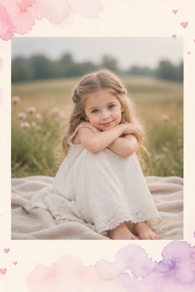
Watercolor frames feel romantic because they look imperfect, like real paper. Pastel pink and lilac are soft on skin tones, so portraits still look flattering. Heart sprinkles are tiny and scattered, so they add mood without turning the frame into a pattern.
Use a watercolor border overlay that hugs the edges and doesn't cover the center. Set the photo matte background to cream #FFF3E6 with a subtle paper texture. Place two heart sprinkles only - top right and bottom left - each about 4-6% canvas width. Add one small caption line in deep purple #5A2A6B at the bottom center.
Pro tipMatch your photo's dominant color to the watercolor palette; if your photo is mostly warm, use pink and peach watercolor, not blue-lilac.
AvoidDon't use a fully patterned background; watercolor should stay edge-focused.
15. Classic Red Check Love Frame with White Nameplate
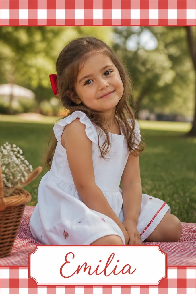
Red check reads romantic because it feels like vintage Valentine packaging. The white nameplate keeps your message readable and gives a clean focal point. A thin red line around the photo keeps the frame from looking like a background pattern.
Build a check border using a 2-color pattern: red #C21F2D and white #FFFFFF. Keep the check area only around the edges, with a clear inset for the photo window (about 45-60 px). Add a white rounded nameplate at the bottom center about 40-45% canvas width. Write one short phrase in red cursive and center it.
Pro tipUse check borders for photos with simple backgrounds; busy photos make the check look chaotic.
AvoidAvoid large check squares; tiny checks look like fabric, big checks look like a tablecloth.


