1. March Mint Grid Frame
This one looks fresh because the grid gives structure without being busy. The mint-green lines sit on a clean white background, so your photo stays the star while the border adds that "seasonal" cue. I like it for spring mornings, because mint doesn't clash with skin tones or pastel outfits.
Print on matte cardstock (at least 160 gsm). Cut the photo opening with a craft knife and a steel ruler for straight edges. Use a 3 cm border thickness so the grid reads in a 4:5 Instagram post.
Pro tipBefore taping, dry-fit the frame over your phone and check that the opening edges sit parallel to your photo edges.
AvoidDon't use glossy photo paper for this - the grid lines catch light and look smeared in photos.
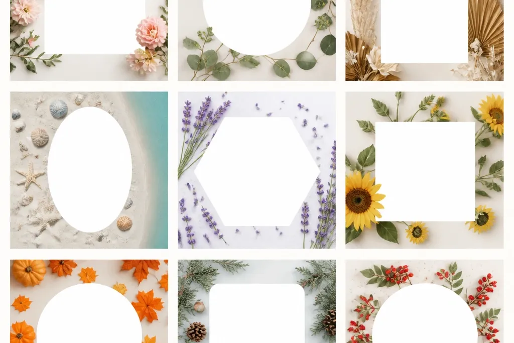
2. April Blossom Petal Frame

Blossom shapes look romantic but still modern when the petals are kept to the corners. The blush tone makes warm photos feel warmer, and it also flatters neutral outfits. Rounded corners make the border feel friendly on Instagram where many photos are shot with softened edges.
Print at 100% scale and use a rounded-rectangle cutter if you have one. Stick with a matte finish and keep the petal illustration limited to the top corners so it doesn't fight busy photos. Border thickness around 3.5 cm looks best.
Pro tipIf your photo is busy, choose a blossom template with fewer petals and more negative space in the center.
AvoidAvoid frames with full-page petal coverage - they make the image look crowded.
3. May Lemon Slice Frame
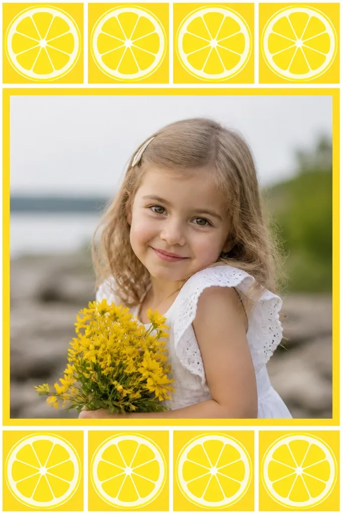
This is the most "summer on the way" frame in the set. Yellow instantly signals warm weather, and the white separators keep it from looking like a blob. It works especially well with beach towels, iced drinks, and outdoor portraits.
Use thick matte cardstock so the yellow holds its color when cut. Keep the icon size medium so the border doesn't overwhelm the photo. I use a 3 cm border and a 4:5 opening ratio for easy Instagram cropping.
Pro tipTone down your photo choice: pick images with at least one neutral area (wall, sky, shirt) so the yellow doesn't compete.
AvoidDon't print yellow frames on thin paper - it shows through and makes the border look gray.
4. June Sky Cloud Frame

Cloud doodles give a calm, breezy feel without turning into cartoon overload. The thin inner mat line helps the photo pop, especially when your photo background is also blue. I've used this for outdoor brunch posts and it photographs clean even with midday sun.
Print on matte paper and add a second layer for the inner mat if you want extra depth: cut a second frame and glue it behind the first with a 0.5 cm offset. This makes the photo opening look framed, not just outlined.
Pro tipIf your phone camera blows out highlights, lower exposure by 0.3 and the cloud outlines stay visible.
AvoidAvoid super tiny cloud linework - it turns into noise when you cut it and hold it up.
5. July Patriotic Stripe Frame
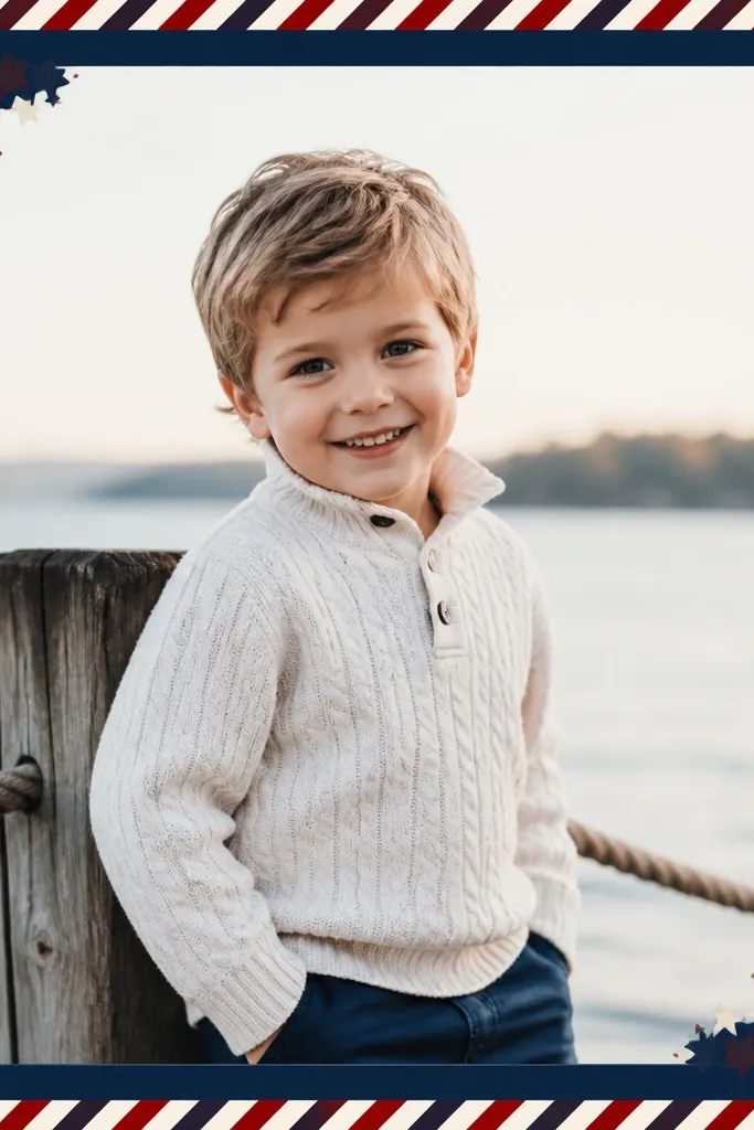
Diagonal stripes look energetic and help your post feel like it has motion. Keeping stars only in two corners keeps it from feeling like a party flyer. The navy base makes skin tones and red outfits look punchy without looking harsh.
Print at full size and cut with a ruler so the diagonal stripes stay crisp. Use a border thickness of about 3 cm and include a thin inner line in white if your template has it. Matte cardstock prevents glare from navy ink.
Pro tipPair it with a photo that has strong contrast - a white shirt, denim, or sunset sky makes the stripes read instantly.
AvoidDon't choose a template with stripes that touch the photo opening - it makes the edges look messy.
6. August Cornfield Frame
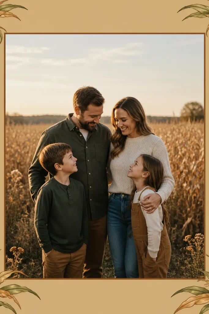
Corn stalk illustrations feel seasonal in a grounded way. The tan background works with warm photos and earthy tones, and the darker inner border gives a "mat" effect. It's great for harvest dinners, farmers market hauls, and outdoor tablescapes.
Print on 180 gsm matte cardstock to keep the tan from looking washed out. Cut the opening cleanly and glue the frame backing with double-sided tape only on the outer ring. Keep the corn stalks at the corners so the center stays calm.
Pro tipColor match your photo: if your photo is too cool (blue cast), warm it slightly in your editor before framing.
AvoidAvoid overly thin brown lines - they tear when you cut.
7. September Earthy Leaf Frame
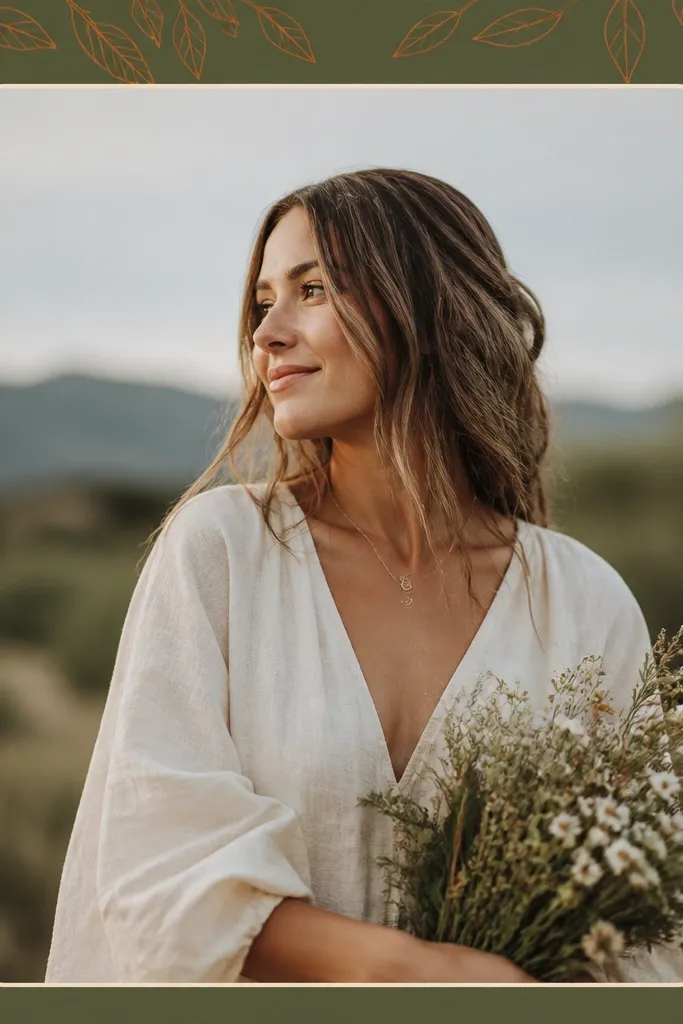
Line-art leaves look grown-up and still seasonal. Olive and burnt orange mix well with fall clothing and warm indoor lighting. Rounded corners keep the overall look soft even with earthy colors.
Print on cream matte paper if you can - it makes the olive feel richer. Use a craft knife and take your time with rounded corners so they look intentional. Border thickness around 3.5 cm keeps the leaves visible but not overwhelming.
Pro tipIf you're posting indoors, choose a photo with warm highlights so the burnt orange doesn't look flat.
AvoidDon't use a border with lots of tiny leaf veins - they disappear in a quick phone shot.
8. October Pumpkin Check Frame
The check pattern reads from far away and makes your photo feel like it belongs to fall. Black inner lines add structure, so the border doesn't blur into the background. I use this for Halloween prep posts and pumpkin spice drinks because it instantly sets the mood.
Print on matte cardstock, then reinforce the outer border with a second backing layer if it feels flimsy after cutting. Keep the pumpkin icons small and only at corners - too many icons makes it look chaotic. Use 3 cm border thickness for a clean edge.
Pro tipFor photos with orange already, reduce saturation slightly so the border and photo don't fight.
AvoidAvoid glossy black ink - it shows fingerprints and glare when you hold the frame up.
9. November Smoke Plaid Frame
This looks cozy because the plaid feels like a blanket, but the smoky gradient keeps it from looking like a craft store prop. It's great for coffee photos, sweaters, and indoor portraits where the background has texture. Gray-blue also plays nicely with most skin tones and dark hair.
Print on thick matte paper (at least 170 gsm). If your template includes a gradient corner, don't over-saturate it when printing - keep it soft. Cut slowly along the plaid lines so the edges stay sharp.
Pro tipUse the plaid frame with photos that have warm light - candle glow makes the gray-blue look intentional.
AvoidDon't pick a photo with a busy plaid background - the two patterns clash.
10. December Pine Branch Frame
Pine branches create that holiday feeling without needing red. The white dot snow accents add sparkle, even when your photo is simple. I like this for winter walks and minimalist holiday decor shots.
Print on matte cardstock and consider adding a white gel pen to the snow dots if you want extra contrast. Keep the opening centered and cut with a ruler so the inner cream line stays even. Border thickness around 3-4 cm makes the branches visible.
Pro tipIf you're posting at night, add a small brightness boost to the photo so the white snow dots stay crisp.
AvoidAvoid frames where the pine branches touch the photo opening - it looks cramped.
11. Winter Snowflake Stencil Frame
Stencil snowflakes look modern and clean when the pattern is light gray, not bright white. It gives texture without stealing attention from your photo. This works well for minimalist feeds and monochrome outfits.
Print on off-white matte paper to keep the gray from looking harsh. Use a sharp blade and replace it if it starts dragging - stencil edges show every tear. Keep border thickness around 2.8-3.2 cm so the snowflakes read.
Pro tipIf your printer tends to fade gray, print one extra test page and compare under indoor and daylight lighting.
AvoidDon't use thin paper - stencil edges fold and look ragged.
12. Year-Round Minimal Solid Frame
This is the template I grab when I don't want a seasonal gimmick. A solid border makes your photo look like it belongs in a gallery wall, and it keeps your feed consistent across changing seasons. Beige and charcoal also make it easy to match any outfit color.
Print on matte cardstock and cut a perfectly centered opening. Use a border thickness of 4 cm for a bold look or 3 cm for subtle. If you want more depth, add a 1 cm white backing mat behind the frame.
Pro tipUse this for product shots: it frames without adding color noise.
AvoidAvoid borders thinner than 2.5 cm - the frame disappears in most phone shots.
13. Spring Check-In Frame

Checkmarks give a "progress update" feel, which is why this looks good even when the photo is casual. Sage-green is calm and doesn't overpower florals or pastel backgrounds. The dotted line near the top keeps the design from feeling flat.
Print on matte paper and cut with a steady hand. Keep the check symbols small so they look like texture, not text. Border thickness around 3 cm works well for 4:5 posts.
Pro tipUse this frame for weekly captions and keep your text off the border so it stays clean in photos.
AvoidDon't add extra stickers on top of the border - it makes the edges look uneven.
14. Summer Tidal Wave Frame
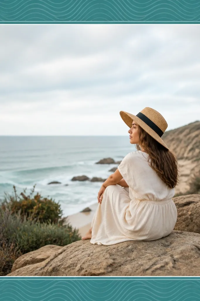
Wave lines feel like water without using literal beach icons. Teal gives a cool summer tone, and the thicker corner waves create a natural frame focus. Your photo looks fresher when the border has movement cues.
Print on matte cardstock and keep the wave line detail moderate. A 3.2 cm border thickness keeps the waves visible but not distracting. If you're using darker photos, the white inner line helps separate the image from the border.
Pro tipIf your teal prints too light, adjust printer settings to "photo off" and "matte" to deepen midtones.
AvoidAvoid wave templates with ultra-fine lines - they smear when cut and handled.
15. Fall Recipe Card Frame
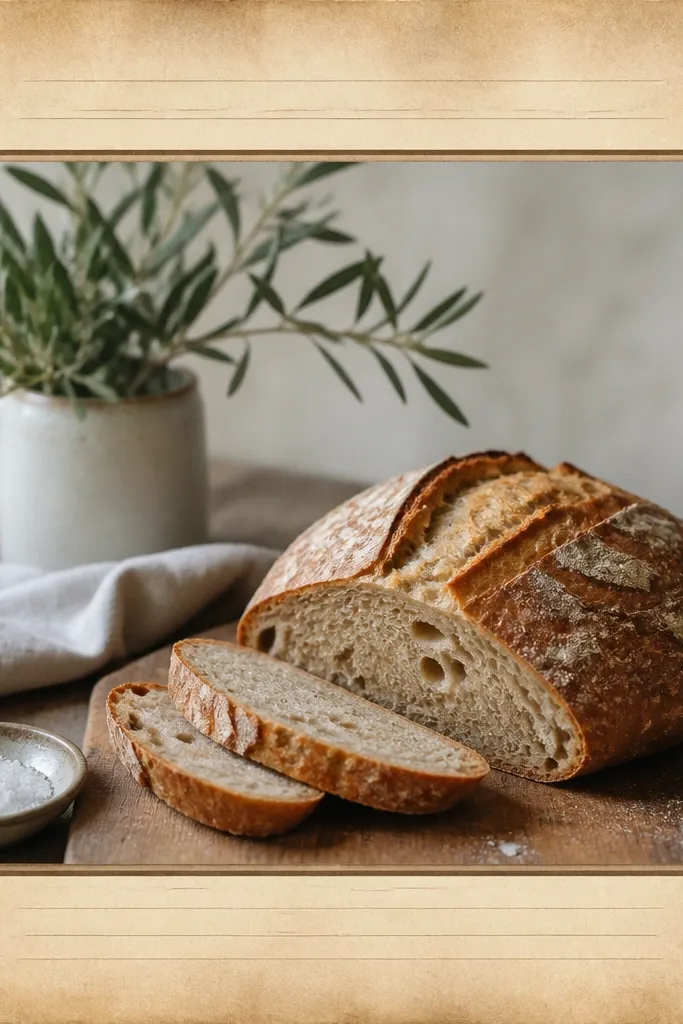
Recipe card styling makes food photos look intentional. The faux lines add structure, and the leaf icons keep it seasonal. Parchment tones also make reds and browns look warm instead of muddy.
Print on cream matte paper and cut the opening cleanly. Use tape on the back only - you want the front surface flat for photos. Keep border thickness around 3.5 cm so the "paper" feel shows.
Pro tipPair it with a top-down food photo so the recipe-card look reads instantly.
AvoidAvoid overly dark brown borders - they absorb light and make the center look dull.
16. Winter Candle Glow Frame
Candle flames look warm even in a simple frame. The gold glow creates a halo effect that makes night photos feel cozy. This is my pick for winter evenings because it looks good with warm indoor lighting and dark backgrounds.
Print on matte cardstock and avoid heavy gloss in the gold layer. Cut the opening carefully and use a backing sheet to prevent warping from moisture in your hands. Border thickness around 3 cm keeps the glow visible.
Pro tipWhen you take the photo, hold the frame slightly above the phone so the gold glow doesn't create glare stripes.
AvoidDon't use this with daylight outdoor shots - the glow effect looks flat.
17. Holiday Gift Tag Frame
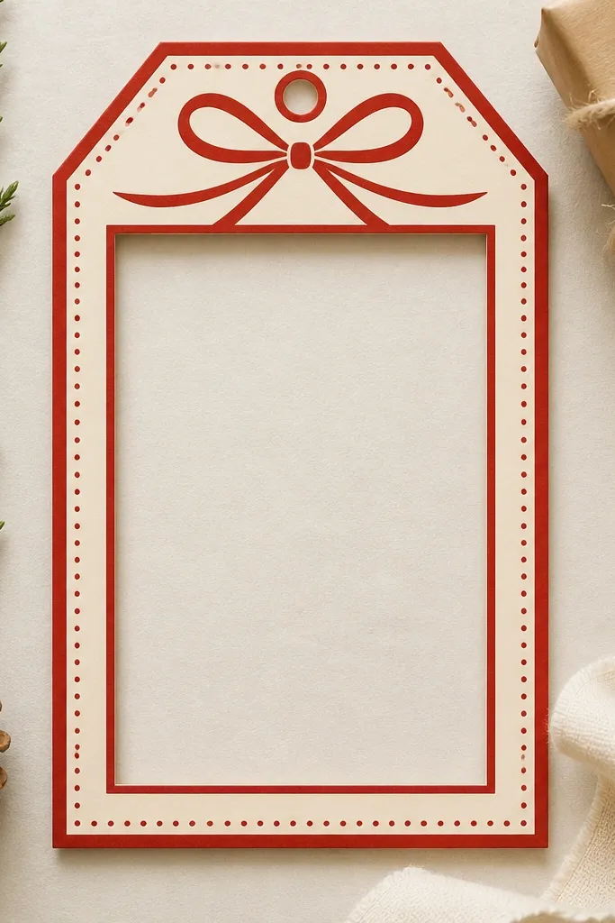
A gift-tag shape makes your post feel like it has a present attached, even when your photo is just a cup of cocoa. Red-and-cream has high contrast, so the border reads fast on small screens. The bow at the top adds a clear holiday cue without crowding the photo.
Print on matte cardstock and cut the tag shape accurately. If the template includes a hanging-twine hole, cut it clean and thread a short piece of twine for extra texture. Keep the opening centered and use 3-4 cm border thickness for a strong look.
Pro tipUse a photo with a bright subject (white mug, dark sweater) so the red border doesn't swallow details.
AvoidAvoid thin paper - tag-shaped frames bend and look cheap.
18. Monochrome Seasonal Frame
Monochrome frames look clean and they make your photo style look consistent across seasons. The calendar squares hint at time without turning into a themed cartoon. I use this when I want the border to feel "intentional" but not overly festive.
Print on matte white cardstock for crisp edges. Cut the opening and keep the inner line visible - don't trim too close to the border. Border thickness around 3 cm looks balanced in 4:5 posts.
Pro tipIf your photo is also black-and-white, add a tiny exposure bump so the photo doesn't blend into the border.
AvoidAvoid frames with too many tiny icons - they blur and look like noise.
19. Seasonal Confetti Corner Frame

Confetti corners feel playful but controlled, which is why they work with almost any photo. The pastel palette keeps skin tones natural and prevents the border from looking like party clipart. The confetti placement in corners also keeps the middle calm for portraits.
Print on matte cardstock and cut carefully around the confetti shapes so you don't nick the edges. Use a border thickness around 3 cm and keep the confetti small enough to read as texture. This template looks best for 4:5 portrait photos and product pics with light backgrounds.
Pro tipPick a photo with one dominant color and let confetti match that color lightly for a cohesive look.
AvoidDon't choose confetti colors that are too saturated - they can overpower the photo.


