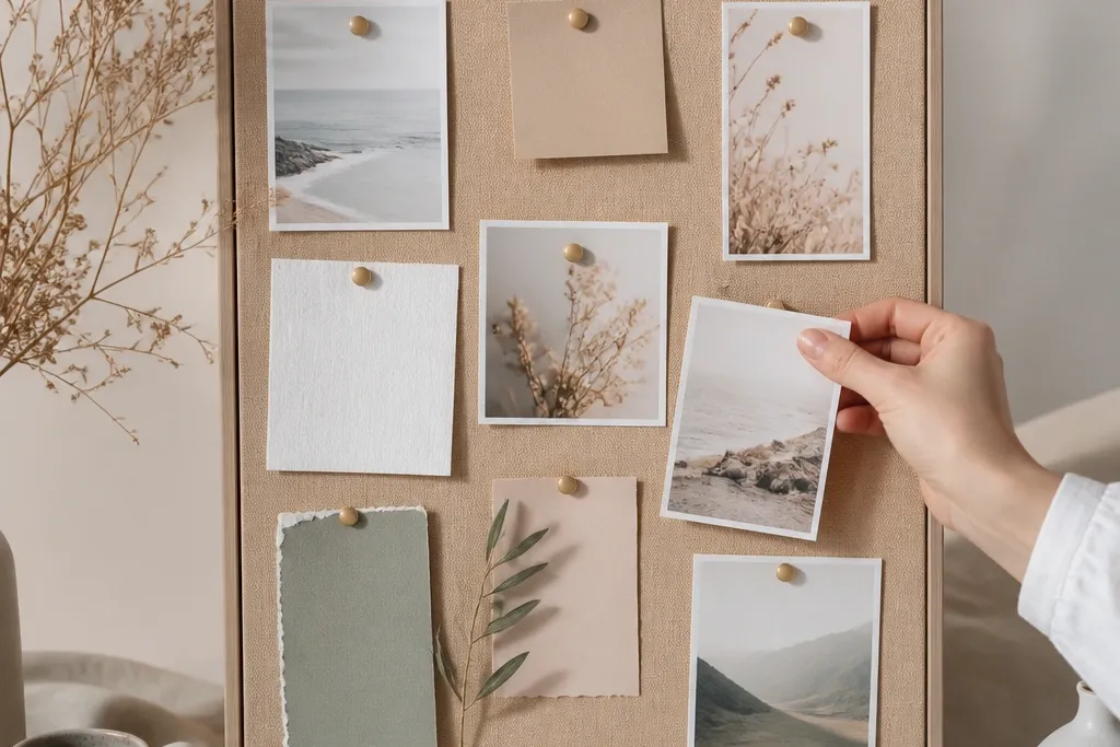
1. Cream Fabric Base with Black Vinyl Scripture Banner
I love this layout because the banner reads instantly from across the room. Cream fabric makes black vinyl pop without looking harsh, and the pushpins give you a tidy way to attach small cards. The banner sits at eye level, with extra space above and below so it doesn't feel packed. Vinyl keeps the lettering crisp even after you handle the board.
Use 12x18 foam board or a thin plywood panel. Cover it with cream cotton or linen using spray adhesive, then seal the surface with a matte decoupage layer. Cut a vinyl banner in a 10-12 in width, leaving 1 in margins on each side. Add three small label cards using 1/2 in gold pushpins so the board stays easy to update.
Pro tipPress the vinyl down with a hard brayer or the back of a spoon, then wait 24 hours before you add any extra layers on top.
AvoidAvoid putting vinyl directly on unsealed fabric - it lifts at the edges and looks cheap fast.
2. Weathered Wood Panel with White Paint-Pen Verse
Wood gives you a warm, grounded look that never feels sterile. White paint pen on sealed wood stays readable and doesn't smear like marker. I keep the verse in the top third and leave the middle for names so the layout feels intentional. The texture of the wood adds character without needing extra decorations.
Sand the wood lightly, then wipe dust off with a damp cloth. Seal with clear matte polyurethane, let it cure overnight, then write with a paint pen meant for smooth surfaces. Use masking tape to create a straight baseline for the verse. Pin small name cards with brass thumbtacks to match the warm wood tone.
Pro tipPractice the verse on scrap wood first - paint pens can be too bright until they dry fully.
AvoidAvoid using permanent marker on raw wood - it soaks unevenly and goes gray.
3. Sage Green Felt Pocket Grid for Weekly Intentions
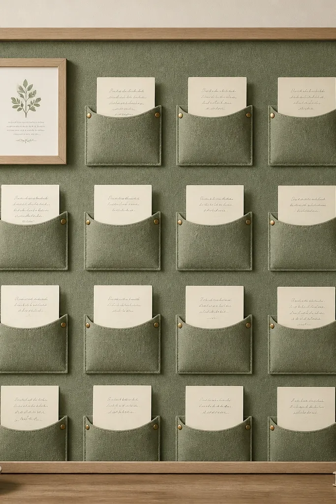
Felt pockets are the most practical upgrade I've made for boards I update weekly. The material grips paper and prevents corners from curling. The grid layout keeps your eye from wandering, so even when you add new cards, the board still looks orderly. Sage felt also hides minor glue spots better than smooth fabric.
Cover the base with sage felt (or glue felt sheets onto a sealed board). Cut pocket rectangles about 3x4.5 in with a 1 in fold-over flap. Sew or glue the sides and bottom, then leave the top flap open so cards slide in. Add one framed scripture tag using a 4x6 in mini frame or a thicker cardstock border.
Pro tipUse index-card thickness paper for the inserts so they slide smoothly into felt pockets.
AvoidAvoid pockets with uneven widths - the grid looks crooked even if the board is straight.
4. Matte Black Metal Clip Strip for Changeable Prayer Cards
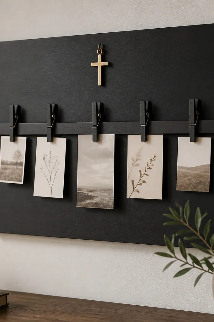
Clip strips make a prayer board feel alive because you can swap needs without tearing anything. Matte black hardware looks clean and modern, and it frames cards so they don't flop. The best part is readability: cards stay at a consistent angle and spacing. The gold charm adds a tiny focal point without taking over the layout.
Use a black painted board or cover with black cardstock and seal it with matte medium. Mount a clip strip or a row of mini binder clips on a wooden rail, then attach the rail to the board. Keep cards the same size, around 2.5x3.5 in, and punch matching holes or use clip-friendly tops. Add a small charm with a brad or hook so it's removable.
Pro tipLabel the back of each card with a date in pencil so you always know what order you wrote them.
AvoidAvoid shiny hardware - it reflects light and makes the text hard to read in photos.
5. Terracotta Ribbon "Prayer Line" with Mini Clothespins
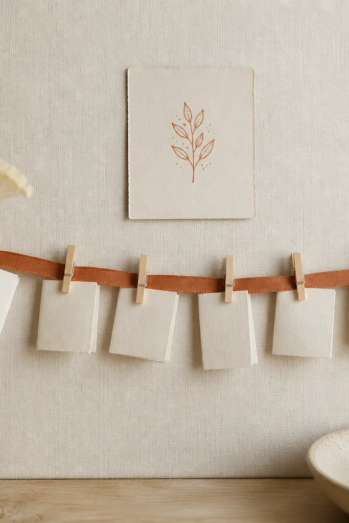
Ribbon lines are a simple way to show "this is where the prayers go" without building a complex pocket system. Terracotta against cream looks warm and comforting, and mini clothespins keep notes visible. I like folded notes because they look neat and you can write more without cramming the front. The line also creates a natural reading path for your eye.
Cover the base with cream cardstock or fabric and seal matte. Stretch a 3/4 in terracotta satin or cotton ribbon across the board, anchoring ends with hot glue plus a small strip of matching fabric tape over the glue. Space clothespins every 2.5-3 in. Use mini notes folded to about 2x3 in and clip one corner so they hang evenly.
Pro tipUse a ruler to mark pin points before gluing - ribbon glue dries fast and you won't forgive yourself.
AvoidAvoid wrinkled ribbon - it makes the whole board look hurried.
6. Navy Washi Tape Frame Around a Single Motto
This is the cleanest "small effort, high payoff" version I've made. Washi tape frames the motto without needing extra materials, and navy keeps it focused. The printed motto stays sharp, and the tiny handwritten bullets add personal meaning. It looks good even with minimal layers, because the tape creates structure.
Use a 12x18 board and cover with white cotton paper or smooth cardstock. Seal lightly with matte medium so tape adheres well. Layer navy washi tape into a rectangle with 1/2 in thickness at corners. Place a single 5x7 in motto card centered inside, then add 3-5 bullet lines in black gel pen.
Pro tipBurnish tape edges with a plastic card so the frame looks crisp, not lifted.
AvoidAvoid too many tape colors - it turns into decoration instead of a prayer board.
7. Gold Leaf-Style Stencil on Taupe Canvas
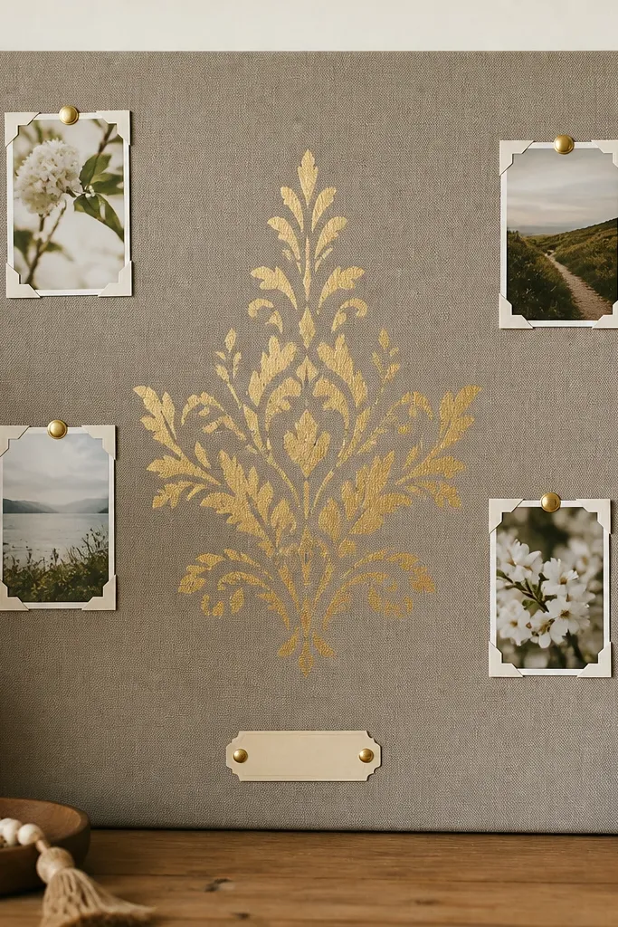
Taupe canvas gives you a soft, grounded background, and stencil work makes the lettering feel intentional. I used a gold metallic stencil paste look with a fine brush, and it reads well because the texture catches light. Keeping the rest of the board sparse makes the gold verse the clear focal point. This one stays beautiful even without lots of charms or ribbons.
Stretch or glue taupe canvas to a board and seal with matte medium. Tape a stencil where you want the verse, then apply metallic paste with a sponge dauber. Let it dry fully, then protect with a light matte topcoat. Add only a few photo corners in the bottom third using small brass brads.
Pro tipClean your stencil immediately with warm water if you use water-based paste, or the edges will harden and smear next time.
AvoidAvoid painting the stencil too thick - it cracks and looks uneven.
8. Whiteboard-Style Prayer Board with Magnetic Scripture Cards
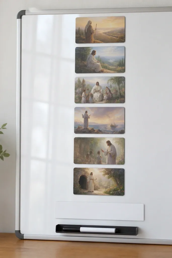
If you want to update daily, this style beats paper pockets. Magnetic cards let you rearrange without damage, and the board surface writes clearly for quick notes. I keep scripture cards in one column so the board doesn't look chaotic when I add new intentions. The clean white background also makes handwriting readable.
Use a smooth panel and coat it with a whiteboard paint product or cover with a pre-made magnetic whiteboard sheet. Seal edges with clear acrylic medium. Attach 1-2 mm magnets to the back of your printed cards using strong craft magnets. Add a marker holder at the bottom with adhesive mounts.
Pro tipWrite your daily "today's prayer" in a different color marker so it's easy to spot in a week of notes.
AvoidAvoid cheap magnets that slide - they make the cards bunch up and look messy.
9. Pastel Washi "Corner Collage" with One Center Quote
Corner collages add personality without stealing focus from the main quote. Pastels work best when you keep them to two colors, like blush and mint, and repeat them only in corners. The center stays calm and readable, and the small accents feel like a gentle frame. This is a good option when you want cute but not cluttered.
Cover the board with cream cardstock and seal with matte medium. Add one center quote card around 7x9 in. Create two corner shapes using washi tape strips angled at about 45 degrees, leaving a 1 in gap from the center card edges. Glue tiny star cutouts with a thin layer of tacky glue.
Pro tipStick to two pastels plus cream - more colors makes it look like scrapbooking instead of prayer focus.
AvoidAvoid filling the whole page with tape - it kills readability.
10. Layered Cardstock "Prayer Ladder" with 5 Steps
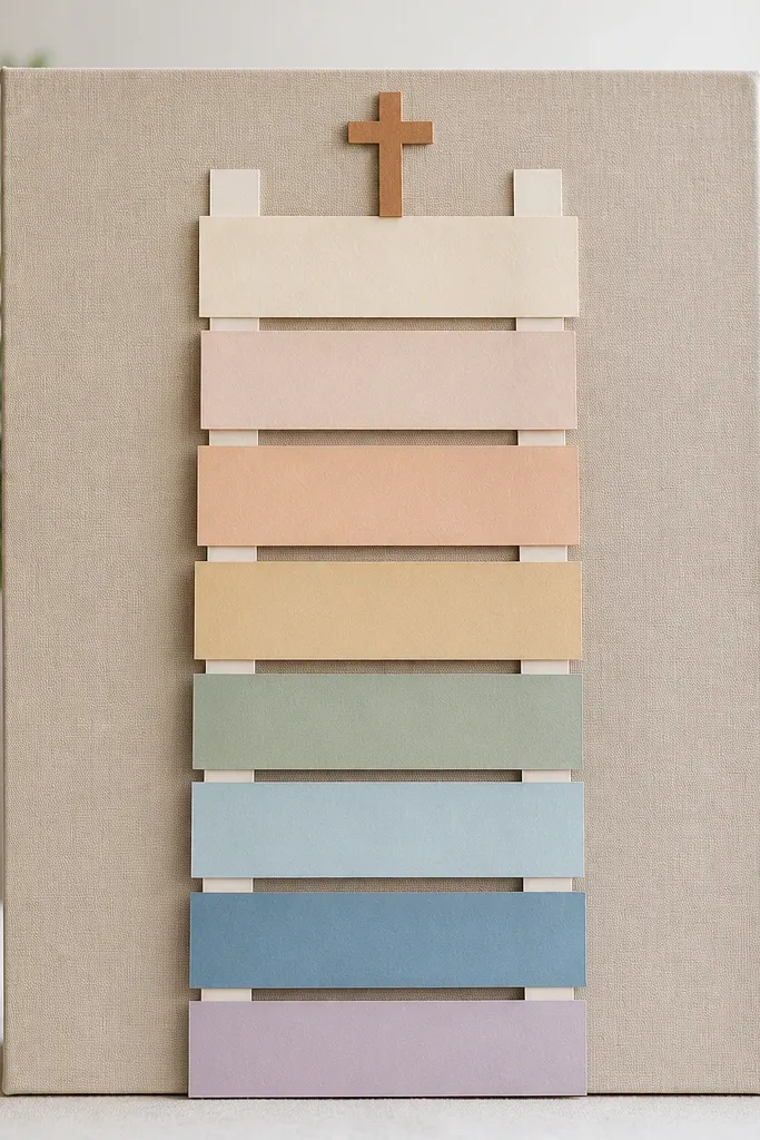
A ladder layout gives your board a built-in flow from top to bottom, which helps when you add goals or weekly requests. Layered cardstock creates depth without bulk, and each step can hold a short phrase. I like five steps because it matches a weekly rhythm without turning into a wall of text. The cross marker makes the top feel grounded.
Cover with a neutral background and seal it. Cut five ladder rungs from 2-3 mm cardstock strips, with each step about 1/2 in taller than the last. Use a 2 in wide vertical side rail or two thin rails to hold the steps. Write one short line per rung in black gel pen, then outline letters with a fine white pen for contrast.
Pro tipUse foam tape under the steps so the ladder casts a tiny shadow and looks dimensional.
AvoidAvoid handwriting that's all the same size - it makes the ladder look flat and harder to read.
11. Flower Press Style Leaves with Scripture in the Middle
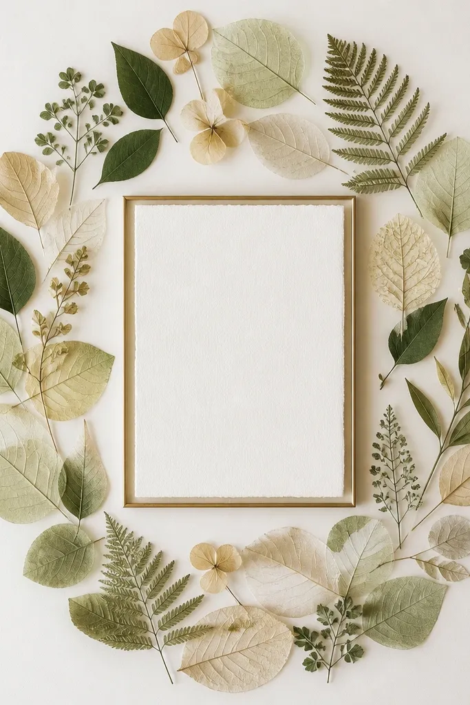
Pressed-leaf layouts look thoughtful because they feel physical and personal. The oval arrangement guides the eye inward to the scripture, and the off-white background keeps the leaves from turning muddy. I keep leaf count low - 7 to 11 pieces - so it stays readable and doesn't look like a craft bin dump. It also works well for seasonal boards.
Seal your background with matte medium first. Arrange leaves dry, then glue with a thin layer of clear craft glue only at the stems. Add a 4x6 or 5x7 framed scripture card centered on top of the leaf cluster. Finish with a clear matte topcoat over the leaves so they don't curl.
Pro tipPress leaves under heavy books for 2 weeks and use a small brush to remove dust before gluing.
AvoidAvoid glossy topcoat - it can make leaves look plasticky.
12. Black-and-White Photo Corner Board with One Name Wall
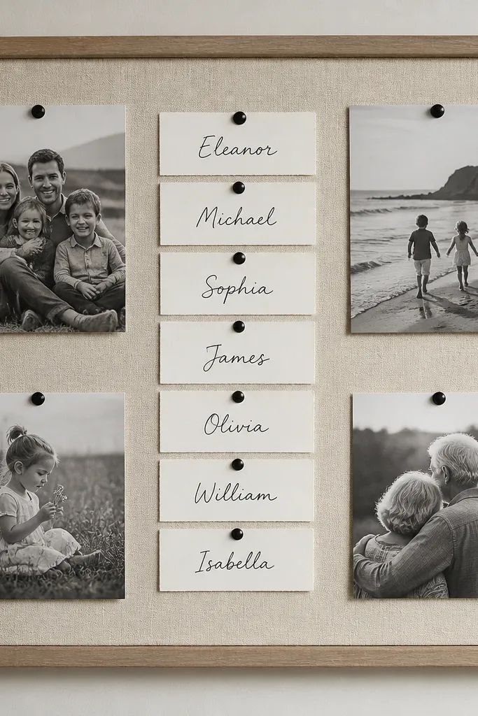
This style looks intentional because it uses one repeating element: photo corners. The center "name wall" keeps it functional, and black tacks tie the photos and cards together. I like black-and-white photos because they don't fight the text. If you want to add people over time, this layout stays neat.
Use a 16x20 board with a smooth white or light gray background. Print 4 small photos and cut them into corner shapes. Glue only the photo corners so the center stays open. For the name wall, write names on 3x2 in cardstock and pin with black pushpins in a tight grid.
Pro tipWrite the header once in a bold font and keep the names in the same handwriting style for consistency.
AvoidAvoid mixing photo sizes - it makes the board look accidental.
13. Hand-Lettered Scripture Scroll with Tucked Ends
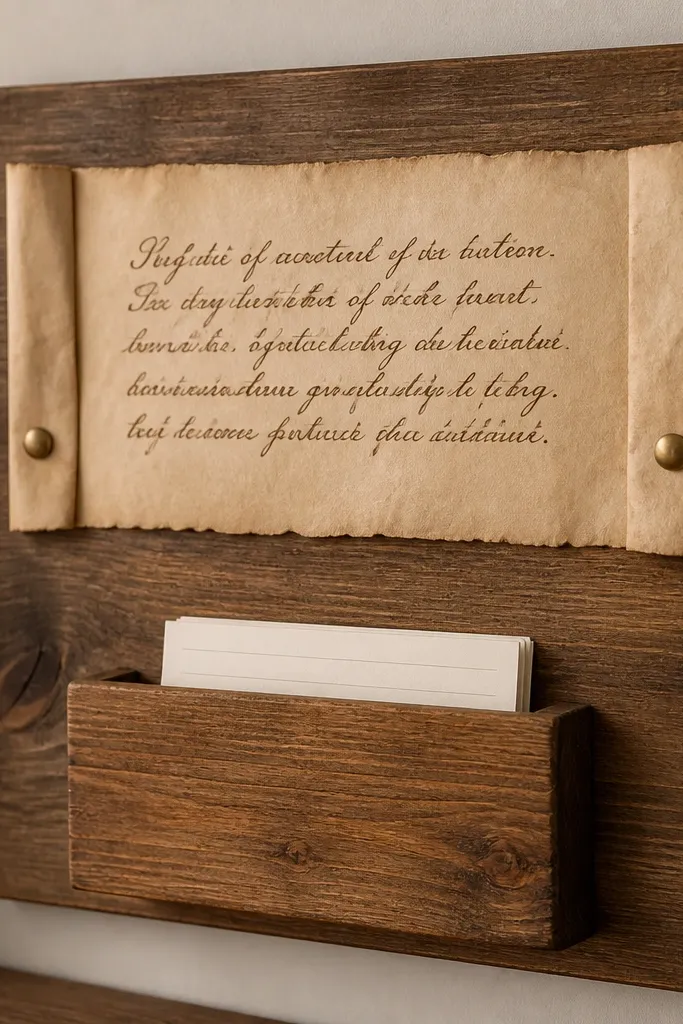
A scroll adds movement without adding clutter. Tucked ends keep the paper secure and make the scroll feel like a real object, not a flat sticker. Brown ink on parchment looks soft and readable, especially in indoor light. This board is great for one main verse plus a small place for daily notes.
Use parchment craft paper or tea-stained paper and seal it with matte spray so ink doesn't bleed. Write the verse with a brush pen or fine calligraphy pen in espresso brown. Tuck both ends under small tabs and secure with brass brads. Add a small 3x5 in pocket below using folded cardstock and glue only the sides.
Pro tipTea staining takes color unevenly, so blot with paper towels until you get a consistent shade before writing.
AvoidAvoid skipping sealing - wet ink smears and the scroll looks messy.
14. Pastel Grid Background with One Floral Sticker Cluster
A faint grid makes your board feel organized even when you use stickers. The grid lines keep spacing consistent, so the quote and cards don't drift. I like adding one floral cluster instead of sprinkling flowers everywhere. It creates a soft corner focal point while the center stays clean.
Lightly draw a grid with a 4H pencil on a light background. Paint over the grid lines with watered-down pastel paint so it stays subtle. Place one quote card centered and keep it the only text block. Add one sticker cluster in the top right, then seal with a matte clear coat to protect the stickers.
Pro tipErase pencil after painting dries so you don't get gray lines showing through the quote card edges.
AvoidAvoid heavy grid lines - it competes with the scripture and makes the board look busy.
15. Teal Chalkboard Patch with Peel-and-Stick Labels
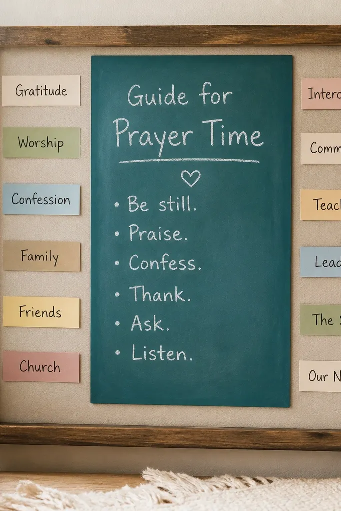
A chalkboard patch makes the board interactive without building a whiteboard system. Teal looks calming, and white chalk pops without needing permanent inks. Peel-and-stick labels make categories clear, and you can rewrite around them. I use this for boards that change weekly because chalk wipes clean.
Cover the base with a neutral fabric or cardstock and seal it. Add a teal chalkboard patch or paint a small rectangle with chalkboard paint. Let it cure 3 days before heavy use. Add label strips with matte adhesive vinyl or peel-and-stick paper, then write category notes in chalk.
Pro tipPrime chalkboard patches by rubbing chalk all over, then wiping - it makes the first writing smoother.
AvoidAvoid writing on fresh chalkboard paint before it cures - it scratches and looks patchy.
16. Gold Twine "Cross" with Hanging Tag Names
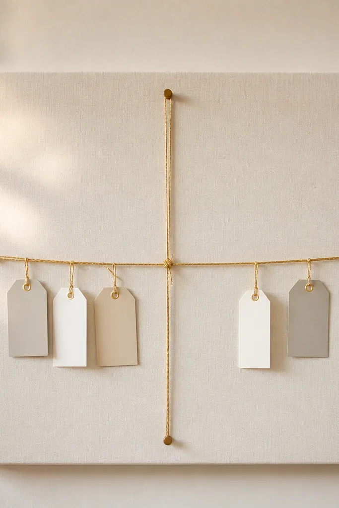
This one is personal and physical. Twine cross lines are simple, and hanging tags keep names visible without using a pocket system. Gold twine adds a warm glow, especially under soft lamp light. The hanging tags also let you add or remove names quickly, and the board still looks clean because the tags share one shape and size.
Cover a board with light cream cardstock and seal matte. Hammer two tiny nails for the cross - about 6 in apart vertically. Stretch gold twine to form the cross, tying securely and trimming ends. Make tags from 2x3 in cardstock, punch a hole at the top, then hang with small jump rings or thin string loops.
Pro tipUse identical tag sizes so the hang stays even - uneven tags make the cross look lopsided.
AvoidAvoid thick rope twine - it makes the cross bulky and throws off the proportions.
17. Monochrome Sticker Wall with Clear Acrylic Overlays
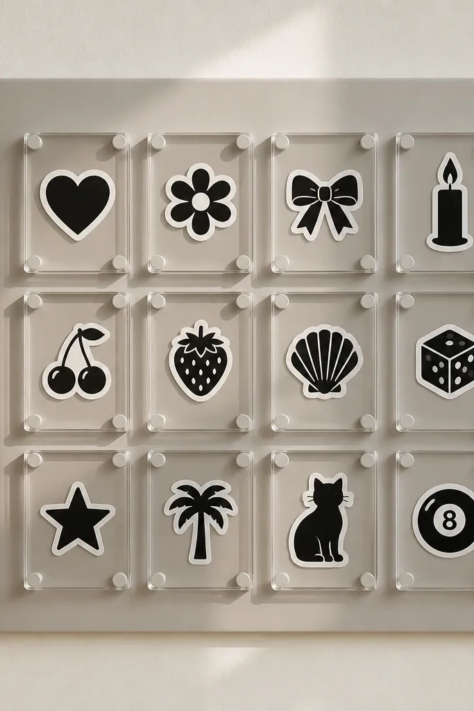
Clear acrylic overlays make stickers look like "designed elements" instead of random decorations. The overlays also protect the surface when you wipe fingerprints off. I keep the icon set monochrome so the board stays calm. Icons in a grid make scanning easy - you see what you need at a glance.
Use a matte background like light gray or cream and seal it. Arrange 9-12 sticker icons in a 3x4 grid with 1 in spacing. Cut clear acrylic or glossy clear label sheets into rectangles, then apply with double-sided tape edges only. Keep the acrylic flush so it doesn't catch light and create glare streaks.
Pro tipIf you use clear label sheets, trim with a sharp craft knife so edges look clean.
AvoidAvoid glossy acrylic over matte backgrounds - glare makes the writing and icons hard to see.
18. Satin Ribbon Corner Clips with a Photo of Your Verse
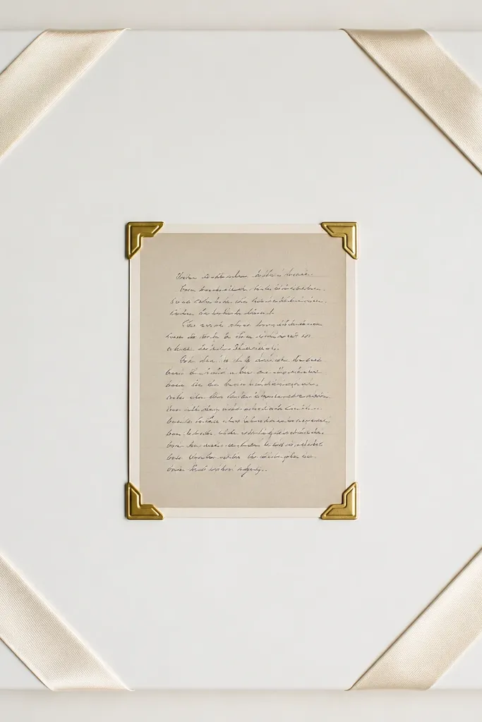
Corner clips are a sneaky way to keep the board looking neat while still letting you swap pieces. Satin ribbon adds softness, and diagonal placement keeps the layout from feeling rigid. The photo of your verse gives you a personal touch, and because it's centered, it reads like the anchor. This works well when you want fewer physical items and more meaning.
Cover a board with white cardstock and seal with matte medium. Attach two satin ribbon strips across corners, leaving a 4-5 in gap from the center. Use small metal corner clips or binder clips covered with fabric so they don't look harsh. Center a printed photo of your verse in a 5x7 frame or cardstock mat.
Pro tipUse a fabric-covered clip for the verse photo so the metal doesn't scratch paper over time.
AvoidAvoid clipping directly on top of ink - the clip pressure smudges some prints.
19. Black Cardstock Background with White Scripture Labels
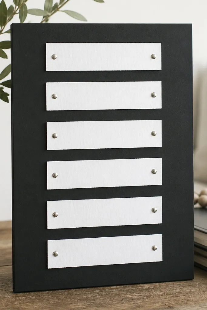
High contrast looks sharp and "finished" even with simple materials. White labels on black background are readable in daylight and at night with a lamp. I like using scripture fragments because they let you cover different themes without one massive wall of text. The silver brads keep the hardware minimal and consistent.
Cover a board with matte black cardstock or paint. Seal with a matte spray so adhesive stays put. Cut label strips about 1.5 in wide and 3-4 in tall, then print or write scripture fragments in white gel pen. Attach labels in a vertical column with silver brads every 1-2 in. Keep 1 in spacing between labels for breath.
Pro tipUse a ruler and cut label strips with a paper cutter so the column looks straight.
AvoidAvoid glossy black - it reflects light and makes the white text look washed out.
20. Glitter-Free "Starry Night" with Constellation Lines
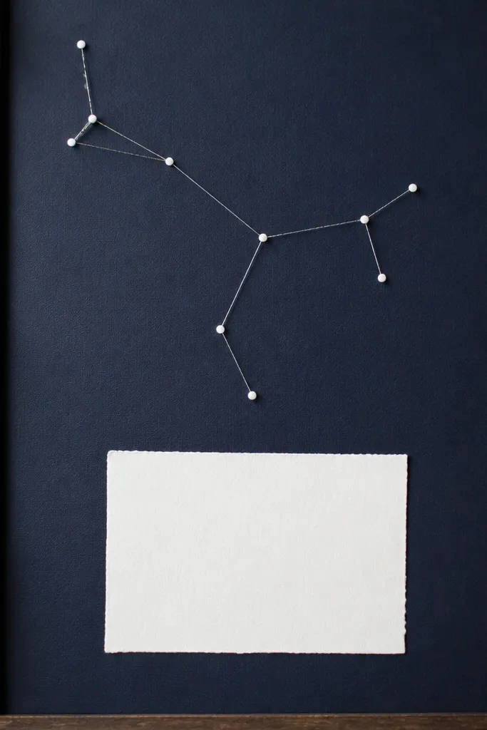
This looks like a night sky without the mess of loose glitter. Dot stickers and thin thread lines create a clean constellation effect, and navy makes the white dots feel crisp. The scripture card in the bottom third keeps focus on prayer, not just decoration. I like this design for teen and college-age boards because it feels modern.
Cover a board with matte navy paper or fabric and seal it. Place 12-18 white dot stickers randomly, then connect them with silver thread using tiny holes and a needle so thread tension stays even. Anchor thread ends on the back with tape. Add one scripture card about 5x7 in at the bottom, secured with two pins.
Pro tipPunch tiny holes with an awl, not scissors - thread slips cleaner and you get straighter lines.
AvoidAvoid loose thread knots on the front - they look messy even if the constellation is pretty.


