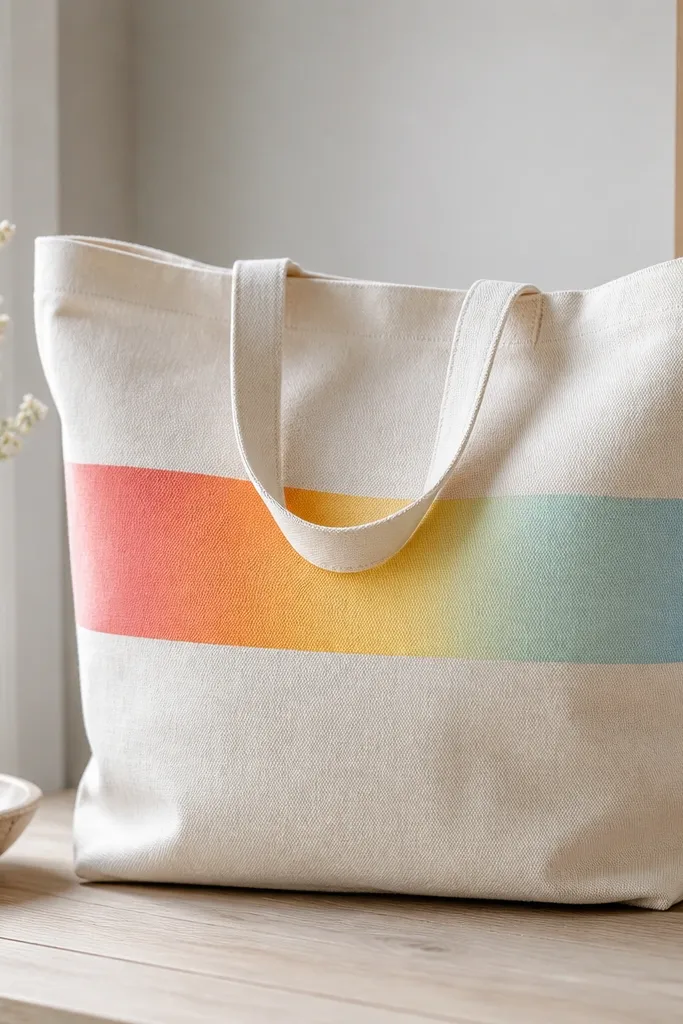
1. Sunset stripe tote with a taped horizon
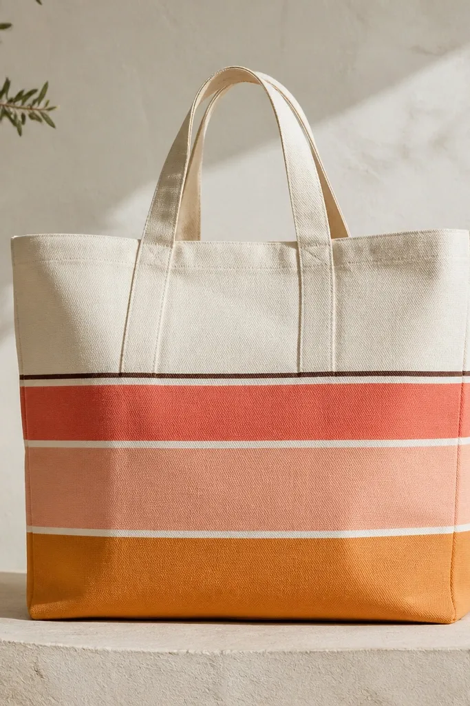
This design looks modern because the stripes are straight and the horizon line is thin. I use coral and peach for the main bands, then add a tiny dark-brown line so the whole thing anchors. The contrast reads clean even from a distance, which is why it works for tote life. Add a small off-center sun circle in light cream to make it feel intentional, not flat.
Use a 10 oz canvas tote. Tape the "horizon" area with 1/8 inch painter's tape, paint the top band first, then peel carefully while the paint is still slightly cool. For the sun, stencil a 2.5 inch circle and fill it with cream mixed with a little yellow ochre. Keep stripes about 3.5 inches tall each so the scale looks balanced.
Pro tipBefore taping, press the tote flat and rub a credit card over the tape edges so paint can't creep underneath.
AvoidSkip thin, watery paint for the bands - it leads to patchy stripes and fuzzy tape edges.
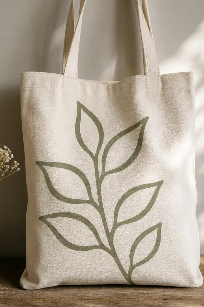
2. Botanical line art in one continuous stroke
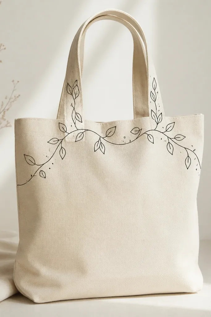
This is the fastest way to make a tote look designed without heavy color blocking. I paint a single vine line in deep charcoal or black acrylic mixed with a drop of fabric medium so it stays flexible. The minimal palette makes the drawing feel modern and airy. It also hides minor fabric texture, which is great if your tote isn't perfectly smooth.
Use a fine liner brush (size 0 or 1). Plan the vine path with a pencil sketch first - start at the left bottom corner, loop around the handle area, and end near the right top seam. Paint leaves as small teardrops, then add 5-8 tiny dots for rhythm. Keep the line thickness consistent by loading the brush lightly.
Pro tipDo a test stroke on scrap fabric to set your brush pressure before you commit to the tote.
AvoidDon't outline too many leaves - crowded line art looks messy on a tote.
3. Abstract watercolor wash with salt texture
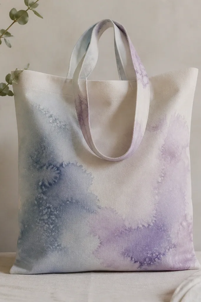
Salt texture makes watercolor-style paint look organic without you having to "paint around" every speck. I mix acrylic with fabric medium and water to a thin, milky consistency so it behaves like dye. The blue-lavender pairing looks modern because it stays cool and calm. Letting the salt do the pattern gives you that expensive, imperfect feel.
Lightly mist the tote with water so the paint spreads. Brush on a base wash of dusty blue, then drop in lavender patches. Sprinkle coarse salt (like kosher salt) while it's still wet, then let it dry fully. Brush off salt gently, then add one darker blue diagonal sweep for structure.
Pro tipSpray a little water on a cotton rag and dab the edges if the wash dries too fast and turns streaky.
AvoidDon't use table salt - it melts too quickly and leaves muddy granules.
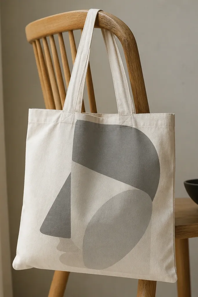
4. Geometric half-moon blocks in matte black and sand
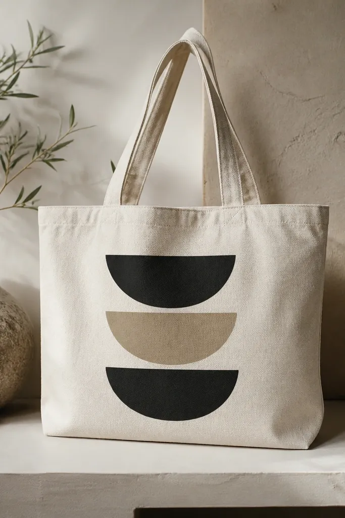
Half-moons look graphic and modern because they're simple but not boring. I paint them with matte black and sand so the tote stays neutral and wearable. The negative space - the visible canvas between shapes - is what makes it feel crisp. This design also forgives uneven fabric because the blocks cover most texture.
Mark a 12 inch wide grid on the front. Use a bowl or stencil to trace 5 inch half-moons, then tape along the pencil lines. Paint sand first, let dry, then tape and paint black. Keep the gap between blocks around 1/4 inch so it reads as intentional spacing.
Pro tipUse thin foam tape for the gaps so you get straight, consistent negative space.
AvoidDon't rush peeling tape - it can lift the paint and create jagged edges.
5. Oversized number 7 with drippy paint edges
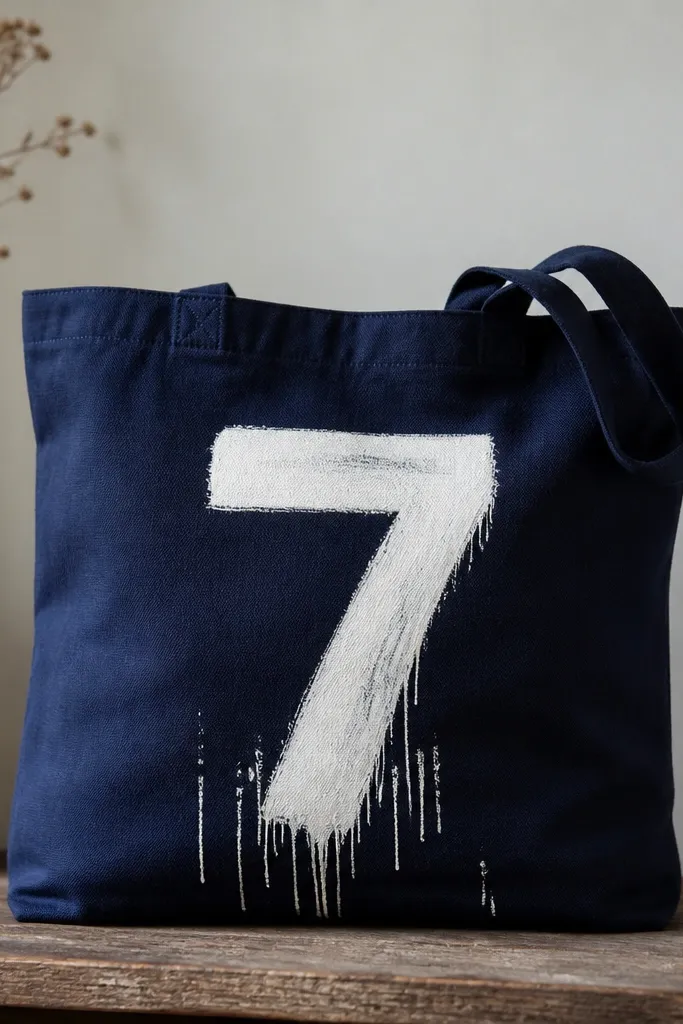
Big numbers feel street-style modern, and the drips add movement. I paint the base number in opaque white, then use a thinner white mixture for drips so it runs just a little. Navy fabric makes the white pop instantly, even if your tote has slight wrinkles. This design looks great on front-center and reads well from across a room.
Use a tote in navy or deep charcoal. Mask the number with a vinyl stencil or a hand-drawn template on parchment. Paint the number with thick acrylic + fabric medium, then mix a thinner version (about 2 parts paint to 1 part medium) for drips. Touch the brush to the bottom edge and let gravity create 1/4 to 1/2 inch runs.
Pro tipIf drips go too far, dab with a damp cotton swab right after they start running.
AvoidSkip super-thin paint for the number body - it turns translucent and looks cheap.
6. Color-blocked pocket panel on the front
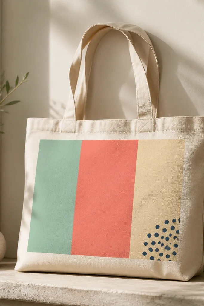
Instead of painting the whole bag, you paint a "panel" area. That instantly looks modern because the rest of the tote stays neutral. Mint + coral + cream is a combo I use a lot because it reads fresh without neon screaming. A tiny dot cluster adds a playful detail without clutter.
Pick a panel size about 9 inches wide by 7 inches tall. Use painter's tape to create borders that are 1/8 inch thick visually (tape width). Paint in this order: cream base, then mint, then coral on the bottom. Finish with 6-8 tiny dots using a toothpick or dotting tool.
Pro tipTape labels the edges - press it down hard and paint with a foam brush to avoid bleed.
AvoidDon't blend colors directly on the tape lines - it creates muddy corners.
7. Soft wave gradient from teal to seafoam
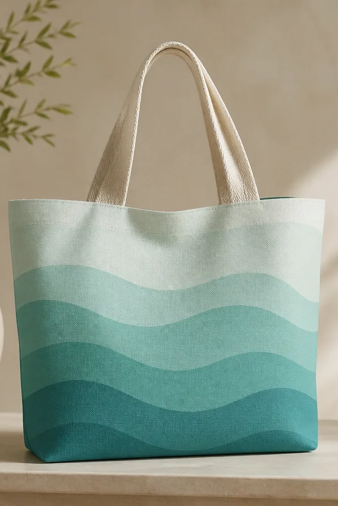
A wave gradient looks modern because it's calm but still graphic. I layer teal and seafoam with a sponge so the transition is soft. The trick is keeping the wave shapes consistent: same curve, same spacing. It reads like a design print but you made it by hand.
Use 2-inch wide wave marks as your guide. Lightly draw 5 wave crests across the bag front using pencil. Sponge on seafoam first, then layer teal at the bottom and blend upward with a damp sponge. Once it dries, trace a thin teal outline along the wave crests for definition.
Pro tipBlend in small circles with the sponge, not back-and-forth strokes, to avoid streaks.
AvoidDon't use too much water - it makes the gradient bleed through seams.
8. Stencil stars with one matte gold accent
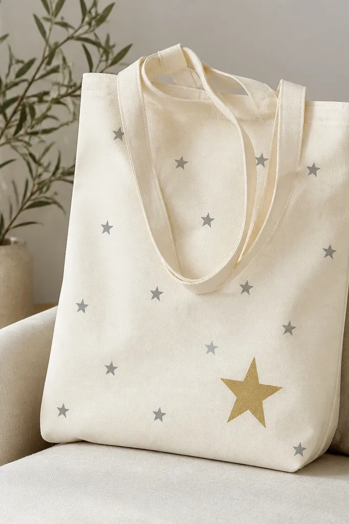
Stars are easy, but the modern part is the restraint: small matte gray everywhere, one gold star as a focal point. I use matte gold paint to avoid the "cheap glitter" look. The gold star catches light subtly when the tote moves. It looks good for day-to-night and doesn't scream holiday.
Choose a 1-inch star stencil for the small ones. Tape the stencil lightly and tap-paint with a sponge brush, then let it dry. Mix matte gold with a fabric medium so it stays flexible. Place the gold star about 4 inches above the bottom seam, centered.
Pro tipIf your stars look fuzzy, wipe the sponge brush on paper towel before tapping on the tote.
AvoidSkip metallic paint without fabric medium - it cracks when the tote flexes.
9. Monochrome portrait frame with brushy edges
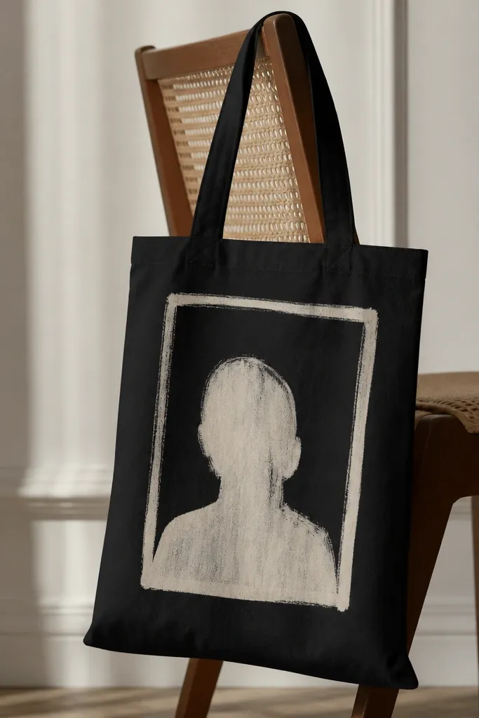
A frame gives structure, and the brushy inner texture keeps it human. I paint the frame in off-white, then use a dry brush technique for the inner area so it looks like a faded photo. Monochrome is modern because it avoids busy color mixing. It also hides uneven tote dye or printing, since the texture blends with imperfections.
Paint a black tote first if it's not already dark, or start with a naturally dark bag. Mask the rectangle with tape and paint off-white frame about 1 inch thick. For the inner texture, dab off-white onto the center with a dry brush, leaving gaps. Add one small "corner mark" line on each corner of the frame.
Pro tipUse a ruler and tape for the frame, then remove tape only after the paint sets enough to hold edges.
AvoidDon't make the frame too thick - it looks like a label.
10. Hand-painted terrazzo dots in 4 colors
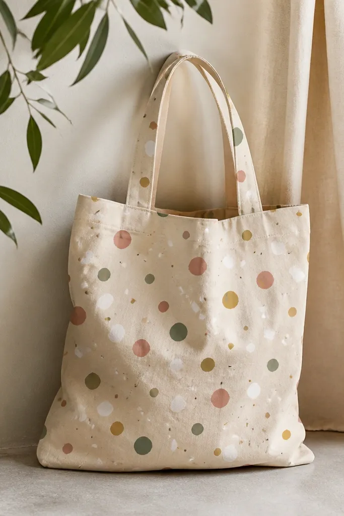
Terrazzo dots look expensive because the variation feels random, not painted in rows. I keep it to four colors max so it stays modern and not chaotic. Use small dot sizes for the "grain" and a few larger dots for visual interest. The result looks like a surface pattern you'd see on ceramics.
Pick a base color like oatmeal or light canvas. Mix 4 acrylics into slightly thick paint so dots don't blur. Use a dotting tool for 1/8 inch dots and a toothpick for tiny specks. Scatter across the front and stop around 1 inch before the side seams so it doesn't bunch.
Pro tipMake a quick dot map on paper first so you know where the biggest clusters land.
AvoidAvoid using watery paint for dots - they spread into blobs.
11. Rainbow ombre ribbon across the tote width
This is the "fun but grown-up" version of rainbow. The ribbon stays modern because the edges are crisp and the gradient is smooth. I do a wide band so the ombre has room to blend instead of turning muddy. It looks great on plain totes because it becomes the only design element.
Tape a rectangle 2.5 inches tall across the tote front. Paint the gradient left to right using 5 colors, blending each layer while paint is still tacky. Start with the darkest coral on the left, then transition to orange, yellow, mint, and finish with soft blue at the right. Blend with a damp sponge right at the color boundaries.
Pro tipUse a wide flat brush for the base band, then switch to a sponge for blending - brushes leave streaks.
AvoidDon't use too many rainbow steps - 5 colors is enough for a smooth look.
12. Botanical stencil branch with negative space leaves
Negative space leaves make this feel modern because they're graphic, not detailed. I use a muted green so it looks natural but still design-forward. The branch is simple and repeats well if you want to add a second smaller branch near the handle. It also hides uneven paint coverage because the canvas shows through.
Use a leaf-stencil set and pick one branch size that fits the tote front. Tape the stencil in place and paint with a foam brush, then remove carefully. If your stencil fills too much, lightly dab paint off the brush to keep the leaf cutouts clean. Place the branch so it starts near the bottom left seam and curves upward toward the right handle.
Pro tipTest your stencil alignment on scrap fabric first so you don't waste a whole tote front.
AvoidSkip heavy brushing over stencil edges - it smears the negative space.
13. No-line abstract face using gray shapes
This design reads modern because it uses shapes instead of outlines. I keep everything in gray tones: warm gray, cool gray, and charcoal so the face looks cohesive. The lack of lines makes it feel contemporary and slightly artsy without being messy. It also works on any tote color because you're using controlled opacity.
Sketch a loose head silhouette with pencil, then break it into 4-6 shapes. Paint the largest cheek and forehead blocks first with a medium-thick brush. Add nose and mouth shapes with darker gray. Use a small sponge to soften edges so the shapes blend but still look like separate pieces.
Pro tipKeep one edge sharp (like the jaw) and soften the rest for a clean modern look.
AvoidDon't use bright colors for this face - it turns into a kid craft fast.
14. Tie-dye inspired brush swirls with fabric medium
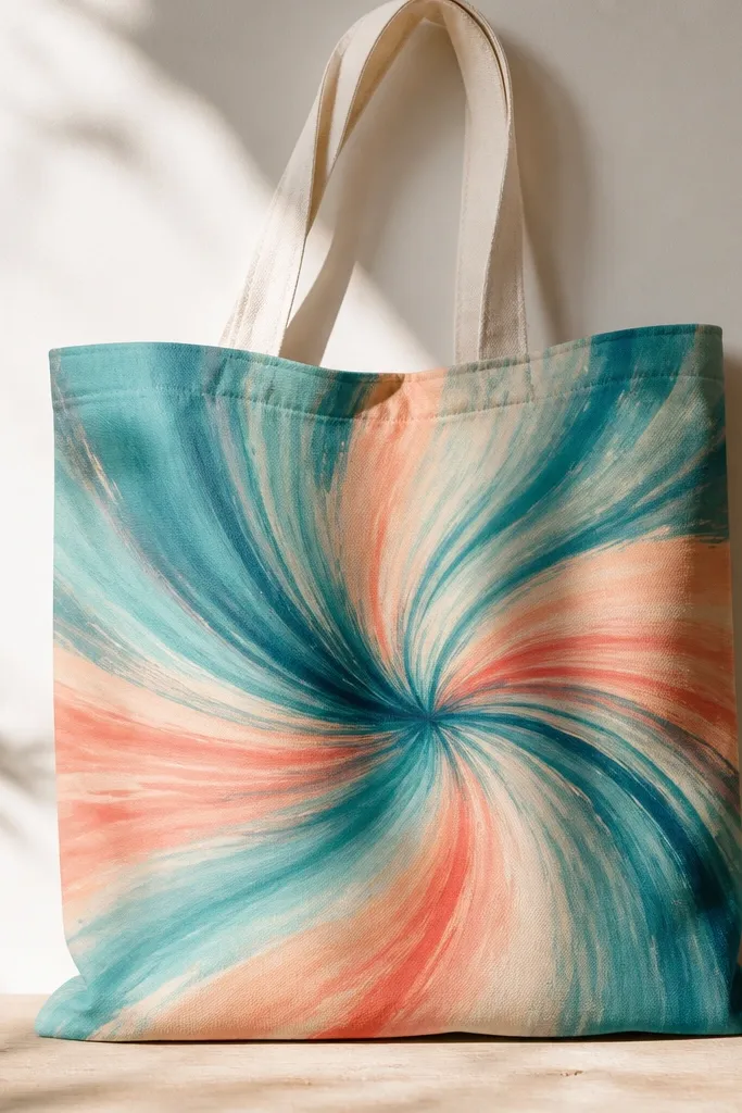
You get tie-dye energy without the weird creases. Brush swirls let you control where the color goes, and fabric medium helps acrylic spread without pooling. The modern part is the limited palette and the consistent swirl direction. It looks like movement, not like you spilled paint.
Use a round brush and mix each color with fabric medium to a thin cream consistency. Draw 6-8 swirl arcs lightly with pencil, then paint within those arcs. Start with teal in the center swirl, then add aqua along one side and coral on the outer loops. Blend the transitions with a damp brush corner.
Pro tipWork on one tote section at a time to keep wet edges - stop and reload your brush often.
AvoidAvoid painting over dried swirls - it creates hard lines that look accidental.
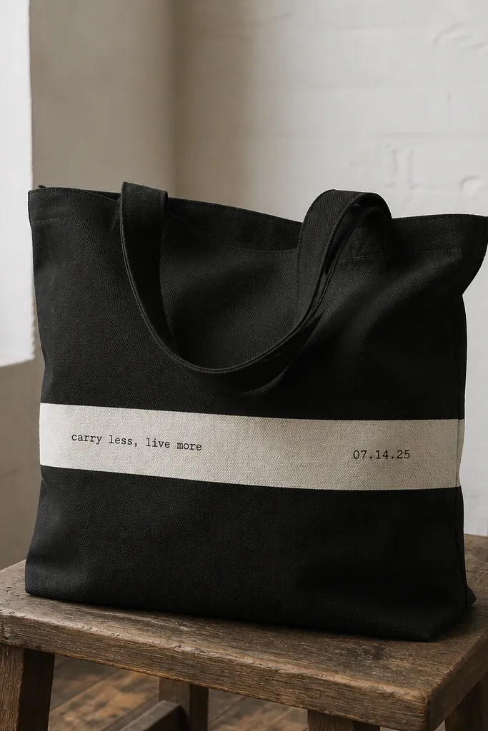
15. Minimal "CAPTION" style lettering with dot separators
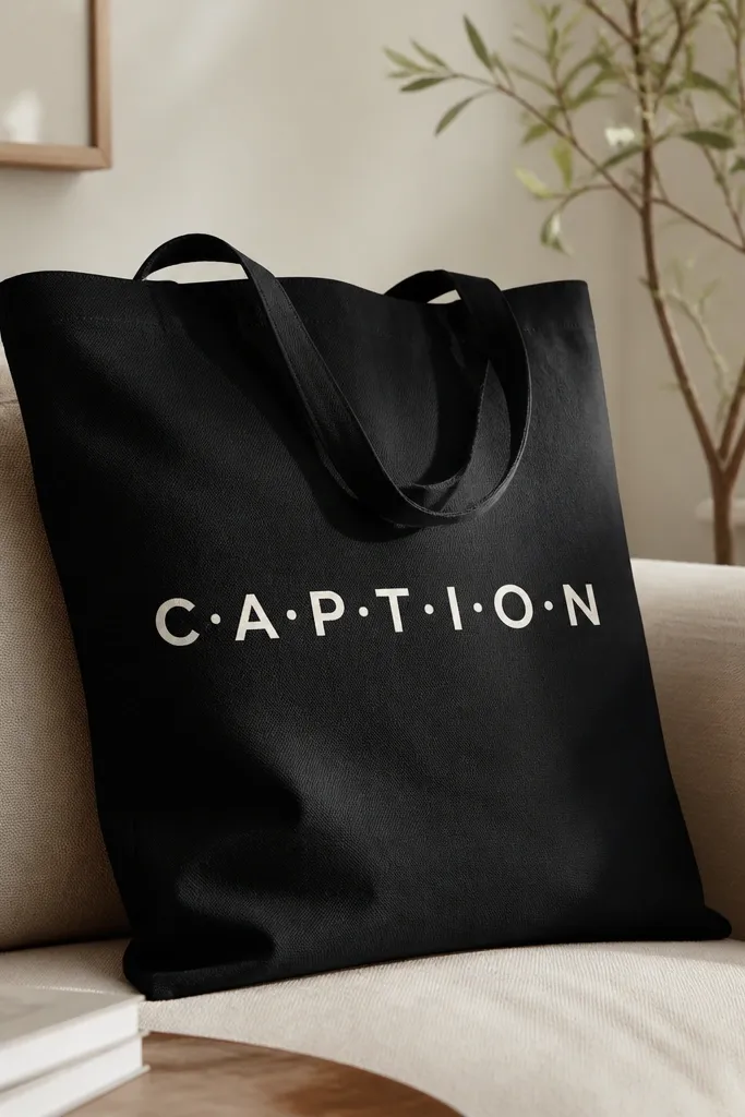
Lettering looks modern when it's simple and spaced right. I use a blocky uppercase style and add dot separators for a little design rhythm. Off-white on black or deep navy makes it readable and street-ready. This is also one of the best options if you want a tote that looks "intentional" from far away.
Practice your letter spacing on paper using a 1-inch grid. Transfer the word to the tote with a light pencil, then trace using a fine liner brush. Paint letters with thick acrylic mixed with fabric medium for flexibility. Add 10-12 dots with a dotting tool at consistent spacing between letter groups.
Pro tipIf you mess up a letter, wipe it while wet with a damp cloth and try again - don't wait for it to dry.
AvoidSkip cursive for this style - it looks dated when you paint it by hand.
16. Geometric sunburst rays with a center circle
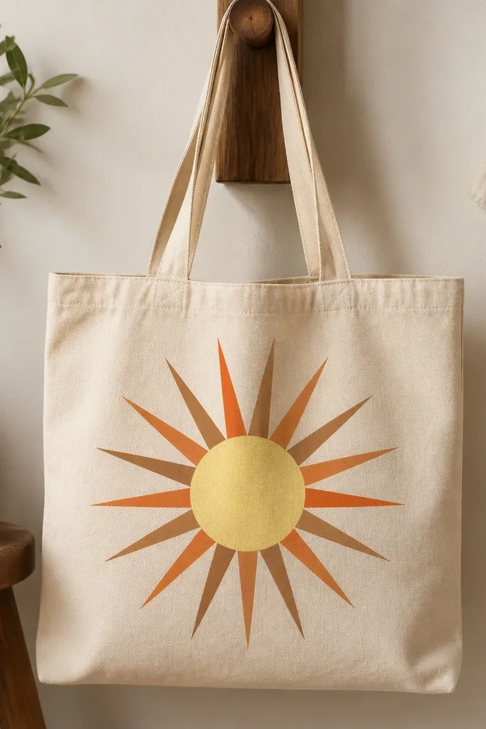
Sunbursts feel modern because they're symmetrical and graphic. I keep the colors warm and muted instead of neon, so it looks wearable. The center circle gives you a focal point and makes the rays feel like a print, not random triangles. It also photographs well because the shapes catch light.
Mark a 4 inch center circle on the front. Tape triangle rays using a ruler guide - aim for 1/2 inch wide rays with 1/8 inch gaps. Paint alternating colors, starting with the darkest brown for the first row so the contrast is strong. Remove tape after each color layer dries to avoid smearing.
Pro tipUse a laser-level app on your phone only for straight placement - it saves you from crooked symmetry.
AvoidDon't make rays too thin - they look like a sketch instead of a design.
17. Galaxy speckle with a single crescent moon
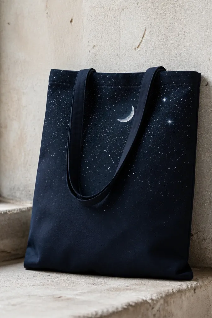
This looks modern because you're not painting a full galaxy scene. You're doing controlled speckling plus one crescent moon, which keeps it clean. I use a dark base color and then add silver specks lightly so it doesn't look glittery. The fade effect makes it feel atmospheric without getting messy.
Start with a dark tote. Load a toothbrush with watered-down white and silver paint, then flick for speckles. For the fade, hold the brush farther away as you go lower. Paint a 3 inch crescent moon with a soft brush edge, then add 2-3 slightly larger star dots nearby.
Pro tipPractice your flick distance on scrap fabric - it controls dot size and density.
AvoidSkip heavy glitter paint - it sheds and feels scratchy against skin.
18. Marbled corner splash in soft gray and white
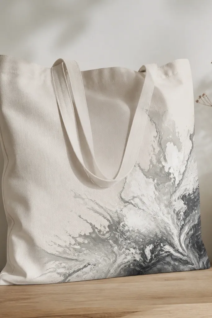
Marbled corners look modern because they're asymmetrical and restrained. I like soft gray and white because they don't fight with clothes. The clean stop line keeps it from looking like a spill. This is a great choice when you want something artsy but still wearable.
Tape off a diagonal rectangle corner area about 10 inches across. Mix acrylic with fabric medium and water to create a marbled flow. Drop in gray and white in small puddles, then swirl with a toothpick. Keep the swirl inside the taped area and peel tape once the paint is dry enough to hold shape.
Pro tipUse a small foam brush to smooth the taped edge after peeling, if needed, while paint is still workable.
AvoidDon't over-swirl - it turns the marbling muddy.
19. Tote handle wrap motif with tiny repeating icons
Painting around the handle looks modern because it turns a functional part into a design element. Tiny repeating icons keep it from looking too busy. I use two colors max plus off-white so the icons pop on either light or dark totes. The best part is you don't have to cover the whole bag front, which saves time.
Measure the handle width and plan a wrap band about 1 inch tall. Mask the handle with painter's tape strips and paint a solid base first. Then use a tiny stamp or stencil for icons, repeating them every 1.2 inches. Let it dry, then remove tape and touch up any edges with a fine brush.
Pro tipRotate the tote as you stamp so icons stay evenly spaced even on curved handles.
AvoidSkip big icons - they distort on a handle curve.
20. Minimal "museum label" bar with black text
This one looks modern because it borrows a familiar design format: the museum label. The trick is keeping type small and spacing tight. I paint the bar in a slightly warm cream and then add black text with a fine liner brush. A tiny worn texture on the bar makes it feel like vintage paper without actually printing.
Tape a bar across the center of the tote front about 11 inches wide and 2 inches tall. Paint the bar cream, then after drying dab a tiny amount of gray on a dry brush to create subtle speckles. Write text with a ruler guide and keep letters consistent height. Add a small underline and one dot on each end of the bar.
Pro tipUse painter's tape as a "line" guide for lettering so you don't drift upward.
AvoidDon't use neon ink-like colors for the text - it ruins the label vibe.
21. Color halo ring around a painted motif
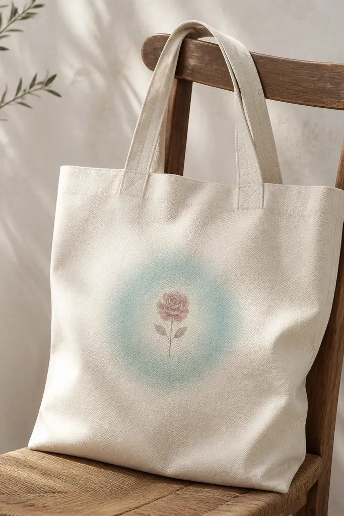
Halo rings make a small motif look like it has depth. I paint the flower in opaque rose, then build a halo with semi-transparent aqua so it fades smoothly. This reads modern because it's controlled and centered. The glow effect also hides any small mistakes around the flower edges.
Start with a 4 inch circle guide centered on the tote front. Paint the flower first with a small round brush. For the halo, mix aqua paint with fabric medium and water to thin it, then sponge outward in circles beyond the flower. Build 2-3 layers, letting each layer dry slightly so it stays smooth.
Pro tipUse a sponge that's slightly damp, not wet, for a clean fade edge.
AvoidSkip thick halo paint - it looks like a solid sticker.
22. Checkerboard stripe blend with tape and sponge
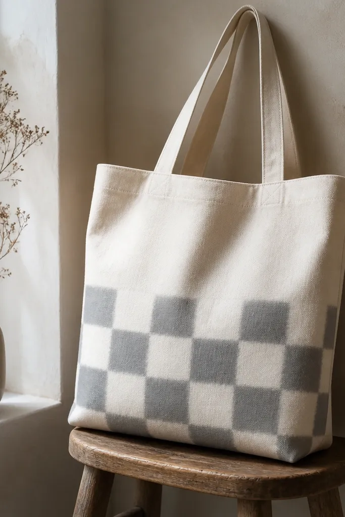
Checkerboard patterns feel modern when the colors are muted and the edges are slightly soft. I use off-white and soft gray so it looks like a graphic print instead of a craft project. Sponge-softening creates a modern "ink" feel. It also gives you lots of texture while keeping the palette controlled.
Tape a grid on the lower half: 1.5 inch squares. Paint the first color in rows, let dry, then tape again for the second color. For softened edges, lightly dab sponge along tape boundaries right after painting the second color. Remove tape once the paint is set but not fully cured.
Pro tipUse the same tape width for every row so the grid stays consistent across the tote.
AvoidDon't use bright white - it can look harsh against muted gray and feels less modern.
23. Resist tie-dye look using wax resist lines
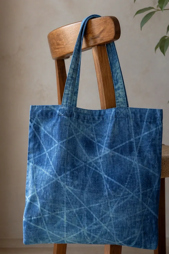
Wax resist gives you that tie-dye vibe without the bulk folds. I draw thin crisscross lines in wax, then brush on blue paint so it doesn't fully cover the waxed areas. It looks modern because the pattern is line-based and controlled. The resist lines also make the tote look layered even when you only used two colors.
Use a paraffin candle or wax stick. Draw crisscross lines on a dry tote, focusing on one front corner or the center panel. Paint over with blue acrylic mixed with fabric medium and water. Let dry fully, then heat with a hair dryer and blot away wax with paper towel until lines are clean.
Pro tipKeep wax lines thin - thick wax makes the resist look chunky and uneven.
AvoidDon't iron directly on top of fresh wax - it can spread and smear the pattern.


