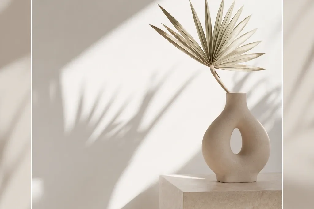

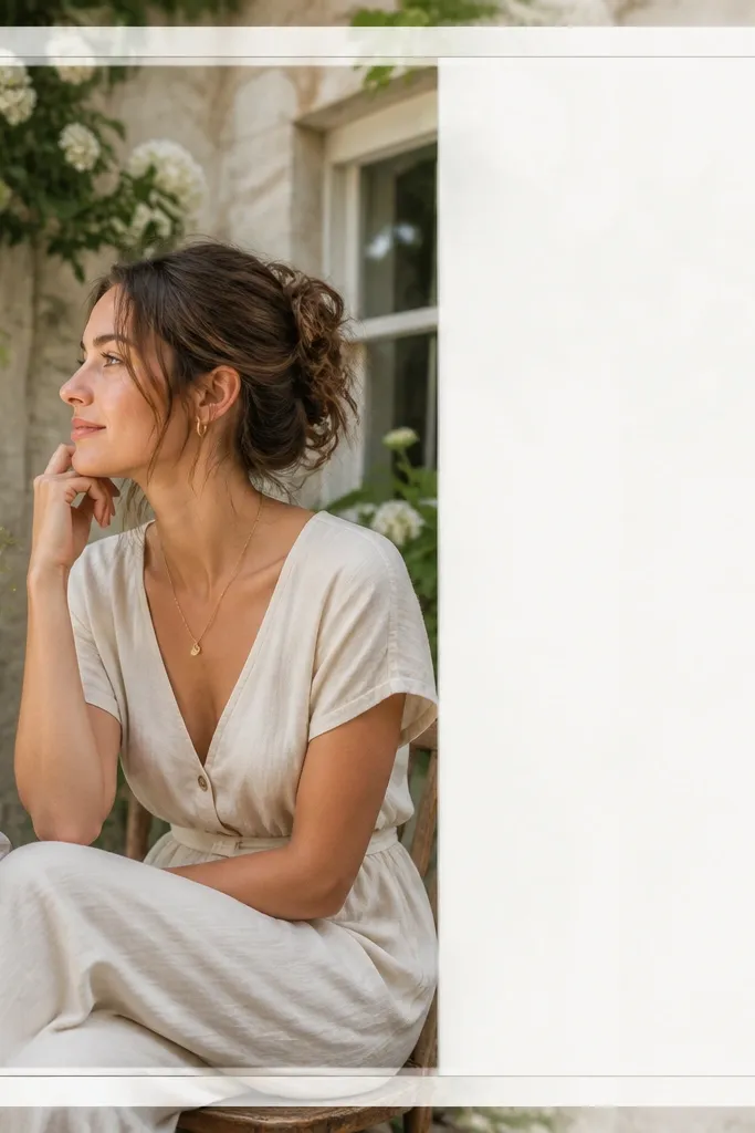
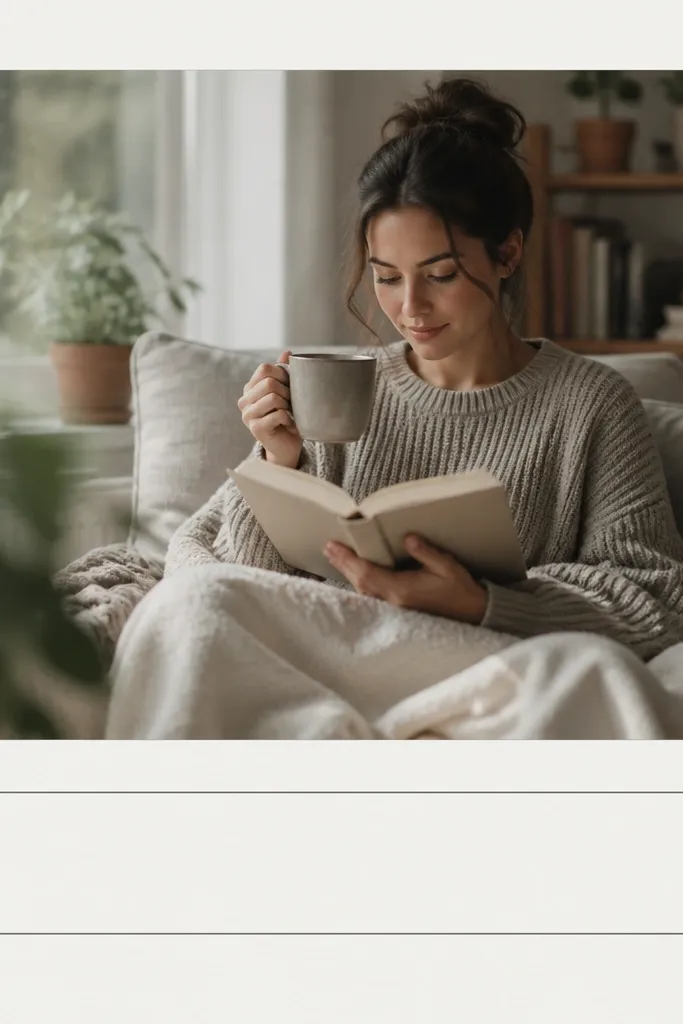
1. Hairline Outer Stroke with Caption Strip
This template looks clean because it uses one visual boundary. The thin outer stroke gives structure without stealing attention from the photo. The caption strip at the bottom is light gray so it doesn't look like a block of ink, and the text stays readable over different images. I like it for travel, coffee, and product shots where the photo already has mood.
Set your border stroke to 4 px black (#111111) on a white background. Make the caption strip 160-190 px tall, with 20-25 px padding on left and right. Use a single font family; set caption text to 38-44 px and line-height around 1.1.
Pro tipIf your photo has bright whites, switch the caption strip to #F2F2F2 and keep text at #222222.
AvoidAvoid thick borders (anything over 10 px) - they make it look like a template screenshot.
2. Two-Tone Edge Lines with Bottom Text Block
Two-tone edges create a designer look because your eye gets a rhythm - top and bottom don't feel identical. The bottom text block sits off-center so it looks intentional, not centered-for-everything. Olive and charcoal are a pair I've used a lot for lifestyle posts because they calm bright photos without turning them gray.
Create a top edge line 3 px in charcoal (#2B2B2B) and a bottom edge line 2 px in olive (#7A7A3A or similar). Place a text block 360-420 px wide at bottom-right with 30-35 px padding. Use a subtle background behind text like #EFE9DA at 90% opacity.
Pro tipAlign the text block's left edge with the photo's right third - it looks balanced even when your subject is off to one side.
AvoidDon't use two different fonts here; the two-tone lines already do the work.
3. Corner Bracket Frame with No Full Border
Corner brackets feel modern because they outline the photo without drawing a full rectangle. You get a "viewfinder" vibe that works great for portraits, art prints, and minimalist interiors. The caption underline adds structure while staying light enough to keep the focus on the image.
Leave at least 70-90 px padding around the photo. Draw corner brackets as short L-shapes: 28-32 px long with 4 px stroke, placed 18-22 px from each corner of the photo area. Put caption text centered below the photo, then add a 2 px underline at the same width as the text block.
Pro tipUse a slightly darker text color than you think you need (#1F1F1F) so it stays crisp on darker photos.
AvoidAvoid placing brackets too close to the photo edges - it looks like an overlay sticker.
4. Caption Bar with Rounded Ends and Thin Side Rules
Rounded ends soften the frame, but the side rules keep it structured. This is my go-to when the photo is a little busy and you still want the typography to look neat. The rounded bar reads "designed" without going fully decorative, and it looks good in both warm and cool color palettes.
Add two vertical lines 2 px thick at x positions about 170 px and 860 px from the left, spanning from the top of the caption bar to the bottom. Make the caption bar 520-580 px wide, 62-70 px tall, with a corner radius about 35 px. Use #EDEDED for the bar and #1B1B1B for text.
Pro tipKeep your caption bar height consistent across your whole template set so your grid looks uniform.
AvoidSkip heavy shadows - even a faint drop shadow makes it look like a random app frame.
5. Monochrome Grid Frame with 3x3 Lines

A grid frame works because it adds alignment cues without looking like a border. The thin lines help your eye judge spacing, and the caption at top-left keeps the composition from feeling centered and generic. Light gray lines (#D6D6D6) keep it minimalist even on colorful photos.
Draw vertical and horizontal lines to make a 3x3 grid across the photo zone only. Use 2 px lines with 0.9 opacity. Place caption in the top-left over the white background area, not on top of the photo, so it stays readable.
Pro tipIf your photo is very bright, reduce line opacity to 60-70% instead of changing colors.
AvoidDon't draw the grid across the caption area - it makes text feel cramped.
6. Centered Photo with Wide Margin and Small Title in Top Margin
This one looks expensive because the margin is doing the design. When your photo sits inside a generous white field, the whole post feels calm and editorial. The thin line above the photo gives a boundary, but the rest stays airy. It's great for art, product stills, and any image that has a clear focal point.
Use a margin of about 95-120 px on all sides. Add a 2 px gray line (#CFCFCF) across the full photo width, placed 12 px above the photo. Put the title in the top margin at 42-48 px, then keep body text out of this template.
Pro tipUse title case only if your actual title is in title case; otherwise keep it lowercase for a more modern look.
AvoidAvoid thick margins with thick lines - it reads like a poster, not an Instagram frame.
7. Thin Double Border with Negative Space Center
Double borders feel subtle when the lines are thin and close. The negative space between the lines looks intentional, and it gives your post a "catalog" vibe. I like this for fashion and stationery because it frames details without adding color.
Draw an outer border 3 px in black, then an inner border 2 px in #444444 at about 12-16 px inset. Keep the photo area centered with 70-85 px padding. Caption sits centered below with a small uppercase style at 34-38 px.
Pro tipSet the caption to uppercase only if your text is short (under 20 characters). Longer captions look better in sentence case.
AvoidDon't let the inner border overlap the caption zone - it makes the composition feel crowded.
8. One-Edge Accent Line and Bottom Caption
One-edge accent lines are my favorite when you want minimalist but not plain. The accent color gives a pop without turning the frame into a theme. Pairing a small blue line with a light gray caption bar keeps readability high across different photos.
Add a vertical accent line 4 px wide on the left edge of the photo zone. Use a bright but not neon blue like #2F6BFF. Caption bar: 170 px tall at the bottom with #F3F3F3 background and 40-44 px text.
Pro tipPick one accent color and reuse it across every template in your account so your feed looks like one system.
AvoidAvoid multiple accent colors in one frame - it breaks the minimalist look fast.
9. Translucent Photo Overlay with White Frame Panel
This template makes photos look cohesive because you add a gentle white panel overlay. It's especially good for photos with harsh contrast or mixed lighting. The caption sits inside the frame panel on the right, so the text feels like part of the design, not pasted on top.
Create a semi-transparent white rectangle around the photo area, about 15-20% opacity. Leave a clear gap of 8-12 px so the photo edge still shows. Place the caption block on the right side inside the panel, 320-360 px wide, with padding 26 px.
Pro tipIf your photo is already washed out, drop the overlay opacity to 10-12% so it doesn't turn gray.
AvoidDon't make the panel fully opaque - the photo edges will look cut out.
10. Matte Border with Soft Gray Background Field
A matte-style border gives a physical print feel. The soft gray background (#F1F1F1) makes the photo look grounded, and the matte white ring keeps it clean. This is one of the easiest frames to use because it hides minor brightness changes between photos.
Set the outer background to #F1F1F1. Put a 30-40 px white matte border around the photo area. Caption sits bottom-left on the gray background, 60-70 px above the bottom edge, with 2 lines allowed at 34-38 px.
Pro tipUse a slightly warmer gray for lifestyle photos (like #F3EFEA) and a cooler gray for product shots.
AvoidAvoid pure black text on very light backgrounds - it can look harsh; use #333333.
11. Vertical Label Strip on Left with Small Caption
A vertical label strip feels intentional because it adds a brand-like element without clutter. Rotated text gives you a different shape language than the rest of the frame. This works well for quotes, series names, and categories like recipes, outfit posts, or project updates.
Add a left strip 120-140 px wide in charcoal (#2B2B2B). Rotate the label text 90 degrees and set it to 26-30 px in white (#FFFFFF) with letter spacing about 0.5-1 px. Keep caption below in sentence case, smaller at 34-36 px.
Pro tipShort labels only. If your label is long, shorten it before rotating so the strip doesn't swallow the photo.
AvoidDon't use light gray text on charcoal at low opacity - it looks washed out on mobile.
12. Corner Dots Frame with Minimal Caption
Dots add a technical, modern feel without drawing a full border. When the dot size is small and spacing is consistent, it reads as a design system. I use this for monochrome photos and simple backgrounds because it stays classy rather than playful.
Place dot clusters at each corner of the photo zone, 3 dots per corner. Each dot is 6-7 px radius (or 10-12 px diameter depending on your tool), with 6-8 px spacing between dots. Caption: one line centered at 40-44 px on a transparent or white background area.
Pro tipMatch dot color to your caption color so the frame feels unified.
AvoidSkip big dots (over 14 px) - they look like clipart.
13. Bottom Caption with Double Rule Line
Double rule lines are subtle but they make the caption area feel engineered. It's a clean way to separate photo and text without using a heavy gray bar. I've used this template for announcements and recipe steps because it keeps the text crisp and structured.
Create a bottom caption zone 140-160 px tall with no fill (transparent or same as background). Add two horizontal lines: one 20 px above the caption baseline and one 10 px below. Use 2 px lines in #2B2B2B and set caption text to 42-46 px with tight line-height.
Pro tipIf your background behind the caption is busy, add a faint white gradient behind the text area at 10-15% opacity.
AvoidAvoid thick spacing between the two lines - it makes the caption area look like a mistake.
14. Asymmetric Frame with Photo Offset and Right-Side Text
Asymmetry looks modern because it breaks the "centered everything" habit. The right-side text block gives you space for longer captions while keeping the frame tidy. I like this for travel blogs and project posts where you want text to carry context.
Set photo width to about 640-720 px and offset it left by 80-100 px from center. Add a right text panel 320-360 px wide with a 2 px divider line at the panel's left edge. Use 44-48 px title and 32-36 px subtitle in the same font family.
Pro tipKeep the subtitle to 1 line. If you need 2 lines, reduce font size by 4-6 px so it stays balanced.
AvoidDon't let the text panel overlap the photo - it looks like you forgot to align layers.
15. Matte Black Frame with Thin White Inner Stroke
This is the high-contrast minimalist frame that makes darker photos pop. The matte black border hides edge noise and gives your post a gallery feel. The thin white inner stroke keeps it from looking heavy, and the white caption stays readable without a big banner.
Use a matte black background (#0F0F0F) for the outer area. Add an outer border thickness of about 70-90 px, then draw an inner white stroke 2-3 px inset by 10-12 px. Caption at bottom center in white at 38-44 px.
Pro tipIf your photo is already very dark, switch the caption to a slightly off-white (#F2F2F2) so it doesn't glare.
AvoidAvoid glossy black gradients - they look like a template effect.


