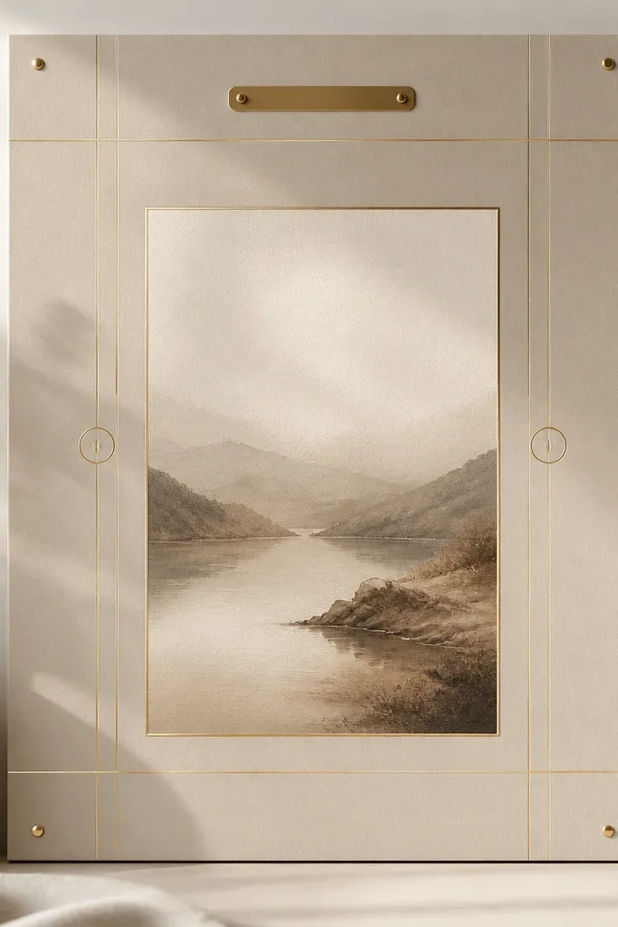
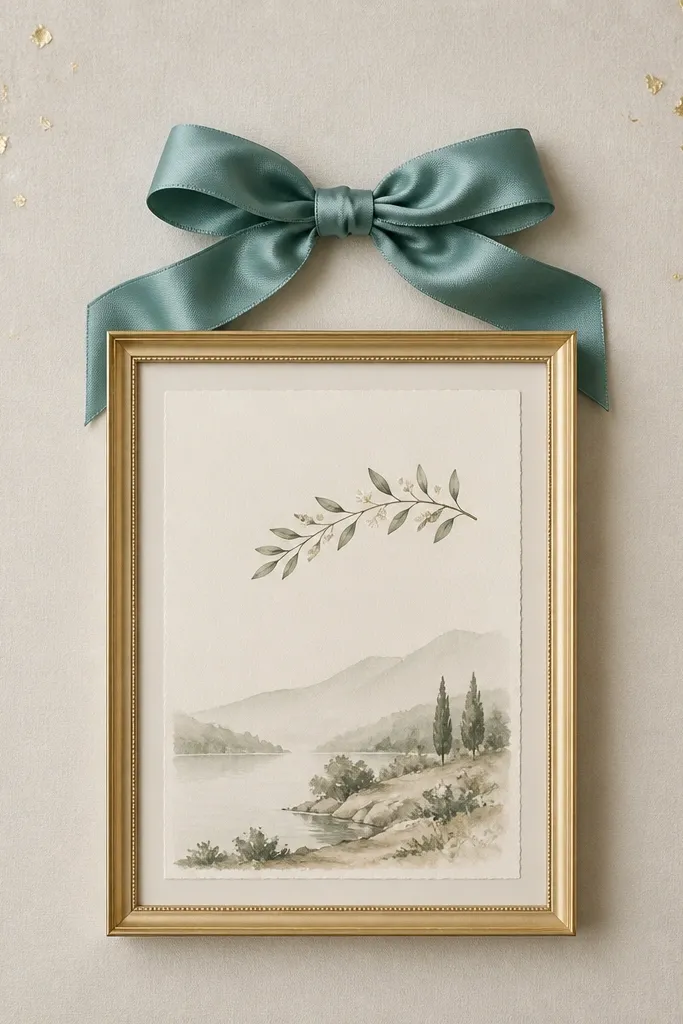
1. Walnut + Linen Chapel Board
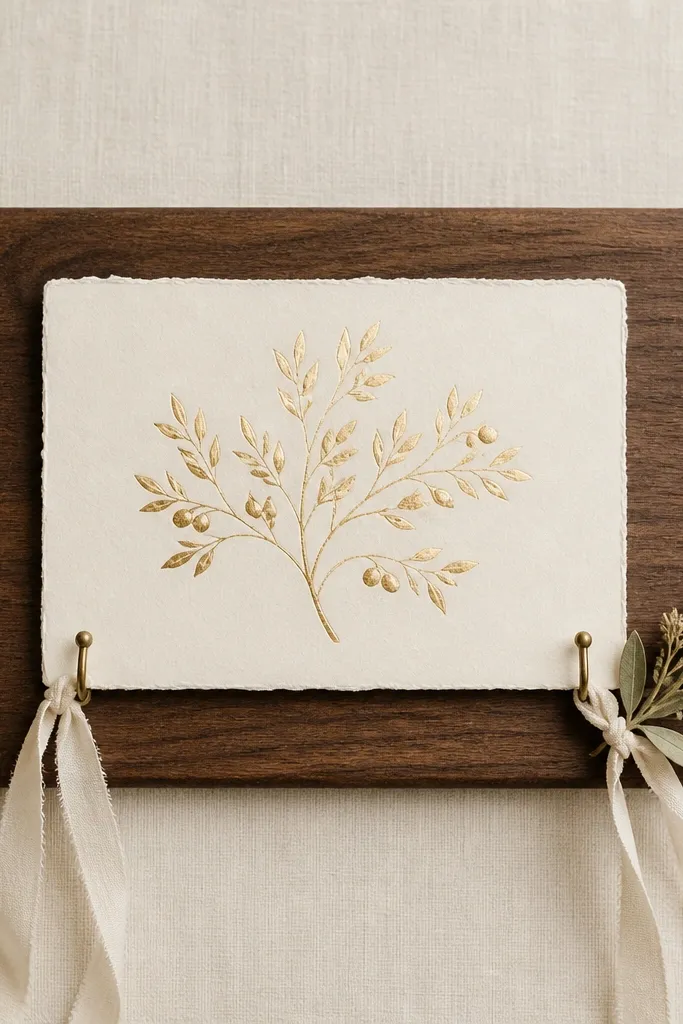
This one looks expensive because the materials are quiet and tactile. Walnut gives warmth, linen kills glare, and gold foil on the raised mat reads like a framed print. The brass corner hooks add a real hardware feel instead of clip-on crafts. The small olive sprig gives a lived-in, calm vibe without turning into farmhouse clutter.
Use a 12x18 in walnut-finish panel or a wood board stained with espresso and wiped back. Wrap the face in linen using spray adhesive, then pull it tight and staple on the back. Build the scripture layer with a 1/4 in foam spacer behind a cream matte. Keep the ribbon and olive piece small - they should sit within the bottom third.
Pro tipMist the linen lightly with a fabric-safe matte spray so it photographs like a showroom wall piece.
AvoidDon't use glossy satin ribbon - it makes the whole board look like party decor.
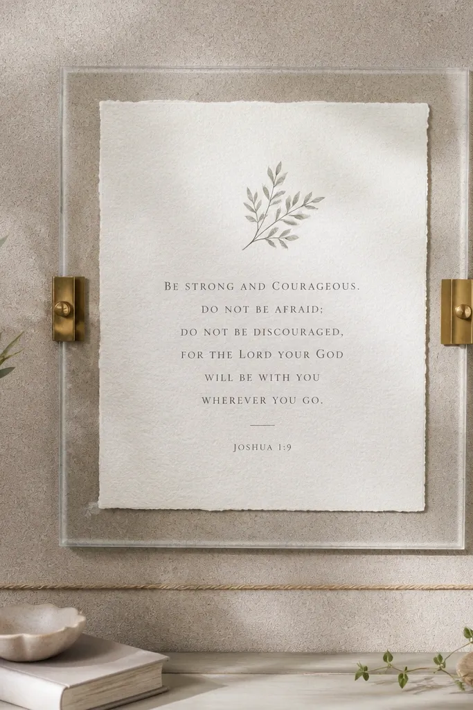
2. Matte Black Frame + Pearl Verse
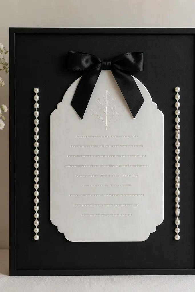
Matte black is clean and modern, and pearl materials read high end fast. The acrylic plaque looks like a boutique display piece, especially when you keep the rest of the board minimal. The two pearl strands create a vertical rhythm that feels intentional. The small satin bow adds a formal touch without covering the main verse.
Paint a board matte black (chalk paint or matte wall paint works) and seal it with a matte clear coat. Cut a 5x7 in plaque from acrylic or use a pre-printed pearl plaque. Mount the plaque on 1/4 in standoffs or craft spacers. Add pearl strands with hot glue dots only at the top and bottom so they hang straight.
Pro tipUse a thin black ribbon, 1/4 in wide, and tie it with a flat knot for a crisp bow.
AvoidAvoid silver accents - they clash with matte black unless you commit to a single metal tone.
3. Champagne Gold Leaf Script Panel
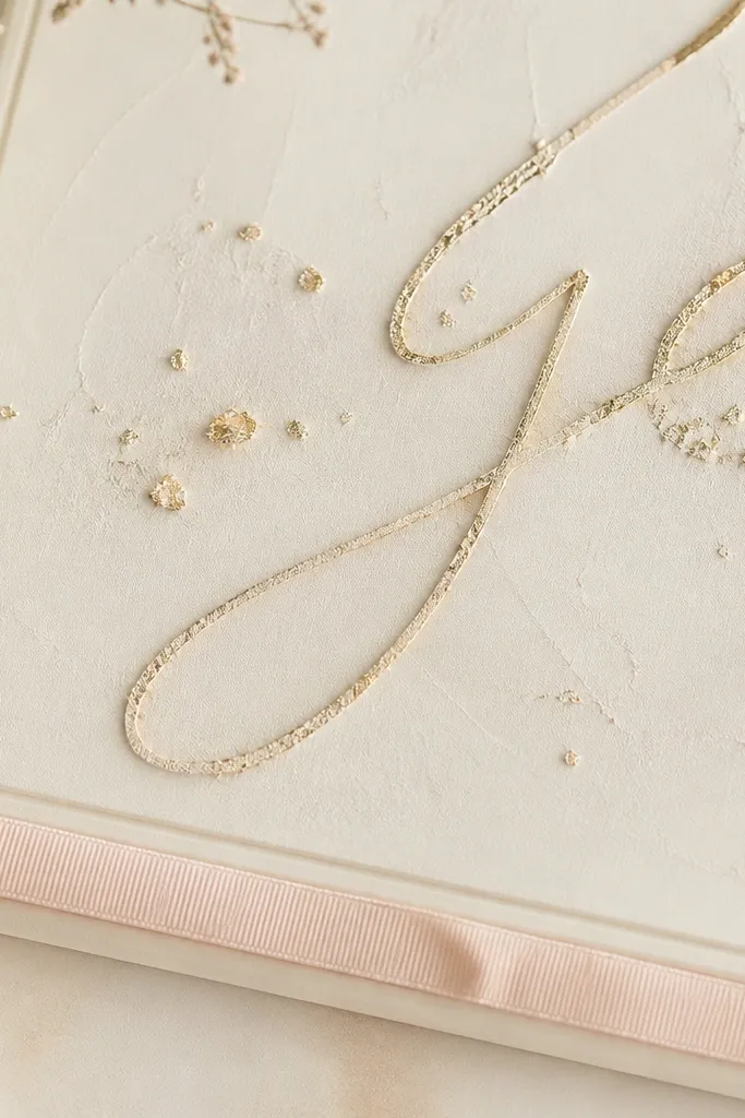
Gold leaf flecks look luxurious because they're irregular and human-made. Champagne tones feel softer than bright yellow gold, especially on a cream base. A raised panel makes the script cast a small shadow, which reads expensive in person. The blush ribbon adds warmth without adding clutter.
Start with a cream board and apply a light texture using plaster-effect paint. Use gold leaf adhesive and press gold leaf only on the lettering area (or use a printed guide). Build the script panel with a 1/4 in raised layer so the leaf doesn't sit flat. Finish with a blush ribbon border along the bottom, secured with fabric glue at three points.
Pro tipSeal the gold leaf with a matte clear spray from 10-12 inches away to avoid sticky shine.
AvoidDon't cover the whole board in leaf - that reads messy, not high end.
4. Soft Greige Cork Bulletin with Scripture Clips
Cork feels grown-up and practical. Greige keeps it neutral, and the clear frame over the scripture makes it look gallery-ready. Brass clips add an intentional "organizer" vibe without feeling office-like. The jute twine line is a small texture detail that keeps it from looking sterile.
Use a cork panel (12x16 in works great). Paint the cork edges greige and seal with a matte sealer so it won't shed. Place a 6x9 in scripture print in a thin clear acrylic frame and mount it with 1/8-1/4 in spacers. Add brass clips with super glue, then run twine low across the bottom third.
Pro tipSpray the cork lightly with matte clear after assembly to stop fraying edges.
AvoidDon't use bright red or neon paper behind the scripture - it cheapens the whole board.
5. Iridescent Pearl Border with Minimal Center
This layout looks luxurious because it breaks the "busy decor" habit. The iridescent frame gives that subtle color shift when you move around. The tiny verse card stays crisp and readable, so it feels intentional. Pearl beads along the inside edge add sparkle without taking over the design.
Use a white board and mount a 1/4 in thick iridescent acrylic frame. Place a 4x6 in verse card centered. Glue pearl beads along the inner border using clear craft glue, keeping beads close but not crowded. Keep the outside edges clean and unadorned.
Pro tipChoose one font style and keep it black - it makes the pearl look premium.
AvoidAvoid adding multiple charms or mini plaques - the minimal center should stay minimal.
6. Terracotta + Cream Ribbon Layered Mat
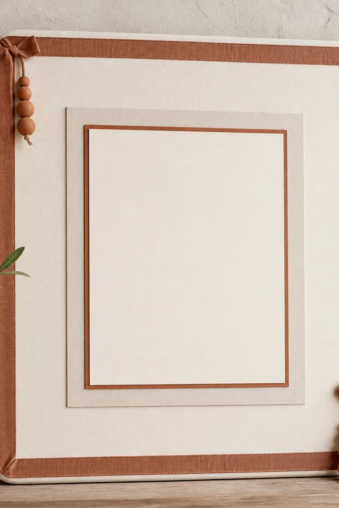
Terracotta and cream reads warm and high end when the shapes stay simple. Layered mats give depth like a framed print in a boutique shop. The ribbon border creates structure, and the clay beads add weight and craft realism. This setup looks great in kitchens and entryways where you want prayer to feel grounded.
Mount a cream mat board with a terracotta backing behind the scripture print. Use 1/4 in foam tape to raise the top mat. Add a 1/2 in terracotta ribbon border around the bottom and sides, mitered at corners. Hang two short bead tassels from the top corners using thin fishing line.
Pro tipMake the tassels uneven by 1/2 in so they hang naturally, not like a straight line.
AvoidDon't pick terracotta that's too orange - it looks like kids' craft clay.
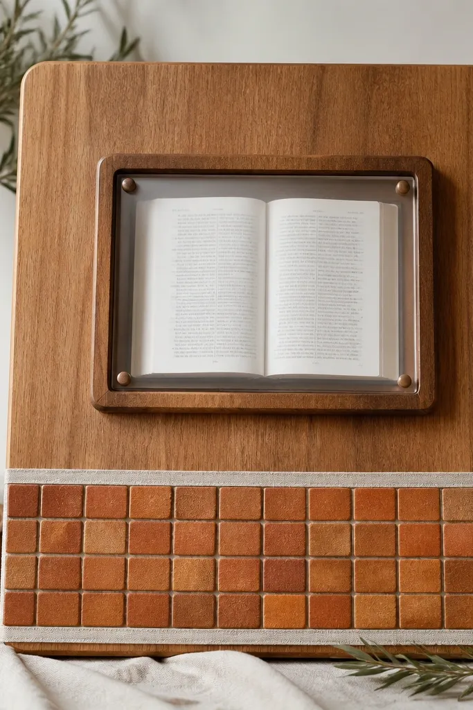
7. Espresso Wood + Brass Key Charm
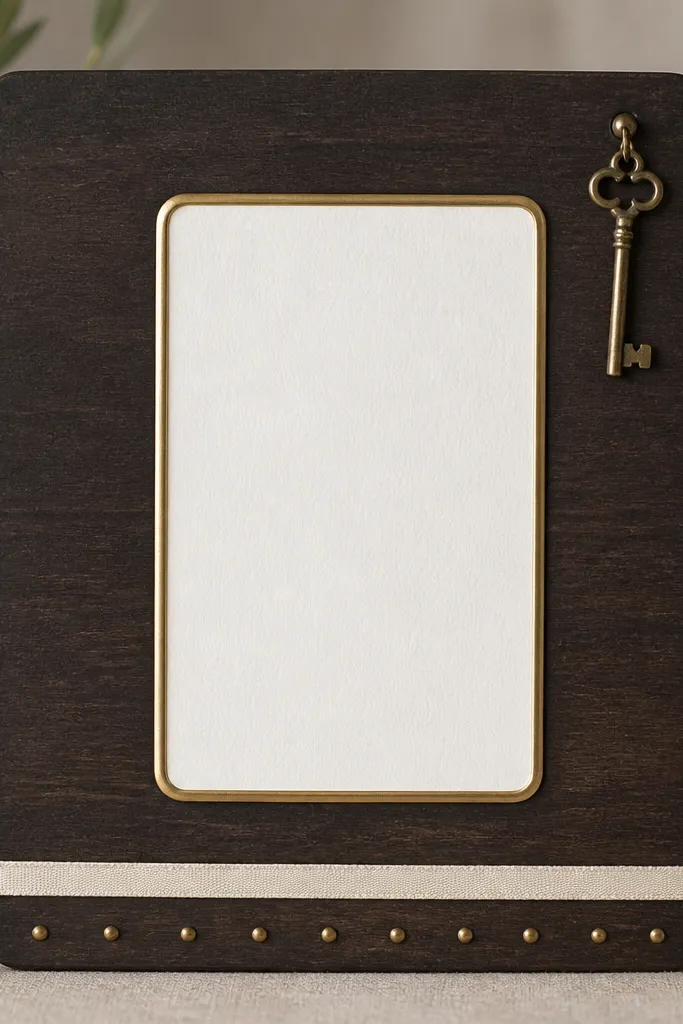
A brass key charm feels symbolic without being theme-y. Espresso wood gives depth, and the brass frame around the verse reads like a real antique. The small brass dot accents keep the board from looking empty while staying tasteful. This is the kind of design people ask about because it looks like it came from a shop.
Use an espresso-stained board, then seal with satin poly. Mount a 6x8 in scripture print behind a thin brass photo frame or brass-toned picture frame insert. Raise the frame with 1/4 in spacers. Add a brass key charm with a small jump ring attached to a tiny screw eye near the top right.
Pro tipWarm up your brass tone by wiping it with a soft cloth after assembly so it doesn't look dull-gray.
AvoidSkip big chunky key chains - one small charm looks intentional.
8. Whitewashed Board + Green Pressed Leaf Corner
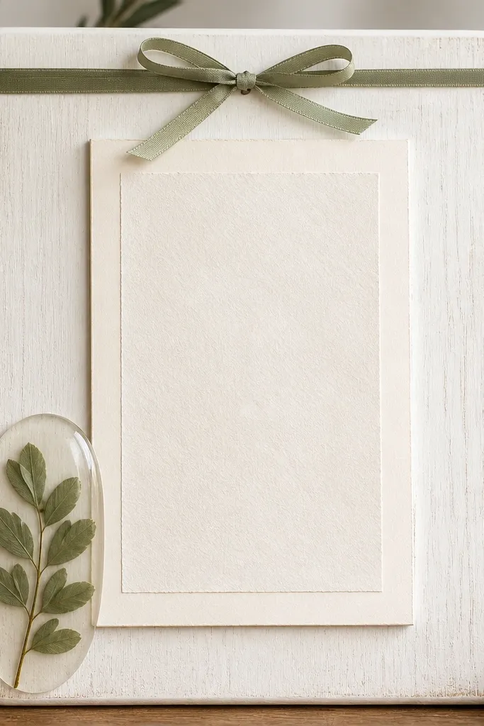
Pressed leaves look high end when they're framed in resin instead of taped on. Whitewashed background keeps everything bright and airy. The raised mat creates that gallery depth, and the sage ribbon bow adds a gentle formal touch. This design feels calm and clean without going minimalist to the point of looking unfinished.
Whitewash a wood board and seal matte. Create a small resin dome (or use a pre-made resin cabochon) and attach the pressed leaf under it. Center the scripture print on a raised mat using foam tape. Place a 1 in wide sage ribbon bow at the top, glued flat so it doesn't puff.
Pro tipPress leaves flat for 5-7 days under heavy books so they look smooth, not curled.
AvoidAvoid loose leaves glued directly - they lift and look cheap fast.
9. Blue Porcelain Tile Accent Board
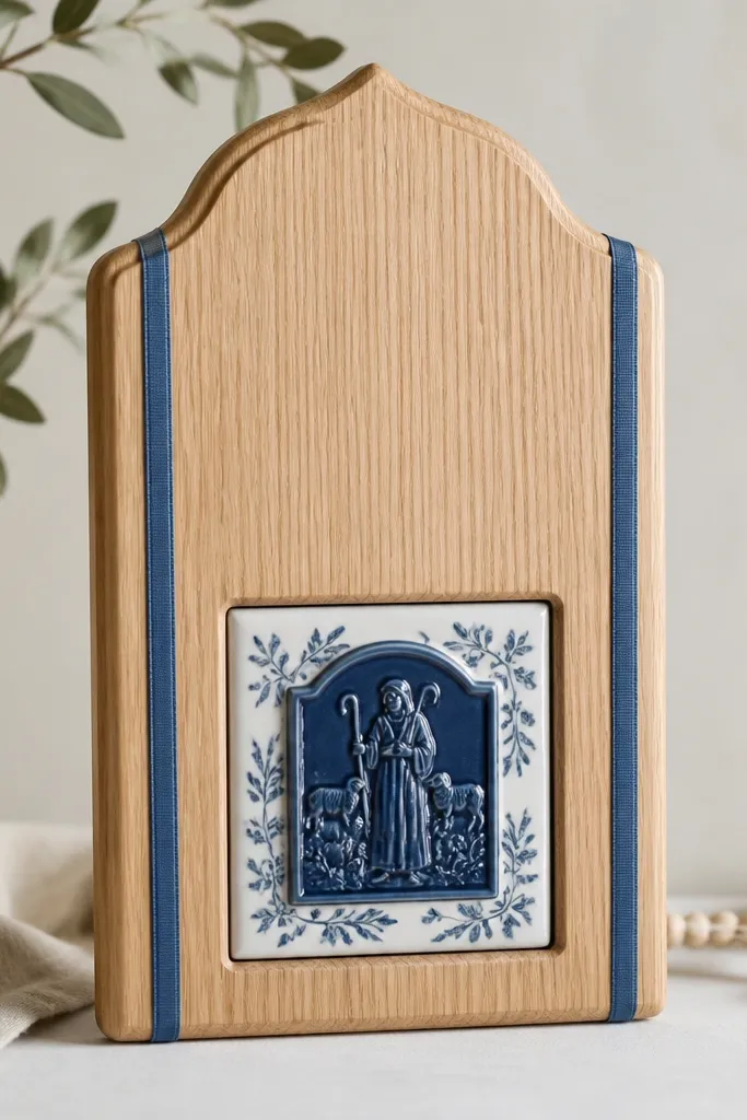
Porcelain tile adds weight and permanence, which reads luxury immediately. Navy scripture panel gives contrast, and the tile anchors the design like a centerpiece. Ribbon strips make it look styled, not random. This is a great option if you like coastal or classic blue tones without going full beach.
Use a light oak board and seal with a clear satin coat. Embed a 2x2 in porcelain tile using epoxy or strong tile adhesive. Mount a 6x9 in navy scripture panel on 1/4 in spacers. Add two thin ribbon strips (1/4-1/2 in wide) vertically beside the tile, trimmed neatly.
Pro tipUse a fine-tip paint pen to touch up any tile edge where adhesive shows.
AvoidDon't use flimsy paper tile stickers - they look like decals.
10. Blush Velvet Ribbon Vertical Center
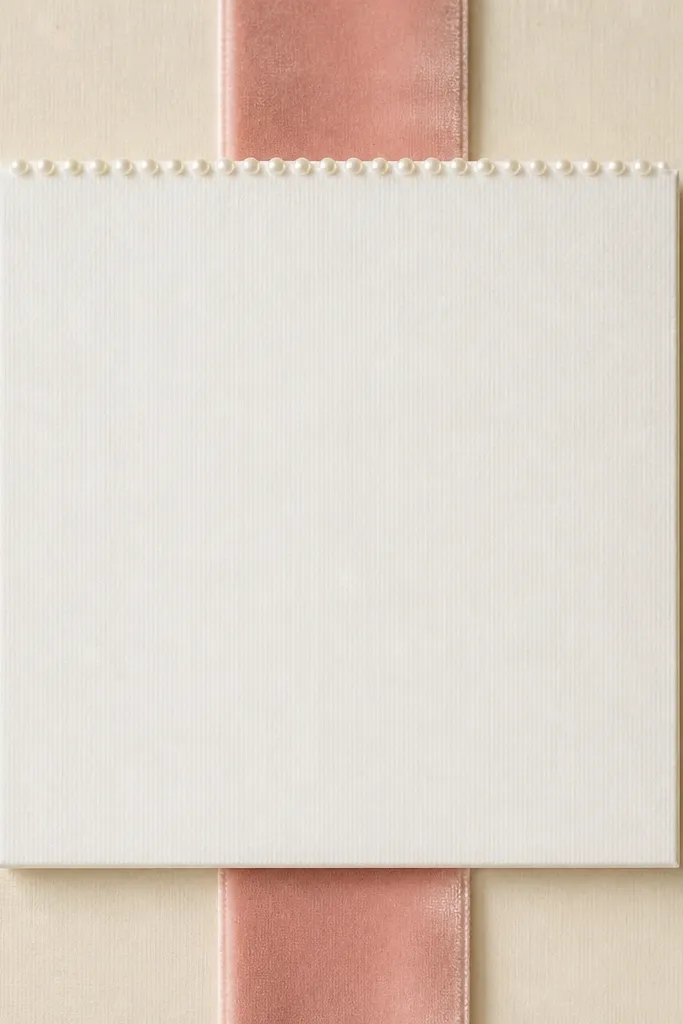
Velvet reads upscale because it absorbs light instead of reflecting it. The vertical ribbon gives a "center aisle" effect that draws the eye straight to the verse. Keeping the rest white prevents the velvet from feeling heavy. Tiny pearls at the top edge act like jewelry for the scripture panel.
Choose a 1/2 in blush velvet ribbon and glue it along the back so the front stays smooth. Mount a raised white rectangle mat in the center with 1/4 in foam tape. Add a thin row of tiny pearls (or pearl trim) just above the verse print, glued in a straight line. Keep the board background matte so velvet doesn't clash with shine.
Pro tipTrim velvet with a sharp blade and seal the cut edge with a dot of fabric glue to stop fraying.
AvoidDon't use fuzzy craft felt - it looks casual next to velvet.
11. Gold Foil Coordinates Style
Gold foil lines give a graphic, luxury "stationery" vibe. The coordinate-style lines frame the verse without adding extra text clutter. Warm beige keeps it soft, and tiny gold dots make the spacing feel designed. The blank brass nameplate adds realism without introducing more messages.
Paint or wrap the board in warm beige matte. Use a gold foil pen or gold leaf adhesive with pre-measured painter's tape guides for straight lines. Mount a 5x7 in scripture print on a 1/4 in raised mat. Place the brass nameplate at top center with two tiny dots of super glue.
Pro tipMeasure with a ruler and mark line start/end points in pencil before applying foil.
AvoidAvoid thick marker lines - the grid should look like precision stationery.
12. Monochrome Black and White Photo Frame Look
This reads high end because it mimics a gallery photo wall. Monochrome keeps the design calm, and the thick white frame adds a modern "museum" feel. Silver screw heads are subtle and real, like someone installed it. It's clean enough for a minimalist home.
Use a 12x18 in black board and mount a thick white frame insert. Raise the entire frame with 1/4 in foam spacers. Add two vertical rows of tiny screw heads (real screws with washers) on both sides, spacing them evenly 2 in apart. Keep the scripture print in crisp black text on white.
Pro tipUse matte spray over the frame insert if it reflects light in photos.
AvoidSkip glossy laminate prints - they glare and look cheap.
13. Matte Seafoam + White Lace Border
Seafoam is gentle and modern, and lace looks luxurious when it's used as a border, not the whole surface. The pale gray print keeps it classy and readable. The two pearls give just enough shine to feel dressed up. This is a soft option for bedrooms and nurseries where prayer time is quiet.
Paint the board seafoam matte and seal it. Apply lace trim around the edges with fabric glue, overlapping corners neatly. Mount a 6x8 in scripture print on a raised white mat with foam tape. Add two tiny pearl drops from lace loops using thread.
Pro tipPress lace flat under a book before gluing so it doesn't ripple.
AvoidDon't use lace that's too wide - it overwhelms the board.
14. Rose Gold Mesh Ribbon Corner
Mesh ribbon looks fancy because it has dimension and a fine sparkle. By placing it in one corner only, you keep the board balanced and not busy. The rose gold beads echo the mesh tone and make the corner feel finished. This design suits people who want luxury without going dark or heavy.
Use a blush matte board. Gather rose gold mesh ribbon and glue it flat in the corner, then add bead accents along the edge. Mount the raised scripture panel centered with 1/4 in spacers. Keep the rest of the board clean - no extra charms.
Pro tipUse small binder clips while glue sets so the corner holds a neat fold.
AvoidDon't add mesh all around - it turns into party decoration.
15. Stone Gray Concrete Paint + Brass Numbers
Concrete texture looks expensive when it's matte and restrained. Brass numbers add a tidy, ritual feel that makes the board functional. The raised scripture panel keeps the focus on prayer, not just decor. This setup works well for people who like structure and daily repetition.
Use concrete-effect paint to get the look, then seal matte. Mount a scripture panel in a brass-toned frame or add a thin brass strip border around the paper. Create a small 3x5 in checklist card at the bottom with numbered spaces. Glue brass numbers one by one with positioning tweezers.
Pro tipUse a metal ruler and a light pencil grid so your numbers line up perfectly.
AvoidAvoid mixing copper and brass on the same board.
16. Pearl Trim + White Wood Slat Background
Wood slats bring structure, and white keeps it airy. Pearl trim around the raised mat gives a "wedding invitation" elegance. The slats also hide tiny mounting imperfections because the lines distract the eye. This design looks crisp and clean in bright rooms.
Build a slat background with thin 1/2 in wood strips spaced 1/4 in apart, then paint all white and seal matte. Mount the scripture mat centered with 1/4 in foam tape. Apply pearl trim in a rectangle frame around the mat. Add a small bow made from 1/2 in satin ribbon at the top, glued flat.
Pro tipSand slat edges before painting so the surface stays smooth under light.
AvoidDon't leave raw wood edges - they show through and cheapen the look.
17. Cream Marble Vinyl + Black Verse Panel
Marble-look vinyl looks designer when the pattern stays subtle. A black raised panel makes the verse pop and reads like high-end stationery. Gold lines add a clean frame effect without adding extra items. This is one of the fastest luxury high end prayer board ideas to assemble because the background does most of the styling.
Wrap a board with cream marble vinyl, smoothing with a plastic scraper. Cut a black rectangle mat and mount it on 1/4 in spacers. Add gold lines using gold paint pen with painter's tape guides. Keep the verse font high contrast and centered.
Pro tipUse a craft knife with a fresh blade for crisp edges on the vinyl and mats.
AvoidAvoid busy marble patterns - they compete with the verse.
18. Deep Navy Felt Board with Gold Tassel
Felt makes everything look soft and expensive because it absorbs light. Deep navy feels formal, and cream keeps the verse readable. A small gold tassel adds motion and a jewelry-like detail. The gold foil accents tie the tassel and scripture together.
Cover a board with deep navy felt and wrap edges on the back. Mount a cream scripture card on a raised mat with 1/4 in foam tape. Add gold foil accents with a stencil and gold paint pen if you're customizing. Attach a gold tassel using a brass ring and a small screw eye at the top.
Pro tipTrim felt edges with pinking shears so they don't fray in a hurry.
AvoidDon't use fuzzy craft felt that sheds - buy denser felt for clean edges.
19. Acrylic Block Stand-Off Verse
This looks premium because it creates real floating depth. Clear acrylic stand-offs catch light and make the verse feel like a modern museum display. The pale gray gradient behind it adds softness without clutter. Gold dots under the print act like a quiet signature line.
Use a white board and create a pale gray gradient with watered-down acrylic paint. Mount the scripture print on a thin backing and attach it to clear acrylic blocks (or buy acrylic stand-off mounts). Place the print centered and keep it level. Add gold dots with a paint pen, spaced evenly.
Pro tipWipe acrylic with microfiber before final placement so fingerprints don't show.
AvoidDon't use thick foam behind acrylic - it makes the floating effect look crooked.
20. Sage Green Linen + White Bead Chain Frame
Linen plus sage is already calming, and the bead chain frames the verse like a piece of jewelry. The bead border gives a subtle shimmer without overwhelming the text. Keeping the bead chain thin and only around the scripture keeps the luxury feel. The knot at the top center makes the border look intentionally styled.
Wrap the board in sage linen and staple the back. Mount a cream scripture mat with 1/4 in foam tape. Arrange bead chain into a rectangle border and glue at corners only, so it sits flat. Tie the knot with thin white thread at the top center and secure with a tiny drop of glue.
Pro tipUse thread to shape the chain before gluing so corners stay crisp.
AvoidDon't glue the chain all the way down - it should look like a frame, not a sticker.
21. Gold Picture Frame + Black Velvet Backing
A gold picture frame instantly reads high end when the background is velvet. The velvet adds depth and makes the cream mat glow. The frame shadow gives the board a finished, gallery look. This is one of the easiest luxury high end prayer board ideas to copy because it uses off-the-shelf frame hardware and a little layering.
Buy a gold frame that fits your scripture print size (example 8x10 in). Mount black velvet to a board and slide the print into the frame with a cream mat. Add 1/4 in spacers behind the mat so it sits forward inside the frame. Keep the rest of the board plain so the frame is the hero.
Pro tipUse museum glass or a clear acrylic insert to reduce glare if you hang it where sunlight hits.
AvoidAvoid cheap plastic frames - the gold should look brushed, not shiny.
22. Ivory Macrame Corner + Raised Verse
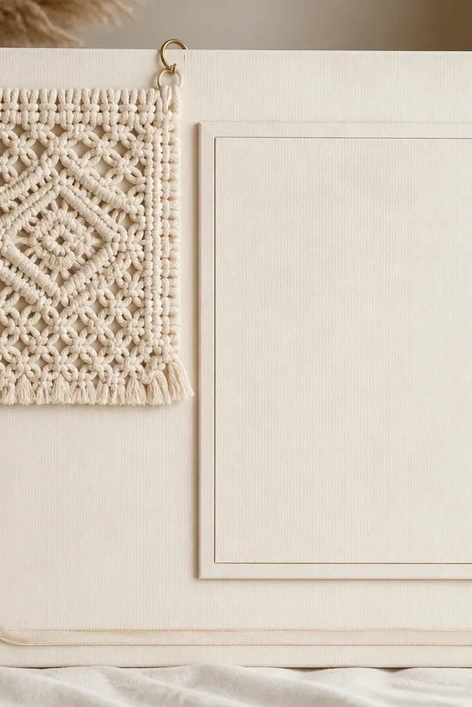
Macrame adds texture and handmade warmth, and it looks luxury when it's used in one corner. The raised verse stays clean, so the texture doesn't steal attention. Brass rings make the macrame feel secured and intentional. The bottom ribbon adds a soft frame effect.
Use a warm ivory board with matte paint or linen wrap. Mount the scripture mat centered on 1/4 in foam tape. Attach macrame using two brass rings and small screws or strong adhesive hooks. Trim a thin cream ribbon to the bottom edge and glue with fabric glue at three points.
Pro tipSteam the macrame lightly so the knots hang evenly before gluing.
AvoidDon't overhang macrame too far - it should stay within the board's silhouette.
23. Teal Silk Ribbon Bow + Gold Scripture Frame
A teal silk bow looks like gift wrapping done right, and when it's small and centered it reads elegant, not childish. The gold frame adds warmth, while greige keeps the background calm. Gold leaf specks at the top corners mimic jewelry sparkle. This design is great for gifts because it feels personal without being cluttered.
Use a greige matte board and mount a gold-toned frame with the scripture print. Raise the frame slightly with spacers so it casts a shadow. Tie a teal silk ribbon bow with tails about 3-4 in long and glue it flat above the frame. Add gold leaf specks with a tiny brush and a stencil mask at the corners.
Pro tipMake the bow tails symmetrical by pinning them with straight pins while the glue sets.
AvoidAvoid big ruffles - they look like costume fabric.
24. Cream Cork + Embossed Leather Nameplate
Leather nameplates look expensive because they're structured and have a clear edge. Cork keeps the board functional and soft to touch. Brass studs add a tailored finish like a handbag detail. This idea works when you want the board to feel like a personal desk object rather than a wall craft.
Use a cork panel and paint it cream matte with sealant. Mount the scripture card on a 1/4 in raised layer. Cut a small tan leather piece or use a pre-made embossed tag and attach at the top center. Glue brass studs in a straight line under the nameplate.
Pro tipIf you emboss your own, press into leather while it's slightly damp for cleaner lines.
AvoidDon't use fake leather that peels - it shows at the edges.
25. Lemon Gold Sunburst Border
Sunburst shapes read luxurious when the rays are thin and the center stays simple. Lemon-gold paper behind the verse creates a subtle glow effect. Black text keeps it crisp and readable. This design is a strong choice for people who want something celebratory but still prayer-focused.
Cut a sunburst layer from 140 lb cardstock in lemon gold and glue it behind the scripture mat. Mount the scripture mat on 1/4 in foam tape so it floats above the sunburst. Keep the sunburst within a 1-2 in margin around the raised mat, so it doesn't look like a party hat background. Add a tiny gold dot line at the bottom edge for balance.
Pro tipUse a craft cutter for consistent rays; uneven rays look cheap fast.
AvoidAvoid metallic foil paper that's too shiny - it can glare.
26. Monogrammed Ribbon Banner Top
A ribbon banner at the top gives a formal header look without adding clutter. Monogramming makes it personal and high end, especially when it's one color. The center stays clean, so the verse is the star. Corner dot accents act like design punctuation.
Paint the board white matte. Create a top banner using 3/4 in ribbon and a printed monogram or vinyl letter. Mount the banner with straight pins or glue on the back of the ribbon. Center the raised scripture mat on 1/4 in spacers. Add small dot accents with a gold paint pen in the two bottom corners.
Pro tipKeep the monogram smaller than you think - around 1.25 in wide looks right on most boards.
AvoidDon't add multiple fonts - one monogram style is enough.
27. Silver Chain Halo Around Verse
A halo shape reads spiritual, but the luxury version is subtle and minimal. Silver chain is delicate, and the partial arc keeps it from looking costume-like. The raised verse mat adds depth, and the light gray background keeps everything calm. This design looks especially good in offices or bedrooms with cool tones.
Use a light gray matte board. Mount the scripture mat centered with 1/4 in foam tape. Bend a thin silver chain into a gentle arc and attach ends to tiny hooks or jump rings on the board sides. Keep the arc height about 1.5-2 in above the top edge of the mat.
Pro tipUse a small ruler to match the arc curve so both sides feel symmetrical.
AvoidDon't use thick chunk chain - it looks heavy and cheap.
28. Terracotta Tiles + Scripture Window
Terracotta tile squares give a handmade artisan look that still feels polished. The scripture window with a clear cover protects the print and looks like a display case. The linen ribbon ties the tile to the background so it doesn't feel like a random collage. This board is great for people who like tactile textures.
Cover the board background with warm linen or paint it warm honey. Tile the bottom third with small 1x1 in terracotta squares using tile adhesive, then grout lightly or leave with clean gaps. Mount the scripture print in a clear window frame and raise it with spacers. Glue linen ribbon along the top edge of the tile area.
Pro tipSeal the tile surface with matte clear so grout lines don't look dusty.
AvoidDon't flood grout - messy grout reads low end instantly.
29. Pearl and Blush Ribbon Crossbar
A crossbar layout makes the board feel structured, like a styled altar cloth. Pearls at the ends add a jewelry finish, and blush pink makes it soft and feminine. Keeping the verse below maintains readability and keeps the focal point clean. This is a good luxury high end prayer board idea for people who want a shape-based design instead of lots of pieces.
Paint or wrap the board blush matte. Create a ribbon crossbar using 1/2 in white ribbon, glued flat across the midline. Add pearl clusters at both ends using small round pearl bunches or pearl trim. Mount the raised scripture mat centered under the crossbar with 1/4 in foam tape.
Pro tipCut ribbon ends at a slight angle so they don't look blunt and cheap.
AvoidSkip loose pearl strands - clusters look neater.
30. Sage Mat + Gold Thread Stitched Border
Stitching reads high end when it looks straight and controlled. The gold thread border adds texture and a subtle shine that feels tailored. Sage and cream is a calm, expensive palette, and black ink stays crisp. This is one of the more craft-forward luxury designs, but the result is clean when the border is measured.
Use a sage background board and mount a cream mat centered. Add a stitched border around the mat using gold embroidery thread and a simple backstitch. Keep the stitch spacing about 1/8 in apart. Secure the thread ends on the back with tape and glue so nothing shows.
Pro tipUse a paper template and poke holes with a needle first; it keeps the stitching perfectly even.
AvoidDon't freestyle stitch - uneven spacing makes it look handmade in a bad way.


