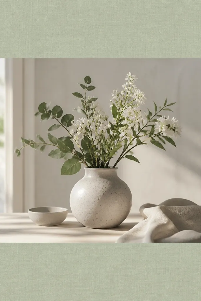
1. Cream Linen Border with Hand-Torn Overlay
This template feels expensive because linen texture reads tactile even on a flat screen. The torn edge adds a craft vibe without going messy. I use a warm cream background and a slightly darker oatmeal border line so your photo still pops.
Create a border that is 64 px thick at full width, then add a 6 px inner double line in off-white (#F6EFE4). Add a torn paper overlay only on the inner margin, leaving the outer border clean. Best with warm photos: wood, skin tones, beige walls.
Pro tipAdd a 10% opacity noise layer over the entire frame so it looks like one material, not separate stickers.
AvoidDon't crank texture opacity - if the linen grain is too strong, it reads cheap.
2. Gilded Gold Double Rule Frame
Gold rules look luxury when they're thin and consistent. This design uses two lines instead of one thick border, which makes it feel like a printed invitation. The faint shadow makes the rules sit on top of the photo, not pasted onto it.
Set an outer margin of 72 px, then draw a 2 px gold line and a 1 px inner gold line with 10 px spacing between them. Use a gold gradient from #D4A84A to #F3D57A and add a shadow offset of 0, 3 px, blur 6 px at 25% opacity. Pair with black-and-white photos or neutral interiors.
Pro tipUse a warm tint overlay on the photo (5-8% opacity) so the gold matches the image temperature.
AvoidAvoid thick gold borders - 10+ px gold makes it look like a template app.
3. Soft Marble Vein Frame with Clear Corners
Marble looks luxe because it has natural movement, but you need controlled placement. Keep the marble only in the frame band so the photo stays readable. The clear corners keep the design airy.
Make the border band 58 px wide. Use a marble texture layer clipped to the border band only, with veins at low contrast (opacity 35-45%). Leave 18 px of corner "breathing room" by masking the marble in the corner cutouts. Works best for spa bathrooms, white kitchens, and cool-toned photos.
Pro tipIf your photo is warm, shift the marble slightly toward greige (#E7E1D8) instead of stark white.
AvoidDon't place marble over the entire screen - it makes the story feel busy and low-end.
4. Black Leather Strap Frame with Brass Rivets
Leather + rivets reads premium because it adds hardware realism. The matte finish keeps it from looking like a plastic sticker. Brass rivets catch light and guide the eye to your content.
Use a 60 px border band with a leather texture set to Multiply at 25-30% opacity. Add 6 rivet circles total: 3 on left/right, 18 px diameter, in a brass gradient (#C59A3A to #F0D27A). Rivets sit 22 px from the top/bottom and spaced evenly. Great for DIY tools, workshop shots, and dark wood projects.
Pro tipAdd a tiny highlight line on the top edge of the strap (1 px at 20% opacity) to sell the raised material.
AvoidSkip glossy leather gradients - shine too high and it looks like costume design.
5. Icy Glass Frame with Frosted Inner Edge
Glass frames look luxury when the frost is subtle and the highlights are directional. This template uses a frosted inner edge to create depth without blocking the photo. The slight cyan accent keeps it modern.
Set border thickness to 56 px. Add a frosted inner edge mask that is 10 px wide with blur and opacity around 20%. Add two thin highlight lines at the top-left and bottom-right corners, 2 px wide, in #8FD6FF at 30% opacity. Best for clean, cool light photos: white tiles, airy shelves.
Pro tipLower saturation on the photo by 5-10 points when using this frame so the cyan doesn't clash.
AvoidDon't use thick outer glows - they make the frame look like a "neon" effect.
6. Chalkboard Paste Border with White Wax Line
This is luxury because it feels handmade and intentional. Chalk smudges add texture, but the wax line gives structure so it still looks designed. It's great for step-by-step DIY stories where you want a "workshop note" vibe.
Use a charcoal border band 62 px wide (#2B2A2A). Add chalk smudge texture at 18-25% opacity, then draw a wax line 3 px thick inside the border with slight jitter. Leave 90 px safe-area for text. Works for tool lists, paint mixing, and messy before photos.
Pro tipUse off-white text (#F2EDE3) instead of pure white for a more realistic chalk feel.
AvoidDon't pick a flat solid black border - it looks like a generic rectangle.
7. Pearlized Soft Pink Frame with Micro Dots
Pearlized frames feel expensive because the surface catches light even at low resolution. Micro dots add depth without cluttering the center. Soft pink keeps it feminine but still modern.
Border band thickness: 58 px. Use a gradient from #F7D6E4 to #F2C1D8 with overlay noise at 10%. Add micro dots (1-2 px) at 8-10% density inside the border band only. Works with lifestyle DIY: candles, shelves, pastel paint jobs.
Pro tipKeep dot color slightly darker than the base (about 15% darker) so the dots look printed, not floating.
AvoidAvoid adding dots across the whole screen - it reads like a filter.
8. Museum Gallery Frame with Thin Shadow Mat
This one looks expensive because it's quiet. The luxury comes from spacing and the shadow mat, not decoration. It's the template I use when the photo is already strong and you just need polish.
Set an outer margin of 74 px. Add a 3 px light-gray mat line (#E6E6E6) and a 1 px inner line (#FFFFFF). Add a shadow under the mat only: blur 18 px, opacity 20%, offset 0, 8 px. Best for product shots: painted knobs, tile samples, hardware closeups.
Pro tipUse one font weight only. This style looks best with medium-weight sans text, not heavy script.
AvoidDon't add extra ornaments - the minute you clutter it, the gallery look dies.
9. Deep Navy Yacht Rope Border
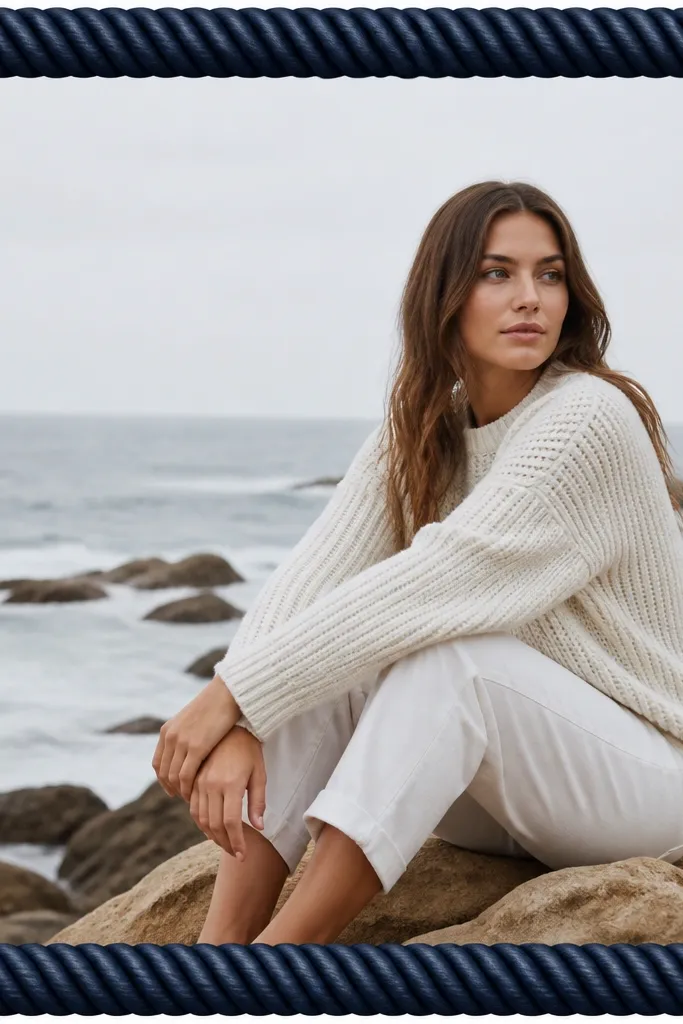
Rope borders feel premium because they're sculptural. The key is tight spacing: rope should look like one continuous band, not random knots. Navy makes it look nautical-luxe without turning into a party theme.
Create a rope texture band 60 px wide. Set texture blend to Overlay at 30% and add a second highlight band of 2 px along the top edge in #2F6B8F. Add a tiny shadow inside the border (opacity 12%, blur 10 px). Works for outdoor projects, patio furniture, and blue-gray interiors.
Pro tipMatch the photo's dominant blue - if your photo is warm, shift the rope toward navy-black (#0F2230).
AvoidAvoid rope textures with big visible knots - they look like a stock overlay.
10. Terracotta Clay Frame with Burnt Edge
Clay frames look luxury when the roughness stays controlled. The burnt edge line gives a finished, handmade feel. This template pairs beautifully with warm DIY content: plaster walls, terracotta planters, matte paints.
Border band width: 62 px. Use terracotta base (#C36B3B) with rough texture at 22% opacity. Add an inner edge line 2 px thick in burnt sienna (#8A3F2A) and add a 1 px lighter highlight (#D07C4F). Keep text 95 px away from the inner line. Great for sunny daylight shots.
Pro tipUse cream text (#FFF3E6) so the clay edge still reads as a line, not a blur.
AvoidDon't add heavy drop shadows on clay - it makes it look pasted.
11. Sage Linen Frame with Minimal Frame Corners
Corner-only frames feel luxury because they leave breathing room for the photo. The sage linen texture adds softness without needing extra ornaments. Short corner marks guide the eye without covering faces or products.
Use a transparent center with a 56 px linen texture band only at the sides, plus corner marks. Corner marks are four L-shapes: each arm 26 px long, line thickness 3 px, color #CFE1D6 at 85% opacity. Keep the main text in the center safe zone. Best for calm spaces, plant shelves, and spa-like bathroom upgrades.
Pro tipIf your photo has lots of green, switch the corner mark color to warm ivory (#F1E9DC).
AvoidAvoid full border rectangles with linen texture - it looks like a background, not a frame.
12. Silver Chrome Frame with Soft Corner Highlights
Chrome looks expensive when it stays smooth and restrained. This frame uses a single metallic gradient plus corner highlights, so it feels like polished hardware. It's especially good for modern DIY: metal racks, brushed aluminum, sleek appliances.
Border band thickness: 58 px. Use a gradient from #C8D0D8 to #FFFFFF and back to #A9B3BE across the band. Add corner highlights: 3 px lines in #FFFFFF with 20% opacity at the top-left and bottom-right. Add a subtle inner shadow (opacity 18%, blur 14 px).
Pro tipUse cool-toned text color (#EAF1F7) so it matches the chrome brightness.
AvoidDon't add multiple chrome layers - too many highlights look like a filter.
13. White Paper Cutout Frame with Shadow Depth
Paper cutout frames feel luxury because they add real depth cues. The raised shadow gives a craft look without clutter. I use this when I'm showing DIY steps and want the frame to feel like layered cardstock.
Border band width: 64 px. Use a paper texture at 15-20% opacity, plus a subtle edge irregularity mask. Add shadow: offset 0, 10 px, blur 18 px, opacity 25%. Best for step shots, recipe-style DIY, and light backgrounds.
Pro tipKeep text black or deep charcoal (#1F1F1F) so it stays readable over the raised paper.
AvoidAvoid harsh shadows with no blur - it looks like a sticker.
14. Sunset Gradient Frame with Gold Thread Edge
This one is luxury because the gradient is controlled to the border area, so your photo stays the star. The gold thread line makes it feel like embroidery. Use it when your photo has warm light and you want the story to match that mood.
Border band thickness: 60 px. Gradient from #FFB07A (top) to #D95AA7 (bottom). Add an inner gold thread line 2 px thick (#D8B15A) with a slight dashed pattern (dash length 6 px, gap 4 px). Keep center clear. Works for paint reveals and sunny outdoor projects.
Pro tipPick one accent color from your photo and align the gradient ends to that color pair.
AvoidDon't use full-screen gradients - they overpower the photo and look like a template.
15. Olive Pressed Leaf Frame with Soft Sepia Tone
Pressed leaf textures feel premium because they look like real botanical material. The sepia tone ties the border and photo together so it reads as one set. Keep it subtle so it doesn't look like a scrapbook app.
Border band width: 58 px. Use an olive base (#6B7A3B) with leaf shapes at 15-20% opacity and blur at 2-3 px. Add a 1 px inner line in off-white (#F3EBDD). Works for herb gardens, linen curtains, and earthy DIY.
Pro tipReduce contrast in the photo by a small amount so the leaf texture doesn't fight the image.
AvoidAvoid high-contrast leaf art - it turns into clipart.
16. Monochrome Marble Frame with Thick Black Edge
This is a clean luxury look because the black edge makes it feel architectural. The marble inside stays low contrast so it reads as texture, not a pattern. It's a strong option for modern kitchens and black hardware reveals.
Border band width: 66 px. Outer edge is solid black (#0E0E0E) with inner marble layer clipped to the band at 30-35% opacity. Add a 2 px inner line in light gray (#DADADA). Keep text safe at 100 px. Best for black appliances, matte tiles, and concrete finishes.
Pro tipUse white text with a slight gray tint (#F5F5F5) so it doesn't glare against the black edge.
AvoidDon't let the marble veining get too dark - it looks like ink blotches.
17. Chocolate Wood Grain Frame with Satin Finish
Wood grain looks luxe when it has direction and a quiet sheen. This template keeps the grain inside the border band only, so the photo stays clear. The cream inner line gives a "finished furniture" feel.
Border band width: 62 px. Use wood grain texture in dark chocolate (#4A2A1A) with overlay at 25%. Add a satin highlight: 1 px line across the top edge in #7A4A2E at 18% opacity. Add inner line 2 px in cream (#F1E8D8). Great for shelving, stain jobs, and warm lighting interiors.
Pro tipRotate the wood grain so it runs horizontally if your photo is mostly horizontal - it looks more natural.
AvoidAvoid repeating wood grain patterns - it looks like wallpaper.
18. Rose Quartz Frame with Blush Glow Corners

Quartz frames look luxury because they combine soft color with a subtle sparkle texture. The corner glow gives depth without covering the photo. This works best for pastel DIY, craft supplies, and cozy bedroom updates.
Border band width: 58 px. Use a rose quartz texture at 20% opacity on a pale blush base (#F4D7E6). Add corner glow circles at each corner: 30 px radius, color #FFA8D2, opacity 25%, blur 12 px. Keep text safe 90 px from inner edge. Pair with bright, clean photos.
Pro tipUse slightly darker blush text (#C45A86) instead of pure black for a softer luxury vibe.
AvoidDon't add glitter particles across the whole border - it looks noisy.
19. Charcoal Concrete Frame with Lime Pinstripe
This is a street-luxe look: industrial concrete plus one bright accent. The lime pinstripe is the "expensive detail" because it's precise and minimal. It makes DIY tool content feel styled, not random.
Border band width: 60 px. Use concrete texture at 25-30% opacity on charcoal (#2A2A2A). Add a 2 px inner pinstripe (#B6F24A) with 8 px spacing from the outer edge. Add a slight inner shadow (opacity 14%, blur 10 px). Best for garage, workshop, and dark photos.
Pro tipChoose text color from the pinstripe and use a 90% opaque version for readability.
AvoidDon't add multiple neon lines - one pinstripe looks intentional; five looks chaotic.
20. Ocean Blue Wave Frame with White Porcelain Edge
Wave patterns feel luxury when they're low contrast and repeated evenly. The porcelain edge gives a clean finish, like a tile border. This template works when your photo has water tones or crisp whites.
Border band width: 58 px. Base color #1F6FA8. Add a wave pattern overlay at 18-22% opacity, scale it so waves are about 40-55 px wide. Inner edge is a 2 px white line (#F6F7F9) with 1 px shadow at opacity 20%. Great for bathroom updates and outdoor steps.
Pro tipIf your photo is too warm, reduce the blue saturation slightly so the wave pattern doesn't look neon.
AvoidAvoid big wave graphics - small, subtle waves read more expensive.
21. Pearl White Frame with Soft Shadow and Tiny Star Caps
This frame is "luxury minimal" - the pearl finish adds softness and the star caps add a hint of celebration. It's perfect for milestone DIY posts: a finished room, a before/after reveal. The trick is keeping the stars tiny so it stays classy.
Border band width: 64 px. Use pearl gradient from #FFFFFF to #EFEFEF and keep noise at 10%. Add star caps at corners: 10-12 px wide shapes in #E2E2E2, opacity 70%. Add shadow under the entire border only (offset 0, 6 px, blur 18 px, opacity 18%). Best with clean bright photos.
Pro tipUse one accent color in text, like dusty gray (#A9A9A9), to avoid the frame stealing attention.
AvoidDon't use oversized stars - they turn the look into a kids party theme.
22. Tortoiseshell Pattern Frame with Warm Amber Inner Line
Tortoiseshell reads luxury because it looks like real material with depth. The amber line makes the design feel finished like a picture frame. It's a great choice for warm, moody DIY images: stained wood, brass hardware, candlelight.
Border band width: 60 px. Use a tortoiseshell texture with colors #6B3F22, #A86B3B, #D3A056 at low opacity layers (each around 20-30%). Add an inner line 2 px in amber (#C78A3A). Keep the center photo brightness natural; don't over-tint it.
Pro tipIf your photo is already warm, set the frame texture opacity lower (around 20%) so it doesn't make everything orange.
AvoidSkip heavy blur on the texture - blurred tortoiseshell looks like a filter.
23. Pastel Gradient Border with Clear Acrylic Corners
Acrylic corners make a frame feel modern and premium, especially when the border is soft and pastel. The gloss highlights sell the "clear" material without blocking the photo. This is my go-to for spring DIY and light home decor content.
Border band width: 58 px. Gradient colors: #D9F2FF to #FAD9E8 to #FFF1C9, blended vertically. Add corner shapes as transparent rounded rectangles with border stroke 2 px in white (#FFFFFF at 35% opacity) and a highlight line 1 px at the top edge. Blur highlights slightly so they look like reflections. Works with bright, airy images.
Pro tipKeep text in the center with a dark gray color (#2B2B2B) because pastel borders can wash out dark text.
AvoidAvoid solid opaque corners - transparent glossy corners are the point.


