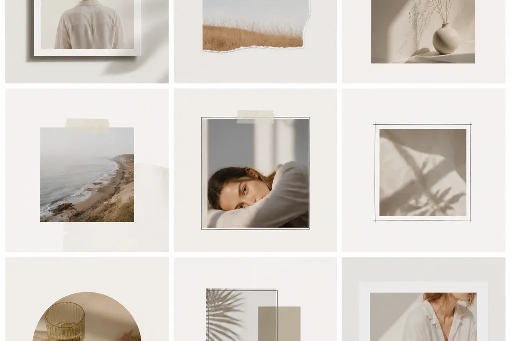
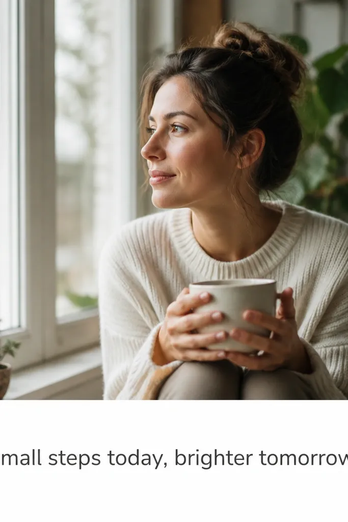
1. Mat Window Frame with Soft Inner Border
This looks like a framed photo in a gallery. The trick is the mat window - it creates a "breathing space" so busy photos don't fight with text. Use off-white for the outer border and a slightly darker gray for the inner line so the layers read clearly. It works especially well with portraits, food close-ups, and any photo with strong light and shadows.
In Canva or any editor, start with 1080x1080. Add an outer rectangle fill in off-white (#F4F1EA), then inset a second rectangle for the mat window using padding around 60-80 px. Put your photo in the inner window and add a 6-10 px gray border (#CFCFCF). Keep the mat area wide enough that your photo edges never touch the border.
Pro tipMatch your mat color to a mid-tone in your photo - I use the background color from the photo's brightest area.
AvoidDon't use a border that's too thin; a 2 px line often looks blurry when exported for mobile.
2. Two-Strip Accent Frame (Top and Bottom)
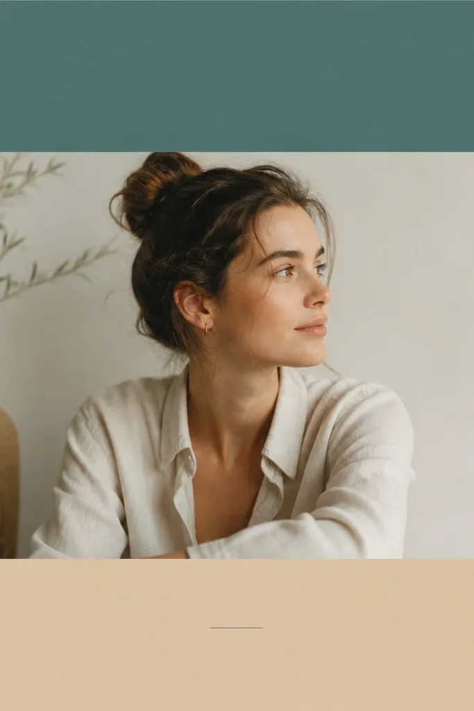
This template gives you a clean "styled" look without clutter. The top and bottom strips create a consistent brand banding effect. It works best when your photos have room at the top or bottom for the strips to land without covering key details. I've used this for travel and weekly recaps because the strips make the layout feel planned.
Set your photo to fill the center area and reserve strip heights around 120-150 px each. Choose two colors that already exist in your photos - for example, muted teal (#4E7A7A) and beige (#E7DCC7). Add a thin 4-6 px divider line in a neutral gray between the photo and each strip. Place your caption text in the blank area below or inside the bottom strip.
Pro tipUse the same font family and keep your caption size identical across posts so the strips feel like part of a system.
AvoidAvoid using two high-contrast neon strips; it makes the photo look like it's sitting on a sticker.
3. Corner Frame with L-Shaped Brackets
Corner frames look modern and they don't cover your photo edges. The L-brackets pull attention to the photo without creating a heavy border block. This works great for moody shots, street photos, and anything with strong subject placement near the center. It also hides imperfections because you're not drawing a perfect full outline.
In your editor, draw four line shapes or use corner bracket elements. Use a line thickness around 10-14 px and set the bracket length around 80-110 px. Keep the bracket color dark gray (#2B2B2B) at 85-90% opacity for a softer look over bright photos. Leave a consistent padding of about 40-60 px from the canvas edge.
Pro tipIf your photo is bright, lower the opacity to 70-80% so the brackets don't overpower the subject.
AvoidDon't place brackets too close to the edges; tight corners make it look like a rushed overlay.
4. Checkered Border (2-Color Micro Grid)
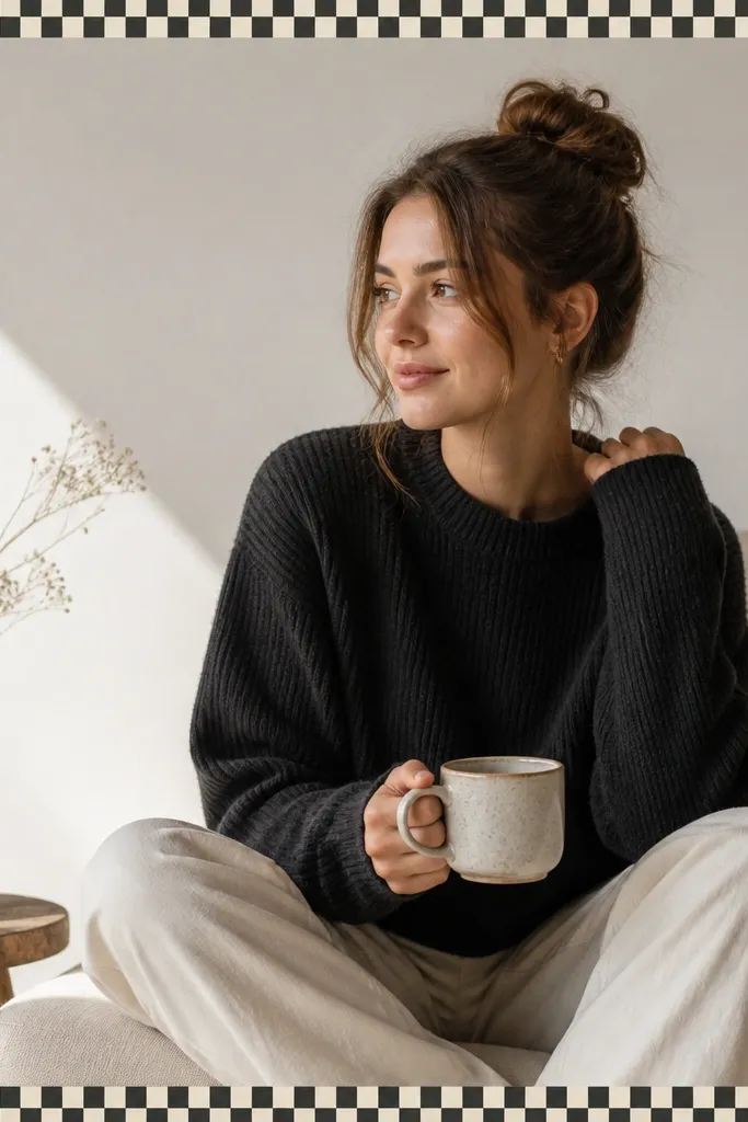
A micro checkered border adds texture without needing extra graphics. It's playful but still structured because the grid is consistent. This works well for coffee shops, bakeries, picnic photos, and any image that already has a pattern in it. The key is keeping the check size small so it reads as a border, not a distracting background.
Create a grid pattern in Canva or your design tool and set the tile size small. For a 1080 canvas, use a border thickness around 70-90 px. Stick to two colors - cream (#F6F0E4) and charcoal (#2F2F2F). Place the photo centered with equal padding so the check border stays symmetrical.
Pro tipUse checkered borders only when your photo has a clear subject; patterned borders + busy photos can compete.
AvoidAvoid large check squares; they look cheap on mobile because the pixels get noticeable.
5. Hand-Drawn Frame Look with Painter's Tape Edges
This one makes your posts feel "made," not templated. The tape edge look adds realism, especially when your photo has a casual vibe. I like it for desk setups, mirror selfies, and flat lays. The slight imperfection is the point - it keeps the layout warm and human.
Use an element pack or draw tape shapes manually with a rough edge brush. Set the frame thickness around 40-60 px. Add a soft shadow offset (like 0, 3, 10, 20% opacity) so it looks lifted. Keep your photo padding consistent so the tape edges don't overlap the subject.
Pro tipIf you're placing text, keep it outside the tape area. Tape frames already feel textured, so text should stay clean.
AvoidDon't use a sharp, perfectly straight border for this style; the tape look depends on slight irregularity.
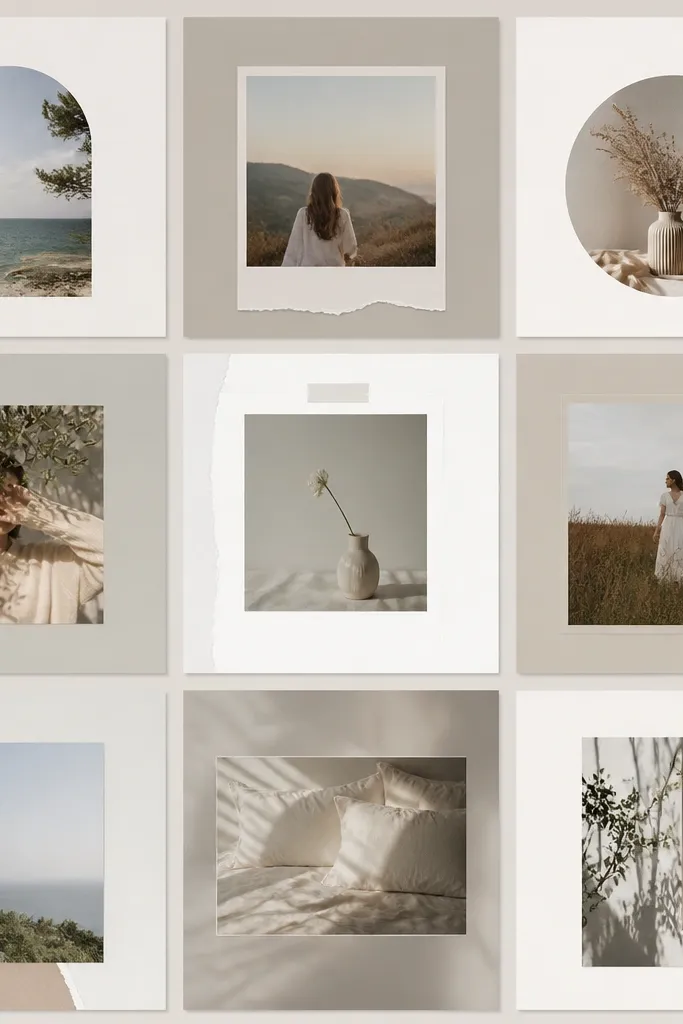
6. Polaroid Stack Frame (One Photo + Drop Shadow)
Polaroid frames make beginners look instantly thoughtful. The layered print effect adds depth without needing a collage of multiple photos. This works great for memories, event days, and "week recap" posts because it feels personal. It also gives you a built-in space for a date or a short caption.
Set the main photo inside a white rectangle with a polaroid-style bottom caption area of about 170-210 px height. Add a second behind-polaroid at 90% size and rotate it by -3 to +3 degrees. Use a shadow with blur around 18-25 px and low opacity. Keep the outer margin around 40-60 px so it doesn't touch the canvas edge.
Pro tipWrite captions in all caps or all lowercase - mixing styles makes it look like a random sticker.
AvoidAvoid heavy shadows; if it looks like a floating sticker, it stops reading as a print.
7. Bold Vertical Divider Frame (Center Spine)
A center spine line gives your post a graphic design feel. It's a simple trick that makes even one photo look composed. Use this when your photo has a subject in the middle or strong leading lines. I've used it for gym progress shots and fashion photos because the vertical line makes the composition feel intentional.
In a 1080x1080 canvas, make a vertical rectangle divider in the center at 18-28 px wide. Reserve a strip area for a label at the top that's around 180-220 px tall, with the label centered. Keep the photo full behind the divider so the divider acts like a graphic overlay. Choose a divider color that matches a detail in the photo, like orange (#E56A2A) or deep blue (#1F4E79).
Pro tipUse one font weight for the label - either all bold or all regular.
AvoidDon't add extra icons near the divider; the spine is already the focal point.
8. Soft Gradient Frame with Clear Photo Window
A gradient frame creates mood without covering the photo. The photo window keeps your image crisp while the border gives personality. This works best with portraits, skincare shots, and any photo with smooth lighting. I like gradients that are low saturation so the border doesn't steal attention.
Create a full-size background gradient on the canvas, then place a solid white or near-white rectangle on top to act as the photo window. Use padding around 70-100 px so the gradient stays visible. Add a thin shadow to the photo window for separation if your image is bright. Keep the gradient angles consistent across posts so it feels like a series.
Pro tipPick gradient colors from your photo - sample a highlight and a shadow tone so they match naturally.
AvoidAvoid hard neon gradients; they look like a template library screenshot.
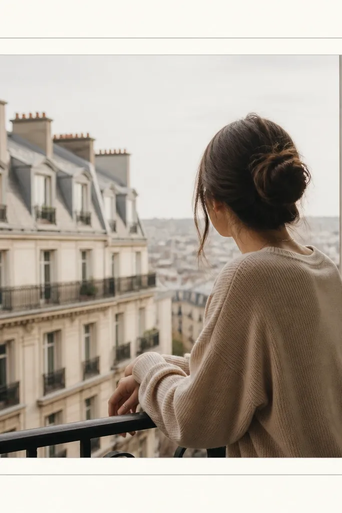
9. Minimal Line Border with One Word Banner
This template looks sharp because it's strict. The thin border keeps everything aligned and the one-word banner gives you a clear theme marker. It works well for quotes, event labels, and category posts like "Lunch" or "Weekend." The minimal approach is also forgiving when your photo is imperfect.
Use a 6-10 px line border in black or dark gray (#111111). Add a banner at the top centered, with height around 90-130 px and width around 420-560 px. Use a font size around 40-60 px depending on your font. Keep your photo padding consistent so the banner doesn't crowd the top edge.
Pro tipUse only one word per post in the banner. Two words makes it feel cramped fast.
AvoidAvoid busy fonts; thin serif fonts look good here, but novelty script fonts usually look messy.
10. Magazine Layout Frame with 3 Text Blocks
This is the frame for when you want your post to feel like a mini article. The three text blocks give you structure for a title, a short description, and a tiny detail line. It works well with product photos, DIY steps, and before/after posts. Your photo stays clear because it has a dedicated area.
Split the 1080 canvas into two columns: photo width around 58% (about 626 px) and text column around 42% (about 454 px). Add thin dividers at y-positions for three blocks, leaving padding around 40-60 px inside the text column. Use a consistent font scale ratio: title 54-64 px, body 28-34 px, detail 22-26 px. Keep text aligned left for a magazine feel.
Pro tipUse short lines. If your line wraps twice, shrink the font or shorten the text.
AvoidDon't center everything; centered paragraphs inside a strict grid look like an auto-generated quote.
11. Polaroid Borderless Frame with Caption Strip
This is a clean alternative to full Polaroids. It keeps the photo full-bleed, then adds a caption area that looks like print labeling. It works with street photos and landscapes because your subject stays uninterrupted. The caption strip also helps viewers read your text without squinting.
Set the photo to fill the canvas completely. Add a white strip at the bottom with height around 130-170 px. Add a subtle top shadow line or 2-4 px gray line between photo and strip so the separation is obvious. Use left padding around 50-70 px and keep the text one to two lines.
Pro tipIf your photo is dark at the bottom, keep the strip pure white (#FFFFFF). If it's bright, use off-white (#F5F5F0).
AvoidAvoid placing the caption strip too tall; it steals space from the photo.
12. Circle Window Frame with Corner Caption
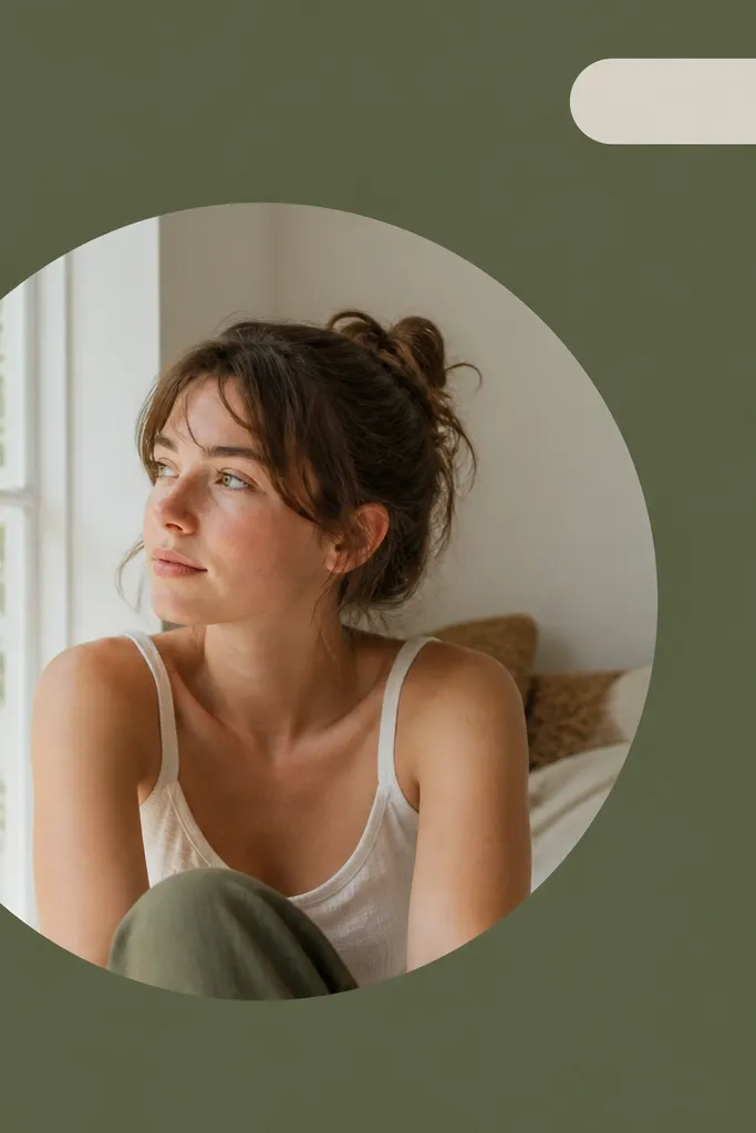
Circle windows add a "designed" look instantly. The background stays simple, so the circle reads as a focal window. This style works well for profile-like portraits, product shots, and any photo with a clear subject. I used this for my plant updates because the circle makes leaves look like they're framed in a spotlight.
Choose a solid background color first, like warm light gray (#EFEAE2) or soft sage (#D7E5D6). Place a circle image mask with diameter around 620-680 px. Position the circle slightly left of center. Add a rounded rectangle caption in the top-right with padding around 28-36 px and corner radius around 24-30 px.
Pro tipKeep the circle border invisible. The image edge should blend into the background, not look like a sticker outline.
AvoidDon't add too many circles. One circle window per post keeps it clean.
13. Stencil Frame Border with Cutout Letters
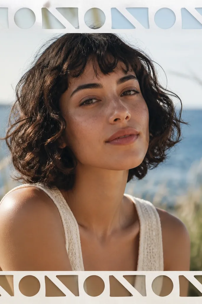
Stencil frames feel artsy and they hide small alignment issues because the border pattern draws the eye. The cutout effect makes the frame look like it's part of the photo layer. This works best with photos that have enough contrast so the stencil remains readable. I use this for street art, music gigs, and any post where the theme is a little rebellious.
Use a stencil-style font or an overlay pattern and set it to repeat along the border area. Keep the border thickness around 60-90 px. Set opacity to around 30-55% so the photo still shows through. Place your photo under the stencil overlay so the cutout reads naturally.
Pro tipPick one stencil color and keep it neutral (charcoal or black). Too many colors make it look like clipping errors.
AvoidAvoid using a stencil that's too thin; thin stencil lines disappear on mobile.
14. Grid Frame with 4 Photo Tiles (Beginner Collage)
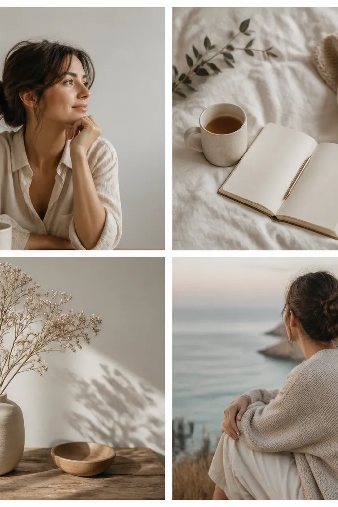
A 4-tile grid is the easiest collage that still looks polished. The gutters create structure, and it's forgiving if each photo is slightly different. This works for "before/after," a mini tutorial, or a set of small moments from one day. I like this grid for beginners because you only need to line up one set of rows and columns.
On 1080x1080, split into a 2x2 grid. Use gutters around 20-30 px wide in a consistent color, usually white (#FFFFFF) or light gray (#F2F2F2). Keep each tile cropped similarly - aim for consistent horizon placement across tiles. Add the title in one tile corner with a semi-transparent background rectangle so it stays readable.
Pro tipUse the same filter or edit settings across the four photos so the grid looks intentional.
AvoidAvoid mixing extreme crops like one close-up and one wide shot with no consistency; the grid will feel chaotic.
15. Serif Quote Frame with Double Rules
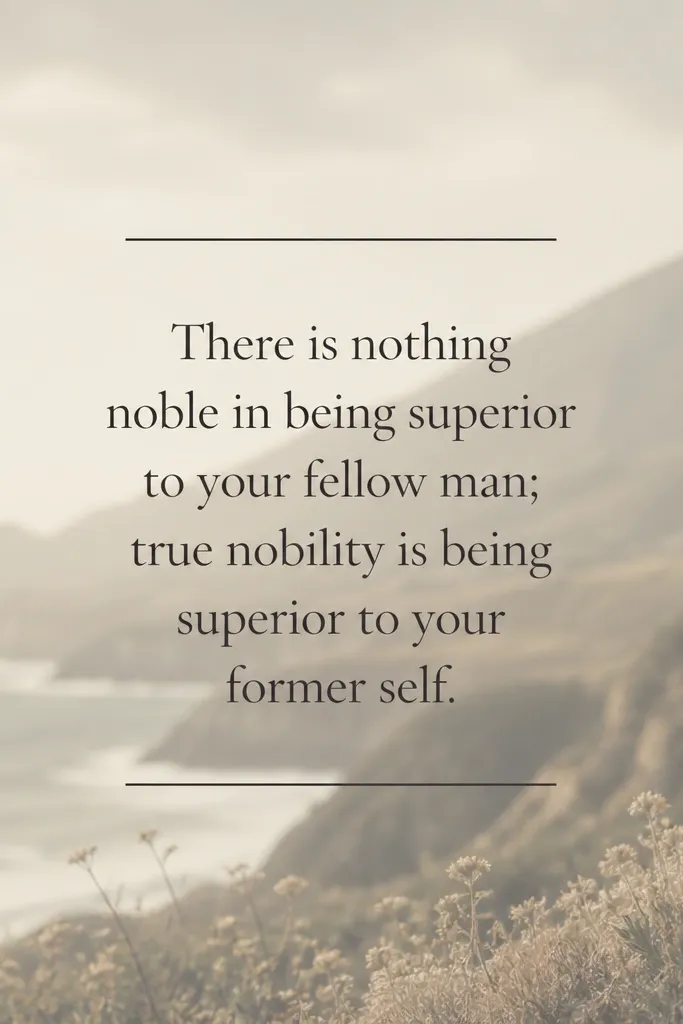
This frame turns your photo into a background and makes the text the star. Double rules (two thin lines) look like print design and keep the quote from floating. It works best when your photo has a soft background or can be desaturated. I've used this for personal affirmations and event captions because it feels like a card.
Desaturate the background image by about 30-50% and add a slight blur if your tool supports it. Place a centered text block with a background color like off-white (#F7F3EC) or keep it transparent with a subtle overlay. Add two horizontal lines above and below the quote, thickness around 3-5 px and spacing around 18-30 px. Use a serif font around 46-64 px for the quote.
Pro tipKeep the quote short enough to stay on one or two lines. Three lines makes it look like a screenshot.
AvoidAvoid bright neon text colors; they clash with the print-card vibe.


