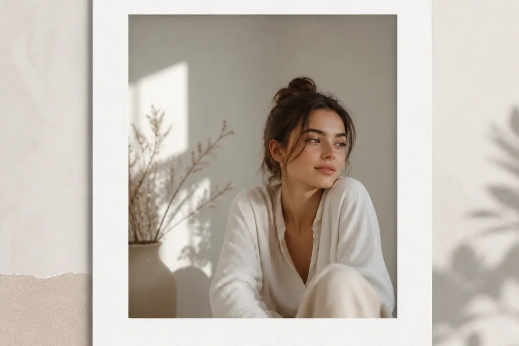
1. Classic 1-inch White Border Window
This is the layout I reach for when I want a frame that never looks messy. The 1-inch border creates a steady visual line, and the off-white background keeps skin tones from looking washed out. I use a centered window so the photo feels intentional, not like it drifted. It also photographs well because the border gives your camera a stable reference area.
Cut a 5x7 cardstock base, then cut an inner window that leaves a 1-inch border on all sides. Print your photo on matte photo paper sized to fit the window exactly. Mount with a thin glue stick layer so the photo edges stay flat.
Pro tipIf your photo has lots of dark areas, switch the border to a warm cream (not bright printer white) for softer contrast.
AvoidDon't use glossy cardstock here - the shine shows as blotchy glare in phone photos.
2. Black Mat Frame for Bright Vacation Photos
Black makes bright photos look richer because it adds instant contrast. This template uses a thin inner white line to keep the photo edge from blending into the black. The result is a crisp outline that reads as "designed," even when the photo is casual. It's also great for outdoor shots with sky and high exposure.
Use a 5x7 black cardstock base. Cut a window for the photo and leave a 0.25-inch white inner edge by layering a second thin paper strip behind the photo edge. Mount the photo so it sits flush against the inner edge.
Pro tipTest with one print under your phone flashlight - if the black looks too heavy, reduce the outer border to 0.9 inches.
AvoidAvoid pure white photo paper with black mat if your photo is already cool-toned; it can look icy.
3. Pastel Gradient Border Strips
Instead of one solid border, you get a gentle color wash that still lets the photo lead. I like gradients made from two tones so it doesn't look like a random filter. Pastels also help when your photo has mixed colors because the border harmonizes without stealing attention. Under daylight, the transition reads smooth and clean.
Print the photo matte. Create four border strips at 1-inch wide using two-color gradient paper or a simple gradient made in Canva and printed. Glue strips around the window on a white cardstock base so the edges look crisp.
Pro tipKeep the gradient direction consistent across all sides - I do left-to-right on top and bottom, then match the corner hues.
AvoidDon't use a full-bleed gradient behind the photo window; it makes the center feel dim.
4. Two-Tone Border: Cream Outside, Navy Inside
This is my "clean and classy" combo. The cream outer border feels warm and friendly, while the navy inner line adds structure. The navy edge keeps the photo from looking like it's floating on a flat background. It also photographs well because the navy line catches light without glare.
Cut a cream 5x7 base. Add a navy mat layer by cutting a window that leaves a 0.12-0.2 inch navy strip around the photo. Mount the photo on a white backing so the navy line looks even.
Pro tipIf your photo has a lot of white (snow, bright walls), keep the cream slightly grayish so it doesn't look harsh.
AvoidAvoid thick navy borders - anything over 0.3 inches starts to dominate.
5. Polaroid-Style Bottom Caption Strip
This template makes casual photos feel styled because you get a built-in caption area. The bottom strip gives you a place for a date, location, or a short phrase, and it frames the photo like a physical memory. I keep the strip matte white so handwriting looks dark and readable. It also helps if you're making a set for a wall because all pieces match.
Use a 4x6 photo print mounted on a larger 5x7 card. Cut the top window so the photo sits slightly higher, leaving about 1.2 inches for the caption strip at the bottom. Add two thin gray guide lines for writing.
Pro tipWrite with a fine-tip black gel pen, then lightly erase pencil marks first so the final lines stay crisp.
AvoidDon't use a glossy overlay on the caption strip; ink smears under glare.
6. Corner Tape Border (Masking-Tape Look)
This one tricks the eye into thinking the photo is taped up on a wall. You get a lighter, less "frame-y" look, and the corners keep the composition airy. I use muted tape colors so it feels handmade, not like a graphic sticker. The design also works on photos with busy backgrounds because it doesn't add a big solid border.
Print your photo to fit a 5x7 window. Use small pieces of printed "tape" paper or actual washi tape cut into 1-inch squares. Place them at the four corners, then mount the photo so the tape sits on top of the photo edge.
Pro tipAngle the corner tape by 2-3 degrees for each corner, alternating direction so it looks real.
AvoidAvoid perfectly symmetrical tape angles - it looks like a template instead of a person.
7. Dotted Border Frame (Tiny Dot Pattern)

Dots add texture without turning into a busy print. I like tiny dots at 3mm spacing because they read as a subtle frame in photos. This works especially well for portraits and food shots where you want a soft, playful edge. Under camera flash, the dots stay defined because the pattern is small and evenly spaced.
Build a 5x7 base in white cardstock. Add a dotted border ring by printing a dot pattern strip at 1-inch wide and wrapping it around the window. Leave a 0.1-inch solid inner edge so the photo doesn't touch the dots.
Pro tipUse gray dots (like #B8B8B8) instead of black so the frame feels light, not heavy.
AvoidDon't use large polka dots; they overpower the photo when you zoom out.
8. Hand-Drawn Border with Faux Marker Lines

A faux hand-drawn border looks human, and it hides tiny cutting imperfections. The key is line weight: thick enough to show shape, thin enough to not cover the photo. I use warm brown or muted charcoal so it matches skin and natural scenery. This template works great for journaling-style sets and personal milestones.
Print the photo on matte paper. Create a border outline using a marker texture in an editing app, then print it at 5x7 scale and cut the window. Glue the border layer behind the photo so the line sits just inside the photo edges.
Pro tipIf your cut lines look too straight, roughen the paper edge lightly with scissors so it feels consistent with the "hand" line.
AvoidAvoid neon marker colors; they look like party crafts instead of a frame.
9. Woodgrain Border (Printed Veneer Look)
Woodgrain gives photos a grounded, homey feel. I use it for kitchen, plants, and family events because the warmth matches real-world textures. The trick is keeping the woodgrain border narrow so it feels like a frame, not a wall panel. I also mount on white so the wood doesn't darken the photo.
Use a white cardstock base. Print woodgrain paper strips at 0.6-0.8 inches wide and glue around the window. Add a thin white inner edge (about 0.1 inch) between the wood and photo to keep it clean.
Pro tipChoose a woodgrain with subtle lines, not heavy knots, so it doesn't compete with the image.
AvoidDon't make the woodgrain border thicker than 1 inch; it can overpower lighter portraits.
10. Neon Edge Glow (Color Pop Border)
This is for night scenes and concert photos where you want energy. The neon line makes your subject feel sharper, and the dark outline prevents it from looking like a sticker. I like lime, electric blue, or hot pink depending on the photo's dominant color. It also looks good in Instagram stories because the thin line reads even at small sizes.
Print your photo matte. Create a 5x7 base in black cardstock. Cut a window, then add a neon border line using printed vinyl paper or a neon marker line on a thin paper strip taped around the window edge.
Pro tipMatch neon color to one highlight in the photo - not the whole palette.
AvoidAvoid thick neon borders; they look like a craft project.
11. Pastel Washi Tape Side Borders
Washi tape sides give you structure without a full border. The patterns stay light, and the vertical placement guides the eye back to the center photo. I use this for portraits because it frames faces without covering corners. It also works well when you want a consistent "brand" look across a series.
Cut a 5x7 base in white or light gray. Mount the photo so it sits centered. Add two tape strips about 0.5 inches wide on the left and right edges, then trim tape ends so they end at the photo corners.
Pro tipPress tape down with a bone folder so edges don't lift and catch light.
AvoidAvoid tape that's too shiny; it flashes under camera lighting.
12. Matte Marble Frame (Printed Vein Border)
Marble is another texture that reads premium without adding bulk. Matte marble keeps the frame from looking like plastic, and the light gray veins pair well with almost any photo. I use marble when the photo is colorful but I still want a calm backdrop. It gives a "gallery print" vibe without needing a fancy printer.
Use white cardstock base. Print marble border strips at 1-inch width, then cut and glue around the window. Keep the inner edge solid white at about 0.1-0.15 inch so the veins don't touch the photo.
Pro tipIf your photo is already gray-heavy, pick marble with warmer undertones (slight beige) to avoid a flat gray-on-gray look.
AvoidDon't laminate marble borders; lamination glare ruins the matte effect.
13. Gallery Double Frame with Inner Shadow Line
This template mimics a store-bought print mount. The outer mat gives space, and the inner shadow line makes the photo edge look lifted. I use it for prints I plan to hang because it hides slight photo thickness differences. Under natural light, the shadow line adds depth without needing 3D parts.
Start with a 5x7 light gray base. Cut a window for the photo, leaving a 1-inch outer mat. Add a thin darker gray strip behind the photo edge (0.08-0.12 inch) like a shadow line, then mount the photo on top.
Pro tipUse a scoring tool to create a crisp bend at the backing so the frame stays flat.
AvoidAvoid thick foam tape unless you want a chunky look; it can warp the photo over time.
14. Striped Border with One Dominant Color

Stripes look fun, but only when you keep them to one color family. I do diagonal stripes because they add motion while still reading as a "border." This works especially well for travel photos and party shots where the image already has energy. The border stays controlled because it's the same hue range as the photo highlights.
Print or create diagonal stripes at 45 degrees. Build a 5x7 base with a 1-inch striped border ring. Keep the inner edge solid white or very light gray at 0.1 inch, then mount the photo flush.
Pro tipChoose stripe spacing so each stripe is about 3-4mm wide; too fine looks like noise.
AvoidDon't use multiple unrelated colors in the stripes; it competes with the photo.
15. Monochrome Film Frame (Grain + Black Mat)
This template makes the photo feel like it came from film. I pair a black mat with a subtle grain overlay so the whole thing looks consistent. The thin white inner border keeps the photo from disappearing into the black. It's my go-to for street shots, profiles, and moody indoor scenes.
Edit the photo to a monochrome or warm sepia tone and add a light grain effect. Print on matte. Use a black 5x7 base with a window and a thin white inner strip at about 0.15 inches. Mount with glue stick for a flat edge.
Pro tipKeep grain subtle - if it's too strong, faces look dusty in close-up photos.
AvoidAvoid adding too many extra icons or text; the film vibe gets cluttered fast.
16. Transparent Overlay Look with Clear Tape Edges
This one looks like a photo protected by clear tape, but it stays clean. The matte photo prevents glare, while the clear tape corners add that real-life "handled" texture. It's surprisingly photogenic because the corners catch light in a small way. I use it for scrapbooking-style Instagram posts and casual gifts.
Print the photo matte and mount to cardstock. Cut clear packing tape or clear bookbinding tape into small corner pieces and place them over the photo edge corners. Use a simple 0.5-0.75-inch solid border so the tape corners remain the focus.
Pro tipTrim tape edges with scissors so there's no ragged film hanging off the corner.
AvoidDon't tape the whole border; it turns into glare city.
17. Rounded Window Frame with Soft Border
Rounded corners make the whole piece feel friendly and modern. The soft window shape keeps portraits from looking too sharp or formal. I pair it with a pale blue border because it reads calm on most color photos. This template also hides small cutting mistakes - rounded corners forgive uneven edges.
Use a corner rounder punch or trace a radius template for 0.5-inch rounded corners. Cut the window in a pale blue cardstock base. Print and trim the photo to the window size, then mount so the corners align cleanly.
Pro tipTest the corner radius on one scrap - 0.5 inch is a good start for 5x7 frames, but your photo thickness changes the look.
AvoidAvoid tiny corner rounds; they look like an accident, not a design.
18. Stitched Border Effect (Faux Sewing Line)
Stitching makes paper frames feel handmade. The trick is to keep the stitch line thin and close to the photo edge so it reads as a border detail, not a graphic outline. I use light gray thread marks because they look stitched without looking printed. This works well for family photos and anything cozy.
Create a stitched border in an editing app or print a pre-made stitch border strip. Cut a 5x7 base with a 1-inch border, then glue the stitched strip around the inner edge. Mount the photo so the stitched line sits just outside the photo edge by 1-2mm.
Pro tipIf you want extra realism, run a colored pencil lightly along the stitch line after printing to deepen the dashes.
AvoidAvoid thick "embroidery" lines; they look like a sticker border.
19. Blackboard Caption Frame with White Chalk Text Area
The blackboard area makes captions readable and gives a strong theme. White chalk text looks great in both daylight and phone flash, and it makes the frame feel like a mini poster. I keep the border thin so the chalk strip is the main design. This is perfect for birthday photos, party tables, and café-style posts.
Use a dark gray cardstock base. Cut a window for a 4x6 photo inside a 5x7 card, leaving a bottom strip about 1.1 inches tall. Use chalk marker or white paint marker for text, and let it dry flat before mounting.
Pro tipWrite your caption in all caps for cleaner strokes with chalk markers.
AvoidDon't smudge the chalk - press a scrap paper lightly over it once it dries instead of rubbing.


