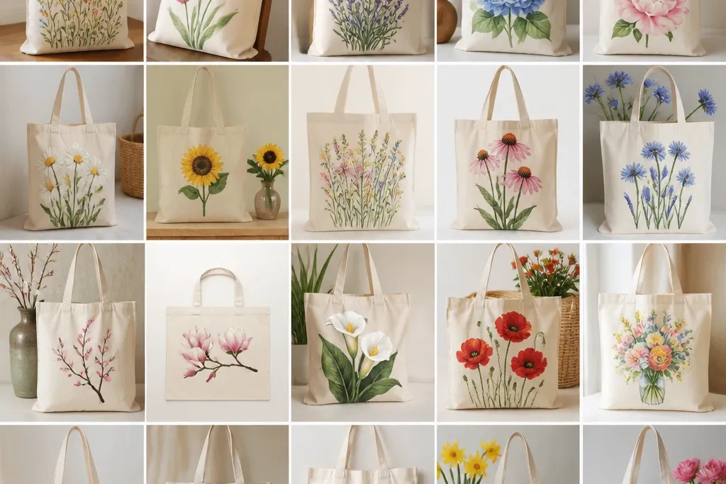
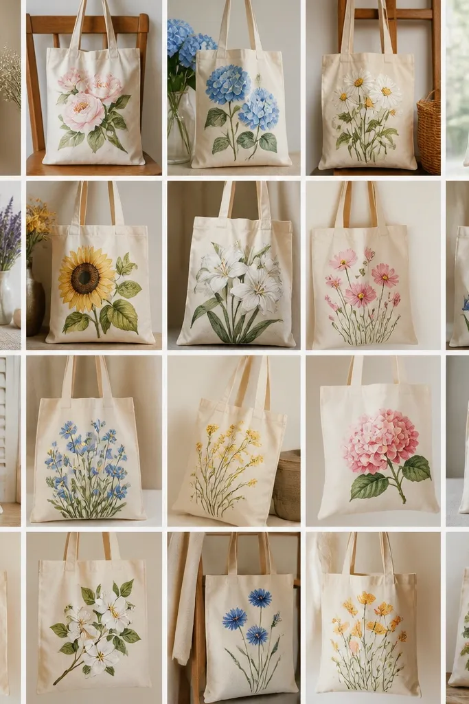
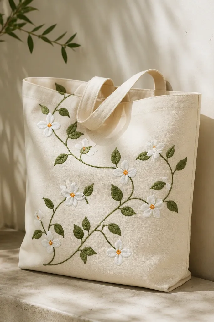
1. Sunflower burst with a crisp black ring
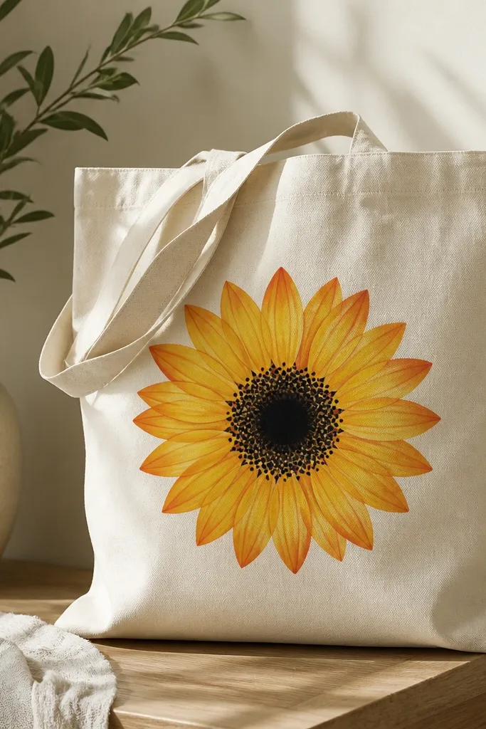
This design looks finished because the black ring frames the petals and gives you a clean boundary. Paint the petals in two tones: lemon yellow for the main shape and burnt orange for the outer edge. The center becomes believable when you add a stippled texture with a small round brush or stipple sponge.
Use a size 8-10 round brush for petals and a tiny liner brush for the black ring. Keep the sunflower about 7-8 inches wide so it fits nicely above the tote pocket seam. For the center, use a mix of dark brown and black with quick taps to avoid smooth blobs.
Pro tipTrace the sunflower outline from a printed template, then paint inside the lines first before you touch the black ring.
AvoidDon't skip the black ring - without it, the petals blend into the canvas and look flat.
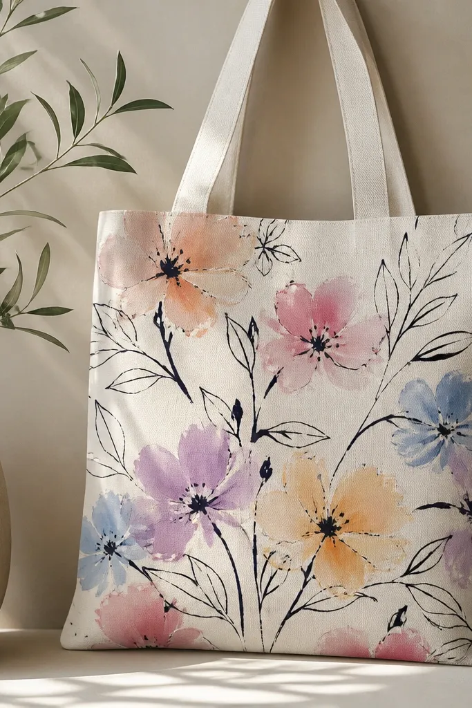
2. Watercolor roses with wet-on-wet edges
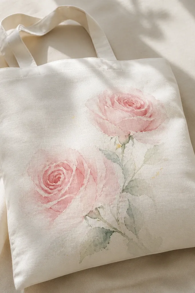
Wet-on-wet gives you that airy, painterly feel that looks expensive. Mix a light pink and a dusty rose, then apply the darker tone while the first layer is still damp so the edges bloom. Add thin green stems last with a liner brush for contrast.
Thin fabric paint with water until it flows like cream - you should see it glide but not run. Paint the rose petals in layers of 2-3 strokes per petal cluster. Let each rose dry fully before you add stems so you don't smear the bloom.
Pro tipUse a damp paper towel to lift extra paint from the petal edge for sharper fades.
AvoidDon't overwork the petals - repeated brushing makes watercolor-style flowers look muddy.
3. Daisy chain border around the bottom hem
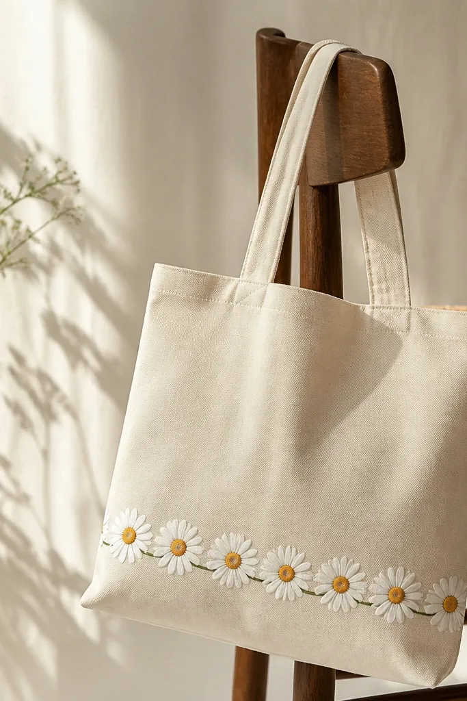
Borders look neat because they use repetition. Paint one daisy the size you want (around 2.25 inches wide), then duplicate it in a staggered rhythm so the chain feels natural. The connected stem line ties the flowers together and keeps the bottom area from looking empty.
Mask a straight line across the bottom with painter's tape so your daisies sit evenly. Use a small stencil (or a cut paper template) to place the centers, then paint the petals with a flat brush for consistent shapes. Keep the green stem line thin so it doesn't overpower the flowers.
Pro tipMix a slightly darker green for the stem and a lighter green for leaf dots to add depth without extra clutter.
AvoidAvoid thick green fills under the daisies - they can make the border look like a blob.
4. Single peony with layered petals and gold-speck center
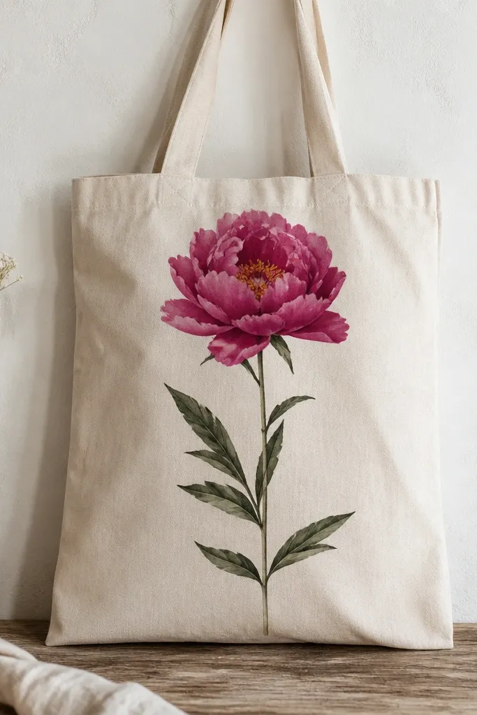
Peonies look dimensional when you stack petal shapes like a fan. Use 3 values of pink: blush for outer petals, medium fuchsia for the main petals, and deep magenta for folds. The gold-speck center adds a focal point even from across the room.
Use a fan brush or a flat brush with a rounded edge to paint overlapping petals. The peony should be about 9 inches tall so it doesn't crowd the bag handles. For gold specks, use a metallic fabric paint or gold acrylic mixed with a touch of medium, then stipple with a toothbrush.
Pro tipPaint petal folds with a thin line of deep magenta, then drag the color into the medium pink for soft edges.
AvoidDon't paint all petals the same shade - it kills the peony's layered look.
5. Lavender sprig with tiny blooms and dry-brush texture
Lavender works because dry-brushing gives you a natural, airy texture. Base the sprig in medium purple, then dry-brush a lighter lavender to catch on the canvas weave. Add tiny bud dots along the stem so the sprig reads as lavender, not generic flowers.
Mix purple with a little gray (or a touch of white plus a tiny bit of black) for a muted tone that looks realistic. Paint the stem with a liner brush, then dab bud clusters using the tip of the brush. Keep the sprig about 10 inches long for a clean diagonal composition.
Pro tipPractice the bud dab on scrap fabric first so you get consistent dot sizes.
AvoidAvoid smooth, solid purple blobs - they look like paint stains.
6. Botanical leaves and wildflower cluster on the side panel
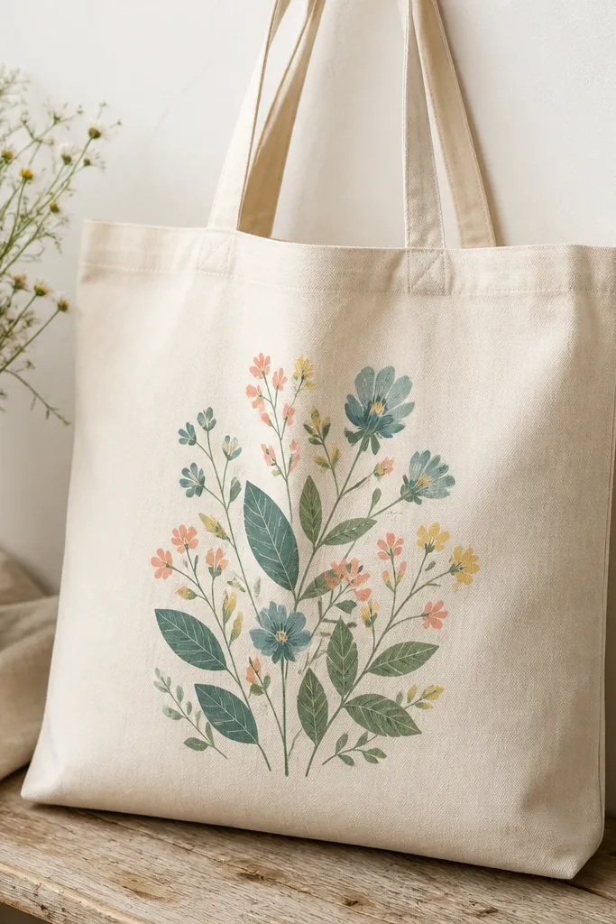
Wildflower clusters look best when you vary scale. Paint 1-2 larger blooms, then surround them with smaller buds and leaves so the cluster feels full. Adding leaf veins with a lighter green makes the whole thing look more botanical and less cartoon.
Choose a side placement about 6 inches from the seam so it doesn't interfere with the handles. Use a small round brush for flower centers and a thin liner brush for veins. Keep the palette limited to teal, coral, pale yellow, and two greens.
Pro tipAdd one tiny blue dot cluster to connect the flowers visually across the panel.
AvoidDon't leave leaf veins out - without them, the leaves look like solid patches.
7. Cherry blossom branch with tiny pink petals
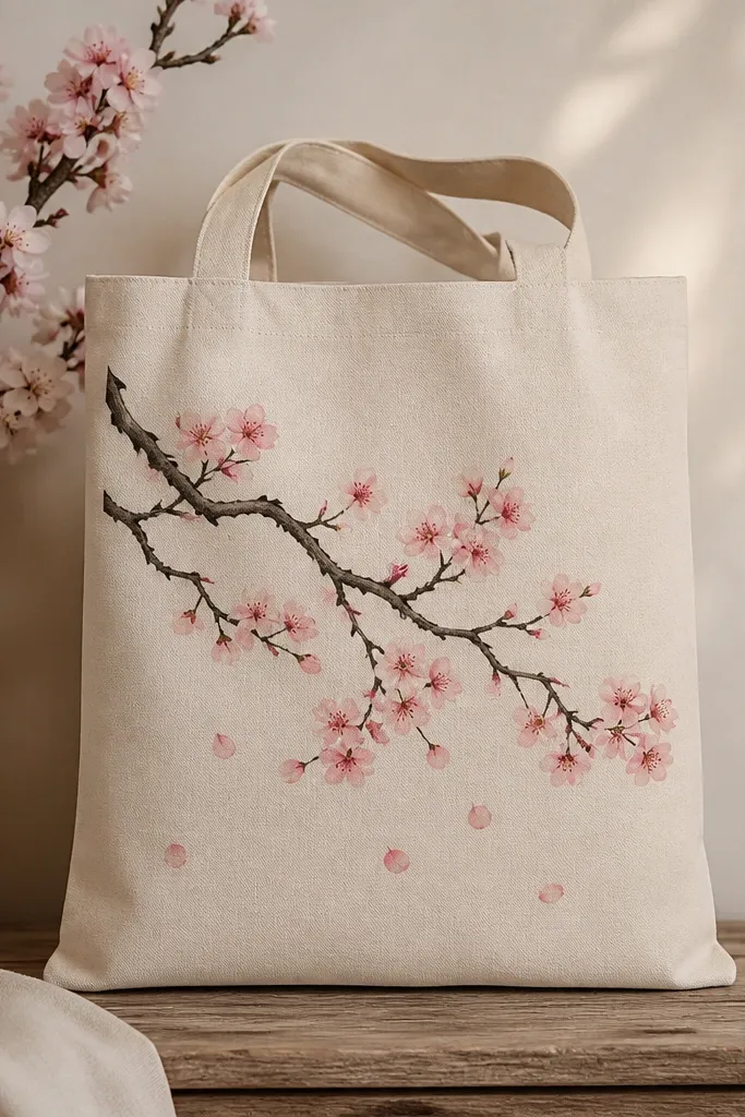
Cherry blossoms look right when you treat them like a pattern, not big flowers. Paint a thin branch line first, then add blossom clusters as small 5-petal shapes. For realism, use pale pink base and a slightly darker pink dot in the center.
Use a size 1 liner brush for the branch so it stays delicate. Place the branch diagonally from upper left to lower right, leaving negative space. Paint 8-12 blossom clusters total so the tote doesn't get crowded.
Pro tipAdd 3-4 floating petals as small teardrops with one darker edge stroke.
AvoidAvoid thick branch lines - they overpower the delicate blossom shapes.
8. Tropical hibiscus with gradient petals
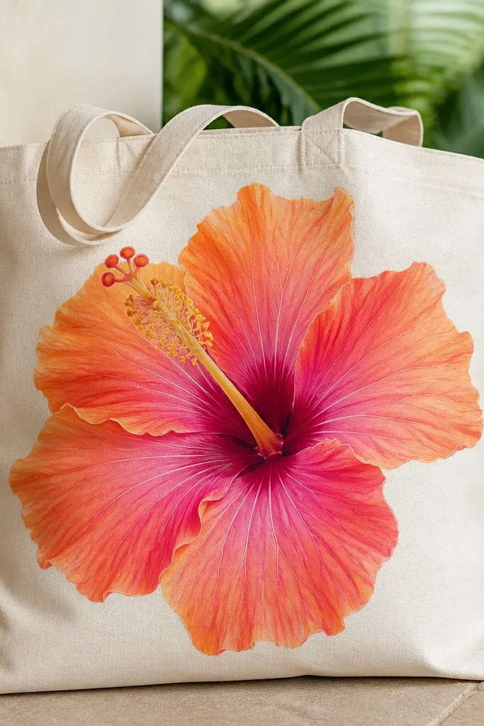
Gradient petals make hibiscus look like a print you'd buy at a boutique. Paint each petal in one continuous shape: start with orange at the base, blend to coral mid-petal, then finish with pink at the outer edge. Add a dark magenta throat to create depth.
Use a medium flat brush for gradients and clean it between petals so colors stay crisp. Hibiscus should be centered and about 8 inches wide. For the center, paint a yellow oval then add tiny red dots along the edges.
Pro tipBlend colors while still damp; if it dries, go back and glaze a thin layer instead of re-scrubbing.
AvoidDon't outline every petal - heavy outlines make gradients look like sticker art.
9. Monochrome black florals with white highlights
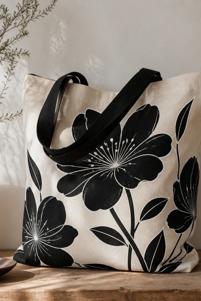
Monochrome looks stylish because contrast does the work. Paint the main flower shapes in black fabric paint, then add white highlights along the petal edges and in the center. This style looks clean even on imperfect fabric texture.
Use a stencil for the flower outlines so everything stays sharp. Fill with black using a sponge or foam roller, then add white highlights with a fine brush. Keep flowers about 6 inches apart so the tote doesn't look like a single stamp.
Pro tipThin the white paint slightly with medium so the highlight lines stay smooth, not chalky.
AvoidAvoid thick, glossy black - it shows brush marks and can crack with flexing.
10. Pastel rainbow flowers in a stacked vertical line
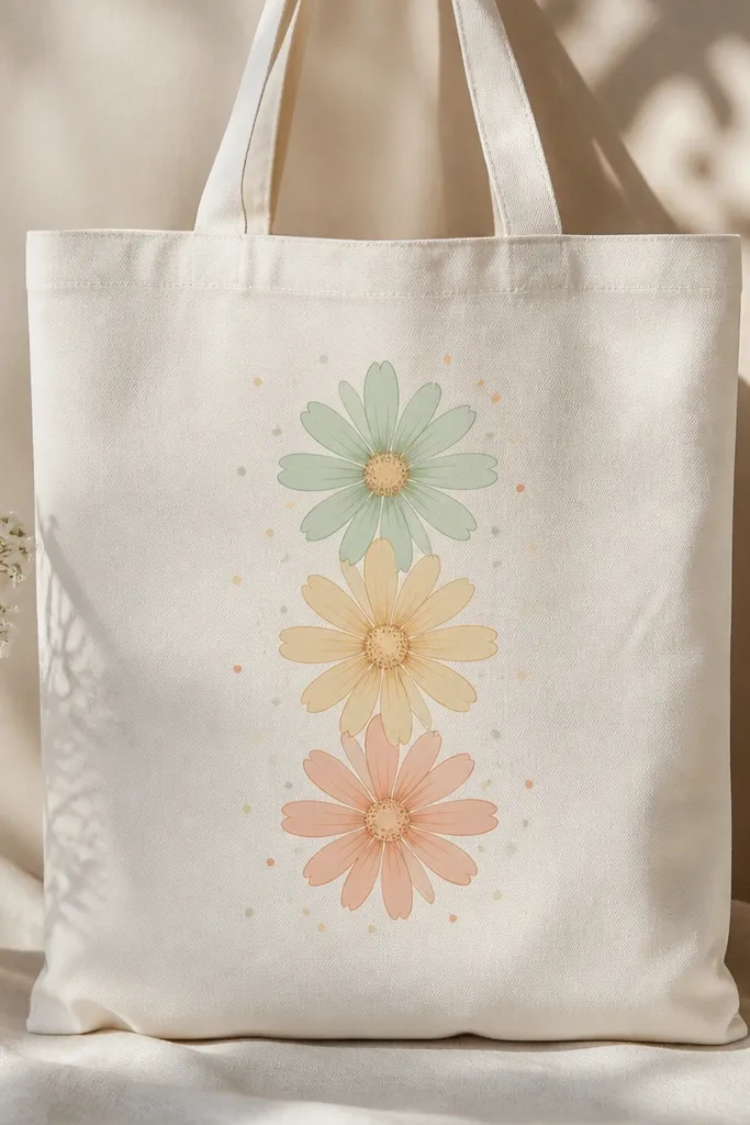
Stacking flowers vertically creates a neat rhythm and keeps the composition from drifting. Use a consistent center style (small dot cluster) for all three flowers so they look like a set. The pastel colors stay soft and pair well with natural canvas.
Mark three placement points with pencil lightly: upper, middle, lower. Paint each flower about 3.5 inches wide. Use matching centers: pale brown for yellow, soft taupe for peach, and light gray for mint.
Pro tipAdd one tiny leaf next to each flower to break up spacing and keep it from looking like balloons.
AvoidDon't mix too many colors inside one flower - it can turn pastel into gray-brown.
11. Tiny wildflower scatter with stamped leaves
Scatter designs look good when they're controlled. Use two sizes: micro flowers (about 0.7 inches wide) and small leaves (about 1 inch long). Stamping leaves makes repetition easy and keeps the look cohesive across the tote.
Make a leaf stamp from a cut potato or a craft foam leaf shape, then press it into fabric paint and stamp. For flowers, use a small flower stencil and fill with a tiny brush. Space flowers irregularly but keep them within a 9x10 inch area so the tote front stays readable.
Pro tipPlan your scatter by drawing a light rectangle on the fabric, then place flowers from big to small.
AvoidAvoid painting random sizes everywhere - it looks unplanned and busy.
12. Giant dahlia with ombre petals
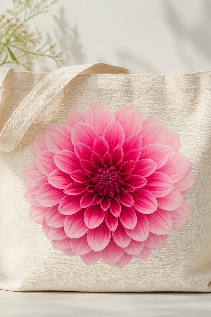
Dahlias look like they took hours because of the ring effect. You build the flower by painting overlapping petal strokes in circles, each ring slightly lighter. Ombre happens naturally when you mix a base color and gradually add white for each outer ring.
Use a filbert brush for petal strokes. Start with the darkest ring at the center, then mix a lighter shade for ring two, and so on until the outer edge. Aim for a 10-inch flower so it fills the tote front without touching the sides.
Pro tipKeep a small palette of 4 mixes in cups so you don't lose your color progression mid-petal.
AvoidDon't stop after one ring - single-layer flowers read as simple blobs.
13. Crimson tulips with thin stems and dot accents
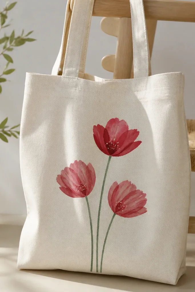
Tulips look sharp when stems are thin and petals have a defined fold. Paint tulip shapes as slightly rounded teardrops, then add a darker crimson line down the center to show the fold. The tiny dot accents make the bouquet feel lively.
Use two greens: a darker green for stems and a lighter green for leaf tips. Place three tulips diagonally so the bouquet feels natural. Keep petals about 2.5 inches tall each so the tote front stays balanced.
Pro tipAdd a single white dot cluster near one tulip to create a focal highlight.
AvoidAvoid thick marker-like stems - they make the bouquet look flat and cheap.
14. Blue-and-white floral with porcelain-style spacing
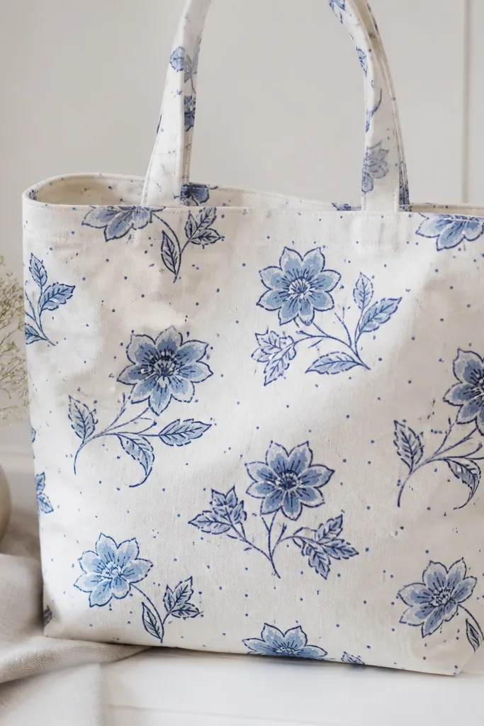
This look works because it uses negative space on purpose. Outline in navy, fill with lighter blue, then add tiny dot clusters between flowers. The dot spacing makes the tote read like a printed ceramic pattern even though it's hand-painted.
Use fabric paint in two blues: navy and light sky blue. Stencil a few flowers rather than freehanding everything, then paint leaves with a thin brush. Keep the overall pattern in the center zone so the handles don't break the design.
Pro tipErase pencil marks after the outline dries so they don't ghost through later layers.
AvoidAvoid filling every empty spot - porcelain spacing needs room to breathe.
15. Black ink-style wildflowers with watercolor blooms
Ink + watercolor looks natural because the lines control the shape and the wash adds softness. Paint stems and leaves first with black, then add small watercolor washes for petals. Let the wash edges feather for that hand-painted vibe.
Use fabric-safe black paint with a liner brush for stems. For the blooms, thin pastel paint until it looks like stained fabric, then tap it into petal areas. Keep the blooms small, about 1.5-2 inches, scattered around the center.
Pro tipIf the wash spreads too much, blot with a dry paper towel immediately - don't wait.
AvoidAvoid painting water-heavy washes over wet black lines - the black will bleed.
16. Rosebud sprig with tiny buds and overlaid dots
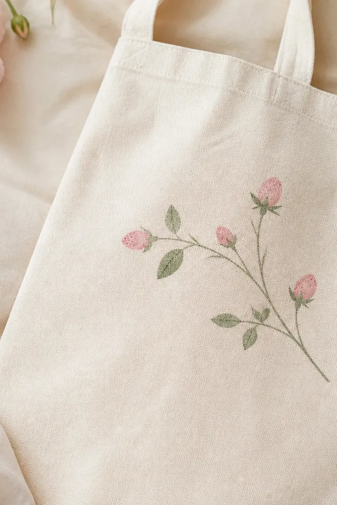
Rosebuds are easiest when you keep them small and consistent. Paint bud shapes as stacked ovals, then add dot texture over the top bud to suggest petal folds. This gives a delicate look without needing detailed realism.
Place the sprig along one side seam, running upward about 9 inches. Use a liner brush for stems and a small round brush for buds. Keep dot texture subtle - a few dots per bud looks intentional, too many looks speckled.
Pro tipAdd one tiny leaf shape near the lowest bud to anchor the sprig visually.
AvoidAvoid full rose blossoms in this style - the tiny bud look is the point.
17. Ombre background panel with flowers floating on top
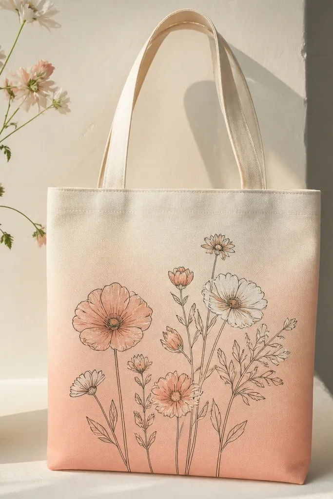
A light ombre background makes the flowers pop without needing bold outlines. Paint the background first, then let it dry completely so your flower colors stay clean. The flowers look like they're floating because the background fades behind them.
Tape off a rectangle on the front so the ombre stays neat, then apply peach paint at the bottom and blend upward with a wide flat brush. Use 2-3 layers until it looks even, then paint flowers above the background panel. Keep outlines thin and use lighter centers so they don't sink into the wash.
Pro tipBlend in broad strokes, not circular - straight vertical strokes look more like dye.
AvoidAvoid rushing the background - if it's still tacky, flower edges smear.
18. Peach and cream cottage flowers with stitched-look outlines
The stitched-look outline makes flowers feel handmade and cozy. Instead of a single continuous line, you paint short dash marks around each petal. Fill petals in peach and cream, then add muted green leaves so the whole bag stays warm and soft.
Use a liner brush for dash outlines and a small sponge or round brush for fills. Keep petals simple shapes so the stitched outline has a clean path. Place the main cluster near the lower center where people naturally look when carrying a tote.
Pro tipPaint one flower at a time and let it dry so the dash edges don't blur into neighboring shapes.
AvoidAvoid thick stitched dashes - they look like paint blisters.
19. Green vine with white blossoms and tiny orange centers
White blossoms look crisp when you keep the centers tiny and warm. The green vine gives movement, while the orange dots add a pop that keeps the design from looking flat. This style works great if you want something clean and modern.
Use a thin brush for the vine and vary line thickness by pressing lighter or heavier as you paint. Blossom size should be about 2 inches wide. For centers, use a dot of orange with a darker orange ring around it for extra definition.
Pro tipAdd one leaf in the same green but with a lighter vein so the vine doesn't look one-note.
AvoidAvoid gray-white petals - they look dull on natural canvas.
20. Rose bouquet cluster with layered stencil frames
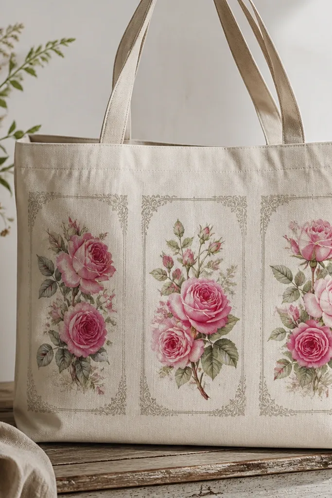
Frames make the bouquet feel intentional, like it's printed in sections. Paint the roses first, then add a light frame border around each cluster so the flowers don't blend into the bag background. Stencil frames also help the spacing look neat even if your roses aren't perfect.
Use two stencil layers: one for the rose shapes and one for a simple border line. Keep frames about 4-5 inches wide each and stack them with 1 inch between clusters. Use a rose palette of blush pink, medium rose, and deep magenta for folds.
Pro tipAfter painting, go back with a damp brush to smooth any stencil edges so the border looks crisp, not jagged.
AvoidAvoid placing frames too close - overlapping borders makes it look messy.


