1. Monochrome block quote tote with stencil edges
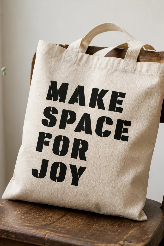
This look is all about contrast and restraint. Use one color (black or deep navy) so the stencil edges stay crisp and the tote looks intentional. Matte paint hides small brush marks better than glossy finishes, which is why I stick to matte acrylic mixed with fabric medium. The negative space around the letters makes the design feel graphic, not messy.
Use a reusable stencil or a printed acetate stencil. Place it with painter's tape at the corners so it doesn't shift while you dab. Mix fabric medium with black craft acrylic at a 1:1 ratio, then dab with a foam brush. Let it dry 30-45 minutes, add a second light coat, then seal with a fabric top coat.
Pro tipPress the stencil down with your palm for 10 seconds before the first dab so paint doesn't sneak under the edges.
AvoidDon't flood the stencil - thick paint creeps under and turns your clean letters into fuzzy blobs.
2. Sunset gradient tote with a sponge fade
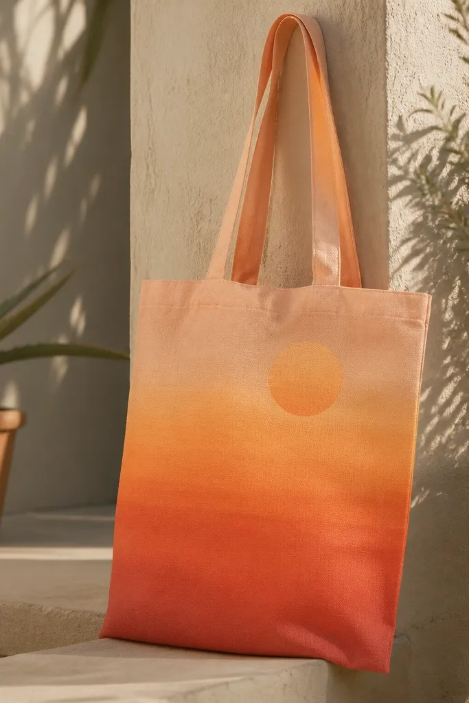
A sponge fade looks expensive because it mimics ombre without needing an airbrush. The trick is layering colors in the same direction so the transition stays smooth. I use three paint mixes - coral, orange, and peach - each mixed with fabric medium for flexibility. The sun circle adds a focal point without filling the whole bag with dense details.
Lightly sketch the sun circle using a pencil or chalk. Mix coral + medium 1:1, then sponge from the bottom up to about one-third height. Clean the sponge (or use a fresh one) and blend orange into the middle band, overlapping slightly. Finish with peach near the top. After drying, seal with fabric top coat.
Pro tipKeep a damp paper towel nearby and dab off excess paint before each blending pass.
AvoidSkip one-color-wide strokes - they leave hard lines where you want a smooth fade.
3. Tiny repeating stars tote with paint-dot pattern
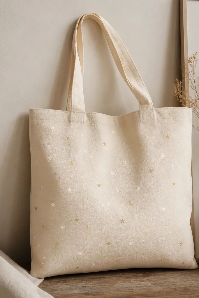
Small repeating marks hide imperfections and make the tote feel playful. Stars work especially well in light colors because they don't visually overpower the fabric. I paint stars with a stencil or a homemade star cutout, then add a second color dot for depth. The result looks like fabric-printed art, but you can customize the star spacing.
Choose a stencil with star openings under 1 inch wide. Tape it down and apply white paint mixed with medium using a sponge dauber. For the pale gold accents, use a smaller brush tip and add tiny dot highlights in 10-20% of the stars. Let it dry fully before sealing.
Pro tipRotate the stencil by 90 degrees for every other row so the pattern feels organic, not mechanical.
AvoidDon't use watery paint - thin dots spread and the star points lose their shape.
4. Bold hand-drawn leaf outline with thin liner brush
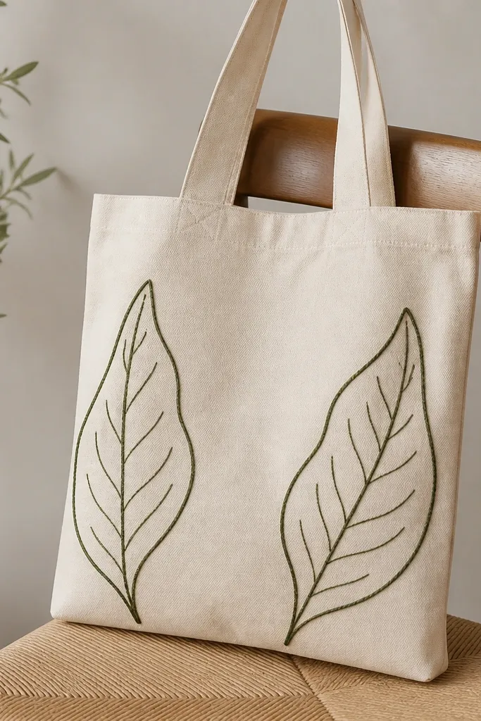
Line art is forgiving if you keep your paint consistency right. A leaf outline gives you a natural theme without needing complex shading. Thin liner brush lines look sharp when the paint is mixed with medium so it dries flexible and doesn't crack. Add a couple of vein strokes and the leaf reads instantly.
Lightly sketch the leaf with pencil: one tall leaf on the left, one on the right. Mix deep green acrylic with fabric medium to a creamy, not runny texture. Use a 10/0 or 6/0 liner brush for outlines, then switch to a smaller round brush for vein lines. Let it dry 45 minutes and add a second outline pass if you want it darker.
Pro tipWipe your brush tip on a paper towel before each line - it prevents paint blobs at the start and end of strokes.
AvoidDon't press hard on the brush - it digs into canvas and makes uneven line thickness.
5. Two-color geometric blocks with painter's tape borders
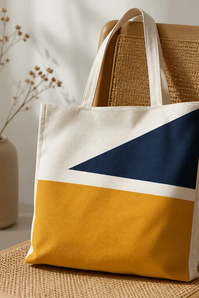
Tape makes geometry look crisp even if your freehand skills are shaky. Two colors keep it graphic and modern, and the negative space makes the tote look designed. Use matte paints mixed with fabric medium so the tape lines stay crisp and the fabric doesn't stiffen. When you pull tape at the right moment, the edges stay sharp instead of peeling.
Plan your layout with masking tape first, then trace lightly with pencil. Mix mustard acrylic + medium 1:1 and fill one panel using a foam brush. After 10-15 minutes (when paint is set but not fully dry), pull the tape slowly. Repeat for navy. Seal after both colors dry.
Pro tipPull tape at a 45-degree angle - it reduces tearing on canvas fibers.
AvoidDon't wait until the paint is fully dry to remove tape - you risk lifting paint off the fabric.
6. Marbled tote using rubbing alcohol and acrylic
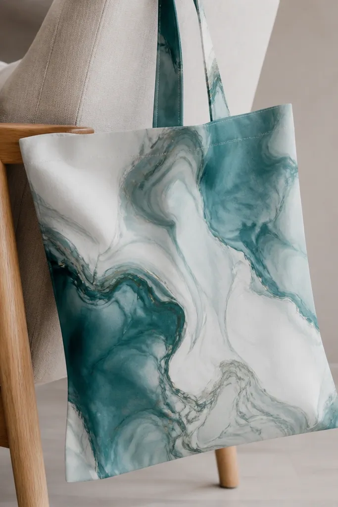
Marbling looks like a store-bought print because the pattern is random. Rubbing alcohol helps the acrylic spread and move, creating those cloudy swirls. The best part: you can keep it contained to one panel so it doesn't overwhelm the tote. I use teal as the main color and add white for highlights.
Lightly dampen the canvas panel with clean water using a spray bottle. Mix acrylic paint with fabric medium, then add a few drops of rubbing alcohol to the paint puddle (not on the whole bag at once). Drop paint with a pipette or spoon, then tip the tote slightly to guide swirls. Let it dry completely before sealing.
Pro tipDo a test on a scrap canvas first - alcohol amount controls whether you get wispy clouds or chunky blobs.
AvoidDon't soak the whole tote - too much moisture makes the marbling bleed into areas you didn't plan.
7. Pastel rainbow arc with brushy texture
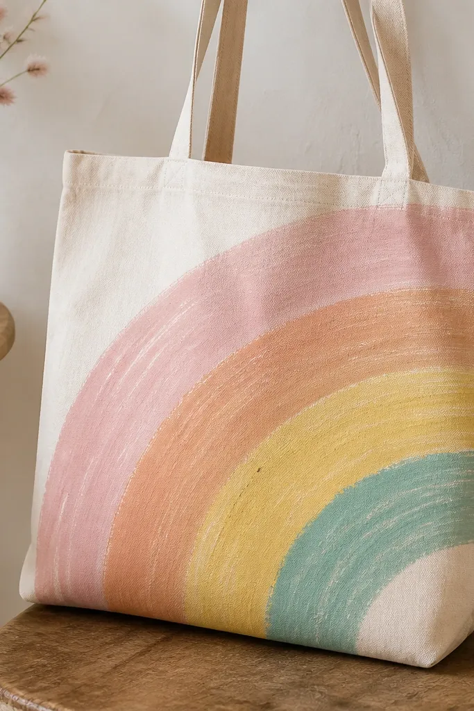
Texture makes pastels feel handmade instead of flat. A rainbow arc is simple but looks cheerful, and the curved layout hides uneven coverage. I use a medium-thick paint mix so brush strokes show but don't puddle. With a matte finish, the brush texture looks intentional.
Draw the arc with a chalk line or by tracing a plate for the curve. Mix each pastel color with fabric medium 1:1 and load a flat brush lightly. Paint one stripe at a time, letting edges overlap slightly so there are no gaps. After drying, seal with a fabric top coat in thin layers.
Pro tipUse a dry brush technique for the top edge of each stripe - it keeps the arc crisp even if the coverage is uneven.
AvoidDon't use too much water in your paint - pastels turn thin and patchy on canvas.
8. Botanical spray silhouette with a foam stamp
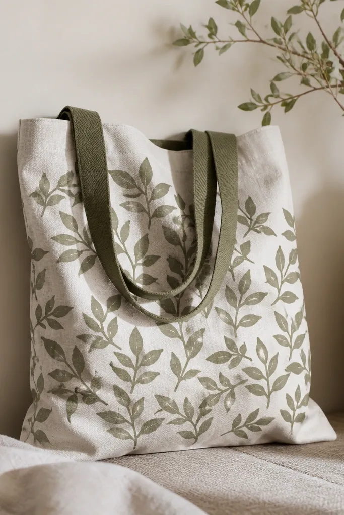
Silhouettes look clean because you're not drawing every leaf - you're stamping shapes. Foam stamping gives you a soft edge that still reads as botanical. Olive and off-white makes the tote look natural without turning into a brown-green mess. The repeated cluster also hides small alignment issues.
Cut simple leaf shapes from craft foam or use a store-bought foam stamp set. Mix off-white + medium 1:1 for the first layer, then stamp a few clusters around the center. Add olive for a second layer, slightly off-register for depth. Let it dry and seal.
Pro tipStamp, lift straight up, then rotate the stamp position - vertical lifting keeps edges from smearing.
AvoidDon't stamp too hard - it crushes foam and transfers streaks into the silhouette.
9. Black-and-white portrait style face using marker transfer
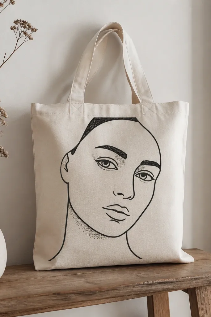
A marker transfer gives you placement accuracy without tracing by eye. For a face, use bold outlines and a small set of shading marks (dots or short hatches). Black and white reads sharp against natural canvas. Mixing your black paint with fabric medium keeps the lines flexible and reduces crack risk.
Print or draw a face design, then transfer it by rubbing the back with pencil or using a transfer sheet. Outline with a fine brush or fabric marker, then shade with dots using the back of a small brush handle. Mix black acrylic + fabric medium 1:1 for the paint outline. Seal after drying.
Pro tipTest the transfer on scrap - some marker transfers look darker on certain canvas weaves.
AvoidDon't overwork the shading - too many layers make the face look muddy.
10. Navy anchor with distress speckle finish
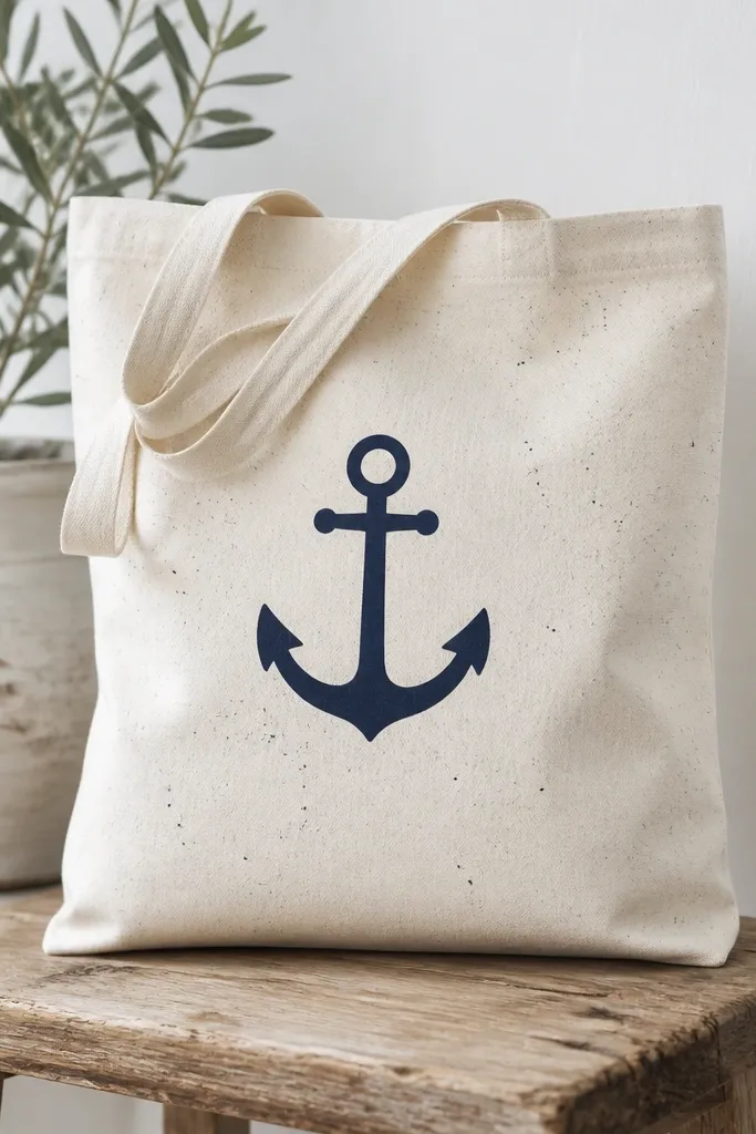
A single anchor keeps the design anchored. The controlled distress speckle adds movement without making the whole tote look messy. Speckle looks best with a stiff brush and diluted paint so dots are small. I like navy plus off-white because it reads nautical but still modern.
Stencil or draw the anchor and fill with navy paint mixed with medium 1:1. For speckles, load a toothbrush or stiff brush with off-white mixed with medium and a drop of water. Flick near the anchor from 6-10 inches away, testing on scrap first. Let dry, then seal.
Pro tipCover the tote handles with paper so splatter lands on the body, not the straps.
AvoidDon't use heavy paint for speckles - blobs look like mistakes, not distress.
11. Tie-dye style stripes with resist wax (no dye bath)
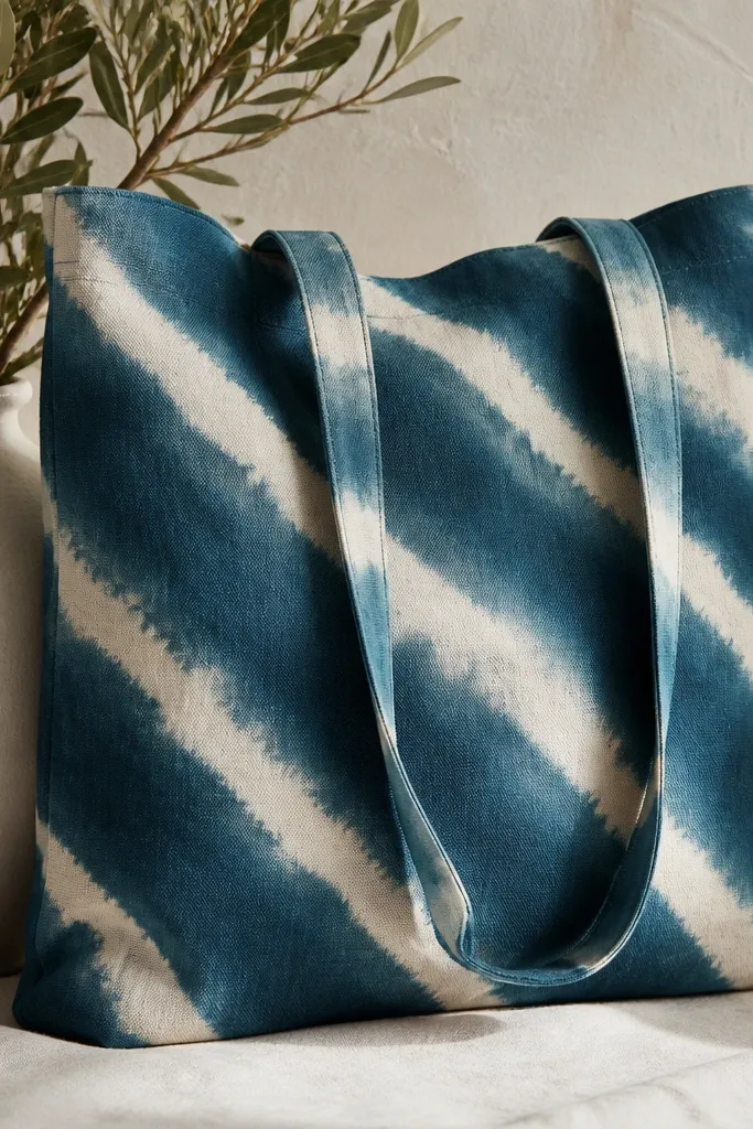
You can get a tie-dye look without boiling water or a full dye setup. Wax resist creates lighter bands while the surrounding paint darkens. This method works great on thick canvas because wax holds shape. The result looks artisan even if your stripe lines are a little imperfect.
Warm a block of beeswax slightly so it spreads. Draw diagonal stripe paths with pencil, then rub wax along the lines. Paint over the whole area with teal acrylic mixed with fabric medium 1:1, then let it dry. Heat gently with a hair dryer to melt wax and wipe it away with paper towels. Seal after paint cures.
Pro tipUse a disposable foam brush for painting over wax - it doesn't snag and leave thin streaks.
AvoidDon't press wax too thin - you'll get gray smudges instead of crisp resist bands.
12. Gold foil feel lettering using acrylic and a sponge
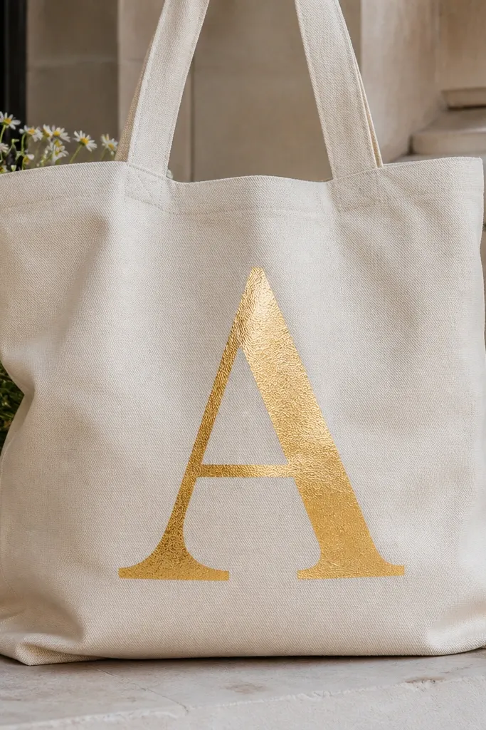
Metallic paint can look cheap if it's smooth and too reflective. Sponge application gives a grainy, foil-like surface that reads upscale. I use gold metallic acrylic mixed with a small amount of fabric medium so it stays flexible without dulling. Pairing gold on natural canvas looks clean and matches everything.
Stencil large letters so you don't have to freehand curves. Mix metallic gold acrylic with fabric medium 2:1 paint to medium. Dab with a sea sponge in small amounts, then add a second pass only after the first layer sets. Seal with a fabric top coat that doesn't add too much gloss.
Pro tipIf your metallic looks patchy, do one more light coat instead of pressing harder with the sponge.
AvoidDon't use a glossy top coat over metallic if you hate glare - it makes the grain disappear.
13. Watercolor wash panel with wet-on-wet edges
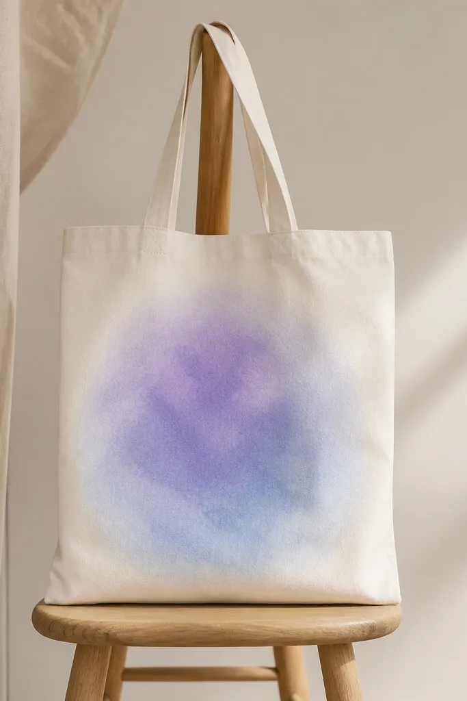
Watercolor-style washes make a tote look soft and artsy without drawing. Wet-on-wet edges happen when you keep paint thin and work quickly. Fabric medium keeps the wash from turning stiff and protects it from cracking after drying. This is a great design for people who hate outlines.
Mask off a rectangle area with painter's tape. Lightly wet the fabric inside the rectangle with a spray bottle. Mix lilac and pale blue acrylic with fabric medium 2:1 paint to medium, then add a tiny drop of water to thin. Drop paint into the wet area and tilt the tote so it spreads naturally. Dry fully and seal.
Pro tipRemove tape only after the paint is fully dry to keep the rectangle edge sharp.
AvoidDon't over-saturate - if the fabric stays wet too long, the wash spreads into the rest of the tote.
14. Color-blocked tote with painted corners and handle accents
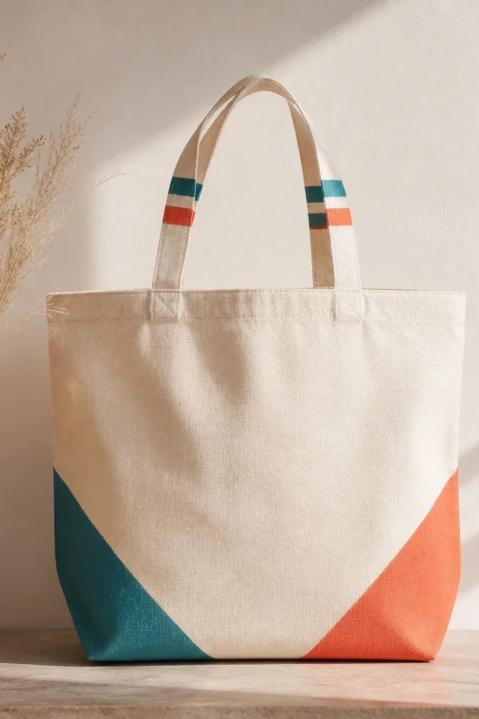
This look uses small painted areas to make the tote feel designed, not covered. Painted corners pull your eye to the bottom and give the bag shape. Handle accents make it look like a matching set, even though the main body stays clean. I like coral + teal because they pop without turning into a rainbow.
Mark two corner triangles on the bottom using painter's tape. Mix coral + medium 1:1 and fill one triangle with a foam brush. Mix teal + medium 1:1 for the other triangle. For handle accents, paint two thin stripes along the handle length using a small brush. Let everything dry, then seal the painted areas.
Pro tipUse a ruler to keep the triangle height consistent on both sides.
AvoidDon't paint handles too thick - heavy paint makes the straps stiff and uncomfortable.


