1. Sunrise wave stripes with a coral horizon
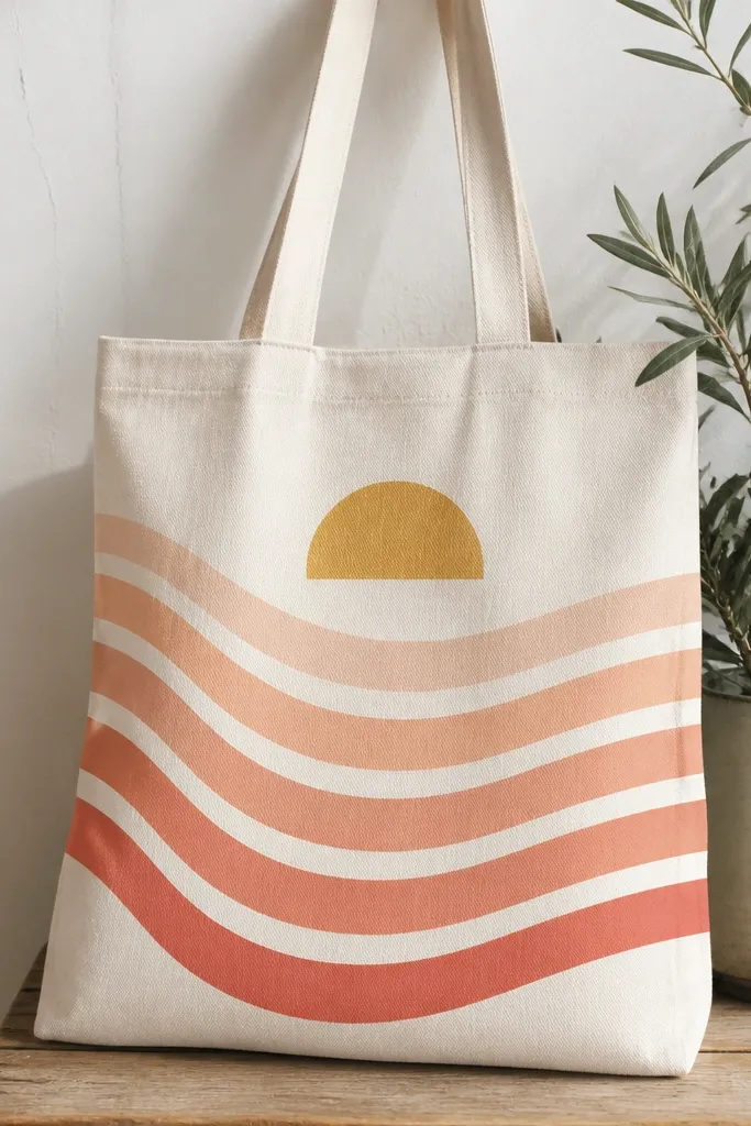
This one looks like you bought it from a beach market stand. The trick is the curved stripe spacing: keep the waves consistent so the gradient reads as a single sunrise. I use pale peach for the first wave, then build to coral, and finish with a thin golden arc for the sun.
Sketch the horizon arc first with a pencil, then paint five waves about 1.5 inches tall each. Use a flat brush for the stripe bodies and a small liner brush for the gold arc. It fits best on a tote with a clear front panel and enough space above the printed logo area.
Pro tipLet each stripe dry 10-15 minutes before adding the next so the colors don't smear into muddy bands.
AvoidDon't paint straight through the tote seams - the bend makes the stripes look wobbly.
2. Tiny fruit cluster in a rounded sticker layout
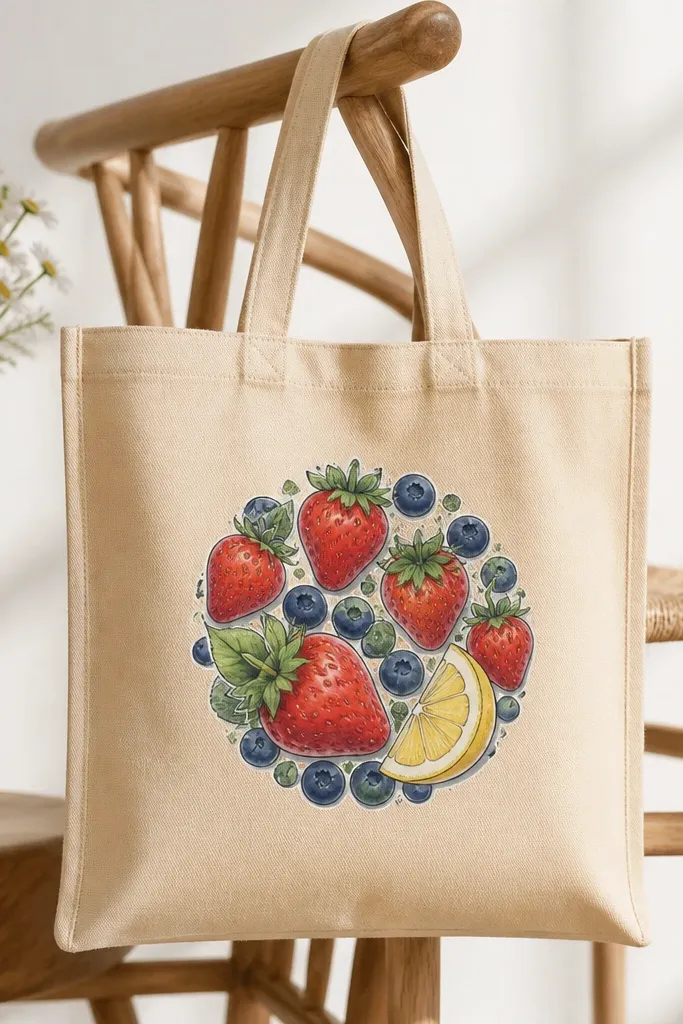
Sticker-style fruit looks cute because it's controlled and readable from far away. Use thick outlines for the fruit shapes, then add tiny dot highlights so the fruit looks glossy. The rounded cluster keeps it from stretching when the bag gets pulled.
Paint a circle guide about 6 inches wide. Inside it, place 2 strawberries, 3 blueberries, and one lemon slice, leaving breathing room between shapes. Fill the fruit with flat color, then shade with a darker tone and add a few white highlight dots.
Pro tipMix a little white into your fruit base color for the highlight spots so they look like light, not random dots.
AvoidDon't use thin, shaky outlines - the cluster turns into a blob.
3. Monochrome botanical sprigs in black ink look
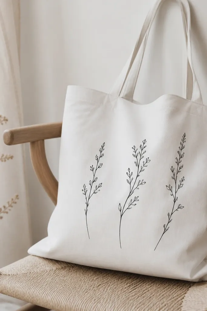
This design is minimal and still interesting because the line weight changes. Thin stems and thicker leaf bases create rhythm. Keep the palette monochrome so the tote color does the background work.
Use a fabric paint or acrylic with fabric medium in black, plus a 0 or 1 round brush. Paint one tall sprig left, one medium sprig right, and a small sprig in the middle. Add a few leaf clusters near the top so the composition feels intentional.
Pro tipPractice on paper first: learn how much paint to load so your brush tip makes a clean taper.
AvoidAvoid filling leaves with flat rectangles - leaves should have a pointed end.
4. Color-block rainbow with a stitched border
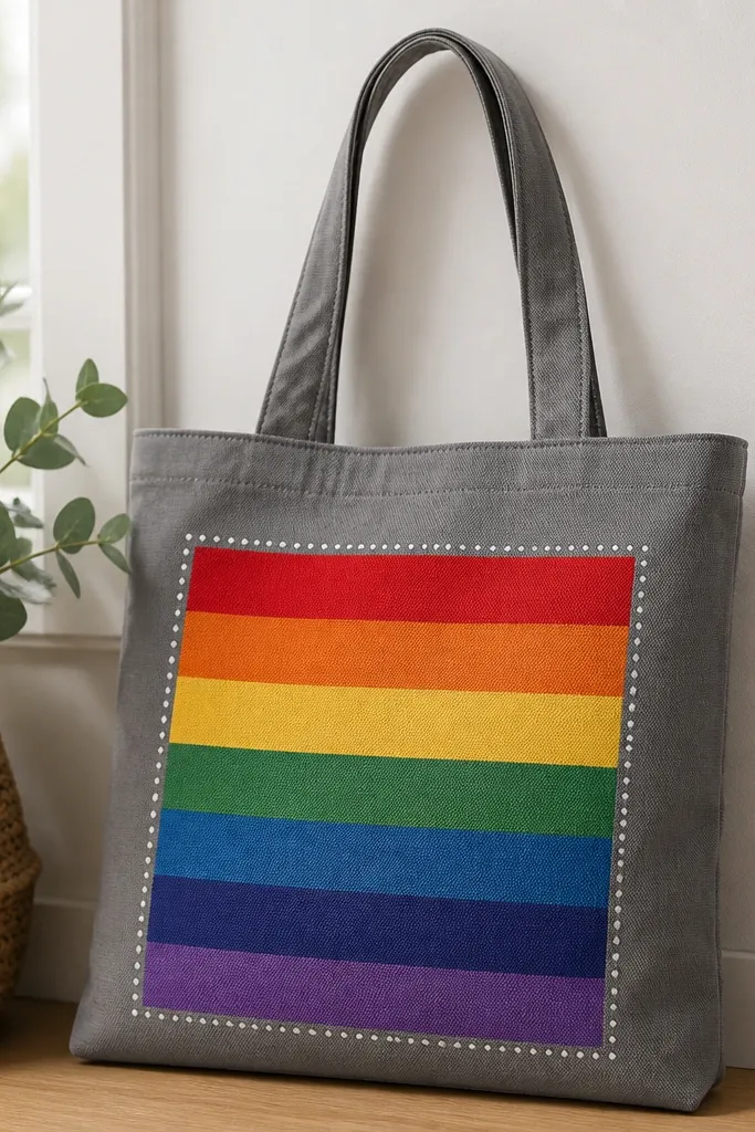
Color-block rainbows look playful without needing lots of detail. The stitched border makes it feel handmade and adds texture even if your paint is smooth. I like using a matte white border so it doesn't glare.
Draw a rectangle about 10 inches wide and 6 inches tall on the front panel. Paint horizontal blocks, each about 1 inch tall. After the rainbow dries, dot a border line using a toothpick or small sponge dipped in white.
Pro tipUse masking tape only for the outer rectangle - freehand the block edges for a more organic look.
AvoidDon't seal with a glossy topcoat - the stitched dots look plastic.
5. Butterfly wing watercolor wash with splatter accents
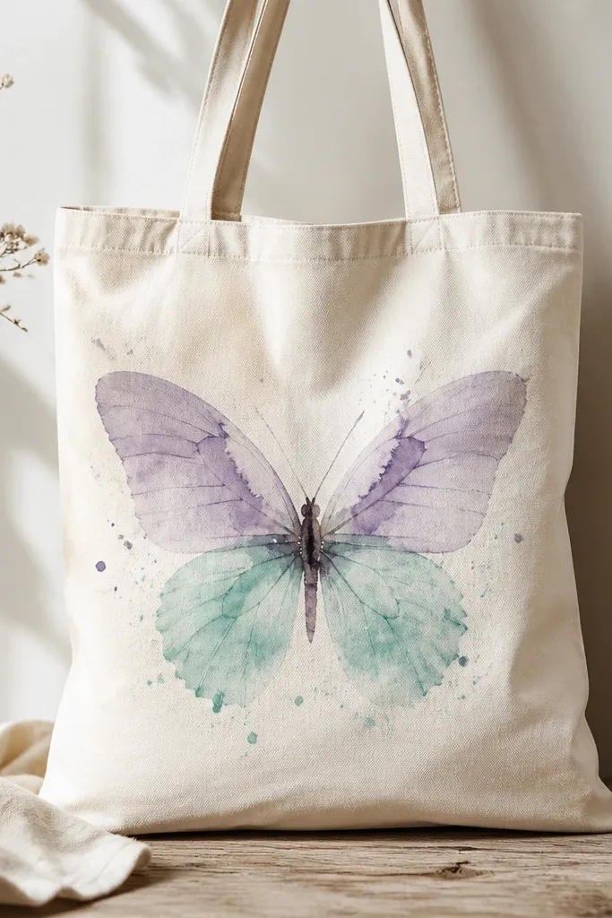
Watercolor-wash butterflies look soft and airy, which is why they're so cute on tote bags. The splatter adds movement, but keeping it small keeps it from looking messy. Use two wing colors and a darker outline so the shape stays readable.
Lightly sketch the butterfly body and wing outline. Mix watered fabric paint for the wings, then add a darker shade at the edges of each wing. For splatter, tap a stiff brush lightly above the wing area so dots land around, not across, the body.
Pro tipKeep a paper towel folded under the cardboard inside the tote so splatter stays contained.
AvoidDon't over-saturate the wings - thick paint dries stiff and looks like a sticker.
6. Pastel checkerboard with teeny daisies
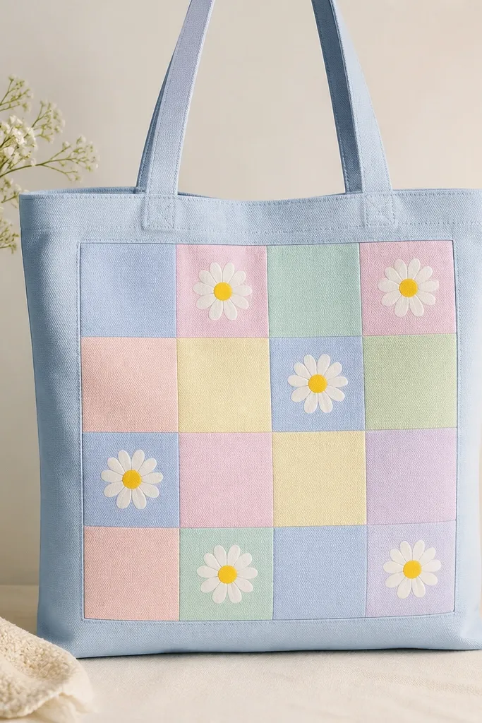
Checkerboards look cute because they're graphic and easy to repeat. The daisies break the pattern so it feels handmade, not like a printed bag. Pastels soften the contrast and keep the design friendly.
Mark a square grid about 8 inches wide. Paint alternating squares in pale pink, mint, lavender, and butter yellow. Add daisies in 4 squares (center top, center bottom, left middle, right middle) so the composition stays balanced.
Pro tipUse a 1-inch painter's tape strip to keep grid lines straight while you fill squares.
AvoidAvoid painting checkerboard squares freehand - crooked grids scream "quick job."
7. Hand-lettered "hello" with bubble outline
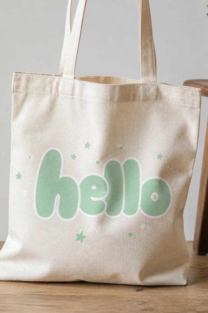
Lettering is cute because it's personal, and bubble outlines make it playful. The white outline is the secret: it separates the mint letters from the tote fabric. Add tiny star dots to fill negative space without adding clutter.
Stencil the word lightly with pencil so you don't fight the bag's weave. Paint the bubble letters with a medium-thick coat in mint, then trace the outline with white. Keep the stars small - about the size of a pea - and place them around the word, not under it.
Pro tipWrite the word on paper first and choose a font shape you already like; copy the stroke thickness exactly.
AvoidDon't use super thin paint for letters - it fades and looks scratchy.
8. Abstract terracotta sun face with dot eyes
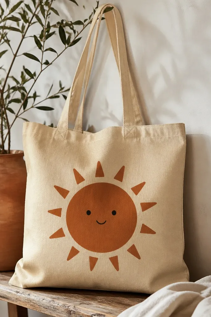
This is cute because it's minimal but still reads like a character. The terracotta against sand looks warm and calm. Short triangular rays give it shape without turning into a complicated doodle.
Paint a 6-inch circle in terracotta, then add 12 short rays around it using a small angled brush. Let the circle dry before adding the face. Use dark brown or black paint for dot eyes and a small smile line.
Pro tipMake the rays slightly uneven by hand - perfect symmetry looks less friendly on fabric.
AvoidAvoid tiny eyes - dots smaller than a pencil eraser smear in fabric texture.
9. Big polka dot panel with one contrasting stripe
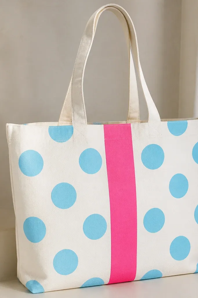
Polka dots are instantly cute, and the single hot pink stripe adds a design twist. The stripe interrupts the pattern so it doesn't feel repetitive. Use big dots so the tote looks styled even when the bag is wrinkled.
Choose a panel area about 10 inches wide. Paint large dots using a round sponge or the bottom of a small paint jar for consistent circles. Then paint one vertical stripe about 1 inch wide in hot pink through the center.
Pro tipPress the sponge straight down and lift quickly to prevent dot edges from smearing.
AvoidDon't place dots too close to seams - the fabric fold makes them look stretched.
10. Nautical anchors with rope and tiny stars
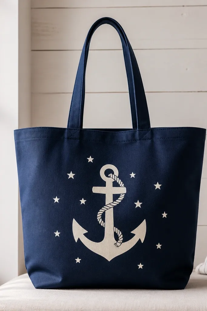
Anchors look great on totes because they're symmetrical and easy to center. The rope detail adds texture you can feel visually even though it's paint. Tiny stars make it playful without needing a full scene.
Sketch the anchor shape with pencil, then paint the anchor in cream. Use a fine brush to draw the rope line spiraling around the top bar. Add 6-10 small star dots using a toothpick dipped in white.
Pro tipUse a stencil for the anchor outline, then freehand the rope so it still looks hand-made.
AvoidDon't thicken every line - anchor details should vary in width.
11. Galaxy clouds with silver moon outline
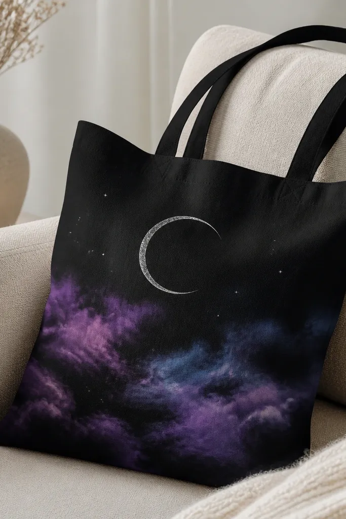
Dark tote + galaxy wash looks dramatic in a good way. Clouds hide brush marks, so your blending doesn't need to be perfect. The silver moon outline keeps the design from becoming a smear.
On black fabric, paint clouds with watered purple and blue, blending at the edges while wet. Add a crescent moon using a stencil, then outline it with silver paint using a thin brush. Finish with small star dots in white and silver.
Pro tipUse a damp brush for blending - it spreads paint without leaving hard tide marks.
AvoidAvoid using chunky glitter - it catches on clothing and looks scratchy.
12. Flower crown arc with three layered blooms
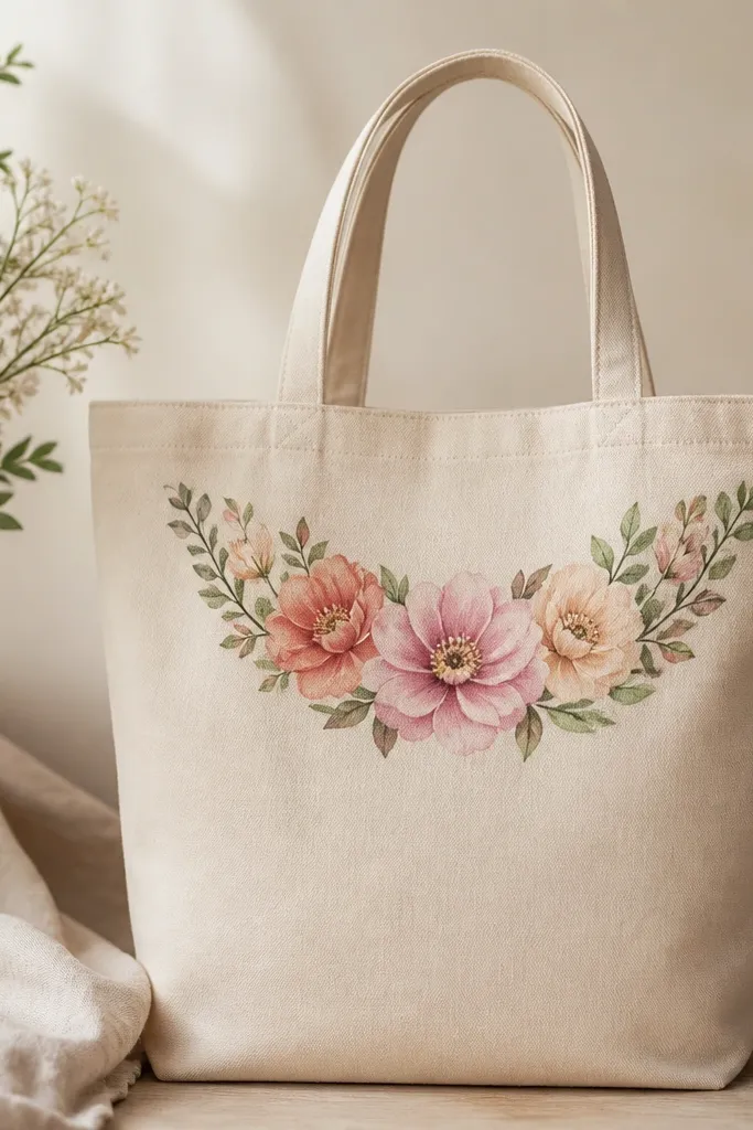
A crown arc is cute because it frames the tote and stays visible even when the bag slumps. Layered blooms add dimension without needing 3D paint. Green leaves connect it so it feels like one arrangement.
Draw an arc line across the top front about 9 inches long. Paint a central flower with three petal layers: light pink, then coral, then a darker pink center. Add two smaller side flowers and connect them with thin green stems.
Pro tipLet the lightest petal layer dry before layering darker petals so edges stay crisp.
AvoidDon't put the crown too low - it disappears against the tote bottom when you carry it.
13. Lemon slice outline with cheeky face
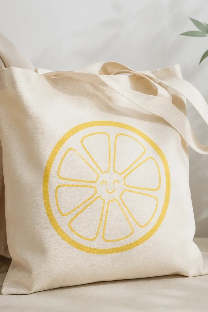
Lemon slices are bright and instantly summer-cute. The cheeky face makes it playful, not graphic-only. Keep the segment lines thin so they look like the inside of a real lemon.
Paint a lemon slice circle about 7 inches wide, then outline it with a darker yellow. Add inner segment lines with a thin brush in a slightly darker shade. Draw a simple face near the center using brown paint for eyes and mouth.
Pro tipUse a reference photo for the segment curve so your lines feel natural.
AvoidAvoid thick black outlines - they make it look like a cartoon print, not paint.
14. Checkered stripe border with tiny hearts
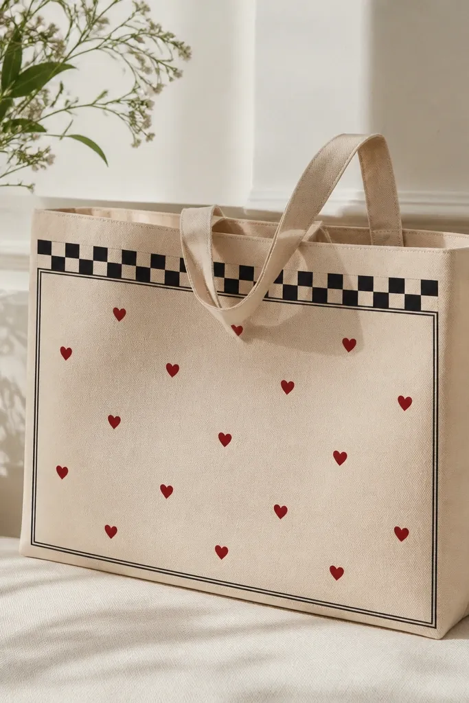
Borders make totes look finished, and hearts add a sweet accent without covering everything. The alternating squares give a clean, graphic edge. Red hearts pop against beige and don't need shading.
Draw a rectangle border about 9 inches wide and 7 inches tall. Paint a thin checkered strip on the top edge only, then a simple black stripe on the sides. Place 5-7 tiny hearts inside using a small round brush.
Pro tipIf your hearts look uneven, paint half the heart first, then mirror the curve by tracing the first half.
AvoidDon't overfill the inside - too many hearts makes the border feel cramped.
15. Terrarium scene in a rounded glass jar
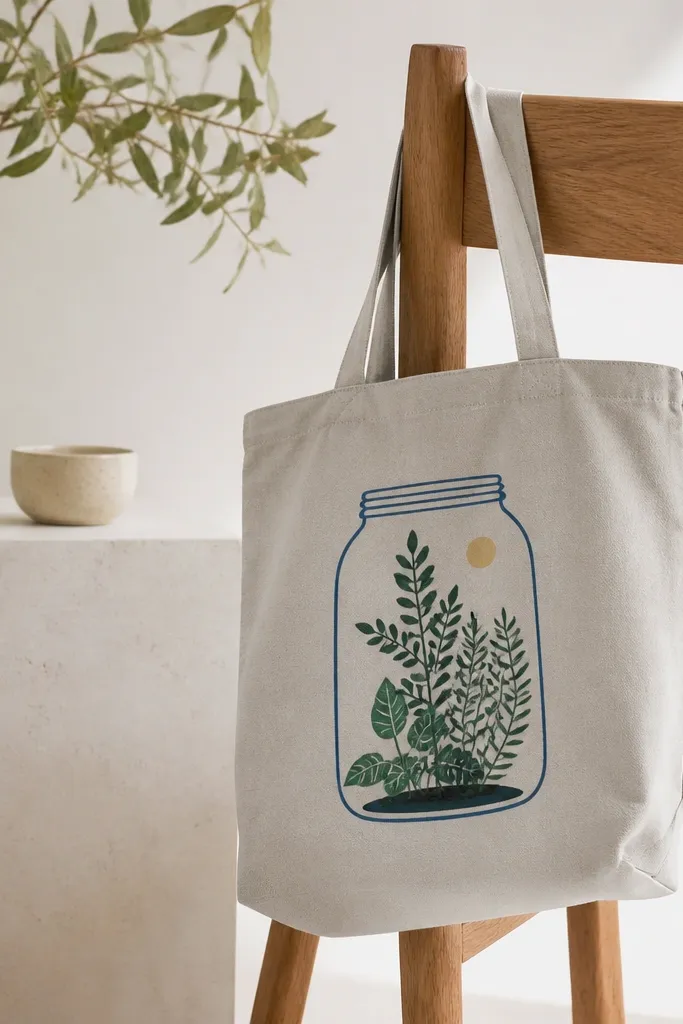
Terrariums are cute because they look delicate and contained. The jar outline gives structure, and the layered plants give depth. Use a clear-ish blue outline so it feels like glass without needing transparent paint.
Sketch a jar shape with a wide base and slightly narrower top. Outline it in light blue, then add a faint inner highlight line. Paint soil as a darker brown mound at the bottom, then add 3 plant layers in green shades with varied leaf shapes.
Pro tipAdd one tiny sun dot above the plants for a focal point that reads even from a distance.
AvoidAvoid painting tiny leaves all over - pick a few bigger leaves and repeat the shapes.
16. Pink flamingo legs with doodle palm trees
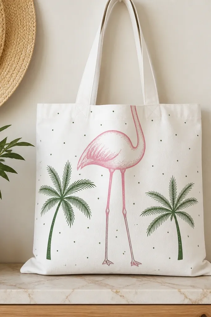
Flamingo legs work because they're tall and graphic, so they match tote proportions. Doodle palms keep it playful and avoid heavy realism. Use a limited palette: flamingo pink, green fronds, and a few black line details.
Paint one flamingo in outline style, then add a second flamingo leg behind it for depth. Draw 2 palm trees on the sides, leaving the center open. Add small dot clusters near the trees to balance the empty tote area.
Pro tipUse a fine brush for lines and keep line breaks intentional - that makes it look like a sketch.
AvoidDon't shade the flamingo too much - flat color looks more cute than realistic on fabric.
17. Colorful abstract face with one-line hair
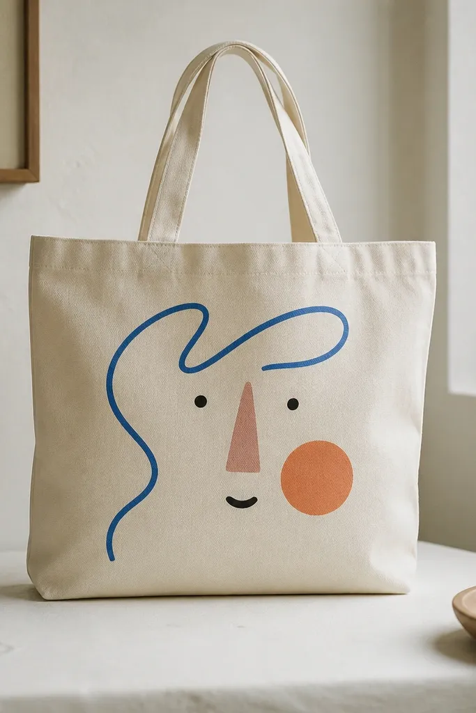
Abstract faces look modern and cute because they're bold but simple. One-line hair creates motion and keeps the design from looking static. The shape colors pop without needing complicated blending.
Sketch the face lightly. Paint the hair as one sweeping line in blue, then let it loop around the forehead and down to the side. Add one cheek blob in orange, then eyes as two dots and a small triangle nose.
Pro tipChoose one "main" color for the face and two accents so the tote doesn't look chaotic.
AvoidAvoid too many small details - the tote weave blurs tiny paint marks.
18. Rainbow ombre balloon strings with confetti dots
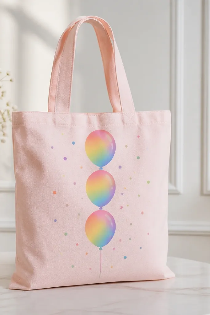
Balloons are cute because they feel celebratory, and ombre makes them look soft and dimensional. Thin strings anchor the balloons so they don't float aimlessly. Confetti dots add a party vibe without covering the tote.
Paint three balloon shapes about 5 inches tall each. For each balloon, blend red-to-violet along the curve using a sponge or soft brush. Add thin strings in gray and a small knot at the top. Scatter confetti dots in white, yellow, and blue around the bottom half.
Pro tipUse a small makeup sponge to blend ombre - it gives a smooth gradient on fabric.
AvoidDon't paint the strings too thick - thick strings look heavy and distract from the balloons.
19. Soft cloud outline with raindrop gradients
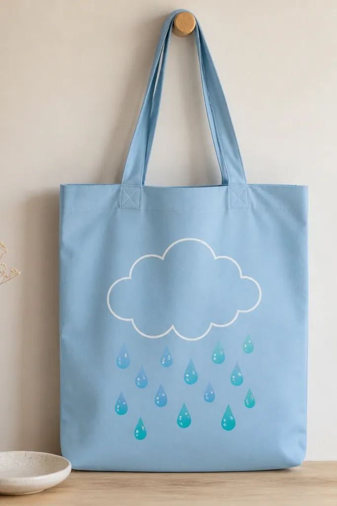
This design is cute because it looks calm, not dramatic. Cloud outlines keep your work neat, and gradient raindrops add interest without complicated detail. The white outline makes the cloud pop on blue fabric.
Draw a cloud outline using a pencil guide, then paint it in white. Paint 7-9 raindrops beneath with a gradient: start light near the top, darker at the tips. Add 3-4 small bubble circles in white as highlights.
Pro tipUse the tip of a round brush to pull each raindrop down into a point.
AvoidAvoid using one flat color for all raindrops - it looks flat and less intentional.
20. Botanical line art + colored leaf fills
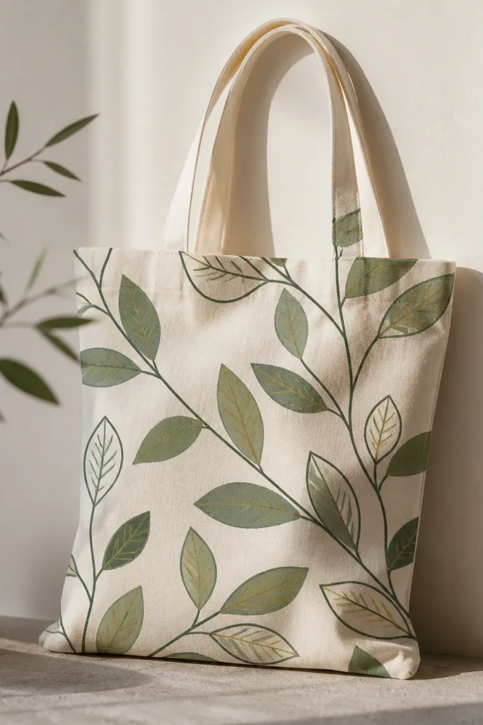
Line art with selective fills looks expensive because it has contrast. The outlines keep the shapes crisp while the colored fills give softness. I like muted greens because they look good on real bags that get dirty over time.
Paint stems and outlines in dark green. Pick 6 leaves to fill - alternate two shades of green. Add tiny vein lines in yellow using a liner brush so the leaves look like they have structure.
Pro tipDon't fill every leaf; leaving some unfilled creates breathing space and makes the design look intentional.
AvoidAvoid neon greens - they look harsh and peel faster on fabric.
21. Starry night stripes with a comet trail
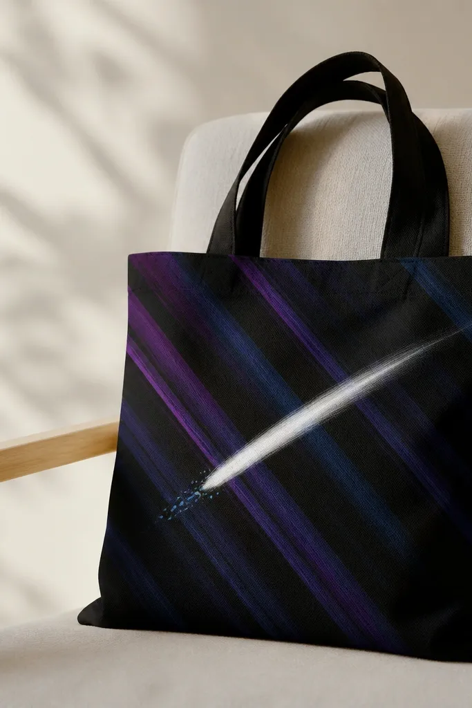
Diagonal stripes make the tote feel dynamic even when it's flat. The comet trail adds a focal point and draws the eye across the bag. Use small dot tail so it looks like light particles, not a solid smear.
Paint 5 diagonal stripes across the front panel, each about 2 inches wide. Add tiny star dots on top with a white paint pen. Then paint a comet streak in white and sprinkle light blue dots along one side for the tail.
Pro tipUse a stiff toothbrush for stars - flick from a short distance for tiny, controlled specks.
AvoidDon't cover the whole bag with stars - keep them concentrated near the comet.
22. Cherry blossom branch with pink petals falling
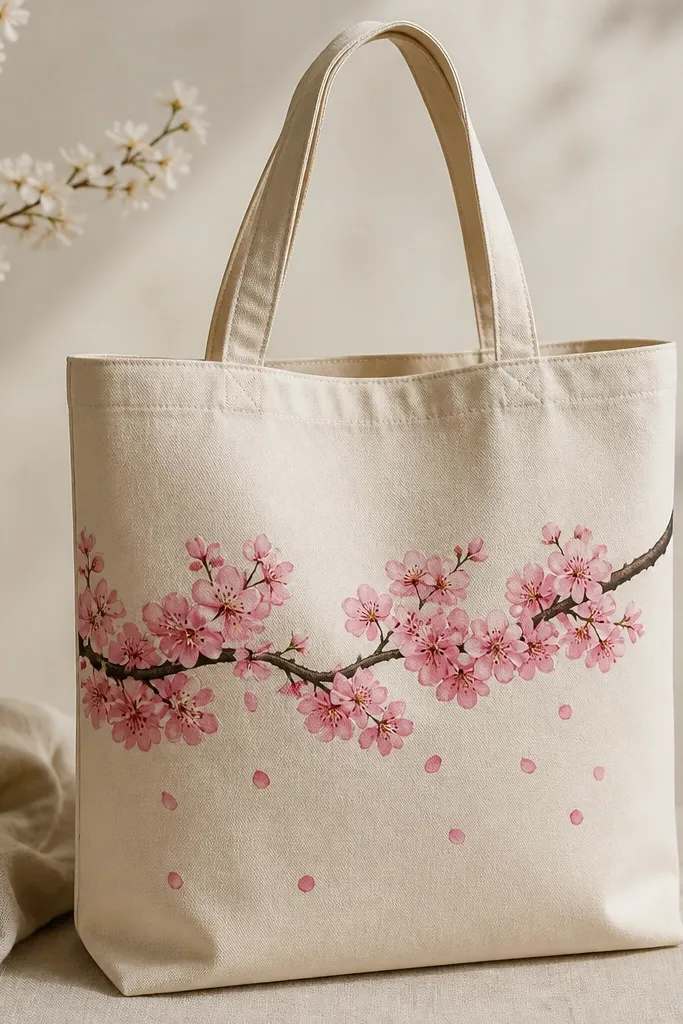
Cherry blossom branches look cute because they're airy but still structured. The branch line gives direction, and petals falling add motion. Keep petals simple: small teardrops with a lighter highlight spot.
Paint a branch in dark brown with 2-3 thicker sections and smaller twigs. Add blossom clusters using a small dot pattern: paint a darker pink center and lighter pink edges. Add 10-14 petal shapes below the branch, spaced unevenly.
Pro tipUse a sponge to dab blossoms; it gives a natural cluster texture on fabric.
AvoidAvoid realistic petal veins - they look messy on tote fabric.
23. Ice cream trio with waffle cone tips
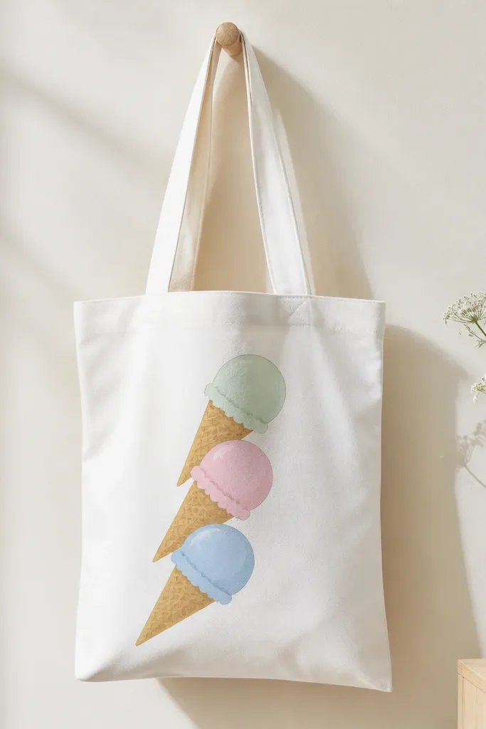
Ice cream trios are cute because they're instantly recognizable. The waffle cone crisscross adds texture that makes the painting look finished. Pastels keep it sweet and not too loud.
Paint three cone shapes in light brown, then add crisscross lines with a fine brush. For scoops, use three colors: mint, pale pink, and light yellow. Add tiny white highlight curves on each scoop so they look glossy.
Pro tipKeep the scoops about 2.5 inches wide so the cones don't look stretched on tote panels.
AvoidAvoid thick paint on cones - it makes the crisscross lines disappear.
24. Geometric mountains with teal sky triangles
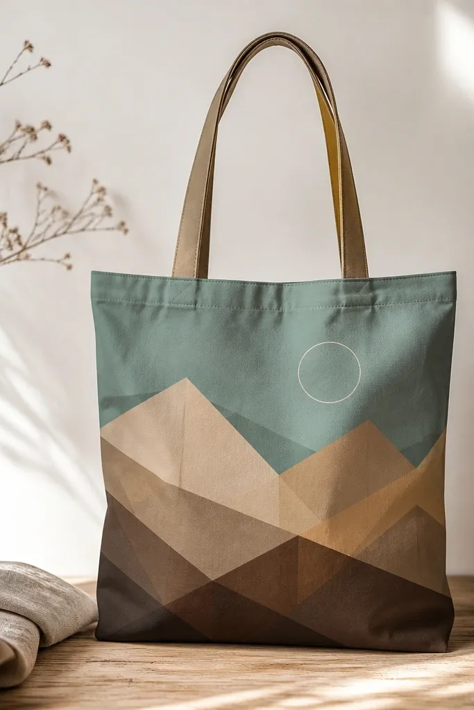
Geometric mountains look cute because they're graphic and easy to photograph. The teal triangle sky adds contrast without needing a full landscape painting. Layering mountains in 3 shades gives depth while staying clean.
Tape a triangle guide on paper first, then transfer to the tote with pencil. Paint the farthest mountain in light brown, middle in medium brown, and closest in dark brown. Fill sky triangles in teal and leave small gaps for a crisp look.
Pro tipUse masking tape for sharp mountain edges, remove tape while paint is still slightly wet.
AvoidDon't blend mountains together - the edges should stay distinct.
25. Cute cat face with whisker stripes
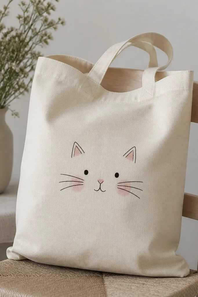
Cats are cute because they're small and expressive, and whiskers give personality. Simple shapes look better on textured fabric than detailed fur. Blush circles make the face feel friendly.
Paint a circle head about 4 inches wide. Add triangle ears, then whiskers as three curved lines on each side. Place a small pink triangle nose and two dot eyes. Add two blush circles on cheeks using a light pink wash.
Pro tipWhiskers look best when you paint them in one smooth motion from the cheek outward.
AvoidAvoid tiny fur dots - it looks speckled and messy on tote weave.
26. Mermaid tail with scale pattern dots
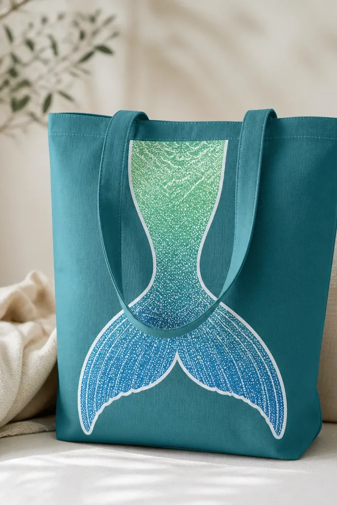
Mermaid tails look cute because they read like a character, not just decor. The dot scale pattern adds texture without needing a stencil. A white outline makes the tail pop against teal fabric.
Sketch the tail shape with pencil, then paint the base gradient using two brushes: one loaded with green and one with blue, blending in the middle. Add overlapping dot scales in a slightly darker shade. Outline the tail in white with a thin brush.
Pro tipUse the end of a cotton swab for dot scales - it keeps dots consistent.
AvoidAvoid over-thick outlines - they crack and feel raised after curing.
27. Sunflower patch with layered petals and green center
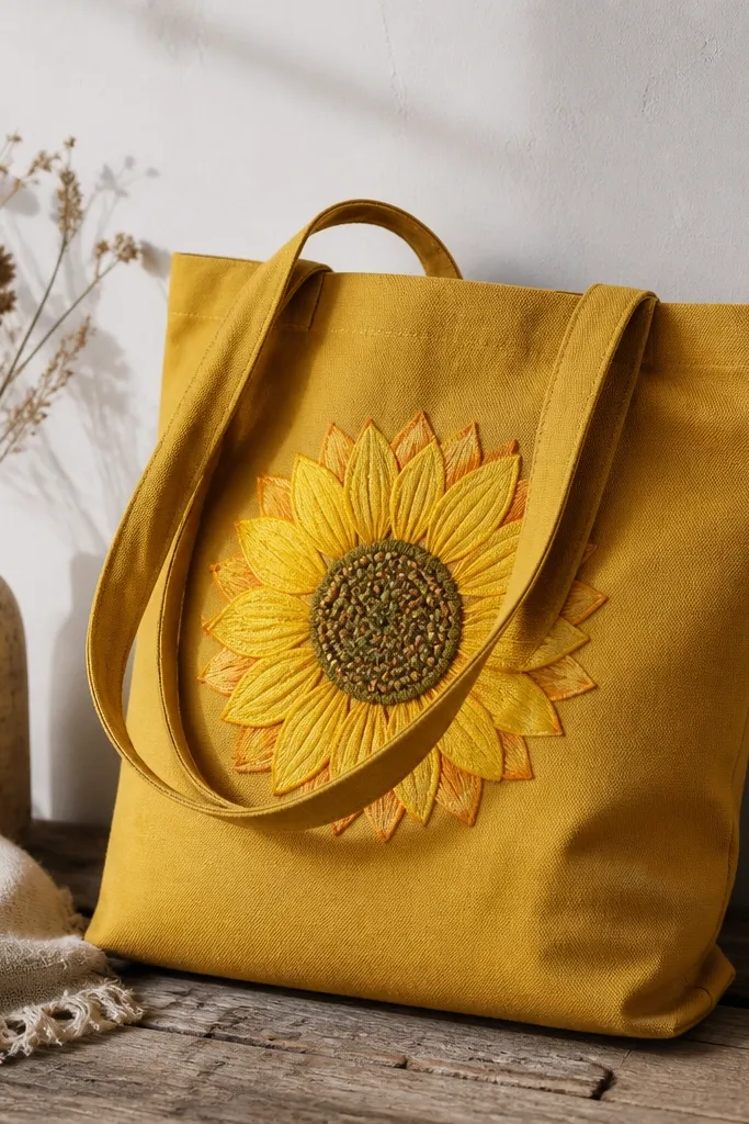
Sunflowers are cute because they look cheerful even with simple paintwork. Layered petals keep it dimensional, and the seed dot center makes the flower feel real. The green-brown center adds contrast that makes the petals look brighter.
Paint a 7-inch sunflower. Do petals in three layers: base yellow, then orange tips, then a few deeper orange petals on the outside. For the center, paint a green-brown circle and dot it with a darker brown.
Pro tipAdd one small shadow under the center using a thin wash so the flower doesn't look flat.
AvoidDon't paint every petal exactly the same size - slight variation looks more natural.
28. Teacup with steam curls and tiny butterflies
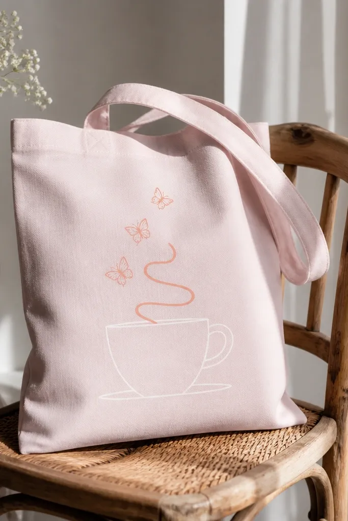
Teacups feel cozy-cute, and steam curls give you an easy way to fill empty space. Tiny butterflies keep it whimsical without taking over the tote. Use warm neutrals so the design looks soft, not loud.
Paint the cup outline in white or light cream, then fill lightly with a pale peach if you want warmth. Draw 3-4 steam curls that spiral upward. Add 3 butterflies above the curls using simple wing shapes and thin bodies.
Pro tipSteam curls look better when they taper at the ends - load less paint as you draw upward.
AvoidAvoid thick fill inside the cup - it makes the cup look like a sticker.
29. Rainbow swirl lollipop with a white highlight edge
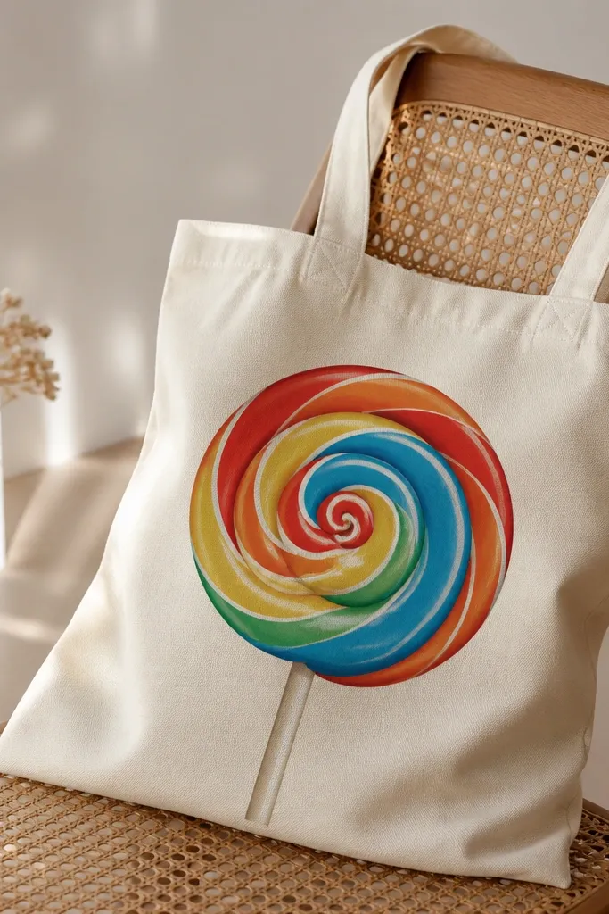
Lollipops are cute because the swirl reads instantly. The white highlight line makes the swirl look glossy and adds a finished look. Keep the swirl thickness consistent so it doesn't turn into a messy coil.
Sketch a circle for the top and a rounded stick for the bottom. Paint the swirl by sections: red band, then orange band, etc., twisting with each layer. Add a thin white highlight line along the outer curve and a small shadow band on the opposite side.
Pro tipUse a reference photo for swirl spacing; it's easy to make the bands too close on fabric.
AvoidDon't overload paint - thick swirl paint cracks when the tote flexes.
30. Mini rainbow arch with raindrop border
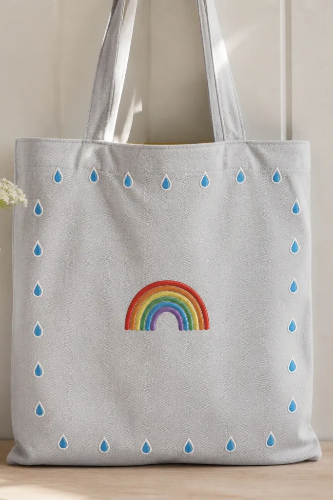
This looks cute because it's compact and framed, like a badge. The raindrop border adds a secondary pattern without cluttering the center. White outlines keep the small drops crisp against the tote.
Paint a rainbow arch about 4.5 inches wide. Then dot a raindrop border around the arch, leaving space between drops. Outline the raindrops in white and fill them with light blue and teal.
Pro tipPaint the arch first, then use it as your guide for raindrop placement so the border stays even.
AvoidAvoid skipping outlines on small shapes - tiny drops blur into the fabric.


