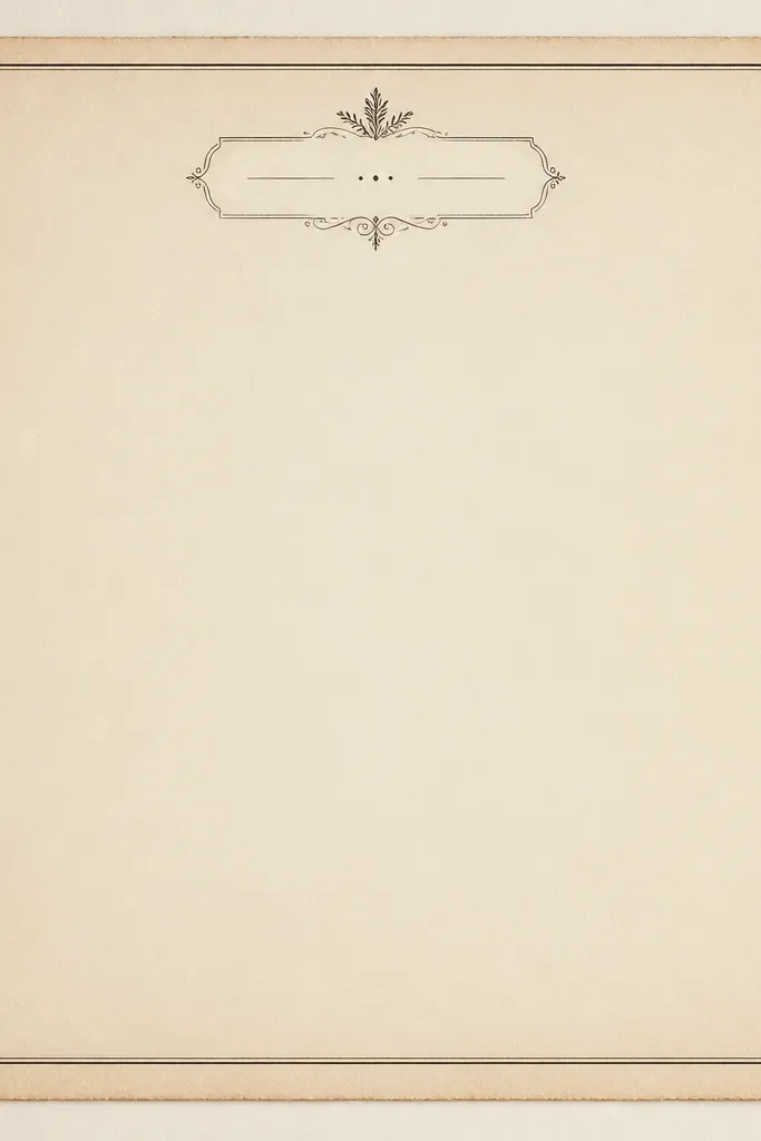
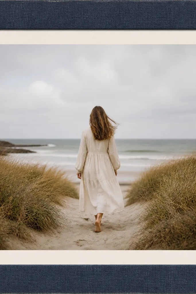
1. Deckle Edge Cream Frame with Tea-Stain Corners
This one looks like the photo was rescued from an old album. The deckle edge creates uneven paper fibers that catch light differently than a crisp rectangle. Tea-stain corners add warmth without covering the photo, so skin tones stay flattering. I pair it with a thin inner rule in tobacco brown so the border still reads clearly when resized.
Build the border at 10% of the image width. Use a cream base around #F3E7CF, then add corner stains using a soft brush at 15% opacity in #B07A3A. Keep the inner line 3 to 5 px thick at 1080px width so it doesn't overpower the photo.
Pro tipPrint once on matte cardstock, then hold it to a window. If the edge looks too gray, darken the tea stain by 5% and reduce the inner line thickness.
AvoidAvoid pure white borders - they look modern and make the vintage effect collapse.
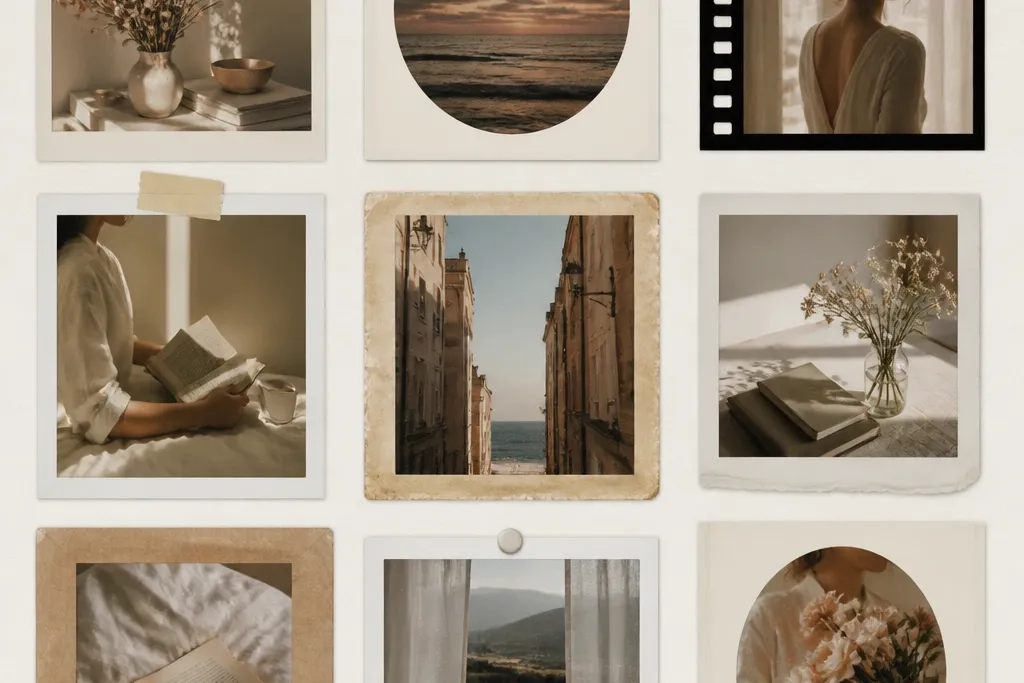
2. Faded Polaroid Stack Frame with Scuffed Tape Strip
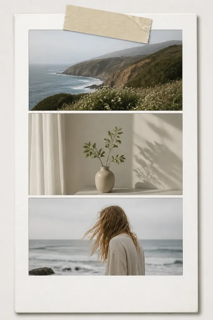
This template works because it adds real "messiness" in one controlled spot - the tape. The stack gives depth, but the tape strip is what sells the cozy, lived-in vibe. Use faded grays and warm whites so it looks like an older camera print. I like it for gift posts and weekend snapshots because the layout makes the photo feel like part of a set.
Set the main photo area to 78% width and stack two smaller frames behind it at 92% width each. Add the tape strip across the top frame at a 7-degree tilt. Color the tape as warm off-white (#F7EEDD) and add scuff marks using a low-contrast noise texture.
Pro tipUse a soft drop shadow with blur 18 and opacity 25 so it looks printed, not floating in 3D.
AvoidDon't use bright neon tape colors - they kill the aged feel instantly.
3. French Café Menu Border with Tiny Type Header
This is my go-to for food, coffee, and "recipe card" posts. The menu look gives you a clear structure: a header band plus ruled lines that guide the eye. Keep the text area small so it frames without turning into a poster. The effect is cozy because the colors mimic printed ink on paper, not digital gradients.
Create a top header band at 12% of the image height using #EFE2C7 as the background. Add two thin horizontal rules in #6B4A2F at 2 to 3 px thickness (at 1080 width). For the "tiny type" header, use a simple serif font style and keep the text to one short line repeated as pattern, not readable paragraphs.
Pro tipIf your printer smears fine text, convert the header text into a slightly larger 1-color pattern and reduce font size by 10%.
AvoidDon't add full paragraphs of readable text - it looks like a design template, not a vintage artifact.
4. Washed Sage Frame with Sun-Fade Inner Mat
Sun-fade makes frames look older without looking dirty. The sage outer border sits nicely against outdoor photos and neutral interiors. The inner mat fade keeps faces and objects bright while still giving that worn photo print feeling. I use this when my pictures have sky, plants, or linen textures.
Start with an outer border color around #A3B89A and apply a gradient that fades to #EEE9D8 at the inner edge. Use a soft mask so the fade edge is uneven, not a perfect line. Keep the border width around 9% of the image width.
Pro tipAdd a barely-there vignette (10% opacity) inside the mat so the photo looks like it's been framed for years.
AvoidAvoid high-saturation greens - they look like a modern filter.
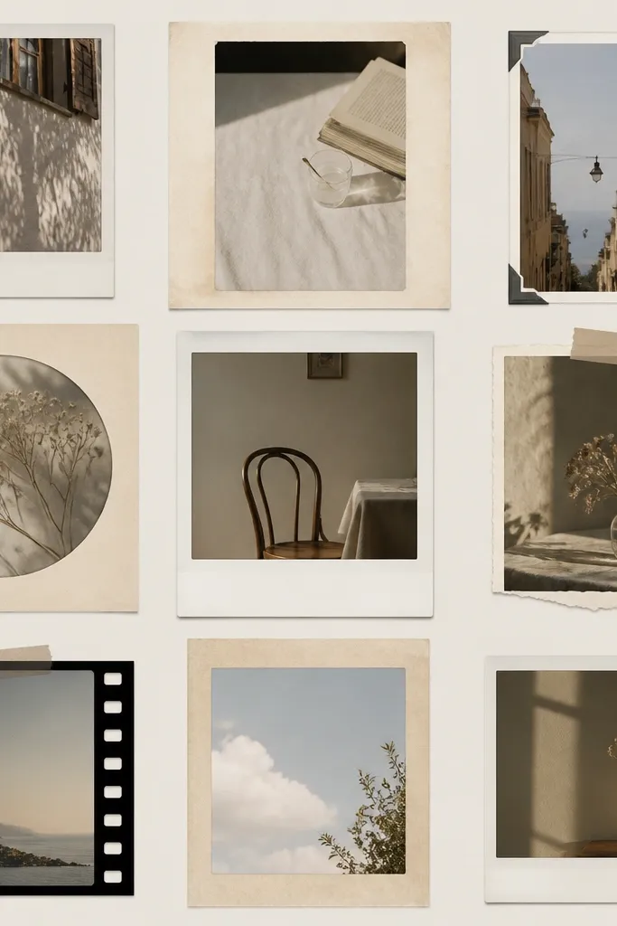
5. Antique Book Page Border with Corner Curl Overlay
This template feels tactile because it mixes a flat page texture with a raised corner illusion. The curled corners pull attention to the photo edges, which makes the whole frame feel "collected." I like using it for journaling quotes, travel shots, and small product photos because the border adds story without blocking the subject.
Use a monochrome page texture in warm sepia (#C9A77E) and keep it subtle at 20% opacity over a cream base. Add corner curl shapes as 4 separate overlays: each should cover about 12% of the border area. Shade the curl with a darker tone (#8B6A49) at 25% opacity to create the lift.
Pro tipPrint on matte paper and rub a fingertip lightly over the corner curls - if you feel texture, it will photograph better.
AvoidSkip glossy overlays. They look like printed stickers instead of paper.
6. Tobacco Woodgrain Side Strips with Center Photo Mat
Woodgrain frames look cozy because they feel like furniture, not graphic design. The side strips add warmth and a little motion, while the center mat stays clean for readability. I use this for portraits, candles, and anything with warm lighting. It also hides minor printing inconsistencies because woodgrain forgives smudges.
Set side strips at 11% of the image width each. Use a woodgrain texture in #6B4A2F and #3F2A1A with low contrast. Add a cream center mat at #F4E6CA and a thin inner line in #1F1A16 at 2 px thickness.
Pro tipIf your woodgrain looks too dark, lighten the texture by raising brightness 10% and reducing contrast 15%.
AvoidDon't stretch a tiny woodgrain image. Scale it so the grain pattern repeats smoothly.
7. Vintage Lace Border with Soft Crochet-Look Pattern
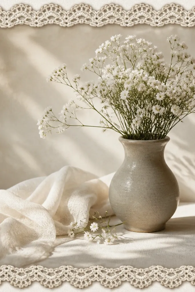
Lace borders are cozy when the lace stays light and airy. This one uses a crochet-loop pattern that reads as fabric texture instead of flat decoration. The subtle shadow makes it look like the lace is layered on top, which gives depth without covering the photo. Great for weddings, baby photos, and soft lifestyle shots.
Make the lace border width 8% of the image width. Use a base color of #F7F0E1 and add a second lace layer at 12% opacity in #D7C7A6 for depth. Add a shadow under the lace at 15 opacity with blur 10 so it looks stitched, not digital.
Pro tipUse a slightly larger pattern scale for thicker loops if your photo has lots of detail. It keeps the border from turning into a blur.
AvoidAvoid pure black lace - it looks like goth typography.
8. Sepia Halftone Frame with Film Grain Specks

Halftone frames feel vintage because they mimic print mechanics. The key is to keep the dot pattern low contrast so it doesn't moiré against your photo. Film grain specks add the "old camera" vibe while staying mostly in the border, not over faces. I use this when my photo has a lot of texture - linens, walls, trees.
Use a halftone dot pattern at 6 to 8 px dot size (at 1080 width) with opacity around 25%. Apply a corner fade mask so the border is darkest in the mid-sides and lighter at the corners. Add grain specks using a noise overlay at 8% opacity across the border only.
Pro tipTest on one photo with fine detail (like hair or leaves). If you see moiré, reduce dot size by 1 step and lower contrast.
AvoidSkip heavy dot density. Dense halftone makes the frame look like a comic filter.
9. Vintage Photo Booth Border with Ticket Stub Corners
Ticket stubs scream "memory" and they frame your photo like a physical keepsake. The perforation marks add realism if you keep them small. A faint stripe in brick red (#8A3D2E) gives the border a focal accent without taking over. This template is perfect for group pics and travel snapshots because it feels like an event souvenir.
Create corner notches by cutting a small right-angle notch at each corner, about 4% of image width. Add perforation dots along the notch edges - use 1 px circles spaced 6 px apart at 1080 width. Keep the stripe as a thin band at 6% of border height, only along the top edge.
Pro tipIf your printer breaks tiny dots, convert perforations into a short dashed line instead of circles.
AvoidDon't make the ticket notches huge. Big cuts look like a template sticker.
10. Rusty Red Frame with Blueprint-Style Inner Lines
This is an unexpected cozy combo: warm rust plus delicate lines. The blueprint-style grid gives structure and keeps the frame from feeling flat. The grid fades so it never competes with faces. I use this when my photo is monochrome or has a clear subject - it adds interest without clutter.
Set outer border color to #A24A3A and keep it at 9% width. Add an inner grid at 4% to 6% opacity using thin lines in #3A2C28. Fade the grid with a radial mask so it's strongest near the center edges and lighter near corners.
Pro tipUse 1 px line weight at 1080 width. Thicker lines look like a modern UI frame.
AvoidAvoid bright red (#FF3B30). Rust looks aged; bright red looks like a brand poster.
11. Cream Mat with Dark Ink Handwritten Title Strip
A handwritten strip turns a frame into a keepsake. This template works because the title area has a different texture than the border, so it reads as a label, not decoration. I keep the strip color deep brown and the font small, like notes in a journal. Use it for dates, names, or a one-line caption.
Make the title strip height about 9% of the image height and span the full width of the inner mat. Use #3B2A1E for the strip and add a subtle paper texture at 10% opacity. Place the inner mat line at 3 px thickness in #1E1A17.
Pro tipPrint the title strip on matte paper, then lightly dab a cotton swab with a tiny amount of warm sepia ink around the edges for extra realism.
AvoidDon't use cursive that's too thin. Thin strokes disappear in print.
12. Faded Navy Frame with Linen Texture Grain
Linen texture makes a frame feel like it belongs on a shelf. The faded navy is calm and works with almost any photo temperature, especially warm indoor light. Wear at corners - tiny lighter scuffs - makes it look handled. This is my pick for home projects and cozy interiors because it matches fabric and wood tones.
Use a navy base around #4A5A6A and overlay a linen weave texture at 18% opacity. Add corner wear by applying a small lighter overlay (#7A8B98) at 20% opacity in the outermost 5% of each corner. Keep border width around 8% and inner mat at #F6EED6.
Pro tipIf your linen texture looks too strong, blur it slightly and reduce opacity. You want it as a hint, not a wallpaper pattern.
AvoidDon't add heavy shadows. Linen already has texture; extra shadow makes it look digital.
13. Vintage Botanical Frame with Pressed Leaf Silhouettes
Pressed leaf silhouettes are cozy because they feel like something you made, not something you bought. The trick is keeping the leaves subtle and placing them along the sides so your photo stays the hero. Yellowed veins add age without turning the border into a busy collage. This works great for garden shots, skincare bottles, and handmade products.
Create leaf silhouettes as a repeating side pattern. Color them in #B08A4B at 20% opacity with slight inner vein lines at 12% opacity. Keep the border width 10% and leave corners mostly clean so the leaves don't crowd the viewer.
Pro tipPrint on heavier matte paper (at least 190 gsm). The leaf edges look sharper and the paper holds the texture better.
AvoidAvoid full-color leaves. Muted, yellowed tones look vintage; bright green looks like clip art.
14. Washed Yellow Frame with Corner Stamp Marks
This template adds history without clutter. The washed yellow matches old stationery and makes warm photos look extra cozy. Corner stamp marks act like physical evidence - they frame the image edges and give you a "document" vibe. I use it for announcements, birthdays, and travel postcards.
Set border to #EEDFAE and fade it toward the inner mat with a soft gradient. Add a circular stamp in each corner at 6% of image width diameter. Use brown ink #6D4A2F with 30% opacity and add a slight offset duplicate stamp at 15% opacity to mimic imperfect stamping.
Pro tipIf your stamp looks too crisp, add a tiny blur to the stamp only, not the border. That keeps the main frame sharp.
AvoidDon't place stamps in the middle. Center stamps make it look like a watermark.
15. Sepia Polaroid Window with Rounded Photo Corners
Rounded corners feel friendly and cozy, especially when the rest of the frame is vintage-toned. The sepia window makes the photo look like it was printed in-camera. I like the soft gradient fade because it keeps the border from feeling like a sticker. This one works well for portraits, pets, and any photo with a calm composition.
Set the photo window to 82% width and apply a 26 px corner radius at 1080 width. Use a sepia outer mat gradient from #D9C3A0 to #F3E7CF. Add a thin outline at 2 px in #3B2A1E around the photo window.
Pro tipRound the photo corners in the template file too. If you only mask the image but leave a square border, it looks wrong in print.
AvoidAvoid heavy bevel effects. They look like modern UI and break the vintage mood.


