1. Cream Moon Phases with Tiny Star Dust
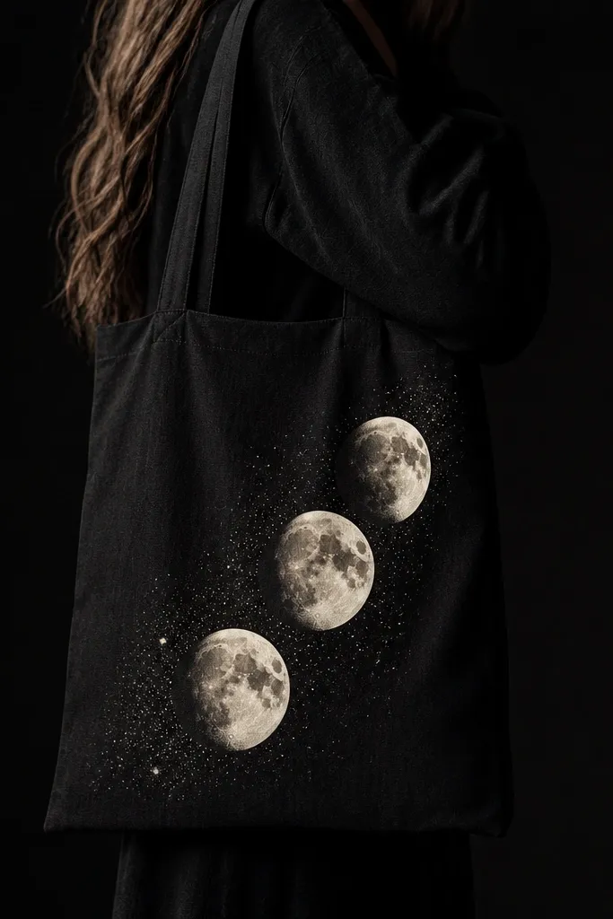
This design works because black makes cream look warm and "lit from within." I paint the moons with a slightly dry brush so the edges look atmospheric, then add a few sharp white dots to give the eye something to land on. The contrast is simple: cream midtones and white highlights, no extra colors fighting for attention.
Use a 3/8-inch flat brush for the moon base and a round detail brush for the star dots. Paint the crescent cutouts first with cream, then go back with white to add a thin highlight line on the top edge of each moon. Keep the stars small - around 1 to 2 mm - so they don't turn into blobs on fabric.
Pro tipSpray a light mist of water on your brush before loading paint for the moon edges; it softens the fade without smearing the black base.
AvoidDon't flood the fabric - thick paint can create raised patches that look uneven after it dries.
2. White Rose Outline with Black-in-White Petal Fill
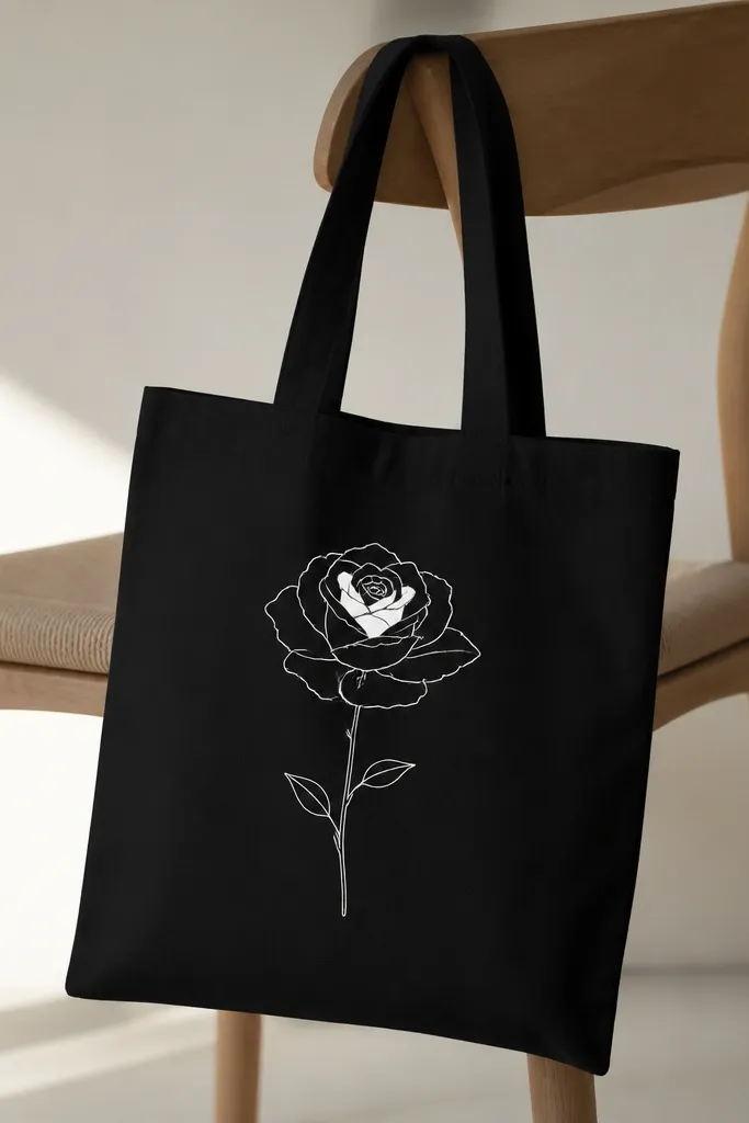
Outline work looks expensive on black because it keeps the design airy. I do the petals in two steps: mostly negative space (black) with white outlines, then small solid white fills near the center to create depth. The rose reads as delicate instead of heavy, even though the tote is dark.
Sketch with a fabric pencil or chalk first, then trace the main outlines with white fabric acrylic using a liner brush. For the center, fill only 3 to 5 petals solid, leaving the rest as outlined shapes. Add leaves with thin, slightly curved strokes so they don't look like stickers.
Pro tipLet the outline dry fully before filling petals so the white lines stay crisp and don't bleed into the filled areas.
AvoidAvoid thick marker-like strokes; wide lines make roses look cartoonish on fabric.
3. Gold Serpent Coils Around a Skinny Frame
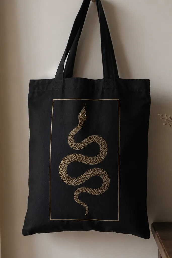
Gold on black is the easiest way to get that "evening bag" look. The thin frame gives structure, and the serpent adds movement without needing tons of colors. I use metallic gold for the main body, then add micro-dots for scales so it doesn't look like a single smooth stripe.
Paint the rectangular frame first with a ruler and painter's tape, leaving about 1 inch margin from the tote edges. For the serpent, use a script liner brush to draw the coil line, then fill the body with metallic gold in thin coats. Add scale dots with the tip of a small round brush - keep them random but consistent in size.
Pro tipIf your metallic paint looks streaky, stir it thoroughly and apply with a foam brush in light taps instead of long strokes.
AvoidDon't cover the whole serpent in one heavy layer; it dries uneven and can crack at the bends.
4. Blackline Faces in White with One Red Accent
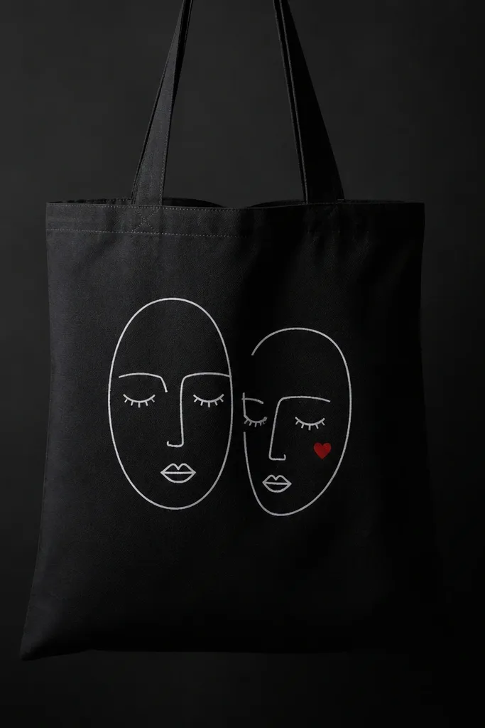
Minimal line faces work because black fabric already acts like the "background shadow." White lines stay readable, and one tiny red accent makes the design feel personal instead of flat. I keep the facial features thin so they look like ink on paper, not painted shapes.
Use a fabric-safe fineliner or a liner brush with white paint thinned slightly for smooth line control. Draw the face outline, then add eyes and mouth as simple arcs. Place the red accent as a small shape about the size of a pea so it reads as a detail, not a second theme.
Pro tipPractice the line weight on scrap fabric first; consistent pressure makes the whole face look intentional.
AvoidSkip full-face filling with white - it turns minimalist art into a bulky block.
5. Skyline Silhouette with White Windows
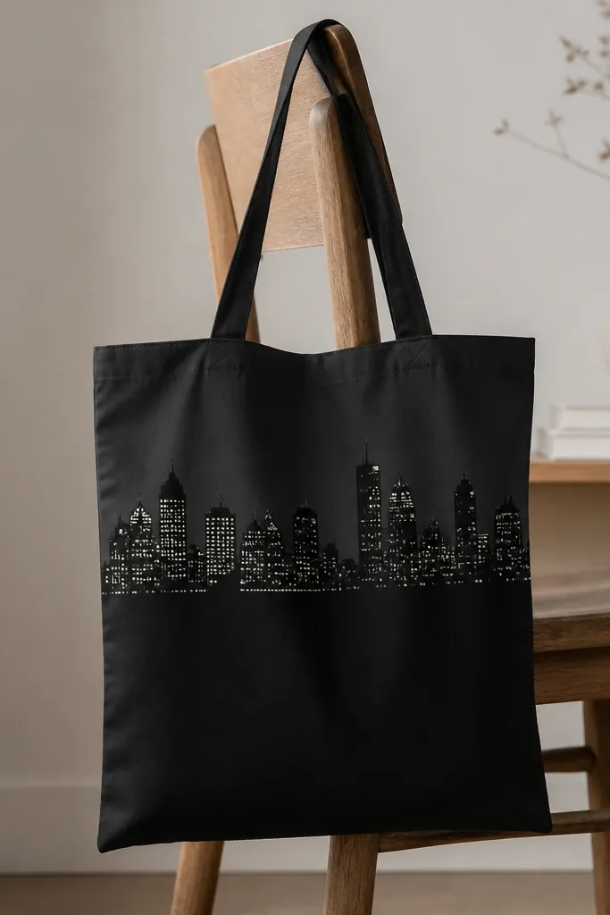
This is a contrast trick: you paint the skyline shape darker than the bag (charcoal) so it's subtle up close, then add crisp white window rectangles for the "spark." It looks like night lighting without using multiple colors. I keep the horizon line straight so the whole thing feels graphic.
Tape a horizontal guide where you want the skyline to sit. Paint the skyline silhouette with charcoal fabric paint, then let it dry. Add windows using a small square stencil or by dotting rectangles with a toothpick-sized brush; keep windows uneven in height but consistent in width.
Pro tipUse a flat brush for the skyline edges and a stencil for windows; that's the difference between "messy" and "designed."
AvoidDon't make windows all the same size; a grid pattern looks fake fast.
6. Monochrome Tie Dye Swirls in White and Gray
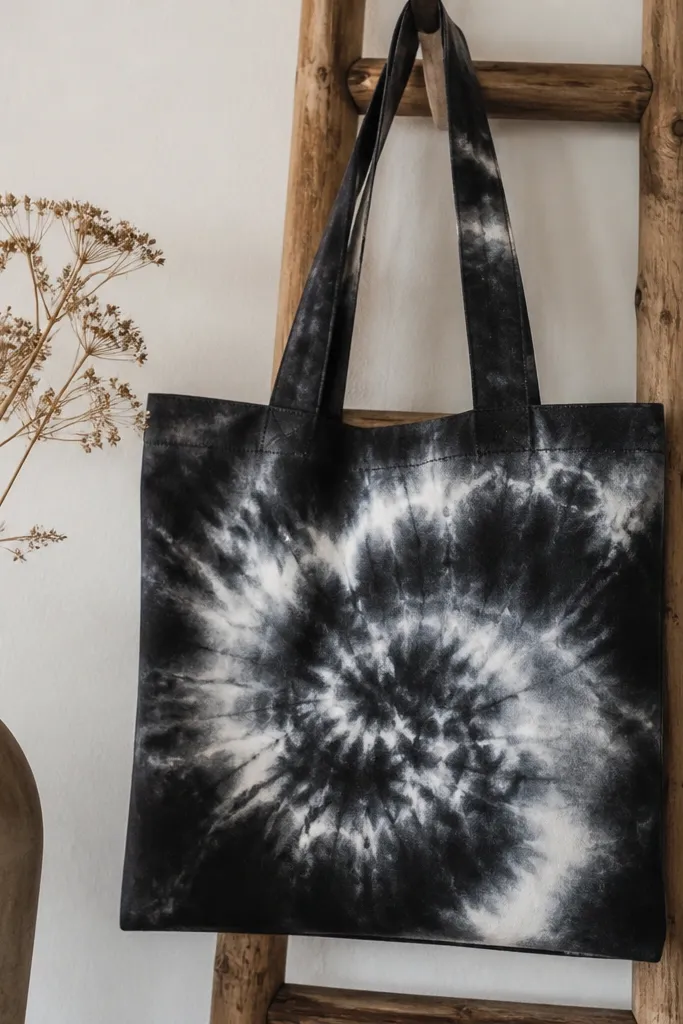
Monochrome swirls look cozy because they mimic fabric texture rather than fighting it. White gives the main glow, while gray adds depth so it doesn't look like flat chalk. I do this with a sponge and keep layers thin so the design feels cloudlike, not painted thick.
Lightly sketch a loose spiral center. Dab white paint with a sea sponge in curved strokes, then blend edges with a damp brush to create gray transitions. Build the swirl in 3 layers: base white band, gray shadow, then a final highlight pass with white on the outer edge.
Pro tipWipe your sponge on paper towels between layers; it prevents muddy gray blooms.
AvoidAvoid straight brush strokes across the swirl; they kill the tie-dye softness.
7. Rainbow Arc Using Only Warm Pinks and Creams
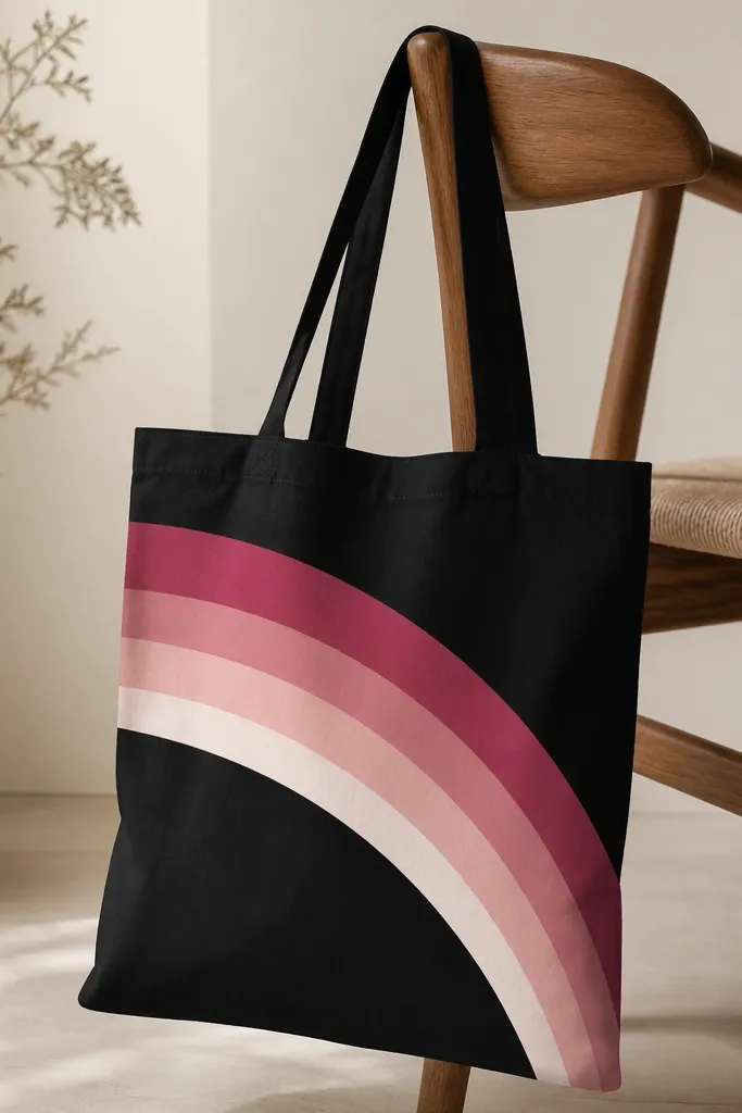
On black, warm rainbow colors look cozy and slightly retro. Keeping the palette to pinks and creams prevents the tote from looking neon or childish. Crisp arcs also read better than fuzzy ones when you're painting freehand.
Tape a gentle curve guide using flexible painter's tape. Paint bands from the bottom of the arc upward, starting with the darkest dusty rose, then moving lighter toward cream at the top. Allow each band to dry 10-15 minutes before removing tape or painting next to it to stop color bleeding.
Pro tipUse a small angled brush for the band edges; it makes the arc look intentional even if your curve isn't perfect.
AvoidDon't use watery paint for the band edges; it seeps under tape and makes the rainbow look smeared.
8. Geometric Starburst with Off-White Lines
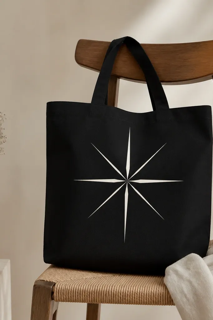
Starbursts look sharp on black when the lines have controlled thickness. I use off-white instead of pure white to avoid harsh glare that makes the design look cheap under store lights. The thicker lines act like shadows, giving the starburst a subtle 3D feel.
Mark the center point with a pin prick and use a compass or string to help lay out 8 points. Paint triangles with a ruler or tape strips - keep gaps consistent so the geometry looks clean. Add two thicker rays by going over them after the first coat dries.
Pro tipLet the first coat dry before doing the thicker rays; it prevents ridges that catch light unevenly.
AvoidSkip freehand without guides; asymmetrical starbursts read sloppy on totes.
9. Candle Jar Scene in Ivory with Wavy Smoke
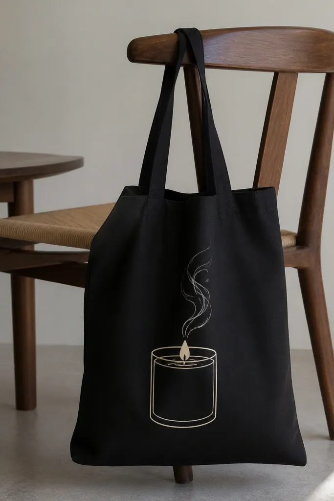
Candle art makes a tote feel cozy without being childish. Ivory on black looks like warm light, and the smoke lines add movement without filling the whole bag. I keep the jar simple with a few highlights so it looks like a printed illustration, not a detailed painting.
Draw a jar rectangle with rounded corners, then add a small flame triangle and a tiny oval base for the wick. Paint jar in ivory, then add a vertical highlight stripe slightly off-center. Smoke lines are wavy strokes in gray, blended lightly so they look like they're fading into the dark.
Pro tipUse a liner brush for smoke and pull each line upward in one stroke so it doesn't look dotted.
AvoidDon't over-detail the flame; too many lines make it look messy on fabric.
10. Botanical Branch with Olive Green Accents
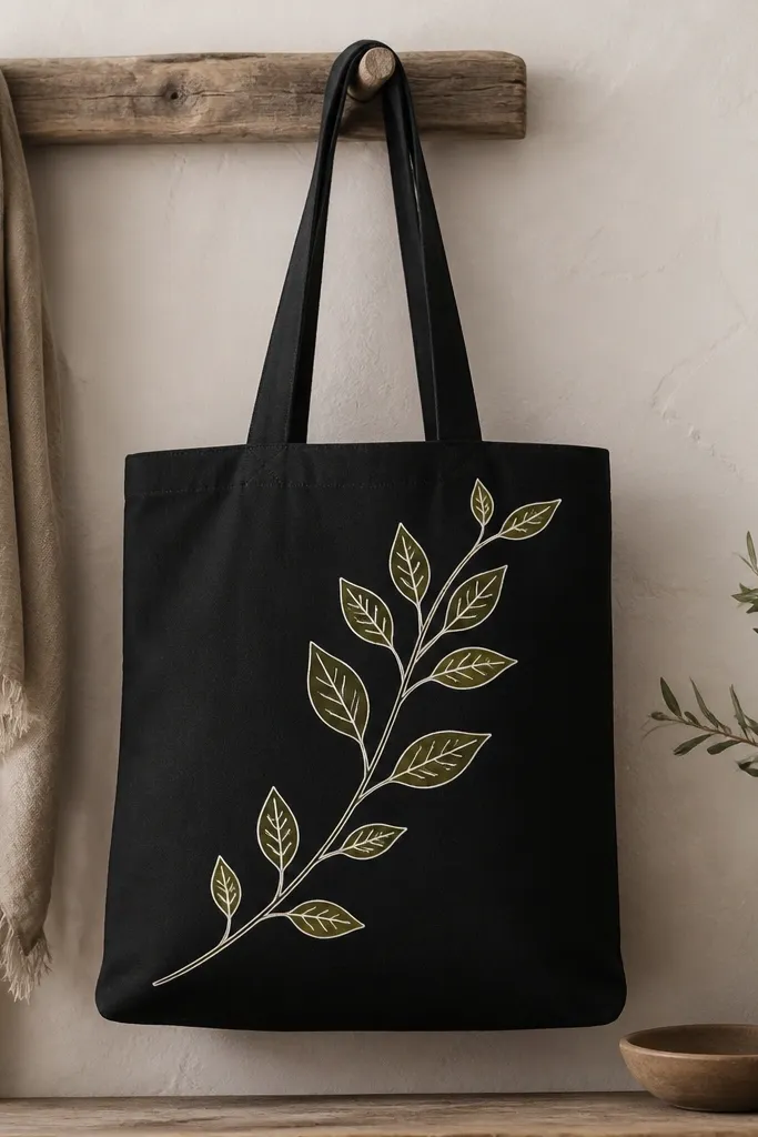
Botanical linework looks classy because it doesn't fight the tote shape. Off-white outlines keep it light, while olive green in small fills adds realism without turning it into a multicolor mess. The veins make it feel hand-drawn, even from a distance.
Paint the branch first as one continuous sweeping line. For leaves, use a small leaf stencil or freehand ovals, then outline in off-white. Fill only the upper half of each leaf with olive green so the other half stays black for depth.
Pro tipAdd 3 short vein lines on each leaf with a fine brush; it takes 2 extra minutes and changes the whole look.
AvoidDon't fill every leaf evenly; flat fills look sticker-like.
11. Monochrome Butterfly with Crystal-Effect White Specks
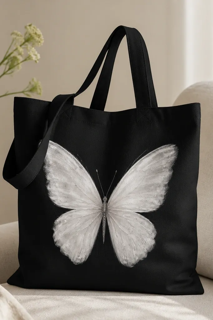
A butterfly reads instantly, and the crystal specks keep it from looking like a simple white silhouette. I shade the wings with gray so the white has dimension, then add specks with a stiff brush for a glitter-like effect without actual glitter. It looks magical but still clean.
Paint the wings in two steps: base white, then gray shading along the inner wing edges. Use a stiff toothbrush for specks; load a little white paint, then tap lightly so dots land randomly. Keep the body thin in gray to avoid a chunky center.
Pro tipPractice the speck density on a scrap tote panel so you don't end up with a snowstorm.
AvoidAvoid heavy glitter glue; it cracks and catches on items in your bag.
12. Night Sky Constellations in White + Silver Dots
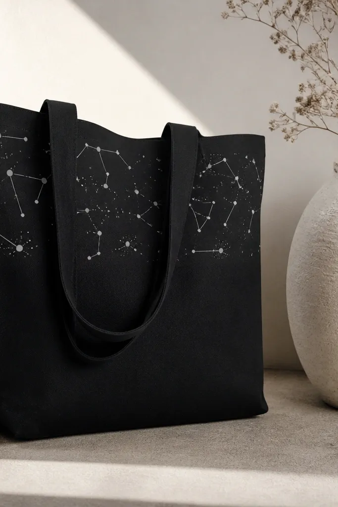
This design is all about controlling dot size and line thinness. White lines look clean, and silver dots add a subtle shimmer that catches light when you move. I map constellations like a real sky - not evenly spaced - so it feels believable.
Paint thin connecting lines with a liner brush using white fabric paint. Add dots in two sizes: 1-2 mm for most stars and a few slightly larger ones for anchor points. Use silver metallic paint for the brightest stars, then seal with fabric sealant when fully cured.
Pro tipKeep the densest area near the top; it makes the tote look intentional even when you only see part of it while walking.
AvoidSkip thick lines - they turn constellations into doodles.
13. Marbled Ink Look with White Acrylic and Rubbing Alcohol
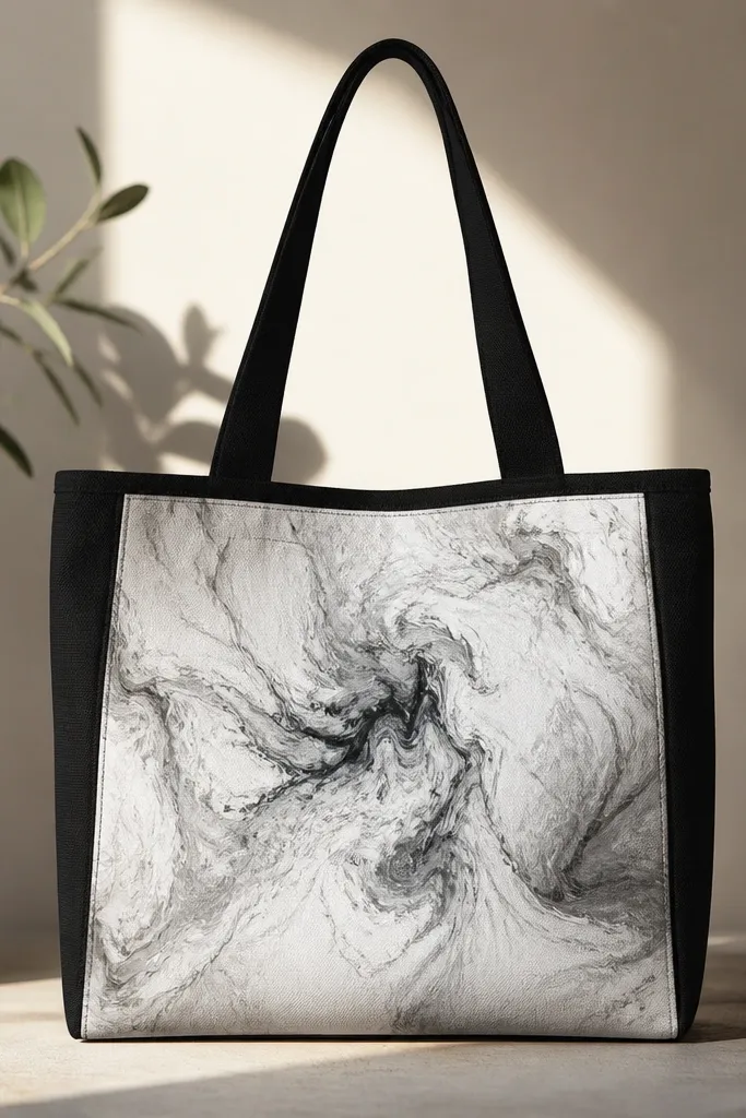
Marbling looks complex, but it's mostly about chemistry: alcohol breaks the surface tension and lets paint spread into natural curves. On black fabric, the white marbling shows up fast, and gray veins make it look layered instead of flat. I keep it to one panel so the tote doesn't become visually noisy.
Mix white acrylic with a tiny amount of fabric medium so it stays flexible. Lightly mist the fabric with rubbing alcohol, then drip or brush diluted paint onto the wet area. Tilt the tote to move the marbling, then stop when you like the pattern. When dry, you can add one more thin alcohol mist to reactivate edges.
Pro tipDo a test on a scrap tote or hidden corner first; alcohol amount changes how wild the spread gets.
AvoidDon't overwork the marbling after it starts setting; it turns into streaks.
14. Black-and-White Portrait Silhouette with Soft Edge
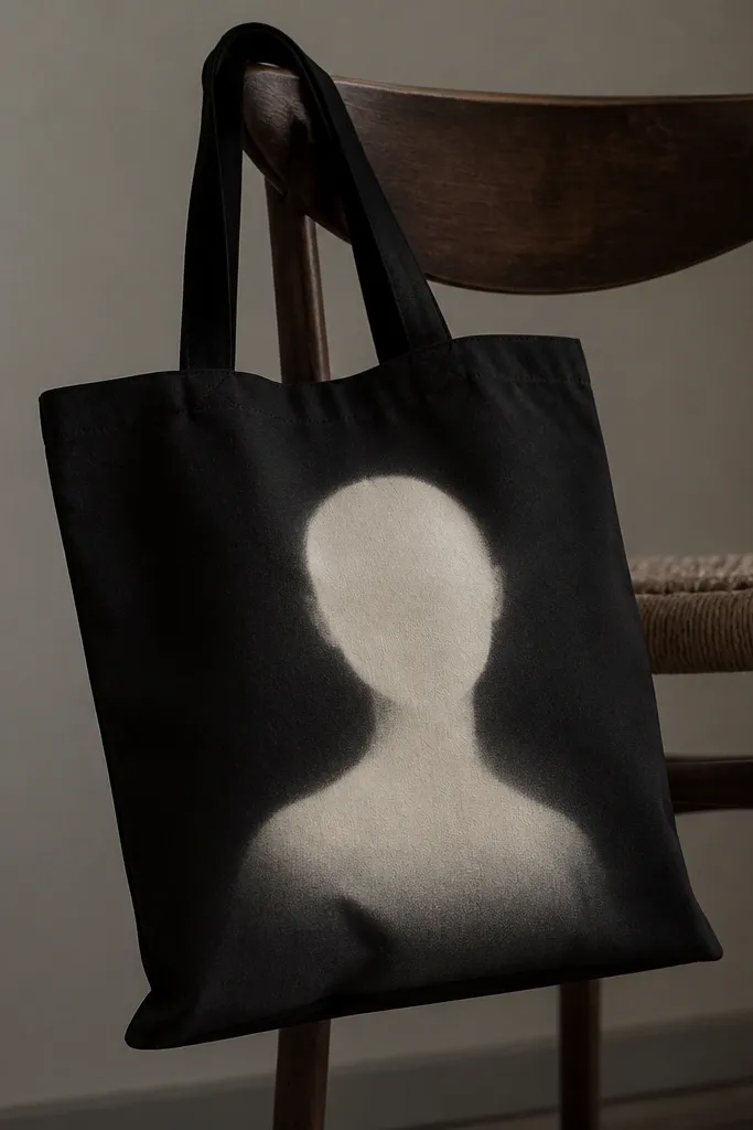
A silhouette can look striking because it uses shape instead of detail. Off-white gives warmth, and the soft edge makes it feel like a poster print rather than paint slapped on. I like adding one tiny highlight line at the neckline so it doesn't look flat.
Print a reference image, trace the silhouette shape onto transfer paper, then apply to the tote. Paint the silhouette with off-white in thin coats, then feather the outer edge with a damp sponge while paint is still workable. Add a narrow highlight stripe in cream at the bottom of the neck area.
Pro tipUse a sponge to feather, not a brush; sponges create a better fabric-friendly blur.
AvoidAvoid a hard outline around the silhouette; it makes the design look cut-out.
15. Checkerboard Border with White + Light Gray Blocks
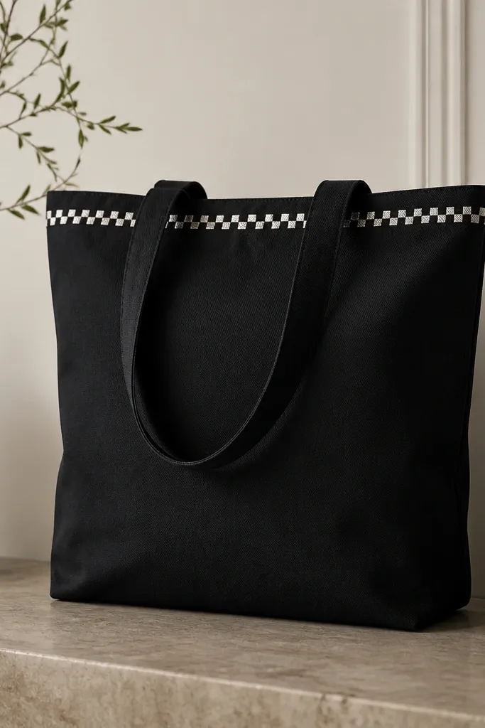
Borders look clean because they frame the tote without covering it all. Alternating white and light gray blocks keep the design from looking too stark, and the small square size makes it feel like fabric pattern rather than a painted trick. I keep the border narrow so it doesn't overwhelm the bag's shape.
Tape a straight line where the border sits and decide the square size - 1 cm squares look right on most tote fronts. Paint alternating squares in two thin coats, letting each dry before moving to the next color. If the tote weave is visible, do a second pass on only the edges of squares.
Pro tipUse a small dotting tool or the tip of a fine brush held straight down for square corners.
AvoidDon't make the squares too big; they look like kid crafts on a tote.


