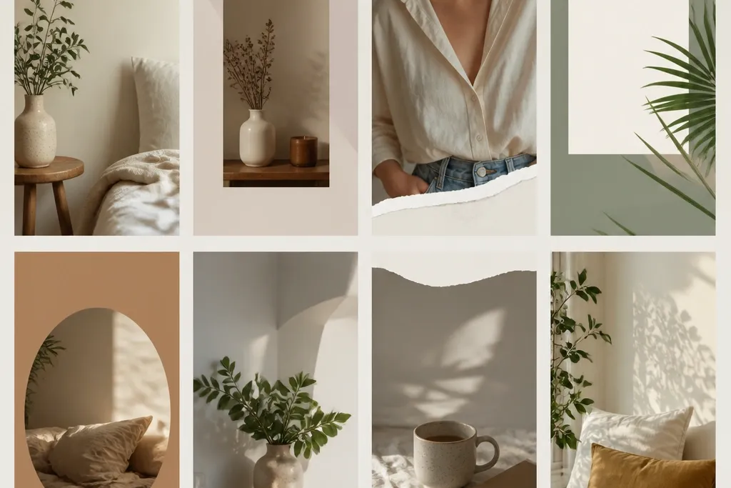
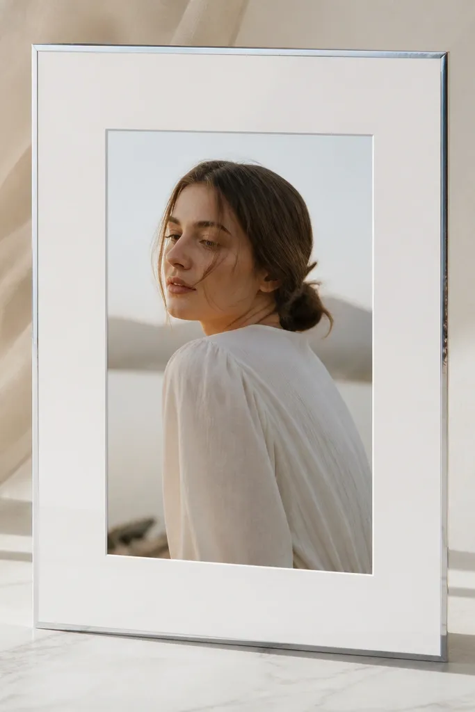
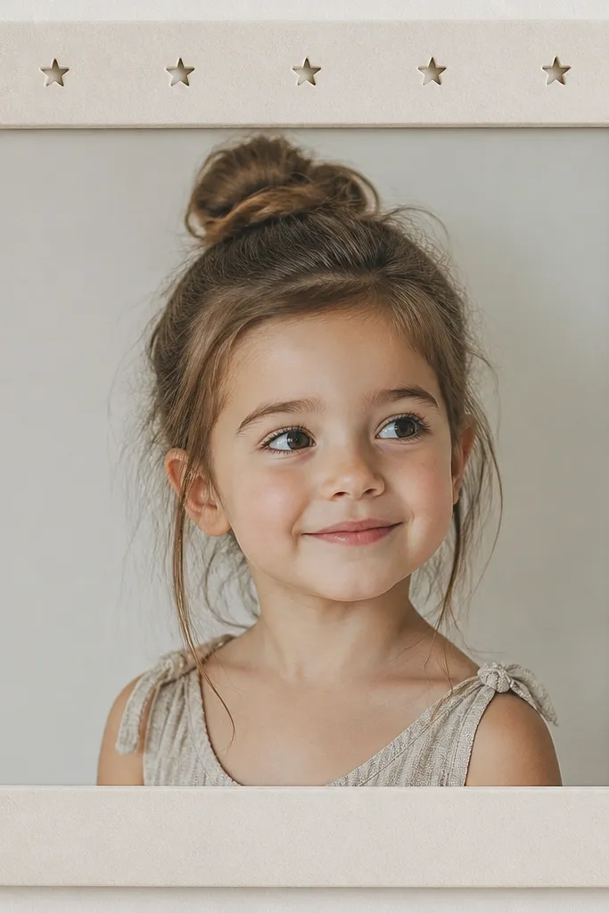
1. Matte Black Foam Window Frame
This is the frame I build when I want a story that looks like a magazine spread. The matte black foam board kills glare, and the photo window stays crisp because foam board edges don't fray. I pair it with a white photo backing so skin tones look warm and text pops.
Cut a 9x16 cm or scale up to 18x32 cm outer rectangle, then cut the inner window leaving a 10% margin from each side. Use 6-8 mm border thickness so it reads on camera. Seal the black foam with a matte spray or cover it with matte laminate film to stop scuffing.
Pro tipIf you plan to add a date or handle, place it on a plain white strip at the bottom of the photo window, not on the border.
AvoidAvoid glossy black - it reflects your room lights and looks patchy in stories.
2. Blush Pink Paper Stack Border
Layered paper gives you dimension without bulky foam. Blush pink makes photos feel softer and works great for self-care, birthdays, and wedding guest snapshots. The "stack" border looks intentional when you keep the layer count consistent all the way around.
Cut four long strips of blush paper and stack them to make a 3-4 mm border. Glue with PVA and press under a book for 30 minutes. Round the outer corners with a 6-8 mm radius so the frame looks friendly instead of boxy.
Pro tipUse a white backing behind the photo so the blush border doesn't tint the image.
AvoidSkip cheap craft glue that warps - warped edges show up fast on camera.
3. Chrome Tape Edge Frame
Chrome tape makes the border look like real hardware. It's the easiest way to get a "product shot" vibe without buying metallic paint. The key is keeping the tape line straight and using a matte photo backing so the shine doesn't overpower everything.
Start with a white foam board base. Cut the inner window with a clean blade, then apply chrome tape only on the border edges, not over the window. Keep the border width around 5-7 mm so the tape line stays crisp.
Pro tipBurnish the tape with a plastic card so the adhesive grabs and the edge looks sealed.
AvoidDon't cover the whole board in chrome - it looks like foil stickers and gets busy.
4. Salted Stone Wash Frame
Textured borders hide tiny cuts and make the frame feel tactile. This one looks great for travel photos because the gray background calms bright skies. The thin white line inside adds structure so the photo window feels intentional.
Use a gray craft paper or faux concrete contact paper for the border. Add a 1-2 mm white mat line by cutting a narrow strip and gluing it inside the window opening. Keep the main border 8-10 mm so texture shows without looking messy.
Pro tipLightly sand the border edges after cutting so it doesn't look sharply manufactured.
AvoidAvoid heavy paint drips - they read as mistakes, not texture.
5. Pastel Ombre Corner Frame

This frame uses restraint. Ombre only in the corners keeps attention on the photo while still giving a styled border. Pastels (mint, lilac, peach) look especially good with soft portraits and latte-colored backgrounds.
Make a foam board base and cut a centered window. Mask the center area, then airbrush or sponge paint only the four corners using three diluted paint tones. Use a 10-12 mm corner "block" so the gradient is visible but not distracting.
Pro tipFinish with a matte clear coat so the paint doesn't look patchy under phone light.
AvoidSkip full-border ombre - it makes the whole story look flat and over-designed.
6. Neon Underline Frame

The underline trick makes the layout feel energetic without covering your photo. Neon green or electric blue reads super crisp on camera, especially against black or dark gray borders. It also gives you a natural spot for short text.
Use black foam board and keep the border 6-8 mm. Add a 2-3 mm neon vinyl strip under the photo window only. For the top corners, cut two tiny neon squares (about 8-10 mm each) and place them slightly inset.
Pro tipPut your handle or date right above the neon underline, centered, in a bold font.
AvoidDon't use neon on a light border - it looks like highlighter smears.
7. Polaroid-Like Bottom Mat Frame
This one borrows the Polaroid feel but keeps it compact for stories. The extra bottom mat gives room for a short caption without crowding the photo. It works great for food photos and outfit checks where you want a tiny note.
Cut a 9:16 outer frame and a centered photo window with a border that's 6-7 mm on top and sides. Leave the bottom mat wider by extending the inner cut so the bottom area is about 15% of the frame height. Use off-white cardstock for the mat so it looks like classic paper.
Pro tipAdd a subtle shadow line around the photo window using a gray pencil so it looks layered.
AvoidAvoid the same width mat on all sides - it stops reading as a Polaroid-style layout.
8. Washi Tape Scrap Frame
Washi tape turns a boring frame into something playful fast. I like it for travel updates, friend pics, and "day in my life" stories because it looks handmade without needing perfect edges. Keep patterns small so the border doesn't compete with the photo.
Mount your photo on a white cardstock base. Apply washi tape strips along the border edges in short segments, leaving 1-2 mm gaps for texture. Use a 4-6 mm border width so it stays compact and doesn't look like a scrapbook page.
Pro tipUse one solid color washi on one side and patterned on the other three - it balances busy and calm.
AvoidAvoid mixing five patterns at once - your border becomes the loudest thing in the story.
9. Clear Acrylic Frame with Floating Photo
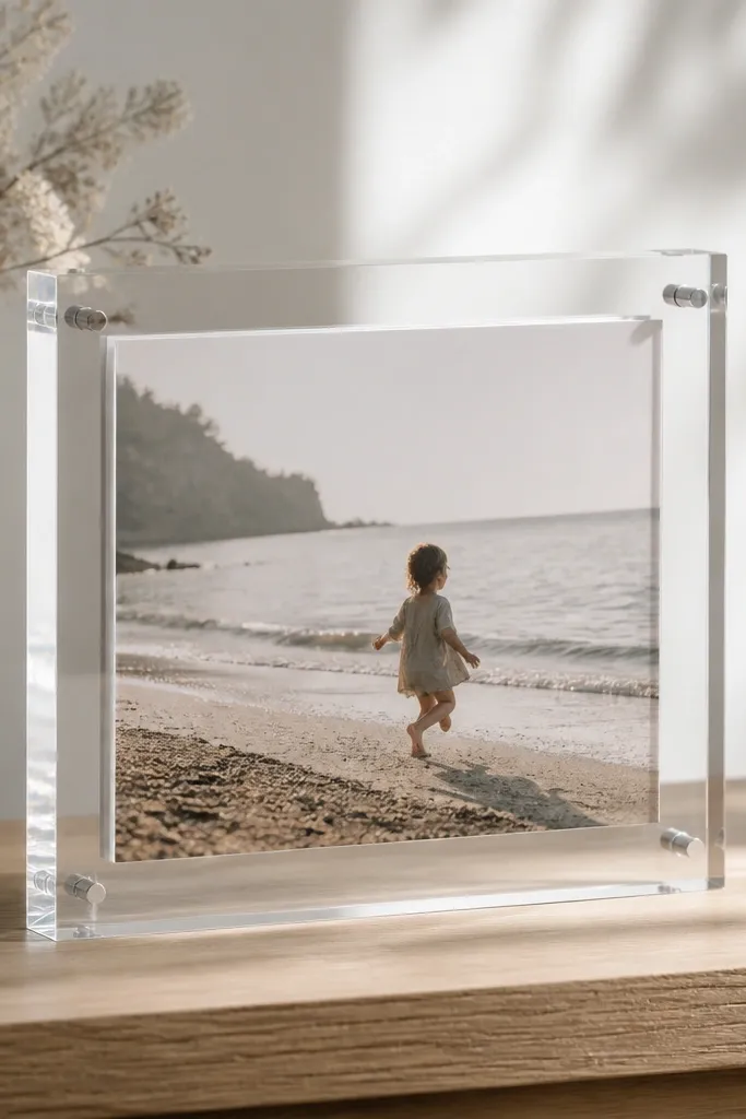
Floating photos look expensive because the light catches the layers. Acrylic is clean and modern, and the raised effect makes selfies look like they're in a display. Use this when you want a "gallery wall" feel in a small space.
Cut a backing board (black or white) with a centered window. Place photo print behind acrylic and use 1-2 mm clear plastic spacers at the corners. Use a border thickness around 3-5 mm so it stays compact.
Pro tipUse UV-resistant print paper so the colors don't shift after you hang it near windows.
AvoidDon't use cheap acrylic with scratches - the glare makes every flaw visible.
10. Double-Line Inner Mat Frame
Double lines make the frame look designed even when the materials are basic. It adds a "matting" effect that photographers love because it separates the photo from the background. This works with both bright and neutral photos.
Build from foam board. Cut the main outer frame and inner photo window, then add two thin strips (1 mm each) inside the opening in contrasting colors, like cream and charcoal. Keep the outer border 7-9 mm so the inner lines don't get lost.
Pro tipUse a ruler and hobby knife for the inner line strips - uneven lines scream DIY fast.
AvoidAvoid thick inner lines - they crowd the photo and reduce the clean look.
11. Braided Jute Twine Border
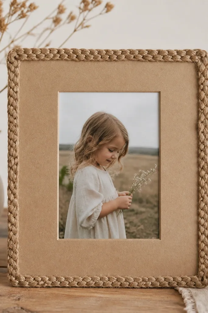
Jute border makes the story frame look like it belongs on a shelf, not just on a phone. It adds warmth and texture that pairs with outdoor photos and cozy interiors. The kraft backing keeps everything grounded.
Use kraft cardstock as the base and glue braided jute around the outer edge with a hot glue gun. Leave the photo window centered with a 10% margin. Keep the border thickness about 6-8 mm so it still reads as a "frame," not a decoration.
Pro tipTrim jute ends at a 45-degree angle so the join looks less obvious.
AvoidAvoid frayed twine - it looks messy, not handmade.
12. Color Block Frame with Side Stripe
A single side stripe adds graphic structure and makes portraits look taller. I like it for announcements, mini essays, and outfit posts because the stripe gives a "layout" feel without clutter. Choose one strong color like cobalt or terracotta and keep everything else plain.
Cut a foam board outer frame and inner photo window. Color one vertical strip on the left border area using vinyl or craft paint, about 12-15 mm wide. Keep the other borders neutral and match the stripe color to the photo's dominant tone.
Pro tipPlace text on the stripe side, not across the photo, so your words stay readable.
AvoidDon't put the stripe on a busy photo background - it blends in and looks accidental.
13. Tiny Star Cutout Border
Cutouts add a playful shadow effect that shows up even in low light. Stars look great for birthdays, graduations, and celebration photos, but the spacing keeps it classy. The border still reads as a frame because the inner window stays clean.
Use black cardstock or foam board. Cut a 9:16 outer frame, then cut the photo window. Add star cutouts along the border edge using a small craft die, spacing about 15-20 mm apart. Seal with matte spray to prevent paper dust.
Pro tipBack the cutout area with vellum so the stars glow softly in photos.
AvoidSkip huge cutouts - big shapes make the border look like it's falling apart.
14. Fabric Ribbon Frame with Satin Edge
Fabric borders look warm and expensive when you keep the edges tight. Satin ribbon on the outside edge catches light and gives the frame a polished finish. This is my go-to for wedding guest photos and baby announcements.
Wrap a thin foam board border with cotton fabric (choose a light color like ivory or dusty rose). Add a satin ribbon strip around the outer edge, 6-8 mm wide, and glue it flat. Leave the inner photo window untouched so the photo stays crisp.
Pro tipPress the fabric wrap under a heavy book for an hour so it lays flat.
AvoidAvoid stretchy fabric - it ripples and shows through the glue.
15. Vintage Brass Label Frame
A label strip makes the story frame feel like a keepsake card. Brass tones add a warm contrast against cool photo colors, and the bottom placement keeps it out of the way of faces. It also gives you a consistent spot for dates or locations.
Use a neutral border like cream cardstock. Add a brass foil label strip at the bottom of the inner mat, about 25-30% of the width and 12-15% of the frame height. Print or hand-letter the text on sticker paper, then seal it with a clear matte top coat.
Pro tipUse a fine-tip white gel pen for small text on brass so it stays readable.
AvoidAvoid tiny blurry text - it looks like stickers instead of a label.
16. Monochrome Grid Frame Template
Grid borders make photos feel organized and modern. Keep it monochrome so the frame supports the image instead of competing with it. I use this for fitness progress pics and desk shots where straight lines look right.
Create the border from light gray paper. Add a grid pattern using a ruler and a 0.5 mm marker, spacing 10 mm. Keep the photo window centered and leave the grid only in the outer border area, 7-9 mm wide.
Pro tipUse a ruler every time - even slightly crooked grids read "cheap."
AvoidSkip multicolor grids - they turn into a distraction fast.
17. Watercolor Wash Border
Watercolor borders look soft and personal, especially for portraits and cozy interior pics. The secret is leaving the photo window untouched and keeping the wash only in the border zone. That way the border feels artistic, not messy.
Use thick white cardstock. Mask the photo window with painter's tape, then paint a thin watercolor wash on the border area only. Aim for a border thickness of 8-10 mm so the color shows but stays controlled. Let it dry fully before removing tape.
Pro tipUse two paint strengths - one light wash and one slightly darker edge - to create depth.
AvoidAvoid painting over the window edge - it blurs and looks sloppy.
18. Shadowbox Photo Frame with Back Pocket
A shadow gap makes the photo feel "framed" instead of pasted. This also helps hide slight print misalignment because the recess covers tiny unevenness. It looks great on desks and shelves since the layers catch light from the side.
Use foam board and cut a recessed pocket by removing a rectangle around the photo area on the back layer. The front layer gets a window opening with a 10% margin. Build a 6-8 mm border and keep the recess depth around 3-4 mm for a clear shadow line.
Pro tipUse double-sided foam tape for the corners only so the photo sits flat without bubbles.
AvoidAvoid full-surface glue - it warps thin prints and creates ripples.
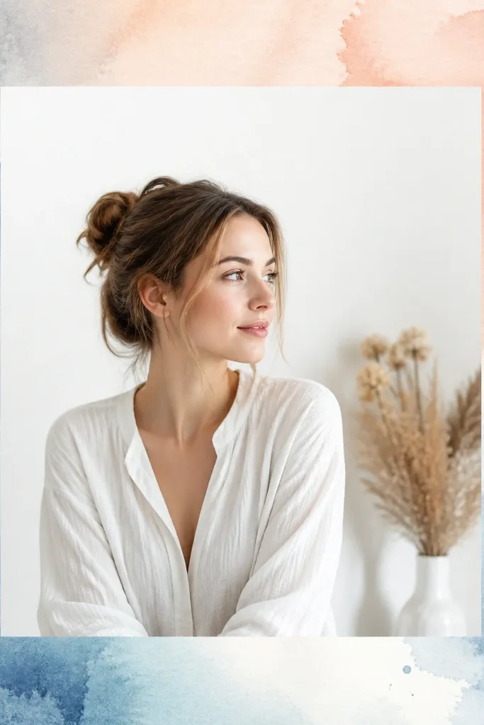
19. Matte White Border with Tiny Dots
Tiny dot patterns feel calm and add texture without stealing attention. Matte white keeps it clean for small spaces, and gray dots add just enough detail for close-up phone shots. This frame works for everyday updates and minimal aesthetics.
Use matte white cardstock or foam board. Add dot pattern with a small dotting tool or stencil, spacing about 6-8 mm apart, confined to the border area only. Keep border width around 6-7 mm so the dots are visible but still subtle.
Pro tipMake one side slightly denser with dots for a directional look that pulls the eye inward.
AvoidAvoid big random dots - they look like fingerprints.
20. Terracotta Tape Corner Frame
Corner-only borders keep your story feeling airy, which matters when you're working with small prints. Terracotta warms up skin tones and makes outdoor photos look sun-kissed. The corners act like a visual "bracket" so the layout feels intentional.
Use a simple white foam board base. Cut the photo window with a 10% margin. Apply terracotta tape only at the corners, each corner block about 18-22 mm wide, and leave the sides bare for a clean look. Seal if you're using paper tape so it doesn't lift.
Pro tipIf you add text, place it near the bottom center and keep it short - the open sides help readability.
AvoidAvoid full border terracotta - it overwhelms small photos.


