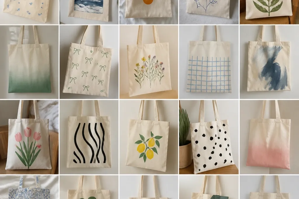
1. Sunset wave with 3 paint bands
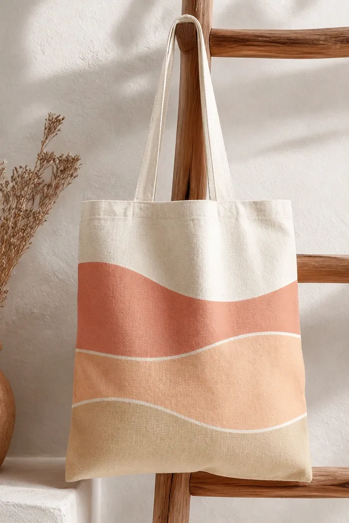
This look works because the design is simple but the edges are crisp. Use three opaque colors laid in wide bands so the tote fabric texture doesn't show through. The thin white wave line makes it look intentional, like a print, not a brushed accident. It also photographs well because the color blocks catch light without fine detail.
Sketch one large wave across the tote width using chalk pencil. Mask the wave areas with painter's tape, then paint each band with a flat brush. Let each band dry before removing tape so you get sharp boundaries; aim for about 2.5 to 3 inches per band.
Pro tipDraw the wave line first on paper, then flip it under the tote and trace lightly so the curve matches across both sides.
AvoidDon't water down acrylic - it seeps into the weave and dulls the sunset colors.
2. Black cat silhouette with neon collar
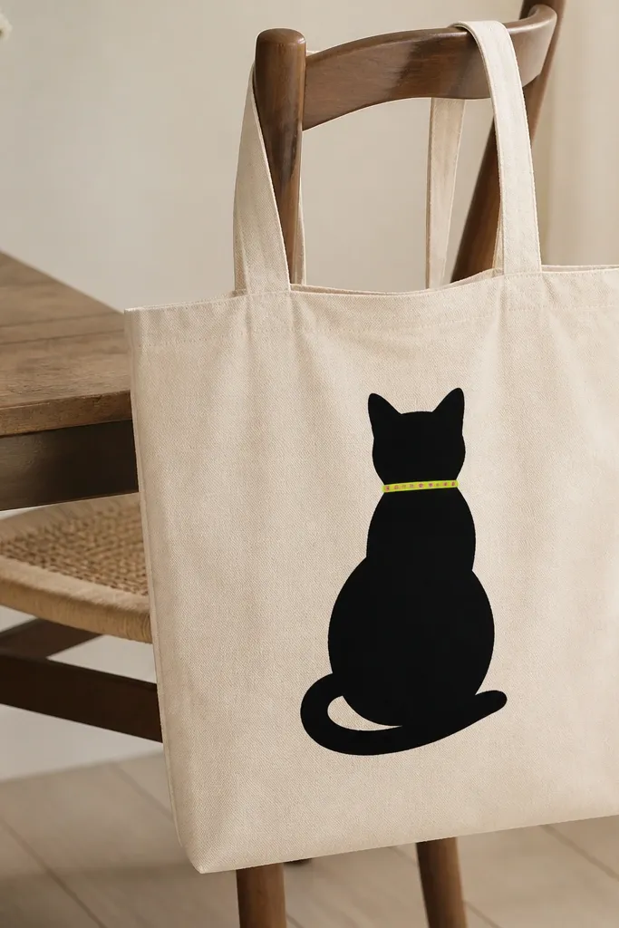
A solid silhouette hides fabric texture and gives that graphic, poster-like vibe. The neon collar adds the "aesthetic pop" without requiring tiny fur details. I like matte black paint because it looks like screen print. The collar ring gives a focal point that still holds up if your outline isn't perfect.
Use a stencil or trace a cat clipart silhouette onto painter's tape. Paint the cat with matte black fabric acrylic, then outline the collar ring with neon green. Add 3 to 5 dot accents using a fine paint pen in hot pink.
Pro tipIf your tote is off-white, this contrast looks best; I've done it on cream canvas and it still pops.
AvoidDon't paint the cat with glossy craft paint - it reflects light and looks messier.
3. Botanical sprig with one-line stems
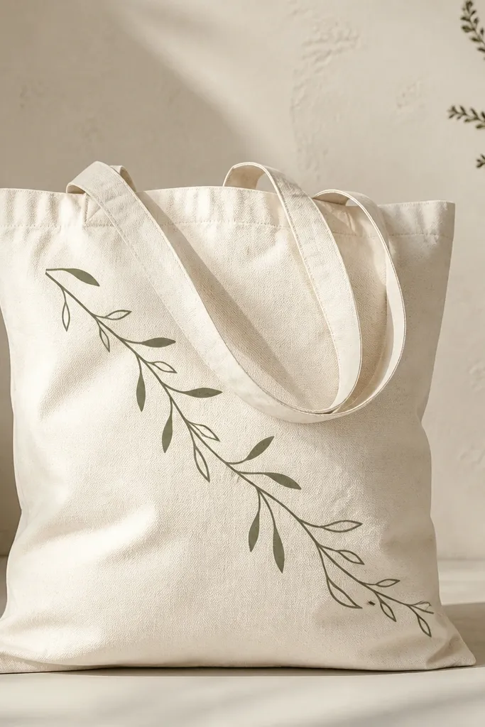
One-line botanicals look delicate but they're forgiving. Negative space keeps it airy, and the repeated leaf shape gives rhythm. Sage green on natural canvas reads soft and modern, especially when you keep the line weight consistent. This also works for beginners because you're not filling complicated areas.
Mix sage green acrylic with fabric medium. Use a liner brush (size 2/0 or 1/0) to draw one long stem and add leaf shapes as teardrops. Leave the background open - no extra shading - so the tote stays light.
Pro tipPractice the leaf stroke on scrap fabric first so both sides of each leaf match.
AvoidSkip tiny vein details - they smear on tote fabric after flexing.
4. Tie-dye look using sponge circles
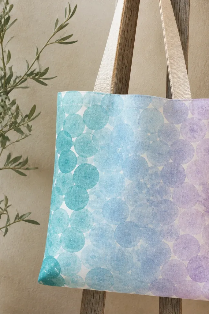
Sponge circles mimic tie-dye without the mess of actual dye. The circle edges create a handmade texture that looks intentional. Teal and sky blue blend nicely on cotton, and lavender gives depth without turning muddy. You get a full-bag statement without needing to paint fine shapes.
Lightly dampen a sea sponge and load it with teal paint mixed with fabric medium. Stamp circles across the tote in a loose grid, then layer sky blue on top where you want smoother transitions. Finish with lavender stamps near the corners for a frame effect.
Pro tipUse a different corner of the sponge for each color so you don't mix them into gray.
AvoidDon't overwork the blend - too many passes make the circles look cloudy.
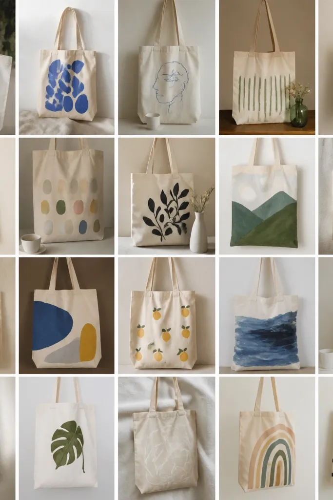
5. Portrait outline of a dancer in white
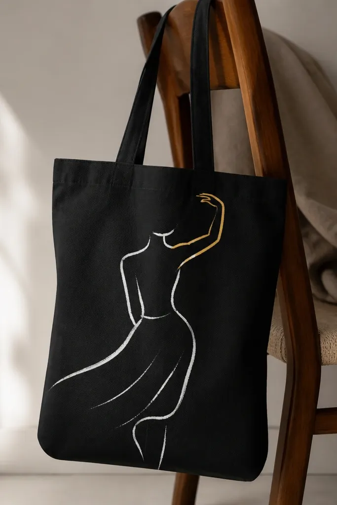
A single-color outline reads as art even when your tote fabric texture shows through. White paint on a darker tote (navy or charcoal) looks crisp and graphic. The thin gold line on the arm gives a "gallery poster" feel without lots of shading. This style also hides small hand tremors because the whole design is line-based.
Choose a tote in navy or charcoal for the best contrast. Sketch the dancer using chalk, then go over with a fabric paint pen in bright white. Add one gold accent line using metallic fabric paint; keep it under 1/4 inch wide.
Pro tipLet the white dry fully before adding metallic - metallic paint can lift white paint if you work too soon.
AvoidDon't add heavy shadows - they turn into streaks on tote weave.
6. Polka dots with a gradient stripe
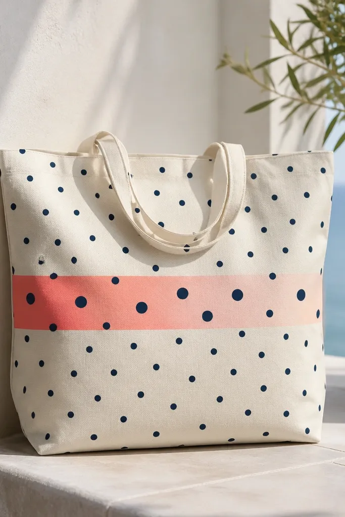
Polka dots look clean when spacing is consistent, and the gradient stripe makes it feel modern. Navy and coral/blush is a reliable combo that reads cheerful without being childish. The slight size change on the dots near the stripe adds movement. It's also easy to scale up on any tote size.
Use a dot stencil or make a DIY one from a plastic lid with holes punched. Paint dots in navy first, then mask a 3-inch stripe in the center and blend coral into blush with a damp sponge. Remove tape while paint is tacky so edges stay soft but defined.
Pro tipUse a ruler and painter's tape to mark dot rows - it keeps the dots from drifting.
AvoidAvoid random dot sizes across the whole bag - it reads messy fast.
7. Geometric triangles in muted earth tones
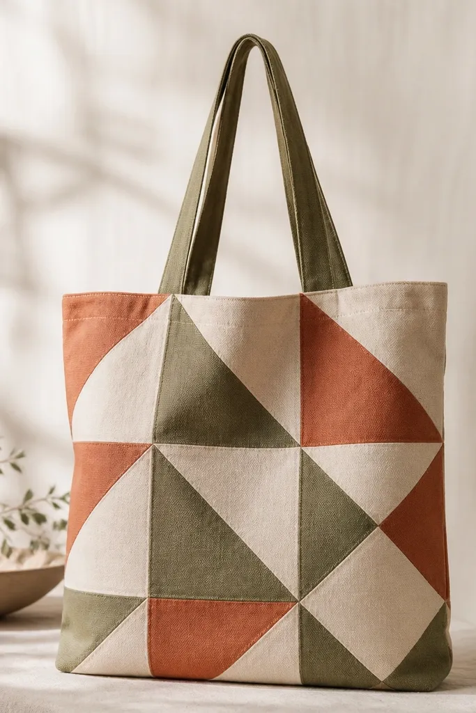
Geometric shapes look expensive when edges are clean and the palette is limited. Earth tones on natural canvas feel grounded and aesthetic. The diagonal arrangement keeps it dynamic, and the cream triangles act like breathing room. Tape-cut shapes hide uneven brush strokes because the tape defines the boundaries.
Create a triangle template from cardboard. Trace triangles onto painter's tape laid on the tote, then paint each color in separate passes. Keep triangle sizes around 2.5-3 inches so the pattern doesn't get crowded.
Pro tipPaint one color at a time and remove tape immediately after that color dries to the touch.
AvoidDon't use too many colors - you'll lose the clean geometric look.
8. Wavy rainbow with thick outlines
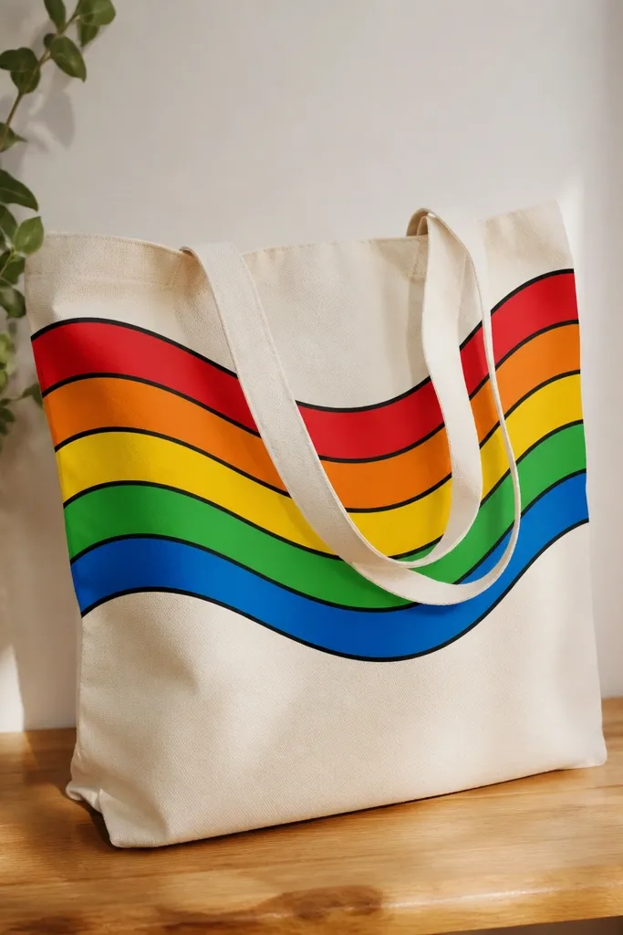
Thick outlines keep the rainbow from looking washed out on textured fabric. The wavy shape makes it playful while the black border makes it graphic. I like using fabric markers for the outline because they stay opaque and don't bleed as much as thin brush paint. This looks great on plain white totes.
Draw 5 parallel wavy lines with chalk pencil. Paint each band with acrylic mixed with fabric medium, then go over edges with a black fabric paint pen. Keep bands about 1 inch tall and leave a small gap between them so the lines read.
Pro tipDo the outline after all colors dry, not before - it prevents smudging.
AvoidDon't blend colors directly on the tote - you'll get muddy transitions.
9. Single word in stacked block letters
Typography looks aesthetic when it's big and has a shadow offset. Stacked block letters give depth even without fancy shading. Off-white on a colored tote looks modern, and the thin gray shadow keeps the letters readable. I've done this with quotes and it always works because the layout is simple.
Pick one short word (3-5 letters) and sketch it centered. Paint the main letters first, then add a shadow by shifting the same letter shape 1/8 to 1/4 inch down/right. Use a small angled brush to keep corners sharp.
Pro tipUse painter's tape as a guide for straight letter edges if your hand shakes.
AvoidSkip cursive - it smears on tote fabric and looks less clean.
10. Butterfly wings with salt texture
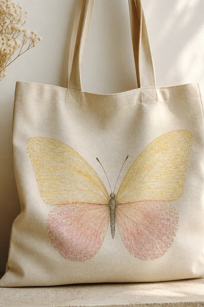
Salt texture gives a lacey, speckled finish that looks like wing patterning. You get dimension without trying to paint individual lines. Pale yellow and light pink stay airy, and the speckles make the wings look detailed. This one always draws compliments because it looks "printed" even though it's handmade.
Sketch a butterfly with a pencil and tape off the body line. Paint wings with semi-wet paint mixed with fabric medium, then sprinkle coarse salt while the paint is still wet. After it dries, brush salt off and paint a thin outline around the edges.
Pro tipUse coarse salt (kosher) not fine table salt - coarse gives bigger speckles.
AvoidDon't over-salt - too much texture turns the wings grainy.
11. Milk carton style stripes and brand mark
This look borrows from retro packaging. Vertical stripes make the tote look taller and cleaner, and the small label adds a human, imperfect vibe. Teal and white feels fresh, and the label keeps the composition from looking blank. It's also cheap because you're mostly painting bands and one small block.
Mask vertical stripes using painter's tape, aiming for 1/2 to 3/4 inch widths. Paint teal in two thin coats. For the label, paint a small cream rectangle, then add a border with a fine brush and dots.
Pro tipPress tape edges firmly with your fingernail so paint doesn't creep under.
AvoidDon't do one thick coat - it bleeds at tape edges.
12. Marble effect with oil-slick colors
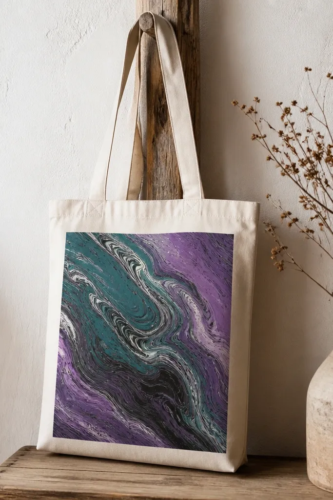
Marble effects look high-end because the pattern is random. The key is thin paint and controlled dragging so you get veins instead of blobs. Teal and purple over black give that oil-slick look, and a few white streaks make it feel like marble. This design works best as a single panel, not full coverage.
Mix black acrylic with fabric medium and paint a base rectangle. Drop small dots of teal and purple paint on top while it's wet. Drag a toothpick through the paint in short lines, then add a few white streaks for veins.
Pro tipUse a paper towel to wipe your toothpick between colors so you don't turn everything into one dark smear.
AvoidDon't let the base dry - marble dragging only works on wet paint.
13. Stars and moon in navy with gold accents
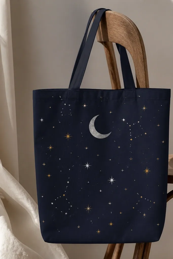
Night-sky designs look aesthetic because they're repeatable and the shapes are simple. Gold accents make the whole thing feel intentional, especially on a dark tote. The gray moon is softer than pure white, so it doesn't look harsh. Star dots are easy to place, and the negative space keeps the bag from looking busy.
Paint the crescent moon with a round sponge or a small brush, then add a thin gold outline with metallic fabric paint. For stars, use a toothbrush to flick white paint and gold paint, then use a fine brush to place 6-10 "important" stars bigger.
Pro tipCover the tote bottom with cardboard before splatter so you don't get stray dots inside.
AvoidAvoid heavy star flicking - it makes the tote look messy instead of dreamy.
14. Portrait frame border with single flower
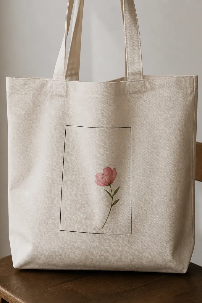
Frames make simple art look curated because they control the eye. A single flower inside keeps it light and modern. Thin black lines are the secret - they look like ink and don't cover the tote texture too much. This is one of my go-to cheap tote bag painting ideas when I want "clean" more than "busy."
Use painter's tape to make a rectangle border about 1.5 inches from the tote edges. Paint the border black, remove tape while paint is still tacky. Add one flower with a small round brush: 5 petals in pink, center dot in yellow, stem in green.
Pro tipKeep the flower small - about palm-width - so the frame stays the main feature.
AvoidDon't use thick marker lines for the frame - they swallow the tote look.
15. Checkerboard corner pattern
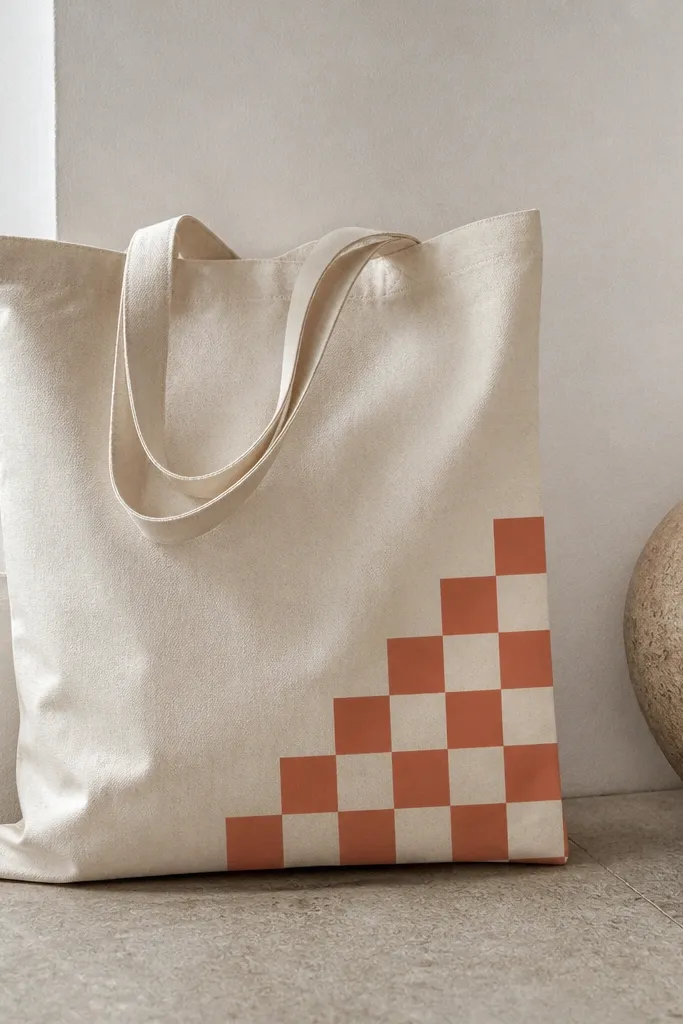
Corner-only patterns look stylish because they don't cover the whole bag. Checkerboards feel graphic and modern, especially with two muted colors. Terracotta and cream keep it warm and not neon. The straight edge makes it look designed, like a patch.
Mask a triangle or square corner area with painter's tape. Paint alternating squares in a grid, using about 1 inch squares. Let each coat dry so the tape edges stay crisp when you remove it.
Pro tipUse a ruler to mark your grid lightly in pencil so you don't drift.
AvoidDon't freehand the grid - wonky squares make it look like a kid's craft.
16. Galaxy swirl using sponge + fan brush
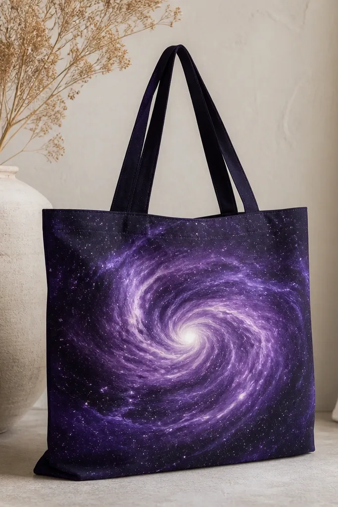
Galaxy art works because the tote fabric texture blends with the sponge work. A swirl gives motion without needing a full space scene. Use deep purple instead of pure black so the galaxy still shows color. The sparse star dots keep it from looking like random speckling.
Paint a circular base in deep purple, then add black around the edges. Dab lavender with a sponge in spiral arcs. Add stars by tapping a fan brush with white paint; place fewer dots near the center and more near the outer edge.
Pro tipUse a cotton rag to gently rub edges while paint is damp for smoother swirls.
AvoidDon't flood the tote with paint - it makes the fabric stiff and uneven.
17. Fruit slices with translucent look
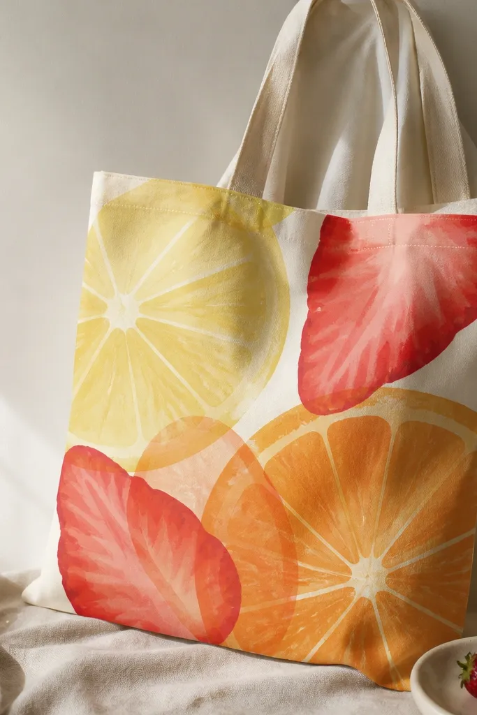
Fruit slices look aesthetic because they're graphic but still juicy. The translucent look comes from layering thin paint instead of one thick coat. You get highlight lines that make the slices feel like stickers. This design is great if you want something colorful but not loud.
Use a stencil for lemon and strawberry shapes or trace from a printed template. Mix each color with fabric medium and paint in two thin layers. Add a lighter highlight stripe on each slice with a small liner brush after the first layer dries.
Pro tipLet each layer dry 10-15 minutes before the next so the translucent layers don't muddy.
AvoidDon't mix too many colors on the palette - it turns fruit slices into brown.
18. Monogram inside a painted circle
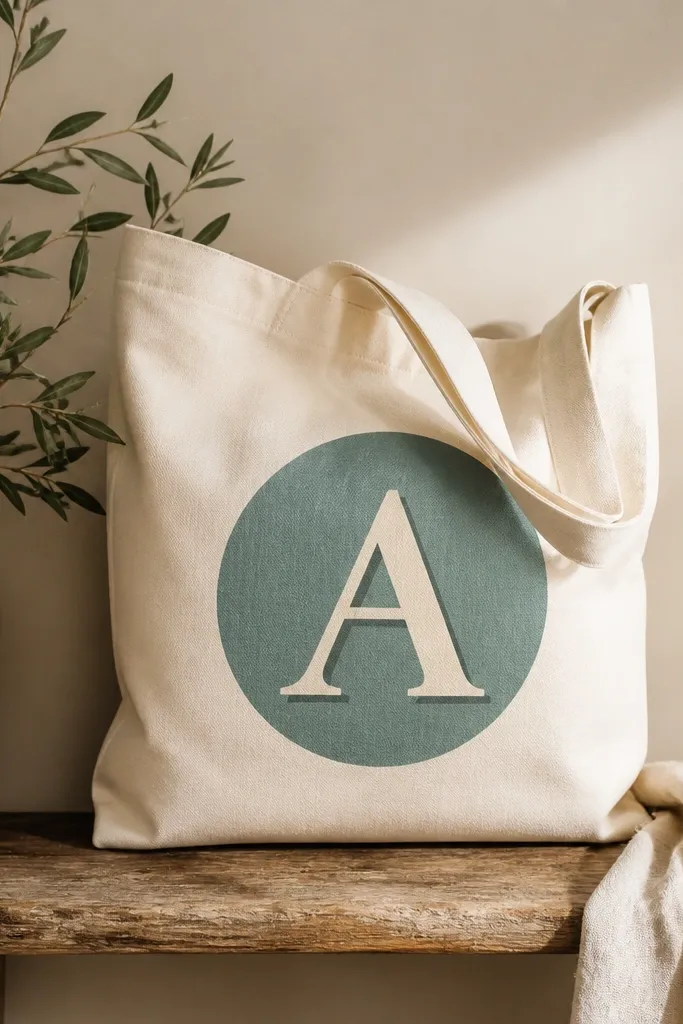
Monograms look polished when you keep everything proportional. The circle acts like a badge, and the shadow makes the letter feel raised. Muted teal is flattering on natural canvas and doesn't scream. This is one of the easiest cheap tote bag painting ideas to repeat for gifts because you only change one letter.
Trace a circle using a bowl or measuring cup, then paint it teal. Let dry, then paint the monogram in cream. Add a shadow offset by lightly painting behind the letter in a darker teal using a small angled brush.
Pro tipCenter the circle using measuring tape: mark tote width mid-point, then place circle so it sits slightly above the bottom seam.
AvoidAvoid tiny letters - small monograms get lost on tote fabric.
19. Line-art mountains with mist fade
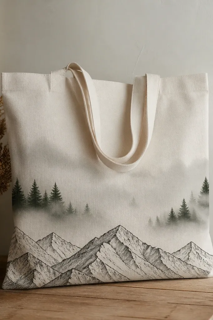
Mountains give instant outdoors vibes, and line-art stays clean even on uneven fabric. The mist fade makes it feel atmospheric without complex shading. Black lines anchor the scene, while the gray fade keeps it soft and modern. I like this on light canvas because the mist looks airy.
Paint mountains with a liner brush in black - simple triangles and one peak ridge line. Create mist by dabbing diluted gray paint with a sponge upward in layers. Add 3-5 pine tree silhouettes near the base using a small brush and a steady hand.
Pro tipKeep the mist fade lighter near the top so it doesn't darken into a solid block.
AvoidDon't outline the mist - it should fade, not look like a second border.


