1. Cream Polaroid Stack with Tiny Gold Dots
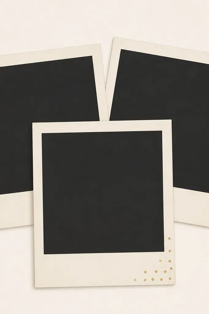
This one mimics the "I styled my desk for a shoot" look without needing real polaroids. The cream border flatters skin tones and makes your photo feel warmer, especially if you shoot with daylight. The tiny gold dots add sparkle without turning into glitter mess. It works because the overlap creates natural depth, so your camera focuses on the image area instead of the border.
Print the template on 200-250 gsm cardstock for stiffness. Cut each polaroid rectangle cleanly, leaving a 1-2 cm border around the photo window. If you want it extra sturdy, glue the finished cutout to a thin cereal-box layer, then trim flush.
Pro tipShoot with your camera slightly above the frame and tilt it 5-10 degrees - the faux stack looks more real.
AvoidDon't print on thin printer paper - the polaroid edges bend and the dots blur.
2. Black Frame with Soft Beige Paper Grain
If your photos look washed out, this template fixes it by adding strong contrast. The beige grain keeps it from looking like a sterile border, and the black frame makes your subject pop. I've used it with plain white curtains and it still looks intentional. The trick is that the grain is quiet - it reads as texture, not noise.
Print on thick paper and keep the border width at least 2 cm so it stays visible on camera. Use a craft knife and metal ruler for straight edges. For best results, place the frame on a neutral surface and shoot from directly in front to avoid perspective distortion.
Pro tipAdd one light source from the side (even a desk lamp) so the paper grain catches just enough shadow.
AvoidSkip frames with thin hairline borders - they disappear when your phone auto-exposes.
3. Pastel Gelato Borders with Rounded Corners
This is the "sweet but clean" style. The rounded corners read friendly and the pastel gradient looks like colored glass without needing actual acrylic. It works best for food, nail photos, and cute product shots where you want a soft mood. The gradient border also helps hide small exposure changes because the color shifts cover minor lighting issues.
Print at 1080x1350 portrait proportions and trim the frame so the corners stay perfectly round. Use a foam sheet backing (2-3 mm) so the gradient border doesn't flatten and reflect glare. If you're photographing outdoors, avoid direct sun - it turns pastel into chalk.
Pro tipPair with a plain countertop and a single prop color (mint towel or pale pink plate) to keep the frame from competing.
AvoidDon't use this with busy patterned backgrounds - the gradient will clash.
4. French Café Typography Frame in Espresso Brown
Typography frames make photos feel styled even when the picture is simple. The espresso brown reads warm and grounded, which helps if your photo has cool tones. Tiny line details keep it from feeling empty. This template shines for street photos, coffee cups, and anything shot in a warm indoor light.
Print on off-white paper to keep the brown from looking harsh. Trim with a ruler and cut slightly inside the border so the typography doesn't get chopped. For mounting, use double-sided tape around the edges only - it keeps the center flat and reduces bubbles.
Pro tipUse a matte finish photo for the center (avoid glossy prints) so the typography stays the star.
AvoidAvoid overly small text - if the font is tiny, it smears on print and looks messy.
5. Sunset Ombre Frame with Faux Film Perforations

This is the one I reach for when I want travel photos to look like they came from a disposable camera. The ombre gives you that warm sky vibe, and the perforations add instant texture. It works because the border has movement - even if your photo is mostly neutral, the frame brings color. I've used it with beach sunsets and even indoor city lights at dusk.
Print in landscape for a stronger film feel, then crop your photo to match the center window. Keep the border width about 2.5 cm so the perforations are readable. Mount it on foam board so the perforation edges don't curl.
Pro tipShoot the frame with a slight angle and let the border cast a thin shadow on your background for depth.
AvoidDon't place it directly on reflective surfaces - the orange ombre can glare.
6. Minimal White Frame with One Sage Corner Cutout

This is for the "my photo is the main character" crowd. The white frame keeps attention on the subject, while the sage corner adds color without covering your image. It looks expensive because there's a lot of negative space. I use it for portraits, product shots on light backgrounds, and calm room photos.
Print on white cardstock and cut the inner photo window precisely so the border stays even. The sage corner should be cut out or layered - either way, keep it small (about 1/5 of the corner size) so it doesn't overpower. Tape it down only at the corners to keep it flat.
Pro tipUse a soft shadow background like light linen or a matte paper sheet so the frame edges look crisp.
AvoidSkip thick, colorful patterns - they destroy the minimal look.
7. Midnight Navy Frame with Starry Speckle Edges

This one makes nighttime photos look intentional without editing to death. The navy border adds mood, and the speckles mimic film grain and tiny lights. It works best with dark outfits, night street scenes, or any photo that already has contrast. The speckles are light enough to avoid looking like random glitter.
Print on matte cardstock so the speckles don't shine under flash. Cut the frame border evenly and mount it on a dark backing so the navy blends smoothly at the edges. If you're using it for Stories, keep the border around 1.5-2 cm so it stays visible on mobile.
Pro tipLight your subject from above or slightly behind the camera so the border doesn't get lost in shadows.
AvoidAvoid glossy paper - it turns speckles into glare spots.
8. Terracotta Tiles Border with Slightly Skewed Lines
This frame turns plain photos into something you'd want to pin. Terracotta reads warm and works great with ceramics, outdoor plants, and warm-toned portraits. The slight skew makes it feel imperfect and human, like it was printed at a small shop. Your photo center stays calm, while the border adds texture.
Print on textured paper if you can (even cheap "linen" stationery). Trim the border so the tile lines align with the photo edges; don't leave a lopsided margin. Mount on foam board and keep it slightly off the background using 1-2 mm spacers (folded tape strips).
Pro tipPair with a white or cream background so the terracotta doesn't fight the photo colors.
AvoidDon't use a bright neon photo center - terracotta + neon looks chaotic.
9. Soft Blush Frame with Hand-Lettered Heart Corners
Hearts in the corners look cute without covering your photo. The blush border gives a gentle tone that flatters both warm and cool skin, and it looks good on self-portraits. I've used it for Valentine-season posts, but it also works for baby pictures and sweet product shots. The corners are where the camera reads first, so the doodles add charm even when the rest is simple.
Print on heavier paper and keep the heart doodles intact by leaving extra border width on the corners (about 2.5 cm). Cut slowly around the curves so the hearts don't get jagged. Use double-sided tape along the back edges, not the center window, to avoid lifting.
Pro tipUse a matte finish photo (or matte filter) inside the frame so the blush border looks soft instead of shiny.
AvoidSkip glossy prints - hearts can look like stickers and cheapen the frame.
10. Green Botanical Border with Pressed Leaf Look
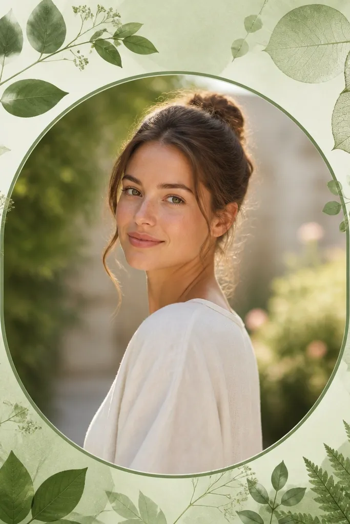
Pressed-leaf frames make your photos feel like they're part of a slow weekend. The green tones are earthy, and the leaf silhouettes add texture without stealing focus. I use this for plant close-ups, linen flat-lays, and outdoor portraits on greenery. The leaf effect works because it's low contrast and sits mostly in the border area.
Print on light kraft or warm white paper to match the botanical vibe. Cut the frame window with a sharp blade so the leaf silhouettes don't fray. Mount on a single piece of cardboard and keep the border flat - any curl makes the leaves look like cheap stickers.
Pro tipShoot with natural light from a window and place the frame on a neutral cloth to keep the greens looking calm.
AvoidDon't put this on a green background - the leaves disappear and the border looks unfinished.
11. Neon Outline Frame with Clear Center Window

Neon outlines look best when your photo has strong contrast. The thin cyan and pink lines create a "glow" effect even on paper, especially against dark clothing or a night scene. This frame is also great for gym shots, streetwear, and techy product photos. Keep the center image sharp so the neon border doesn't feel like a sticker overlay.
Print at high quality and cut the border carefully - the neon lines show every cut mistake. Mount on black paper or dark cardstock so the neon reads brighter. If you're shooting at night, turn off overhead lights and use one small lamp behind the frame for a rim glow.
Pro tipUse a phone exposure lock on the subject, then let the border be slightly brighter for that neon pop.
AvoidAvoid using neon frames on pale, low-contrast photos - it looks washed out.
12. Gold Foil Border Look on Matte Off-White
A gold outline makes cheap prints look intentional because it mimics the expensive part of real frames. The matte off-white keeps the gold from looking like a cheap sticker. I've used this with jewelry shots and perfume bottles - anything small that needs a little glam. The ornamental corners are small enough to read as detail, not clutter.
Print on off-white cardstock and set your printer to "best" or the highest quality mode. Cut the inner window so the gold line stays unbroken. For mounting, use thin foam board and keep the border flat - foil-style edges look bad when they curl.
Pro tipTake photos under warm light (2700K-3000K) so the gold reads golden, not green.
AvoidDon't use glossy photo paper for the frame - "foil" glare looks fake fast.
13. Checkerboard Frame with Micro Black Squares
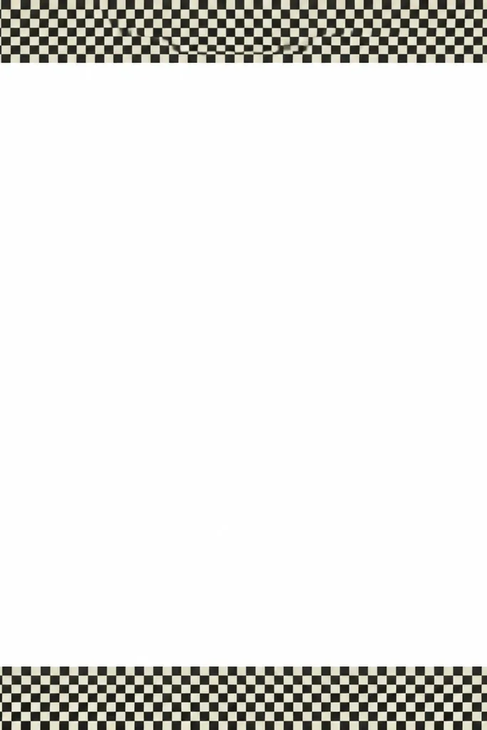
Checkerboard frames add graphic energy without needing color. The micro squares create a visual rhythm that makes your photo feel like it belongs in a fashion spread. It works with monochrome outfits and black-and-white photos, but it also looks good when your center image has one strong color. The border stays readable because the squares are consistent and concentrated in the frame area.
Print and cut with a ruler so the checker edge is straight. Use a thick border (2.5-3 cm) so the pattern doesn't disappear on camera. Mount it on a light background so the off-white squares match the paper tone.
Pro tipShoot with your camera parallel to the frame - checker patterns reveal perspective instantly.
AvoidDon't let the frame hang off the photo edges - partial checker borders look accidental.
14. Paper Cutout Window Frame with Layered Borders
Layered frames trick the eye into thinking you spent time assembling physical paper. The faux shadow offsets make it look dimensional even if you're printing it flat. I like this for crafts, desk setups, and cozy home photos because it matches handmade energy. The center window stays clean, so your photo doesn't get buried.
Print the template and cut the separate layer areas (or print two copies and stack). If you're stacking, use a 1 cm overlap area and glue with a thin layer of craft glue or double-sided tape. Keep the top layer slightly smaller than the bottom layer so the shadow offset is visible.
Pro tipPress the layers under a heavy book for 10 minutes - it keeps the edges crisp.
AvoidDon't use thick glue blobs - they create bumps that show in photos.
15. Monochrome Magazine Frame with Crop Marks
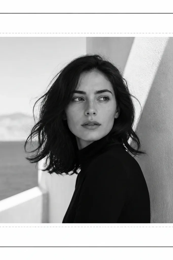
This frame makes any photo look like it was designed, even if you took it on your kitchen floor. The crop marks create that layout feel, and the monochrome palette keeps it from clashing with your subject. I use it for portraits, art prints, and flat-lays when I want a clean editorial mood. It works because the design is technical-looking but stays inside the border area.
Print in a crisp black-and-white mode if your printer has it. Cut the inner window slightly larger than you think you need, then trim the photo to fit - this avoids white gaps. Mount on a board and shoot straight-on so the dashed guides stay aligned.
Pro tipUse a photo with strong lines or texture so the editorial frame doesn't look empty.
AvoidAvoid colored frames with monochrome crop marks - it breaks the magazine illusion.


