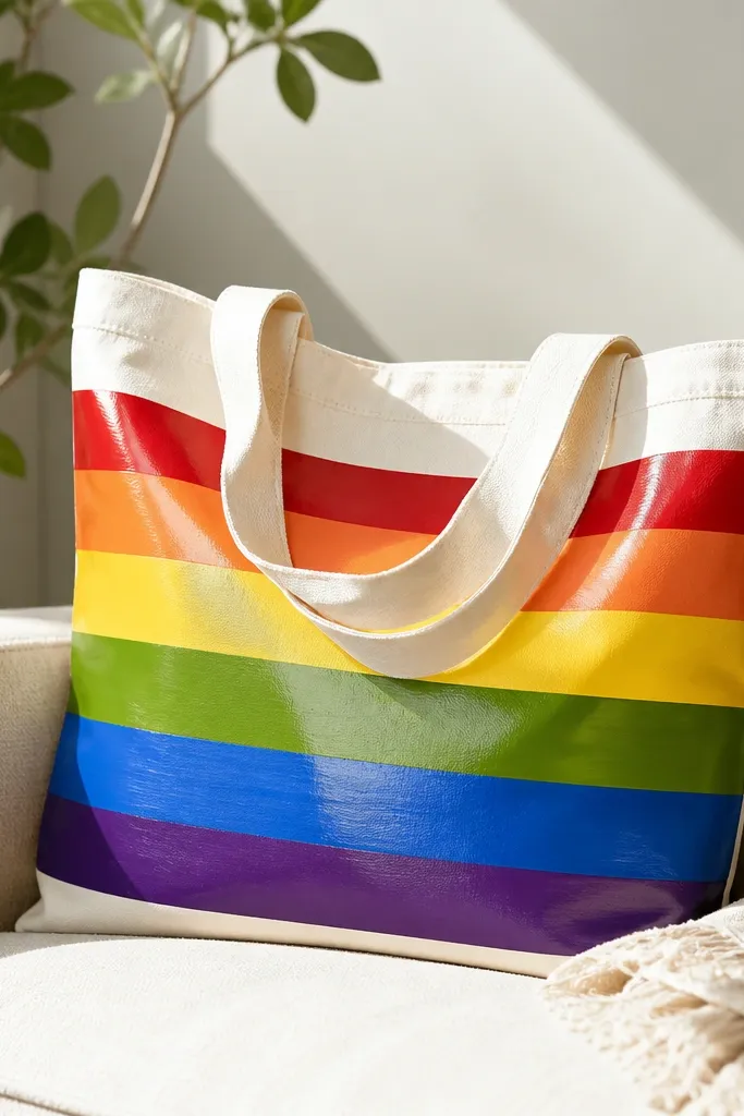
1. Two-tone sunrise with foam roller clouds
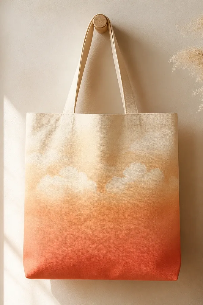
This one looks store-bought because the sky is blended in broad strokes, then cloud shapes break it up. I use peach and coral as the main gradient, then a thin layer of cream for highlights so the sky doesn't look flat. Foam roller clouds give a mottled texture that reads like clouds even at arm's length. The contrast stays clean because you keep cloud paint lighter than the sky around it.
Paint a 6-7 inch band at the bottom in peach, then blend upward with coral using a damp brush. For clouds, load a small foam roller lightly with cream and press in short taps across the top third. Let it dry 30-60 minutes before any extra highlights so the cream doesn't muddy the coral.
Pro tipRoll the cloud foam roller off on scrap cardboard first - you want speckle, not a thick blob.
AvoidAvoid painting the clouds too dark or fully opaque at once; it kills the airy look.
2. Botanical sprigs in one continuous line
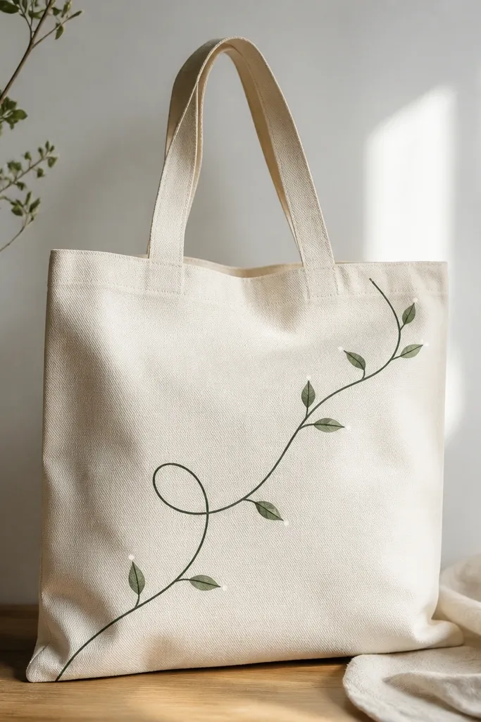
The "one continuous line" style looks intentional and expensive because it keeps movement consistent across the tote. Dark green gives depth, while tiny white dots add a fresh, dewy feel. This works especially well if your canvas tote has a natural off-white color, because the design doesn't fight the bag. The line stays crisp when you use a liner brush and let paint dry between thicker strokes.
Sketch the vine path with a washable fabric marker. Mix dark green acrylic with fabric medium to get a smooth flow, then draw the main line with a 10/0 liner brush. Add small leaves with quick teardrop strokes, then tap white paint at leaf edges for sparkle.
Pro tipIf your line wobbles, stop and reload the brush - don't try to "fix" it mid-stroke.
AvoidSkip thick outlines; they make the vine look like sticker art instead of painted.
3. Geometric block pattern with painter's tape edges
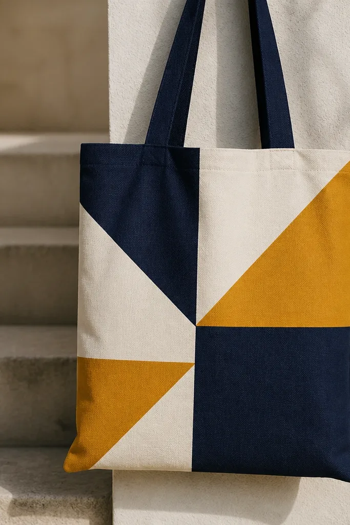
Tape makes geometry look sharp on fabric, and sharp edges are what read as "clean" from across a room. Use limited colors so the tote feels graphic, not chaotic. Navy gives structure, mustard adds warmth, and off-white keeps it bright. The secret is letting each taped color dry before you remove the tape so the edge doesn't smear.
Cut strips of painter's tape into short lengths and plan a 10x12 inch design area centered on the bag front. Paint the first color (navy) with a foam brush, then remove tape after 10-15 minutes while paint is tacky. Re-tape for the next sections and paint mustard and off-white.
Pro tipPress tape down with a fingernail or plastic ruler so paint doesn't wick underneath.
AvoidDon't peel tape when the paint is fully wet - that's when borders turn jagged.
4. Watercolor wash with salt sparkle texture
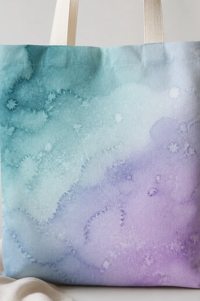
This style looks soft and artsy because the paint is partly transparent, then you add salt texture for natural-looking highlights. Teal and lavender blend beautifully on canvas when the fabric is slightly absorbent. Salt creates irregular "burst" patterns that feel like light on water. You get a watercolor vibe without needing actual watercolor paper.
Thin acrylic with fabric medium and a splash of water until it looks like heavy cream. Wet the fabric lightly with clean water using a sponge so the wash spreads evenly. While still wet, sprinkle coarse salt (kosher salt) on the darkest areas, then let it dry completely before brushing salt off.
Pro tipUse a hairdryer on low to speed drying - don't rush with high heat or the fabric can warp.
AvoidAvoid fine table salt; it melts into streaks and won't give crisp sparkle.
5. Monogram block letters with drop-shadow behind
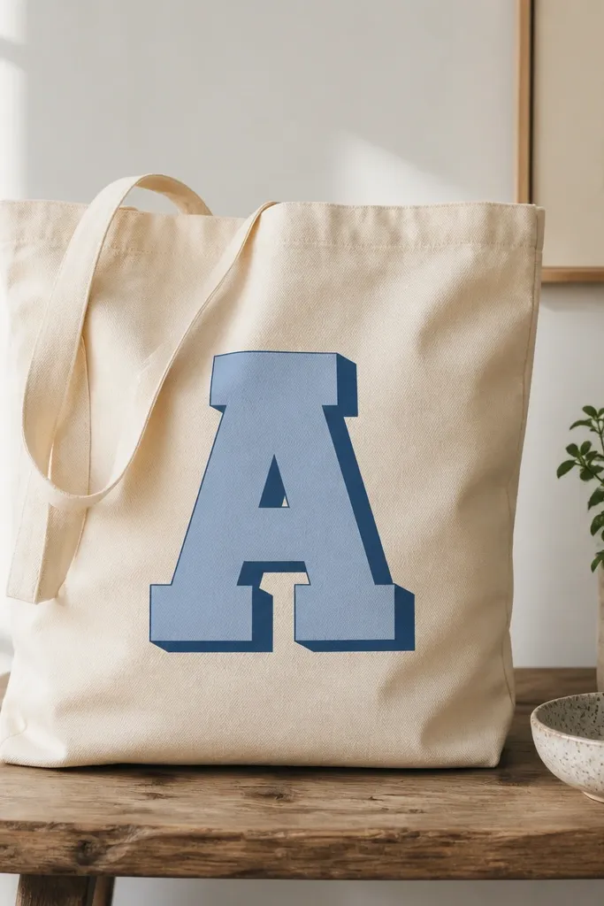
Monograms look polished when they have a shadow offset and strong color contrast. Choose two colors that pop against the tote - like black and warm gray, or navy and cream. The drop-shadow makes the letter feel dimensional even on flat fabric. I like block letters because they stay readable on bags that get folded and creased.
Stencil or freehand a 7-9 inch tall monogram. Paint the shadow first in a darker tone, let it dry, then tape around the letter and paint the main color. Add a final thin highlight line with a lighter shade once everything is dry.
Pro tipKeep the shadow offset small - about 1/8 to 1/4 inch - for a clean look.
AvoidDon't skip a dry step between shadow and main letter; you'll get fuzzy edges.
6. Sun-bleached stripes with dry brush edges
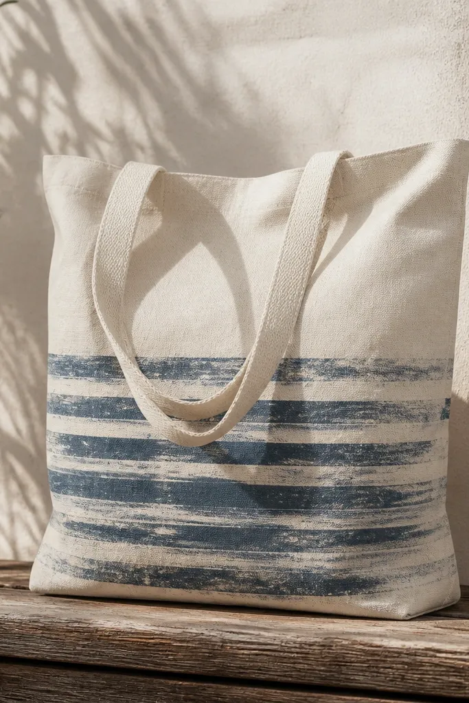
Dry brushing gives you that worn, lived-in effect without actually damaging the bag. The fade looks natural because the brush lifts pigment unevenly. Use muted colors - dusty blue, faded coral, and warm sand - so it reads like sun exposure rather than modern graphic paint. The stripe placement matters too - keep them mostly near the bottom so the bag's natural creases enhance the worn look.
Tape a straight guide line for your stripes and paint 1/2 inch bands. After painting each band, lightly drag a nearly dry brush along the edge to create the bleached fade. Blend between colors by feathering where stripes meet.
Pro tipWipe excess paint on a paper towel until the brush makes scratchy lines, not wet strokes.
AvoidAvoid fully even stripes; perfect stripes look like crafts store vinyl instead of paint.
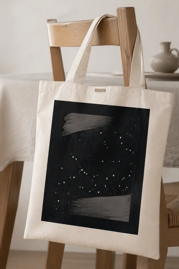
7. Galaxy dots with a sponge and a toothbrush flick
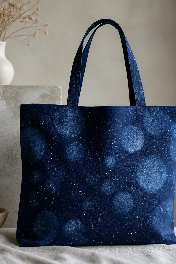
Galaxy patterns look great on tote bags because small stars scale well with distance. The combination of sponge circles and toothbrush flicks gives both big and tiny texture. Navy is the base color that makes the white pop. Add a few light blue dots so it doesn't look like plain confetti.
Paint the whole front navy first and let it dry thoroughly. Dab a seafoam sponge lightly for soft circles in the upper half. Flick white paint using a toothbrush loaded lightly with paint and flick away from the bag.
Pro tipPractice the flick on paper first - you want misty dots, not long paint threads.
AvoidDon't overdo the white - too many dots flatten the galaxy and make it look messy.
8. Tropical leaves with layered greens
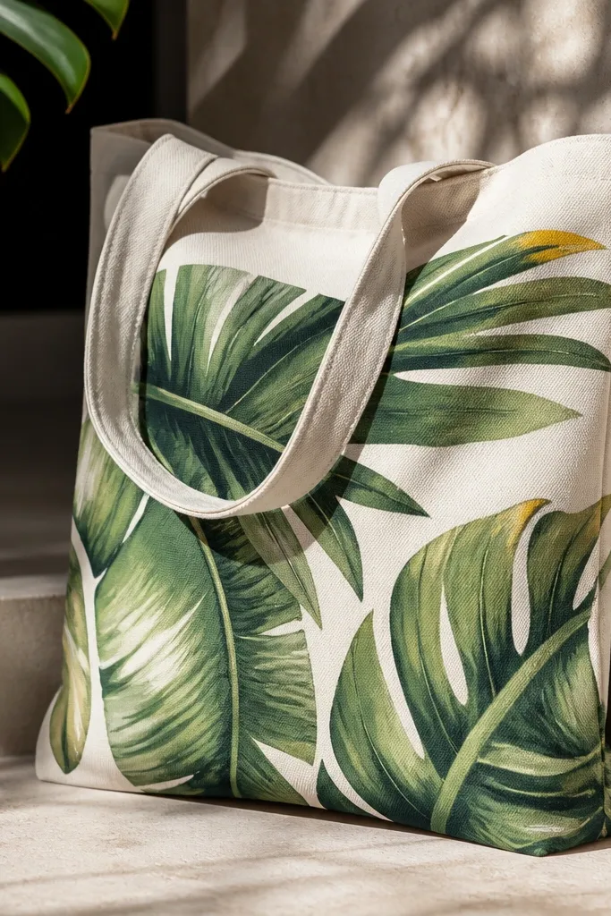
Layering greens makes leaves look dimensional, not flat. Dark green veins anchor the shape, while lighter greens at the edges catch the light. Yellow-green tips make the leaves feel fresh and sunlit. This works best on a tote that has enough surface space - plan for a 9-10 inch leaf cluster rather than tiny scattered bits.
Block in leaf shapes with medium green first. Add veins with a fine brush using dark green, then outline some leaf edges with lighter green. For a finishing pop, add a few small yellow-green marks at the tips.
Pro tipPaint veins while the base coat is still slightly tacky so the edges stay soft.
AvoidAvoid one-tone leaves; they look like a stencil copy when you don't layer.
9. Marbled paint ribbons using shaving cream
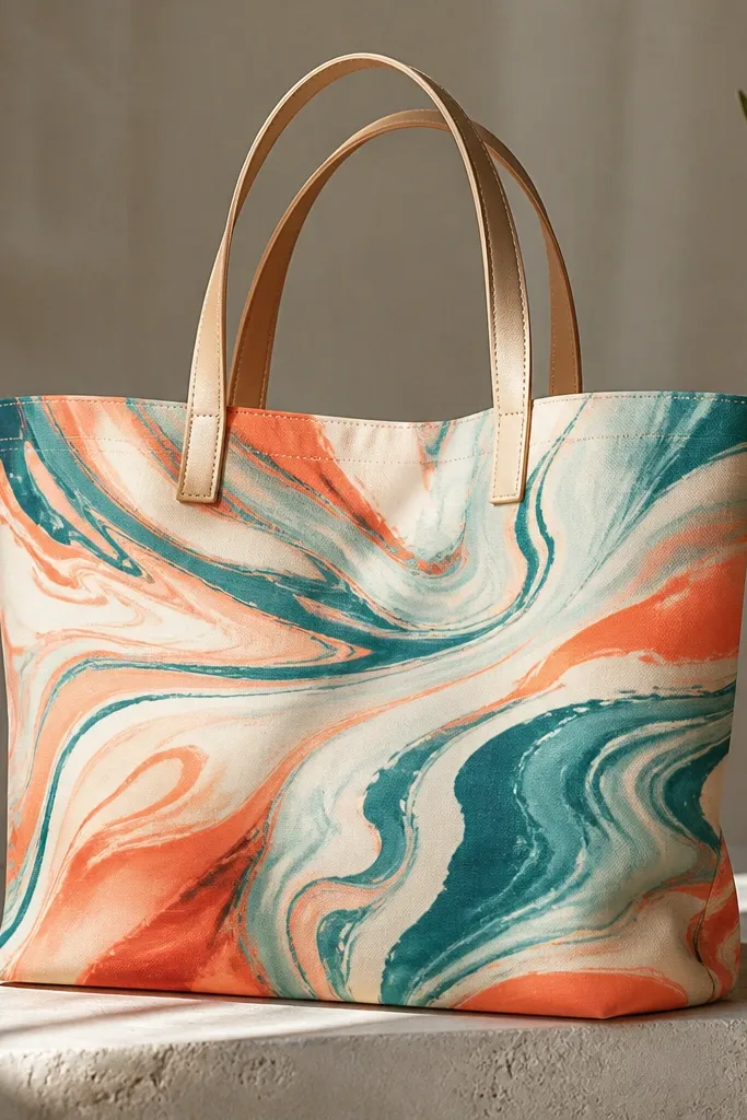
Marbling looks fancy because it's organic and unpredictable, and that randomness reads as high-end. Shaving cream helps you spread paint on top and swipe through it for ribbon swirls. Teal and coral create strong contrast, while cream tones keep it wearable. The marbled area looks best when it's concentrated in a rectangle, not all over the bag.
Squeeze shaving cream into a tray, add drops of diluted paint in teal, coral, and cream, then swirl with a skewer. Press the tote fabric gently onto the surface for 10-15 seconds, then scrape off cream. Let it dry fully and then seal.
Pro tipUse a rigid tray and keep the fabric flat - wrinkles trap marbling lines and look messy.
AvoidAvoid pressing too long; you'll over-transfer and blur the ribbons.
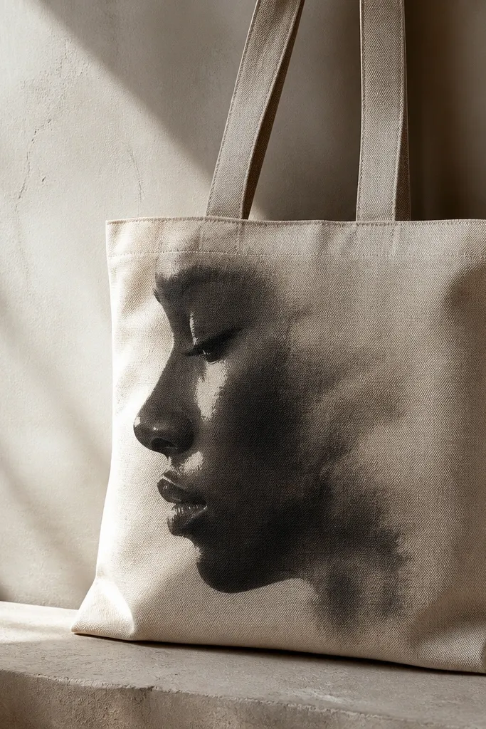
10. Ink-like outlines with diluted paint splatter
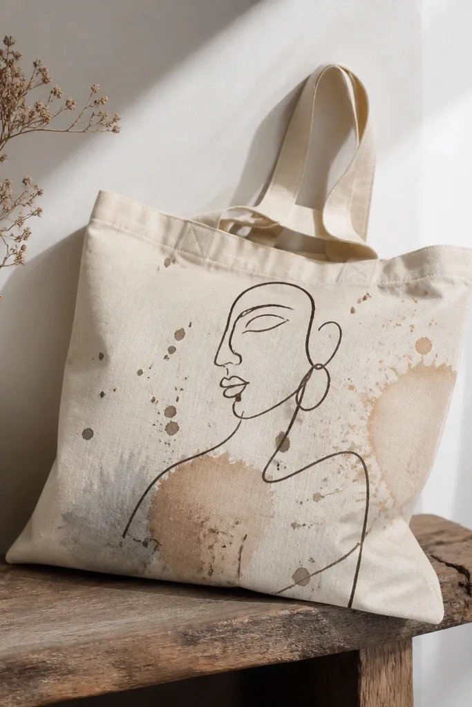
This style looks artsy because the linework is crisp and the splatters stay light and airy. Diluted paint splatter adds motion without covering the whole bag. Dark brown feels warmer than black on off-white canvas. The trick is keeping splatter in the background only, so your outline stays readable.
Draw your figure with a fine brush and dark brown paint mixed with a little fabric medium and water. Mask the figure area with paper so splatter doesn't land on the face. Use a toothbrush flick for splatter - start sparse, build slowly, then seal.
Pro tipHold the toothbrush farther away than you think - 8-10 inches gives tiny dots instead of blobs.
AvoidDon't splash directly on wet paint; splatters will bleed into the lines.
11. Ombre polka dots with sponge dab
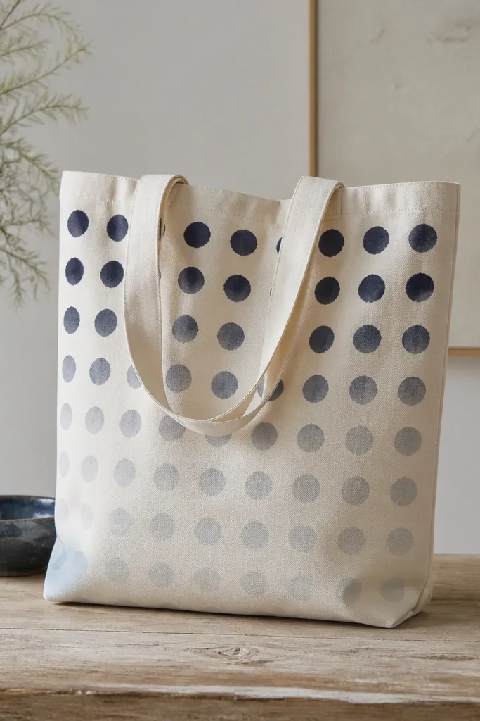
Sponge-dab dots look handmade but still neat, especially when you place them in rows. An ombre dot pattern flatters tote shape because it guides the eye down the bag. Use one base color plus a lighter mix so dots fade smoothly. The soft edges make it forgiving on fabric creases.
Mix your dot color in three strengths: full, half, and light. Mark a dot grid lightly with washable marker so spacing stays even. Dab dots with a small makeup sponge, moving from dark to light across rows.
Pro tipRinse and dry the sponge between color strengths so you don't muddy the gradient.
AvoidAvoid overworking the same dot area; it spreads and turns into a stain.
12. Fabric-paint collage style with torn paper masks
Torn-paper masks give you a natural edge that paint can't fake with a brush. The rough borders make the design look layered even when you're painting flat. Mustard and teal look great together on cream canvas, and off-white ties it together. This approach also hides small mistakes because the torn edge is meant to be imperfect.
Tear paper pieces for masks and tape them lightly in place. Paint over each mask one color at a time, removing the paper while paint is tacky. Build layers from background to foreground so top shapes sit cleanly over earlier colors.
Pro tipUse paper masks only once - reused masks drag paint and blur the torn edge.
AvoidDon't flood paint under the mask; quick coats prevent bleeding.
13. Stencil wave pattern with metallic outline
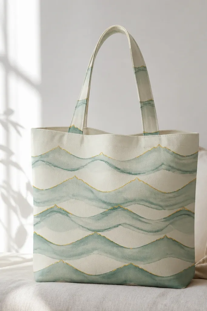
Stencils make repeat patterns look crisp and wearable. Metallic gold outlines add a "special occasion" feel without needing heavy coverage. Keep the metallic lines thin so they don't crack on folds. Sea green waves feel calm, and the gold peaks catch light when the tote moves.
Use a wave stencil with gaps that are small enough to hold detail. Paint waves with sea green acrylic + fabric medium, letting dry before lifting the stencil. Once dry, use a fine brush to trace the wave crests with metallic gold fabric paint.
Pro tipClean stencil between colors so you don't get dried paint ridges.
AvoidDon't use metallic paint as the only fill color; it looks patchy when stretched.
14. Portrait-style face silhouette with soft gradients
A silhouette with soft gradients looks striking because it reads like street art. Charcoal on off-white canvas gives a dramatic look without needing bright colors. White highlights keep the face from disappearing into the bag's natural texture. This style is best when you keep the gradient smooth - harsh edges make it look like a sticker.
Block in the face shape in charcoal first, then blend the edges with a damp brush using circular motions. Add cheek and lip highlights with a tiny amount of white paint blended outward. Let it dry fully and seal with a flexible topcoat.
Pro tipUse a sponge for gradients if your brush leaves streaks - dab then smooth lightly.
AvoidAvoid hard outline strokes around the silhouette; they make it look printed rather than painted.
15. Rainbow stripes with fabric-medium glow
Thick stripes are the easiest way to get "wow" coverage, and fabric medium helps the paint stay flexible. A slightly glossy finish makes colors look deeper, especially reds and blues. This design works for everyday bags because it stays readable even when the tote creases. Keep stripe edges straight and consistent so it feels intentional.
Plan five to seven stripes, each about 2 inches tall, centered on the tote. Use acrylic paint + fabric medium for each stripe, and paint one stripe at a time. After fully dry, add a thin clear fabric topcoat to even out sheen.
Pro tipUse a ruler and painter's tape for stripe borders - freehand stripes look uneven fast on canvas.
AvoidDon't thin paint too much; translucent stripes look patchy on tote fabric.
16. Black-and-white photo frame style border
A frame border makes any simple design look curated because it gives structure. Black-and-white is forgiving on canvas since you're not fighting color mismatch. White dots add rhythm without taking over the tote. I like adding one small scripted line to feel personal, but keep it small so it doesn't blur.
Tape a rectangle border on the tote front and paint it black using a flat brush. Remove tape after 10-15 minutes while paint is tacky. Add gray brush strokes inside and sprinkle white dots with a toothbrush flick. Paint the tiny label with a fine brush once everything else is dry.
Pro tipPractice the script on paper first; tote fabric stretches slightly when you paint.
AvoidAvoid big lettering; large scripts crack more on tote folds.
17. Coffee cup doodles with speckled background
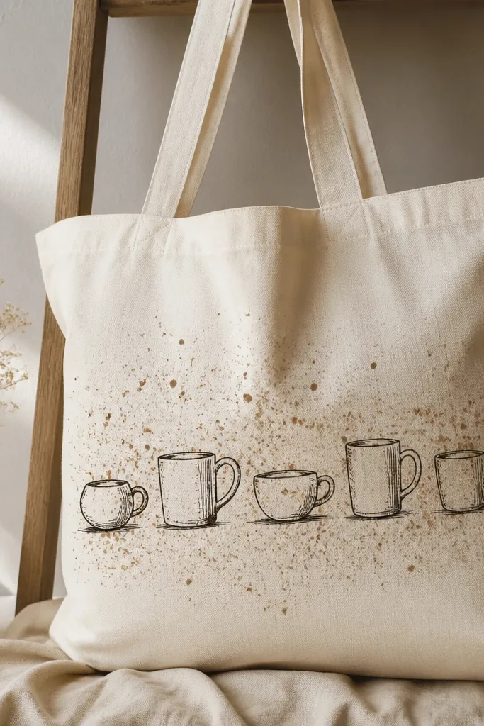
Coffee doodles look cute and practical because they're recognizable even if your tote gets creased. The speckled background hides small uneven spots in the paint and makes the whole piece feel textured. Use warm tones like espresso brown and creamy beige so it matches everyday outfits. It also looks good on both light and darker canvas totes.
Paint a light beige wash over the area where doodles will sit. While it's drying, flick espresso-brown dots across the background with a toothbrush. Draw cups with a fine brush, filling cups with light brown and adding white highlight lines on the rim.
Pro tipKeep doodles about 3 inches wide each so they stay readable after sealing.
AvoidDon't use pure black for doodles; it looks harsh on warm coffee palettes.
18. Navy anchor with rope pattern fill
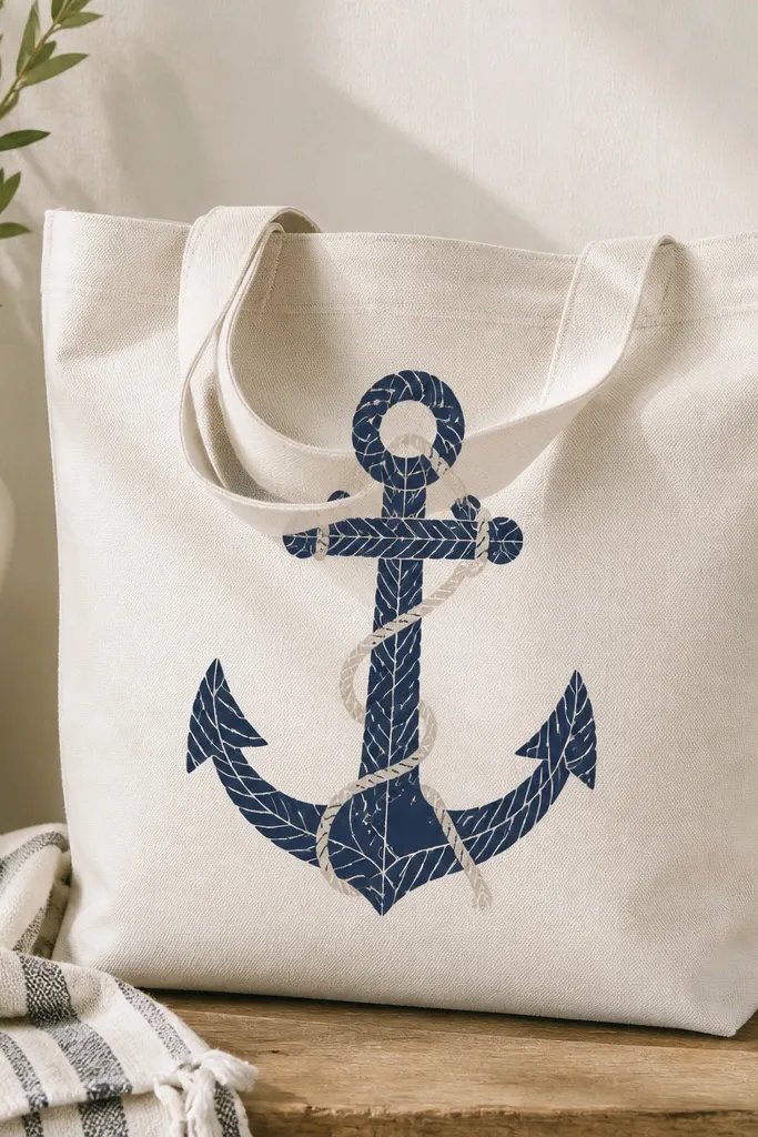
This design looks detailed without being complicated because the anchor is the only big shape. Rope patterns add texture that reads even when the tote folds. Navy anchors look classic, and cream rope lines keep it from feeling too heavy. The key is using a pattern fill that stays consistent - that's what makes it look like painted craft instead of scribbles.
Sketch the anchor outline lightly, then fill the shank with curved rope lines using a small round brush. Add knot dots at intervals. Paint a cream rope line around the anchor and finish with a few tiny highlight strokes.
Pro tipUse a thin paint mix (not watery) so the rope lines stay visible on canvas texture.
AvoidAvoid thick paint for the rope lines; it turns into raised ridges that crack.
19. Pastel gradient with hand-drawn dots border
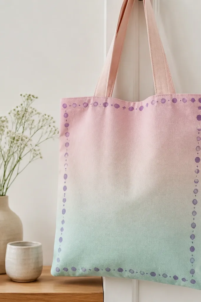
The dotted border frames the tote and makes the gradient feel intentional. Pastels look delicate, but the border adds definition so the piece doesn't look washed out. I like purple dots against pink-mint gradients because it gives contrast without turning the tote into a loud rainbow. The uneven dot sizes make it feel human and less like a sticker.
Blend pink into lavender, then into mint across the tote front using a wide brush with gentle strokes. After it dries, draw a dotted border around the edges with a fine brush in purple. Add a few dots inside to echo the border and tie the composition together.
Pro tipLet the gradient dry longer than you think - 1-2 hours - before border work.
AvoidDon't outline the gradient with a solid line; it makes pastels look like a coloring page.
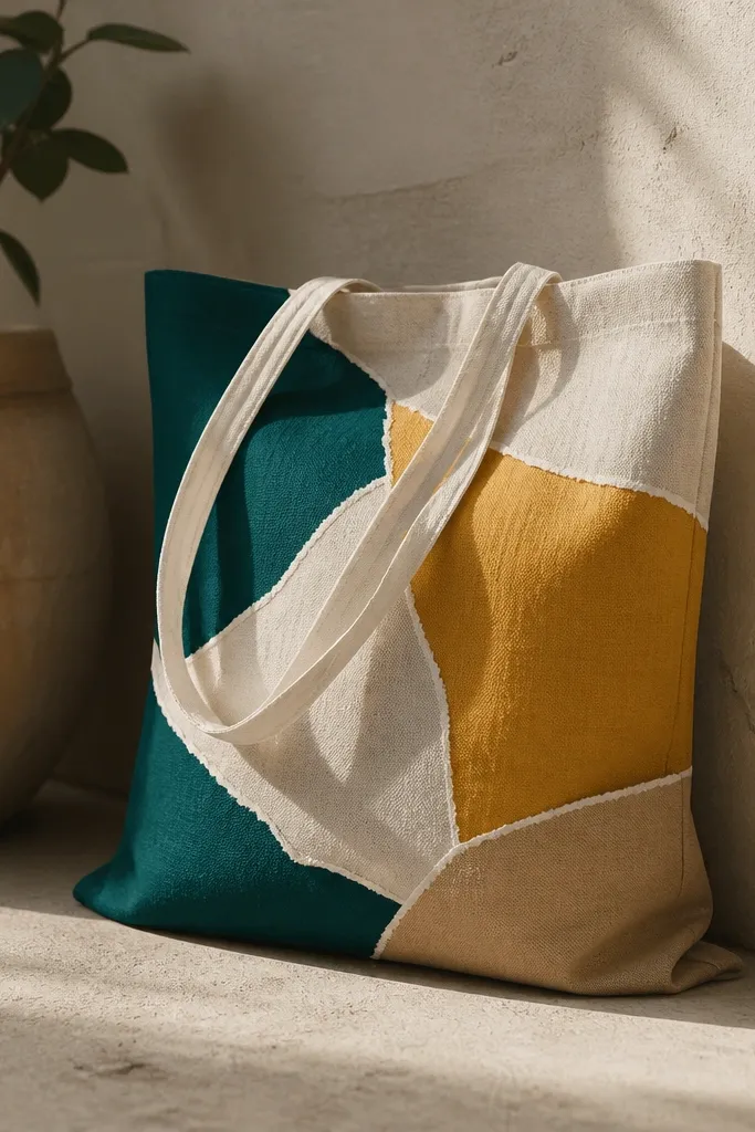
20. Color-blocked map coordinates with tiny compass marks
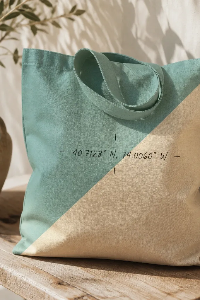
Coordinates and compass marks feel personal and look good in a small area, which matters on totes. The color blocks behind the text keep it readable and hide fabric texture. Choose one dark text color (black or deep charcoal) and one warm background tone (sand) plus a cool accent (teal). Keep the compass ticks small so they read as map details.
Tape diagonal blocks and paint teal first, then sand. Once dry, remove tape and write coordinates with a fine brush or fabric marker in black. Add compass ticks by drawing short lines around the text, then place a tiny star or dot at the center.
Pro tipWrite coordinates with a straightedge guide - even a 1/8 inch slant looks intentional if you keep it consistent.
AvoidAvoid using glossy paint on the text; it smears when you seal over it.


