1. Matte White Frame with "Polaroid" Inner Border
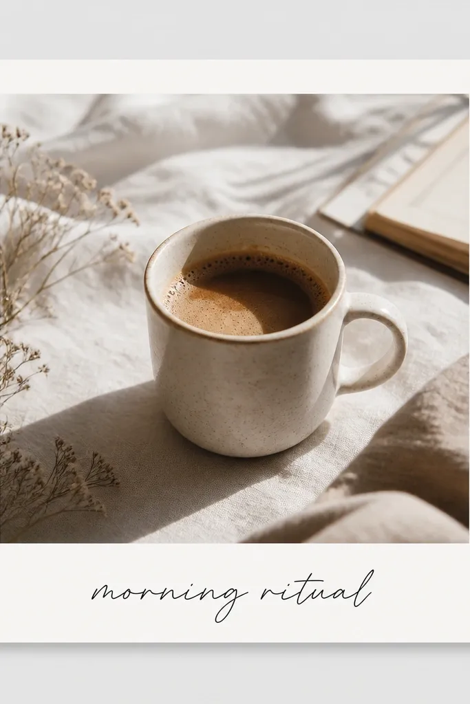
This look works because the frame has two separate visual zones: a matte outer border and a softer inner border. The off-white inner edge makes the photo feel like it sits on paper, not behind glass. I usually pair it with a single-color caption so the photo stays the hero.
Start with a square frame template that has at least 80-90px of border thickness in a 1080x1080 canvas. Add a second inner rectangle in an off-white like #F3EFE6 and set a shadow blur around 12 with low opacity. Use a text color close to #111111 and keep the caption within the bottom 15% so it never competes with the photo subject.
Pro tipBefore exporting, zoom to 200% and check that the photo edges hit the inner border evenly on all sides.
AvoidAvoid thin borders under 40px - they disappear on mobile and look like a cheap overlay.
2. Black Frame + Gold Line Accent (Event Poster Style)
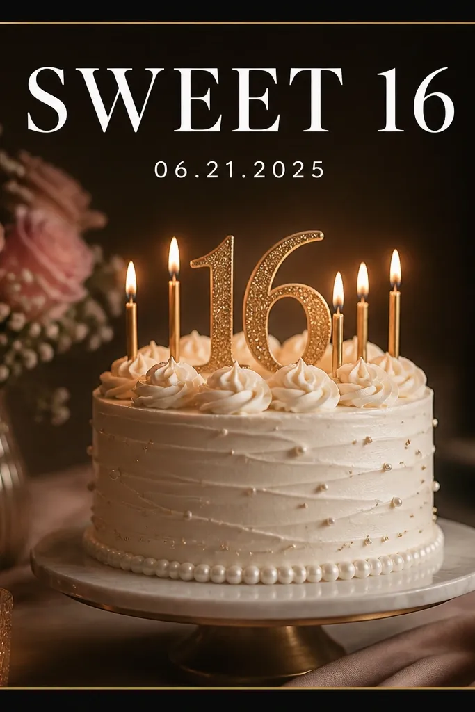
Black frames make colors pop, and a single gold line keeps it from looking flat. I've used this for birthdays and small brand announcements because it reads like a mini poster. The gold line also gives your eye a guide, so the text and photo feel aligned.
Pick a square template and set the outer frame to #0B0B0D. Add a 6-10px gold line (try #D4AF37) inset by about 18-22px from the outer edge. Keep your headline in a bold font and center it in the top 20% of the canvas. If your photo is busy, reduce the photo brightness slightly so the gold line stays crisp.
Pro tipIf the gold looks dull, increase contrast by lowering photo exposure 5-10 points instead of changing the gold color.
AvoidDon't stack multiple gold effects like gradients and sparkles - it turns into sticker clutter fast.
3. Rounded Corner Frame for Soft Skincare Photos
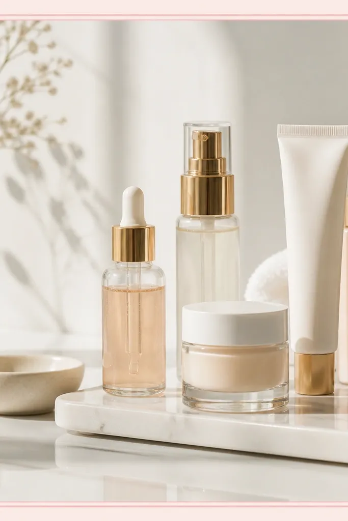
Rounded corners feel friendly and match product photography with gentle lighting. The blush palette keeps skin tones flattering, and the inner line stops the photo from bleeding into the background. I like this when the background is mostly white or light beige.
Use a frame template that supports rounded corners (I target a radius around 28-36px on a 1080 square). Set the outer border to #F6D7D7 and the inner line to #E7A8A8. Place the photo so the main product sits slightly above center, then keep text left-aligned in the top-left quadrant.
Pro tipUse one font style only - either script OR sans. Mixing two styles makes the rounded frame look busy.
AvoidAvoid pure white (#FFFFFF) borders on white photos - they disappear and you'll lose the frame shape.
4. Thick Denim Blue Frame for Travel Shots
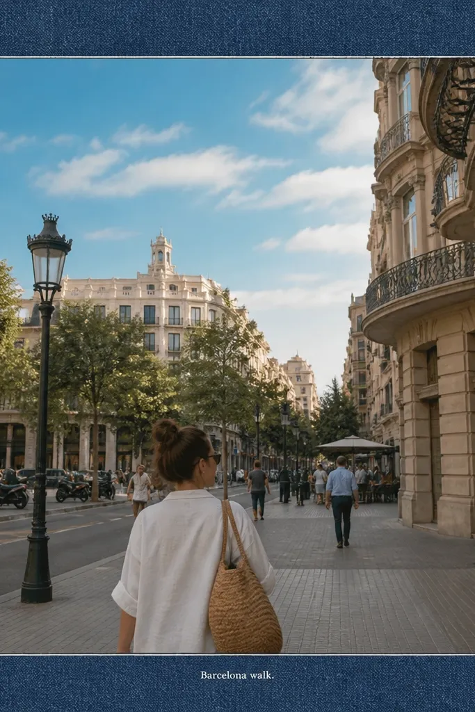
A thick, textured-looking frame gives travel photos a scrapbook vibe without adding messy stickers. Denim blue also balances strong blues in the sky, so the whole image feels like one color story. The lighter inner edge gives definition even when the photo background is loud.
Choose a frame with a border thickness around 90-110px on a 1080 square. Set the denim color around #2F4F6B, then add a 4-6px inner edge in a lighter tone like #4F6E8E. Put the caption at the bottom, but keep it small - 2 lines max, and stay within the lowest 12% of the canvas.
Pro tipIf the photo is very bright, add a slight vignette in the app so the corners don't wash out the frame.
AvoidDon't use dark frame colors with dark photos - the border will look like a black blob.
5. Gallery Wall Frame Grid (3-Panel Within One Post)
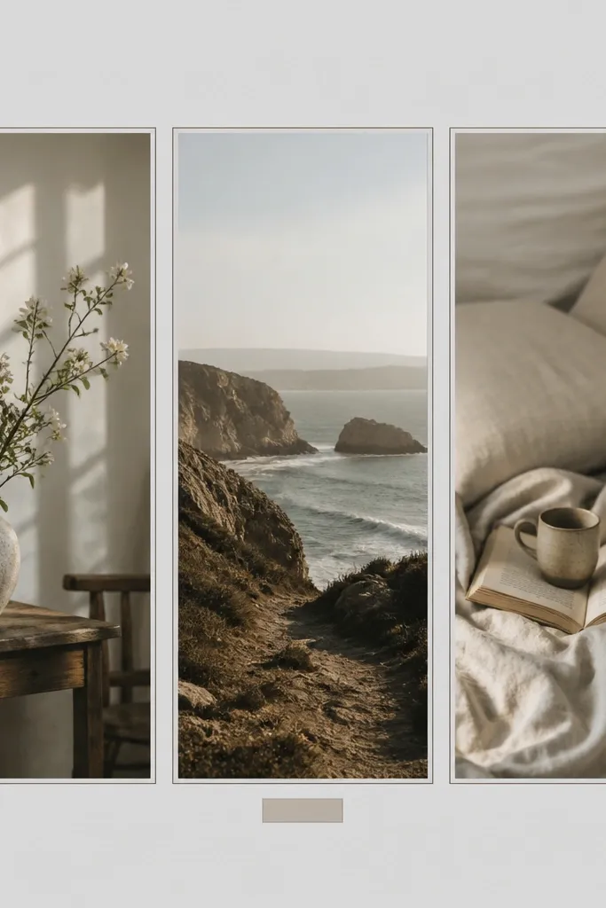
This works because you're giving the viewer multiple focal points without needing multiple posts. The key is consistent spacing: narrow gaps and matching border thickness. I've used this for outfit photos, before/after shots, and "3 things I packed" posts.
In your app, create a 1080x1080 canvas and use a template that supports multiple photo slots or build it with rectangles. Set side gaps around 16-20px and keep each panel border to 4-6px. Use a light gray frame like #D9D9D9 so it doesn't fight with the photos. Add a tiny label under one panel only to avoid clutter.
Pro tipCrop all three photos to the same aspect focus (same horizon height or same subject size) so the grid feels intentional.
AvoidAvoid uneven gaps - even a 5px difference makes the whole layout look amateur.
6. Neon Ticket Frame for Night Market Photos
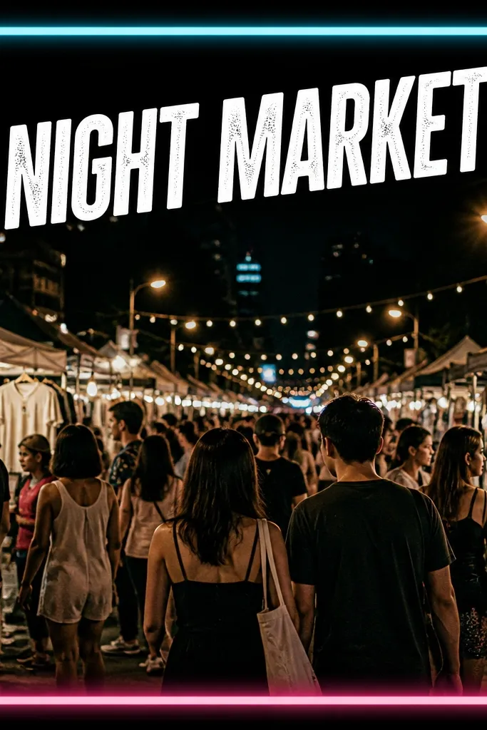
Neon edges create energy, and the ticket-stub style adds a "found object" feel. This is the kind of frame that looks best when the photo already has lights or motion blur. You get a strong theme without relying on heavy filters.
Set the outer frame to black or near-black (#0F0F12). Add neon edges in cyan (#00E5FF) and hot pink (#FF3DAE) on opposite sides or corners. Keep the text in white (#F5F7FF) and limit it to one headline plus a date. If the app supports rotation, rotate the headline 2-3 degrees for a real poster look.
Pro tipUse neon only on the frame, not on the photo. If you neon-tint the photo too, it gets muddy.
AvoidSkip multiple glow layers. One glow effect looks sharp; stacked glows look like a sticker.
7. Soft Shadow Frame for Minimal Food Posts
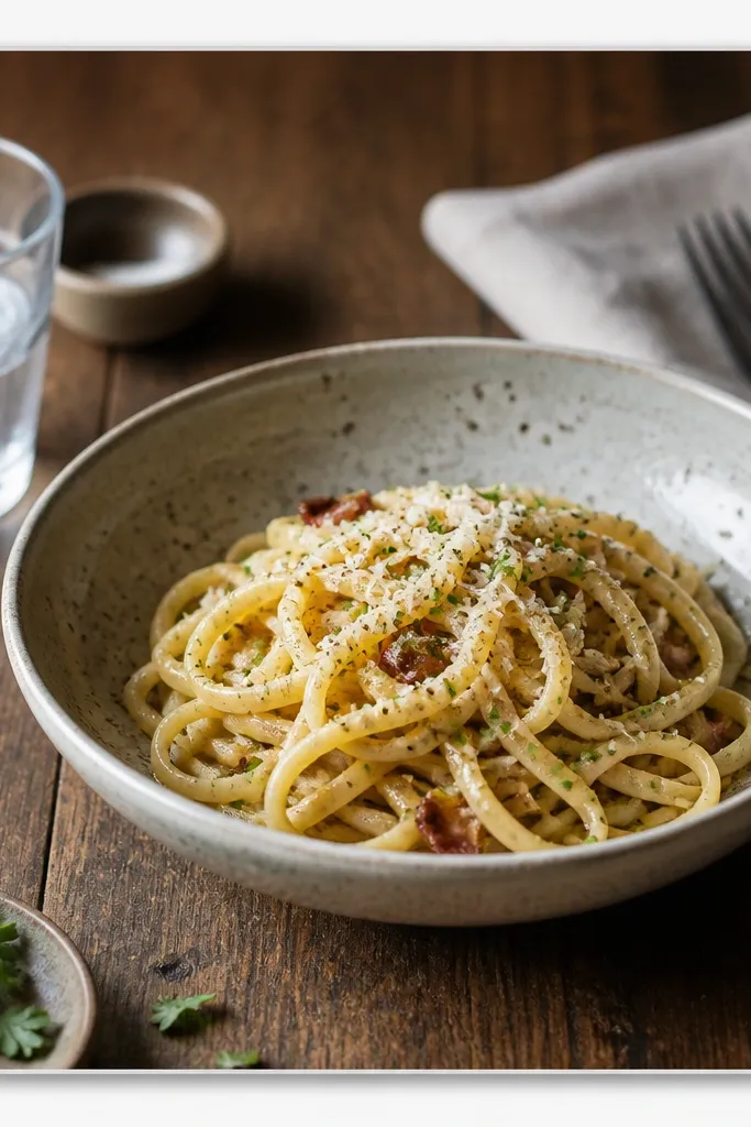
Minimal frames work when your photo already has good composition. The soft shadow makes the photo sit off the background, which makes the whole post feel finished even without bold colors. It's also easy to keep consistent across your feed.
Use a thin frame border around 30-45px in light gray (#CFCFCF). Add a shadow under the photo layer: blur 18-25, opacity 0.25-0.35. Keep text in dark gray (#333333) and use one short line so it doesn't compete with the food.
Pro tipMatch your text color to a mid-tone in the photo (like wood or pasta sauce) so it blends naturally.
AvoidAvoid pure black text on pale photos - it can look harsh next to the soft frame.
8. Sticker-Accent Frame with One Icon Only
This is how you keep sticker frames from turning into a clutter pile. One icon gives character, and the clean borders keep the layout structured. For study, journaling, and desk content, this style makes the post feel personal without looking random.
Choose a pastel frame color around #FFE7A3 with a white inner border inset by about 20px. Add exactly one sticker icon in the top-right corner and keep it small - roughly 8-10% of the canvas width. Place text in the bottom-left with a margin of 60-80px from the edges.
Pro tipIf your sticker overlaps the frame border, reduce sticker opacity to about 90% so it looks like it belongs.
AvoidDon't add three or more stickers - it breaks the grid and makes the border irrelevant.
9. Monochrome Frame for Fitness Progress Photos
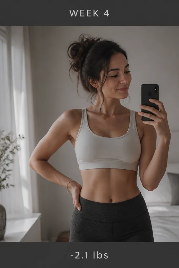
Progress posts need clean readability. A monochrome frame keeps attention on the numbers and the photo, not on color chaos. I like charcoal frames because they work with skin tones and gym lighting.
Use a charcoal frame around #2A2A2A with a thin inner line in #4A4A4A. Desaturate the photo slightly (aim for a subtle reduction, not grayscale) and add a bit of contrast so the subject pops. Keep text in two lines only, center-aligned, and keep the numbers larger by 1 size step.
Pro tipUse consistent text placement across weeks so your series looks like one set.
AvoidAvoid decorative fonts for numbers - they make the data look like a joke.


