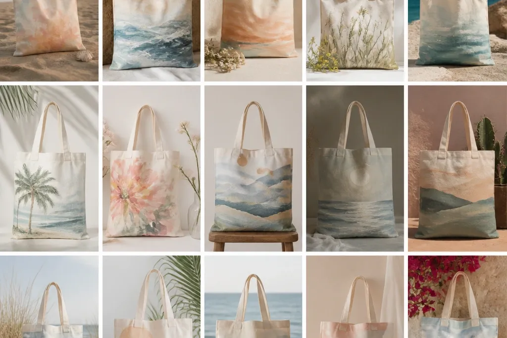
1. Sea Glass Ombre Waves with White Mist
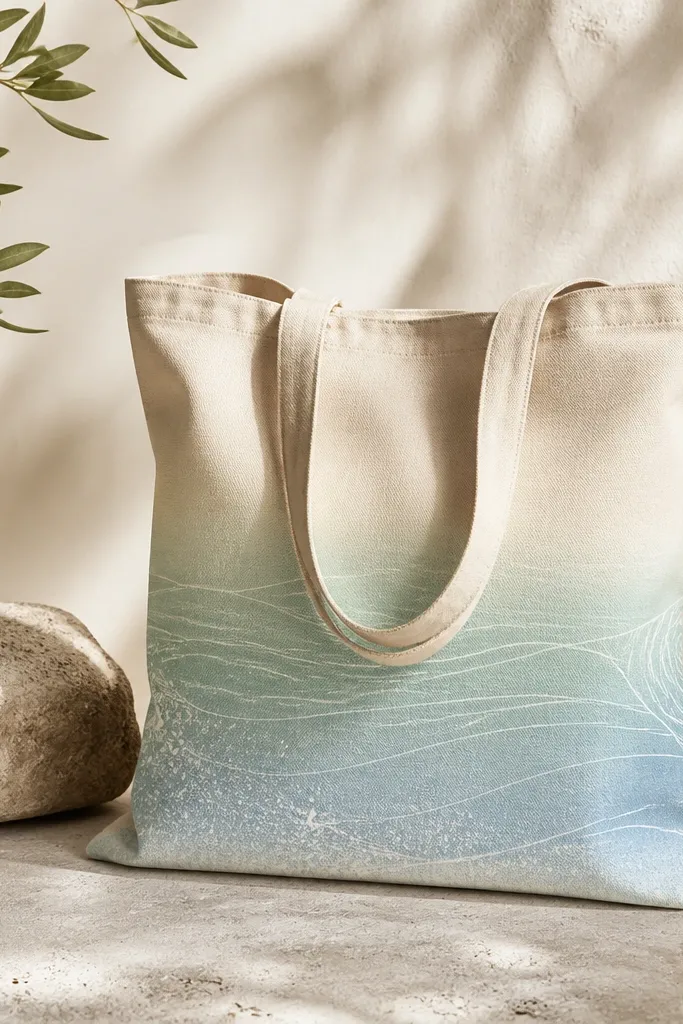
This design uses a smooth ombre strip so the bag looks airy even with minimal drawing. Seafoam and sky blue imitate water depth, then the white mist makes it feel like ocean spray. I like adding a few uneven wave marks instead of perfect lines - it keeps it beachy and not "stenciled."
Paint the bottom third of the tote with three diluted layers, blending at the seam between colors using a damp sponge. Add wave lines with a small round brush, pulling short arcs left and right. Finish by tapping white paint through a toothbrush for tiny foam dots.
Pro tipMix your green and blue with fabric medium so the ombre stays soft and doesn't dry with a chalky edge.
AvoidSkipping a flexible medium is the fastest way to get cracking when the tote folds.
2. Sand Dune Gradient with Footprint Stamps
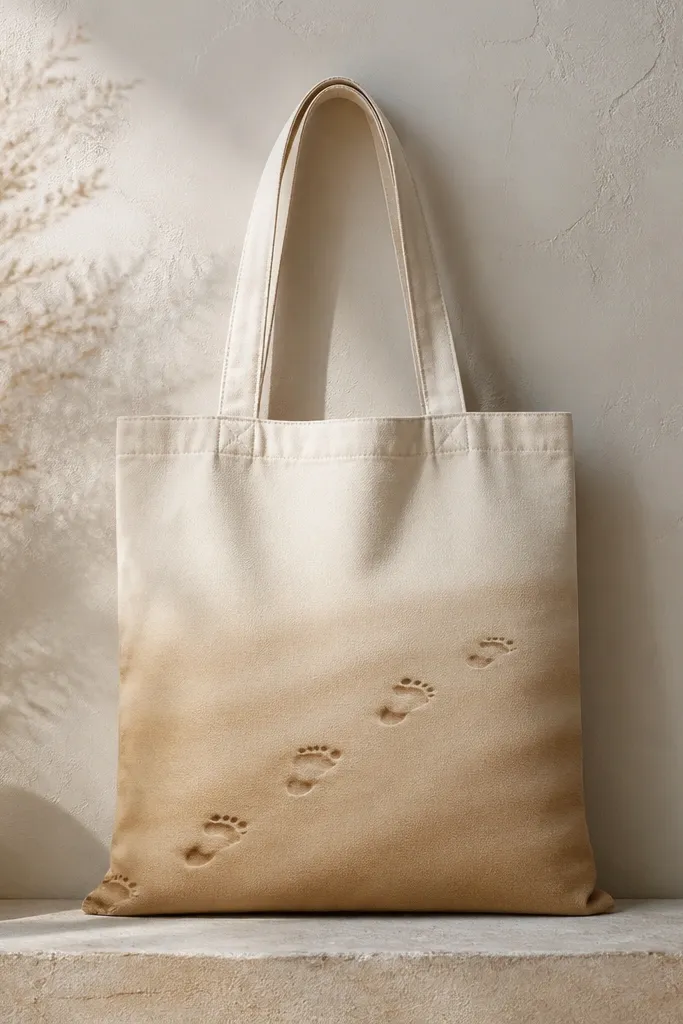
Sand gradients look dreamy because they mimic natural color shifts from sun glare to shadowed dunes. Footprint stamps add a story without requiring detailed drawing. I keep the footprints small and spaced so they don't crowd - the tote still looks light.
Use a sponge to apply beige, then tan, then a final thin wash of darker brown near the bottom. For footprints, use a foam craft stamp or cut a simple pattern from a craft sponge, then press lightly for crisp edges. Add a faint shadow under each stamp using a tiny brush and diluted umber.
Pro tipTest your footprint pressure on scrap fabric so you get the right depth without blobs.
AvoidDon't use full-strength paint for footprints - it turns them into chunky blocks.
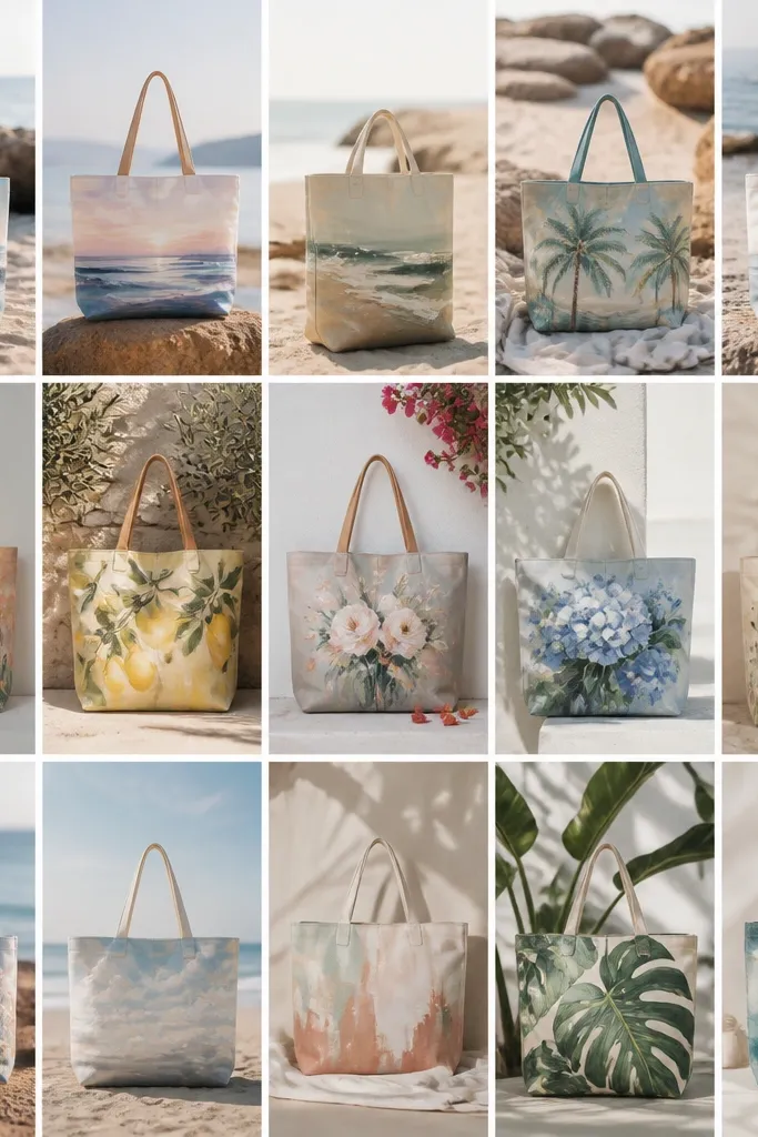
3. Shell Border Line Art with Coral Accents
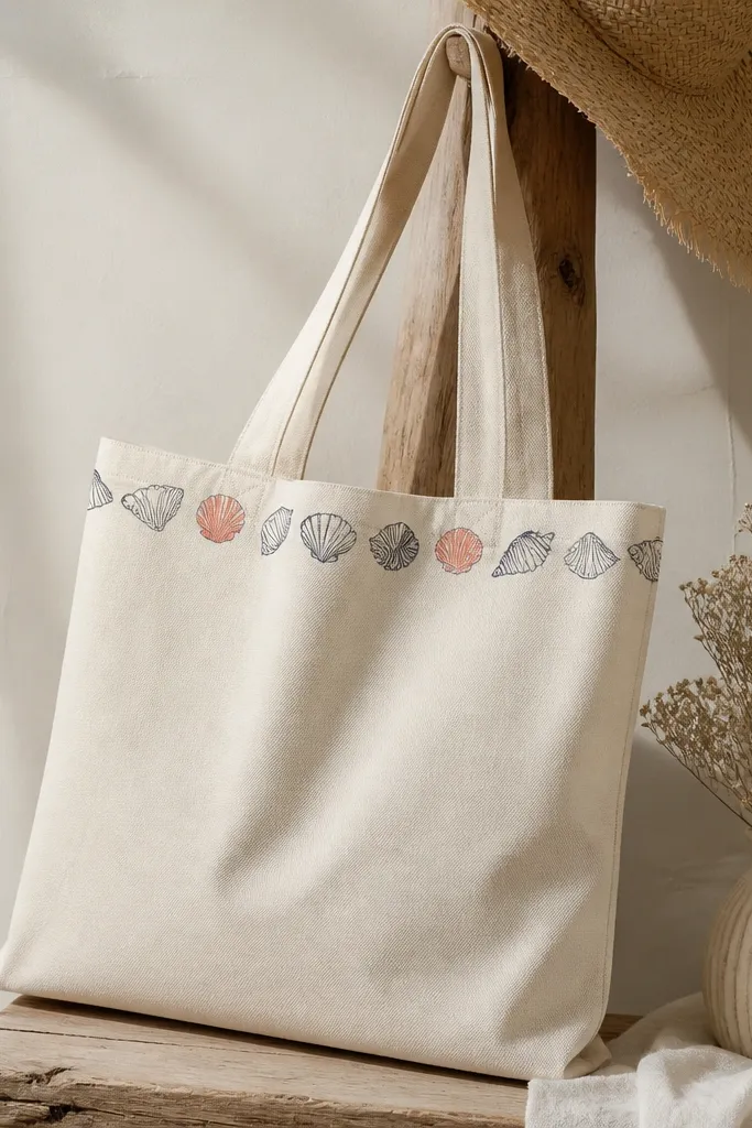
Line art gives you a polished beach look with very little mess. Navy ink-like paint makes shells read clearly, and coral accents add warmth that feels like sunset. This works even if your drawing is imperfect because the shapes repeat and your eye fills in the rest.
Sketch a simple shell outline with a pencil, then trace with fabric paint thinned slightly for smooth flow. Color a handful of shells with coral and peach using a tiny flat brush. Keep the border height around 2 inches so it frames the bag without taking over.
Pro tipUse a ruler and painter's tape for a straight top border; crooked lines scream "quick project."
AvoidAvoid thick paint lines - they dry raised and look heavy on a tote.
4. Sunset Sky Wash with Floating Kites
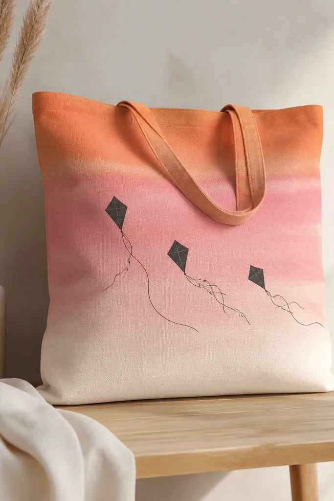
A sunset sky wash turns a basic tote into a wearable poster. The floating kite silhouettes keep it playful and beach-appropriate without needing detailed wings or patterns. I use charcoal for the kites because it looks crisp against soft color and dries matte.
Apply a top-to-bottom gradient using a wide sponge, keeping edges slightly blurred. Let it dry 15-20 minutes, then paint kite outlines with a liner brush. Add thin tails with a diluted charcoal mix, keeping each tail under 4 inches long.
Pro tipKeep the kite shapes simple and asymmetrical - real kites never look perfectly matched.
AvoidDon't paint the silhouettes before the wash fully sets or you'll get fuzzy edges.
5. Tropical Watercolor Palm Leaves (No Hard Edges)
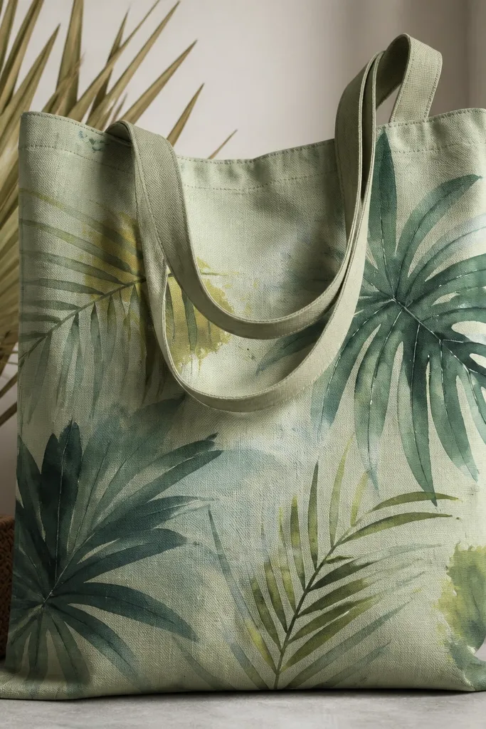
Palm leaves look dreamy when the edges stay soft. Layered greens and teals create depth, and small yellow-green dabs mimic sun hitting the fronds. This is one of my favorite "doesn't require drawing skills" designs because the leaves can be messy and still look right.
Wet your brush slightly, then load paint and lightly drag it onto the tote so it blooms. Use three greens: deep forest, teal, and a pale yellow-green for highlights. Paint 6-10 leaves radiating from the upper corner, leaving negative space in the center.
Pro tipWork in small sections and rinse your brush often so colors don't turn muddy.
AvoidDon't outline the leaves with a dark line - it kills the watercolor effect.
6. Blue Crab Corner Piece with Dots and Net Lines
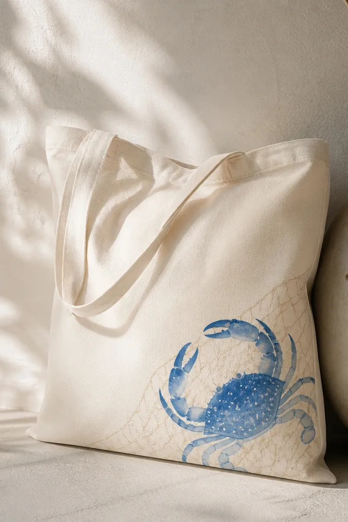
A corner crab is instantly beachy because it feels like a found illustration from a seaside shop. Dots add texture without complicated shading, and net lines bring movement. I keep the crab slightly larger than you'd expect - it reads well on a tote when you carry it.
Paint a simple fishing-net background with a light gray wash using a small sponge or stiff brush. Add the crab in two layers: base blue, then lighter highlights on the claws and legs. Finish with white dot accents using the tip of a round brush.
Pro tipUse a reference photo for the crab shape, but freehand the legs so yours looks like it belongs to the design.
AvoidAvoid placing the crab dead center; corner placement looks more intentional.
7. Wave Crest Stencil Repeat in Navy + Seafoam
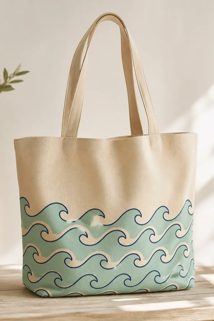
Stencil repeats look clean and dreamy because the rhythm does the work. Navy outlines keep it crisp, while seafoam fills keep it light. I like placing the repeat on the lower half because waves feel grounded and the tote top stays airy.
Use a wave crest stencil and painter's tape to position it. Dab paint with a foam mini roller or sponge so you don't get drips under the edges. Do two layers: seafoam fill first, then navy outline second for definition.
Pro tipPress the stencil down firmly and lift straight up to avoid smears.
AvoidDon't flood the stencil area; thick paint bleeds and ruins the pattern edges.
8. Tie-Dye Beach Twist Using Acrylic + Rubbing Alcohol
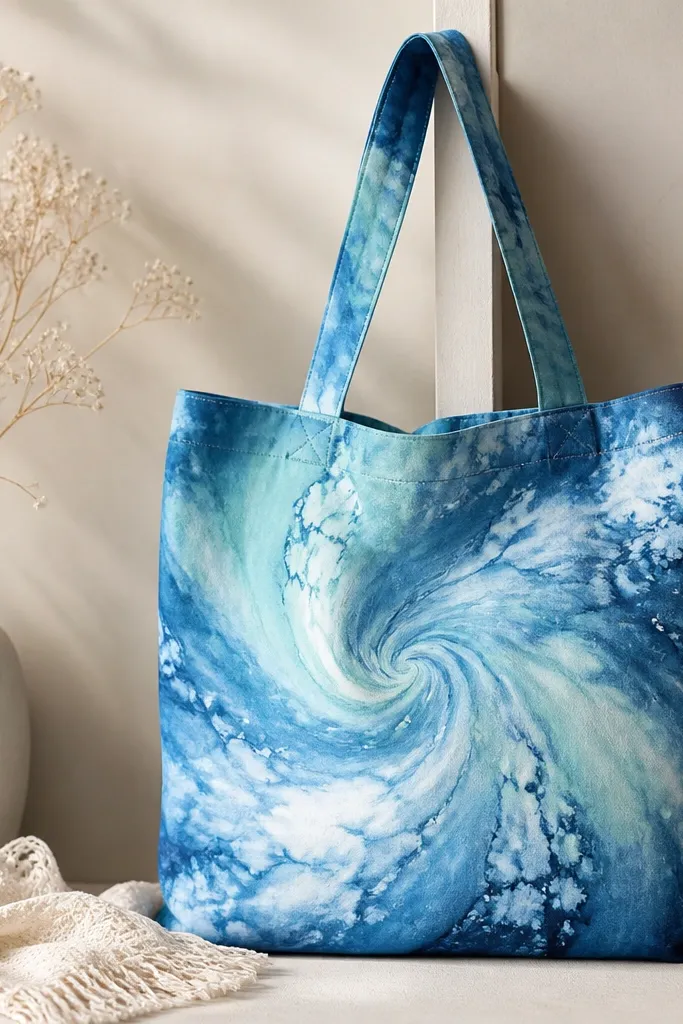
This looks like beach tie-dye without needing dye kits. Rubbing alcohol helps acrylic pigments spread and bloom, creating soft cloud edges that feel like salt air. The swirl pattern gives you movement even if you only do one big motif.
Lightly dampen the fabric with water, then apply diluted acrylic paint in three blues. Drip a few drops of rubbing alcohol into the center and watch the paint feather out. Let it dry fully before sealing so the colors don't lift.
Pro tipKeep the tote inside a tray or cardboard box so alcohol mist doesn't stain your workspace.
AvoidSkipping dilution - thick paint won't bloom and you'll get hard blobs.
9. Sunbleached Stripes with Salt Speckle Overlay
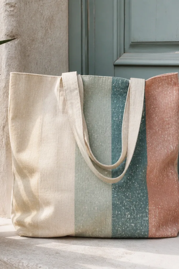
Sunbleached stripes look real because the fade is uneven. Dusty coral and muted teal keep it beachy but not childish. The salt speckle ties it all together - it makes the paint look like it's been in the sun.
Paint vertical stripes using a wide brush, then blend the edges with a damp sponge so they fade. After drying, load white paint on a toothbrush and flick lightly with your wrist. Keep the speckles lighter on the top half and heavier near the bottom.
Pro tipUse two passes per stripe: one for color, one for blending so you control the fade.
AvoidDon't over-flick speckles or it turns into a noisy mess.
10. Tide Pool Scene with Tiny Seaweed Silhouettes
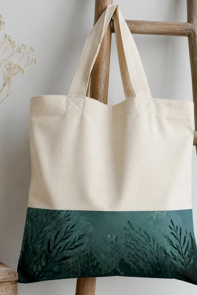
A tide pool scene is dreamy because it's moody and textured. Dark teal gives depth, while thin seaweed lines look delicate without needing detailed leaves. Bubbles made as simple circles with a small highlight make the whole thing feel alive.
Use a wide brush to block in dark teal at the bottom third, then blend upward with a damp sponge. Paint seaweed as thin strokes - vary thickness by pressing less for the tips. Add bubbles using a fine liner and a tiny white dot highlight in each circle.
Pro tipLet the teal dry longer than you think before adding seaweed so the lines stay sharp.
AvoidAvoid painting seaweed with a thick brush; it looks like marker scribbles.
11. Coral Reef Blobs with Neon-Lite Highlight Dabs
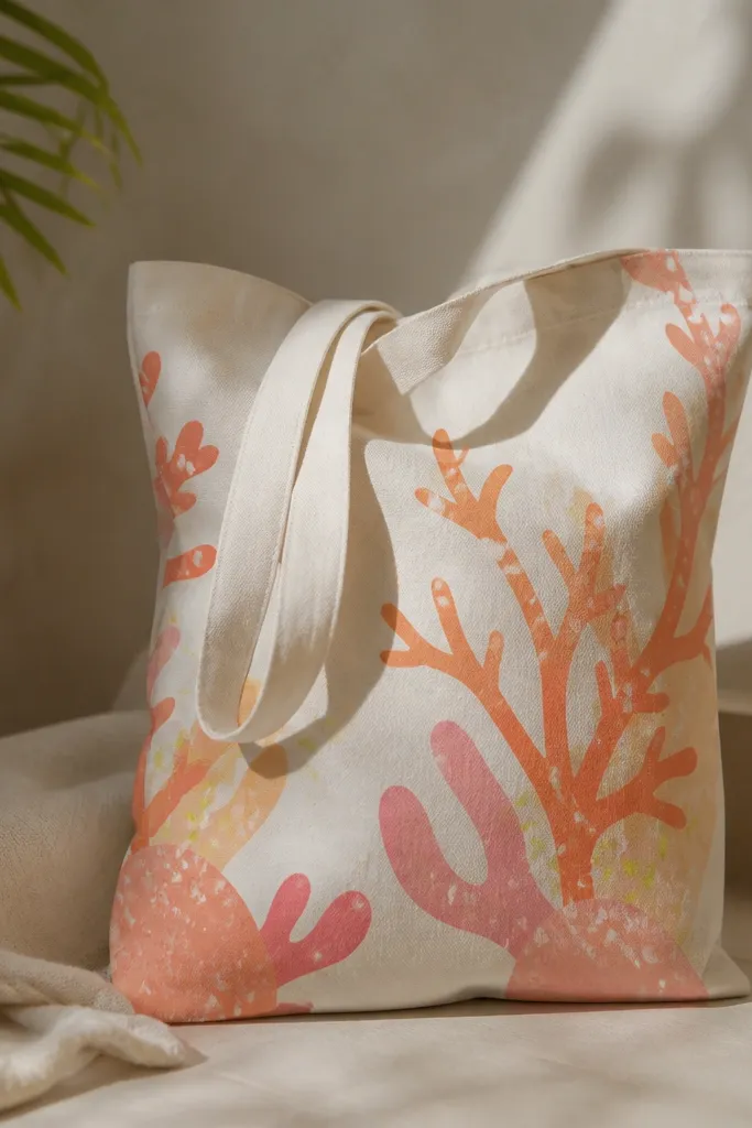
Reef blobs are forgiving and still look intentional because the shapes repeat and branch. Coral tones feel warm against the beach, and tiny neon-lime dabs add that "sun hitting the reef" pop. I keep the neon-lime to small accents so it doesn't look like playground art.
Sketch branching blob paths lightly, then fill with layered coral shades. Add a second pass with a lighter pink on one side of each branch for volume. Dot in lime-lighter highlights and draw a few bubble circles in white.
Pro tipUse a toothpick for highlight dabs so you get pinpoint control.
AvoidDon't cover the whole reef with highlights - only hit the tops and edges.
12. Beach Umbrella Stripes with Fringe Fringe Handle Art
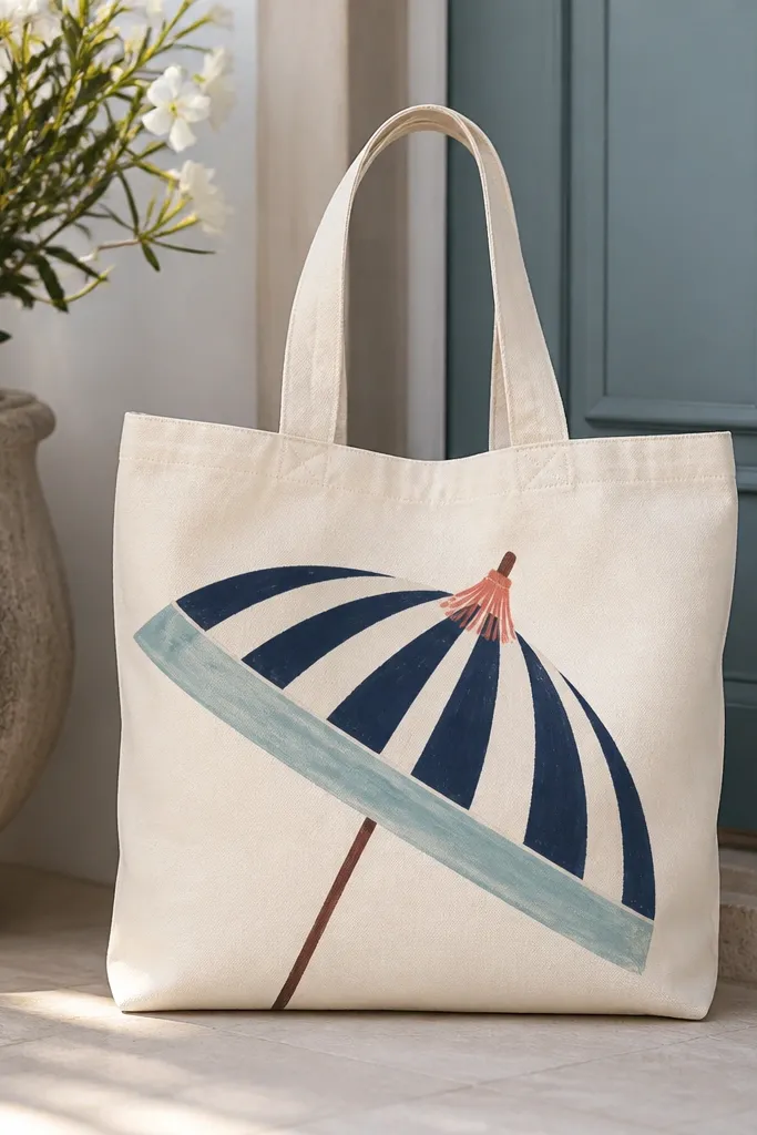
An umbrella motif makes the tote look like a beach accessory, not just a bag. Stripes are easy to plan and they read well from far away. Fringe-like handle art adds movement without painting the entire handle - the tote still looks wearable.
Paint the umbrella canopy as a half-circle, starting with lighter aqua at the rim. Mask the stripe spacing with thin tape lines if you want perfect rhythm, or freehand if you want looser stripes. For fringe, paint 1-2 inch short strokes in coral near the handle area, stopping before the handle attachment points.
Pro tipDo the umbrella first, then paint the fringe after so the lines don't get buried under stripes.
AvoidAvoid painting stripes over wet paint - they blur into one thick band.
13. Monochrome Navy Anchors with Chalky White Dry Brush
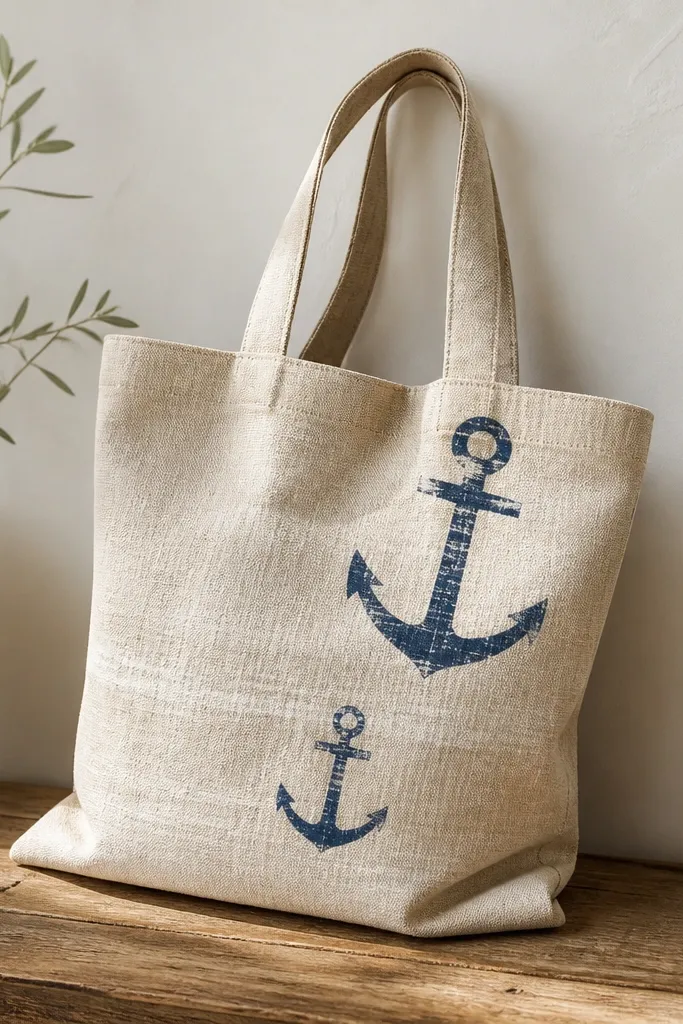
Monochrome designs look expensive because they're controlled. Navy anchors are classic beach decor, and chalky white dry brushing gives that sun-worn feel. I like this for people who want beach style without bright colors.
Paint anchors with a liner brush in navy, then add a second lighter navy highlight on the rope areas. For dry brush, load a stiff flat brush with white paint, wipe most off on paper, then skim across the tote in short strokes. Keep the dry brush mostly around the anchor edges.
Pro tipUse a stiff brush and very light pressure; dry brush should look like texture, not solid paint.
AvoidDon't wet-blend the dry brush - it stops looking chalky and turns streaky.
14. Seagull Silhouette in Negative Space with Sky Wash
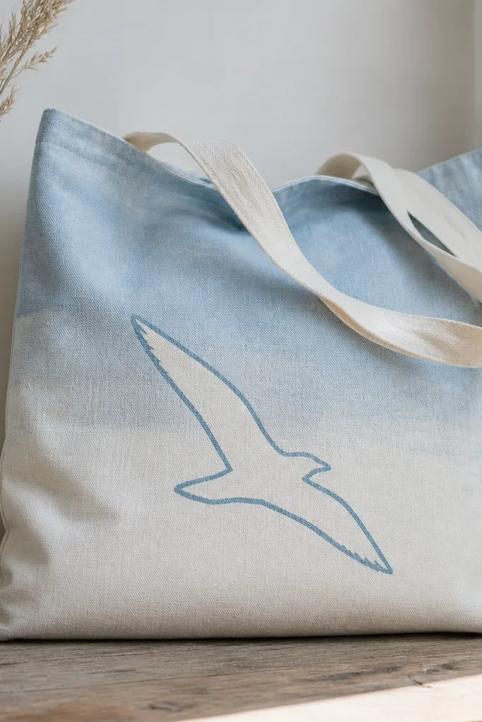
Negative space is the fastest way to make something look clean. The sky wash sets the mood, and the seagull reads instantly because your eye sees the contrast. I like adding a few tiny cloud smudges behind the bird in the same blue family.
Paint a sky gradient across the top half, leaving a seagull area untouched. Add a darker blue shadow line around the bird shape so it looks like it has depth. Finish with 2-3 small cloud smudges using a torn sponge for soft edges.
Pro tipUse painter's tape to mask the seagull area for razor-clean edges on your first try.
AvoidAvoid painting over the seagull area; if you fill it in, you lose the negative-space look.
15. Watercolor Beach Sign with Hand-Lettered Words
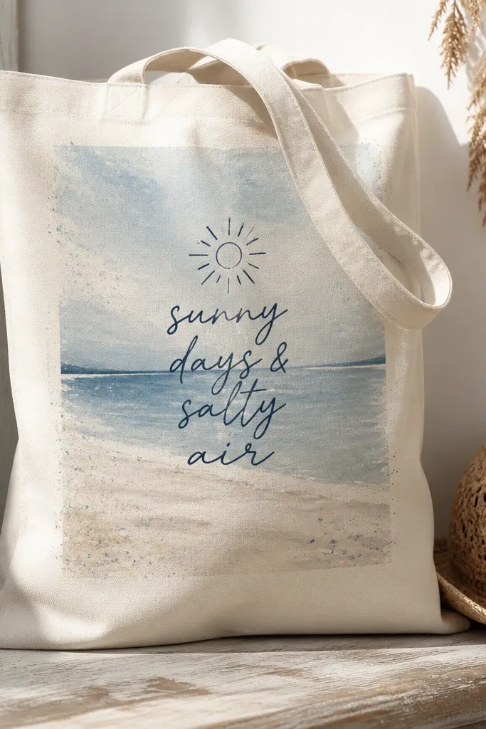
A beach sign panel makes your tote feel like a gift shop print. The watercolor rectangle gives a dreamy background, and hand-lettered text gives personality. I keep the message short - 2-3 words - so it still looks neat on a tote.
Paint a rectangle panel where you want the text, leaving at least 1 inch margin from the tote edges. Use a liner brush for lettering in navy, then add a simple sun icon with a small circle and uneven rays. Add a few controlled splatters around the panel using diluted white paint.
Pro tipPractice the lettering on paper first, then transfer the layout lightly with a pencil sketch.
AvoidDon't cram long sentences into the panel; tote space disappears fast.


