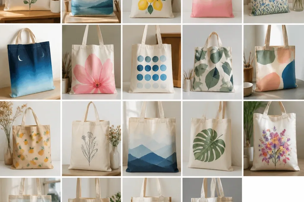
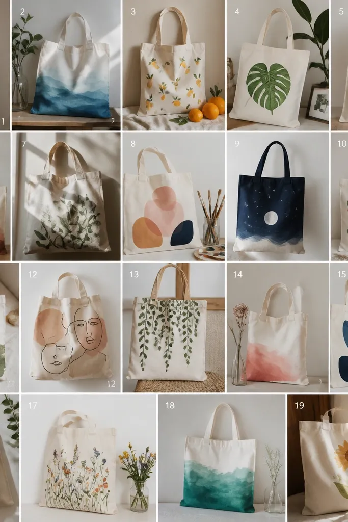
1. Sunset gradient blobs with a 2-color base
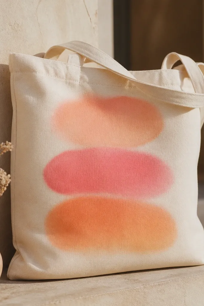
This one looks expensive because it's built from smooth color transitions instead of outlines. I paint a quick base with two colors (peach and coral), then blend the boundary using a damp sponge so the colors melt together. The blobs sit slightly above the bottom seam, so the tote structure frames the art. It works best with acrylic mixed with a little fabric medium so the paint stays flexible and doesn't get rubbery.
Use a soft sponge or makeup sponge for the blending. Mix peach acrylic with a touch of white, and coral acrylic with a touch of orange so the gradient goes from warm to deeper warm. Let each pass dry 10-20 minutes, then add the next layer while the sponge paint is still slightly tacky for smoother blending.
Pro tipDo a test blob on a scrap of the same tote fabric - if the sponge leaves streaks, add a bit more fabric medium to thin the paint.
AvoidDon't outline the blobs with a dark line - it kills the airy sunset look and makes it look like a sticker.
2. French stripe tote with hand-painted corner dots
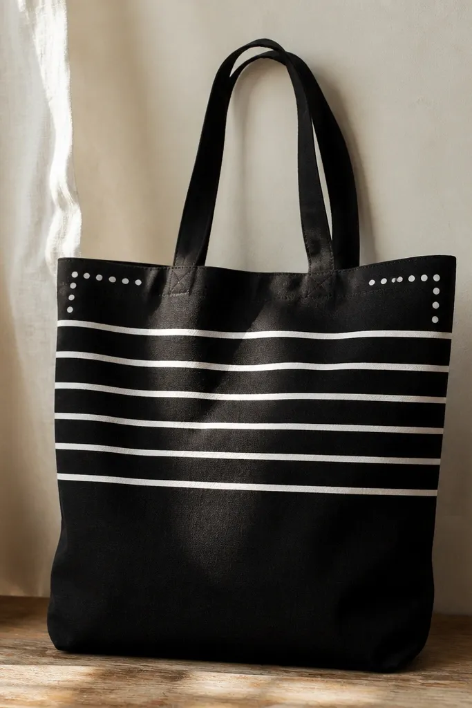
Stripes are the easiest way to look polished fast, and corner dots make it feel custom. I start with painter's tape to keep the stripes straight, then paint in two passes for opacity. The dots are small and uneven on purpose - that hand-made imperfection reads more human than perfect geometry. It's a great choice when you want something graphic that still feels soft.
Tape off 1-inch bands (or 3/4-inch if you want it tighter). Paint white acrylic mixed with fabric medium over each band, let dry, then remove tape while the paint is still slightly firm to avoid tearing. For dots, use a small round brush and tap-lightly so the dot edges stay rounded.
Pro tipPress the tape down hard at the edges with a fingernail so paint doesn't creep under and blur your stripe lines.
AvoidAvoid wide tape gaps - they create uneven stripe widths that look sloppy, not chic.
3. Botanical line art with a single brush and watered ink
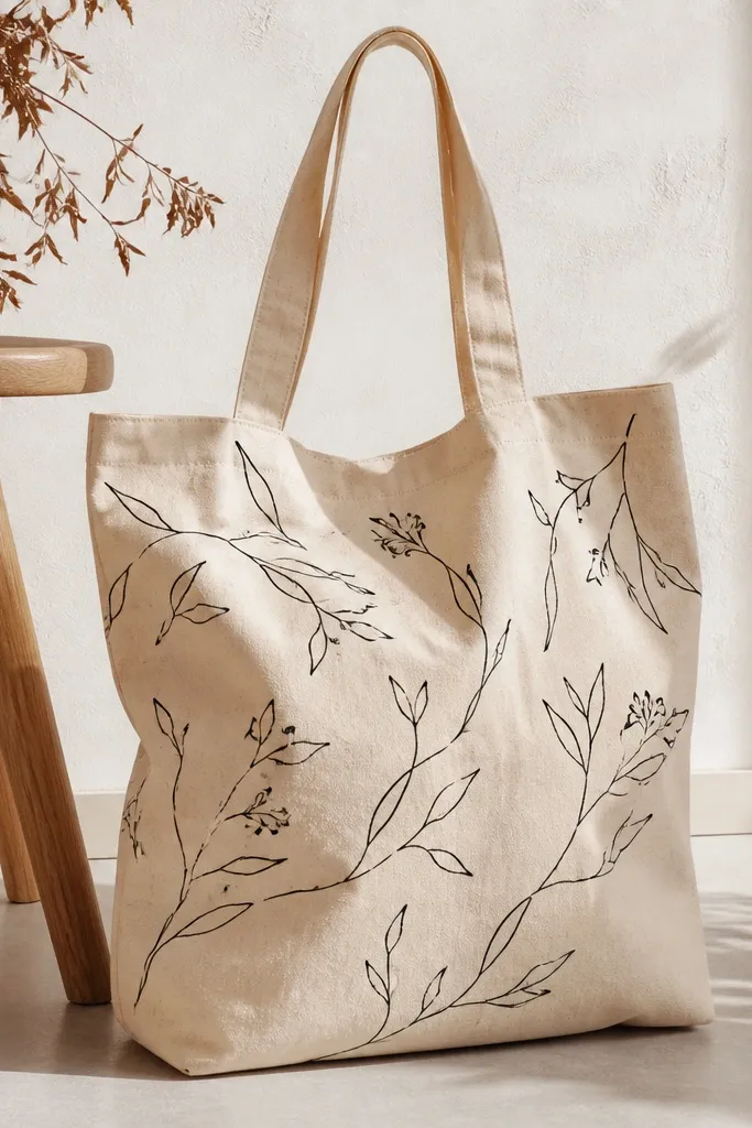
Line art looks clean because you're not covering the fabric - you're drawing on top. I use black acrylic thinned with water and a tiny splash of fabric medium, then pull lines with a round brush so the stroke gets thinner at the end. The variation in line thickness makes the whole thing look intentional. Keep the drawing in one color for a high-end, poster-like look.
Plan your layout with chalk pencil first, then paint over it. Use a size 2 or 3 round brush, and keep a paper towel nearby to wipe the brush so you don't flood the weave. Let it dry, then add a second pass only where you want darker emphasis on stems.
Pro tipIf your lines look too gray, don't add more paint to the brush - use fewer water drops and reload with thicker paint.
AvoidSkip thick outlines - heavy black makes the tote look like a craft project.
4. Shibori-style tie-dye effect using salt and squeeze bottles
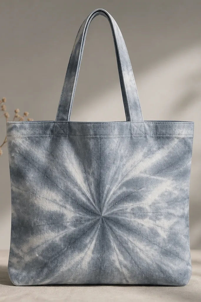
This gives that fabric-dyed look without buying dye kits. You fold and twist the tote like a quick shibori, then paint with watered acrylic so it behaves like dye. Salt creates lighter speckles and streaks where it pulls pigment as it dries. The result is moody and artsy, and it hides minor brush marks.
Wet the fabric lightly so the paint spreads. Twist the tote into a small rope coil, secure with rubber bands, then squeeze watered blue acrylic over it. Sprinkle coarse salt on top and let it sit until dry, then rinse gently and re-dry before you paint any extra accents.
Pro tipUse two blues (a mid blue and a deeper indigo) and alternate squeezes so the folds look dimensional.
AvoidDon't soak the whole tote - keep the effect centered or it turns into a messy wash.
5. Geometric triangles using 1/4-inch painter's tape
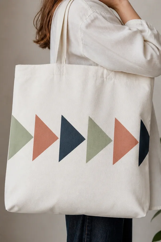
Sharp geometry reads modern, and tape makes it repeatable. I map a simple triangle grid, then tape one color area at a time so edges stay razor clean. Use muted colors instead of neon - they look more "designed" and less like kids' craft paint. The triangle placement on the lower half makes the top handles feel like they frame the art.
Cut strips of 1/4-inch painter's tape and build triangles on the tote surface. Start with the lightest color (sage), then add terracotta, then navy. Peel tape after each layer dries 100%, not halfway.
Pro tipPress tape edges with a ruler so you don't get tiny paint leaks that ruin the crisp look.
AvoidDon't layer tape over wet paint - you'll smear and end up with jagged edges.
6. Polka-dot ombre with sponge stamps
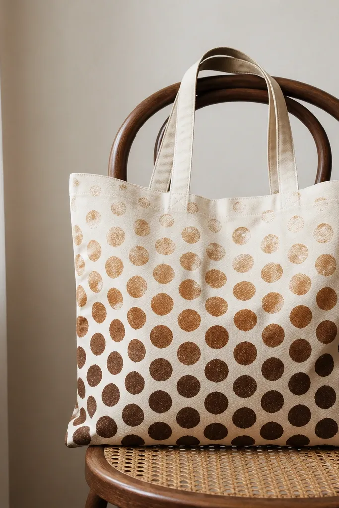
Sponge-stamped dots are forgiving, and the ombre gradient makes it look intentional. I stamp in a tight grid so the dots feel patterned, then lighten the paint mix as I go up. The slight texture from the sponge keeps it from looking too perfect. This is one of the fastest ways to cover a tote without it looking messy.
Mix brown acrylic with fabric medium, then create three thinning levels by mixing in more white or more medium. Stamp dots using a makeup sponge cut into a clean circle. Work from bottom to top, reloading the sponge often so each dot stays full.
Pro tipStagger the dots slightly (not perfectly aligned) so the tote doesn't look like a printed sheet.
AvoidSkip thick paint - it makes dots blob and looks cheap.
7. Starry night with dry-brush speckles and a masking moon
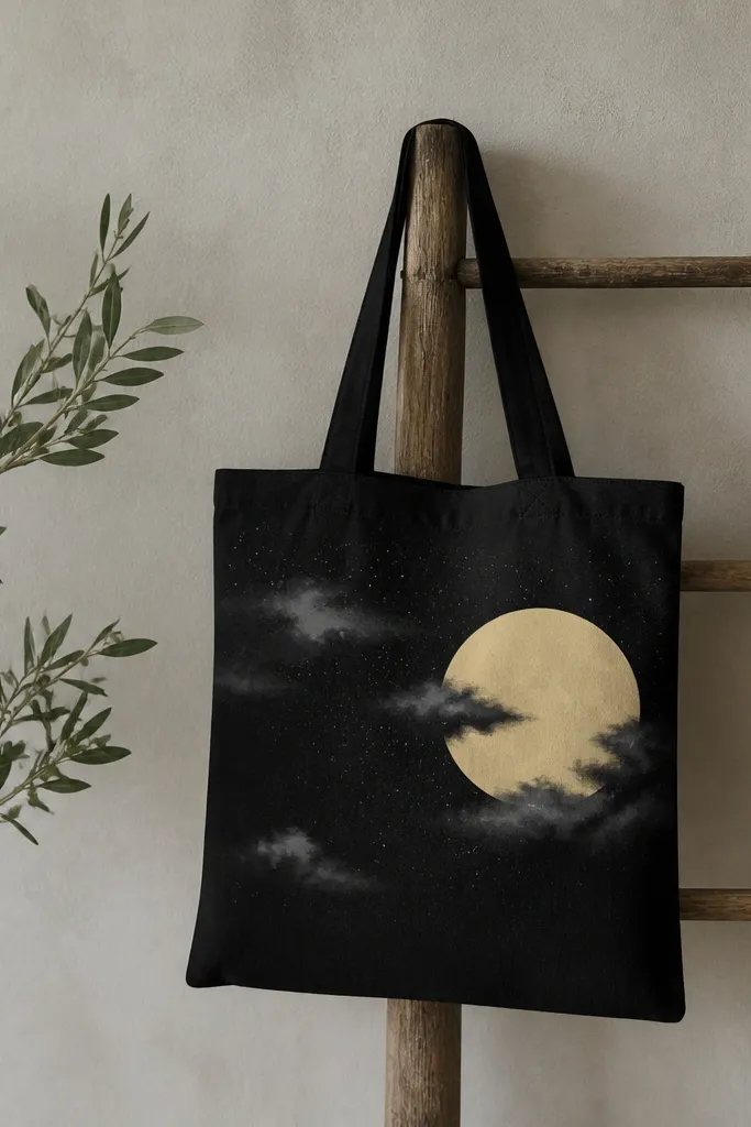
Dry-brush speckles look like stars because they're random and layered. I mask a clean moon circle with tape so it stays bright and crisp, then build the background with gray dry brushing. Finally, I flick white paint off a stiff brush for star dots. This is dramatic and cheap because you only need white, gray, and one pale yellow.
Tape off a moon circle using a round piece of cardboard as a guide. For the clouds, load a flat brush with gray paint and wipe most off on a paper towel, then drag lightly. Flick white paint with the brush held close to the fabric but not touching.
Pro tipPractice the flick on scrap until you get tiny dots instead of splatters.
AvoidDon't remove the moon tape too late - peeled tape on fully cured paint can tear edges.
8. Monogram in bubble letters with a shadow outline
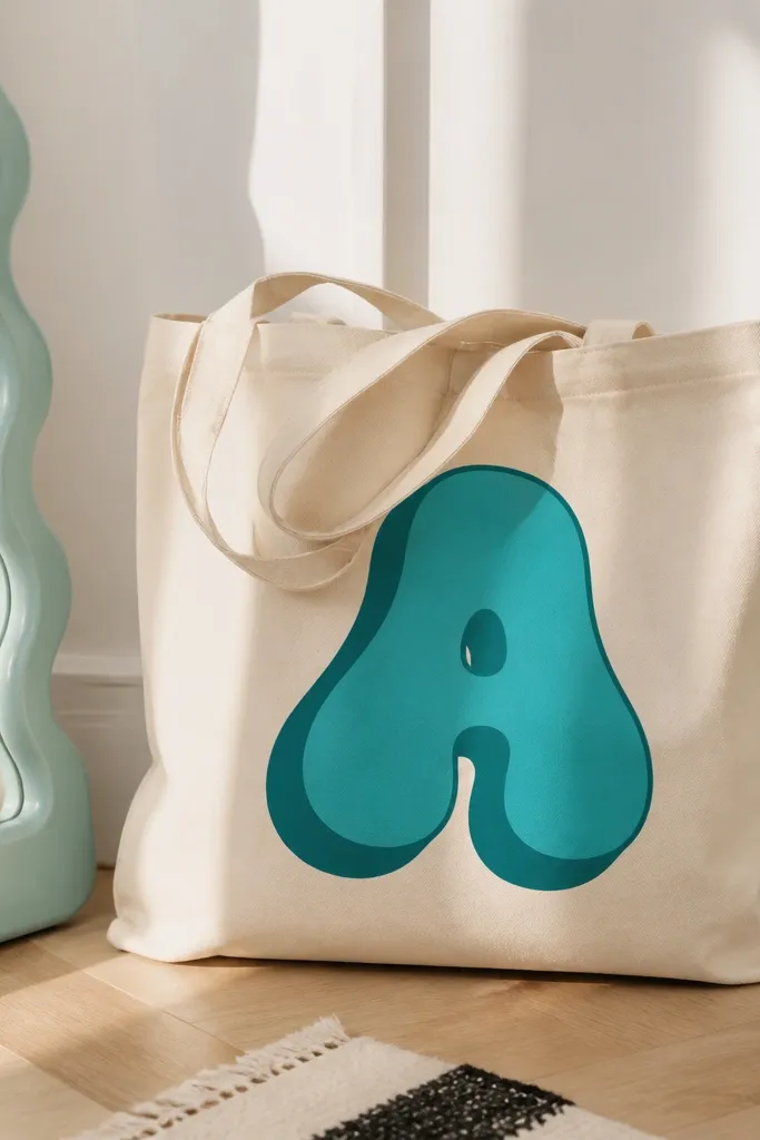
Monograms look polished when you add a shadow offset. I paint the bubble letters thick enough to read from across a room, then trace the same shape again with a darker shade shifted a few millimeters. The offset shadow makes the design feel like a screen print. Use two coordinated tones, not random colors, so it stays clean.
Sketch the letter with pencil, then trace it with a fine liner brush. Fill the bubbles with teal acrylic mixed with fabric medium. After drying, paint the shadow by repeating the outline offset down and right by about 3-5 mm.
Pro tipKeep your bubble stroke thickness consistent by using the same brush angle for every curve.
AvoidAvoid freehand shadow offsets - if it's uneven, the monogram looks careless.
9. Marbled acrylic wash with foam roller streaks
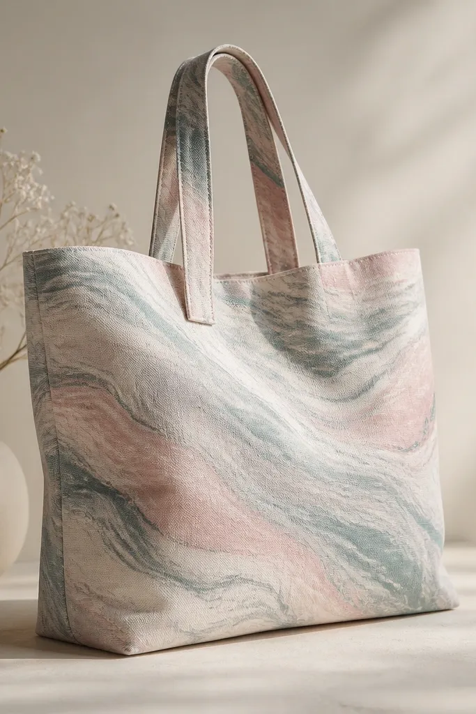
Marbling looks high-end because it's layered and organic, and you don't have to be a great drawer. I dilute acrylic into a wash, then roll it with a small foam roller so the paint streaks spread like liquid. Add one darker color on top and swirl with a damp brush tip. It turns a plain tote into something that looks like it belongs in a studio.
Mix pink and seafoam acrylic with lots of fabric medium so it stays flexible. Roll a thin base coat, wait until tacky, then drag a darker gray stripe through it with a damp brush. Let it dry overnight before you handle it heavily.
Pro tipUse a foam roller that's new or very clean so you don't bring old lint into the pattern.
AvoidDon't overwork it once it starts drying - extra swirls turn into muddy gray.
10. Limited palette face sketch in muted peach
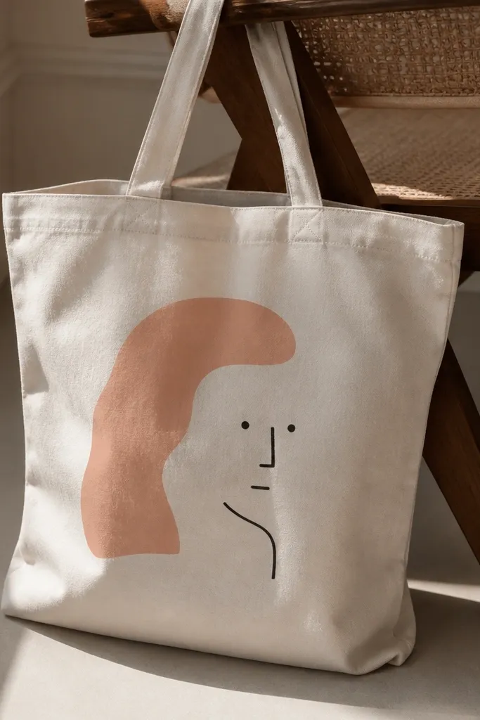
Minimal faces look cool because negative space does the work. I keep it to two colors: muted peach for skin tones and black for line details. The trick is to use painterly blocks for hair and cheeks, then add tiny features with a liner brush. The result feels modern and wearable, not cartoonish.
Sketch the face placement lightly, then fill hair with a flat brush using a peach-mix plus a touch of brown. Paint eyes and nose with a liner brush using watered black acrylic. Add one blush cheek stroke and stop - too many lines make it cluttered.
Pro tipUse a thin sheet of cardboard inside the tote so paint doesn't bleed through to the other side.
AvoidDon't use bright peach-orange - it reads too neon and cheap.
11. Botanical stamp border using cut sponges
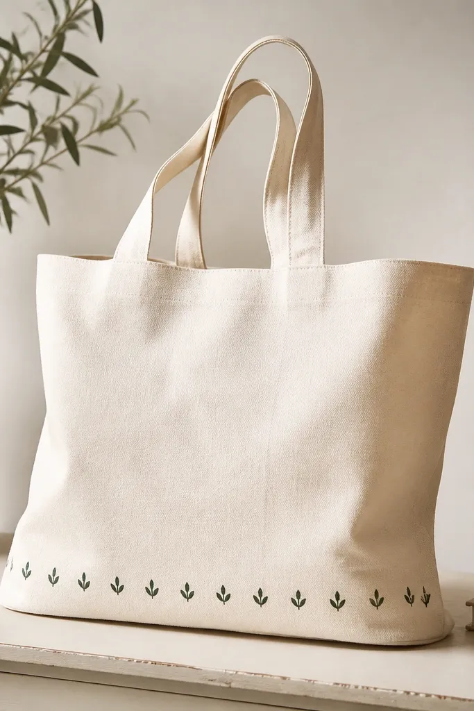
A stamp border makes even a plain tote look finished. You don't need carved stamps; you can cut leaf shapes from craft foam or sponge. I press the stamp along the bottom seam line, then vary pressure slightly so some leaves look lighter. It's fast, consistent, and looks intentional when you keep the border height small.
Cut a simple leaf shape from craft foam and seal the edges with a quick coat of clear acrylic medium so it doesn't shed bits. Mix dark green acrylic with fabric medium and stamp in a straight line. Work in sections and let it dry before you start the next row.
Pro tipHold the stamp straight up and down for each press. Tilting creates blurry leaf tips.
AvoidDon't stamp too close to the seam where fabric folds - you'll get smeared leaves.
12. Rainbow wave stripe with paint marker control
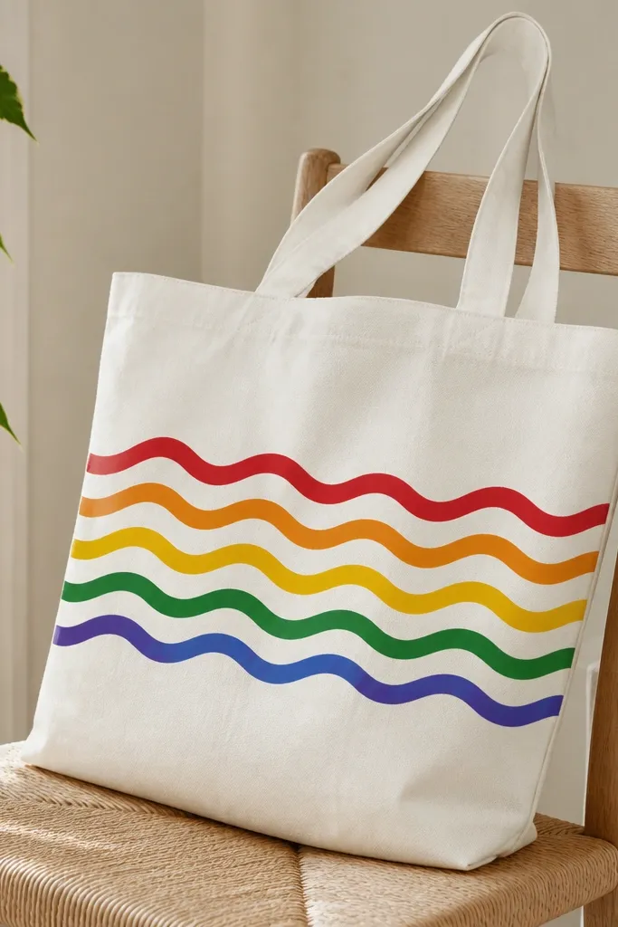
Paint markers give you control on curved lines, and waves look fun without being childish when the palette stays soft. I use a limited rainbow: warm yellow, coral, pink, lavender, and sky blue. The waves are drawn with a steady hand, then lightly blended at the edges with a small brush if needed. It reads like a print because the lines stay consistent.
Use thick-tip paint markers and draw the wave lines first as guides. Fill between two wave lines with a small flat brush, using thin paint so it doesn't crack. Let each color dry 15 minutes before touching the next stripe.
Pro tipDraw the first wave with pencil guide marks, then commit with the marker only after the spacing looks right.
AvoidAvoid overfilling marker strokes - thick paint lines look raised and can crack when folded.
13. Stencil animal silhouette with dry brush texture
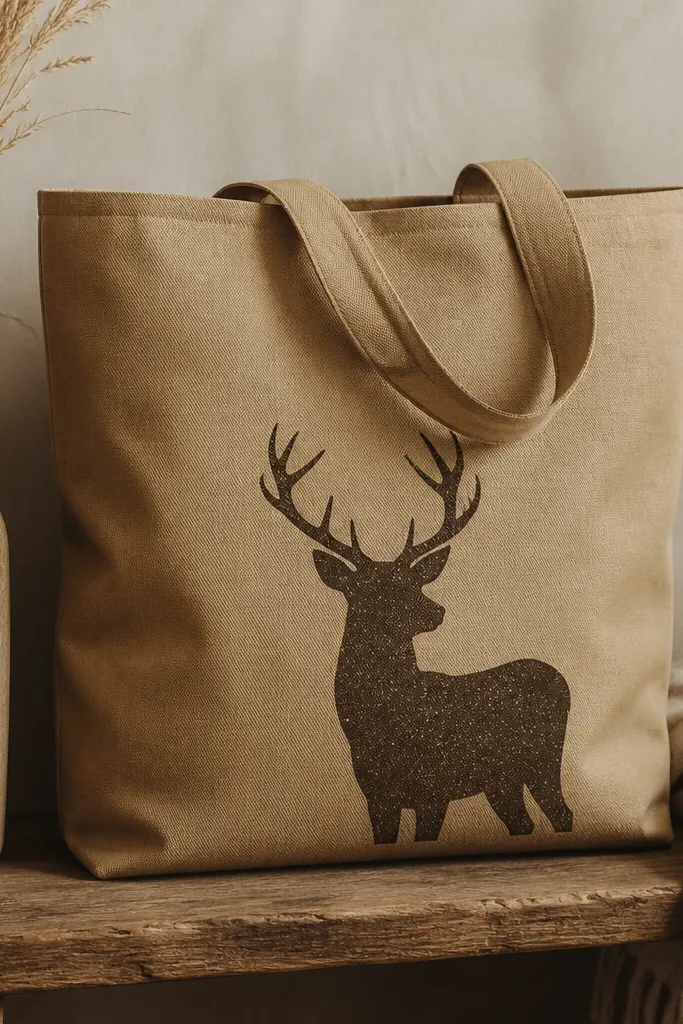
Silhouette stencils look great because they avoid detailed drawing, and dry brush texture keeps them from looking flat. I stencil the animal shape in dark brown, then lightly dry brush a lighter brown over part of the inside for fur texture. It gives depth without needing realistic painting. Works especially well on medium-tone bags where the silhouette can stand out.
Use a reusable stencil or cut a stencil from thick plastic folder material. Secure it with painter's tape so it doesn't shift. Dab paint with a sponge brush for the stencil fill, then dry brush texture after the stencil paint is dry.
Pro tipClean the stencil immediately after use so dried paint doesn't ruin edges next time.
AvoidDon't flood the stencil - dripping paint under the edges ruins the silhouette.
14. Tie-up ribbon lettering effect using masked stripes
This looks like a printed graphic because the stripes inside the letters are controlled with masking. I paint the whole word in one base color, then mask narrow stripes inside each letter. The final effect is a ribbon lettering vibe without complicated brushwork. It's a fun choice if you want text but still want it to look artsy.
Sketch the word lightly, then paint a solid base (sage). After drying, mask thin vertical stripes inside each letter using 1/8-inch tape strips. Paint the exposed stripes in an off-white or cream shade, then remove tape carefully.
Pro tipUse a ruler to keep stripe spacing even across letters. Your brain notices inconsistency fast.
AvoidAvoid tiny stripe widths - under 1/8-inch the tape edges get messy.
15. Watercolor look florals using diluted acrylic wash
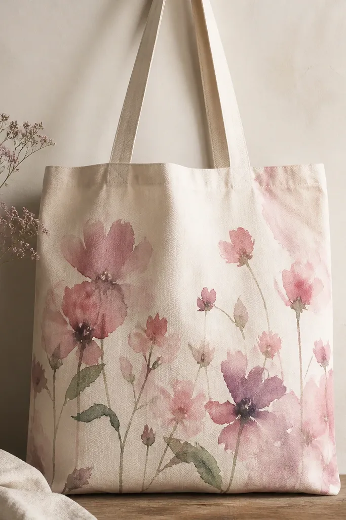
You can get a watercolor look using diluted acrylic and a wet brush, even on tote fabric. I mix acrylic with fabric medium and enough water to make it flow, then paint petals in quick strokes while the fabric is slightly damp. The feathering happens because the paint soaks and spreads. Keep the shapes simple - loose florals look better than overly detailed ones.
Lightly dampen the area with a clean water mist. Paint petals with a round brush, then add a darker center color while the first layer is still wet. For stems, use a smaller brush and thin green paint.
Pro tipWork from light to dark and stop adding color once petals look balanced.
AvoidDon't overpaint dry areas - it creates chalky edges instead of watercolor softness.
16. City map coordinates using tiny dot grid
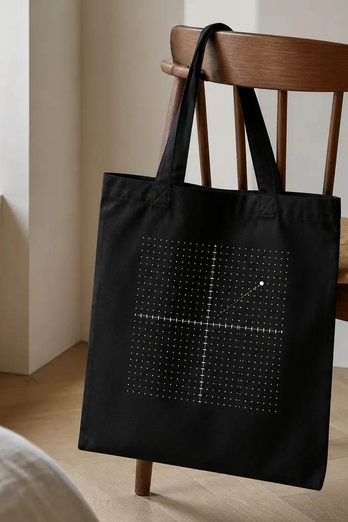
Dot grids look like maps and they're surprisingly easy. I paint a small grid with light pencil marks, then place dots using a paint pen or a stippling brush. The dotted numbers hold up well at a distance, and the black background makes the white pop. This one is a great gift design when you want something personal but still clean.
Mark a 1-inch grid area where the coordinates will go. Use a white paint pen to dot each grid intersection, then add a tiny arrow marker in the corner. Let it dry fully, then add a second dot layer only if you need opacity.
Pro tipIf dots smear, your fabric is too wet - let the tote dry and then test dot size on scrap.
AvoidAvoid large dots - they stop looking like a map and start looking like random confetti.
17. Monochrome marble frame with gold leaf accents
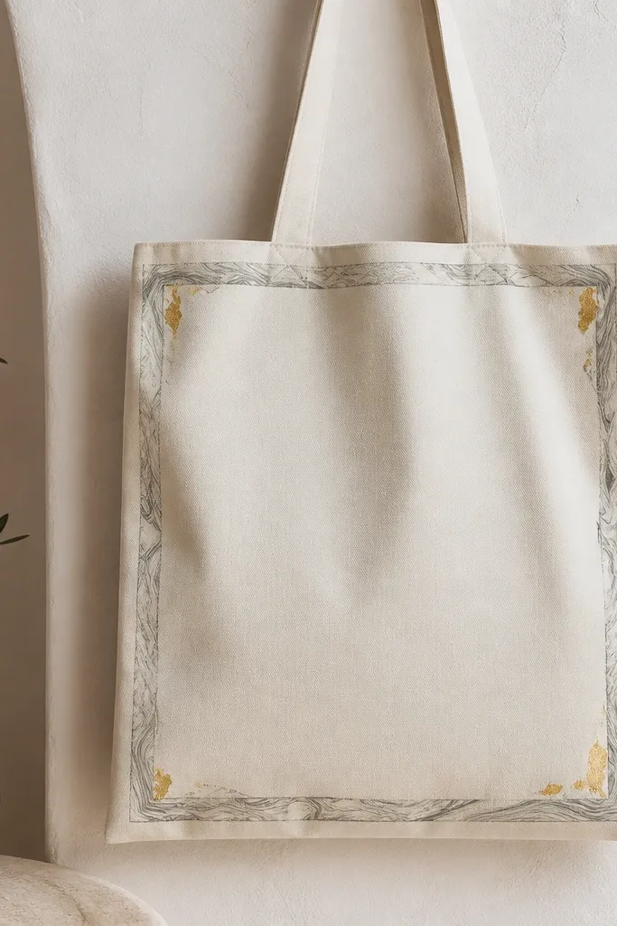
A frame gives your tote a finished, invitation-card vibe. I paint a thin border in a gray marble wash, then add gold leaf at the corners so it looks like metal without heavy painting. Keeping the center blank makes the frame stand out. This works on any bag color, but it looks best on cream or black.
Mask a border area with tape, leaving about 3/4-inch margin from the edge. Create marble by dragging a damp brush with gray paint through lighter gray wash. Once dry, press small pieces of gold leaf where you want highlights and seal with a matte fabric clear coat.
Pro tipGold leaf sticks better if the surface has a slightly tacky layer - follow the tack timing on your adhesive or use a fabric leaf adhesive.
AvoidSkip thick clear coat over leaf - it can dull the shine and make gold look flat.
18. Large polaroid-style photo frame with stamped 'tape' corners
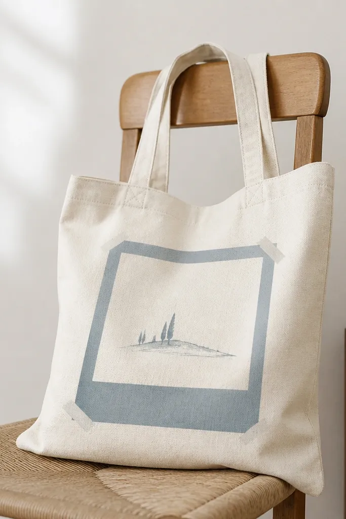
This design looks like you taped a photo to a tote, and the effect is mostly in the frame proportions. I paint a big rectangle, add a lighter inner border, then fake tape corners with angled shapes. The center can be a tiny doodle - mountains, a sun, or a single leaf. It's playful but still tidy because the shapes are controlled.
Use a stencil or tape to create a 6x8 inch frame area on the front panel. Paint the outer frame color (muted blue), then add an inner border in off-white. For tape corners, paint two small angled rectangles at each corner and add a thin gray shadow line to mimic tape depth.
Pro tipKeep the doodle small, like 2 inches wide, so the frame stays the main focus.
AvoidDon't make the frame too thick - thick frames look like foam craft instead of printed design.
19. Gradient "ink wipe" stripes with rag drag
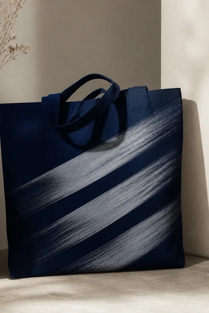
Rag-drag stripes look like ink wiped across paper, and you get a smooth gradient without fancy tools. I apply paint in a controlled stripe, then drag a damp rag across it to pull pigment and create the fade. The diagonal angle makes it dynamic, and the limited color keeps it cohesive. This one is great when you want motion but don't want to draw.
Tape three diagonal guide lines first so stripes align. Paint each stripe with a thick-ish layer of navy acrylic mixed with fabric medium, then immediately drag a damp rag across the stripe in one direction. Let it dry, then remove tape after full drying.
Pro tipUse a rag with no lint. Old cotton tees work well if they're washed and not shedding.
AvoidAvoid dragging back and forth - it creates muddy overlaps.


