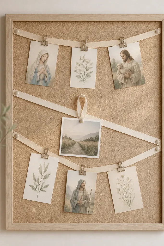
1. Linen + Brass Clip Quote Bar
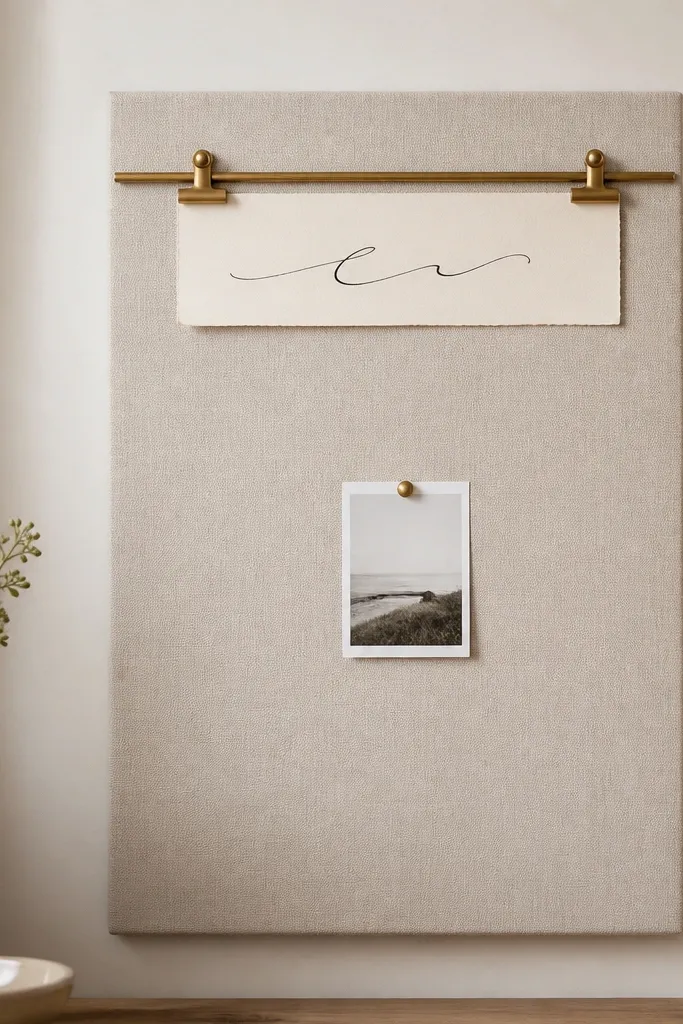
This design looks expensive because the fabric is the main color - linen has soft texture that hides minor wrinkles and makes everything else feel intentional. The brass clip rail adds warm metal contrast against the beige. Keeping the layout mostly calm makes the quote card readable from across the room. One photo and one verse card keeps the board from turning into a bulletin board.
Frame a 20x30 inch panel with 1x2 inch wood trim painted matte white or stained natural oak. Stretch linen cotton over foam core or a thin plywood base and staple on the back. Add a 20-inch brass picture-rail or a slim brass rod along the top third, then hang the quote card with two brass binder clips.
Pro tipPrint your verse on textured cream paper and use a black pigment pen so it looks like it was lettered by hand.
AvoidAvoid multiple small magnets and pins all over the linen - too many fasteners break the clean look.
2. Walnut Veneer Shadow Box Verses
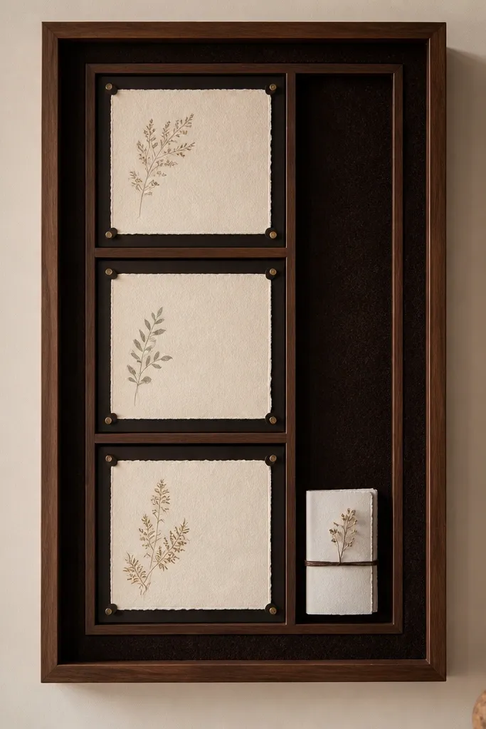
Shadow-box builds look upscale because the cards look protected and spaced like collectibles. Walnut veneer reads warm and expensive even in small rooms. The espresso felt background absorbs glare, so the text stays sharp. Three compartments keep the board organized without crowding.
Use a ready-made shadow-box frame or build a box from 1x2 inch walnut veneer plywood strips. Add 1/2 inch dividers to create three compartments. Back it with espresso felt and cover the front with 1/8 inch clear acrylic secured with corner standoffs.
Pro tipCut your cards to the same width with 1/4 inch spacing between compartments - that alignment is what makes it feel designed.
AvoidAvoid raw paper directly under acrylic without a spacer - it fogs with condensation and looks messy.
3. Matte Black Grid Cork Board
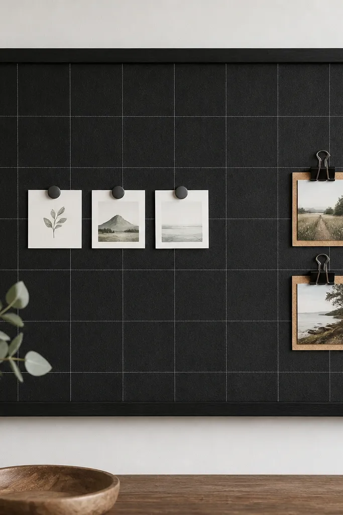
Cork gives you a forgiving surface, but painting it matte black makes it look modern and intentional. The thin white grid lines create order without adding clutter. Magnets keep cards flush and flat. This is the kind of board that still looks neat after you swap cards weekly.
Paint cork with matte black spray paint in two thin coats, then let it cure 24 hours. Draw a light grid using a white paint pen or fine-tip acrylic marker. Mount with a black metal frame or attach cork to a 1/2 inch plywood backing for weight.
Pro tipUse small square magnets (about 3/4 inch) instead of big round ones so the cards stay visually clean.
AvoidAvoid bright colored pins - they fight the matte black look.
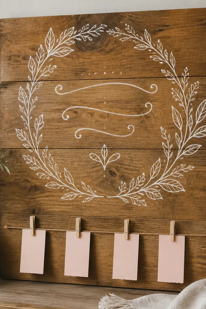
4. Whitewashed Wood Slat + Linen Pockets
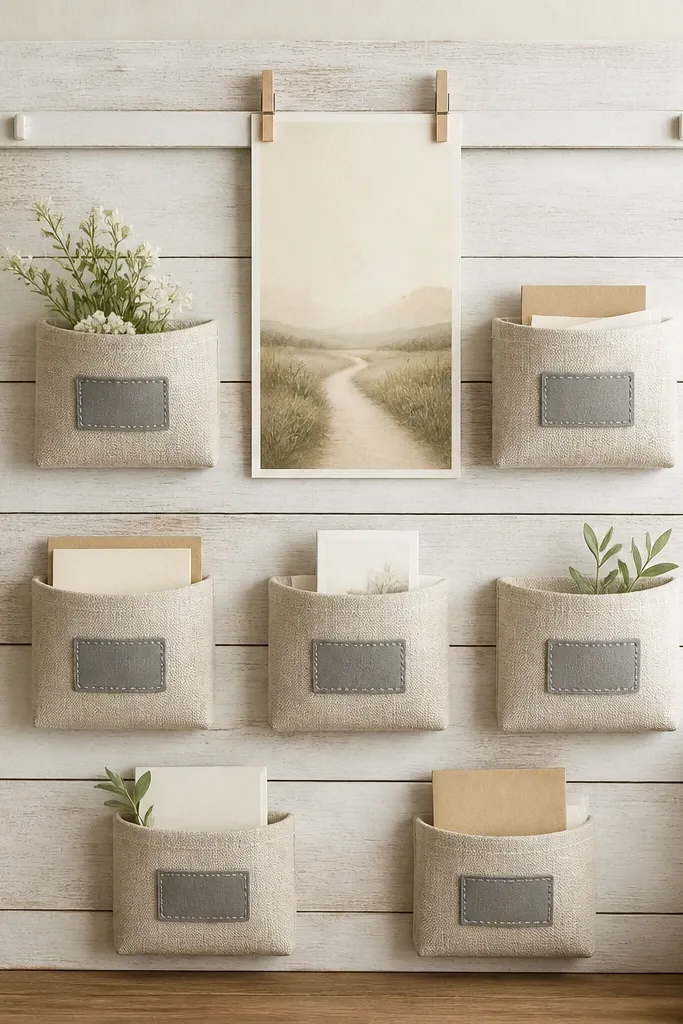
Wood slats bring a horizontal rhythm that reads like farmhouse modern. Linen pockets add softness and hide the mess of loose cards. The stitched labels make it feel curated without being fussy. This layout is great for families because each pocket holds one theme: gratitude, requests, answered prayers.
Use 1x3 inch slats spaced 1/2 inch apart on a plywood base. Attach two top rails: one for clipped cards and one for hanging pockets. Sew or buy linen pocket sleeves sized about 5x7 inches, then clip them to the rails with small wooden clips.
Pro tipLabel with a single font and one consistent gray thread color so the whole board reads uniform.
AvoidAvoid mixing pocket sizes - it creates visual chaos fast.
5. Creme Foamboard Marble Look + Gold Pushpins
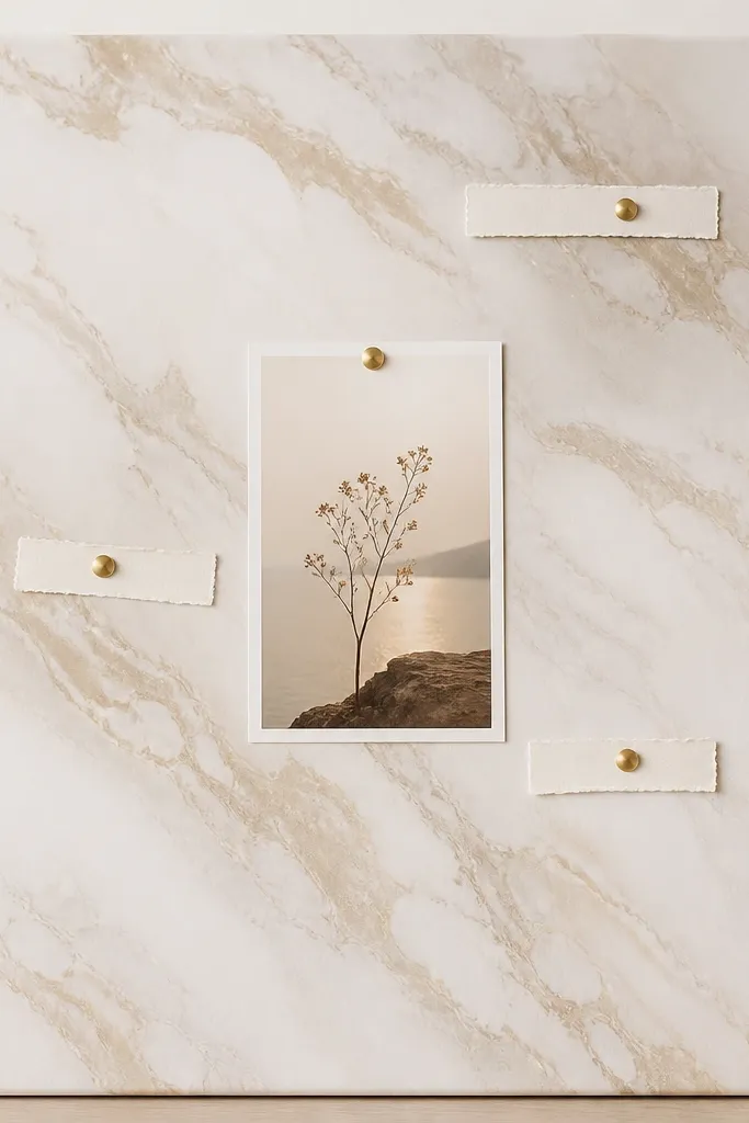
Marble-look backgrounds trick the eye into thinking the board is expensive because the finish has movement. Gold pushpins add a small luxury detail, especially against cream. The layout stays minimal, so the text is the focus. This works well in offices and entryways where you want calm, not clutter.
Cover foamboard with marble-contact paper or paint a faux marble pattern using a sponge and diluted taupe acrylic. Seal with a matte clear coat if you painted it. Add a small 1-inch white picture frame for the main verse and secure with gold pushpins.
Pro tipWrite notes on narrow strips about 1 inch wide so they look like elegant tags, not random scribbles.
AvoidAvoid full sheets of paper pinned all over - the marble will look busy.
6. Acrylic Photo Frame + Magnetic Verse Tiles
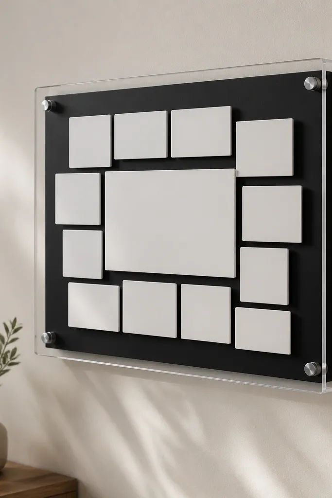
Magnetic tiles look clean because they sit flat and align to the same thickness. Acrylic framing makes the whole thing look like a modern display case. The black backing boosts contrast so lettering pops in daylight. You get the benefit of easy swapping without the messy pin marks.
Use a ready-made acrylic wall frame around 18x24 inches. Attach a thin steel sheet to the back with adhesive strips. Make tiles from 1/8 inch acrylic or cardstock laminated to a magnet sheet, then cut and mount with magnets behind.
Pro tipKeep all tiles the same font size scale. Change the content, not the typographic style.
AvoidAvoid mixing handwritten and printed fonts on the same board - it looks like a collage.
7. Cork + Fabric Ribbon Wall for Prayer Cards
Ribbons soften cork and make it look styled, not utilitarian. Clips along the ribbon create a gentle line that guides the eye, which is why this reads aesthetic even with multiple cards. The fabric also hides the look of random thumbtacks. Use it when you want cards to move often but still look tidy.
Leave cork unpainted or seal it with clear matte varnish. Pin ribbons using small tacks at the back edge so the front looks smooth. Clip cards with binder clips that match the ribbon color - silver clips look sharp on cream.
Pro tipFold the ribbon edge under by 1/4 inch before pinning so it looks finished and doesn't fray.
AvoidAvoid rubbery satin ribbons that shine - the glare makes the board look cheap.
8. Ceramic Tile Prayer Board with Rope Hanger
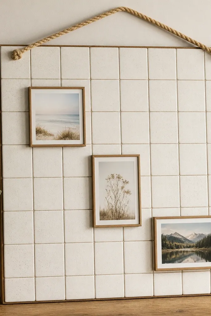
Ceramic tile looks expensive because it has consistent color and a hard, clean surface. The rope hanger adds texture and a handmade touch without clutter. Removable frames keep the design flexible for seasonal verses. This board also wipes clean, which matters when family members keep touching it.
Use 4x4 inch ceramic tile sheets or buy individual tiles and grout. Mount tiles to a sealed plywood backing with tile adhesive, then grout and seal. Add a top rope hanger anchored with two heavy-duty screws and washers.
Pro tipAdhere removable picture mounts rated for tile so you can swap frames without damaging grout.
AvoidAvoid glossy tiles - reflections make small text hard to read.
9. Neutral Felt Board with Leather Strap Clips
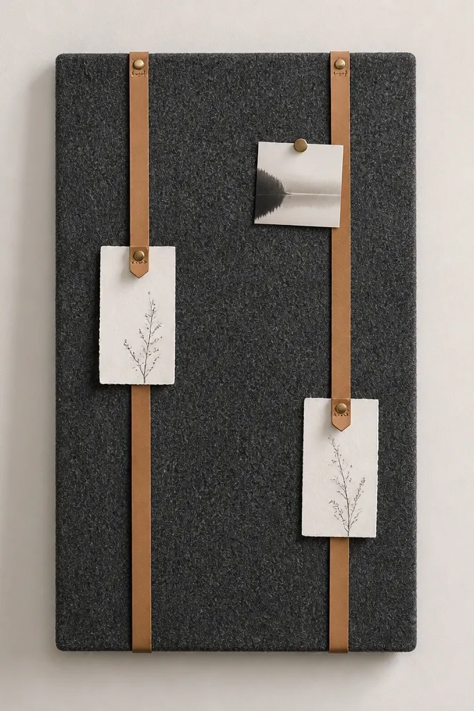
Felt gives you that soft, quiet background that makes typography look like it belongs in a gallery. Leather clips add a warm material contrast and make the board feel custom. The vertical straps give structure, so cards don't drift. This is the best option if you want a prayer board that looks good even when it's empty.
Stretch charcoal felt over a plywood base and staple cleanly at the back. Mount two leather straps using Chicago screws. For clips, use small leather tabs with a slit and a metal snap, or buy leather card holders and anchor them along the straps.
Pro tipKeep card edges consistent - trim to the same width and use a ruler so the clips hold everything evenly.
AvoidAvoid too many colors of felt - one neutral tone looks intentional.
10. Gold Foil Lettering on Matte White Panel
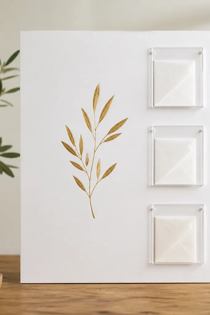
Gold foil on matte white reads expensive because the finish contrast is sharp. The clear acrylic pockets keep folded notes neat and visible, which reduces the chaos of loose paper. This board works for people who prefer minimal, elegant displays. It also makes it easy to swap notes without pulling everything apart.
Use MDF or a smooth plywood panel painted matte white. Apply gold foil vinyl lettering with transfer tape. Add acrylic pocket frames you can buy for craft displays, or cut clear acrylic sheets and glue with acrylic-safe cement.
Pro tipStick to one central phrase. Let the gold lettering do the work instead of adding lots of different verses.
AvoidAvoid glossy white paint - it reflects light and kills the clean gold look.
11. Blackboard Paint + White Chalk Verse Strip
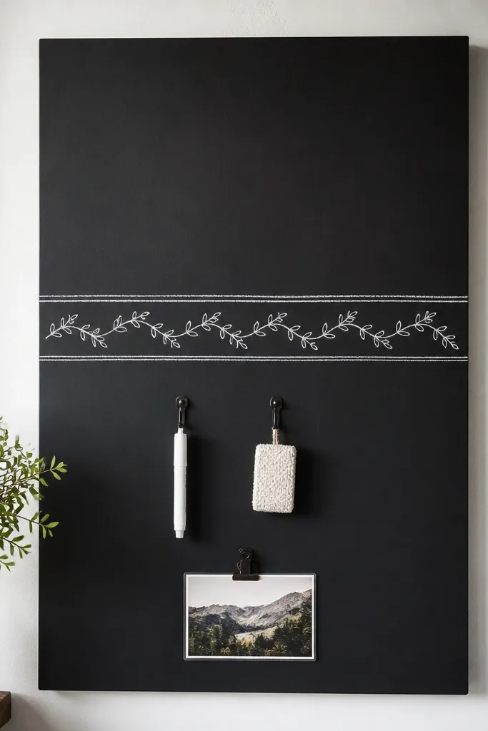
Chalkboard boards look authentic because the writing is part of the design. White chalk on black gives high contrast, so you can read it from across the room. The hooks keep tools contained and make the board feel used, not abandoned. It's perfect if your prayer life changes weekly and you want the board to keep up.
Sand the base lightly, prime, then paint with blackboard paint in two coats. Use a straight edge to lightly sketch the verse strip with pencil before chalk. Seal the rest of the board with chalkboard wax only if you want extra smoothness.
Pro tipWrite on the board with a chalk pen for consistency, then keep one laminated guide card for letter spacing.
AvoidAvoid erasing daily - chalk dust builds a patchy look. Wipe gently and re-season the board occasionally.
12. Maple Frame + White Lined Prayer Card Inserts
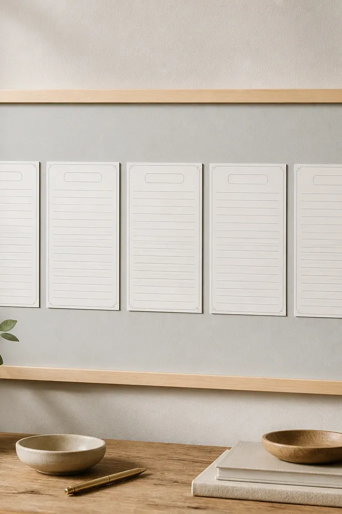
This design looks expensive because it feels like stationery inside a frame. The maple frame adds light warmth, and the gray backing keeps it modern. Lined inserts make it easy to write requests neatly. When the cards are aligned, the board reads organized even if the content changes.
Build a 1x2 inch maple frame and back it with thick cardstock or matte art paper. Create five card inserts sized about 4x6 inches each, with a 1/2 inch gap between them. Secure inserts using small corner clips or slide-in sleeves made from clear plastic folders.
Pro tipUse printed lined paper and cut it to card size. The texture of lines makes handwriting look better.
AvoidAvoid uneven gaps between inserts - that's the main thing that makes it look homemade.
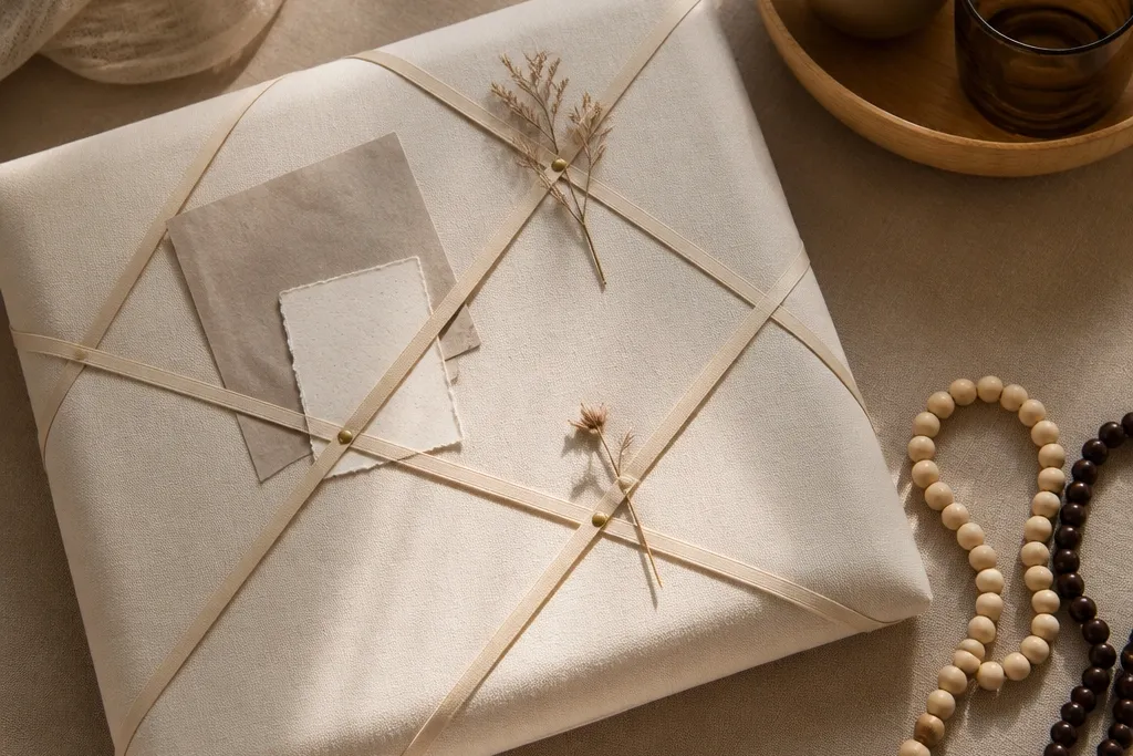
13. Sealed Linen Cork Combo with Magnet Corners
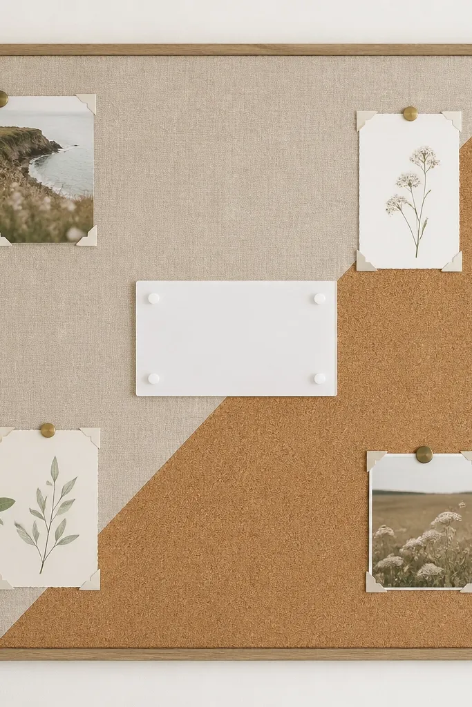
The diagonal split is what makes it look designed. Linen gives softness and warmth, while cork gives texture and grip for magnets. Magnet corners keep the cards from sliding, so the board stays tidy even when you rearrange. The acrylic label in the center adds a clean focal point.
Cut a cork panel and a linen panel to fit a 20x30 backing, then glue them with a straight diagonal seam. Seal cork with matte varnish so it doesn't look dry. Install small magnets in the corners and center using a thin steel sheet under the surface.
Pro tipUse one label style: same font, same size, and a matte finish so it doesn't compete with the textures.
AvoidAvoid messy seams between linen and cork - hide the edge with a thin trim strip.
14. Rattan Woven Panel with Button-Pin Verse Cards
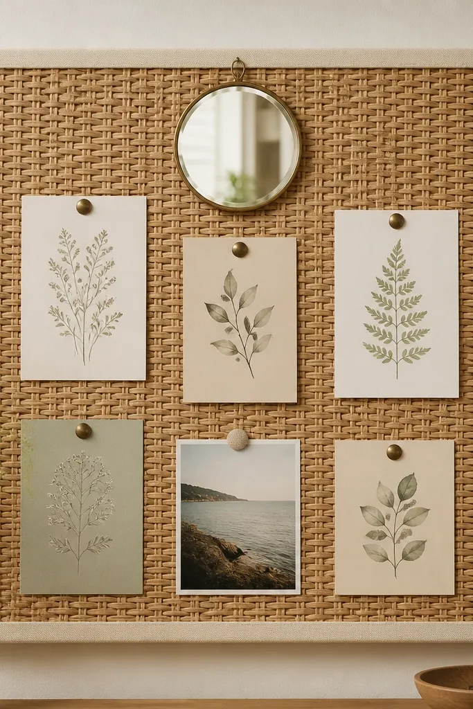
Woven rattan makes a board look handmade in a good way. When you pin cards with the same type of brass pushpins and keep them in one vertical column, it looks intentional instead of random. The mirror at the top adds brightness and makes the wall feel styled. This setup works great in kitchens and hallways where you want a calm focal spot.
Mount rattan to a rigid backing board with hot glue and staples. Paint the backing cream so it doesn't show through. Pin cards using antique brass pushpins spaced 2.5 to 3 inches apart.
Pro tipUse one column of cards, not scattered. Scattering is what makes rattan boards look like a craft table.
15. Chalk Lettered Wood Panel with Clothespin Border
Reclaimed wood gives instant character, but the "expensive" part is the disciplined layout. The chalk verse in the center is clean and readable. The clothespins along one edge make the notes feel like a planned detail, not loose papers. Pale pink notes soften the wood without taking over the design.
Sand the wood lightly and seal with matte clear coat. Letter your verse with a chalk pen and keep it centered with a ruler. Attach a thin strip of wood at the bottom edge to mount clothespins so the pins sit straight.
Pro tipMake your mini notes the same width and trim the corners with scissors for a crisp look.
AvoidAvoid multiple verse lines in different fonts - it makes the center look crowded.
16. Matte White Frame + Hanging Mini Banners
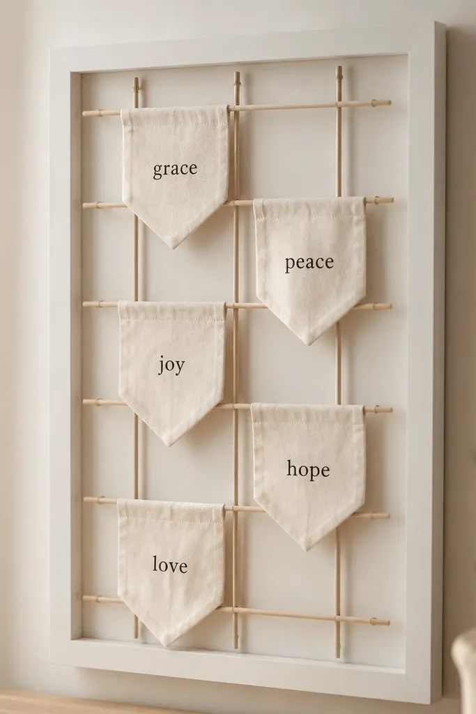
Mini banners look expensive because they create movement and texture without adding clutter. The matte white frame keeps the whole thing crisp and modern. Off-white muslin makes the black ink feel bold, like signage. This works best for short prayer themes: mercy, gratitude, peace, help, grace.
Use a 20x30 frame and attach five thin dowels spaced evenly across the top third. Cut muslin rectangles about 6x10 inches and fold the top edge into a loop with hot glue. Sew or paint one word per banner using fabric paint and let it cure fully before hanging.
Pro tipKeep banner lengths consistent within 1/4 inch so the spacing reads designed.
AvoidAvoid bright patterned fabric - it competes with the words.
17. Terracotta Clay Label Board with Brass Thumbtacks
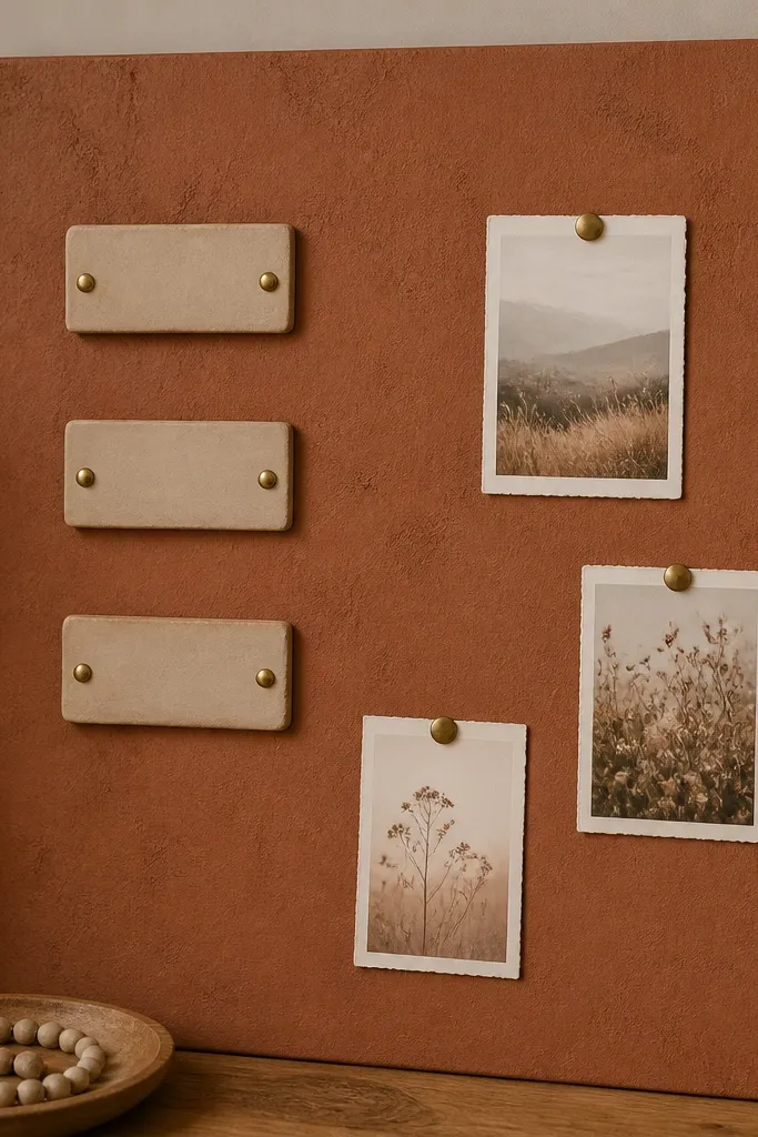
Terracotta looks warm and high-end when the texture is controlled and the labeling is consistent. Clay labels add a handmade material layer that feels intentional. Brass thumbtacks echo the hardware on the labels. This board is perfect if you want categories rather than lots of different quotes.
Paint a smooth board with terracotta textured acrylic or sponge-paint texture, then seal matte. Make clay labels from polymer clay baked and sealed with clear matte varnish. Mount labels with small brass screws and pin cards around them using thumbtacks.
Pro tipUse only three categories max so the board stays calm and the cards have room to breathe.
AvoidAvoid too many pinned cards - terracotta already has visual weight.
18. Monochrome Photo Collage with Clear Pocket Strip
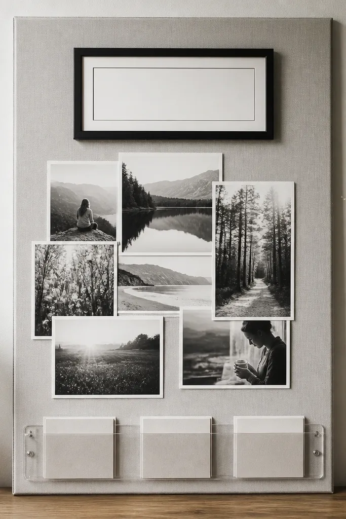
This looks expensive because it leans monochrome and uses one protected storage area for notes. Clear pockets keep paper edges from curling and makes the bottom area look tidy. Monochrome photos add emotion without visual chaos. It's ideal for someone who wants the board to feel like a personal wall display.
Print photos in black and white and mount them with thin white borders. Use a clear pocket strip sized about 3.5 inches tall for the folded notes. Place the typed verse in a small black frame at the top center and keep everything aligned to a vertical center line.
Pro tipUse thin white tape or photo corners to mount photos - it keeps edges crisp and avoids glue smudges.
AvoidAvoid color-mixing prints - even one bright photo makes it look like a scrapbook.
19. Green Velvet Panel with Copper Rings for Cards
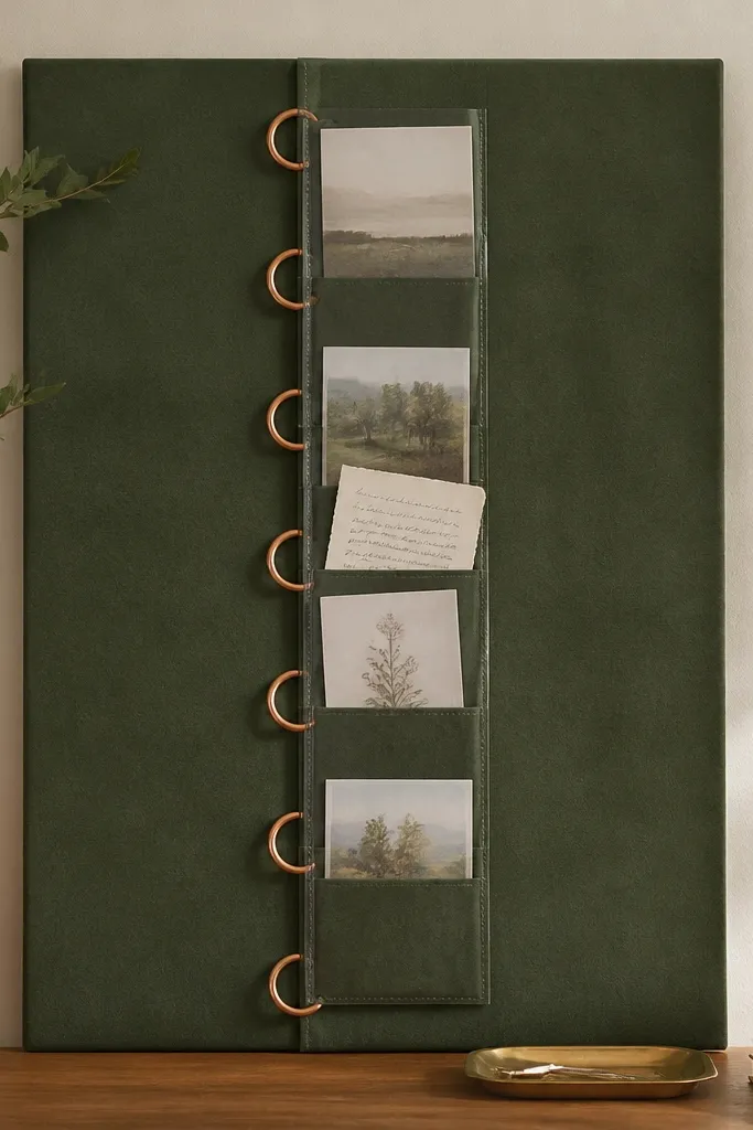
Velvet instantly reads luxe because it absorbs light and makes text feel like it's in a shop window. Copper rings add warm metal contrast against the green. Sleeve cards look clean and protected, so the board stays neat even when you swap weekly. The vertical ring line creates a strong visual axis.
Stretch sage velvet over a foam board backing and staple tightly at the back. Install three to five copper rings along a vertical strip using small screws and washers. Make card sleeves from clear plastic report covers cut to size so the sleeves slide smoothly.
Pro tipUse a single paper color for cards, like cream, so the board looks cohesive even when content changes.
AvoidAvoid cheap thin velvet that looks shiny - choose matte velvet for the best texture.
20. Stone-Effect Contact Paper + Minimal Black Lines
Stone-effect contact paper tricks the eye into thinking the board is made from real surface material. Minimal black lines create structure without adding extra color. A single frame and one clip keep the board from feeling crowded. This design works when you want aesthetic prayer board ideas that look like modern decor, not crafts.
Cover a smooth board with stone-effect contact paper and smooth edges with a plastic scraper. Add black linework with a fine paint pen on top of the contact paper. Mount one small white frame centered and place one black binder clip along the grid line to hold a card.
Pro tipCut contact paper with a sharp craft blade and wipe the surface with isopropyl alcohol first so it sticks flat.
AvoidAvoid thick layers of tape on the front - they create raised edges that look sloppy.


