

1. Sage tiered tray with ring arcs
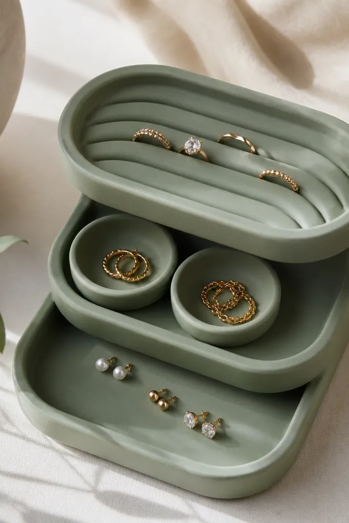
This one looks clean because the tray uses height changes as a design element. Sage clay keeps the whole piece soft and calm, and the arc wells make rings sit upright instead of flattening and tangling. I like adding two tiny round cups for studs — they catch light and keep pairs from migrating. The matte surface hides minor fingerprints, which matters because you’ll touch it every day.
Roll your clay to about 6-8 mm thickness for the base. Build ring arcs by rolling thin snakes, pressing them into a semicircle shape (about 12-15 mm wide), then smoothing the join so the arcs look grown, not glued. Add two stud cups using a bottle cap imprint, then refine the lip with a craft knife. Seal with 2-3 thin coats of clear matte sealer once fully dry or cured.
Paint only the lip of each arc with a thin line of white acrylic — it makes the ring wells look intentional and helps you see where to place bands quickly.
Avoid making the ring arcs too tall; if they’re over 20 mm high, rings catch and scrape when you pick them up.
2. Terracotta necklace cradle with chain bump
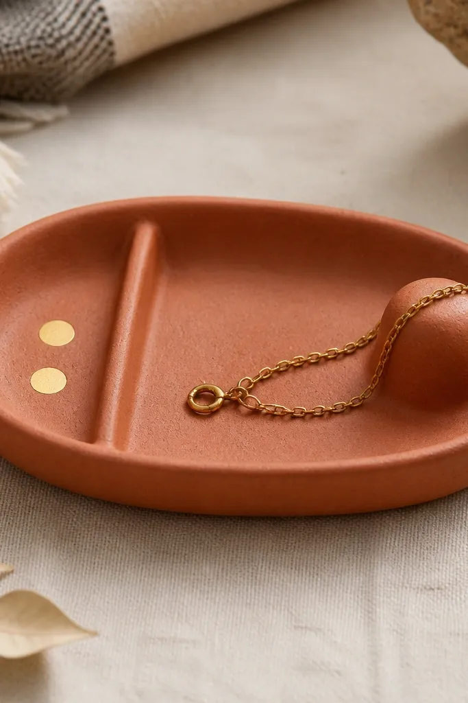
Necklaces slide off flat trays. This design fixes that with a chain bump — a rounded ridge where the chain naturally rests. Terracotta looks warm and expensive, and it pairs well with gold-toned paint details. The vertical divider gives you a place for a second necklace so they don’t braid together on the dresser.
Form an oval base about 18 cm long and 10 cm wide, with 8 mm edges. Create the chain bump by rolling a thicker clay coil (roughly 10-12 mm diameter), placing it along the right third, and blending it into the base. Add a 4-5 mm tall divider wall on the left using a thin strip pressed upright. Finish with dry-brush gold acrylic on the bump and divider edges.
Before sealing, test-fit one of your heaviest chains on the bump. If it doesn’t rest within 2-3 minutes, make the bump slightly higher.
Skip flat “shelf” ridges; chains slip off straight edges and it starts looking messy fast.
3. Black-and-rose stud wells with glossy dots
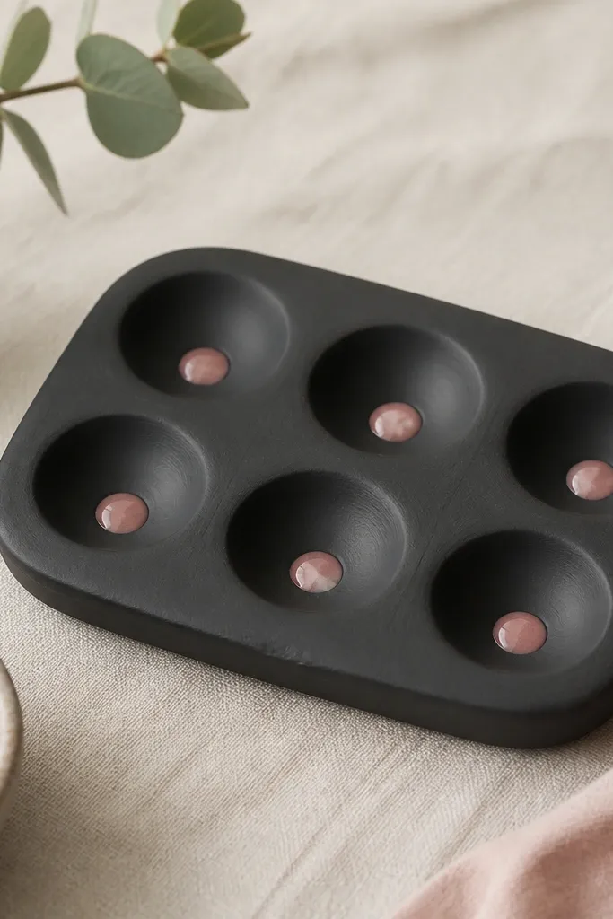
If you wear studs a lot, you need wells that hold the backs. Matte black makes the rose dots pop, and the glossy centers help you spot pairs from across the room. The cup shape is shallow but enough to stop rolling. This is the organizer I use when I’m styling for photos because it looks tidy even with imperfect jewelry.
Press six circles into the clay base using a clean bottle cap, then deepen each with a spoon handle tip to about 3-4 mm. Keep the walls thin but not fragile — about 2-3 mm thick around each well. Paint rose-pink acrylic dots only in the bottom center, then seal after it dries. For polymer clay, bake first, then paint and seal with a clear gloss topcoat.
Use a toothpick to paint the dot without flooding the well walls — extra paint makes the well look messy after sealing.
Don’t seal before the paint fully cures; glossy paint can cloud under early topcoat.
4. Pastel confetti compartments with scalloped edges
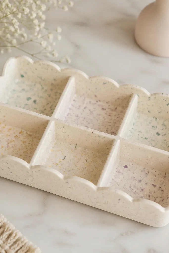
Scalloped edges make the whole piece feel playful without turning it into a kid’s craft. The confetti flecks look like “specks of color” on an art palette, and they hide tiny smudges from handling. I like rectangular compartments because they keep earrings from sliding into each other. Pastels also play well with small charms and delicate chains.
Make a base about 20 cm long, 12 cm wide, and 7 mm thick. Cut scallops along the perimeter using a cookie cutter or a printed scallop template, then smooth the edges with a damp sponge. Add four divider strips inside, each about 2-3 mm wide, reaching 4-5 mm up. Paint confetti flecks with a dry brush using mint, lilac, and butter yellow, then seal with satin finish.
Do confetti flecks after dividers are set — it avoids paint bleeding across walls and keeps the lines crisp.
Avoid thick divider walls; they steal space and make the organizer look chunky.
5. Marble-effect polymer clay with gold rail

Marble effect looks high-end because the pattern is organic, not painted in obvious stripes. The gold rail gives you a functional “catch” for necklaces and bracelets. I like this design when I want one strong feature instead of lots of compartments. It also photographs well — the veining reads clearly under side light.
Condition polymer clay and mix white with small amounts of gray. Use the marble technique: fold and twist thin layers, then slice and stack to create veining. Form a base rectangle about 16 x 10 cm, then roll a thin clay strip for the rail (about 6 mm wide). Bake, then add gold acrylic or leaf paint to the rail only.
Editor's noteUse a damp makeup sponge to lightly blur gray veining edges right before baking. It keeps the marble pattern from looking cut-out.
Skip thisDon’t over-bake — scorched clay dulls the marble look and makes the gold rail look yellow.
6. Coastal shell tray with seafoam compartments
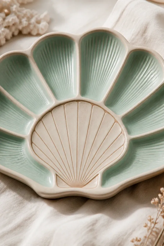
This is a good choice if you like beachy decor but still want your jewelry to stay organized. The shell outline gives a focal point, while the seafoam compartments keep small pieces from getting lost. The ridges add texture that catches light, so it looks interesting even when empty. I’ve used this layout for summer vacation bags — it stays cute on a nightstand.
Press a small shell shape into the center of the base to create a raised outline, then smooth the surrounding area. Make two or three compartments around using thin wall strips, and color those compartments seafoam by inlaying thin clay panels. Keep each compartment depth around 4-6 mm so earrings don’t fall out. Seal with a clear coat so the beige doesn’t stain.
Dry-brush a tiny amount of white along the shell ridges after sealing. It makes the texture pop without looking painted.
Avoid using glitter in the shell grooves; it sheds and gets into earrings.
7. Rose quartz look with heart earring holders
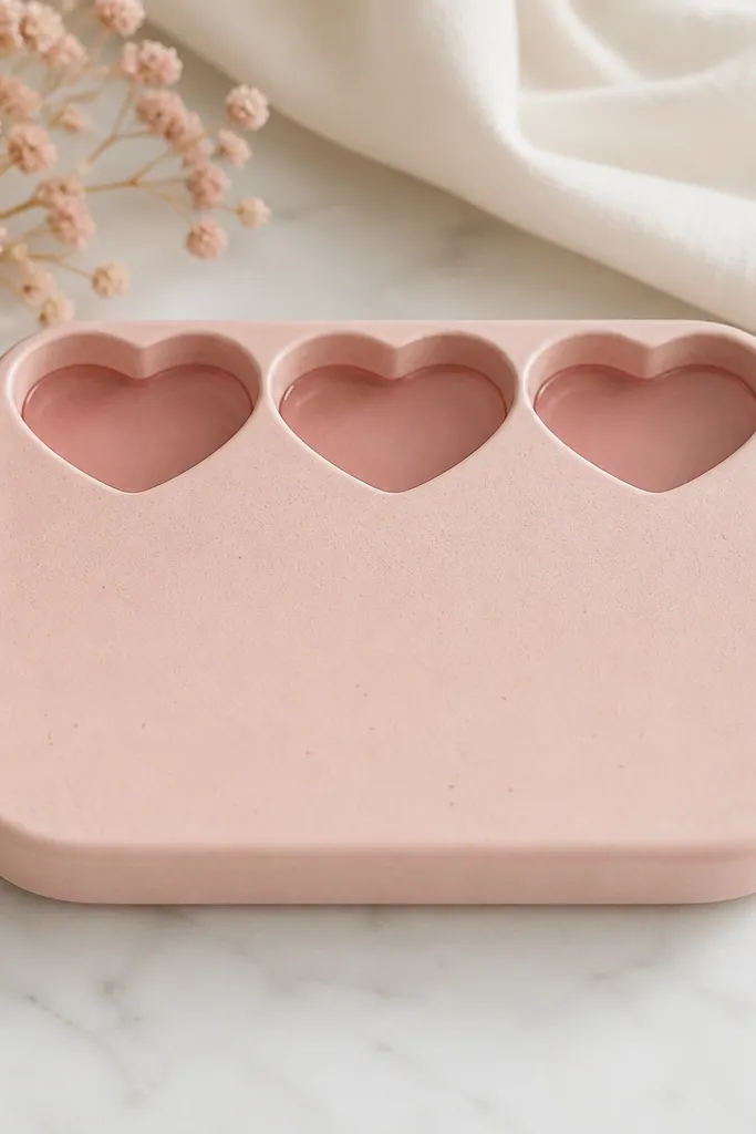
Heart holders make earrings easy to place because the shape guides you. The rose quartz look comes from mixing blush clay with tiny translucent bits so the surface catches light. This is the organizer I use when I want my desk to look soft and romantic without clutter. The translucent windows also make small studs easier to find quickly.
Roll blush clay for the base and add tiny speckles of lighter pink. For each heart holder, cut a heart shape from a thin clay sheet, then back it with a slightly translucent layer (thin enough to see through when lit). Place the hearts on top of the base and blend edges with a damp tool. Seal with a clear gloss if you want the rose quartz sparkle.
Editor's noteHold the heart piece up to a desk lamp while curing to check how the translucent layer reads. Adjust thickness while it’s still soft.
Skip thisDon’t make the heart windows too thick; they turn cloudy and lose the rose quartz effect.
8. Chocolate-brown organizer with vertical hoop channels
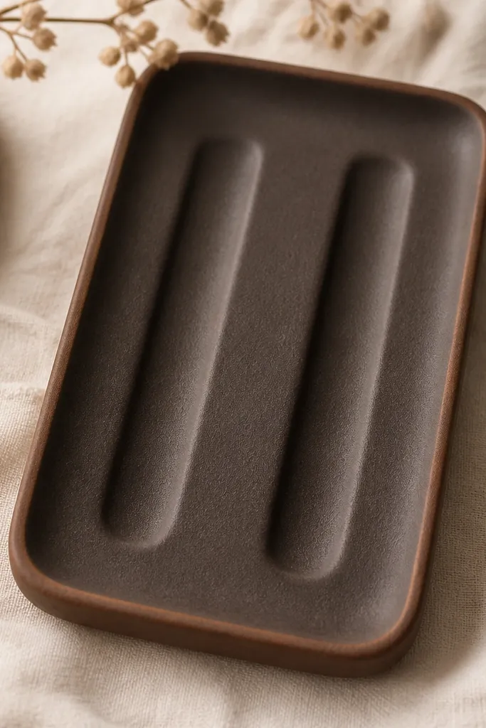
Hoops tangle because they roll. Vertical hoop channels stop that by giving the hoop a track. Chocolate-brown looks grounded and pairs with gold and brass jewelry. The channels also keep your hoops from scraping each other when you set them down quickly.
Make a base about 14 cm long, 9 cm wide. Build two channels by rolling thin clay strips into U-shapes and pressing them upright, about 25-30 mm tall. Smooth the inside curve so the hoop can slide in without catching. Add a small horizontal ledge at the bottom of each channel to hold the hoop slightly elevated.
Measure your hoop diameter — aim for a channel opening about 2-3 mm larger than the hoop’s widest point.
Skip sharp corners inside the channel; hoops snag and the organizer looks worn fast.
9. Mint glaze finish with mini ring ladder
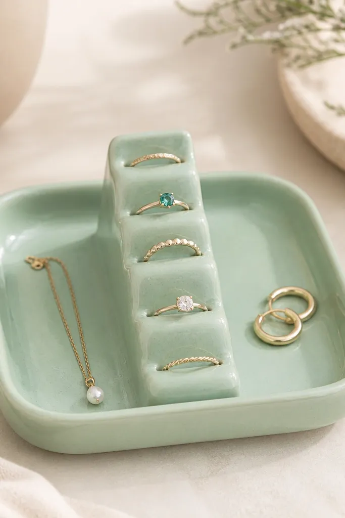
A ring ladder is simple but effective. Each step holds one band so rings don’t pile into a flat mess. Mint glaze makes it look fresh and clean, and the glossy finish makes the steps look smoother. This organizer is also great for travel because the structure keeps rings from clinking together.
Build the base as a flat slab with 8 mm edges. Make ladder steps using flattened clay strips cut into 10-12 mm lengths, then stack and blend them into a staggered pattern. Space steps about 8-10 mm apart so rings can sit without touching. Seal with a clear gloss topcoat for a glaze look.
Editor's noteUse a thin paintbrush to coat only the top step surfaces with gloss so the sides stay slightly matte.
Skip thisDon’t stack steps too high; tall ladders make rings fall forward when you pick them up.
10. Monochrome geometric organizer with triangle dividers
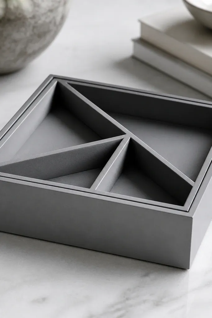
Geometric dividers make it look designed even if you only use a few pieces. Triangles are great for mixing small items like stud backs and tiny charms because they create corners that hold shape. Gray keeps it modern, and sharp divider lines read clean under daylight. This one is for people who like a minimal dresser look.
Roll and flatten clay into a 15 x 11 cm base with 7-8 mm thickness. Cut three triangle divider walls from thin clay sheets, about 3 mm thick, and press them in. Leave a small gap at the base of each divider so pieces can be lifted out. Paint the perimeter line with black acrylic after drying and seal satin.
Editor's noteUse a metal ruler and craft knife for divider edges. Clean edges matter more than fancy colors here.
Skip thisAvoid rounded dividers; they blur the geometry and make the piece look handmade in a messy way.
11. Sunflower bright tray with bead-like bumps
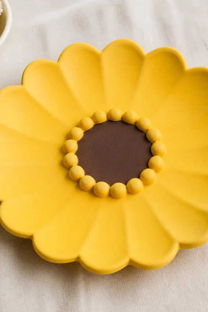
Bead-like bumps stop tiny studs from rolling. The sunflower center gives you a clear “place here” focal point, and the yellow color reads cheerful without being neon. I like this for a vanity because it keeps the small stuff from disappearing into a drawer. It also makes earrings look like part of the design.
Shape a flat base 18 cm wide with 6-7 mm thickness. Add a sunflower center by pressing a small circular clay disk and using a toothpick to add shallow texture lines. Create bead bumps by pinching tiny balls (about 6-8 mm) and placing them in a ring, then smoothing their bases into the tray surface. Seal with a satin finish so it doesn’t look plastic.
Use a dark brown for the center and add two lighter yellow “petal lines” using a thin brush for depth.
Skip tiny bumps under 4 mm; they break off when you pick jewelry up fast.
12. Black marble dots with gold crescent dish
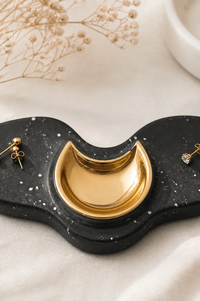
This design looks luxe because the gold crescent is a single strong shape. The black marble dots hide wear marks from daily handling. The crescent dish is perfect for one statement earring pair because it cradles them without letting them slide. I made one of these for a friend who always lost one hoop — the crescent keeps pairs together.
Create a black base and add white dot flecks by tapping a toothbrush with white acrylic onto the surface. Make the crescent dish separately from a thin clay sheet and press it into the center. Keep dish thickness around 5-6 mm so it feels sturdy. After curing, paint the crescent with gold acrylic and topcoat with clear gloss.
Let the gold dry fully, then do a second thin layer. One thick layer looks streaky on clay.
Don’t place dots over the gold dish area; the contrast gets muddy and cheap-looking.
13. Rainbow stripe organizer with sliding bangle track
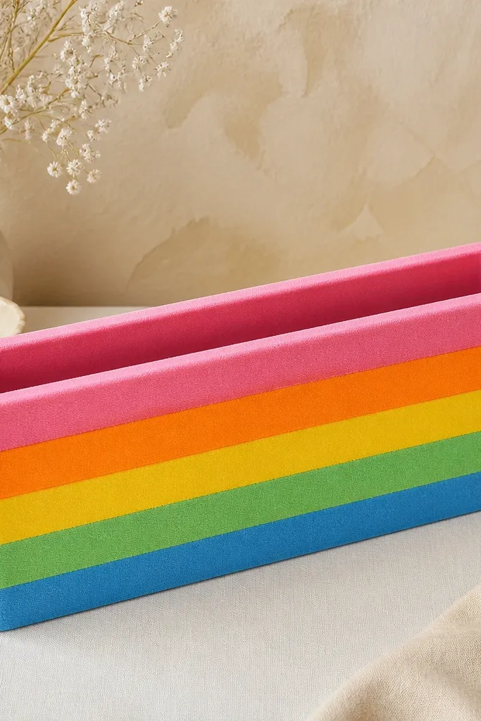
Color stripes make this feel playful, but the real win is the sliding bangle track. Bangles sit in a channel and don’t tip over, which is the problem with flat trays. The darker track visually separates function from decoration, so the organizer reads clearly. This is the one I’d put on a bathroom counter because the colors look bright in daylight.
Build a base and then press in thin stripe clay layers before sealing — keep each stripe about 4-6 mm tall. Create the channel by rolling a thicker strip and pressing it down to form a rounded trough. Leave the channel opening wide enough for bangles, with at least 2-3 mm clearance. Seal with satin so the stripes stay smooth.
Editor's noteAfter you seal, wipe the channel with a damp cloth once. It removes dust and keeps the track slick for easier placement.
Skip thisSkip narrow channels; bangles scrape and the organizer loses its neat look quickly.
14. Ivory organizer with tiny carved initials on dividers
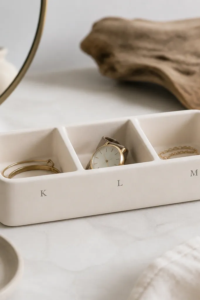
Carved initials make it personal, and personalization looks best when it’s small and clean. The darker fill paint in the carved letters gives crisp edges and makes the initials readable without painting the whole organizer. Ivory keeps it classy, and the dividers keep chains and earrings separated. I used this style for a wedding guest gift — it looked thoughtful without being complicated.
Make an ivory slab base, 15 x 10 cm, with 7 mm edges. Add two or three divider walls about 12-15 mm tall. Carve initials with a craft knife or a tiny letter stamp while the clay is still workable. Fill the grooves with diluted gray acrylic, wipe excess off the surface, and seal matte to keep it soft.
Editor's notePractice carving on a scrap first and aim for shallow grooves. Deep carvings collect dust and look messy after a month.
Skip thisAvoid thick paint filling; it creeps outside the letters and makes the initials look smeared.
15. Charcoal tray with linen-look texture and earring rails
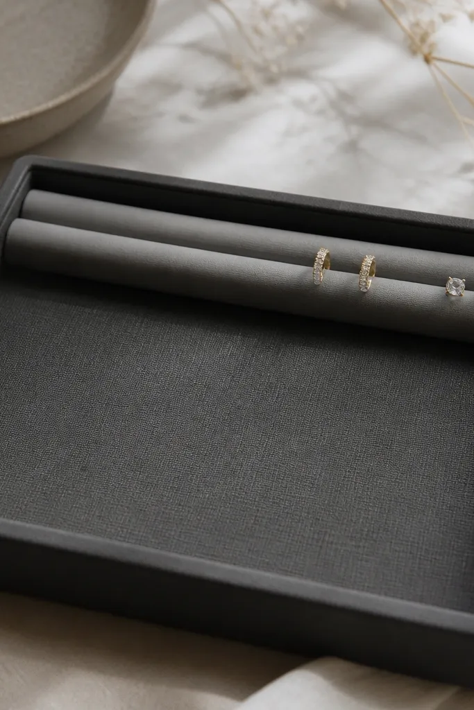
Texture makes clay look expensive when it’s subtle. The linen-look surface hides fingerprints, and the raised rails keep earrings from rolling toward the edge. Charcoal is practical — it matches almost every dresser and doesn’t show dust as fast as light colors. This organizer also feels sturdy because the rails are built thick enough to take repeated use.
Press a piece of linen fabric or a linen-texture stamp lightly into the clay before it fully sets. Keep the imprint shallow so it doesn’t look like a cheap stamp. Build two rails by rolling two clay strips and blending them onto the top edge, then smooth them with a damp finger. Finish with a clear matte sealer so the texture stays tactile.
Editor's noteUse a soft toothbrush to clean the textured surface after sealing. It keeps texture sharp and prevents dust buildup in the grooves.
Skip thisDon’t over-saturate the texture with water; it can blur and turn patchy.



