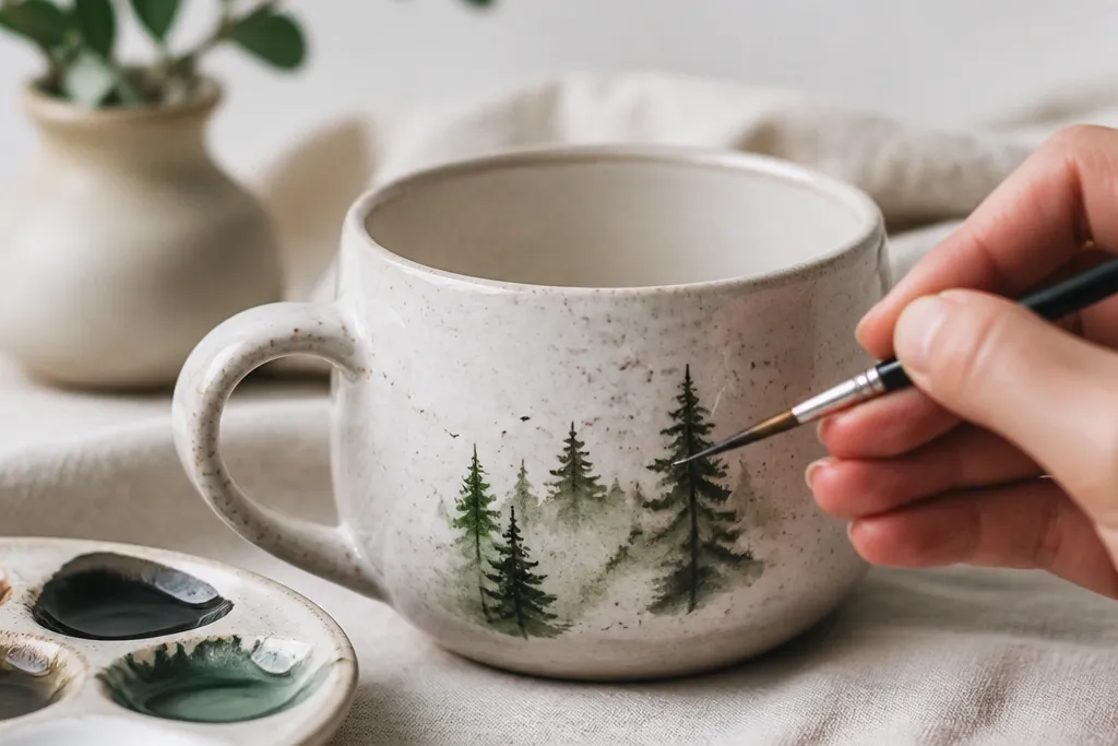
1. Tiny lemon slice border
I paint lemon slices as half-moons, not full circles. The yellow centers pop against white, and the thin green rind keeps it from looking flat. A repeating border reads cleanly even with the mug's curve because each slice is small and consistent. I finish with tiny dot seeds so the design looks intentional, not like blobs.
Use a 2-3 mm round brush for the yellow and a 1 mm liner for the green rind. Keep the border about 1 inch below the rim so you don't fight the lip shape. Let each slice dry 3-5 minutes before adding seeds so they don't bleed.
Pro tipStart with a penciled guide line around the mug, then paint slices in pairs to keep spacing even.
AvoidDon't let yellow touch green without drying, or you'll get a muddy olive mix.
2. Cozy gingham heart on the front

A heart gives you a clear silhouette, and gingham turns it into something that looks like vintage kitchen decor. I use two tones of red - a bright tomato red for the checks and a slightly darker red for the grid lines. The check pattern hides minor brush wobble because the squares visually blend.
Mask the heart shape with painter's tape, then paint the check by doing vertical stripes first and letting them dry before adding horizontal stripes. Keep squares about 3-4 mm wide. After the checks dry, fill the bottom with two tiny white dots using a paint pen to add charm.
Pro tipUse a ruler to mark tape positions on a scrap cardboard first so your checks stay even.
AvoidSkip tiny micro-squares - they blur on a mug's curve.
3. Watercolor raindrops with a navy drip
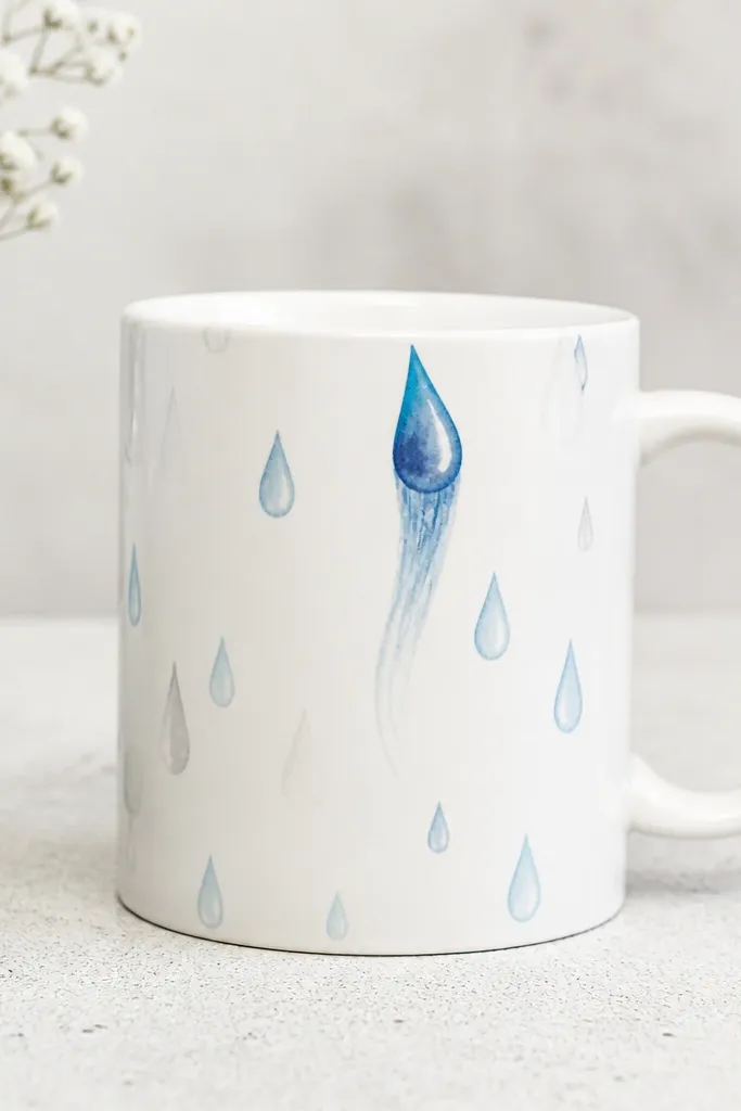
I like raindrops because they're forgiving. You can vary sizes and let the paint feather slightly for a watercolor look, but the navy drip gives the whole thing direction. Light blue and gray make it calm, and the navy tail anchors it so it doesn't look random.
Thin your paint with a drop of water or medium so it spreads a little. Use a round brush for drops, then add the navy tail with a liner brush pulled straight down about 2 inches. Work on a paper towel under the mug so drips don't stain your space.
Pro tipAfter painting the drops, tilt the mug slightly while the tail is still wet so the navy edge looks naturally tapered.
AvoidDon't overwork the feathered edges; repeated brushing makes them chalky.
4. Minimalist black cat silhouette
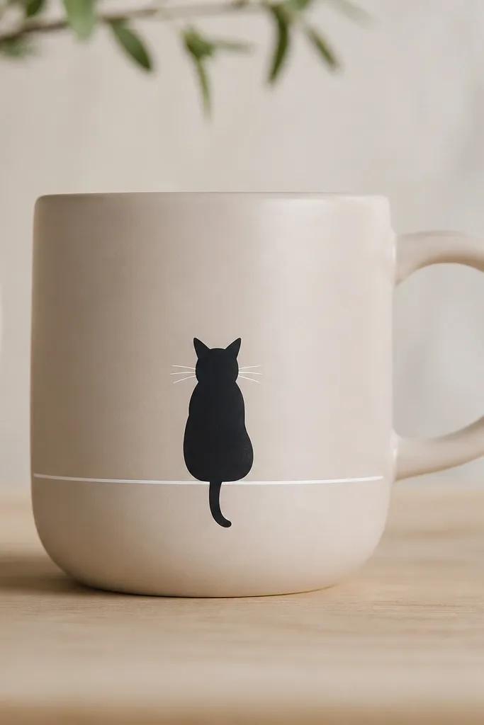
A single silhouette is perfect for small space mug painting ideas because it needs almost no background. Black on light glaze looks sharp, and the thin line under the cat gives a ground line so the shape doesn't float. I add whiskers and one tiny eye highlight to stop it from looking like a sticker.
Draw the cat with a simple stencil or freehand using a pencil outline. Fill with black paint using a small flat brush, then let it dry fully. Add whiskers with a black paint pen, and put a tiny white dot eye highlight about 1 mm wide.
Pro tipPractice the whisker strokes on scrap ceramic or paper first so you get confident line length.
AvoidDon't use gray paint for the body; it reads muddy on glossy mugs.
5. Pastel rainbow bands
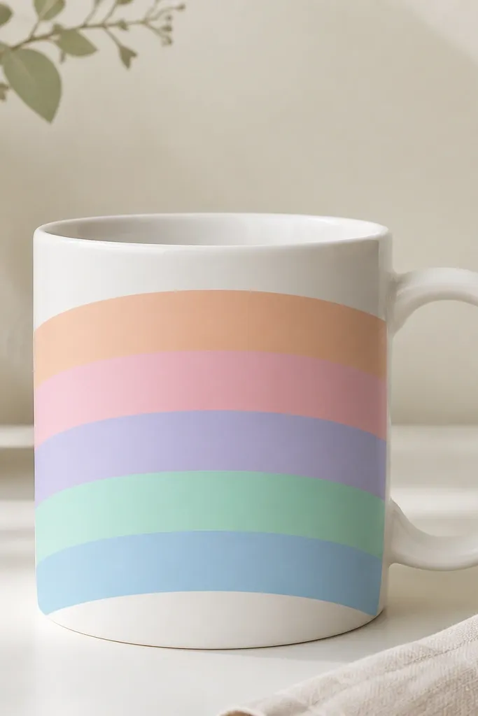
Bands are my go-to when I want something cute fast. Pastels look soft and modern, and wide strokes wrap around the curve without needing details. Clean edges make the mug feel store-bought. I keep the band thickness consistent so it looks intentional.
Mask horizontal stripes with painter's tape. Paint peach first, then pink, lavender, mint, and sky blue, leaving 1-2 mm between bands for the white base. Remove tape while paint is still slightly tacky so edges stay crisp.
Pro tipUse a hair dryer on low for 30-45 seconds between colors so you don't smudge tape edges.
AvoidDon't paint too close to the handle; leave a 1-inch gap for a cleaner look.
6. Botanical sprig in one-line style
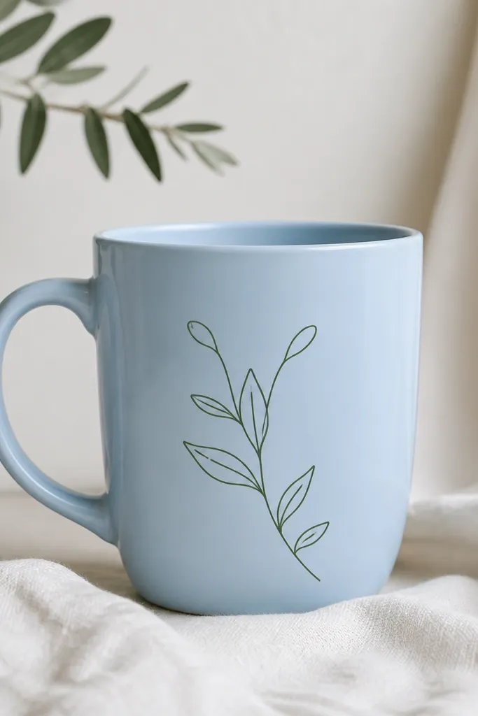
A one-line sprig looks artsy without taking up space. Dark green linework on light blue is readable from across a room, and the negative space keeps it light. This style also hides small tremors because the line is meant to feel hand-drawn.
Use a fine liner paint pen or a 0.5-1 mm brush with dark green paint. Start at the bottom, draw a thin stem, then add leaf shapes as teardrops that touch the stem. Finish with a tiny bud dot and one short vein line per leaf.
Pro tipKeep leaf sizes consistent by drawing three leaves, then copying that spacing upward.
AvoidAvoid thick marker-like strokes; they look heavy and cheap on small mugs.
7. Orange starburst with dot rays
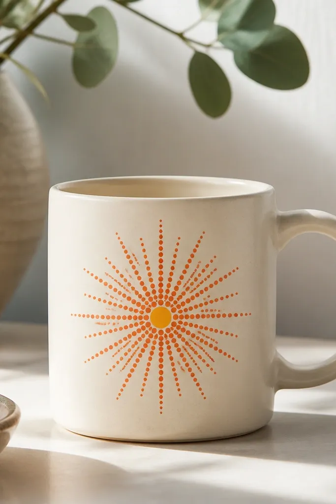
Starbursts hide the mug curve because the rays spread evenly. Dots are easier than sharp lines, and the dot texture looks cute and slightly retro. Orange plus warm yellow in the center makes it feel like a sunny snack.
Paint a small yellow circle first at center, about 1 inch across. Then use an orange paint pen to place dots in a circle pattern. Aim for 18-24 rays so it doesn't look sparse.
Pro tipMark the center point with a pencil dot, then count your rays so both halves of the starburst match.
AvoidDon't skip the center circle; it makes the rays look scattered.
8. Indigo tie-dye swirl (controlled)
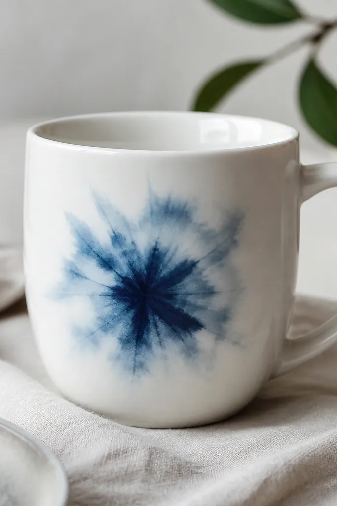
Tie-dye is fun, but you need control on a mug. I use a limited palette of indigo shades and keep the swirl compact so it doesn't wrap into a blob. The lighter edges make it look airy, while the darker streaks add depth.
Use a sponge or the corner of a makeup sponge dipped lightly in indigo. Dab in a tight spiral shape, then add a second pass with a darker indigo only at the center. Keep the total swirl diameter under 2.5 inches for a clean front panel.
Pro tipBlot your sponge on paper towel first so the dye doesn't pool at the bottom curve.
AvoidDon't let it touch the handle side; tie-dye bleeds visually and looks messy.
9. Monochrome coffee corner icons
Icons give you personality without covering the whole mug. Black-and-white keeps it classy, and the cluster layout feels like a little moment you made on purpose. I use simple shapes so the icons stay readable after heat-setting.
Use a stencil sheet or draw freehand with a fine black paint pen. Place the cluster in one corner of the front, about 1.5 inches from the handle. Add a tiny heart as a connector and outline everything with a thin line.
Pro tipLeave a 1/4 inch gap between icons so they don't merge when paint spreads.
AvoidAvoid filling large areas solid black; it can crack if the paint layer is too thick.
10. Pastel checkerboard band + dots
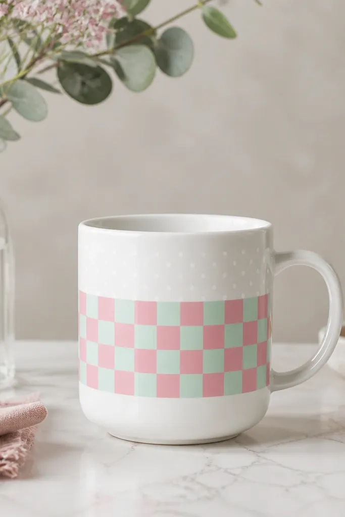
Checkerboard bands look great on curves because each square repeats. Mint and pink feel playful, and the dot row adds a little motion. I like this design when I want something that looks like a pattern from fabric, not random paint.
Mask a rectangle band about 2 inches tall. Paint alternating mint and pink squares about 5 mm each. After removing tape, add a small dot row above with a white paint pen using consistent spacing.
Pro tipIf your squares drift, redo only the tape edges - don't repaint the whole band.
AvoidDon't use too much water in the paint or the squares will bleed together.
11. Gold foil-look dots (no real foil)
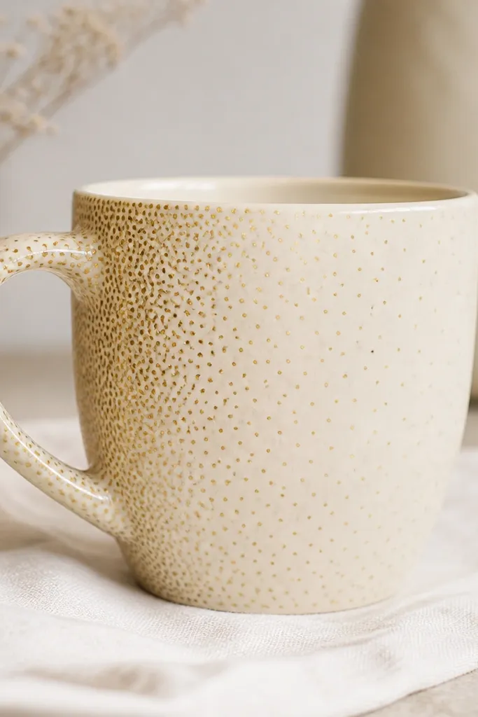
This gives you that expensive foil look without using real foil. Metallic gold dots catch light when you lift the mug, so it looks special even if the design is simple. The fade gradient makes it look designed, not random.
Use a metallic gold paint pen or metallic gold acrylic plus a small dot tool. Start with heavier dots near the handle side and gradually space them farther apart toward the center. Keep the dot area within 2 inches wide so it reads as a pattern.
Pro tipDo two layers: first for coverage, second after fully dry for a brighter metallic shine.
AvoidSkip thick blobs of metallic paint; they look raised and can scratch.
12. Skyline at sunset (tiny horizon)
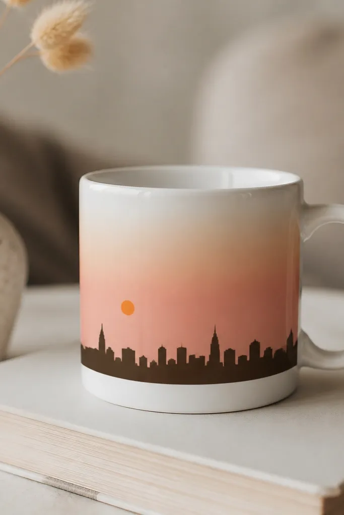
Small skylines look charming because you can keep them contained. The gradient sky gives color without needing a lot of detail, and the dark silhouette makes everything readable. I paint the skyline last so it stays crisp against the softer sky.
Paint a horizontal gradient using peach and pale pink. Add a small orange sun circle near the top left or right. Then use a fine liner brush for the skyline - simple rectangles and triangle rooftops work best.
Pro tipLet the gradient dry before painting the skyline so the dark lines stay sharp.
AvoidDon't add too many building windows; they look like dots once baked.
13. Berries and leaves cluster
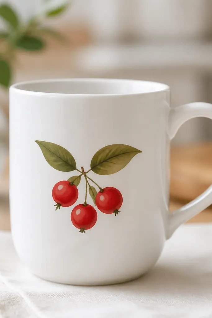
This cluster style makes a small mug look like a hand-painted ceramic piece. The white highlights on the berries stop the red from looking flat. Green leaves add contrast and give the design a natural shape that doesn't fight the mug curve.
Paint three berries as circles about 3/4 inch wide each, then add tiny stem lines meeting at one point. Paint leaves as teardrops with a darker green vein line. Add two white highlight dots per berry while the red is still slightly tacky.
Pro tipUse a toothpick to place the highlight dot - it makes a perfect tiny circle.
AvoidAvoid using neon red; it looks harsh next to the glaze.
14. French stripe with bow tie
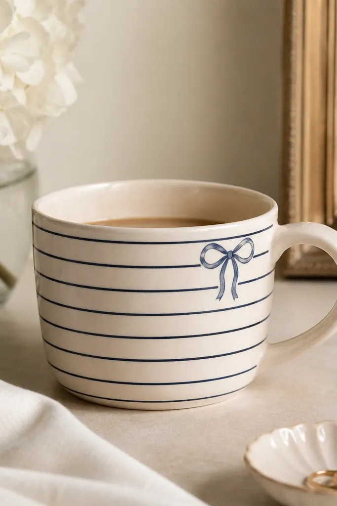
Stripes always look cute on mugs, and a bow keeps it from being boring. Navy and white reads clean and nautical, and the bow adds a focal point right where your hand naturally goes. Outline-style bows also dry faster and stay crisp.
Mask stripes about 1/4 inch wide. Paint navy bands, then remove tape after a few minutes. For the bow, paint two loops and a knot center using a liner brush, then add two short stitch lines across the center.
Pro tipKeep the stripes level by rotating the mug slowly while painting the band.
AvoidDon't freehand the stripe width; uneven stripes scream "craft project."
15. Chocolate drizzle and sprinkles
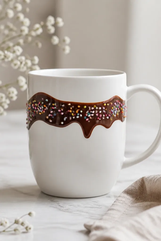
This one looks good even when the sprinkles are slightly uneven. The thick drizzle creates a strong shape, and the colorful dots make it fun. I use a few sprinkle colors only - like pink, green, and yellow - so it doesn't turn into a rainbow mess.
Paint a zigzag drizzle with a thick liner brush or paint pen in chocolate brown. Let it dry, then add sprinkles as tiny rectangles or dots using a small brush. Keep sprinkle sizes around 1-2 mm.
Pro tipSprinkle by dotting with the brush tip, then drag a tiny line for the rectangle shape.
AvoidDon't paint the drizzle too thin - it disappears on glossy glaze.
16. Marbled mint swish
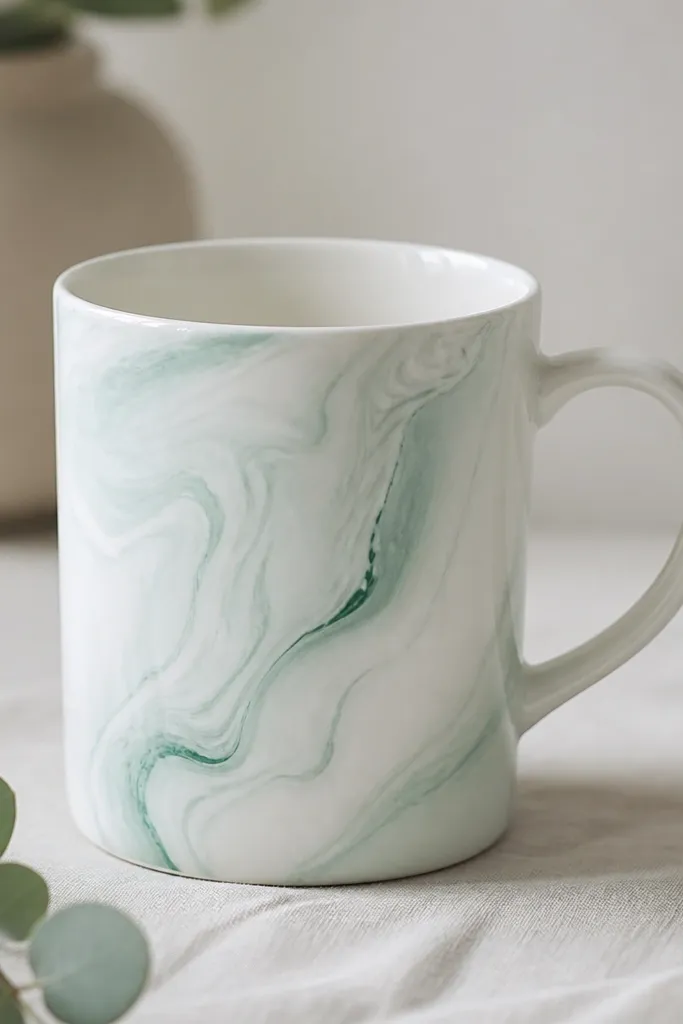
Marbling is surprisingly forgiving when you keep it to one swirl. Mint looks fresh, and the marbled streaks make the mug feel like it came from a studio. The key is using a couple of mint tones, not trying to create full galaxy detail.
Mix two mints: one light (add white) and one medium. Use a small sponge or fan brush to dab wispy streaks, then add darker lines on top. Keep the swirl area about 2 inches wide and let it dry flat.
Pro tipAfter the first layer dries, add darker streaks sparingly - less looks more expensive.
AvoidDon't over-blend; too much mixing turns the swirl into one flat green.
17. Tiny floral frame around a blank center
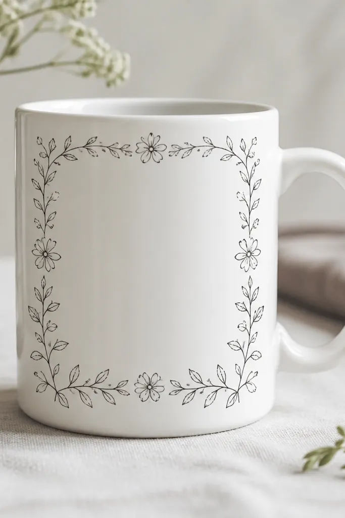
A frame makes a small mug feel designed because it gives the eye a boundary. Keeping the center blank makes the mug look neat and prevents crowding on the curve. I use tiny flowers and leaves at the corners only, then connect them with thin vines.
Use a fine liner for the vine line and a dot tool for flower centers. Place small corner clusters, then draw a thin border around the front panel area about 2 inches tall. Leave a 1/2 inch blank center so the glaze stays clean.
Pro tipPaint the border line first, then add flowers last so your spacing stays tidy.
AvoidAvoid thick border lines; they overpower the mug.
18. Color-blocked corner with outline
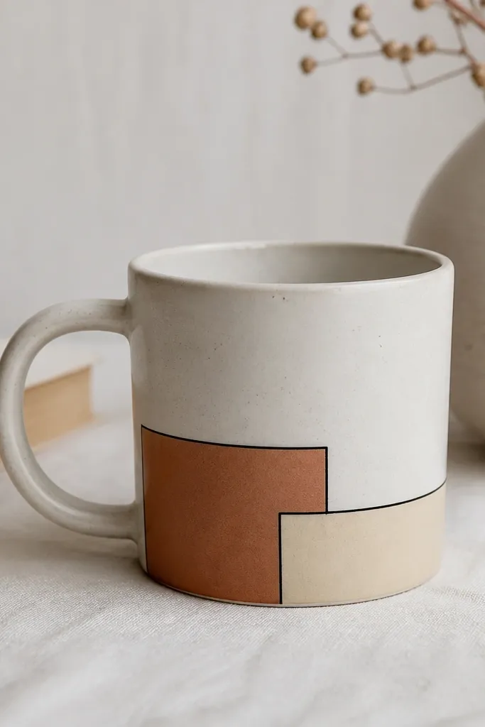
Geometric corners look sharp on mugs because you're working with straight edges. Terracotta adds warmth, and the black outline makes it pop. The blank space in the rest of the mug keeps it modern instead of childish.
Mask a triangle or quarter-rectangle corner near the base of the front panel. Paint terracotta, then add a smaller cream inset block with painter's tape. Outline everything with a thin black liner brush after the blocks dry.
Pro tipUse tape to define the outline gap, then paint the outline color in one pass.
AvoidDon't paint over tape too early or the color can creep under and soften edges.
19. Rainbow wave with single-line clouds
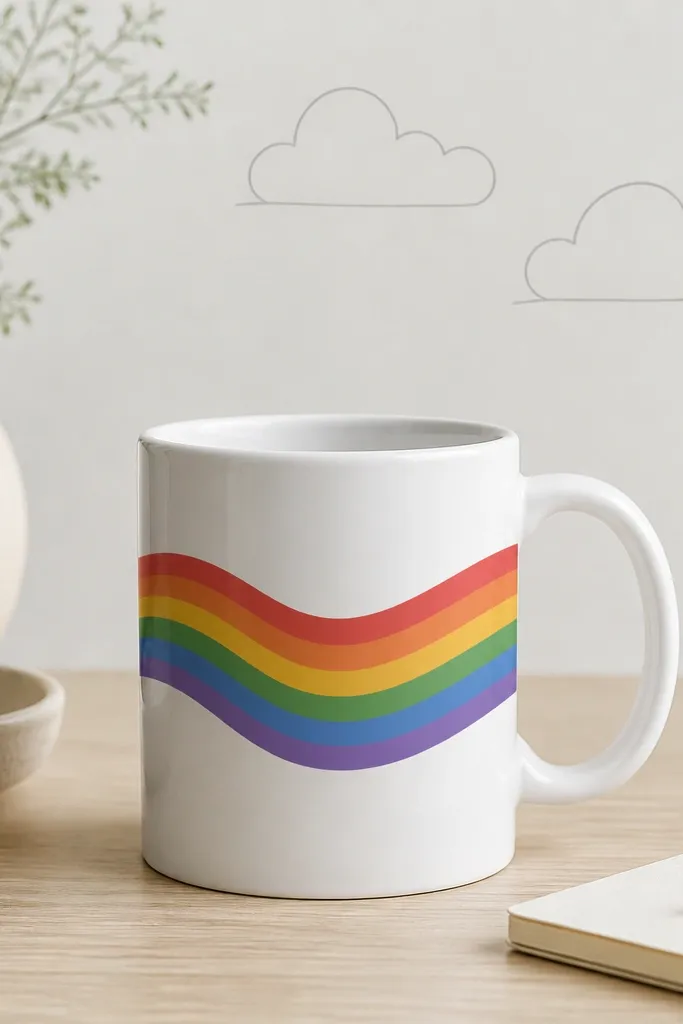
Waves wrap around the mug better than straight lines because the motion matches the shape. Single-line clouds keep the scene airy and don't require filling. I use a limited rainbow order - red, orange, yellow, mint, sky - so it feels cohesive.
Mask a wavy band using flexible tape or draw a template with paper. Paint each color stripe one at a time, letting it dry before the next. Add clouds with a light gray liner and no fill, then outline the wave edges with a thin matching gray.
Pro tipIf your wave drifts, fix it by re-taping only the next segment, not the whole band.
AvoidAvoid too many cloud lines; the mug surface will make them look cluttered.
20. Beach rocks and tiny sea foam
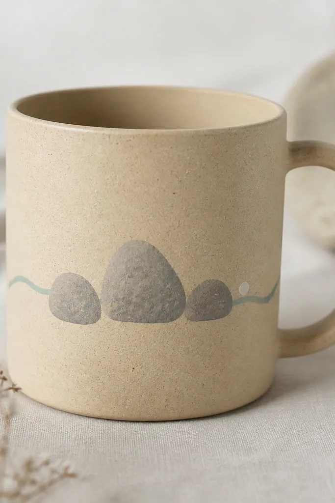
This style looks calming and looks good on warm-toned mugs. Gray rocks add structure, and the sea-foam line gives a beach vibe without covering the whole cup. The tiny foam dot makes it feel like movement.
Paint rock shapes as irregular ovals with a medium gray base, then add lighter gray highlights on one side. For the sea line, draw a thin wave curve in sea foam green. Add one small white dot near the wave crest to mimic foam.
Pro tipUse a sponge to dab rock highlights so they look natural, not painted solid.
AvoidSkip heavy outlines; they make rocks look like cartoon stickers.
21. Pink ribbon with bow centered
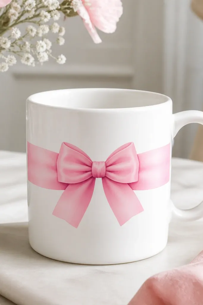
A ribbon gives you instant "present" energy even on a plain mug. The fold shadow line makes it look dimensional, not flat. I keep it to one ribbon panel so it doesn't overwhelm the handle area.
Paint the ribbon base in medium pink. Add a darker pink shadow along one edge of the ribbon fold using a liner brush. Then paint a bow with two loops and a center knot; add tiny highlight strokes on the loops.
Pro tipLet each shade dry fully before adding the shadow line so it doesn't smear into one tone.
AvoidDon't use neon pink with white - it looks harsh on ceramic.
22. Charcoal doodle border with tiny stars
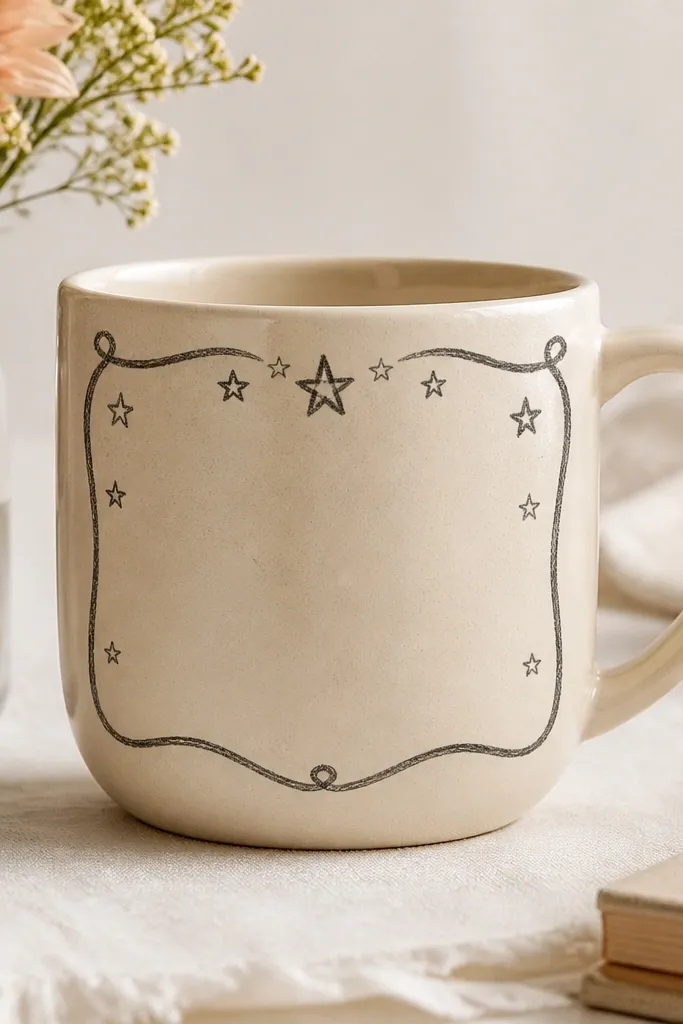
Doodle borders make a mug feel like it belongs in a sketchbook. Charcoal stays classy, and the tiny stars add sparkle without needing metallic paint. The border also hides small imperfections because it's meant to look hand-drawn.
Draw a rectangular border about 2 inches tall with a loose shaky line. Add stars as 5-point shapes, each about 1/4 inch wide. Keep the doodles near the edges so the center stays clean and readable.
Pro tipUse a pencil first to plan the border corners, then trace with charcoal paint pen.
AvoidAvoid perfect straight lines; perfect looks artificial for doodles.
23. Vintage botanical label text block
A label look makes a small mug feel like a prop from an old apothecary. The faux paper rectangle adds texture contrast against glossy glaze. Leaf drawings keep it botanical without relying on readable lettering, which is hard to make neat on curved surfaces.
Paint a slightly off-white rectangle with a darker edge line. Add a few small leaf sprigs inside using green liner paint. Add a thin faux stripe at the bottom of the label in sage green for depth.
Pro tipDry-brush the label edge with a tiny bit of tan so it looks like aged paper.
AvoidDon't try to write tiny words; they blur around the curve.
24. Teal ombre from bottom up
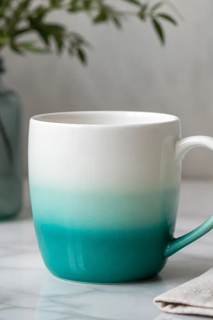
Ombre is one of the most forgiving styles on curved ceramics. The gradient hides brush marks and looks smooth even when you're working in a small space. Teal feels modern, and the fade direction looks intentional from the way you hold the mug.
Load a flat brush with teal paint and add water to thin it for the top fade. Paint upward in horizontal swipes, then blend the transition with a slightly damp brush. Keep the ombre height around 2 inches so it doesn't cover the whole mug.
Pro tipBlend while the paint is still wet; once it starts to tack, it won't smooth as nicely.
AvoidAvoid hard lines between colors - they look like tape edges.
25. Gecko or lizard scales pattern
Scales look fun and textured, and they hide tiny paint bumps better than smooth patterns. Two greens give the scales dimension so the pattern doesn't flatten. I keep it to one horizontal band so it's cute, not busy.
Use a small brush to paint overlapping teardrop scales. Alternate hunter green and light green scales, and add a tiny lighter dot near the center of each scale. Place the band about 1 inch above the bottom so it looks like a wrap.
Pro tipUse a toothpick to drag a short line for a scale crease - it makes the pattern look sharper.
AvoidDon't make scale shapes too big; large scales turn into blobs.
26. Black-and-white checker dots (polka grid)
Polka grids are clean and easy to repeat, which matters when you're painting in small space lighting. The staggered dot layout feels playful but still organized. Black-and-white reads crisp and hides small inconsistencies in dot size.
Mark a grid lightly with pencil - rows about 1/3 inch apart. Use a dot tool or the end of a round paint pen to place dots in a staggered pattern. Add a thin black line above the grid using a liner brush.
Pro tipCount rows out loud while you place dots so you don't lose your place.
AvoidAvoid uneven dot spacing; it looks like you got distracted mid-pattern.
27. Berry jam swirl with spoon line
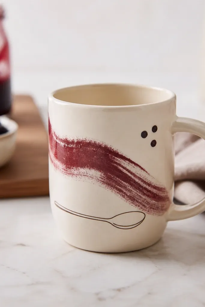
Jam swirls look great because the shape naturally follows the mug's curve. Maroon reads rich without needing metallics, and a spoon outline adds a kitchen connection. Small berry dots make it look like fruit pieces without adding too much detail.
Paint a maroon swirl as a thick ribbon, then pull lighter maroon highlights through it with a liner brush. Add a spoon outline in dark brown under the swirl, keeping it simple. Place 3-5 tiny berry dots around the swirl, leaving white gaps for highlights.
Pro tipUse a reference photo of jam on toast for swirl direction so it looks natural.
AvoidDon't thin the jam color too much or the swirl turns transparent and dull.
28. Mint leaf sprig + gold dot halo
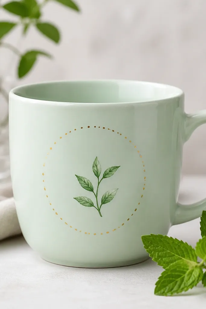
This design looks fancy because the gold halo catches light around the sprig. The mint leaf sprig stays soft, and the dot halo frames it without covering the whole mug. It's a nice option when you want something cute for gifts but don't want to paint a full scene.
Paint the leaf sprig first with a dark mint or deep green, using a liner brush for veins. Then add a circle of gold dots around the sprig area, keeping the dots evenly spaced. Use 18-24 dots for a full halo look.
Pro tipLet the leaf paint dry completely before gold so you don't get muddy mixing.
AvoidAvoid a solid gold ring; dots look cleaner and less likely to crack.
29. Striped handle-side patch
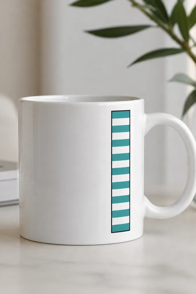
A handle-side patch is smart for small space mug painting because your design doesn't have to wrap around to the back. The stripes add movement, and the black rectangle makes the patch look like a label. Teal and white feels crisp and clean.
Mask a narrow rectangle about 1 inch wide beside the handle. Paint alternating teal and white stripes within the rectangle, then outline with black liner paint. Leave the rest of the mug blank so the patch looks intentional.
Pro tipUse painter's tape as a straightedge and remove it while paint is slightly tacky for sharp edges.
AvoidDon't paint stripes wider than 1/4 inch or they'll look chunky on small mugs.
30. Tiny butterfly wing watercolor wash
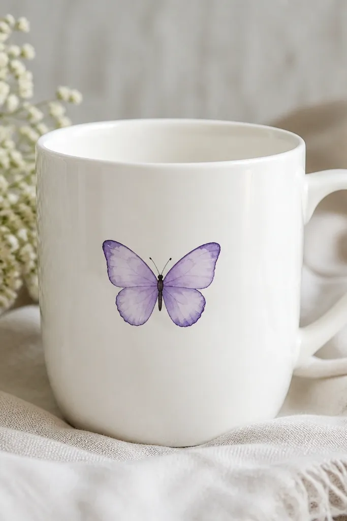
Watercolor washes look soft and pretty on mugs when you keep the butterfly small. Lavender wings feel feminine without being loud, and a darker outline keeps the shape from fading into the glaze. I add simple antenna dots so the butterfly reads even from a quick glance.
Paint two wing shapes as semi-transparent washes, then outline with a darker purple liner once dry. Add small antenna dots above the wings and a tiny body line between them. Keep the butterfly about 1.5 inches wide so it sits comfortably on the front panel.
Pro tipBlot your brush on paper towel before outlining so the paint line stays crisp.
AvoidDon't over-saturate the wash; pooled watercolor looks spotty after baking.