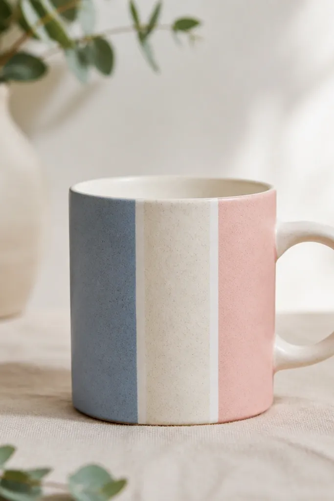
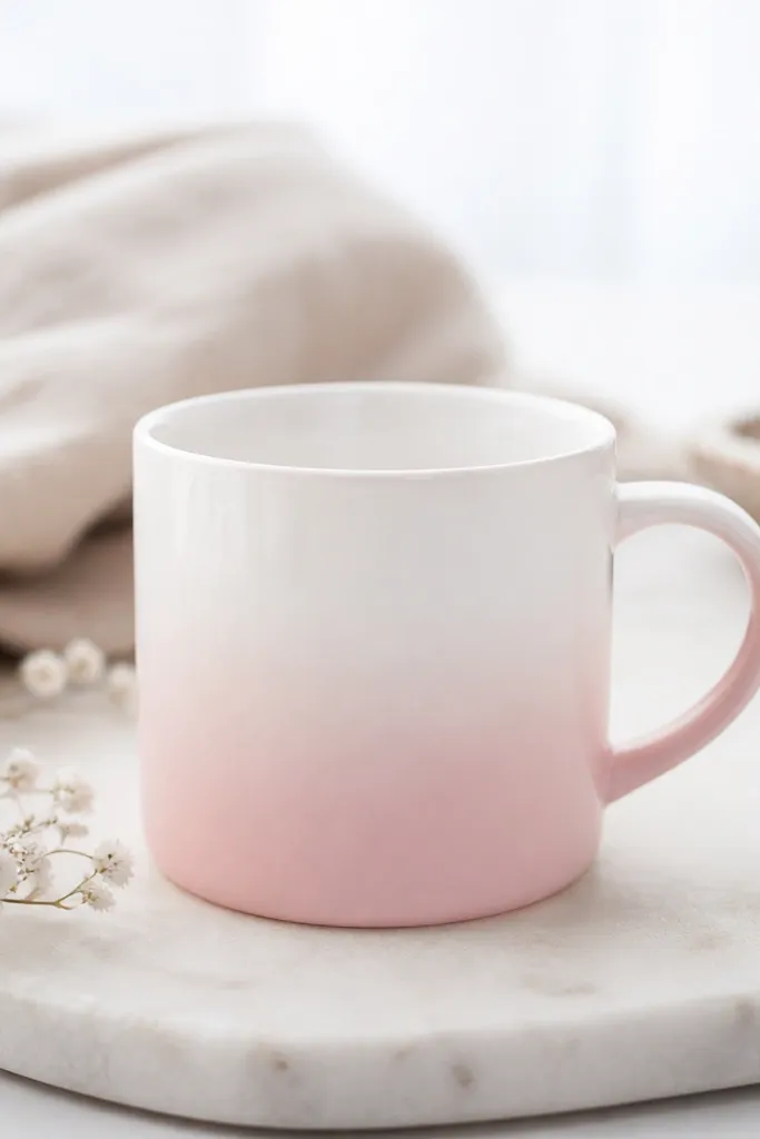
1. Two-Tone Sunrise Stripe Mug
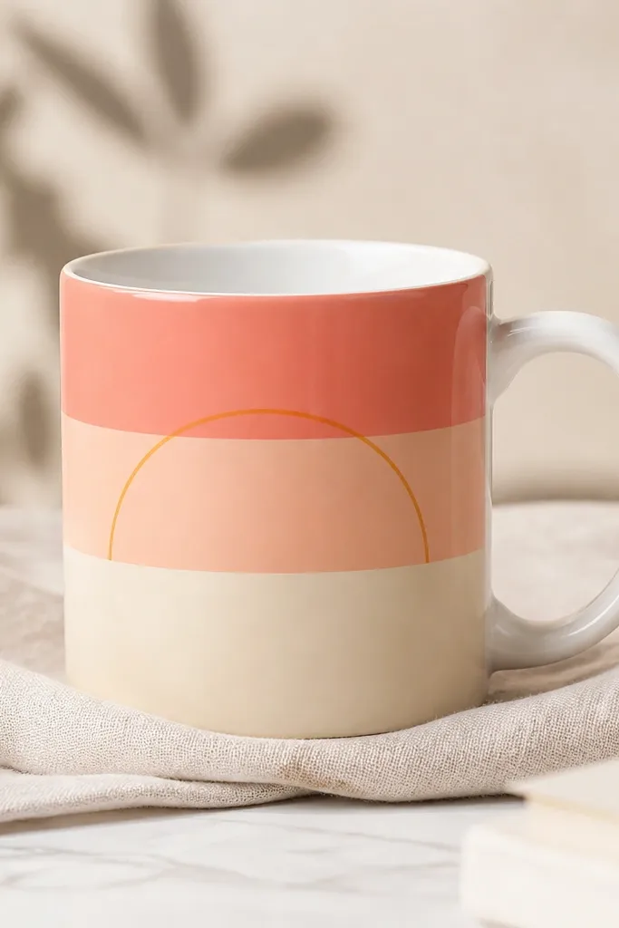
This one looks clean because stripes hide tiny brush wobble. The sunrise semicircle gives you a focal point without needing fine details. I use coral and peach for warmth, then add a pale cream band so the colors separate instead of blending. The thin semicircle line keeps it from looking like random blocks.
Paint the stripes first using a flat brush, keeping each stripe about 3/4 inch tall on a standard 11 oz mug. Let it dry fully, then draw the semicircle with a liner brush - it should span roughly 70% of the mug width. If you want extra crisp edges, trace the stripe boundaries lightly with pencil and erase after painting.
Pro tipUse painter's tape for the stripes, press it down with a fingernail, and remove tape while paint is still slightly tacky for sharper lines.
AvoidDon't mix wet colors directly on the mug - you'll get a fuzzy sunrise edge.
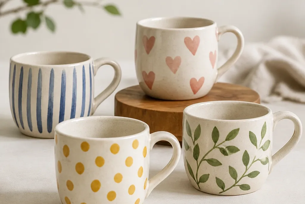
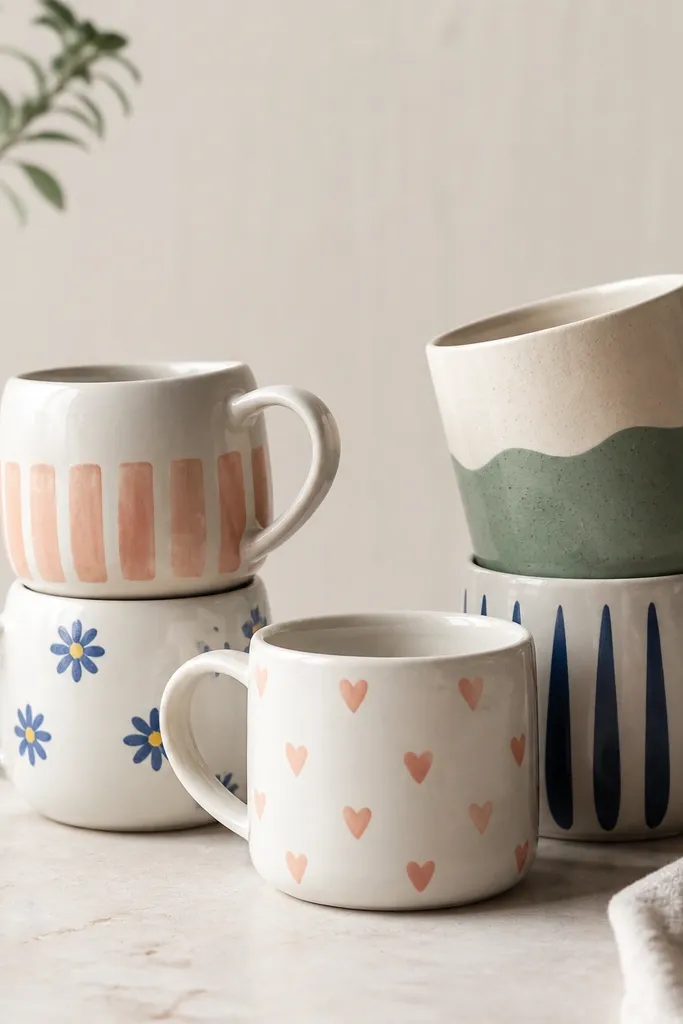
2. Polka Dot Grid with Tiny Heart
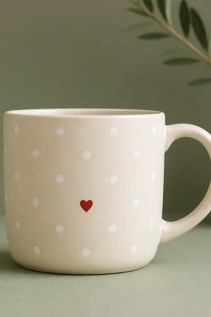
Dot patterns look "designed" because spacing is the whole trick. A sage base makes the mug feel calm, and the white dots pop without needing heavy outlines. The tiny heart adds a sweet detail without turning the whole thing into a cartoon. It's also easy to repeat if you want a matching set.
Start by painting the mug sage, either as a full coat or as a band around the center (about 2.5 inches tall). After drying, dot with a stylus or the back of a small paintbrush handle using white paint. Place a heart about 1 inch below the center line, drawn with a paint pen for consistent shape.
Pro tipMake a dot-spacing guide on paper first: mark dots every 1/2 inch, then lightly transfer one dot row to the mug as your reference.
AvoidDon't eyeball dot spacing - uneven dots read like a mistake.
3. Botanical Sprig in One Brushstroke
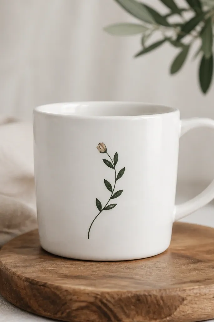
This design works because it looks like calligraphy. One curved stem gives direction, and leaf pairs make it feel organic without needing lots of tiny flowers. I like dark green plus a muted beige bud because it looks natural in daylight and still reads well at night.
Use a liner brush and paint the stem with a single confident curve. Add leaf pairs by touching the brush to the mug, dragging slightly, and lifting - each leaf should be about 1/4 inch long. Finish with one small bud near the top using a dot or short teardrop shape in beige.
Pro tipPractice on paper once: leaf pairs look best when they're the same angle on both sides of the stem.
AvoidSkip thick outlines around the leaves - it can look like stickers.
4. Monogram Block Letters with Shadow Line

Block letters are the quickest way to make a mug look "gift-ready." The gray offset line acts like a shadow, so even a beginner letter looks polished. Black ink-like paint gives sharp edges, and the shadow keeps it from looking flat.
Pick one letter and center it on the mug front. Paint the letter in black, then after drying add a shadow outline by offsetting 1/16 to 1/8 inch down-right using a gray liner. Keep the letter height to about 3 inches so it fills the space without wrapping into the handle area.
Pro tipIf your letters wobble, trace the letter from a printed font onto transfer paper, then paint over it.
AvoidDon't use light gray for the shadow on a white mug - it disappears after curing.
5. Lemon Slices and Green Leaves
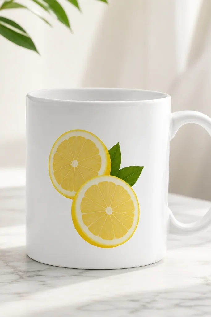
Lemons make mornings feel bright, and the segments are simple to draw. You only need a few curved lines inside each slice, so it stays beginner-friendly. The green leaves add balance so the yellow doesn't dominate the whole mug.
Paint one lemon slice about 2.5 inches wide, then add a thicker outer ring in darker yellow. Inside, draw 6-8 curved segment lines, leaving the center slightly lighter. Add two small leaves using a teardrop shape with a center vein line. Keep the motif angled so it looks like it's "resting" on the mug.
Pro tipUse a fine paint pen for the inner segments - your hand stays steadier than with a brush.
AvoidDon't flood the yellow - thick paint can crack after baking.
6. Washi Tape Look Stripes (Painted, Not Taped)
The trick is the gaps. Washi tape style looks intentional even when your lines aren't perfect because the white separators create structure. I like muted blue and soft pink because they look vintage without being childish.
Paint the first band (about 1 inch wide) and let it dry. Paint a thin white separator strip, then paint the next band. Repeat for three bands total, keeping the separators consistent thickness (around 1/8 inch). Finish with a tiny black dot in the corner of the front band if you want a signature detail.
Pro tipMeasure with a flexible tape measure around the mug so your bands line up evenly from left to right.
AvoidDon't try to freehand thin separators while the paint is wet - you'll smear the edges.
7. Coffee Cup Line Art Border

A border makes the mug look finished and keeps the design from needing lots of space. Simple line art also hides small alignment issues because the icons repeat. Pairing the border with one small word gives you a focal point without clutter.
Use a fine black paint pen for the icons. Draw 7-9 tiny coffee cups across the front band, each about 1 inch tall, leaving equal gaps. Add the word "brew" or "wake" in a single line centered below, using the same pen for consistency.
Pro tipMake a quick icon template on paper so your cups all have the same handle shape.
AvoidDon't use a thick marker for line art - it bleeds after curing.
8. Galaxy Nebula Fade with Star Dotting
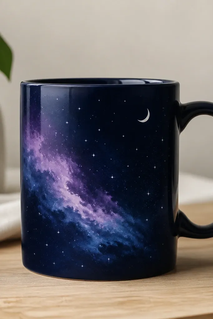
Galaxy fades look hard, but they're forgiving because the blur is the point. Indigo and purple create depth, and star dots are easy - you just need steady pressure. A small crescent keeps it from looking like random paint blobs.
Base coat the area with indigo. While slightly tacky, sponge on purple and blue in small circles, blending at the edges with a damp brush. Add white stars with a paint pen or toothbrush splatter (tap gently over a test scrap first). Finish with a crescent moon drawn in light blue.
Pro tipUse a makeup sponge for the fade - brush strokes show up too much on curved mugs.
AvoidAvoid too much white splatter - heavy stars can look chalky after baking.
9. Rainbow Arc with Cloud Outline

Arcs look great on mugs because the curve matches the mug's shape. A cloud outline frames the rainbow and makes the colors feel intentional. I use five bands in order, with a white border around the rainbow to keep each color separate.
Draw a gentle arc across the center front in pencil. Paint red, orange, yellow, green, and blue in bands that are about 1/2 inch tall each. Outline the cloud in white and keep the cloud about 2 inches wide. If you want a bolder look, add a thin black outline to the rainbow edges.
Pro tipStart with the red band - it anchors your arc so the rest follows the same curve.
AvoidDon't overload the cloud outline - heavy paint makes it look raised and clunky.
10. Terracotta Pot with Succulent Dots
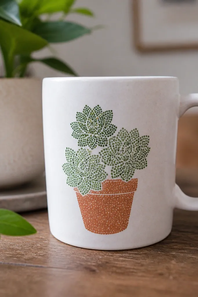
This is a beginner-friendly succulent because dots stand in for leaf detail. Terracotta warms up the palette and makes the greens look richer. Keep the pot simple and the rosettes playful - that contrast makes it look thoughtful.
Paint a terracotta rectangle with rounded corners as the pot body, then add a darker terracotta lip line. For succulents, dot green circles using a stylus: center dot, then ring dots, then one more smaller ring. Place three rosettes on top of the pot, spaced evenly.
Pro tipUse a toothpick to drag one or two dots into a leaf-like teardrop for extra character.
AvoidDon't make all rosettes the same size - the unevenness looks more real.
11. Art Deco Fan Pattern
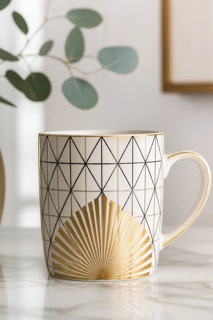
Art deco patterns hide beginner imperfections because geometry forgives. The fan radiates attention, and the black lines keep it from looking like plain gold paint. I like gold + black because it looks upscale without needing a lot of colors.
Draw a central vertical line, then sketch 8-10 fan ribs that curve outward. Paint ribs in gold metallic paint, and fill the triangle spaces with black lines only (no full fills) so the pattern stays crisp. Add small gold dots at the ends of the fan ribs for sparkle.
Pro tipUse tape to keep the gold ribs straight, then paint over the tape edges and remove carefully after a few minutes.
AvoidDon't cover the entire mug in metallic paint - it can look uneven and smear during handling.
12. Checkered Side Panel with Handwritten Date
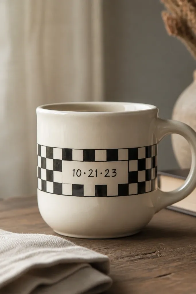
A checkered panel looks stylish because it's structured. The handwritten date makes it personal and still simple - you're only drawing numbers, not a whole scene. I've used this for birthdays and housewarming gifts, and people always ask where I got the mug.
Paint a vertical band about 2 inches wide on the front. Add alternating squares in black and cream, each square about 1/4 to 1/3 inch. When dry, write a date with a paint pen, keeping the numbers big enough to read from arm's length.
Pro tipWrite the date on paper first, then use a ruler to lightly mark the baseline on the mug.
AvoidDon't make the squares too small - tiny checks look messy after curing.
13. Butterfly Wing Wash with Black Veins
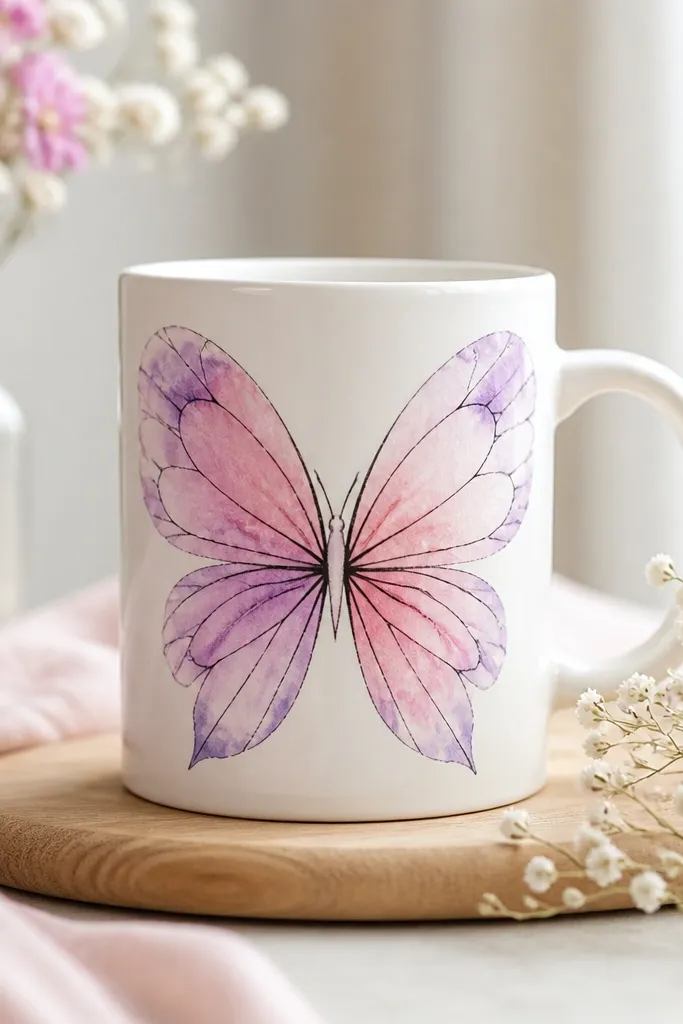
The wash effect is forgiving because gradients hide brush marks. Black veins give the butterfly a sharp, finished look. Choose two neighboring colors on the color wheel so the wings blend instead of muddying.
Base the wings with a light pink wash, then sponge purple near the edges. While slightly damp, add a darker pink edge for depth. Draw veins with a fine black liner - start from the center and branch out. Place the butterfly centered and sized to about 3 inches wide.
Pro tipUse paper towels to dab the brush between colors so you get a smooth gradient on the mug curve.
AvoidAvoid painting veins over fully wet color - the ink will bleed.
14. Minimal Line Flower with One Accent Dot
Minimal designs look expensive because they leave space. A thin-line flower in dark gray keeps it modern, and one accent dot makes it pop. If you're worried about painting, this one is great because you only need a few lines and a single color spot.
Draw a simple flower: five petals with gentle curves, a center circle, and one small stem leaf. Use dark gray paint for the outline and fill only the center with bright yellow. Keep the flower about 2.5 inches tall so it stays readable.
Pro tipLet the outline dry completely before adding the yellow center so the colors don't mix.
AvoidDon't add extra petals or extra dots - minimal looks best when it stops early.
15. Sea Glass Swoosh with Speckle
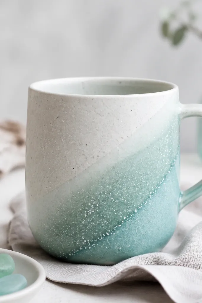
Sea glass colors feel calm, and the swoosh uses the mug curve to your advantage. Speckles add texture without requiring detailed painting. I like mint + aqua with a thin off-white highlight so it looks like light hitting glass.
Paint a diagonal swoosh about 1.5 inches wide across the front. Start with mint, then sponge aqua at one edge and blend with a damp brush. Add speckles using a toothbrush dipped in off-white paint - tap lightly over the mug, but cover the handle area with paper first.
Pro tipMask the handle with painter's tape and paper so speckles stay only where you want them.
AvoidDon't shake the toothbrush hard - you'll get blobs instead of fine specks.
16. Cottage Stripe Band with Tiny Stars
Stripes plus tiny stars look cozy without turning into holiday-only decor. The navy and dusty rose combo reads warm and slightly vintage. The stars are small enough that you don't need perfect symmetry - repetition does the work.
Paint a center band about 2 inches tall with alternating stripes (each stripe about 1/4 inch). While the rose stripes are dry, add tiny stars with a stencil or by hand using a paint pen. Keep star size around 1/8 inch so they don't clutter the band.
Pro tipUse a printed star stencil and press it lightly before painting - it helps beginners a lot.
AvoidDon't put stars on every stripe - odd spacing looks better than full coverage.
17. Citrus Peel Border Around the Rim
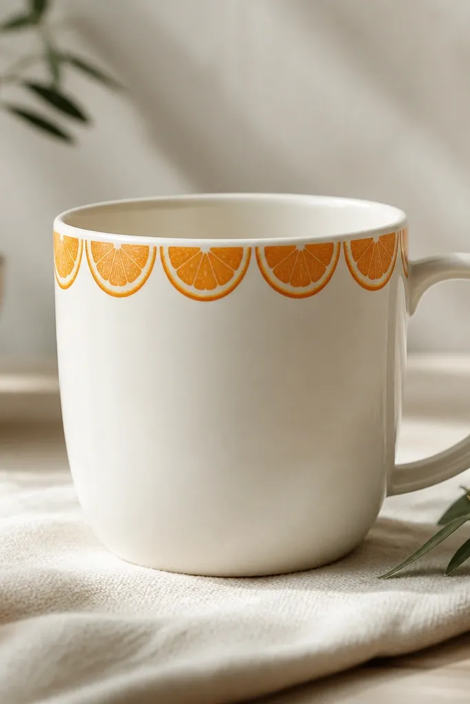
A rim border is a sneaky way to make a mug feel designed while keeping the center clean. Citrus peel shapes give a playful vibe without needing full fruit illustrations. It also helps if your hand shakes - you're drawing small repeat shapes in a small zone.
Paint a thin band near the top rim about 1/2 inch tall. Add repeating half-moon segments in orange, with a slightly darker orange inner curve. Leave the center blank so the border reads as intentional framing.
Pro tipRotate the mug a little between segments and mark your starting point with a small pencil dot.
AvoidDon't paint too close to the rim lip where it catches splashes - border wear shows fast.
18. Chocolate Drip and Strawberries
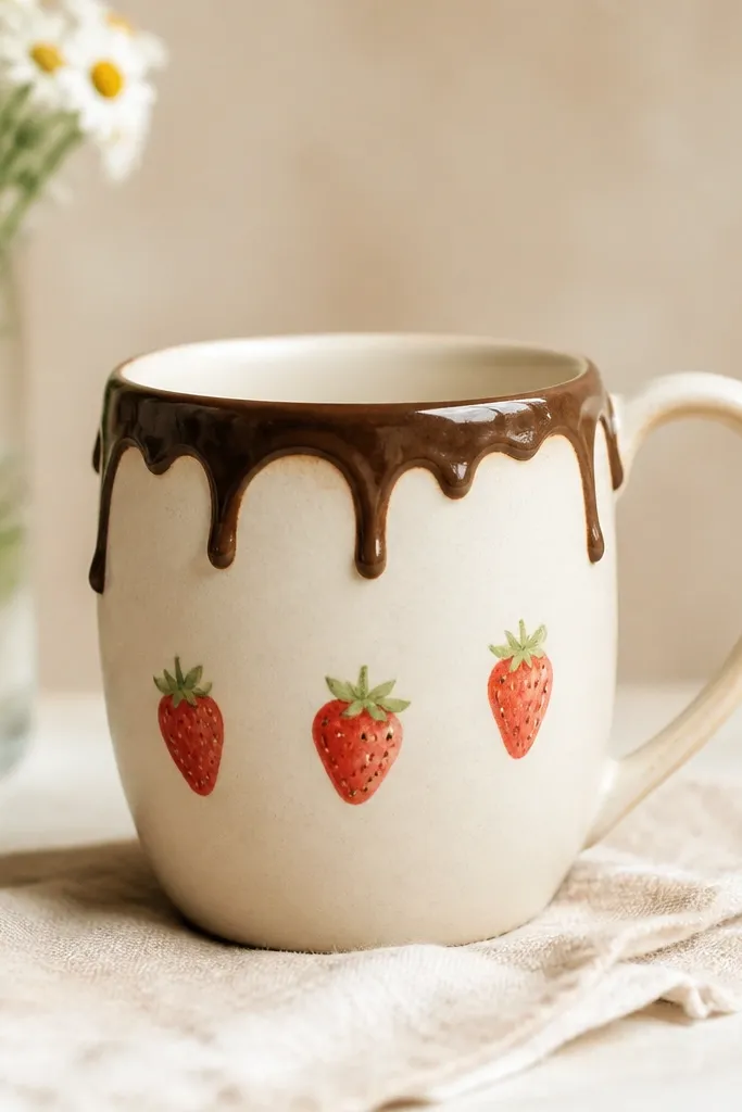
This design is fun and clearly "treat-themed," and it's easier than it looks. The drip is just a series of controlled lines, and strawberries can be simple: red teardrops with a few seeds and a green top. Keep the palette to brown, red, green, and a touch of cream for highlights.
Paint a dark brown drip starting near the top center, with 5-7 drips that stop at different lengths. Let it dry. Add three strawberries: two smaller on the sides, one larger center - each about 1.25 inches tall. Draw seeds with tiny dots and add green leaves at the top.
Pro tipUse the side of a small brush to make the drip lines thicker at the top and thinner at the ends.
AvoidDon't outline every strawberry - too many lines make it look like a sticker.
19. Pastel Ombre Bottom Fade
Ombre looks pro because it's about blending, and blending is forgiving on curved mugs. Pastels make it feel cozy and not loud. The fade also hides any tiny brush strokes that show up in solid painting.
Base coat the lower third with the lightest pastel. Sponge in a slightly darker pastel just above it, then blend upward with a damp brush. Work in thin layers so you don't get a hard line where colors meet. Keep the fade gentle: the darkest tone should cover only the bottom 1 inch.
Pro tipRinse your sponge often; dirty sponge = muddy ombre.
AvoidDon't try to blend in one heavy coat - you'll see streaks.
20. Tiny Animals on a Polka Hill
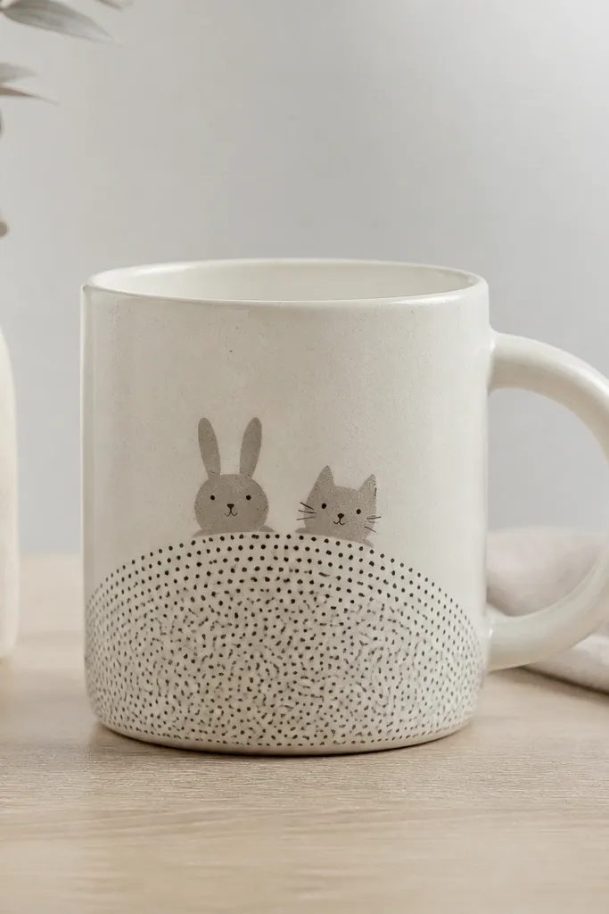
This is cute without being complicated. The hill is just a curved band with dots, and animal faces can be minimal: eyes, nose, and a few lines for ears or whiskers. The polka hill gives texture, so your animals don't need fur detail.
Paint a base hill band in light gray or beige that curves across the middle. Add evenly spaced dots on the hill using a stylus - about 1/8 inch apart. Draw a bunny face and a cat face in front of the hill, sized around 1.5 inches each, with black liner for features.
Pro tipKeep animal features centered on each face - off-center eyes ruin the cuteness fast.
AvoidDon't use very dark gray for the hill - it looks muddy next to pastel faces.
21. Hand-Painted Tie-Dye Swirls (Beginner Edition)
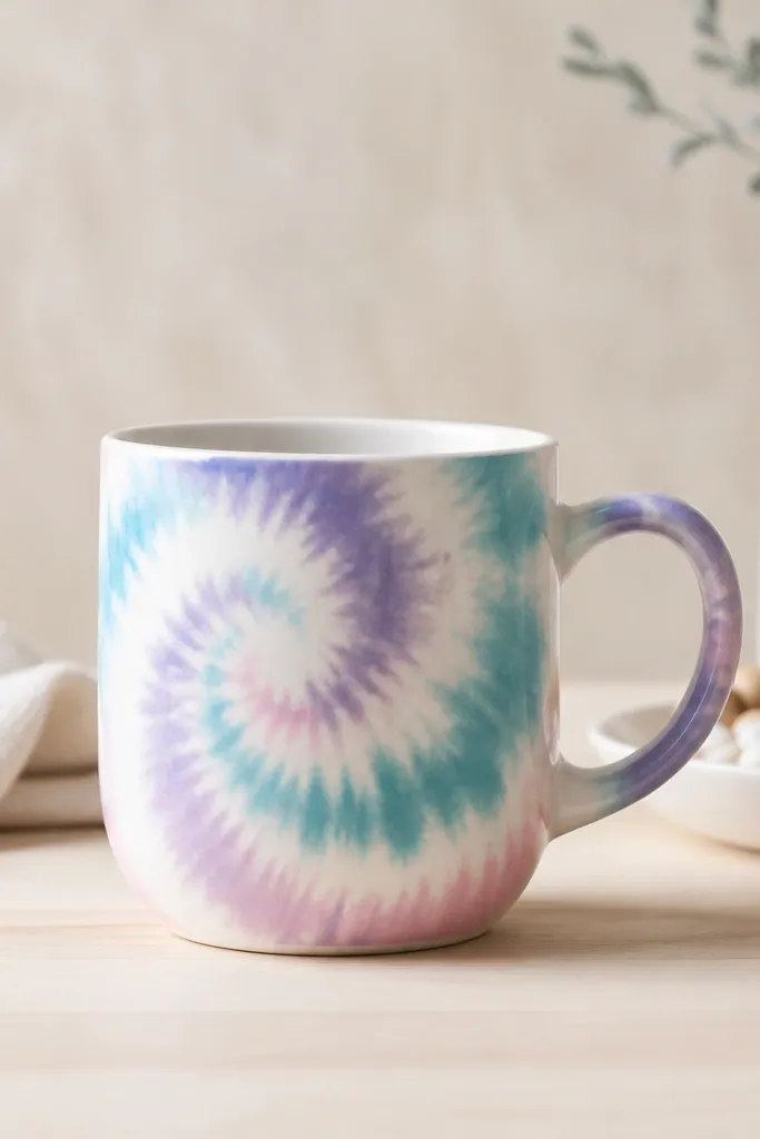
Tie-dye looks wild but it's easy if you keep white gaps. Those gaps make each color stay separate and prevent the whole mug from turning one brownish blob after curing. Teal, lavender, and pink look playful and still calm in a kitchen.
Paint the mug with a light base layer first (off-white works best). Then draw swirling shapes with a thin white gap line. Fill each swirl with one color using a sponge or small brush, keeping edges soft but separated. After drying, add a few tiny white dots to mimic light sparkle.
Pro tipUse a sponge for the color fill - it keeps the texture tie-dye-like without overworking it.
AvoidDon't skip the white gaps - that's what keeps the colors from bleeding together.
22. Geometric Mountains with Sun Triangle
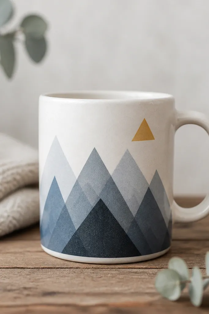
Mountains are made of triangles, and triangles are beginner-friendly. Layered shapes create depth even if your lines aren't perfect. The small sun triangle in yellow makes the whole scene feel like a sunrise without adding lots of detail.
Draw three mountain layers: the back layer widest and lightest, the middle slightly darker, the front smallest and darkest. Use a ruler to keep triangle edges straight - each layer height around 2 inches. Place a small yellow triangle sun in the top right, then add two short white lines as highlights on the mountains.
Pro tipLet each triangle layer dry before painting the next so colors don't smear into each other.
AvoidDon't make the mountains all the same color - the scene needs contrast.
23. Script Quote in One Color with Underline

One-color text is the easiest "aesthetic" win because it doesn't fight with busy art. A script-style quote adds personality, and the underline keeps it from looking like random writing. I like dark charcoal because it looks classy and doesn't stain like bright colors can.
Choose a short phrase that fits the mug front, like "good morning" or "coffee first." Transfer the lettering using transfer paper or lightly pencil it first. Paint over with a fine brush or paint pen, then add a thin underline that follows the baseline curve. Keep the text height about 2.5 inches so it stays readable.
Pro tipIf your script wobbles, write slowly and stop - broken letters look handmade, messy letters look sloppy.
AvoidDon't pick a quote longer than 2 lines - it will crowd around the handle.
24. Cherry Blossom Branch with Pink Blobs
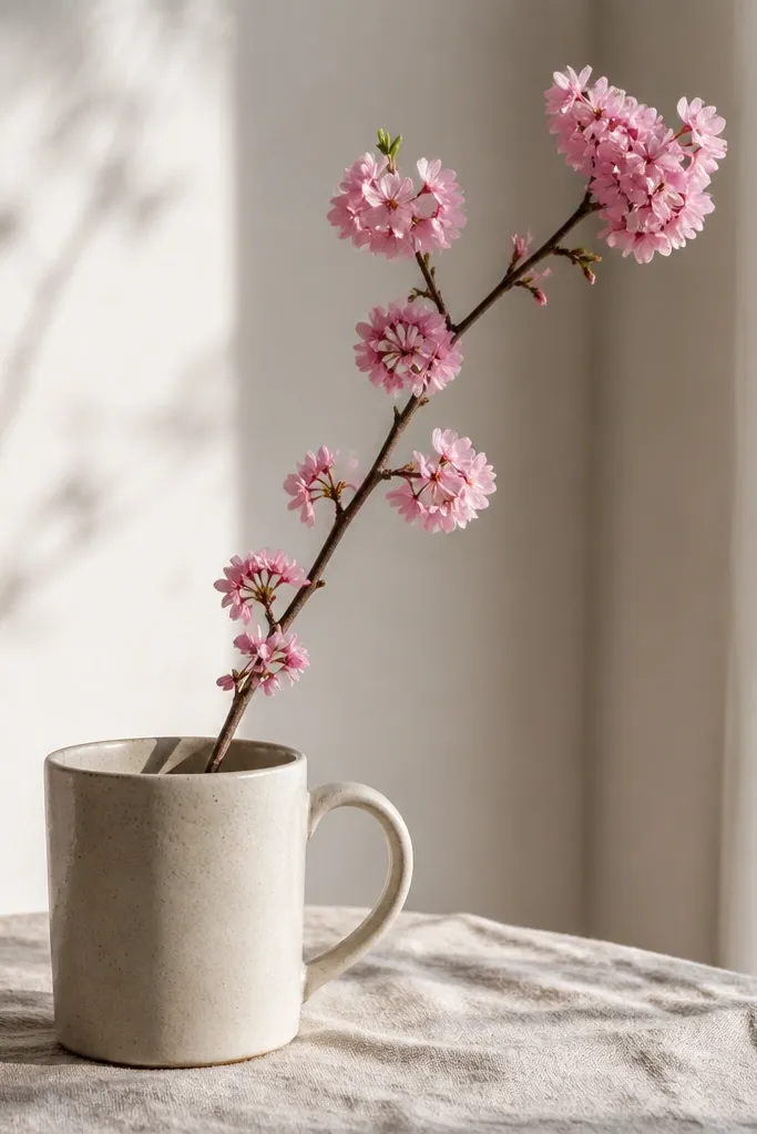
Cherry blossoms look detailed but you can paint them with simple clusters. The branch line gives structure; the blobs suggest petals without needing perfect flower shapes. Pink on white looks airy and calm, especially in morning light.
Paint a thin brown branch using a liner brush, with 3-4 small offshoots. For blossoms, dab light pink circles in clusters at the branch ends and along the smaller twigs. Add tiny green dots for stems and leaves. Keep the whole branch about 3 inches tall and angled slightly to the left.
Pro tipUse the same brush tip for all blossoms so the blob shapes match across the mug.
AvoidDon't outline every blossom - it turns soft blossoms into hard cartoon stickers.