1. Midnight Galaxy Mug with a Teal Ring

I made this one with navy ceramic base, then built the sky using a sponge dab so the texture looks like dust, not brush strokes. The teal ring gives you a clean boundary so the galaxy doesn't blur into the handle area. For the stars, I tap white paint through a small toothbrush - it creates dots of different sizes that look natural on a curved surface. The purple cloud sits behind the teal ring, so your eye reads the mug as layered, not flat.
Start with navy coverage in 2 thin coats. For the galaxy, dab purple and black with a makeup sponge, then add a soft halo by lightly dragging a nearly dry sponge outward. Paint the teal ring about 1.5 inches tall around the mug body, keeping it level even as the mug curves.
Pro tipUse a toothbrush for star speckling and practice on a paper plate first so you don't fling dots onto the counter.
AvoidAvoid painting tiny stars with a fine liner - they smear on ceramic curves and look like pen marks.
2. Sunrise Stripes with a Gradient Peach Rim
Stripes are the easiest way to make a mug look "intentional" because the curve becomes part of the design. I paint the stripes in the same direction as the mug's curvature, then I blend the rim gradient to mimic sunrise light. The peach rim makes the mug feel warm even though the base is white. Keep the stripes slightly uneven in width - perfectly measured stripes look machine-made and boring.
Mask the stripe edges with painter's tape, leaving about 1/4 inch between strips. Paint each stripe in thin coats, then remove tape while the last coat is still slightly tacky so edges stay crisp. For the rim gradient, sponge peach paint from the top down about 3/4 inch, then wipe a damp brush across it to soften the boundary.
Pro tipUse a damp paper towel to wipe your brush between stripe colors so you don't get muddy transitions.
AvoidAvoid thick paint on stripes - it pools at the curve and makes the lines look swollen.
3. Botanical Branches in Sage and Cream
This design works because thin botanical lines look clean on ceramic if you keep them consistent in thickness. Sage and cream give a calm, slightly vintage vibe without needing gold accents. I add tiny off-white highlights to leaf edges so the leaves look dimensional rather than flat stickers. The diagonal placement makes the mug feel like it has motion.
Use a fine paint marker or a liner brush for the branches. Start with one main stem, then branch off with short "V" strokes for leaves. Paint leaves in sage, then add a light off-white highlight on the same side of each leaf for a consistent light direction.
Pro tipPlan your branch path by holding a scrap paper strip around the mug - trace the curve before you paint.
AvoidAvoid freehanding leaves that all point in random directions - the set will look messy fast.
4. Speckled Clay Look with Terracotta Dots
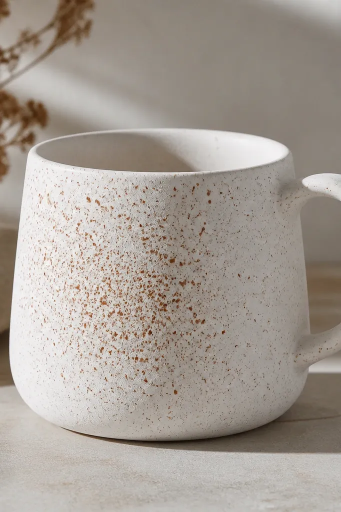
Speckle patterns hide minor brush marks and make the mug look textured even if your base coating is imperfect. Terracotta dots on a white base look like handmade pottery. I vary dot size by using two brushes: a stiff one for tiny dots and a smaller one for larger blotches. The density gradient keeps the design from feeling like a random scatter.
Paint the mug base with matte white ceramic paint. For dots, load terracotta paint on a stiff brush and tap gently, aiming for more dots in the center band. After it dries, add a second pass with a slightly lighter clay color (like pale orange) to catch the light.
Pro tipDo your speckle in two steps: first heavy dots, then a lighter pass so you don't clog the surface.
AvoidAvoid using too much paint on the brush for speckles - thick blobs look like drips.
5. Art Deco Fan Panel in Black and Gold
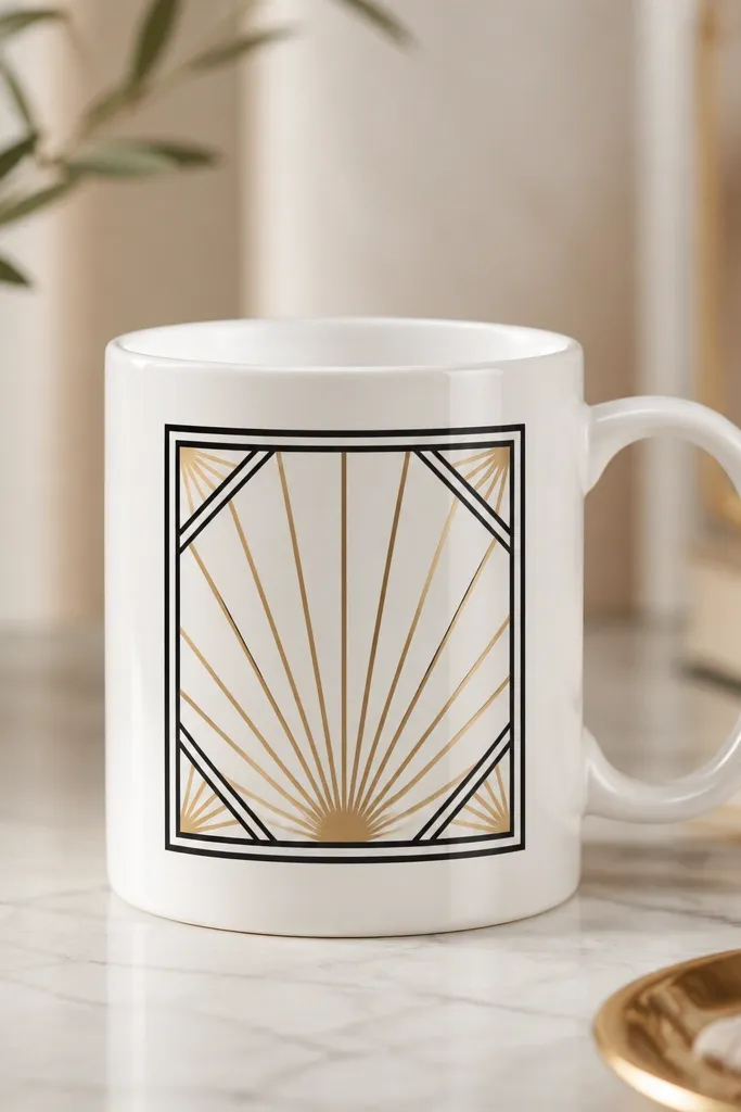
Art deco designs look sharp because they're geometric and repeatable. I use thick black lines to create the frame, then fill the fan rays with metallic gold. The metallic paint catches light on the curve, so the rays look like they're glowing. Small triangles at the panel corners keep the layout balanced.
Outline the frame with a thick black ceramic paint pen. Fill the fan rays by painting alternating gold stripes about 1/8 inch wide, keeping them all the same angle. Add corner triangles in black and a thin gold line along the inner edge of the frame.
Pro tipUse a ruler to mark the angles on paper, then transfer lightly - your first fan sets the whole pattern.
AvoidAvoid thin black lines - they disappear after baking and the panel looks unfinished.
6. Monochrome Portrait Silhouette with Soft Shadow
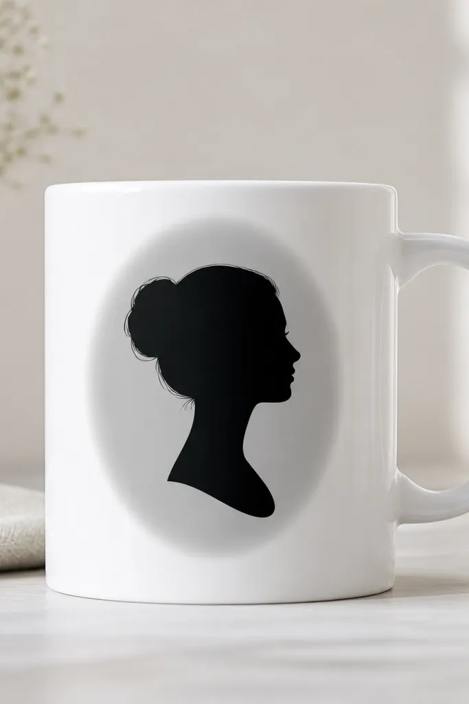
Silhouettes are forgiving because you don't need perfect facial details, just a clean outline. I paint the silhouette in one solid black coat, then add a gray shadow halo behind it for depth. The halo should be blurred - not streaky. This makes the mug look graphic and intentional even if your freehand drawing isn't perfect.
Print or trace a simple profile onto transfer paper, then position it on the mug and outline. Fill the silhouette with a dense black coat, then let it dry before adding the gray halo with a sponge. Keep the halo about 1/4 inch around the silhouette so it reads as shadow, not another shape.
Pro tipUse a cotton swab to soften the halo edge while the gray is still wet.
AvoidAvoid painting the halo directly on top of wet black - you'll lose the silhouette edge.
7. Candy Cane Handle Wrap with Red/White Twist

This one looks fun because the twist lines guide your eye around the mug. I paint the stripe direction so it visually "connects" around the handle - the mug looks like a single continuous twist. Keep the red slightly translucent in the first coat so it doesn't look like thick marker ink. The result looks playful but still neat.
Mark a starting point near the bottom and another near the top on the front side. Use painter's tape to create alternating stripe bands that follow the twist angle, then paint red in thin coats. Remove tape carefully and touch up with a small brush if any edges lift.
Pro tipIf your hand shakes, tape the first stripe line and paint just one wrap pass at a time.
AvoidAvoid painting the twist too close to the handle rim - it looks cramped and messy.
8. Watercolor Dots and Drips in Dusty Rose
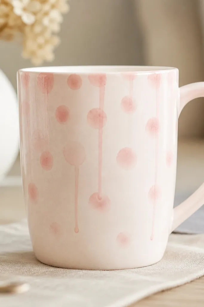
Watercolor-style effects look best when you control how the paint spreads. Dusty rose on a light base gives you that "soft art print" look. I make the drip lines with a wet brush, then stop them by blotting the tip on paper. The dots are done by pressing a damp brush, not by drawing circles.
Start with a light blush base or leave the mug white and use dusty rose only. For dots, load your brush, dab once, then lift - you should see a soft edge. For drips, place one dot near the drip start, then drag downward slightly with a damp brush tip and blot to stop the run.
Pro tipPractice drip stops on a spare mug or tile - the blotting timing is the difference between cute and sloppy.
AvoidAvoid adding water to the whole mug - you'll get uneven spread and dull patches after baking.
9. Blackboard Label Style with White Chalk Lettering
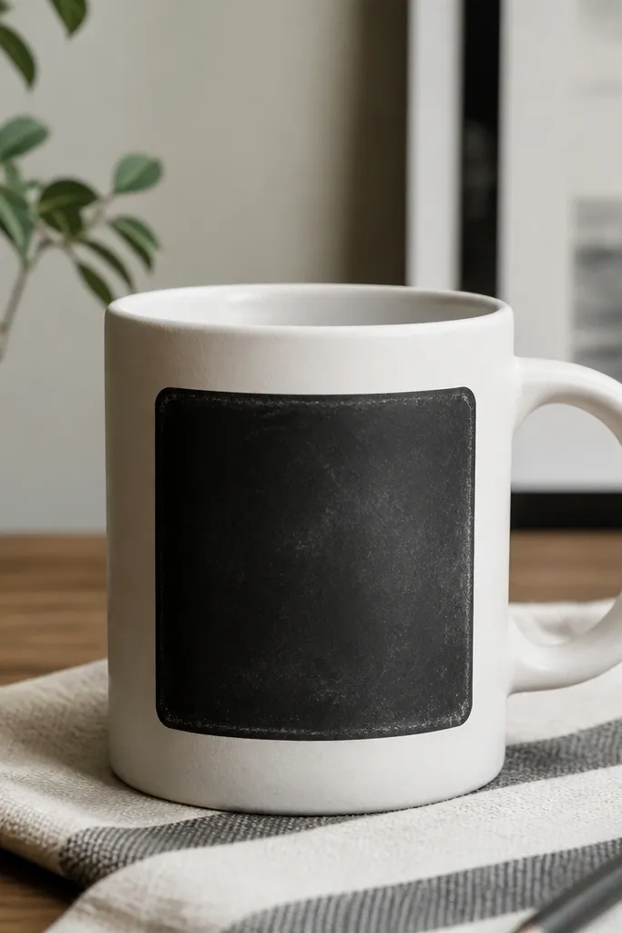
A chalkboard label makes the mug look interactive even when you're not using real chalk. I paint a matte black rectangle, then letter with opaque white acrylic-ceramic paint using a flat liner brush. The trick is to lightly vary pressure so letter edges look chalky. You can change the wording later by sanding lightly and repainting the label area.
Paint a rectangle about 3 inches wide and 2.5 inches tall on the mug front. Let the black cure per paint instructions, then add white lettering. Add a few tiny gray smudges behind letters using a dry brush and diluted gray paint for realism.
Pro tipLetter with a scrap paper template for spacing; the curve makes long words drift.
AvoidAvoid glossy black - it reflects light and makes the lettering look like decals.
10. Coastal Wave Lines in Blue with a White Foam Edge
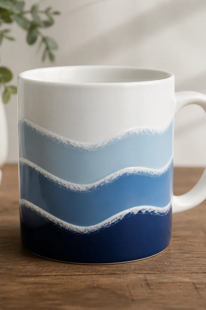
Wave lines look clean when you treat each band like a sticker outline, not a freehand squiggle. I paint the blue bands first, then trace a white foam edge on the crest so it looks like sea spray. The foam edge is thin and crisp - it's what makes the waves read as waves. This design also hides uneven mug texture because the lines create structure.
Paint three horizontal wave bands across the front, spaced about 1.1 inches apart. Use a mid-blue for the base waves, then a lighter blue for the top band. Add white foam by painting a thin line along the wave peaks, then lightly feather the ends with a damp brush.
Pro tipUse a damp paper towel to wipe your brush between wave peaks so the foam line stays sharp.
AvoidAvoid drawing waves too close together - they blur into one stripe after baking.
11. Pink Floral Sprigs with Tiny Dot Centers
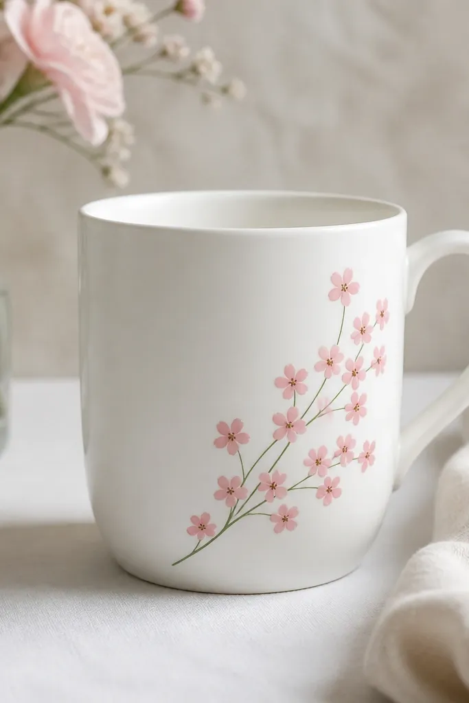
Small clustered flowers look best on mugs because they fit the available space without wrapping your whole design around. The dot centers add a focal point and make each bloom read clearly. I keep the stems thin and the petals rounded, so the flowers look friendly, not fussy. Pink plus a muted green makes it feel fresh without turning into cartoon overload.
Sketch one stem line diagonally from near the handle down. Add 5-7 blossoms, each with 5 rounded petals and a single darker pink or magenta dot center. Add tiny leaf shapes in muted green and keep them smaller than the flowers so the blooms lead.
Pro tipLet petals dry before adding centers; wet petals blend and lose their shape.
AvoidAvoid outlining every petal - it makes the flowers look heavy and cheap.
12. Terracotta Arch Frame with Off-White Inside Space
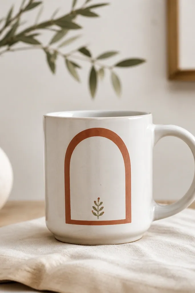
Negative space makes mugs look expensive fast. The arch frame in terracotta gives you a strong shape, and leaving the inside mostly blank keeps it clean on the curved surface. I add a small sprig at the bottom to keep the composition from feeling empty. This one looks good in kitchens because it doesn't scream for attention.
Paint an arch about 2.75 inches tall and 2.25 inches wide. Use a steady hand or a stencil for the arch outline, then fill the frame with terracotta in two thin coats. Add a tiny green sprig at the bottom inside, with 3 leaves and one small bud.
Pro tipIf you want crisp edges, use tape for the arch outline and remove it before the paint fully dries.
AvoidAvoid filling the whole arch interior with color - it makes the design look like a sticker.
13. Gold Leaf Corners with Matte Background
Gold leaf looks classy when it's restrained. I paint a matte base first, then add gold corner flourishes so the mug looks styled rather than decorated. The flourish lines should be thin and slightly uneven, like real leaf edges. A thin gold line near the handle ties the corners into one layout.
Paint the mug with matte light gray or soft white ceramic paint. Add gold flourishes at the top corners using a fine liner brush. Finish with a single thin gold line that runs from near the handle toward the center so it doesn't feel disconnected.
Pro tipUse gold paint sparingly; you want a light sheen, not a thick metallic layer.
AvoidAvoid covering the whole mug in metallic paint - it turns bumpy and scratches off faster.
14. Monogram Bands in Navy with a Clean White Outline
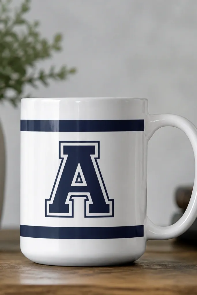
Monograms look sharp because you're giving the eye one job: read the letter. The white outline makes the navy pop on the curved ceramic, and the two bands create a frame. I paint the bands first, then the outline, then the letter fill so edges stay crisp. This design is also easy to personalize for gifts.
Paint two navy bands about 1 inch tall each, spaced around 1.2 inches apart vertically. Mask the monogram area with tape and paint a navy letter. Add a white outline around the letter using a small round brush, then touch up any gaps with a liner.
Pro tipPrint your letter in a bold font, tape it under the mug, and trace lightly with a pencil first.
AvoidAvoid freehand monograms without a guide - the curve makes letters wobble and look uneven.
15. Rainbow Watercolor Wash with a White Cloud Top
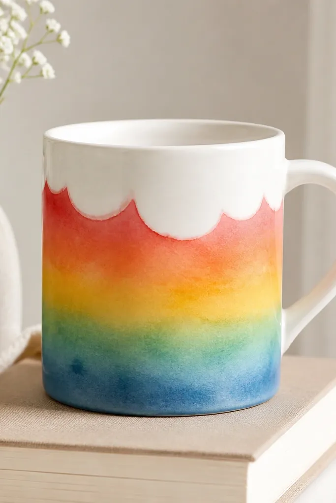
This design works because watercolor washes blend smoothly on ceramic when you control moisture. I layer colors from warm to cool, letting each band dry for a minute before adding the next. The white cloud top hides the transition edge and makes it feel like sky meets rainbows. It's bright without needing tiny details.
Use a light base and tape a horizontal band where the rainbow will sit. Paint red, then orange, then yellow, then green, then blue with a wide brush, keeping the paint watery but not dripping. After the rainbow sets, paint a soft white cloud band across the top edge and blend lightly with a clean damp brush.
Pro tipKeep a paper towel nearby and blot your brush to prevent streaky runs.
AvoidAvoid doing the whole rainbow in one wet pass - colors bleed into mud on the curve.