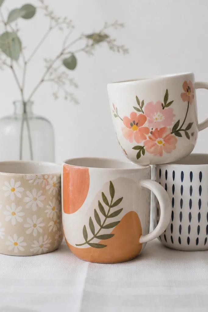

1. Berry Glow Constellation
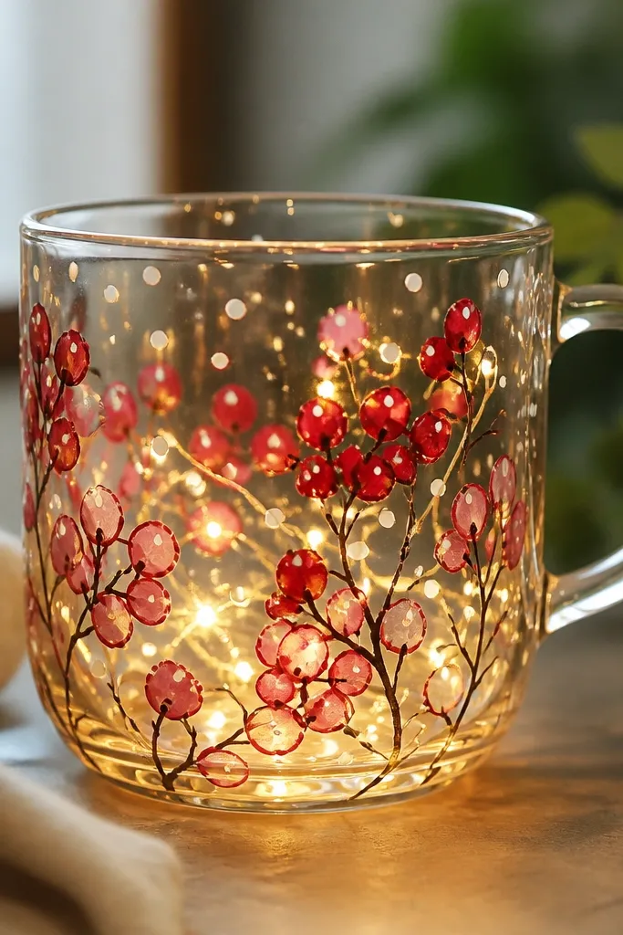
This one looks like a fruit constellation because the berries are translucent and the LEDs behind them turn the red to a soft lantern glow. I paint the berry shapes with stained-glass style red and layer a lighter pink at the top edge so it blooms when lit. Thin black lines keep the berries readable even when the room is dark.
Paint a loose ring of berries around the midsection, about 1.5-2 inches tall, leaving the handle area mostly clean. Use opaque white dots sparingly for "sparkle" points. Cure according to your paint label, then place a warm-white LED micro strip behind the painted ring so light hits the berries head-on.
Pro tipAdd 6-10 tiny white dots with a fine liner after the final cure. They make the whole mug look planned, not accidental.
AvoidDon't fill every inch with color - if it's too dense, the glow turns muddy and the design disappears.
2. Sunset Gradient Skyline
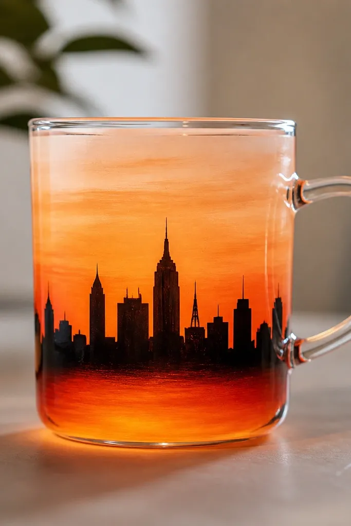
The gradient reads as light because the LEDs pass through the translucent layers. I do the sky in three paint bands - orange, coral, then peach - with a soft blend using a damp brush edge. The skyline in near-black gives contrast so the silhouette doesn't look like a smudge under glow.
Mask a straight horizon line with painter's tape. Paint the sunset bands inside a 6-7 inch wide strip across the mug, keeping the band height around 2.5 inches. Cure, then wrap warm-white LEDs around the back side so the light warms the peach top.
Pro tipBlend the gradient while the paint is still slightly tacky, using only the brush tip - too much water makes streaks that show under LEDs.
AvoidSkip metallic gold for the sky layer. It looks flat at night and turns scratchy-looking under light.
3. Map Coordinates Lantern
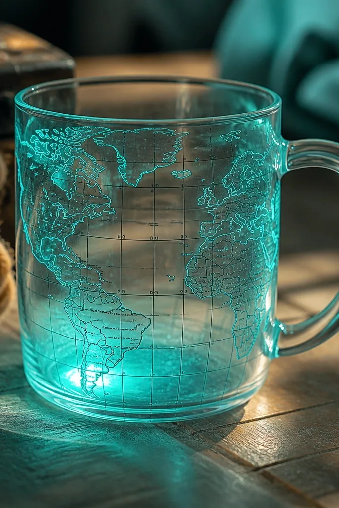
This style works because it mixes thin, high-contrast linework with a translucent color wash. The teal glow is stronger than blue because it reflects warmer LED light better. The coordinate numbers give it a "found object" vibe, and they stay crisp when you keep the lines narrow.
Paint a light teal wash behind the lines first, using translucent paint diluted just enough to flow. Then add streets/contour lines with a 0.5 mm liner brush. Place the LEDs around the back half so the teal wash brightens without blowing out the black text.
Pro tipWrite the coordinates with a pencil mock-up first on paper. Transfer using carbon paper so your spacing stays even.
AvoidDon't use thick marker-like strokes for the map lines. Under LEDs, thick lines look like blobs.
4. Neon Butterfly Wing Fade
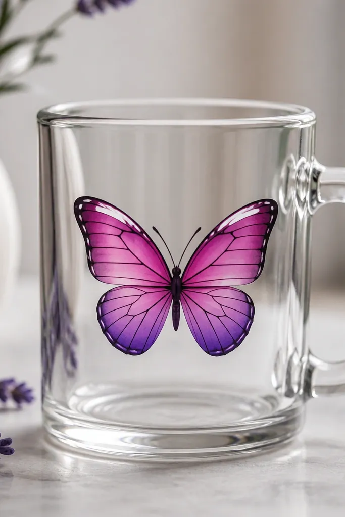
Neon looks real on glass when you control opacity. I paint the wing bases in translucent magenta and fade the lower edges into violet using a nearly dry brush. White highlights along the wing top make the LEDs feel like they're "catching" the butterfly.
Sketch the butterfly so it's about 4 inches wide and centered on the mug's front. Paint the veins last with dark purple-black, using a liner brush. Cure fully, then tuck a cool-white LED mini strip behind the butterfly so the violet reads clean.
Pro tipUse a cotton swab to soften the fade boundary while the paint is still workable. It gives that airbrushed wing look.
AvoidDon't outline every wing edge in black. Leave some areas lighter so the glow can breathe.
5. Citrus Slice Stained Glass
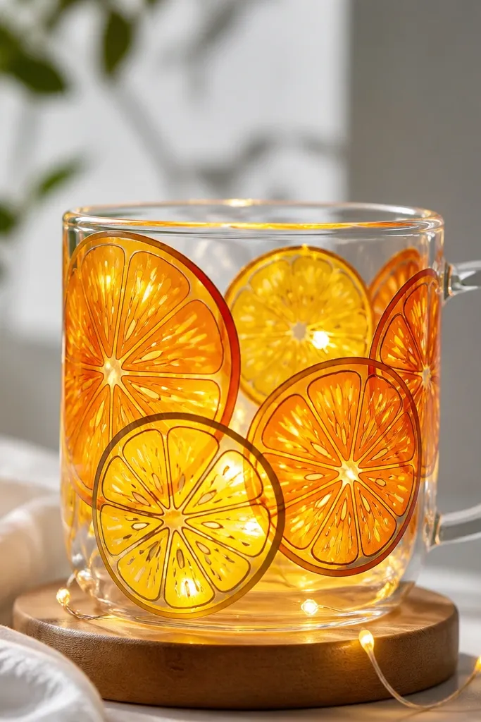
Stained-glass outlines do the heavy lifting here. Thick dark borders keep the translucent slices separated so the light doesn't smear your design into one blob. The orange-to-yellow layering makes the slices glow like they're inside a lantern.
Use stained-glass style paint or glass paint thick enough to hold a line. Draw two to three half-slices overlapping on the front, each about 2 inches across. Color the interior with translucent orange and add a thin yellow highlight band near the "rind" edge.
Pro tipLet the thick outline dry a bit before filling each slice so the colors don't bleed into the borders.
AvoidDon't use opaque paint for the main fruit. It kills the glow and looks like regular craft paint.
6. Winter Star Script

Script plus stars works because the LEDs illuminate the background wash, while the white text stays legible. I use a thin icy blue layer that's light enough to glow but not so thin it turns streaky. The snowflake lines are kept simple - just a few arms - so the mug reads clean in low light.
Paint an icy blue wash in a vertical rectangle on the front, leaving margins. Add 8-12 tiny stars with white paint, then write a short phrase in white glass paint (one or two lines). Place warm-white LEDs behind the blue wash for a soft winter effect.
Pro tipWrite on paper first, then trace onto the mug with a light pencil. Wipe the pencil marks after curing.
AvoidSkip long paragraphs of text. Under LEDs, small letters blur together.
7. Garden Mason Jar Vines
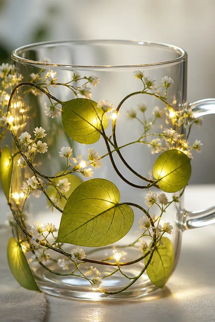
Vines look good because they give the light multiple thin shapes to catch. Translucent green makes the mug feel like a living lantern. I add small white flowers so there's sparkle where the LEDs hit, and dark stems keep the whole thing from looking like a green haze.
Paint a base translucent green leaf shape on both sides of the mug, leaving a gap near the handle. Use a liner brush to add stems and leaf veins in dark green-black. Put the LED strip behind the center so the brightest part sits around the leaf cluster.
Pro tipUse two leaf sizes: one about 1 inch long and one about 0.6 inch. The scale makes it look hand-drawn, not stamped.
AvoidDon't paint thick green fills. Thick areas block light and turn dull.
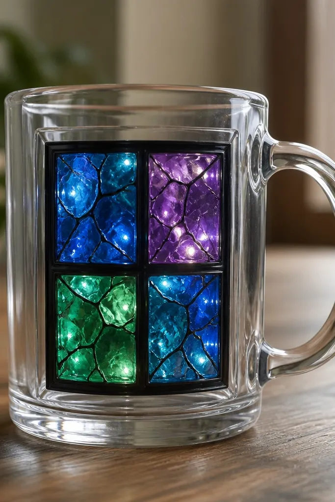
8. Geometric Prism Lines
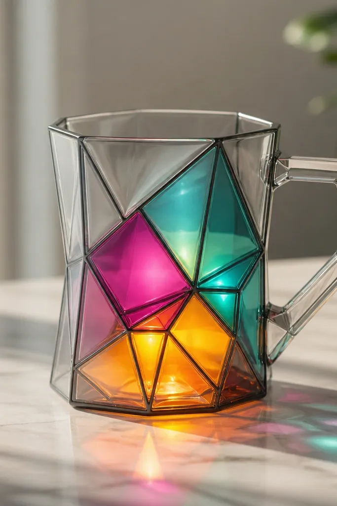
Prism geometry works because hard edges make light color separation look intentional. I keep the outlines crisp and thin, then fill each prism face with a different translucent color so the LEDs create a stained-glass effect. Amber and teal look especially good together - they warm and cool the glow.
Mask a triangle-like pattern with painter's tape so the angles stay sharp. Fill 3-5 prism faces with translucent paints: teal, magenta, amber. Cure, then place LEDs behind the center so each face gets similar light.
Pro tipPress tape edges firmly with a fingernail. Any gap lets paint creep and ruins the crisp lines.
AvoidAvoid mixing colors directly on the mug. Layering looks clean; mixing makes gray streaks.
9. Lavender Night Sky Drops
This is a "soft glow" design. The lavender wash near the bottom makes the mug feel like a night sky, while the droplet shapes give movement to the light. White specks add depth without needing elaborate stars.
Paint a gradient wash from deep lavender at the base to near-clear toward the middle. Then dab translucent droplet shapes using a sponge tip or the corner of a makeup sponge. Add a few white specks with a fine liner after curing.
Pro tipStart with fewer droplets than you think. You can always add more, but you can't un-make a crowded look under LEDs.
AvoidDon't overdo the lavender opacity. If it's too thick, it stops glowing and looks like paint on glass.
10. Retro Arcade Halo
Halo graphics read strong at night because circles concentrate the glow. I paint three translucent rings - green outer, cyan middle, and a lighter inner ring - then add a tiny black grid to give it arcade energy. The LEDs make the rings look like they're radiating.
Draw a circle about 3.5 inches across on the front, centered slightly above the mug's midline. Paint the rings in translucent neon green and cyan, leaving thin gaps for a crisp layered look. Cure, then position LEDs behind the circle for even ring brightness.
Pro tipUse a compass or a jar lid to trace your circle. Freehand circles wobble and show under glow.
AvoidSkip thick outlines around the entire halo. It turns into a sticker effect.
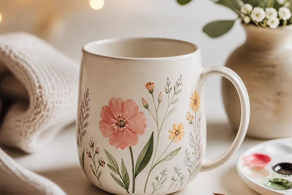
11. Cherry Blossom Paper Lantern
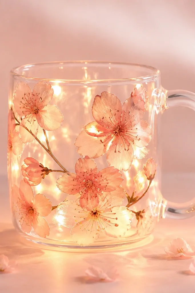
Cherry blossoms look delicate under light because the petals are translucent and layered. I use a milky pink wash as the background so the LEDs make a soft glow, not a harsh beam. Petal edges are outlined lightly in dark rose to keep shapes from merging.
Paint a light milky pink wash covering the front only, about 70% of the surface. Add 10-12 blossoms using a dot-and-dash petal method with a small brush tip. Cure, then wrap warm-white LEDs around the back so the glow spills through the petals.
Pro tipAdd one tiny white highlight stroke on each blossom petal. It makes the petals look wet and luminous.
AvoidDon't use bright red for the petals. It looks too heavy and kills the paper-lantern softness.
12. Ocean Depth Tides
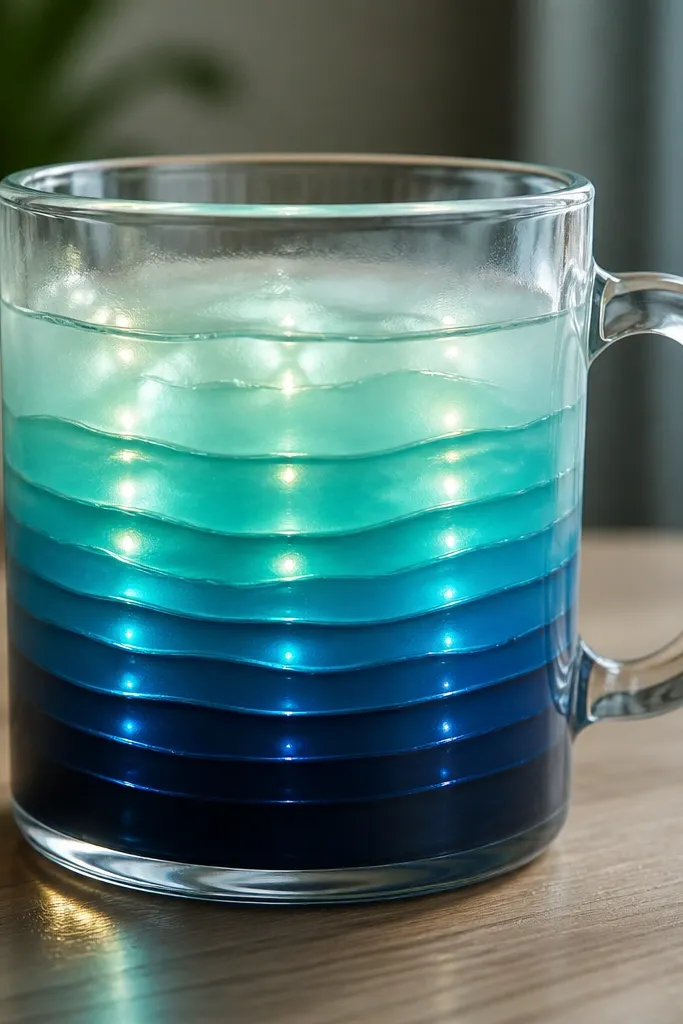
Horizontal bands are perfect for lights because the glow travels through the layers like waves. I paint 5-7 tide lines, each slightly different thickness, and fade the colors upward from navy to aqua. The dark bottom anchors the design so it doesn't look like a flat wash.
Mask a vertical strip on the mug front, then paint horizontal bands inside it. Keep each band about 0.4-0.6 inches tall and blend edges gently. Cure fully, then use cool-white LEDs to keep the aqua crisp.
Pro tipUse a ruler or tape guide so the lines stay level. One crooked band makes the whole mug look sloppy under light.
AvoidAvoid metallic blues for the tide bands. They shimmer in a cheap way instead of looking like depth.
13. Monogram With Light-Guide Strokes
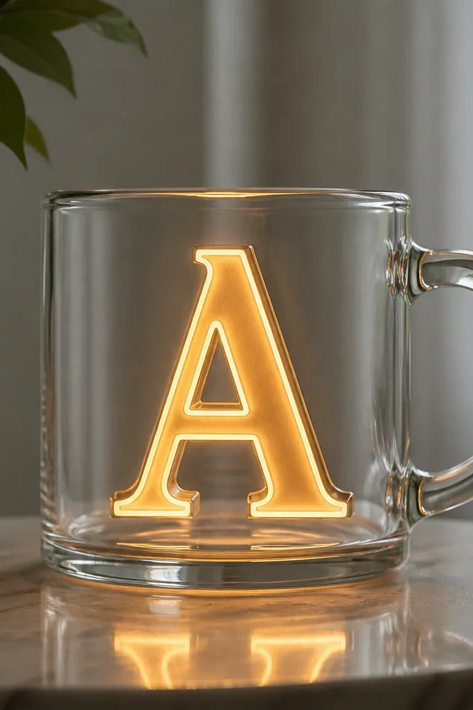
This is the cleanest "event gift" look I've made. The monogram glows because the letter fill is translucent, while the white highlight gives the LED light something to bounce. Thin dark outlines keep the letter shape sharp and readable from across a table.
Pick a single letter and size it to about 4 inches tall, centered on the mug. Fill the letter with translucent paint, then add a narrow white highlight line down one edge. Cure, then place LEDs behind the center so the glow sits inside the letter, not around it.
Pro tipUse a vinyl stencil for the letter. It saves you from wobbly curves that show under glow.
AvoidDon't paint the entire mug background. Keep the glow focused so it looks like signage, not decoration.
14. Terracotta Ember Spots
Spot patterns look surprisingly sophisticated when they glow. Terracotta and amber make a warm ember effect that looks good with warm-white LEDs. I add a couple of thin arcs to guide the eye so the dots feel like a pattern, not random specks.
Paint a light translucent wash base in pale sand, then dab terracotta dots using a sponge or the end of a round brush. Add amber dots in between for variation. Cure, then position LEDs behind the dot cluster so the strongest glow hits the densest area.
Pro tipUse two dot sizes: one about 1/8 inch and one about 1/16 inch. The scale difference keeps it from looking like confetti.
AvoidSkip super tiny dots everywhere. Under LEDs they blur and look like noise.
15. Midnight Stained Glass Window
A window layout makes the glow feel structured. The black lead lines separate the colors so each panel stays distinct even with bright LEDs. Deep blue and purple are dramatic at night, and a small green panel adds a "stop" point where your eye lands.
Draw a simple rectangular frame across the mug front, leaving space around the handle. Create four panels inside with black outline paint, then fill each panel with translucent colors: deep blue, purple, green, and a lighter indigo for the fourth. Cure, then add a LED strip inside the mug so it lights all panels evenly.
Pro tipUse painter's tape to block the frame edges before filling panels. Clean borders make stained glass look expensive.
AvoidDon't use thick opaque white for the whole background. It makes the stained glass look chalky under light.