1. Sunrise gradient mug with taped horizon
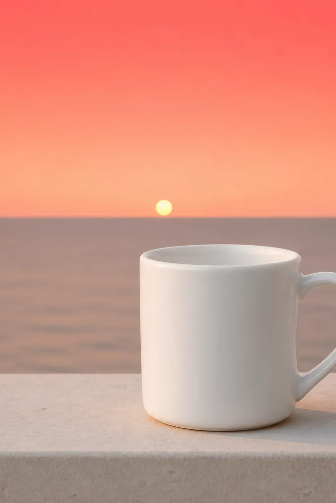
This look works because the gradient reads like light, and the taped horizon keeps it from looking messy. I paint the top with a darker coral, then blend down with a damp brush so the colors fade naturally. A small yellow sun gives the whole mug a focal point without clutter. The clean horizon line makes it feel intentional, even if your freehand blending is imperfect.
Start by marking a center line on the mug using a strip of painter's tape wrapped around as a guide. Mask the horizon with thin tape and leave the area above it for the sky. Use three paint mixes: coral, peach, and pale cream; apply coral first, then blend peach into it while still wet, then feather pale cream near the horizon. Let it dry fully between coats so the gradient stays smooth.
Pro tipBlend with a nearly dry brush - too much water makes ceramic paint run and dull.
AvoidDon't paint the gradient in one thick coat; it dries with streaks and a chalky edge.
2. Polka-dot mug with two-size dot pattern
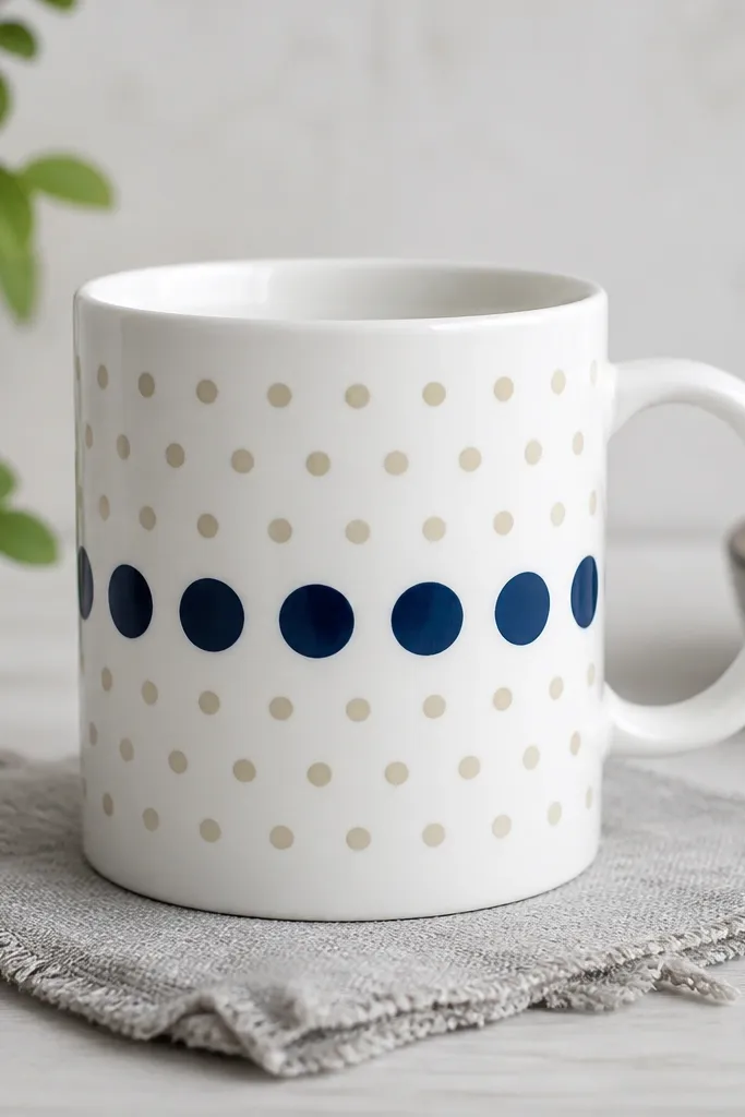
Polka dots hide small hand-drawing mistakes because the pattern does the heavy lifting. Two dot sizes add rhythm - large dots anchor the layout, while small dots keep the negative space from feeling empty. I use a limited palette (navy and cream or black and gold) so it looks modern instead of kid-craft busy. The key is consistent spacing, not artistic flair.
Use a dotting tool or the end of a cotton swab for small dots and a foam paint marker cap for larger ones. Lightly mark a grid with a pencil: for a standard 11 oz mug, aim for about 6-7 large dots across the widest part. Work around the curve by rotating the mug on a turntable or towel and keeping your wrist steady. Let each dot dry 10-20 minutes before adding the smaller ones so you don't smear.
Pro tipDo one test row on paper first, then match your dot pressure to that row.
AvoidAvoid dragging the paint into the dot; dab straight down for round edges.
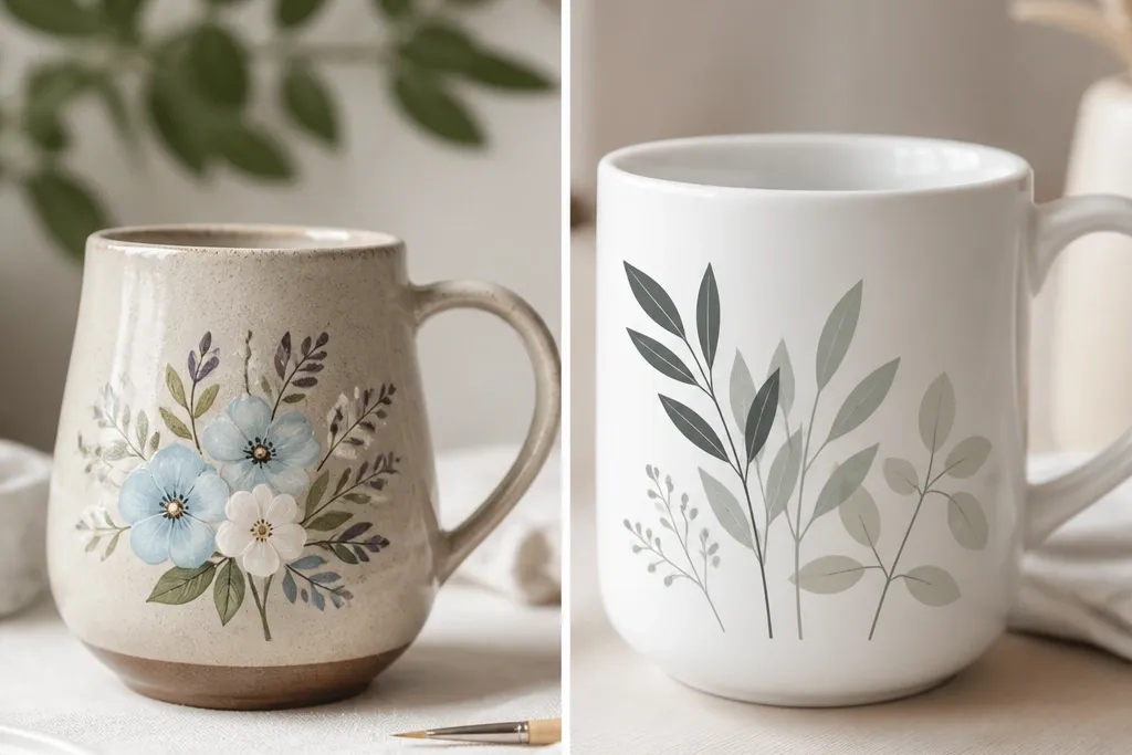
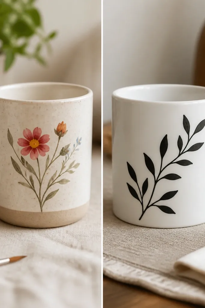
3. Botanical branch with single-line stems
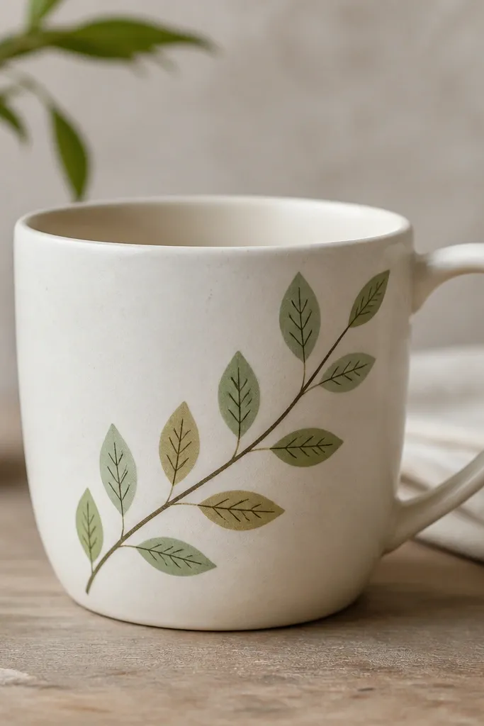
Single-line stems look classy because they're light and airy. The branch direction adds movement, and the leaf shapes stay readable even if you're not perfect at symmetry. I keep the palette earthy (sage, olive, and a slightly darker vein color) so the mug looks like a printed botanical sketch. Tiny vein marks make the leaves look "real" without adding extra clutter.
Sketch one long branch with a pencil - keep it thin so it doesn't overwhelm the mug. Paint the stem with a liner brush (size 0 or 1) using a medium green. Add leaves as teardrops: one side painted, then a short darker vein line from the center outward. Place leaves with gaps - I aim for one leaf every 1 to 1.5 inches along the branch.
Pro tipLet the stem dry before painting leaves so the leaves don't bleed into the line.
AvoidSkip heavy outlines; thick borders make it look like a sticker instead of a brush illustration.
4. Strawberry trio with glossy red highlights
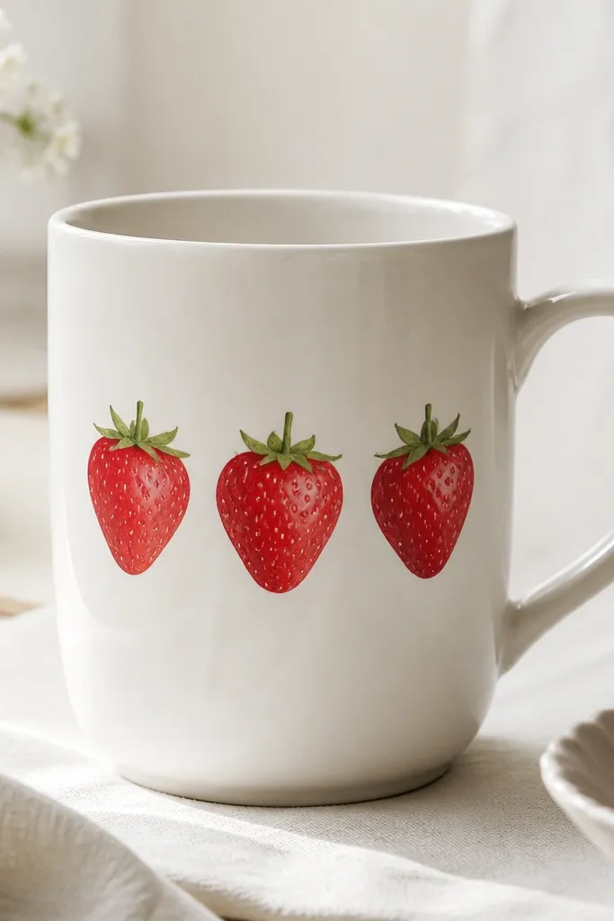
Fruit looks great on mugs because it reads at a glance and the shapes fit the mug's curve. The glossy highlight curves make the paint feel dimensional, even with simple brushwork. I paint the seed texture with tiny dots rather than lines so it stays cute, not gritty. A green top with a couple of short strokes finishes the realism.
Draw three ovals with a pencil, spacing them so the middle berry sits slightly higher. Base coat each berry with red, then add light pink on one side of each oval. For seeds, use a fine brush to dot off-white across the highlight area. Paint the tops with a darker green base and add 3-4 angled strokes for leaves.
Pro tipUse a smaller brush than you think you need for the seed dots; control beats speed.
AvoidDon't cover the whole strawberry with red and then try to "fix" it - highlights need to be planned while the base is still fresh.
5. Monogram on a curved banner ribbon
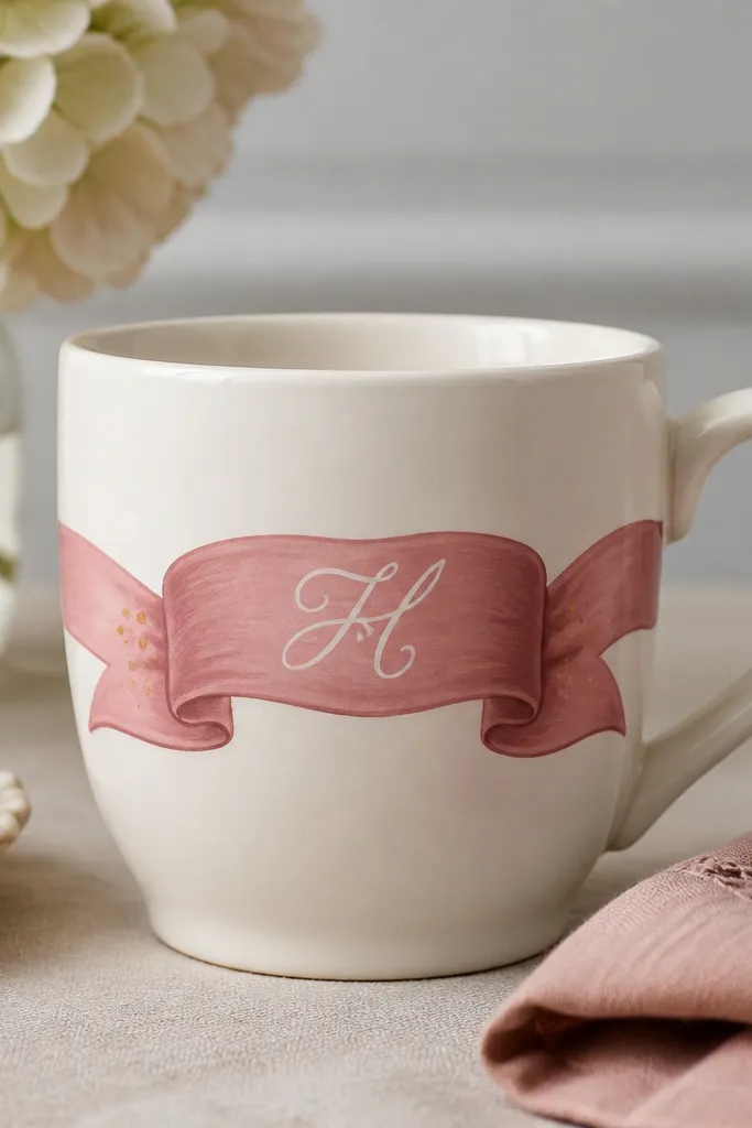
A ribbon banner makes a mug look designed because it frames the lettering. Dusty rose gives a softer feel than bright pink, and white lettering stays readable. Gold dots at the ends mimic a stitched or decorative finish. The curved placement matters: it should follow the mug's contour so the monogram doesn't look stretched.
Mask a horizontal band with painter's tape wrapped around the mug at the level you want the monogram. Paint the band with two thin coats of dusty rose and let it dry. For the monogram, use a stencil or hand-letter lightly in pencil first. Paint in white, then add two gold dots near the band ends.
Pro tipIf you freehand the monogram, practice on paper and keep your downstrokes thicker than your upstrokes.
AvoidAvoid painting the ribbon too close to the handle; it makes the lettering feel squeezed.
6. Geometric checker band with crisp edges
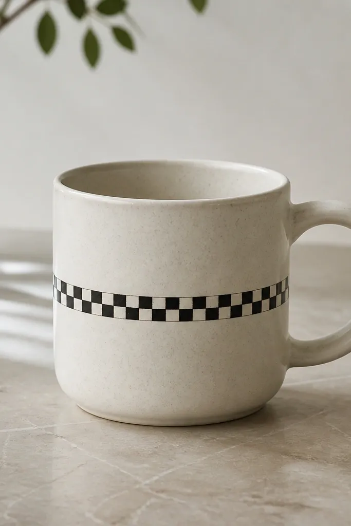
Checker patterns look clean and modern when the edges are sharp. Tape gives you straight lines, and consistent square sizes keep it from looking like a random grid. I keep the rest of the mug blank so the band feels intentional. The contrast between black and off-white makes it pop without adding extra graphics.
Measure the mug's circumference with string or tape, then decide square size. For a typical mug, 1/2 inch squares look right for a narrow band. Use thin painter's tape to make a grid, paint in alternating colors, and remove tape while paint is still slightly tacky for crisp borders. Let it cure fully before use.
Pro tipPaint the lighter color first; it helps you see the grid while you work.
AvoidDon't rush tape removal after a long dry; fully dried paint can tear at the edges.
7. Lavender cloud wash with sponge texture
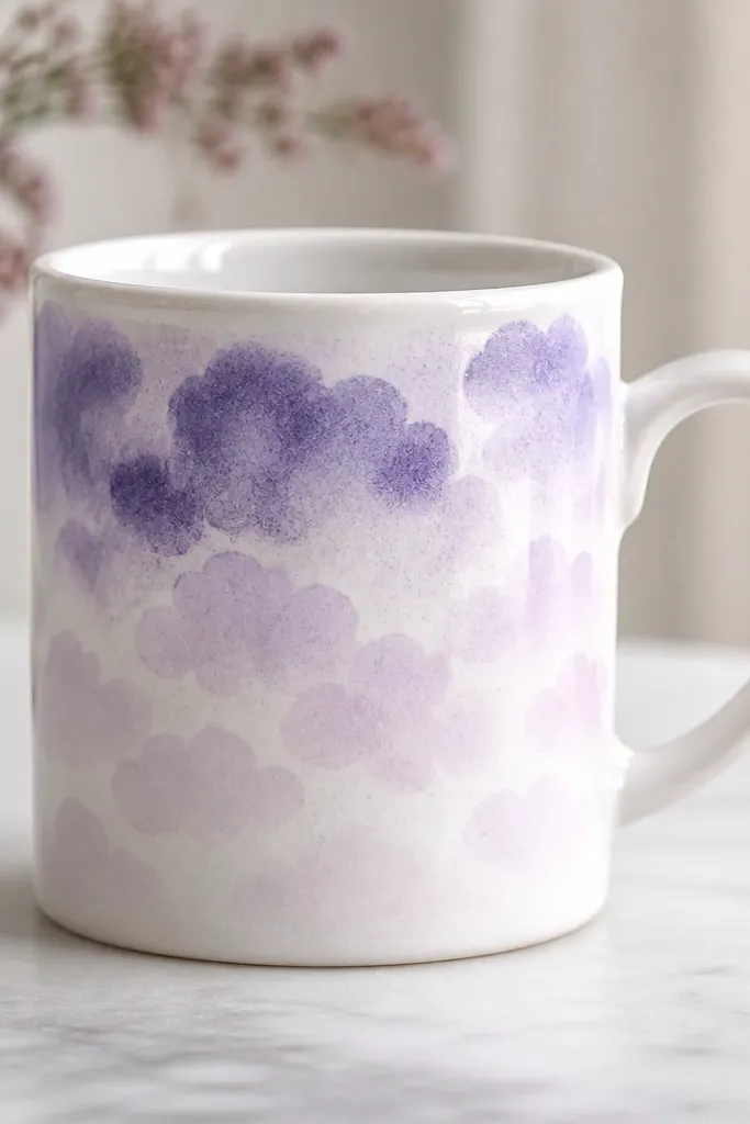
Sponge texture makes a mug look airy, like watercolor clouds, without needing smooth gradients by brush. The fade from darker to lighter keeps it from looking like a flat sticker. Lavender plus a touch of white paint looks calm and works for everyday mugs. The cloud shapes also hide minor brush marks.
Dilute lavender paint slightly with ceramic paint medium or the brand's recommended thinner so it dabs instead of smears. Tape a soft boundary near the bottom if you want a fade line. Dab with a makeup sponge in irregular circles, then go over lightly with a second sponge loaded with pale lilac for the lower fade. Let it dry between layers so the texture stays crisp.
Pro tipUse a separate sponge for the darkest shade so you don't muddy the fade.
AvoidAvoid soaking the sponge; wet paint can seep under tape and create hard edges.
8. Coffee beans border and tiny "steam" lines
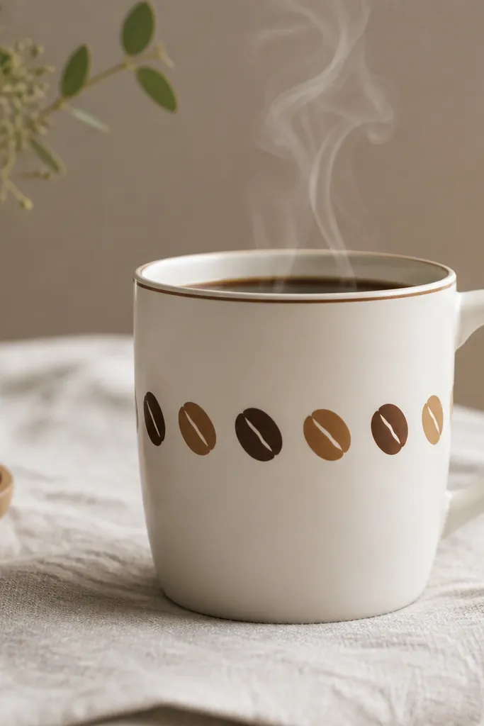
This design looks handmade because it has small repeated details. The bean border frames the mug and pulls the eye toward the center. Steam lines add motion without needing a full cup illustration. I use three brown tones so the beans look dimensional instead of flat.
Draw a light pencil line around the mug where the border sits. Paint bean shapes as curved ovals with a lighter center stripe. Alternate dark brown and medium brown beans, then add tiny steam lines above the middle - 5 to 7 short curved strokes in a light cream. Keep the steam lines thin so they don't overpower the beans.
Pro tipUse a reference photo and copy one bean shape; repetition looks professional.
AvoidSkip thick outlines around each bean; it makes the border look like a decal.
9. Marble effect swirl with white + gray veining
Marble paint looks complex, but you can fake it with layered swirls. The trick is thin veining and a few darker pockets, not full coverage. Gray and white reads sophisticated on a plain mug. It also hides small uneven brush strokes because marble is all about variation.
Base coat the mug with a light-to-medium gray. While it's slightly tacky, paint thin white streaks with a liner brush, then add a few darker gray streaks that follow the white. Use a dry brush to soften some edges so the swirls blend naturally. Build in 2-3 passes so it doesn't turn into a solid blob.
Pro tipKeep your veining hair-thin; even slightly thick lines ruin the marble illusion.
AvoidDon't overmix colors on the mug surface; marble needs contrast, not one muddy gray.
10. Rainbow arc with hand-painted brush texture
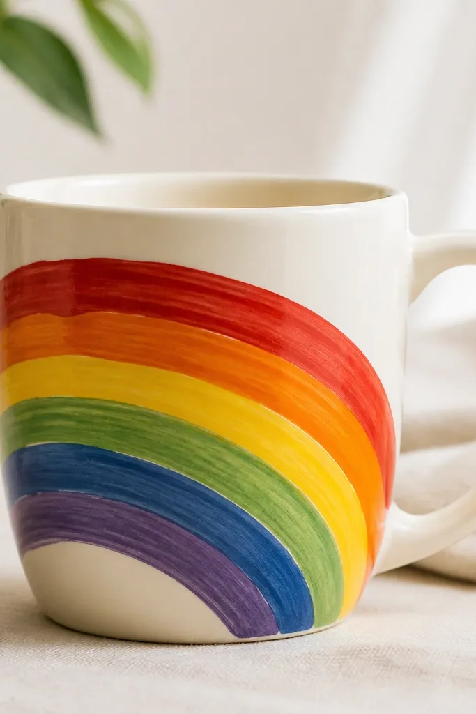
This is the "fun but still pretty" mug painting idea. Brush texture shows up beautifully on ceramic because it catches light differently than smooth fills. Keeping arcs thick and evenly spaced makes the rainbow look bold. I like this design because it's forgiving: small variations in arc thickness add charm.
Mask a curved arc guide by wrapping tape in a gentle curve around the mug front. Paint bands from red down to violet, letting each band dry 5-10 minutes before the next to avoid bleeding. Use a medium flat brush for the bands so you get broad strokes. Add a small white highlight curve on the top edge of each band with a fine brush.
Pro tipUse a reference rainbow photo and keep the violet band slightly shorter so it doesn't feel cramped.
AvoidAvoid thin, watery paint; it looks patchy and uneven on ceramic.
11. Gold leaf style dots with metallic accents
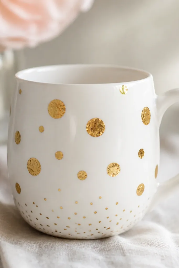
Metallic accents look expensive because the paint reflects light. Random dot sizes create a leaf-like effect without needing actual gold leaf. I keep the design minimal so the gold doesn't feel busy. A few off-center specks near the bottom make it look intentional instead of "painted everywhere."
Paint a clean white base first if your mug isn't already bright. Dab metallic gold paint using a small stipple brush or the tip of a sponge. Vary dot sizes by changing how long you press and how much paint is on the brush. Add 10-15 tiny specks around the bottom third, then stop. Let it cure fully before washing.
Pro tipTest metallic paint on paper because some lines dry darker than they look wet.
AvoidDon't flood metallic paint in one spot; it forms a raised blob that looks clumpy.
12. Tiny face mug with simple blush cheeks

Minimal faces are easy to place and hard to mess up when you use a symmetrical layout. The blush gives warmth and makes the mug feel friendly. I use a small liner brush for the features so the lines stay crisp. This design also works well if you're doing matching mugs for a group - every face is quick.
Sketch a light face outline with pencil, then mark eye positions with two tiny dots. Paint eyes in dark brown or black, then paint a smile curve. For blush, use a makeup sponge with diluted pink paint and tap lightly on each cheek. Add a tiny highlight dot on the smile side if you want extra cute.
Pro tipKeep cheeks higher than you think; it makes the face look more "smiling" than "round."
AvoidAvoid large blush circles; big patches make it look like a kid's sticker.
13. Tile-inspired front panel with hand-drawn edges
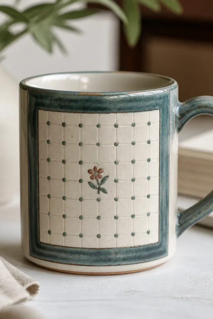
A tile panel makes the mug look like it has architecture. The teal border frames everything and keeps the design from spreading over the whole mug. Off-white squares with dots add rhythm and make it feel like patterned ceramic. A tiny flower breaks the repetition so it looks handmade, not like a printer sheet.
Use painter's tape to block out a rectangular panel centered on the mug front, leaving about 1/2 inch of space around it. Paint the border teal and fill squares inside with off-white. Add teal dots in each corner area of the squares, then paint a tiny 5-petal flower in the center square. Remove tape while paint is slightly tacky for clean edges.
Pro tipLightly score the tape edges with a fingernail so paint doesn't seep under.
AvoidSkip tiny over-detailing in the flower; two layers of petals are enough.
14. Galaxy mug with stars and a crescent planet
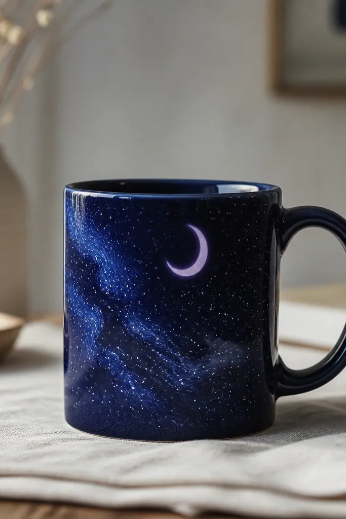
Galaxy designs look incredible because the background is dramatic and hides brush streaks. Stars are forgiving - you don't need perfect spacing, you need varied sizes. The crescent planet gives direction and keeps it from looking like a random speckle. I like navy plus lavender because it reads as "space" without turning into a rainbow mess.
Base coat the mug front with navy paint. While it's still slightly tacky, sprinkle or splatter tiny white dots using a toothbrush loaded with paint - practice on paper first. Add a lavender crescent by masking a curved shape with tape or freehanding with a steady hand. Blend faint swirls with a sponge using diluted light blue.
Pro tipSeal the galaxy with a final clear coat meant for painted ceramics so stars don't scratch off.
AvoidAvoid over-splattering; too many stars make the mug look dirty instead of magical.
15. Cozy plaid mug with layered tape grid
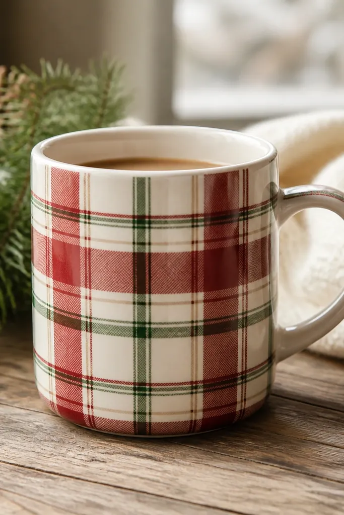
Plaid looks hard, but tape makes it controlled. Layering the grid gives you that cozy woven feel without needing to freehand straight lines. I use muted colors so it looks like a flannel shirt, not a holiday craft. The hand-painted texture shows where the brush hits, which keeps it from looking like printed vinyl.
Wrap painter's tape around the mug to mark horizontal lines, then add vertical strips to form a grid. Paint the first color (cream) lightly as the base between tape. Let it dry, remove some tape, then add the red and green lines with a small flat brush. Keep line widths consistent - about 1/8 inch for thin plaid.
Pro tipPaint with a light hand and let the brush glide; thick paint makes plaid lines look raised.
AvoidDon't remove tape if the paint is fully cured; you'll pull edges and create jagged lines.