1. Two-Color Band Stripe with Tiny Dot Accent
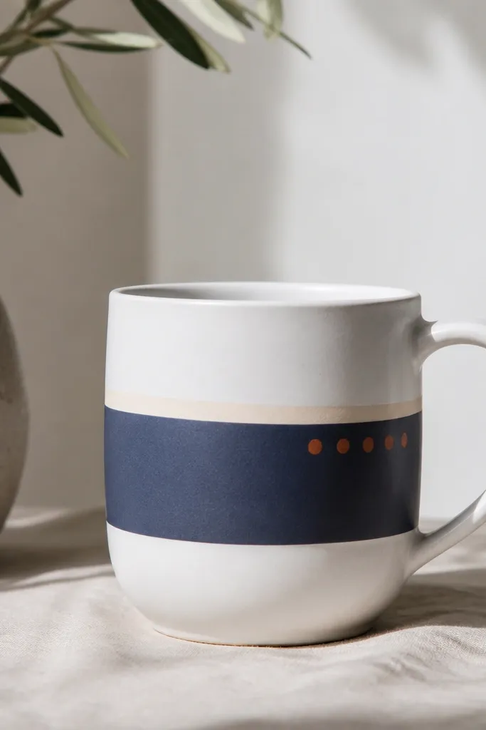
This design works because it uses one strong graphic element - the band - plus a small dot cluster that gives movement without clutter. Navy reads modern and calm, while terracotta warms the whole mug. The off-white stripe creates a layered look that feels intentional instead of flat.
Measure a ring around the mug at about 2 cm above the base. Tape the top edge first, paint the band, let it set 10 minutes, then remove tape. Add the dots last with a paint marker so they look perfectly round.
Pro tipPractice the dot spacing on paper first so the cluster looks even from across the room.
AvoidDon't freehand the band - wobbly edges make the whole mug look like a craft project.
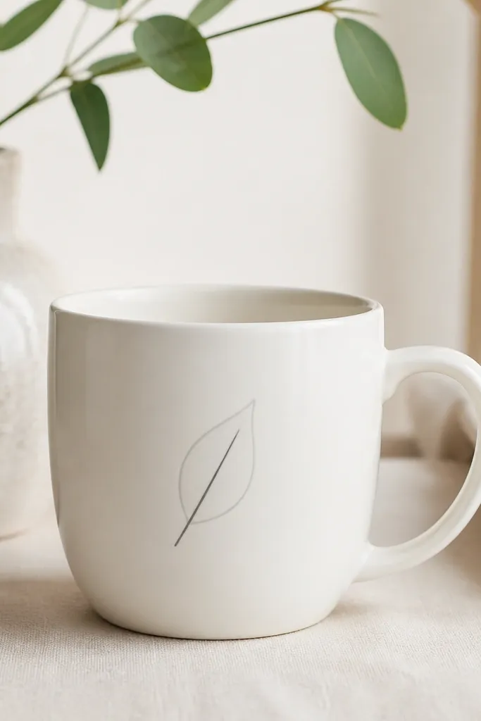
2. Minimalist Terrarium Silhouette (One-Line Plant)

A one-line terrarium silhouette looks modern because it's graphic and leaves lots of white space. Black ink gives structure, and the single pale green dot adds a soft focal point. No shading means you don't have to blend on a curved surface.
Use a 0.3mm paint marker for the linework. Draw the terrarium outline as an oval with a flat base, then add 3 leaf strokes inside. Keep the whole drawing about the width of your palm so it doesn't wrap weirdly around the handle.
Pro tipLightly sketch in pencil first, then trace in marker so your line stays clean even if your hand shakes.
AvoidAvoid thick marker blobs - they swallow the minimalist look.
3. Clean Calendar Grid with One Highlight Date
The grid reads modern because it's structured, like stationery. Keeping most squares light gray makes the one highlighted date feel deliberate. It's also easy to customize for birthdays, anniversaries, or a graduation year.
Tape a rectangle where the grid will go, about 4 cm wide by 3.5 cm tall. Use a ruler to mark 4 by 4 squares, then paint each square light gray. Outline one square in charcoal and write a single digit or two-digit number.
Pro tipUse a tiny stencil for the numbers if your handwriting isn't consistent.
AvoidDon't make the grid too big - tiny grids look sharp, oversized grids look busy.
4. Geometric Triangle Cluster on the Curve
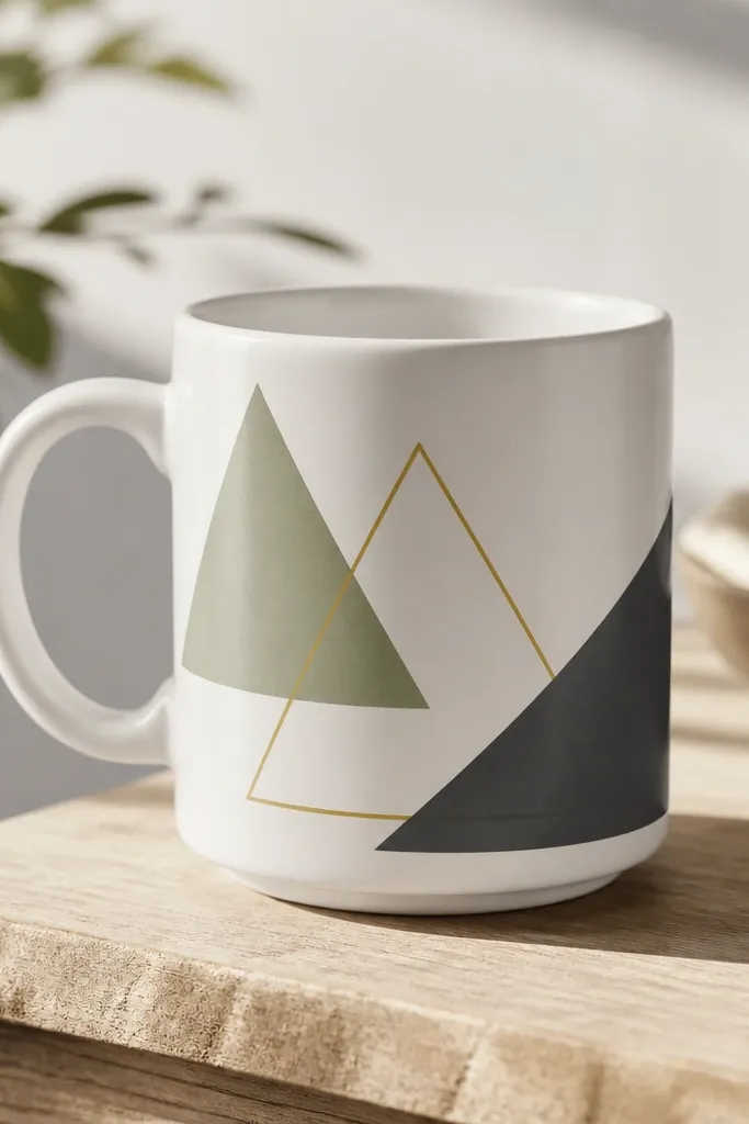
Triangles feel modern because they're sharp and graphic. This cluster works because the colors repeat the same "temperature" in small amounts - sage and mustard are warm/soft, charcoal adds contrast. The partial overlap gives depth without real shading.
Place three triangles so they share a common center point. Keep sage and mustard triangles filled, and use outlines for one to reduce visual weight. Paint in thin layers and let each triangle dry before adding overlaps.
Pro tipMark the triangle edges with painter's tape, then paint right up to the tape for crisp corners.
AvoidSkip hand-drawn triangles without guides - the edges usually end up uneven on the mug curve.
5. Swoosh Signature Line (Like a Modern Brand Mark)
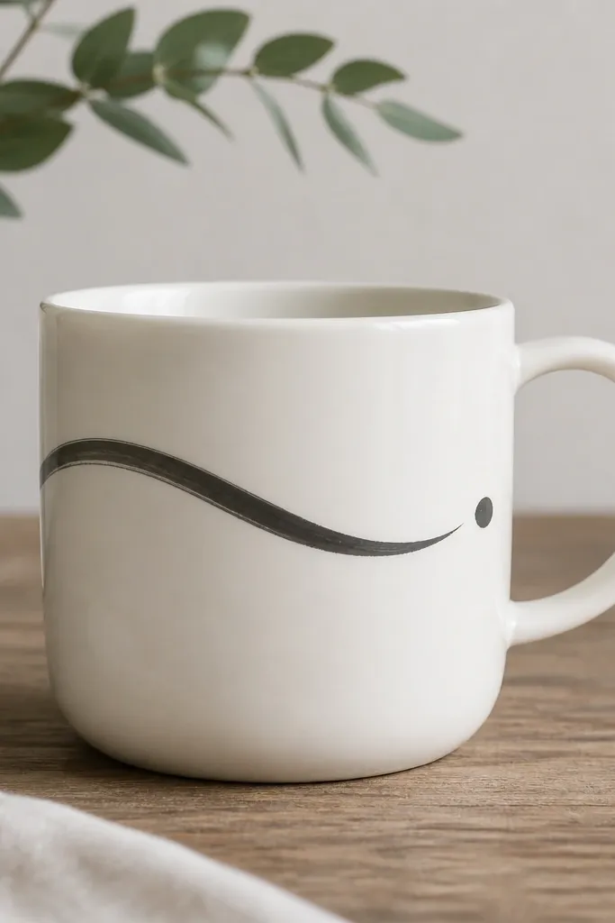
A single swoosh is minimalist because it's one continuous gesture. Charcoal keeps it classy and readable in photos, while the ending dot balances the composition. This style looks like a designer logo, especially when you keep it thin.
Use a fine liner brush or a brush pen. Start the swoosh on the left side of the mug, let it curve once, then taper off near the handle. Add the dot after the line dries 5-8 minutes.
Pro tipDo one dry run with the pen on a paper towel to get the speed right before touching the mug.
AvoidDon't repaint over the swoosh - it thickens and loses the clean brand-like look.
6. Monochrome Ombre Fade in a Narrow Window
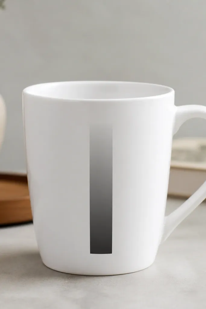
Ombre can look modern when it's contained. The narrow window keeps it from turning into a watercolor mess, and the hard edges make it feel like graphic design. Monochrome gray stays calm and works for almost any gift.
Tape two vertical lines 2 cm apart. Paint the bottom strip dark gray, then blend upward with a damp flat brush, keeping the tape edges clean. Remove tape only after the paint is no longer wet so edges don't smear.
Pro tipBlend in short passes - one swipe per section - to avoid streaks.
AvoidAvoid wide ombre areas - they look messy on mugs and show brush marks.
7. Minimal Mountain Peaks with One Sun Dot
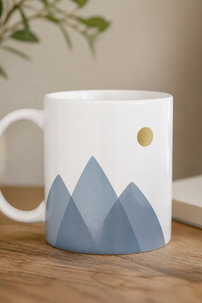
Mountain peaks are a classic minimalist motif, but the trick is keeping them geometric and unshaded. Slate blue gives a crisp outdoors feel, and the single mustard sun dot adds warmth. This combo looks great for housewarming gifts.
Sketch three peaks with a straight edge so the slopes hit clean angles. Paint the peaks in slate blue using a flat small brush. Add the sun as a solid dot, about the size of a pencil eraser, in the upper corner of your design zone.
Pro tipKeep the peak heights different by 1 cm so the silhouette looks layered.
AvoidDon't add snow caps or extra lines - it turns into a landscape painting fast.
8. Tiny Chevron Row with One Bold Stripe
Chevron rows look modern when they're small and evenly spaced. The light gray chevrons give texture without loud color, and the bold charcoal stripe adds a strong focal line. It also photographs well because the pattern stays within one plane.
Use painter's tape to mark the chevron row width, then draw a center guideline. Paint tiny V shapes using a stencil or a ruler to keep angles consistent. After the chevrons dry, paint one thick stripe straight through the middle.
Pro tipUse a toothpick to place each chevron point if your brush tip keeps wandering.
AvoidSkip uneven chevron spacing - it's the fastest way to make it look homemade in a bad way.
9. Abstract Wave Lines in Off-Black
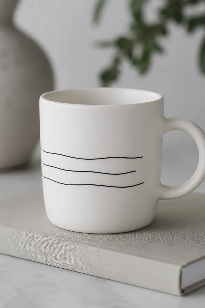
Wave lines feel modern when they're thin and repetitive, like a design pattern. Off-black is softer than pure black, so it doesn't look harsh. Three lines are enough to suggest motion without crowding the handle area.
Draw the waves with a ruler-guided pencil line first. Paint each wave with a 0.3mm marker or liner brush, keeping line thickness consistent. Space lines about 6-8 mm apart so they don't blur together.
Pro tipLet each wave dry for 5 minutes before painting the next to prevent smudging.
AvoidDon't use thick paint - it will look like a sticker instead of a design.
10. Negative Space Circle Frame with One Corner Cut
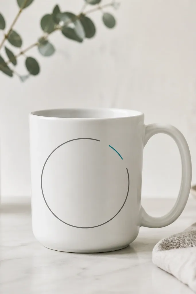
Negative space designs look clean because the unpainted mug becomes part of the art. The missing corner makes it feel contemporary rather than "sticker art." A small teal mark in the gap keeps the piece from feeling too monochrome.
Trace a circle lightly in pencil using a small plate or cup as a guide. Mask the gap area with tape before painting the circle frame. Paint the frame in light gray, then add a short teal line where the gap is.
Pro tipUse tape to create the exact missing section instead of trying to stop the brush mid-stroke.
AvoidAvoid shaky circle lines - use a template or you'll get wobble.
11. Micro Lettering Band with Monogram Only
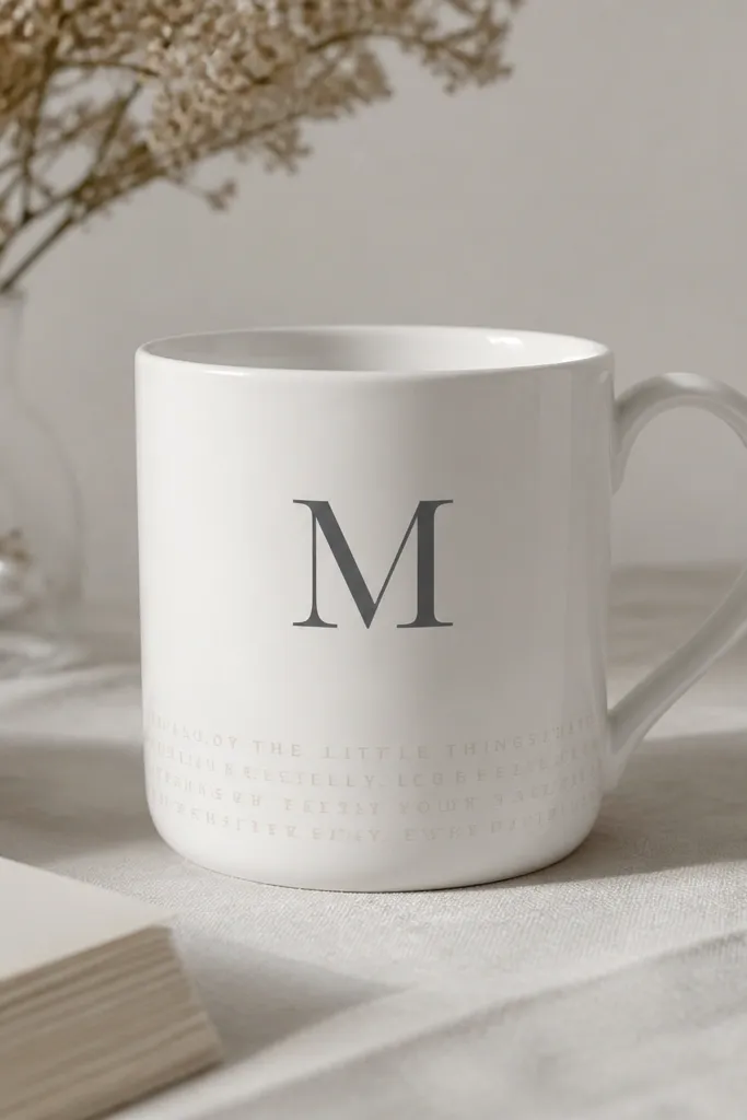
Micro lettering looks minimalist when it's restrained and mostly decorative. The monogram is the functional element, while the tiny letters add a background texture without turning into a full quote. This is great for weddings and new apartments.
Paint the monogram first in charcoal - keep it about 5 cm tall. For the micro band, use a stencil for one or two tiny lines of text, or write a short word spaced closely. Seal after curing so the tiny letters don't rub off.
Pro tipWrite the monogram with a ruler guide so the strokes stay straight.
AvoidDon't add long phrases - they look cramped and peel faster at the edges.
12. Color-Blocked Handle Side Panel
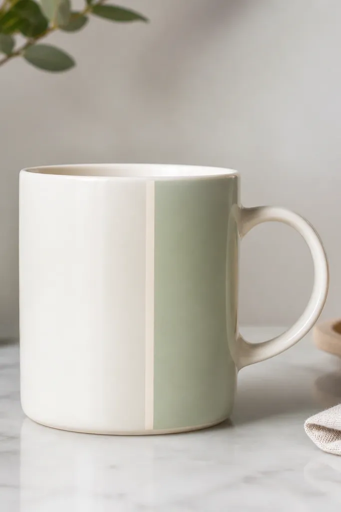
Color-blocking feels modern because it treats the mug like a design object. Painting only the handle-side panel keeps the composition clean and avoids covering the whole surface. The thin off-white stripe adds a tailored look.
Use a strip of tape along the handle curve and another strip 2.5-3 cm away. Paint the panel pale sage, then remove tape and add the off-white stripe with a smaller brush. Keep the panel height about 9-10 cm.
Pro tipPress tape down firmly with a plastic card so paint doesn't seep under.
AvoidAvoid messy tape edges - they turn crisp color blocks into smeared blobs.
13. Single-Line Leaf Vein Accent
This looks modern because it's more symbol than illustration. The leaf outline gives a botanical hint, and the one vein line adds structure. Using gray keeps it neutral for any recipient.
Draw a leaf outline about 4 cm long near the upper left of your design zone. Paint the outline in light gray, then trace the vein in darker gray. Add no other shading so the linework stays crisp.
Pro tipUse a stencil leaf if your leaf drawings always look lopsided.
AvoidSkip multiple veins - it stops being minimalist fast.
14. Minimal Sunburst Rays in One Small Corner
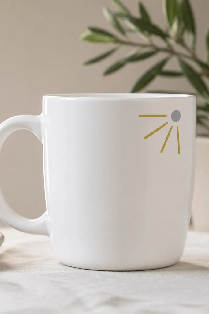
Sunbursts can look cartoony, but a tiny corner version feels graphic and grown-up. Six rays are enough to read as a sun without the "child craft" vibe. The gray center circle grounds it.
Place the sunburst near the top right in your ring zone, about 3 cm wide. Paint the rays in muted mustard using a fine brush or marker. Add the gray circle with a dot marker or the tip of a brush.
Pro tipCount rays before you paint so you don't end up with uneven spacing.
AvoidAvoid too many rays - more than 10 starts to look noisy.
15. Thin Frame Border with One Break for the Handle
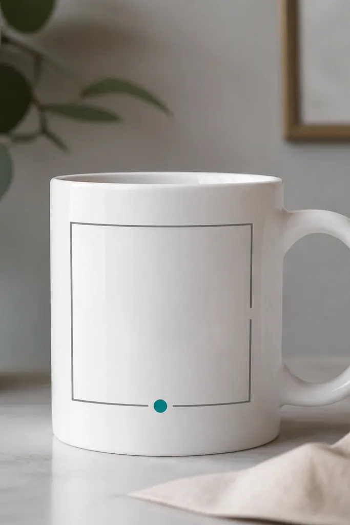
Framing makes a mug look like a designed product label. The break near the handle keeps it from wrapping into awkward angles, and the teal dot adds a single accent color. It feels modern because the lines stay thin and evenly spaced.
Mark a rectangle with tape: top and bottom edges about 6 cm apart, width about 8 cm. Leave a 1 cm gap on the handle side by not placing tape there. Paint the frame in light gray, then add the teal dot in the bottom center.
Pro tipUse a ruler for the tape placement, not your eye - it matters at this scale.
AvoidDon't paint a thick border - it looks like a cheap craft sticker.
16. Monochrome Circles Ladder (Three Steps)
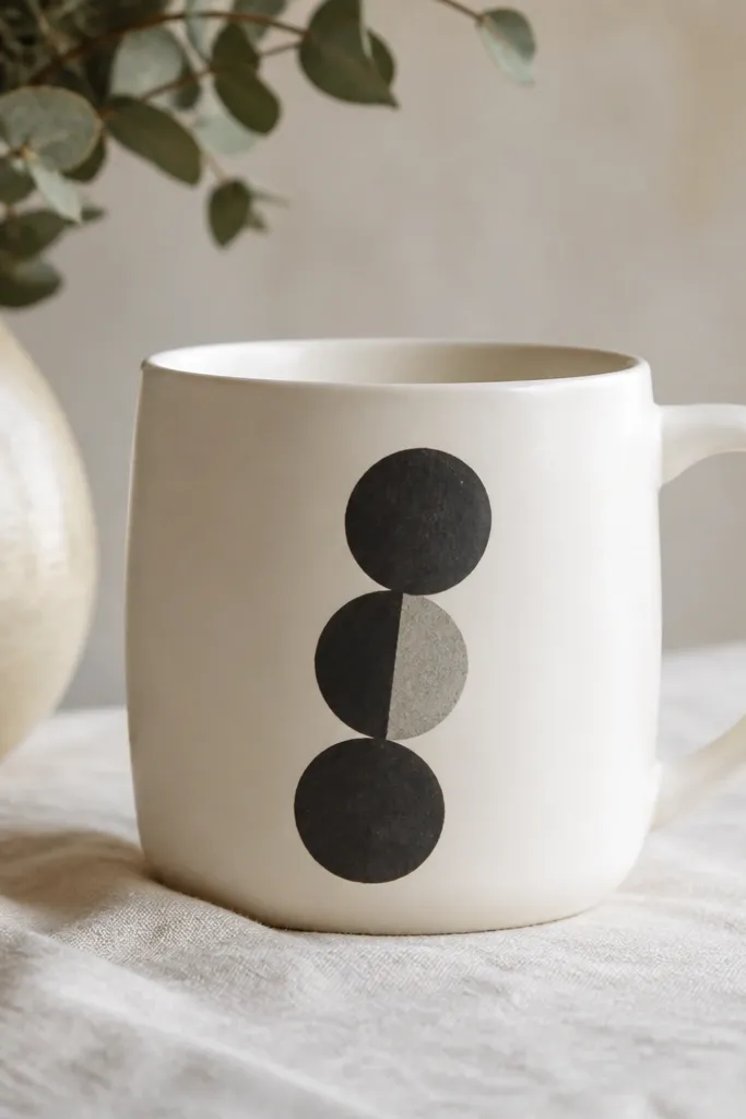
Circle ladders look modern because they're rhythmic and graphic. Using only charcoal and gray keeps it calm. The half-shaded circle adds just enough depth to feel intentional.
Draw three circles with a compass or a set of bottle caps so sizes are consistent. Place them so their centers shift slightly to the right each step. Shade only half of the top circle with a lighter gray wash for the depth effect.
Pro tipUse painter's tape to mask half a circle so the half-shade edge stays sharp.
AvoidAvoid random circle sizes - consistency is the whole minimalist trick.
17. Abstract Splash Dot Cluster with Clear Negative Space
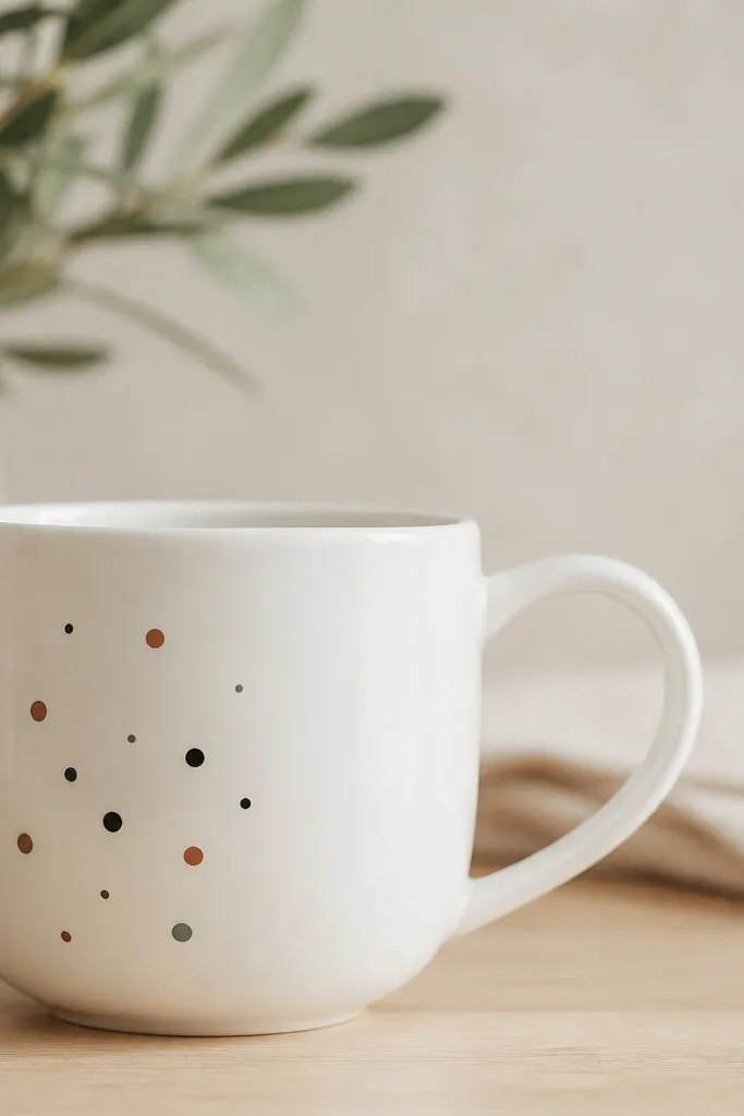
Dot clusters feel artsy without looking messy when you keep them contained and use negative space. The three dot sizes create texture, and the color trio keeps it modern. The blank area makes the dots look like a design element, not accidental splatter.
Dip the tip of a small round brush into paint, then tap off on scrap paper to control dot size. Place the cluster so it sits away from the handle by at least 2 cm. Use sage and terracotta sparingly - most dots should be black or off-black.
Pro tipIf your dots look too perfect, add one slightly off-center dot for a human touch.
AvoidDon't spray dots from far away - you get spatter that bleeds into the blank space.
18. Minimal Abstract Face Profile (Tiny and Clean)
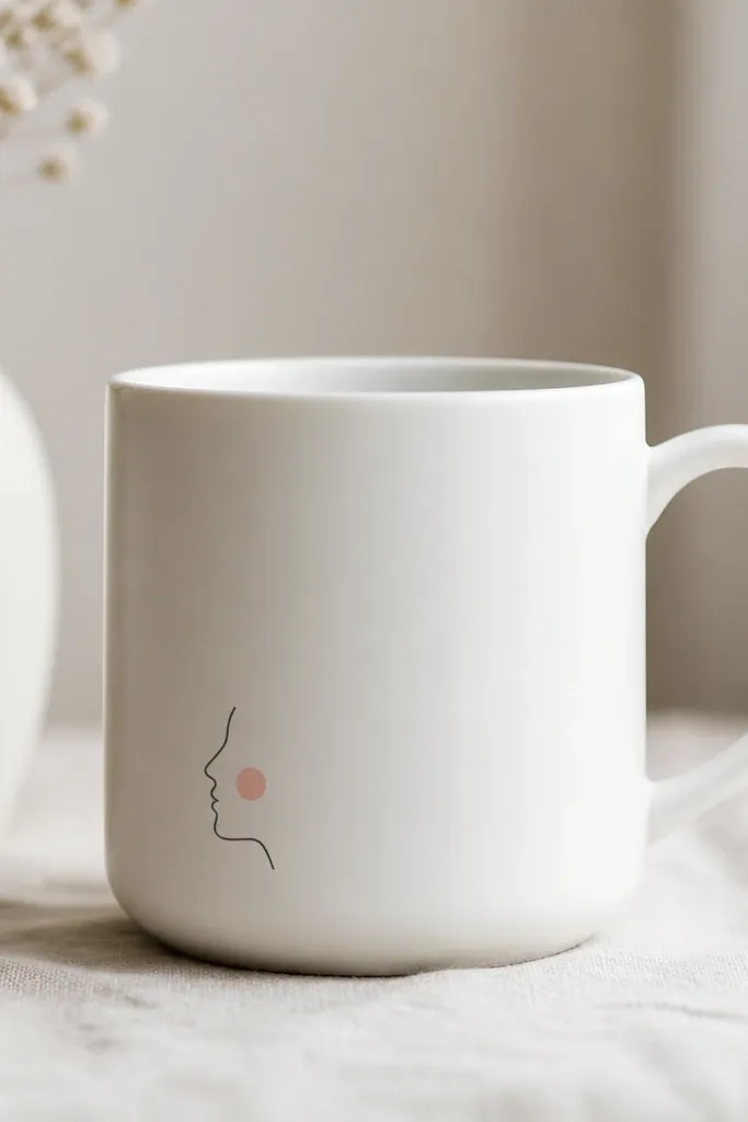
A tiny profile line reads modern when it's minimal and placed low. Off-black keeps it graphic, and one blush cheek dot adds warmth without turning into a cartoon. The small size makes it feel like a secret detail, not a full illustration.
Draw the profile with one continuous line: forehead, nose, lips, chin. Keep the face about 3.5-4 cm tall. Add one blush dot where the cheek would be, using a dot marker for even placement.
Pro tipUse a reference photo and draw slowly - the line is the whole point.
AvoidAvoid adding eyes and hair - that's where it stops being minimalist.
19. Two-Row "Checklist" Marks with One Tick
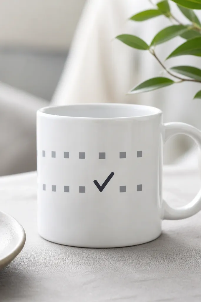
Checklist marks look modern because they're simple symbols. Two rows keep it balanced, and the single bold tick becomes the focal point. It's also a great gift idea for teachers, planners, or anyone who loves organization.
Tape a rectangle about 7 cm wide and 4 cm tall. Paint 8 small squares in light gray across two rows. Then paint one bold charcoal check mark over one square in the center row.
Pro tipUse a stencil check mark if your checks always come out lopsided.
AvoidDon't add multiple ticks - it turns into a pattern instead of a statement.
20. Slim Wave Border Around the Bottom Rim
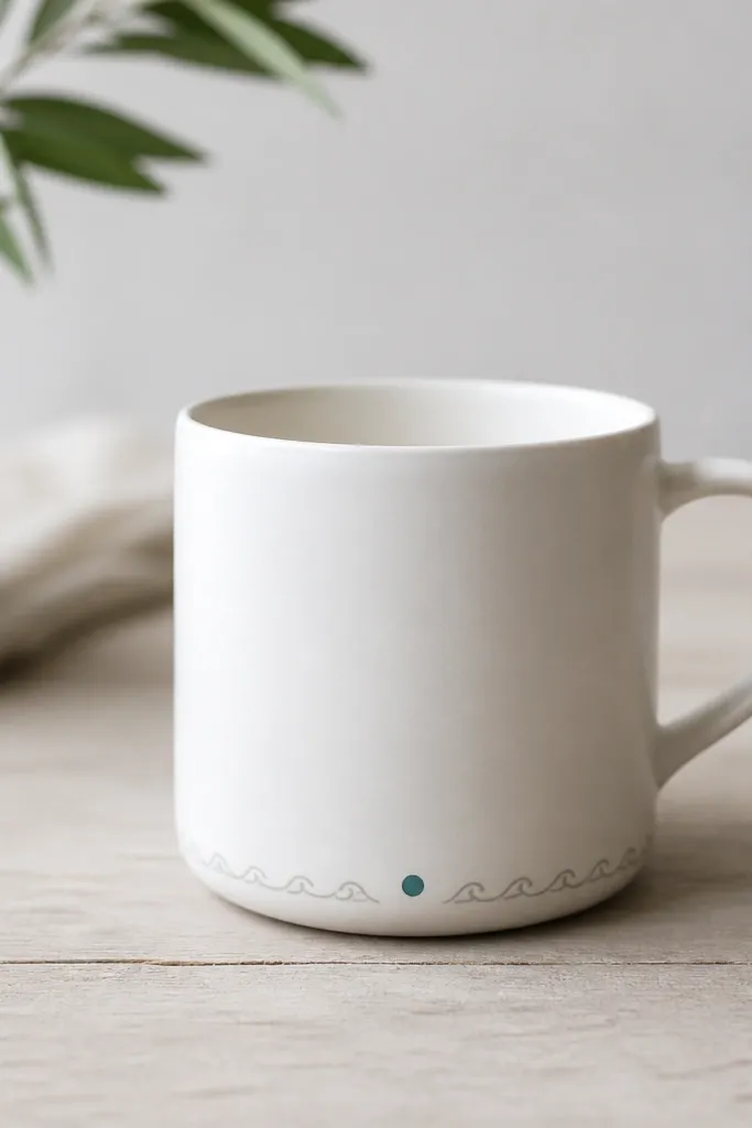
A bottom rim border feels modern because it frames the mug without taking over the front. Repeating small waves create a soft texture, and the teal dot gives a precise accent. It looks especially good on mugs with a simple handle shape.
Tape a strip around the mug at about 1 cm above the base, using a flexible tape strip so it follows the curve. Paint repeating waves across the tape line with a small liner brush. Remove tape after 10-15 minutes and add the teal dot at the front center.
Pro tipDo one full test wave on scrap to match your wave height before you start.
AvoidAvoid thick wave lines - they look like kid art once they dry.
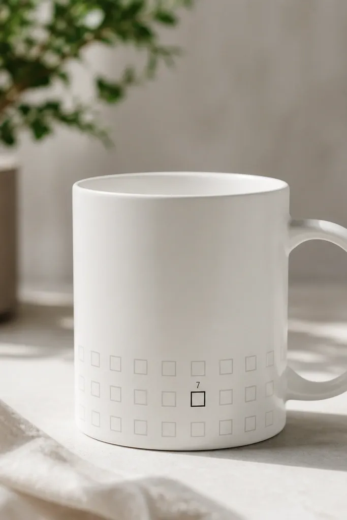
21. Vertical Bar Chart with One Tall Bar

Bar charts look clean and modern because they're structured and measurable. The one tall bar creates a clear focal point, and the tiny plus sign adds a feeling of growth or celebration. Keep it monochrome for the minimalist finish.
Tape a rectangle about 6 cm wide and 8 cm tall. Paint three short bars in light gray and one tall bar in charcoal. Add a tiny plus sign above the tall bar using a paint marker.
Pro tipMake all bar widths equal by marking them with a ruler before painting.
AvoidDon't crowd the chart - leave white space around it so it reads as design, not data.
22. Minimal "Cut Paper" Shape Layers
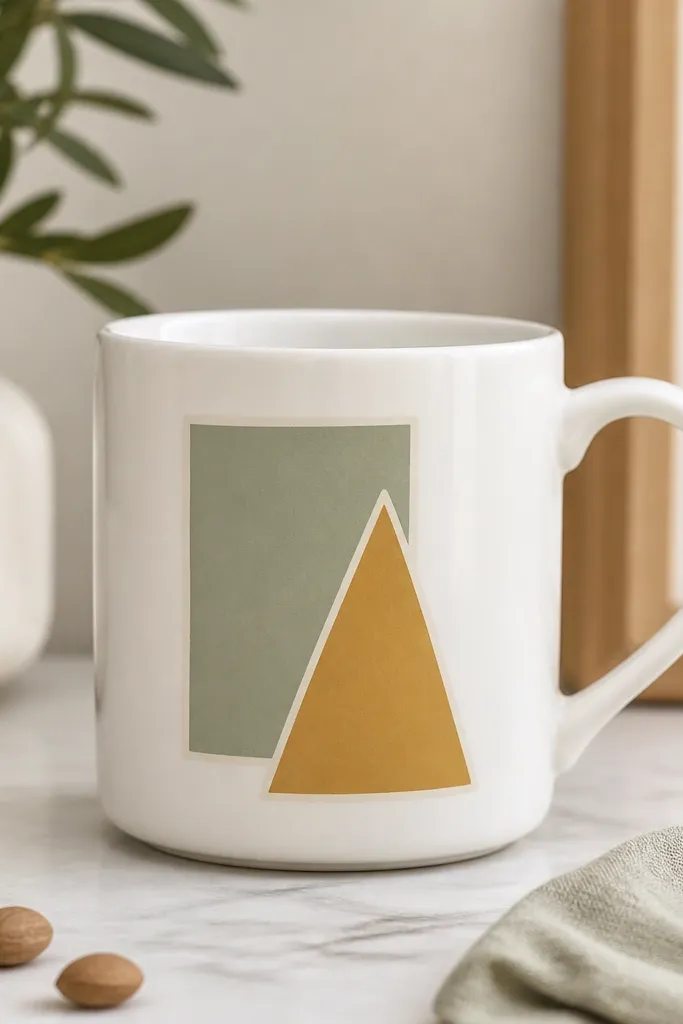
Painted cut-paper shapes look modern because they mimic graphic design layers. Flat fills keep it crisp, and thin borders make the layers separate cleanly. The muted sage and mustard combo looks warm without being loud.
Paint the back shape first (sage rectangle), then let it dry. Add a thin off-white border around it using a fine liner brush, then paint the top shape (mustard triangle) and border. Keep borders 1-2 mm wide so they look like design strokes.
Pro tipUse a scrap of cardstock as a straightedge for the triangle edges.
AvoidAvoid mixing too many colors - three layers max keeps it minimalist.
23. Monogram + Tiny Coordinates Style Dots
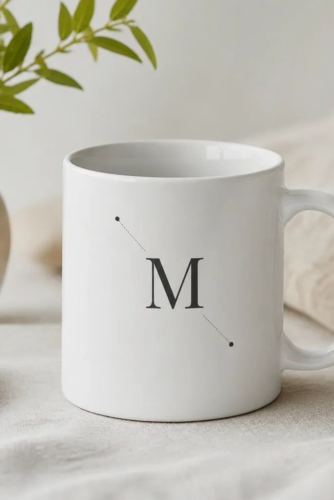
This style looks modern because it combines a clear identity element (monogram) with a technical detail (coordinate dots). The dot endpoints make the design feel precise rather than decorative. It's a great gift for couples or people who like maps and stationery.
Paint the monogram in charcoal about 5 cm tall. Then add two dotted lines: one horizontal line with three dots, and one short diagonal line with two dots. Place the dotted lines to the left and bottom of the monogram so it frames it.
Pro tipUse a dotting tool or marker for the endpoints so they're perfectly round.
AvoidDon't draw coordinate lines solid - solid lines look heavier and less minimalist.