1. Gold Line Crest with Navy Block Background
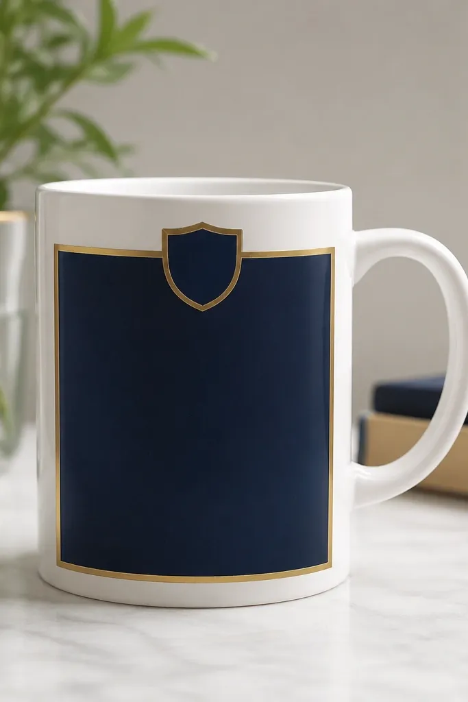
This one looks luxe because it's basically graphic design: one solid color field plus crisp metallic lines. The navy reads rich, and the gold outline makes the crest feel like it belongs on a luxury stationery set. Keep the crest small - about the width of a thumb - so it doesn't look childish. Add a tiny gold dot "crown" at the top to catch light when the mug moves.
Mask the navy area with painter's tape so the edges stay sharp. Paint two thin coats of navy ceramic paint, letting each coat dry. After the navy dries, use a fine detail brush to outline the crest and border in metallic gold. Bake per your ceramic paint instructions, then apply a clear oven-safe top coat if your paint system recommends it.
Pro tipTrace the crest lightly in pencil first - kids paint faster when they're following lines already placed.
AvoidDon't flood the gold paint; thick metallic lines look blobby and cheap after baking.
2. Icy Silver Snowflake Fade

A fade makes the mug feel like it has depth, not just flat decoration. Silver snowflakes add a winter-luxe finish without needing glitter. The trick is placing snowflakes unevenly - one big, a few small - so it looks intentional. Keep the fade smooth by blending with a damp sponge rather than brushing back and forth.
Paint a light blue base first. For the fade, sponge a slightly darker blue from the bottom up in gentle taps until you get a smooth transition. Use a snowflake stencil and silver ceramic paint for the design. Once dry, bake and add a clear coat to protect the painted texture.
Pro tipUse a makeup sponge for the gradient - it creates a softer blend than a brush.
AvoidDon't use chunky glitter paint here; it catches on fingers and can feel rough after baking.
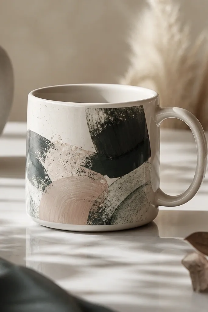
3. Emerald Marble with White Veins
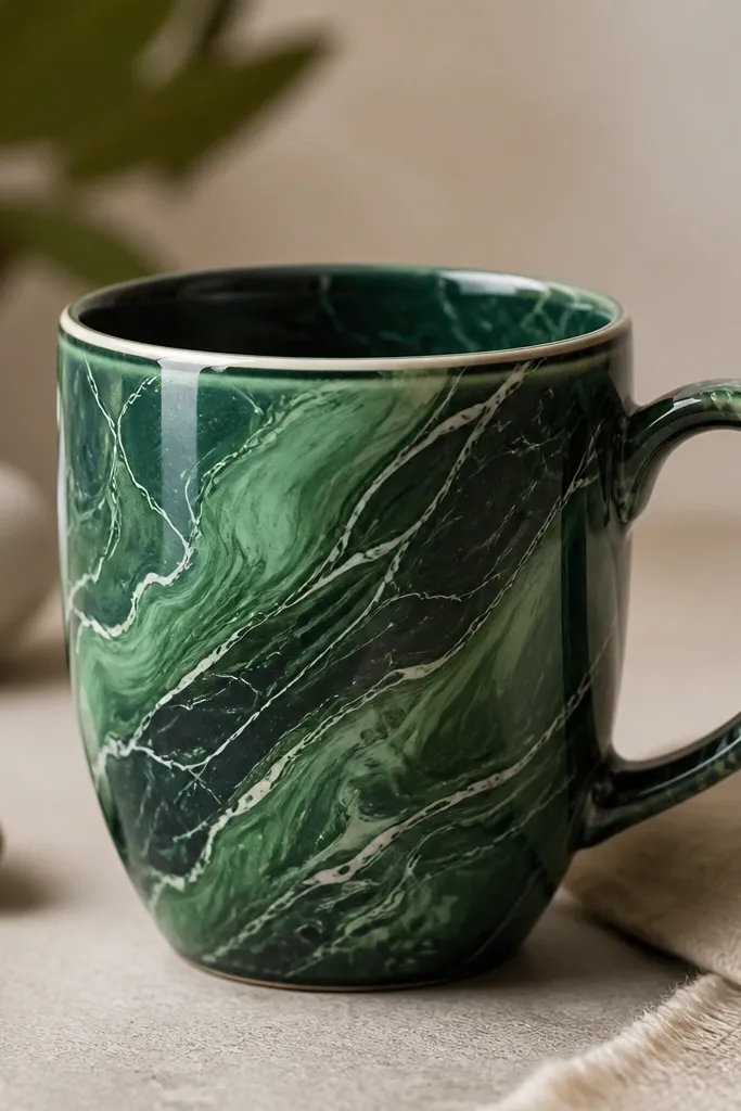
Marble looks expensive because it's complex, but you're controlling it with a few colors and a technique. Emerald over forest gives a rich, high-end depth. White veins make it readable from across the room. This design also hides small brush mistakes because the pattern is naturally irregular.
Drop small dots of emerald and forest green ceramic paint onto a palette. Add a few drops of white and swirl gently with a toothpick. Press the toothpick-swirled paint onto the mug using a sponge, then drag a few white veins across with a fine liner brush. Build in thin layers so the veins don't smear after baking.
Pro tipPractice on paper first - marble looks best when you keep the veins thin and spaced.
AvoidDon't overwork the marbling with repeated strokes; it turns muddy after baking.
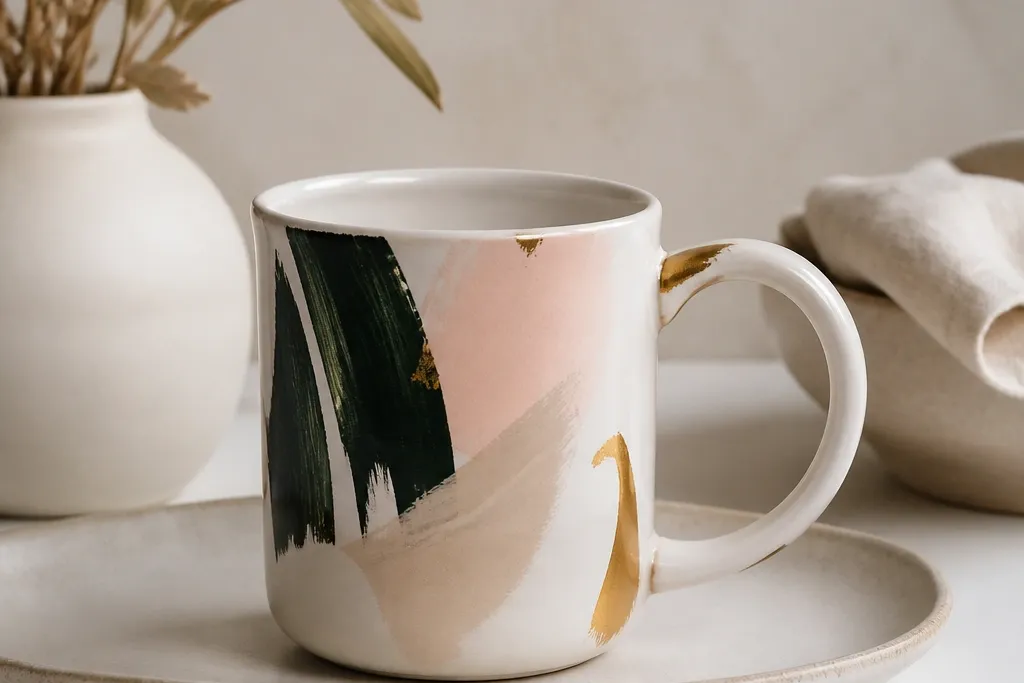
4. Rose Quartz Blush Blocks
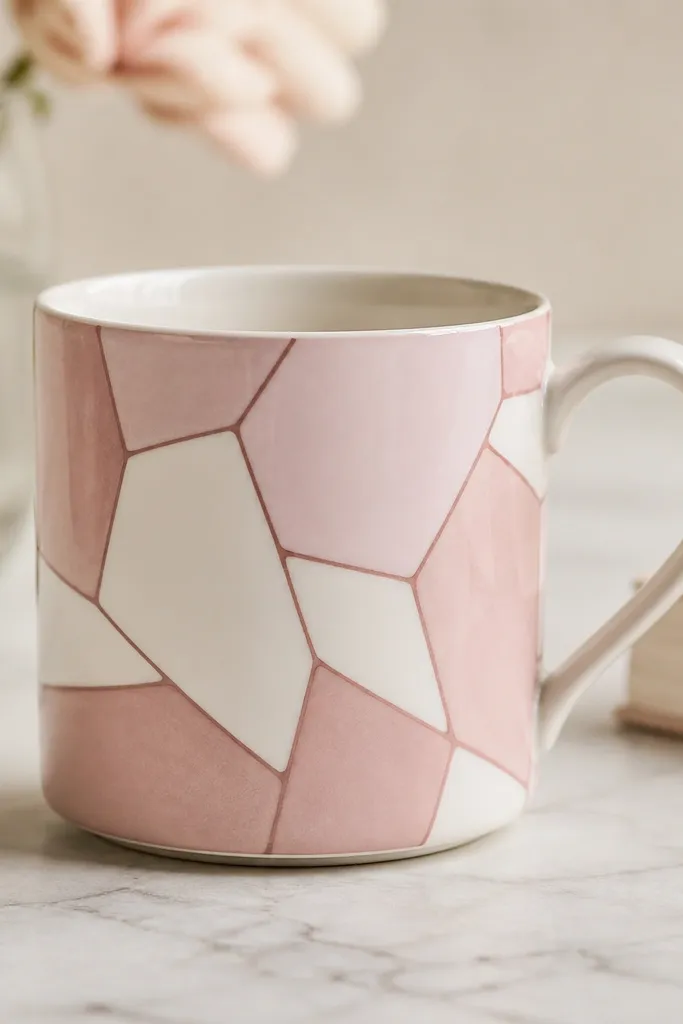
This is luxe because it looks like stone - soft blush tones with defined lines. The contrast between pale rose and deeper rose outlines gives that "high-end countertop" feel. Kids can paint the shapes confidently because the broken-glass layout forgives uneven edges. Keep the background mostly white so the design has breathing room.
Draw a loose grid in pencil, then break it into irregular shapes. Paint pale rose blocks first, leaving thin gaps. Use a darker rose liner paint to trace the gaps like grout. Bake, then seal with a clear top coat. If your paint system allows, add one tiny pearl highlight dot per block with a light pink metallic.
Pro tipUse a sponge for the fill, then a liner brush only for the outline.
AvoidDon't cover the whole mug; full coverage makes it look like kids art instead of stone.
5. Midnight Starry Sky with Tiny Constellations

A star field looks fancy because it's all about contrast and control. Dark navy makes white dots pop hard, and constellations add a personal, "designed" feel. The key is small dots - like salt grains - not big paint blobs. Leave some areas darker so the pattern breathes.
Paint the mug navy with two thin coats. For stars, use a toothbrush flick technique: load a brush with white ceramic paint, then flick over the mug. Use a toothpick or fine liner brush to connect a few dots into constellations. Bake and seal.
Pro tipDo stars in two passes: one for sparse dots, one for a denser cluster near the center.
AvoidDon't shake glitter in place of dots; it looks messy and feels gritty after washing.
6. Terracotta Sunset with Sunrise Band
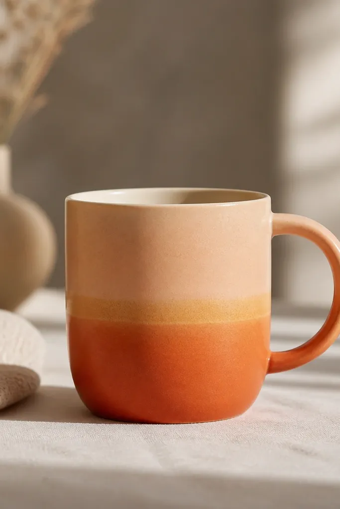
Sunsets read upscale when the colors fade smoothly and the highlight line is thin. Terracotta plus peach gives that warm, adult color palette kids can still enjoy. The gold band makes it look like a craft store "limited edition" mug. Keep the gold line straight and narrow - about 3-5 mm.
Paint the bottom band terracotta, then sponge peach upward, then blend to cream near the top. Let dry between steps. Add the gold band with tape to keep it straight. Bake and top coat.
Pro tipUse painter's tape for the gold band even if you think you can freehand it.
AvoidDon't add extra gold sparkles around the mug; one band is enough.
7. Monogram Frame in Black and Cream
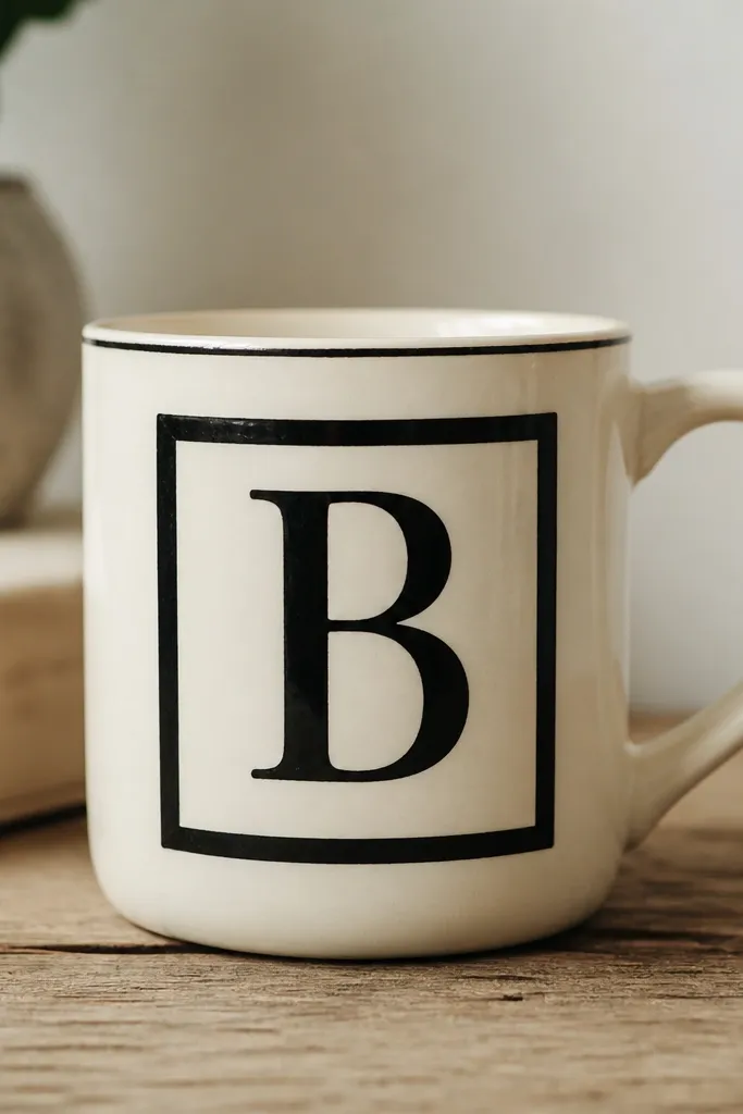
Monograms look luxe because they're clean and intentional. Black and cream is classic and reads "gift-ready" even when a kid paints it. The frame creates structure so the mug doesn't look random. A single letter is more grown-up than a whole name spread across the mug.
Tape a rectangle on the front for the frame, leaving a narrow border around it. Paint the frame black with two thin coats. Inside the frame, paint the letter with a stencil or traced pencil guide. Bake and seal with clear top coat.
Pro tipIf you're painting a letter, use a stencil printed large and cut out for a crisp edge.
AvoidDon't use gray for the letter; it looks washed out after baking.
8. Peach and Gold Confetti Dots
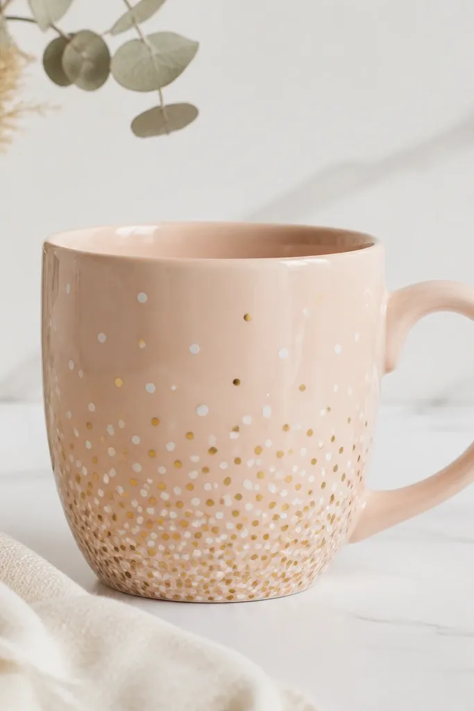
Confetti dots can look high-end when they're tiny and spaced like a pattern, not a pile. Peach is soft and warm, and gold gives the "ceramic dinnerware" vibe. The density gradient makes the design feel planned. This is one of the easiest luxe looks for kids because dots are forgiving.
Paint a pale peach base. For dots, use the end of a cotton swab or a dotting tool. Make two dot sizes: small white dots and slightly larger gold dots. Keep the dots mostly on the lower half so the mug doesn't look busy. Bake and seal.
Pro tipDip the tool lightly so you get a crisp dot edge - heavy paint smears in baking.
AvoidDon't use big glitter dots; they look chunky and can scratch skin.
9. Ocean Teal Waves with White Pinstripes
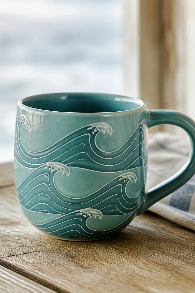
Waves look premium when the lines are consistent and the foam color is clean white. Teal plus darker teal gives depth without needing ten colors. White pinstripes make it look like a seaside brand mug. The pattern repeats, so kids feel like they're doing something "real" and not random coloring.
Paint the mug teal first. Draw wave lines with a pencil lightly, then paint darker teal wave bands. Use a fine liner brush to add white pinstripes along the crest of each wave. Bake and apply a clear top coat so the stripes don't dull.
Pro tipUse a ruler to keep wave height consistent across the mug.
AvoidDon't make the waves too thick; thick shapes flatten and look like blobs.
10. Botanical Line Leaves in Sage
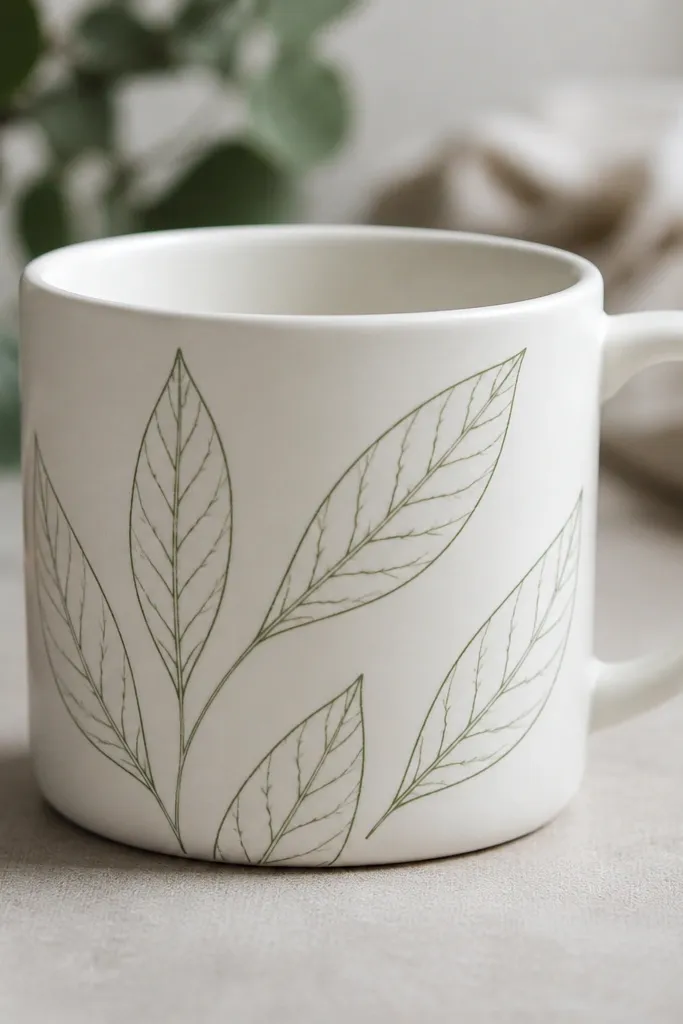
Line art reads luxe because it's light, not heavy. Sage is a calm, expensive-looking green when it's used sparingly. Thin leaves also hide shaky hands - kids can focus on one leaf at a time. The center vein and a few offshoot lines make the drawing feel detailed without crowding.
Use a pencil to sketch 5-7 leaves around the front, leaving empty space. Paint leaves with a fine liner brush in sage ceramic paint. Add a tiny dot or short stem line to connect leaves into a small cluster. Bake and seal.
Pro tipDo the outline first, then go back for the center vein - it keeps the lines cleaner.
AvoidDon't fill leaves solid; full fills look like kids coloring after baking.
11. Black Lacquer Look with Pearl Highlights

This is the "expensive coaster" look, but on a mug. Solid black makes everything feel intentional, and pearl highlights mimic light reflections. You're not painting a picture - you're painting the feel of lacquer. Use pearl white sparingly so it reads as highlight, not another color block.
Paint the entire front in black ceramic paint in two thin coats. Let it dry fully, then paint 3-5 curved highlight strokes using pearl white metallic. Keep strokes narrow and slightly angled. Bake and top coat with a clear glossy finish if your kit includes one.
Pro tipHold a paper towel next to the mug and wipe your brush lightly before painting highlights for thinner lines.
AvoidDon't add more colors to black; it turns into a Halloween mug fast.
12. Lavender Watercolor Wash with Dipped Edges
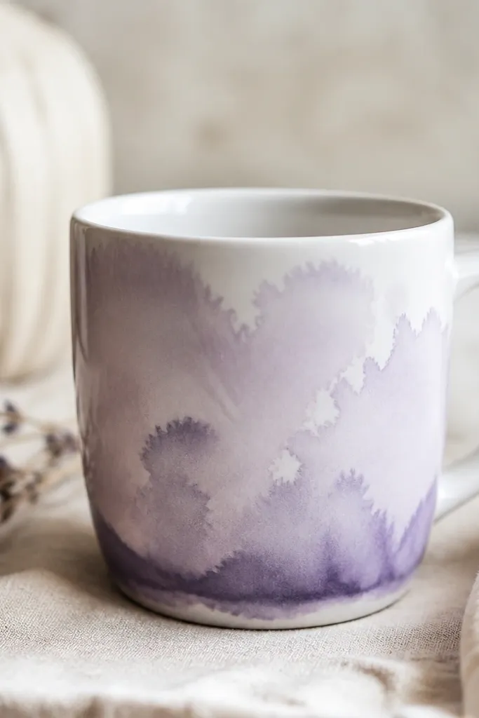
Watercolor style looks luxe because it's soft and airy. Lavender gives a grown-up feel without looking harsh. The dipped edge adds structure, so it doesn't look like a random splash. Kids can make the blooms with gentle dab motions, and it still looks intentional.
Mix lavender ceramic paint with a tiny amount of water per your paint label (or use a watercolor-style ceramic paint if provided). Paint a loose wash across the front with a flat brush. For the dipped edge, dab a darker lavender band at the bottom and lightly blend upward. Bake and seal lightly so the wash doesn't get cloudy.
Pro tipUse a damp brush, not wet paint straight from the bottle - that's how you avoid hard edges.
AvoidDon't over-blend; it turns gray and dull after baking.
13. Candy Stripe Teal and Cream with Gold End Caps
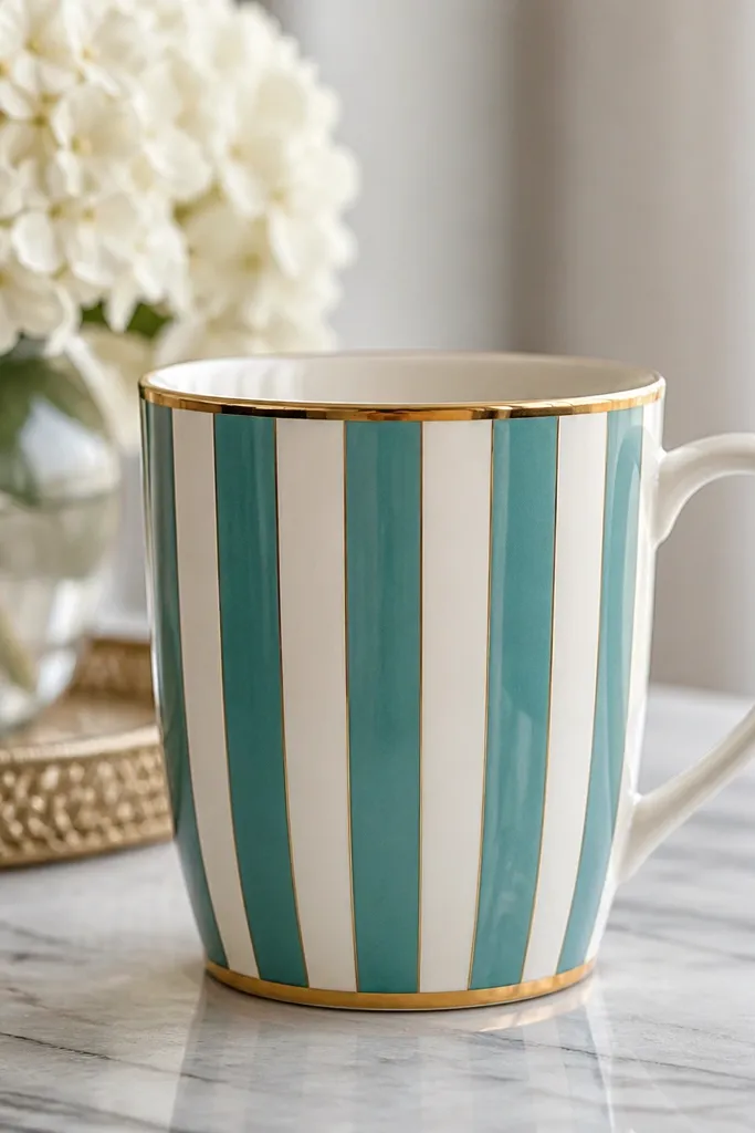
Vertical stripes feel high-end when they're even and the colors are limited. Teal and cream reads clean and modern, and gold end caps make the stripes look finished like a designer product. Keep stripe width consistent - that's where the luxe look lives. Kids can do it with tape guides.
Tape vertical lines on the mug to create stripe columns. Paint teal stripes, remove tape after paint is set but not fully dry, then fill cream areas if you need full coverage. Add thin gold lines near the rim and near the base. Bake and seal.
Pro tipRemove tape at a slight angle so edges stay crisp instead of tearing paint.
AvoidDon't freehand stripes - uneven widths are what make them look like craft paint.
14. Terracotta Tile Pattern with White Grout Lines
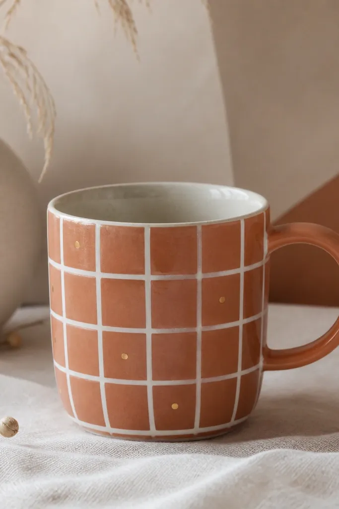
Tile patterns look luxe because they mimic real materials. Terracotta feels warm and expensive, and white grout lines make the design look crisp and architectural. Adding a few gold dots makes it feel like a boutique kitchen accessory. The pattern also helps kids paint within boundaries without needing perfect drawing skills.
Paint the base terracotta. Draw a grid in pencil with columns about 2 cm wide. Paint white lines as grout, then add gold dots only at intersections or center of every other tile. Bake and seal.
Pro tipUse a paint marker or squeeze bottle tip for grout lines - steadier than a brush for kids.
AvoidDon't make grout lines too thick; thick lines look like cartoon borders.
15. Monochrome Leopard Spots in Espresso
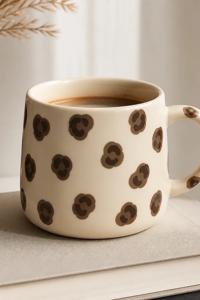
Leopard spots look luxe when you keep it monochrome and add a layered center. Espresso brown on cream looks like high-end fashion accessories. The key is consistency: spot size and spacing should feel random but controlled. Kids can dab spots with a sponge tip and then add centers with a smaller brush.
Start with a cream base. Use a sponge or stippling tool to dab espresso outlines as irregular ovals. Add a small darker dot in the middle of some spots for depth. Finish by tracing a few spots with a thin liner for definition. Bake and seal.
Pro tipMake 20 spots, then stop - the mug looks better with fewer marks than a full "print."
AvoidAvoid using black and brown together; it turns into a messy animal print fast.
16. Cherry Blossom Branch with Blush Petals
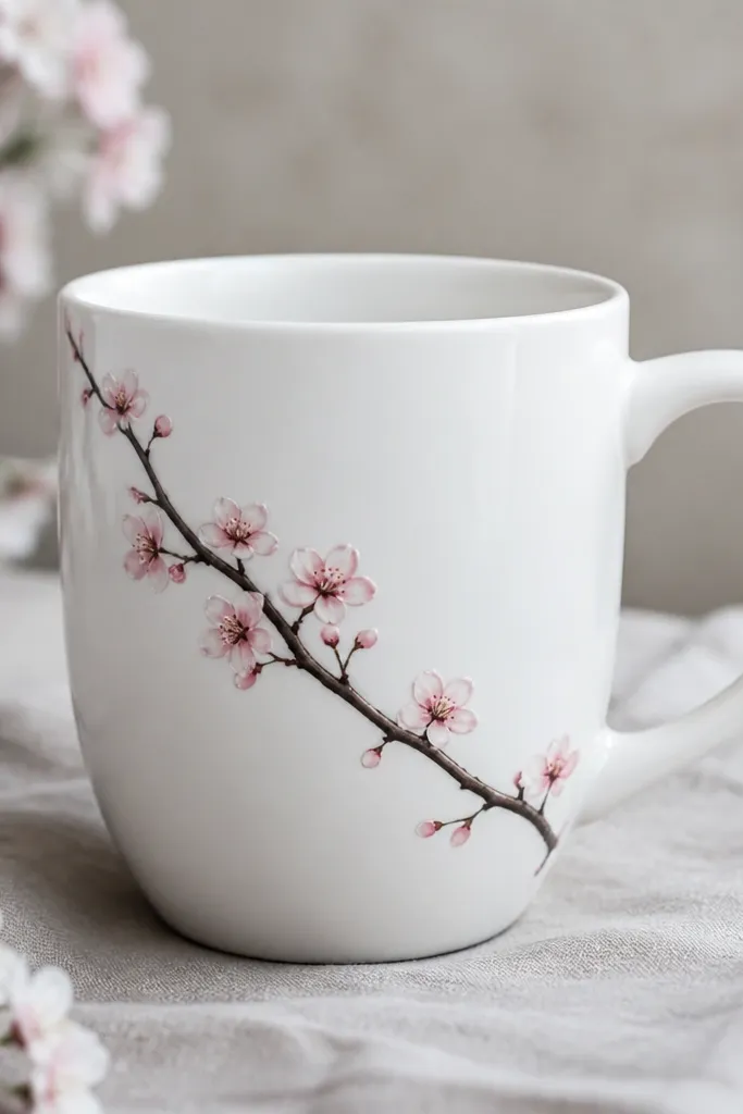
A single branch looks elegant because it's minimal and directional. Dark branch lines anchor the design, while blush petals add softness. The tiny white highlights make the petals look dimensional. It's a great choice when you want something pretty but not busy.
Paint the branch first in a dark brown or soft black ceramic paint, angled from lower left to upper right. Add clusters of blush petals as small teardrops around the branch. Use a tiny brush to add one white highlight stroke on a few petals. Bake and seal with a clear top coat.
Pro tipKeep petal clusters tighter near the center so the branch looks fuller.
AvoidDon't scatter petals everywhere; too many clusters makes it look like confetti.
17. Pearl Geometric Frames with Blush Fill
Geometric frames look luxe because they're structured. Pearl white lines have a soft sheen that looks expensive under warm kitchen light. Blush triangles keep the design sweet without turning into cartoon hearts. The negative space - the untouched white mug - is what makes it feel clean.
Tape simple triangles or use a ruler and pencil to sketch shapes. Paint blush triangles first, then outline each shape with pearl white. Add a second frame line slightly offset for a layered look. Bake and clear coat.
Pro tipIf kids struggle with triangles, use pre-cut triangle sponge stamps for the fill and save lines for you or a steadier hand.
AvoidDon't fill all the empty spaces; negative space is part of the design.
18. Rainbow Ombre Bands with Matte Finish
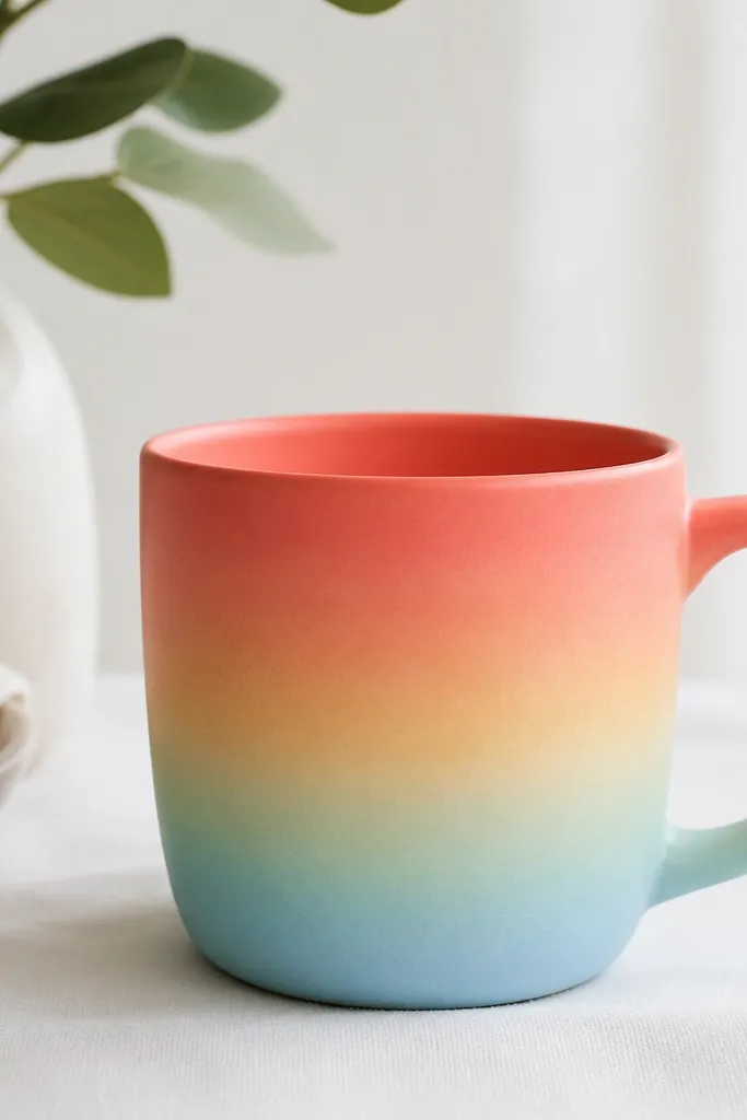
Ombre bands look luxe when the blend is smooth and the colors are laid in the right order. This palette is gentle and modern, not neon. Matte-looking color also hides brush streaks after baking. The banded approach is easier for kids than full-picture painting.
Paint the bottom band coral, then sponge peach above it, then pale yellow, then mint, then sky blue near the top. Blend using a damp sponge between colors while the paint is slightly tacky. Bake and apply a matte clear top coat if you can - it makes the ombre look more like ceramic glaze.
Pro tipUse a wide sponge for band blending so you don't get harsh stripes.
AvoidDon't let each band dry completely before blending; you'll get hard seams.
19. Faux Enamel Dots in Primary Luxe
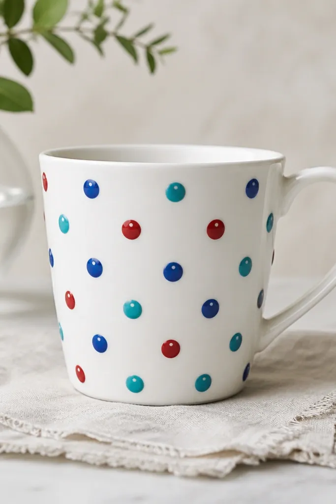
Enamel-style dots look high-end because they mimic glossy hardware. You get that effect by using ceramic paint made for smooth, opaque coverage and by keeping dots domed rather than smeared. Primary colors read playful, but the enamel shine makes them feel like decorative objects. The tiny white shine dot sells the illusion.
Paint a white base. Dot red, blue, and teal in a repeating pattern across the front. Add a micro white shine dot on each colored dot with a toothpick tip. Bake and seal with a glossy top coat so the dots look like they sit on the surface.
Pro tipPress the dot tool straight down for a round shape - tilt causes oval dots.
AvoidDon't overcoat with many clear layers; too much clear can pool and make dots look uneven.