
1. Single-Line Cherry Border
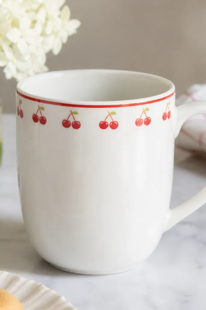
This design works because the border is simple and repeatable. Paint the cherries as stacked shapes - a red circle, a darker red dot for the shine, and a green stem - so you don't need fine sketching. Keep the band narrow (about 3/4 inch tall) so it reads clean even if your spacing is slightly off.
Scuff the mug, then use blue painter's tape to mark a straight band. Paint the band in two thin coats of cherry red, let it dry 20-30 minutes, then add cherries with a small round brush (size 0 or 1). Add green stems with the tip of the brush and cure per your ceramic paint instructions.
Pro tipUse a dotting tool or the eraser end of a pencil to place cherry circles fast and consistent.
AvoidDon't make the band too wide - thick borders hide uneven spacing and look crowded.
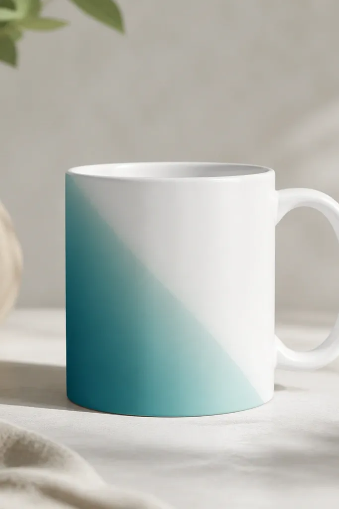
2. Two-Color Dot Ombre Band

Dot ombre looks harder than it is. You're basically painting a controlled gradient using the same dot size, which hides small mistakes. Limit the palette to two teals (or one teal and one white) so the mug looks cohesive.
Tape a horizontal band across the mug. Mix a dark teal and a lighter teal (or add a little white to your teal). Dip a dot tool for consistent circles, then shift to lighter paint as you move across the band. Let it dry, then add a second pass for opacity.
Pro tipWipe your dot tool between colors so the gradient stays distinct instead of muddy.
AvoidDon't overlap dots heavily - clusters make the pattern look like accidental splatter.
3. Mini Daisies in a Row
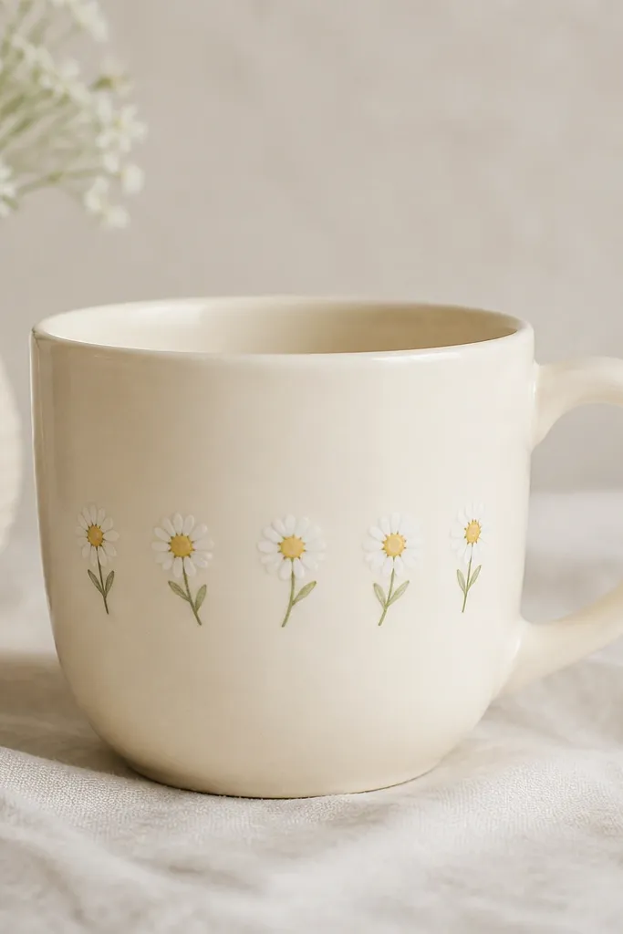
A single-row flower line is low maintenance because each flower is the same build. Petals are painted as teardrops or short crescents, which you can repeat quickly. The yellow centers catch light and make the mug look cheerful without needing shading.
Paint a thin green guideline first using a liner brush. For each daisy, paint a yellow dot center, then add 6-8 white petals around it. Keep petals small (about 1/4 inch) so the row doesn't run into the handle curve.
Pro tipUse a stencil for the daisy center size, then freehand the petals for speed.
AvoidSkip heavy outlines around petals - thick black lines make it look like a kids' craft.
4. Sage Stripes with a Black Pinstripe
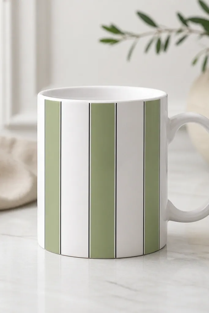
Stripe designs look sharp even when you're moving fast. The trick is a pinstripe divider: it makes your spacing mistakes less noticeable. Sage plus black reads modern, and it hides brush marks better than bright colors.
Measure the mug front and plan 3 vertical stripes. Use painter's tape to mask stripe widths, then paint sage in two coats. Once dry, add a thin black pinstripe with a liner brush or paint pen. Cure fully before using.
Pro tipPress tape down firmly at the edges so paint doesn't creep under it.
AvoidDon't paint stripes freehand without tape - uneven stripe widths scream "beginner."
5. Peach Geometric Triangle Stack
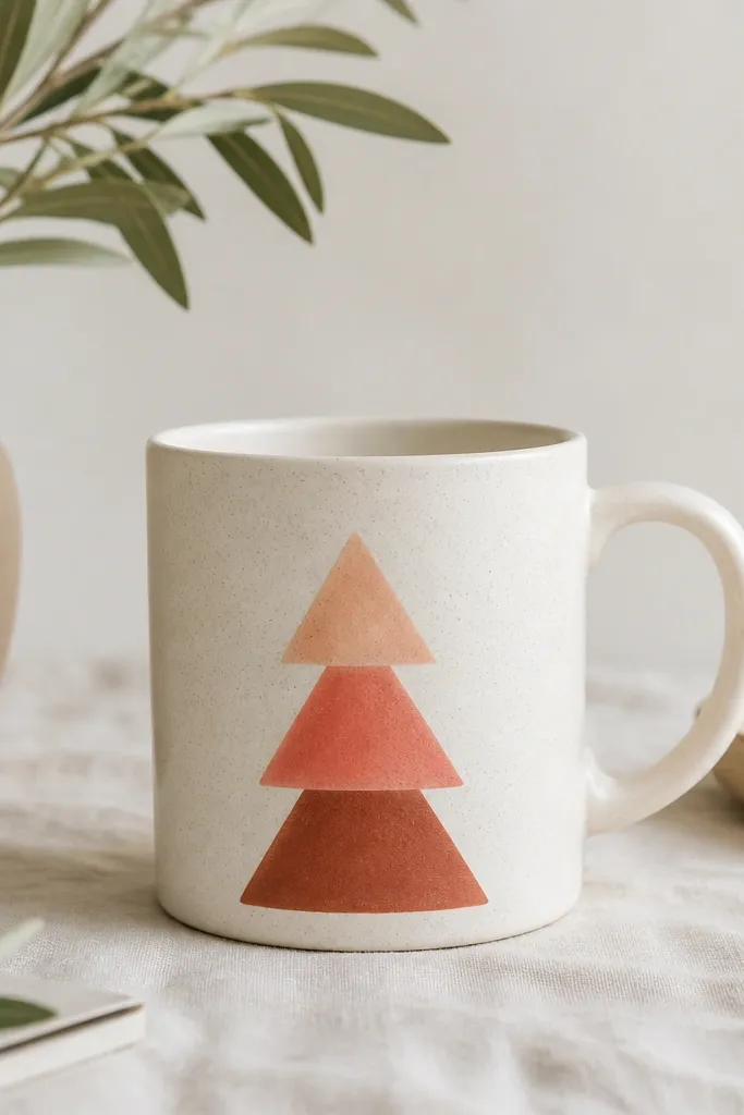
Triangles are forgiving because your eye reads the shape, not the tiny edge imperfections. This design is quick because you're filling large areas. Warm peach and terracotta make the mug feel cozy and look good on plain white ceramic.
Mark a vertical center line on the mug. Mask triangle shapes with tape, starting with the largest bottom triangle in terracotta, then coral in the middle, then peach on top. Use thin coats to avoid ridges, then remove tape when paint is slightly tacky for cleaner edges.
Pro tipIf tape edges look fuzzy, paint over the edge with the triangle's base color once it dries.
AvoidDon't use too many shades in one triangle - three tones is plenty.
6. Polka Dot Sleeve with a Solid Base
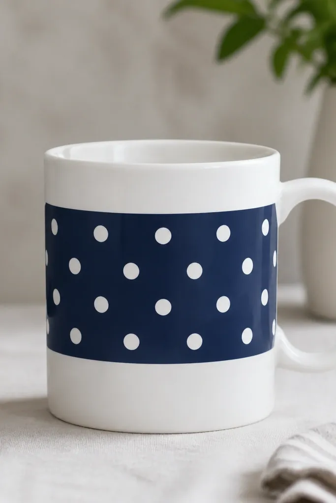
This is my go-to when I want clean results fast. You're doing one solid fill plus a dot pattern, and both are easy to control. White dots on navy look crisp and hide slight dot size variation.
Tape a band at mid-height (about 2 inches tall). Paint the band navy and let it cure to tacky-dry, then dot with white using a sponge or dot tool. Finish by adding one tiny accent dot in gold (optional) near one side for a little depth.
Pro tipUse a paper template to keep dot spacing consistent around the mug curve.
AvoidDon't put dots too close to the band edges - it makes the band look lopsided.
7. Gold Rim Accent Dots
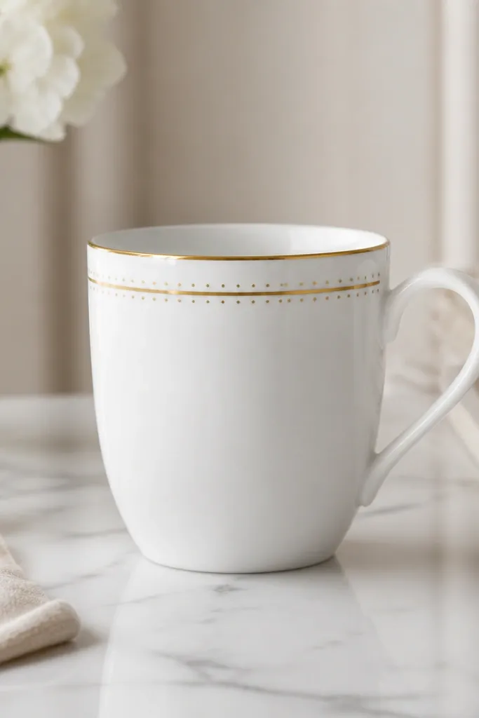
A rim accent is low effort with high payoff. Because it's near the top, the design reads from across a room. The dots add rhythm without needing any drawing skills.
Mask a thin strip around the rim using painter's tape wrapped carefully. Paint gold in one or two thin coats. After drying, add tiny dots with a paint pen or dot tool just above and below the gold band, keeping dot diameter around 1-2 mm.
Pro tipPractice your dot pressure on scrap paper so your pen doesn't blob on the mug.
AvoidDon't let gold paint pool - pooled rim paint feels raised and chips sooner.
8. Monochrome Lettering Banner

Lettering looks custom even when it's basic. The key is to keep it to one short word or two initials, painted in a blocky font style. Monochrome keeps it classy and prevents color mismatch.
Tape a horizontal rectangle banner on the mug front. Paint the banner gray, let it dry, then write the word with a black paint pen or liner brush. Add a tiny underline line only if the word has no bottom flourish.
Pro tipWrite with a pencil first and erase - it prevents paint from locking in crooked letters.
AvoidAvoid cursive loops that are too thin; they look fragile and smear when curing.
9. Tiny Star Confetti
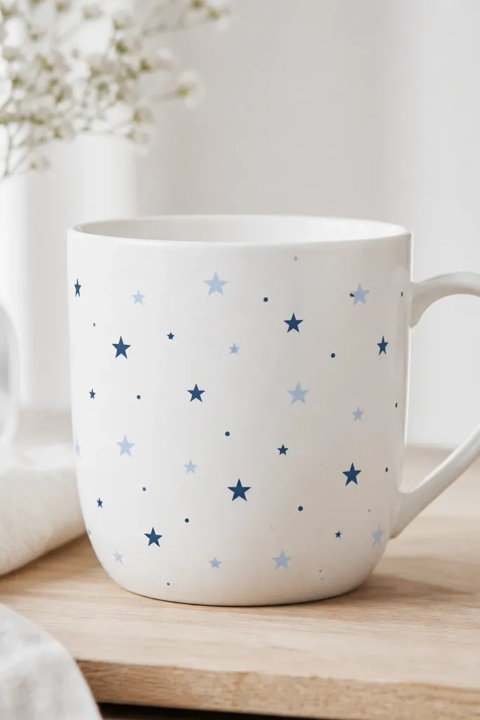
Confetti stars are easy because you're repeating a single stamp-like shape. They look fun without requiring perfect symmetry. Use two blues only so it looks intentional rather than random.
Plan a loose cluster on the front panel only. Paint stars with a stencil or by making a 5-point star with a small brush, then add a few dot dots. Keep stars small (about 1/8 to 1/4 inch). Cure in one go and avoid overpainting.
Pro tipIf you don't have a star stencil, use a craft knife to cut a star shape from masking tape and stamp paint.
AvoidDon't cover the whole mug - dense confetti makes it look like a mistake.
10. Coffee Cup Steam Swirls

This is a friendly icon set that reads quickly. The steam lines are thin and directional, so you get movement without shading. Stick to black + gray for a clean look that matches any kitchen color.
Paint the coffee cup icon first using a stencil or draw a trapezoid with a handle. Then add three steam curves above it, leaving gaps between lines so the mug stays readable. Finish with a small dot of darker gray at the base of the steam if you want extra contrast.
Pro tipUse a liner brush and pull the paint line in one smooth stroke for the tapered ends.
AvoidDon't thicken the steam lines - thick lines look cartoonish and feel heavy.
11. Wavy Sea Line with Dots
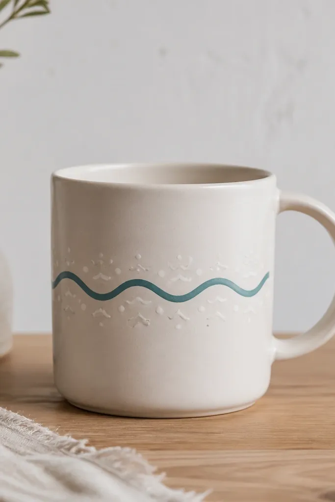
A single wave line is calming and quick. The dots act like foam, giving texture without extra painting. Teal against white looks crisp and feels modern.
Tape a straight horizontal guide line across the mug. Paint the wavy line with teal using a liner brush. Add white dots on the crests and a few small tick marks to suggest foam. Cure and avoid scrubbing the painted area early.
Pro tipKeep wave peaks consistent - count 7-9 peaks across the mug front so it looks intentional.
AvoidSkip freehand without a guide - wavy lines that drift up and down look sloppy.
12. Rainbow Arc with Three Bands

Arcs look great because they curve naturally with the mug. Thick bands are forgiving and don't require fine detail. Use three bands only so the arc stays bold and clean.
Mask an arc using flexible tape or cut tape strips to follow a curve. Paint the bands from the bottom arc up: green first, then yellow, then red. Leave small gaps between bands for crisp separation. Cure fully.
Pro tipUse poster tack to hold tape in place on the curve without wrinkles.
AvoidDon't add blue and purple - too many bands turn into mud when opacity isn't perfect.
13. Lemon Slice Half-Moon
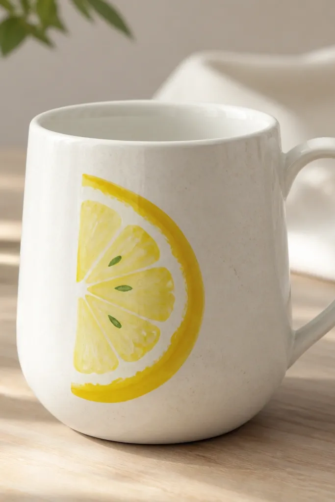
One lemon slice reads like summer even with minimal work. The slice shape is simple: paint the rind outline, fill yellow, then add small seed dots. White highlights make it look glossy without actual glaze.
Draw a half-moon rind outline with a pencil. Paint yellow base, then add a thin darker yellow rind line. Add seeds with a tiny brush - 6-10 small green dots. Add two thin white highlight strokes along the rind.
Pro tipDo seeds last - they hide tiny uneven spots in the yellow fill.
AvoidDon't outline everything in black - lemon looks best with warm tones.
14. Butterfly Wing Spot Pattern
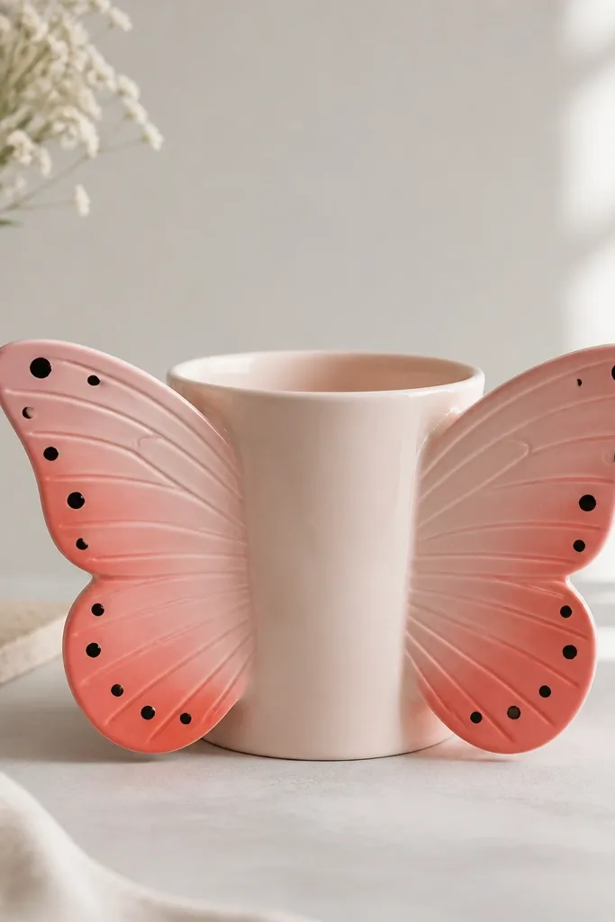
Symmetry makes this design look "designed," even though it's mostly dots and filled shapes. You paint one wing pattern and mirror it, which saves time. The pink-to-coral gradient gives depth without heavy shading.
Sketch a butterfly center line. Paint one wing: light pink base, then coral blotches near the outer edge. Add black dot clusters in pairs. Flip your mug orientation and repeat the same on the other side, matching dot count rather than exact placement.
Pro tipUse a damp paper towel to soften the coral edge into pink while paint is still wet.
AvoidAvoid over-blending - muddy gradients look dirty on white mugs.
15. Ragged Chalkboard Checkers
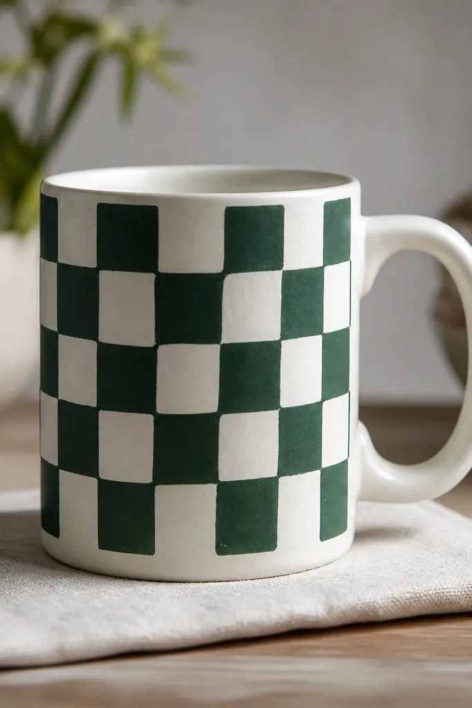
Chalkboard-style checkers look cool and hide brush texture. The uneven edges are part of the charm, so you don't need perfect masking. Keep the checkers small and the panel limited to the front so it doesn't overpower the mug.
Tape a front panel rectangle and paint it dark green. After drying, paint white checkers with a small flat brush. Use a slightly dry brush for a chalky look so the checkers don't look glossy. Cure and let it sit 24 hours before washing.
Pro tipIf you hate masking, freehand the checkers with a pencil grid first.
AvoidDon't paint checkers too large - big squares show uneven lines immediately.
16. Botanical Leaf Stamp Trio
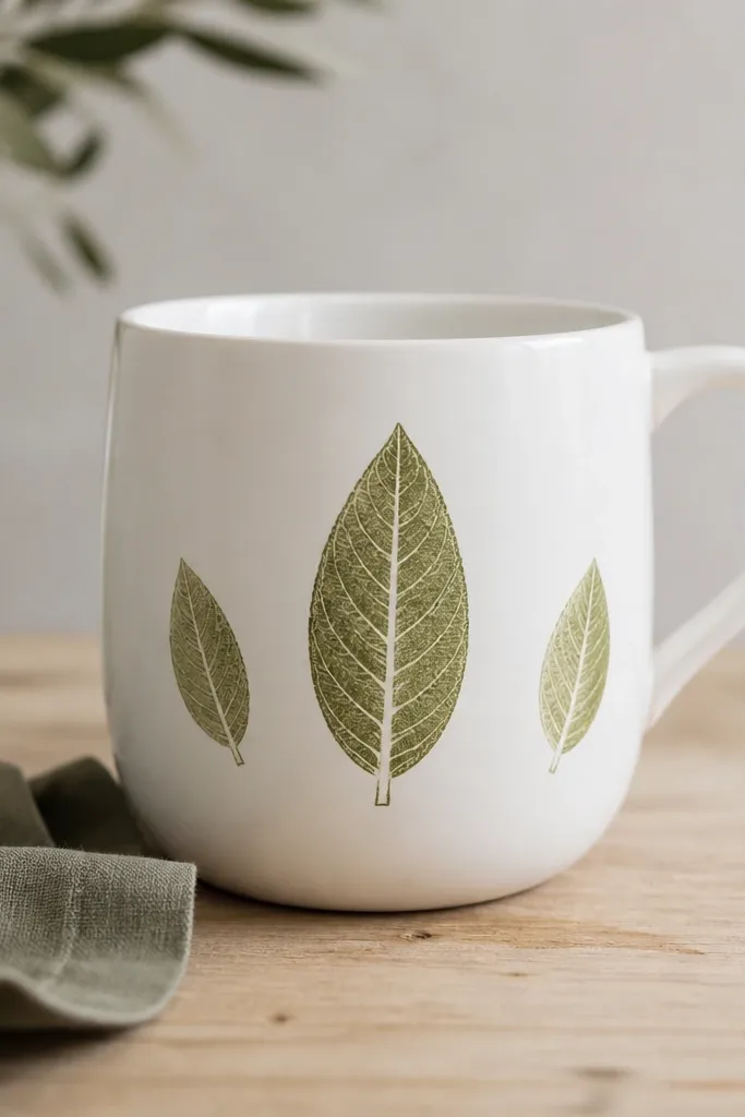
Leaf stamps are fast because you repeat one shape. Veins add realism, and you can do them with a thin liner line down the center plus short side branches. Olive and light green look natural and don't clash with most kitchens.
Use a leaf-shaped stamp (silicone craft stamp) or hand-paint leaf outlines. Paint the leaves olive, then add vein lines with a lighter green. Keep the trio size consistent: center leaf about 2 inches tall, side leaves about 1.25 inches. Cure and avoid soaking during the first week.
Pro tipMake vein lines after the leaf base dries, so they don't bleed into the fill.
AvoidSkip tiny background details - the leaves already carry the design.
17. Half-French Stripe Handle Side
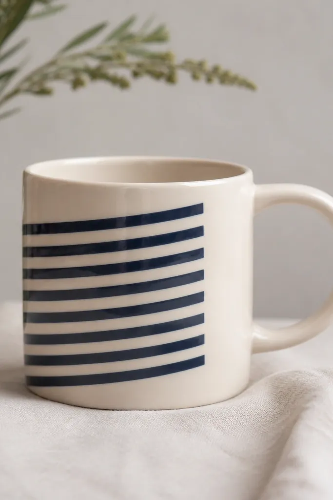
Painting only one side keeps it low maintenance. The angled stripes look lively, and you don't have to wrap the design around the handle. Navy + cream gives a classic look that still feels hand-done.
Tape a diagonal band on one side panel, leaving the handle area untouched. Paint alternating navy and cream stripes in two coats each color. After drying, remove tape and add a thin navy border line at the top edge only.
Pro tipAngle your stripes by eye using the mug's vertical axis - don't chase math perfect alignment.
AvoidDon't try to stripe around the handle - it creates awkward breaks and messy edges.
18. Simple Geometric Frame

A frame looks polished because it gives structure. You can keep the inside minimal: two triangles, a dot cluster, or a short line. The frame also hides minor unevenness in the mug's surface because it defines the art area.
Tape a rectangle frame on the mug front. Paint frame lines in black or dark brown. Fill two small triangles inside - one teal and one coral - and keep them about 1 inch each. Cure and avoid thick paint on the frame edges.
Pro tipUse a ruler and tape for the frame, then paint lines in one careful pass.
AvoidDon't use very light gray for frame lines - it disappears after curing.
19. Sunburst Dots Near Bottom
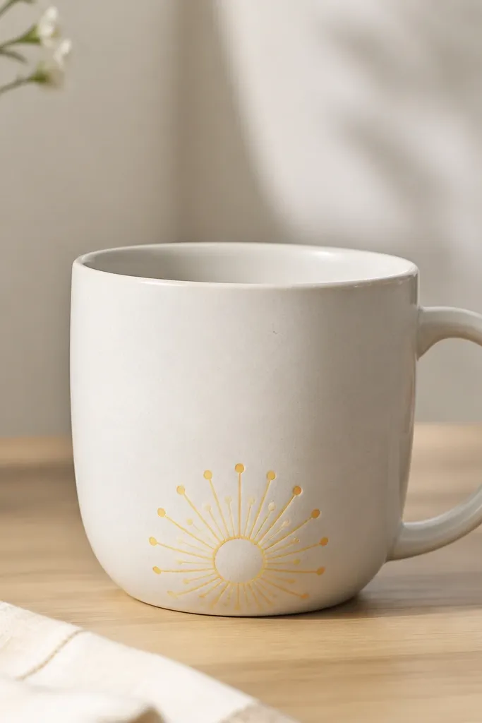
Sunbursts are a fun way to fill the lower part of a mug without heavy detail. Rays and dots are quick because you're repeating the same stroke. Place it near the base so it feels playful when you set the mug down.
Draw a small circle about 2 inches from the bottom. Paint rays outward using a liner brush, alternating yellow and orange. Add tiny dots at the ray ends so the burst looks crisp. Cure fully.
Pro tipCount your rays (like 12) so it looks balanced, even if the strokes aren't identical.
AvoidDon't put sunbursts at the rim - it makes the design feel cramped.
20. Terracotta Chevron Band
Chevron is satisfying because it creates motion with simple shapes. You only need straight lines, and tape helps you keep the angles consistent. Terracotta feels warm and reads well on white ceramic.
Tape a chevron band by marking a center line and two angled guide lines. Paint the terracotta triangles first, then fill valleys in cream. Remove tape while paint is slightly tacky for sharp edges. Cure per paint instructions.
Pro tipIf you mess up one chevron, paint over just that triangle instead of redoing the whole band.
AvoidDon't make chevrons too thin - narrow lines look uneven and chip first.
21. Simple Rainbow Pop on White

This is a "small statement" design. Because it's near the top center, you don't need to cover much surface area, so it dries quickly. Thick stripes hide minor paint streaks and still look clean.
Mask a small arc using flexible tape. Paint stripes from the bottom of the arc upward in five colors, letting each coat settle before the next. Use a fan brush or flat brush to keep stripe edges crisp. Cure fully and handle gently for the first day.
Pro tipKeep your arc width about 2.5 inches - any bigger and it takes longer to fill evenly.
AvoidSkip ultra-bright neon colors - they look harsh next to ceramic glaze.
22. Navy and White Sailboat
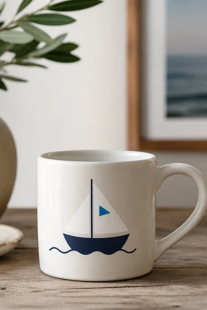
A sailboat silhouette looks clean because it's mostly one shape. Add a single interior triangle and a wavy line to suggest water. This design is low maintenance because it doesn't require shading or tiny rigging details.
Use a printed sailboat template under the mug (taped to the inside) to trace lightly with pencil. Paint the boat navy, then paint the sail white and add one blue triangle detail. Finish with a simple teal or light blue wavy line. Cure and keep the water line thin.
Pro tipUse a Q-tip to clean edges around the sail triangle before it fully dries.
AvoidDon't add too many ropes - tiny lines chip and look messy.
23. Color-Block Ombre Corner
Corner ombre looks modern and hides uneven brush texture because the diagonal edge gives structure. You paint a solid block, then blend toward the center with a dry brush. Keep the gradient small so it doesn't take forever to dry.
Mask a diagonal corner area with tape. Paint solid teal first, then while still slightly wet, add aqua and blend inward with a dry foam brush. Keep the blend within about 1 inch from the diagonal edge. Remove tape carefully for a crisp diagonal.
Pro tipUse a hair dryer on low for 2-3 minutes between layers so you can control blending.
AvoidAvoid overworking the blend - repeated strokes turn it dull.
24. Minimal Heart with Dot Outline

Dot outlines make hearts look intentional and playful without shaky curves. You get two textures: the solid heart and the dotted border. Pink on white is the easiest palette for clean results.
Paint a solid heart in pink first. After it dries, make a dotted outline by placing evenly spaced dots along the heart edge using a dot tool. Add one small white highlight dot in the top right of the heart. Cure fully.
Pro tipUse the same dot tool for all dots so the border looks consistent.
AvoidDon't make the heart fill too thick - thick fill can crack after curing.
25. Botanical Vine Line Across
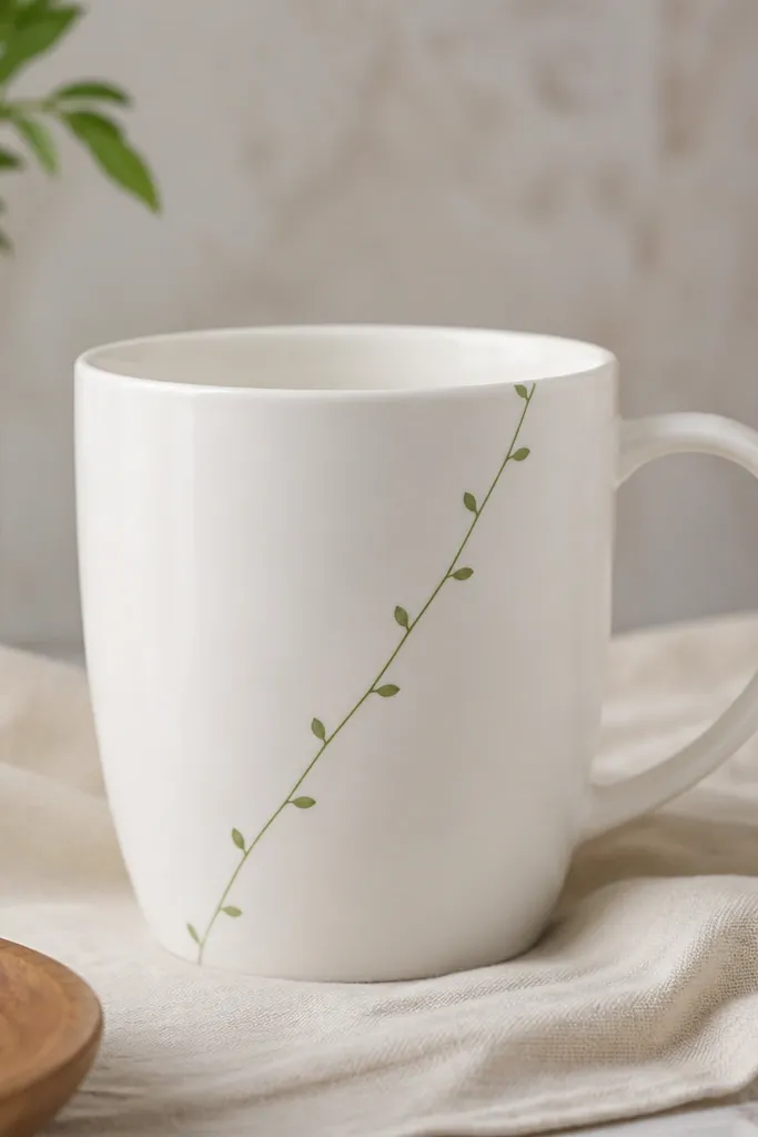
A vine line is basically a rhythm exercise: line, leaf, line, leaf. It looks airy because the line stays thin and the leaves are small. Use one green shade and one lighter green for leaf veins to keep it simple.
Sketch a diagonal path with pencil lightly. Paint the vine line in darker green, then add small leaf shapes along it (oval with a point). For each leaf, paint a lighter green vein down the center. Keep leaves spaced about 1 inch apart.
Pro tipUse a liner brush and pull the line in one stroke for smooth curves.
AvoidSkip big leaf shapes - they require more paint layers and look heavy.
26. Black Circle Target with Rings
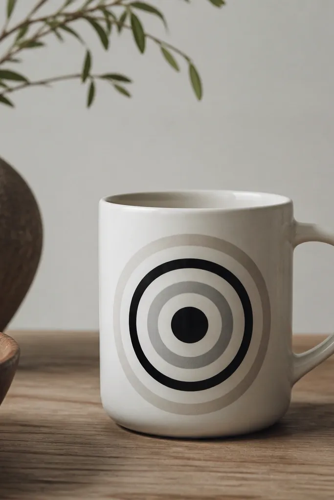
Targets look graphic and modern. They're low maintenance because you're repeating circles - even if they're slightly imperfect, it still reads as intentional. Black plus light gray stays calm and doesn't fight other home decor.
Use a round object like a bottle cap to trace the largest circle lightly. Paint the outer ring first in light gray, then add black rings inward. Finish with a solid black center dot. Cure and let rings dry between layers so they don't blend.
Pro tipWipe your stencil edge between rings to keep paint from smearing into the next circle.
AvoidDon't rush circle layers while paint is wet - rings merge and look like one blob.
27. Teacup Pattern with Tiny Saucer Dots

This pattern looks cute because it repeats in a small footprint. Each teacup icon is simple: cup outline, a small fill line, and a handle curve. The saucer dots make it feel finished without adding more details.
Paint the teacup outline in navy. Add a light blue dot cluster under each cup like saucer dots, about 5-7 dots per icon. Repeat 3-4 cups across the front panel. Cure and avoid thick paint on the handle curve.
Pro tipMake handles last so you can match cup height and spacing.
AvoidAvoid tiny saucer circles - they smear when the paint cures.
28. Color-Blocked Dots Around a Vertical Line
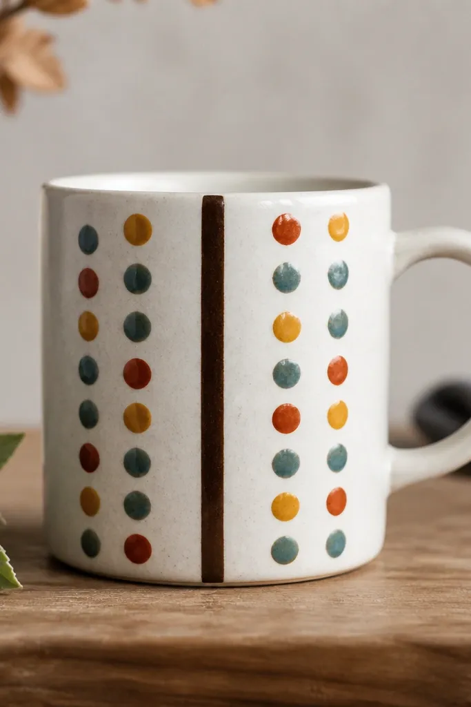
This is a structured dot design that still feels hand-done. The vertical line gives you alignment, and the dot rows let you vary color without drawing. It looks great on mugs that have a slight curve because the dot stacks follow the shape.
Paint a straight vertical line in dark brown using tape as a guide. Then create dot rows above and below, alternating colors every row. Keep dots the same size (about 1/8 inch) so the pattern stays crisp. Cure and do a second coat on dots only if you see ceramic showing through.
Pro tipUse a limited palette of 3 colors plus brown so it doesn't look chaotic.
AvoidDon't vary dot sizes wildly - it turns into random splatter instead of a pattern.
29. Sunflower Center Pop
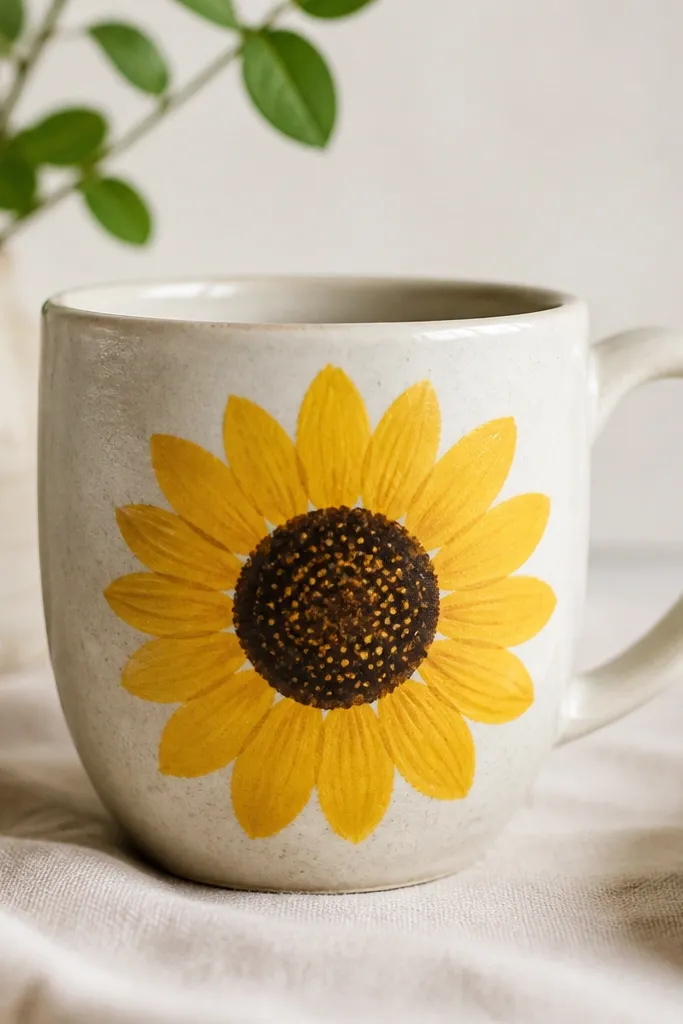
A sunflower can be simple if you focus on the center texture. The petals are just repeating half-ovals, so your hand gets a rhythm. The dotted center adds realism without shading complexity.
Paint the center circle in dark brown. Add tiny yellow dots around and within the center area. For petals, paint 10-14 yellow half-ovals around the center, with the tips slightly darker yellow. Keep the sunflower diameter around 3 inches for a mug-friendly size.
Pro tipUse a toothpick for the tiny center dots so they stay controlled.
AvoidDon't paint leaves too - a single sunflower looks cleaner and dries faster.
30. Monogram in a Rounded Rectangle
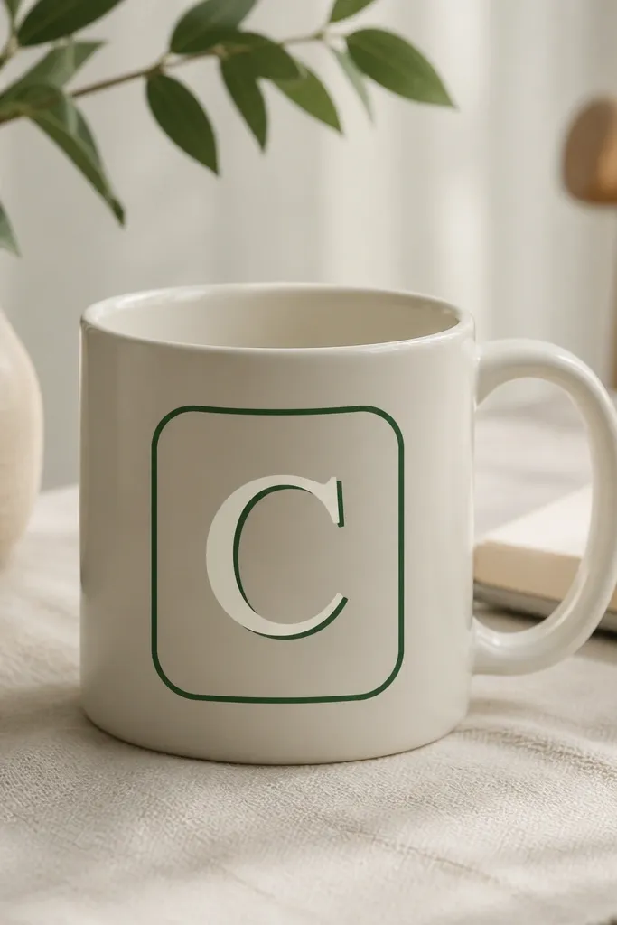
A monogram is low maintenance because it's one shape with one color plan. The rounded rectangle frame keeps it from looking plain, and it hides tiny letter wobble. Choose one letter and one palette - it looks intentional.
Tape a rounded rectangle frame on the mug front. Paint the frame dark green, then paint the letter inside in cream. Add a thin shadow line offset by about 1-2 mm using a lighter green. Cure and keep the frame lines thin.
Pro tipIf your tape can't make rounded corners, trace a circle guide for each corner and paint freehand inside the guide.
AvoidAvoid thin light-lettering - it disappears after curing.