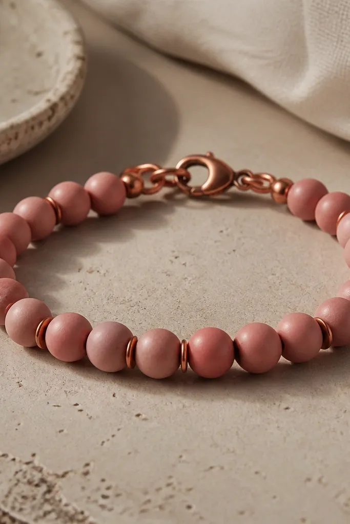
1. Sunset gradient stack with 6mm terracotta-to-peach beads
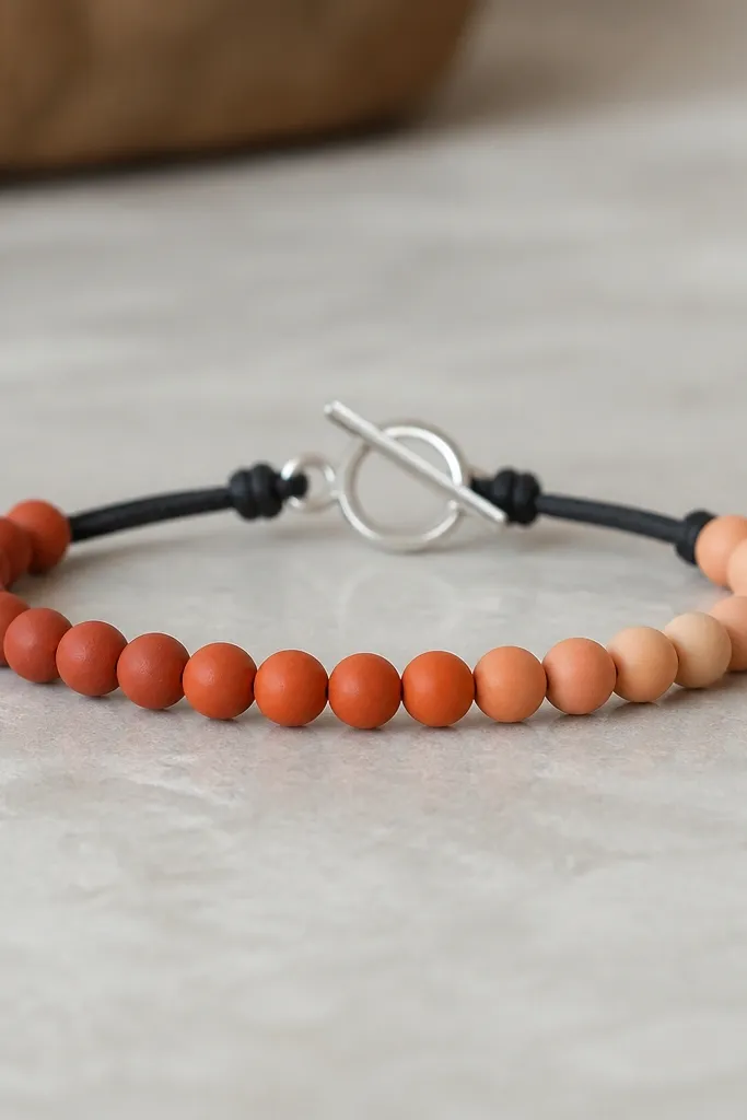
I made this using 6mm clay beads in a terracotta-to-peach gradient so the color change is the whole design. The reason it works is that clay beads look best when the shape stays consistent and the color does the talking. I used matte black cord because glossy beads would show shine where your fingers touch. The clasp is a small toggle so the bracelet front stays flat instead of twisting.
String 18 to 22 beads depending on your wrist measurement, keeping the biggest color shift near the center. Use a 0.7mm beading wire or 0.8mm braided line, then finish with a toggle clasp that matches the wire thickness. For a clean look, keep spacing tight - about 1 bead-width between beads so the gradient reads as one block.
Pro tipLay the beads on the table in order and take a quick phone photo before you string. It's the fastest way to catch a color swap.
AvoidAvoid mixing bead sizes in a gradient bracelet - it breaks the smooth color flow and makes the center look uneven.
2. Sea glass mix with speckled mint, 4mm + 6mm alternating
This is the look I reach for when I want something that feels beachy without going full theme. Alternating 4mm and 6mm beads creates a natural rhythm, and the speckles add texture even when the clay is matte. Tiny silver spacers (3mm) keep the bracelet from looking chunky. The result looks layered without actually adding bulk.
Pick 10 to 14 larger 6mm beads and 10 to 14 smaller 4mm beads to match your wrist length. Keep silver spacers consistent - one spacer between each 6mm and the next 4mm. Use a wire-and-crimp finish so the bracelet doesn't stretch out and change the spacing.
Pro tipBefore crimping, pull the wire snug and check the spacing from the side. If any gap looks wider, fix it before you lock the crimp.
AvoidAvoid using elastic for this one - the alternating sizes start to drift and the bracelet front stops lining up.
3. Black and gold night beads with 8mm clay rounds + 3mm brass discs
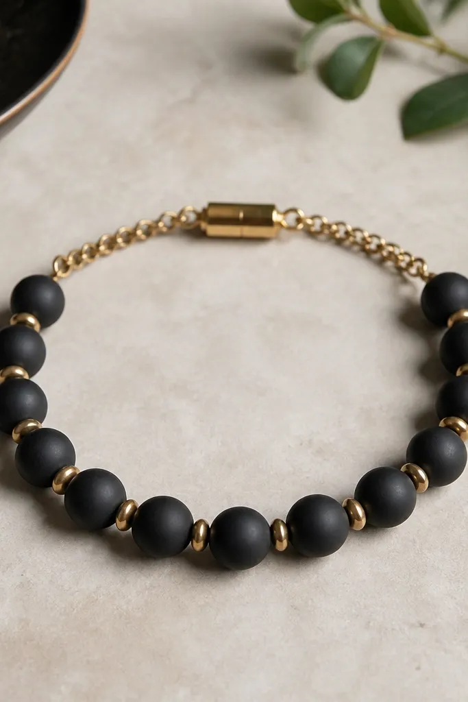
This one is dramatic in a good way. The matte black clay gives you depth, and the small brass discs add a metallic shimmer that doesn't overpower the beads. I used brass discs instead of full spacers because they reflect light in tiny flashes as your wrist moves. It looks expensive because the contrast is clean: black, gold, and nothing else.
Use 10 to 14 black 8mm beads depending on wrist size. Add one 3mm brass disc between each pair of clay beads, and finish with a magnetic clasp sized for beading wire. Keep the disc holes aligned with the wire direction so the bracelet doesn't twist around the clasp.
Pro tipWipe the brass discs with a microfiber cloth right before assembly so fingerprints don't dull the finish.
AvoidAvoid mixing gold tones (brass plus bright yellow gold) - it reads mismatched instead of intentional.
4. Pearl-core look with cream clay beads + tiny 2mm white glass seed beads
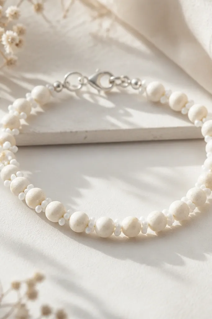
Cream clay beads can look a little flat by themselves, so I added tiny white seed beads as micro sparkle. Seed beads fill the negative space and make the bracelet look more detailed from arm's length. The halo effect is subtle, not glittery - just enough to catch light. It's a great everyday bracelet because it matches denim, black dresses, and sweaters.
String one cream 6mm bead, then add 2 to 4 seed beads before the next cream bead. Keep the seed count consistent so the rhythm feels even. Finish with a small toggle or lobster clasp - anything bulky makes cream beads look cluttered.
Pro tipIf seed beads snag, use a slightly stiffer wire (0.8mm) so the bead run stays straight.
AvoidAvoid overloading seed beads - too many makes the bracelet look fuzzy and messy.
5. Terracotta + turquoise pops with 5mm clay rounds and 4mm chips
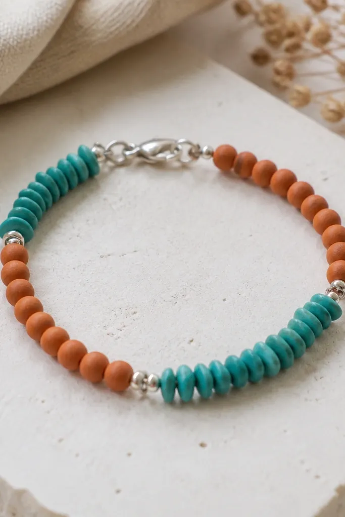
Chip-shaped beads add movement, and pairing them with round beads keeps the layout readable. Terracotta and turquoise is a color combo that looks good in daylight - the clay tones stay warm and the turquoise stays cool. I used silver jump rings to separate the two bead types into clear zones. That zone separation is why it looks designed instead of random.
Build in sections: 6 to 8 terracotta rounds, then 4 to 6 turquoise chips, then repeat. Use one jump ring every time you switch bead type so the bracelet has a visual beat. Wire up with crimp ends so the chip shapes don't rotate and create gaps.
Pro tipSort chips by color first - if the turquoise varies too much, the bracelet reads patchy.
AvoidAvoid mixing chip sizes freely - too much variation makes it look like the beads were dumped in.
6. Marbled sage with 8mm beads and a single gold spacer line
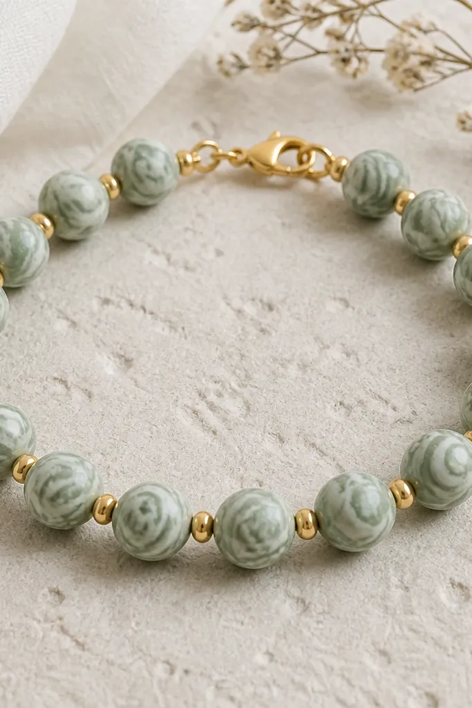
Marbled clay beads already have motion. When you add too many accents, the swirls stop looking like swirls. I kept it simple: 8mm marbled sage beads and just one slim gold spacer bead between each. The gold line acts like punctuation, so the marbling stays the main character. It looks clean, not busy.
Use 10 to 12 of the 8mm beads for a comfortable fit. Thread a gold spacer between each marbled bead, keeping the spacers all facing the same direction if they have a flat side. Finish with a clasp that doesn't sit on top of the marbling, like a flat-profile lobster clasp.
Pro tipIf the marbling has darker swirls, place two slightly lighter beads at the center so the bracelet front looks balanced.
AvoidAvoid adding multiple different spacer types - it turns marbling into clutter.
7. Hot pink clay beads with 3mm hematite-style spacers
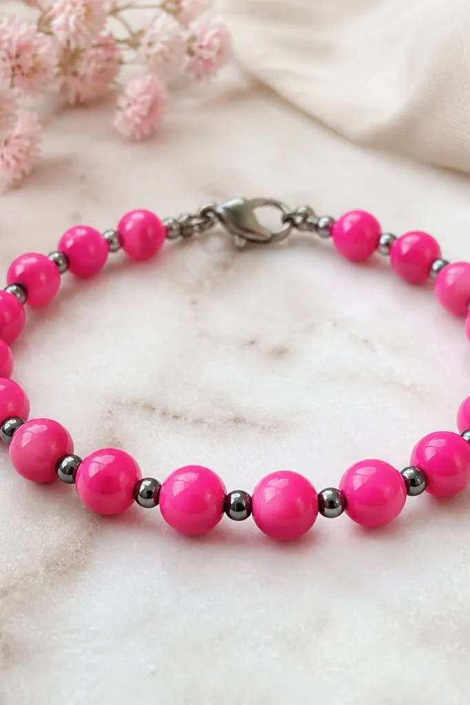
This one pops because the spacers are dark and slightly metallic, which makes the pink look even brighter. The key is scale: 3mm spacers between 6mm clay beads keeps it crisp. I used a slightly darker clasp so you don't get pink-on-pink shine. It's the bracelet I wear when I want a single loud accessory with zero effort.
Use 16 to 20 pink beads for wrist-length coverage, then add one 3mm spacer between each pair. If you're using wire, crimp with two crimps stacked so the spacing doesn't shift. Keep the bead run tight so the pink beads line up in one straight band.
Pro tipDo a quick wrist test. If any spacer flips to the back, adjust before you finish the clasp.
AvoidAvoid glossy clear coating on hot pink beads - it can make fingerprints look like smudges.
8. Matte rainbow mini bracelet with 4mm beads and a single silver bar
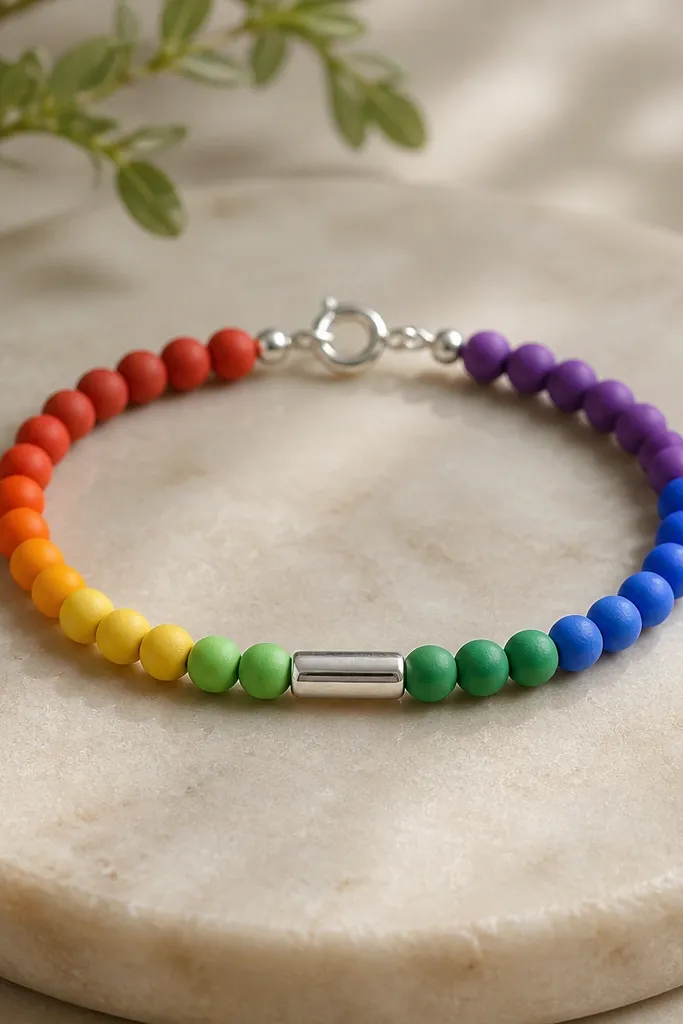
A mini bracelet needs a clean focal point, or it looks like a handful of beads. I used matte 4mm beads in a rainbow sequence, then anchored the center with one small silver bar charm. Matte beads keep the colors soft instead of neon. The charm makes it feel intentional even at a glance.
Pick 14 to 20 beads total so it sits as a cuff-like bracelet, not a full loop. Place the silver bar at the midpoint and keep the rainbow order symmetrical left and right. Use wire so the charm doesn't rotate.
Pro tipIf you want a calmer rainbow, swap one or two colors for cream or gray clay beads.
AvoidAvoid uneven rainbow spacing - if one color clumps, it looks accidental.
9. Earth-tone mix with 10mm flat clay ovals and tiny seed bead borders
Flat ovals feel modern, but they can look bare if you don't frame them. I bordered each oval with a thin strip of seed beads so the ovals look like they sit in a tiny frame. Earth-tone clay keeps it wearable, and the seed border adds texture without turning it into glitter. This bracelet looks good with long sleeves because it catches light along the oval edges.
Thread one oval, then add 6 to 10 seed beads on each side of the oval hole before moving to the next oval. Keep the seed count consistent so the oval frames look even. Use wire and a bronze clasp so everything matches the warm palette.
Pro tipIf the oval hole is rough, ream it first so the seed beads sit flat against the clay.
AvoidAvoid skipping seed borders - flat ovals alone look like oversized beads with no finish.
10. Chocolate swirl beads with 6mm rounds and bronze jump ring spacers
Swirl beads are beautiful, but they look best when you break them into groups. I used 6mm swirl rounds and grouped them into two clusters, separated by bronze jump rings. The jump rings add structure and keep the bracelet from looking like a continuous brown blur. It also makes the bracelet look thicker at the center, which is flattering.
String 8 to 10 swirl beads, then add one jump ring, then string another 8 to 10 swirl beads. Keep the wire tension snug so the jump ring sits centered. Finish with bronze hardware that matches the jump ring color so the metals blend.
Pro tipUse a ruler to mark the midpoint on your wire before you load beads. That keeps the clusters balanced.
AvoidAvoid mixing swirl beads with solid beads in the same cluster - it kills the "swirl grouping" effect.
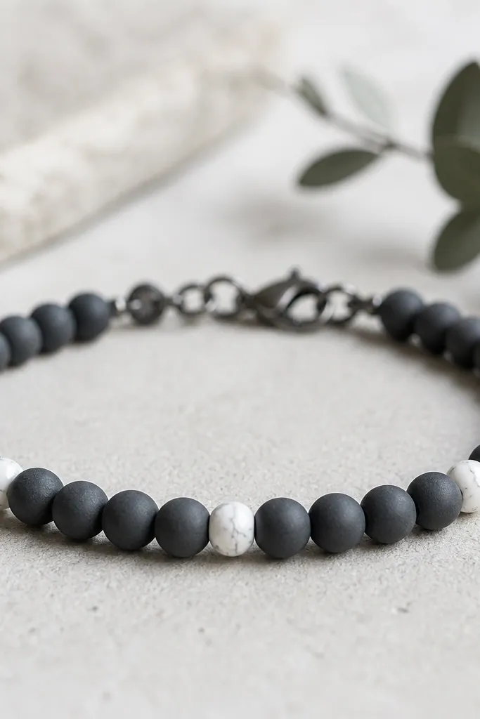
11. Black matte beads with small white clay accent hearts
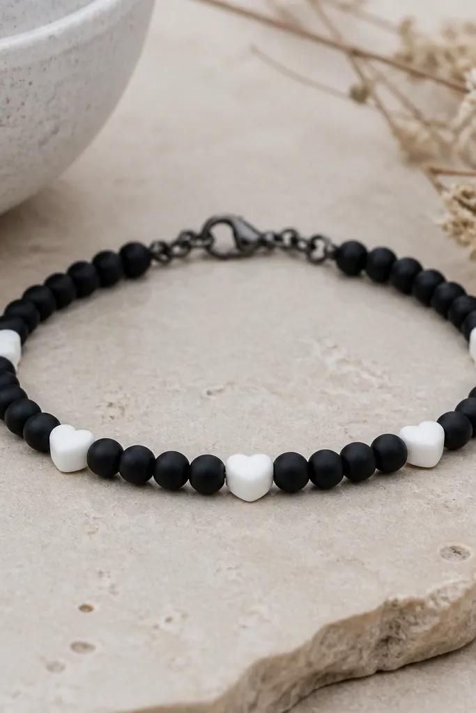
This is the quickest way I know to make a simple bead bracelet look cute without going too childish. Black matte beads provide the base, and white heart accents act like a repeating detail. I positioned hearts at even intervals so you always see one in the center when you wear it. That repeat is why it looks designed.
Use 16 to 20 black beads, then add 3 to 5 heart beads in the middle third of the bracelet. Keep the heart orientation consistent by pulling the bead into position before crimping. Wire with crimp ends so the hearts don't rotate away from the front.
Pro tipIf your heart beads have holes that pull sideways, ream the hole straight so the heart sits flat.
AvoidAvoid random heart placement - if hearts are uneven, the bracelet looks like it got assembled in a hurry.
12. Cream clay beads with 2mm gold seed beads and a charm spacer
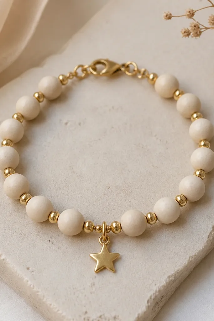
This is "soft glam" without glitter. Cream clay beads look warm, and gold seed beads add shimmer at close range. The star charm gives you a focal point so the bracelet doesn't rely on color alone. I like this for holidays because it looks festive without looking costume-y.
Add 3 to 6 gold seed beads between each cream bead, then space the star charm at the midpoint. Use a gold clasp that matches the jump ring tone. Keep the bracelet tight enough that the star charm stays on the front.
Pro tipUse a needle to separate seed beads during threading so they don't clump into one shiny lump.
AvoidAvoid too many seed beads between each clay bead - it makes the bracelet look tangled instead of sparkly.
13. Ocean blue gradient with 3mm spacers and a silver barrel clasp
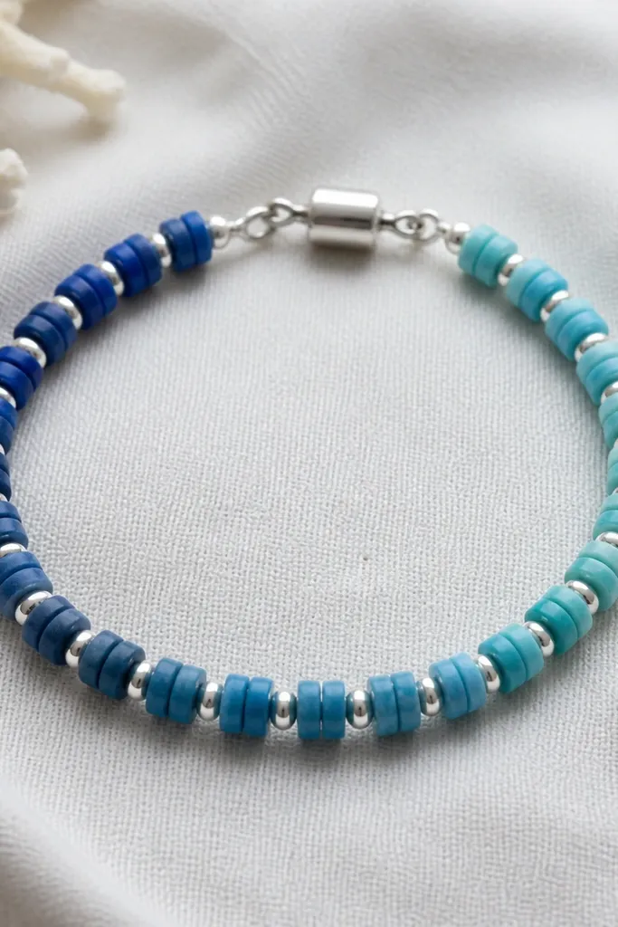
Gradient beads look best when the spacing is consistent and the hardware is minimal. I used a navy-to-teal gradient and kept the silver spacer size tiny so the color stays the main focus. A barrel clasp sits flatter than a bulky lobster clasp, which matters when the gradient beads are small and the bracelet is lightweight. The whole piece feels crisp and clean.
Use 20 to 26 beads at 4mm to 5mm size depending on length. Add one 3mm silver spacer between each bead pair. Finish with a barrel clasp sized to your wire so it doesn't wobble.
Pro tipIf your gradient has a sudden jump, spread the color change across 4 to 6 beads instead of stacking it at one point.
AvoidAvoid oversized spacers - big metal pieces overpower small gradient beads.
14. Lavender matte with 4mm beads and a twisted wire wrap center
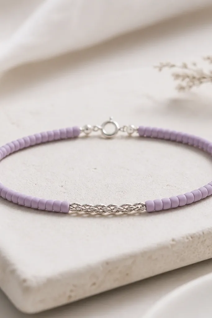
You don't need charms to create interest. I added a twisted wire wrap in the center between bead runs so the middle has texture. Lavender matte beads look calm and soft, and the twisted wire gives a sharp little detail that catches light when you move. It reads "handmade" in a good way because you can see the technique, not just the materials.
String bead runs on wire, then stop at the midpoint and twist the wire ends together for 5 to 8 twists before continuing. Keep the twist tight so it doesn't interfere with the clasp. Use 22 to 28 beads total for a snug but comfortable fit on a typical wrist.
Pro tipTwist over a pen-sized mandrel so the twist stays uniform in thickness.
AvoidAvoid a loose center twist - it makes the bracelet bunch and the beads slide out of alignment.
15. Rose clay with 8mm beads and tiny copper nail-head spacers
Rose clay can look flat unless you add contrast. Copper nail-head spacers mimic tiny studs and give the bracelet a tactile feel. I grouped beads so the copper spacers show up in patterns instead of scattered everywhere. The effect is playful and a little edgy, but still wearable.
Use 12 to 14 rose beads at 8mm. Add copper nail-head spacers in sets of two between bead groups, like 3 beads, two spacers, 3 beads, two spacers. Finish with copper-toned clasp hardware and wire crimp ends.
Pro tipArrange spacer sets on the table first and count them - it keeps the pattern even on the front.
AvoidAvoid mixing copper spacers with shiny silver hardware - it looks like random leftovers.
16. Charcoal clay with 6mm beads and 3mm white cracked-glaze accents
Cracked-glaze accent beads add a "texture story" without changing the bracelet's overall palette. Charcoal stays neutral, so you can wear this with almost anything. The white accents look like tiny highlights, and because they're smaller than the main beads, they don't dominate. This is one of my go-to bracelets for winter because it looks crisp with knits.
Use 16 to 22 charcoal beads and 4 to 8 cracked-glaze accents placed at regular intervals. Keep the accents separated by 2 to 4 charcoal beads so the pattern is visible. Wire up with crimp ends so the small accents don't rotate.
Pro tipMatch accent placement to your clasp position so the accent sequence starts on the same side every time.
AvoidAvoid placing accents too close together - it turns the highlights into a single white blob.
17. Mint clay with 6mm beads and a single row of tiny gold beads at the edge
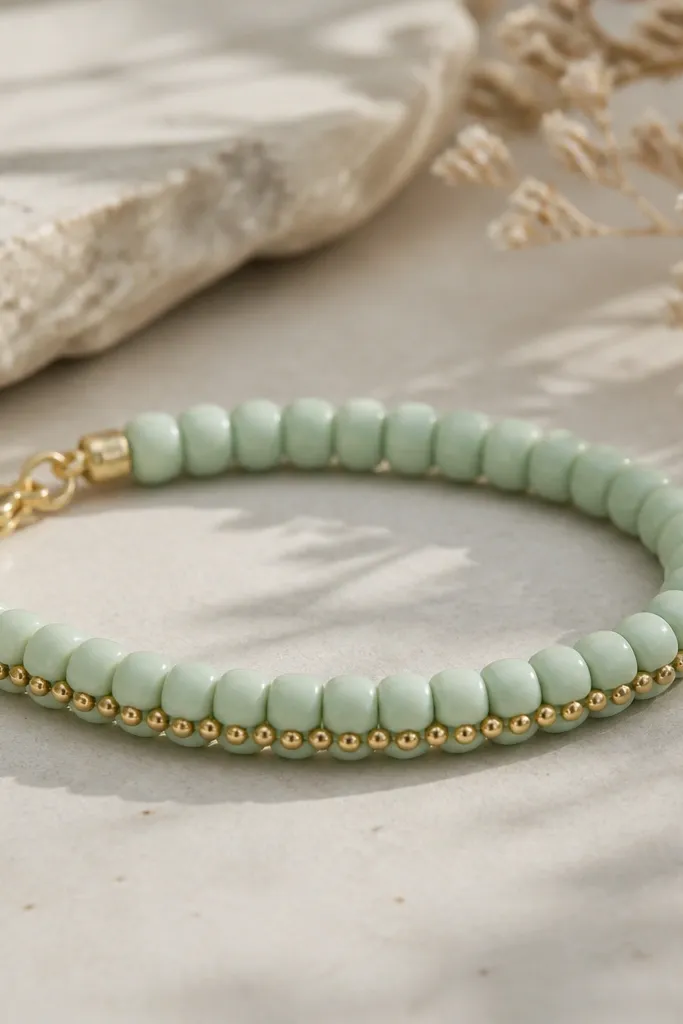
This border trick makes the bracelet look more detailed without adding more bulk. I used mint beads as the base and stitched a thin gold edge row so the bracelet has a "finished" look. The edge row makes the bracelet read as a single piece rather than individual beads. It also photographs well because the gold catches light along the side.
Thread your main beads normally, then add a second pass for the gold row using the same wire thickness. Keep gold beads at 1.5mm to 2mm so the border stays delicate. Place the gold row along the same side of the bead holes so it doesn't twist to the back.
Pro tipTape the bracelet to your wrist with painter's tape while you set the second pass. It keeps the border perfectly aligned.
AvoidAvoid a thick gold border - chunky gold rows make mint look costume-y.
18. Two-tone checker with 6mm clay rounds and matte black cord
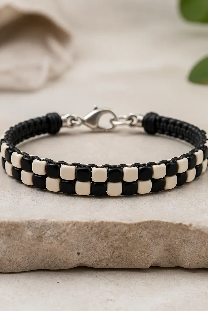
Checker patterns look sharp when the bead sizes match and the spacing is exact. I used matte black cord so the beads line up without extra shine. The checker works because your eye reads it as a grid, not a random mix. Keep it strict - the bracelet looks modern and graphic.
Use equal numbers of black and cream beads, usually 20 total for a standard wrist. Alternate one bead at a time, not in blocks. Finish with wire and crimps so the pattern doesn't drift as you wear it.
Pro tipCount beads out in pairs before stringing. If you start with 11 black and 9 cream, the checker will end uneven.
AvoidAvoid loose tension - if the cord isn't snug, the checker pattern slides and looks sloppy.
19. Warm gold clay with 10mm beads and a braided cord backer
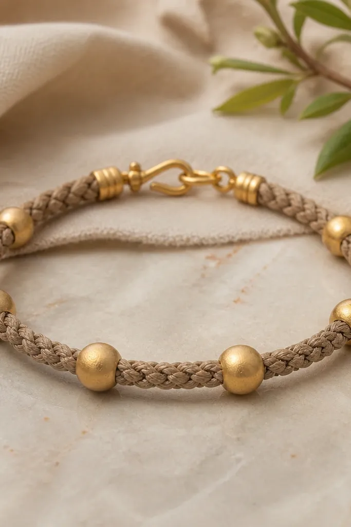
When beads are big, stringing them on thin wire can look too delicate and a bit fragile. I used a braided cord backer so the bracelet feels substantial, then added small gold spacers to keep the beads from rubbing. Warm gold clay looks best with a cord that has texture because it hides tiny spacing differences. The bracelet feels comfortable and sturdy for everyday wear.
Use 10mm beads and plan for 10 to 13 beads total depending on wrist size. Tie onto the braided cord with a knot designed for beading line, then lock it with a small cord end or glue-lined knot cover. Add 3mm gold spacer beads near the clasp so the closure area looks intentional.
Pro tipRoughen the cord slightly with sandpaper where you glue the knot cover so it grips.
AvoidAvoid thin, shiny cord with big clay beads - it makes the whole bracelet look flimsy.