1. Glossy Rim Ombre with a Clear Finish Line
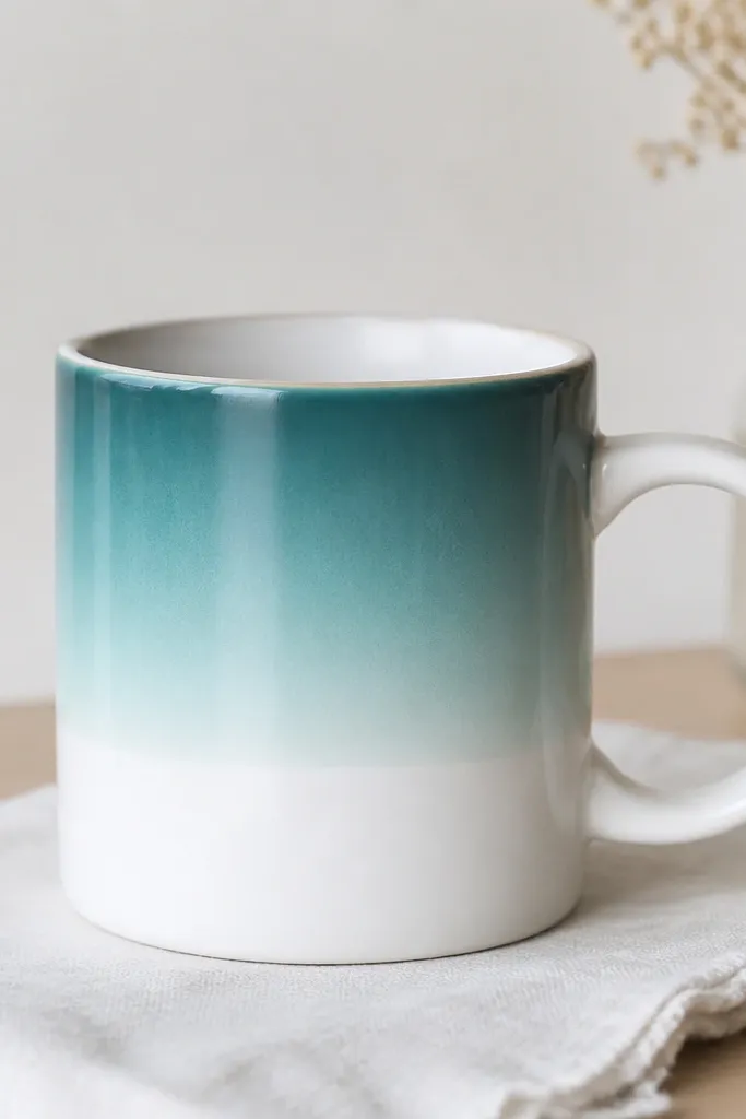
This look works because the ombre sits on top of a sealed, sanded surface and the stop line is protected from paint bleed. I use teal and aqua acrylics thinned with a tiny splash of water so they blend without turning streaky. The clear strip gives you a clean boundary, and the final gloss top coat makes the gradient look like glass.
Sand the mug lightly with 220-grit, then prime with a thin coat of ceramic primer. Tape a straight band with painter's tape about 1/2 inch wide at the height you want the ombre to end. Paint 2-3 thin passes: start with teal at the top, blend down with aqua using a wide flat brush. Finish with a heat-cure gloss sealer in 2 coats so the gradient stays smooth.
Pro tipRemove the tape when the last ombre layer is dry to the touch, not fully cured. That timing keeps the edge sharp instead of tearing.
AvoidSkipping primer on glazed mugs - the ombre will lift in patches after the first few washes.
2. White-on-Black Lettering with Micro-Highlight Dots

I like this because it hides small brush imperfections and makes the lettering look intentional. The contrast is strong: matte black paint under clean white lines gives you a stable base. The micro-dots add depth without clutter, and gloss sealer makes the white look opaque instead of chalky.
Prime the mug first, then cover the target area with matte black paint in one thin coat and one slightly thicker second coat. Once dry, use a fine liner brush (size 0 or 1) for the white lettering. Add 10-20 micro dots per word using the tip of the brush - don't drag them. Seal with a heat-cure clear gloss spray or brush-on sealer in 2 thin coats.
Pro tipPractice the spacing on paper with the exact brush you'll use. Lettering that's too tight looks messy in the mug's curve.
AvoidPainting white directly over glossy black without letting your black base dry fully - the white will smear when you apply the top coat.
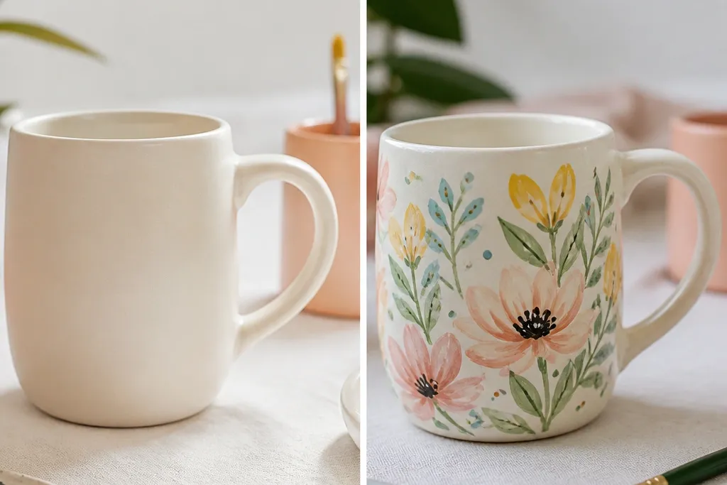
3. Stained-Glass Style Flowers with Raised Outline
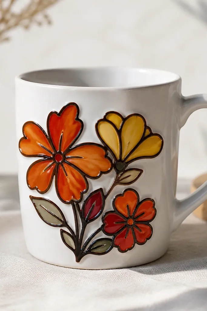
Raised outlines make the design look professional even if your fill isn't perfect. The semi-translucent colors work best when you apply them in thin layers so light can read through. This look also forgives small mistakes because the outline "contains" the colors.
Use a stencil for the flower shapes, then trace with a fabric paint outline or a ceramic outline medium. Let the outlines dry until they feel firm, not rubbery. Fill petals with thin translucent paint (orange/yellow/red) in 2 layers, letting each dry. Top coat with a clear sealer that doesn't turn the colors milky.
Pro tipIf your fill paint runs, wait 5-10 minutes longer before adding the second layer. The first layer should grab the outline edges.
AvoidOverfilling petal shapes - thick paint pools and cracks after baking.
4. Speckled Clay Look with Dry Brush Texture
This one hides brush lines and makes the mug feel handmade. The speckles catch light differently as you rotate the mug, so it looks good from every angle. I use a dry brush and a stiff bristle technique so the texture stays consistent instead of looking patchy.
Prime the mug, then base coat in warm beige. Use a dry brush with slightly thicker white paint - wipe most paint off on a paper towel until the brush leaves faint streaks. Flick a second color (tan) using a toothbrush for tiny dots. Finish with a satin heat-cure top coat to keep the texture from looking glossy and messy.
Pro tipDo the speckle step over a scrap sheet and wear a mask. The specks land everywhere, and you'll thank yourself later.
AvoidUsing too much paint on the dry brush - you'll get muddy patches instead of controlled speckles.
5. Geometric Sunset Bands with Sharp Tape Edges
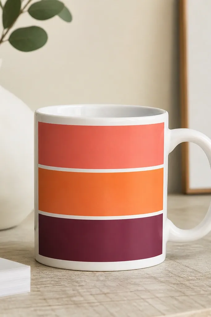
Tape-separated bands make geometry look intentional on a curved mug. Thin coats keep the tape lines crisp and prevent a raised ridge that catches on the rim. The sunset palette (coral, orange, plum) stays readable even after sealing because you're not relying on super-fine details.
Plan band widths so they scale with the mug: for a standard 12 oz mug, I aim for bands about 1 inch tall each. Prime, then paint the bottom band first, let it dry 20-30 minutes, then tape the next band edge. Apply 2 thin coats per color. Remove tape before the final coat fully cures, then seal with gloss.
Pro tipPress tape down with a fingernail along the edge so paint can't creep under it. Cheap tape that lifts will ruin the line.
AvoidTrying to correct a wobbly tape line after paint dries - it will always look patched.
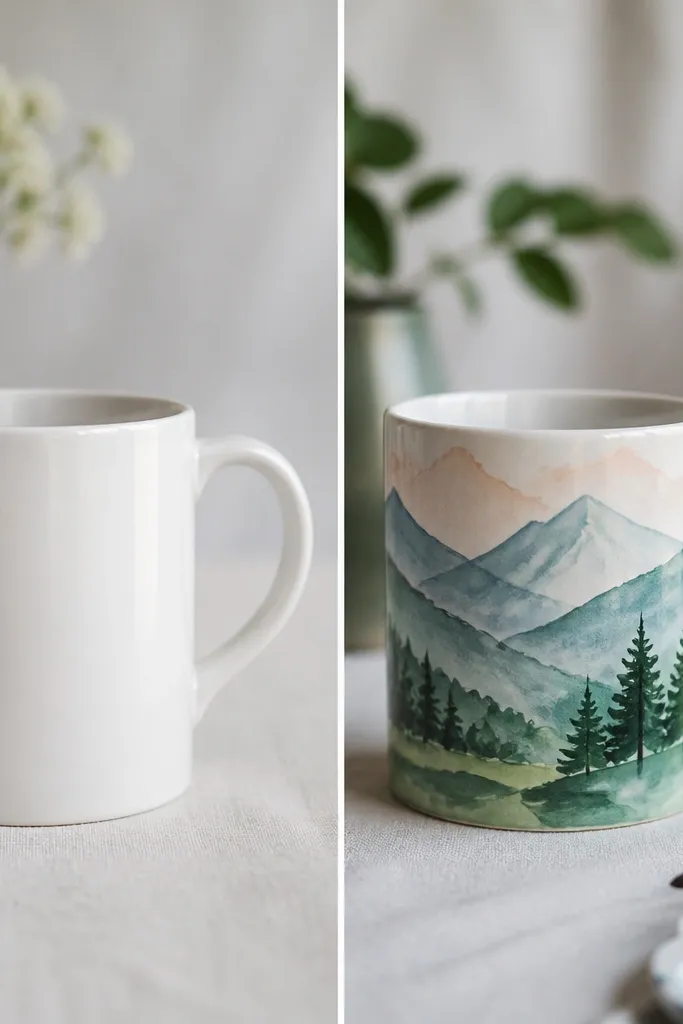
6. Botanical Sprig in Two Greens (Leaf Fade Trick)
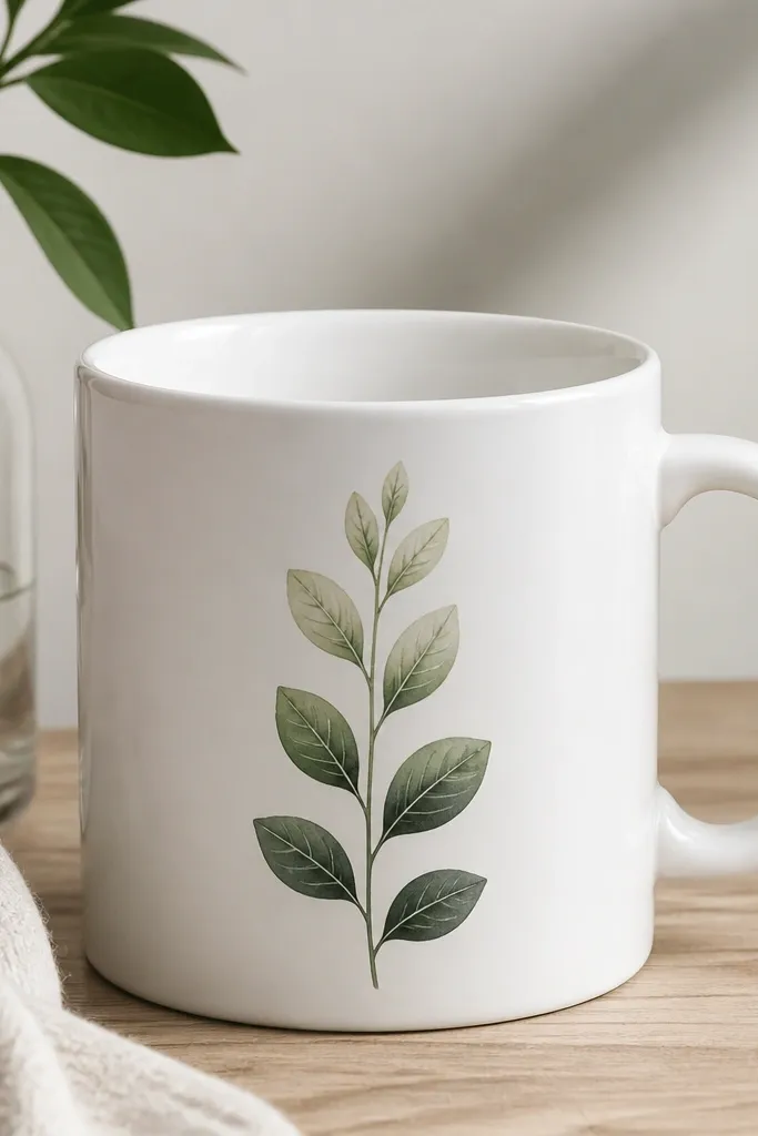
This looks realistic because each leaf has a light-to-dark gradient and a simple vein. I paint the leaf base dark, then drag lighter green toward the tip while the paint is still wet. That wet blend is what makes the leaf look alive instead of flat.
Use a small round brush (size 2 or 3). Paint the sprig stem in dark green, then do leaves by base-coating with dark green. Mix a lighter green and add it at the leaf tip, then pull it back 1/3 of the leaf length. Outline veins with a darker green pencil or fine liner once dry. Seal with a heat-cure clear top coat in satin if you want softer botanicals.
Pro tipKeep your leaf shapes consistent by using the same brush pressure every time - slow down and watch the curve of the tip.
AvoidOverworking wet leaves - you'll lift paint and get muddy greens.
7. Monochrome Marble Swirl with Black + Gray Veins
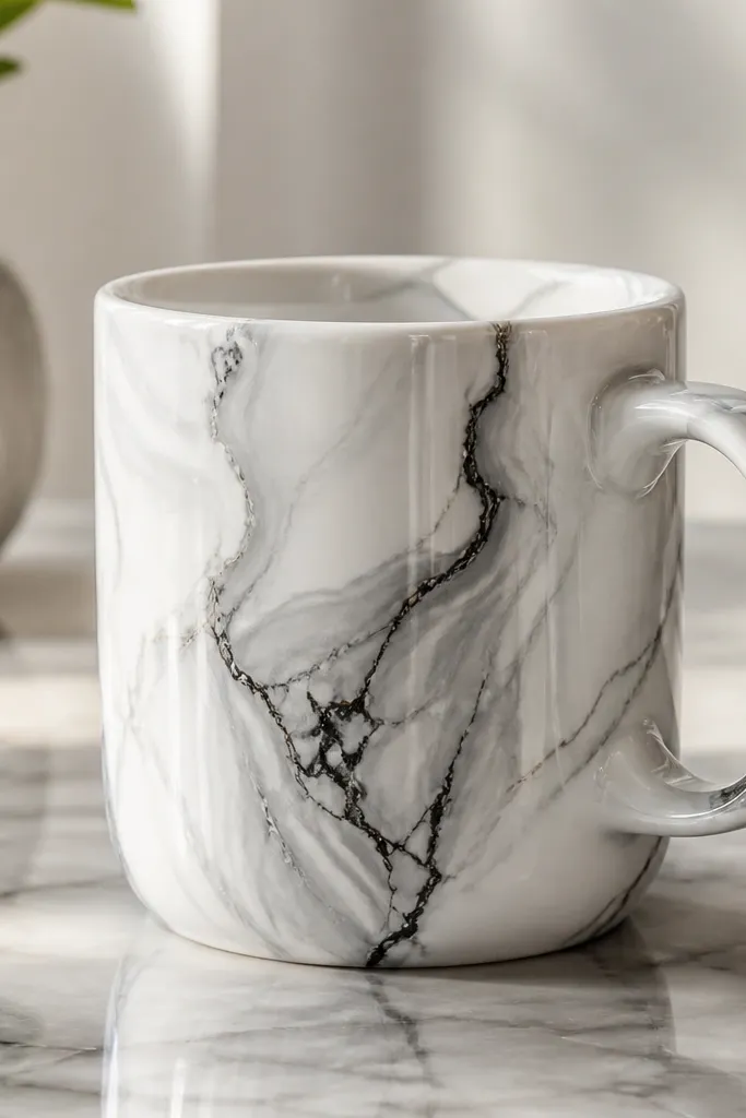
Marble looks hard, but it's mostly patience and controlled paint consistency. The trick is using two grays plus a thin black vein line so your eye reads depth. A glossy sealer makes the swirls look like they're under a clear layer, which is exactly what you want for before and after coffee mug painting ideas.
Prime and base coat in off-white. Mix gray 1 (cool gray) and gray 2 (darker charcoal-gray). Swirl with a sponge or soft brush in loose arcs, then drag thin black lines through with a liner brush. Let it dry fully, then apply 2-3 thin coats of heat-cure gloss sealer so the surface levels out.
Pro tipThin your gray paint slightly so it moves. Thick paint won't swirl - it will smear.
AvoidSkipping the final leveling coats - the marble will look bumpy instead of smooth.
8. Minimal Portrait Sticker-Style Face with Transfer Paper
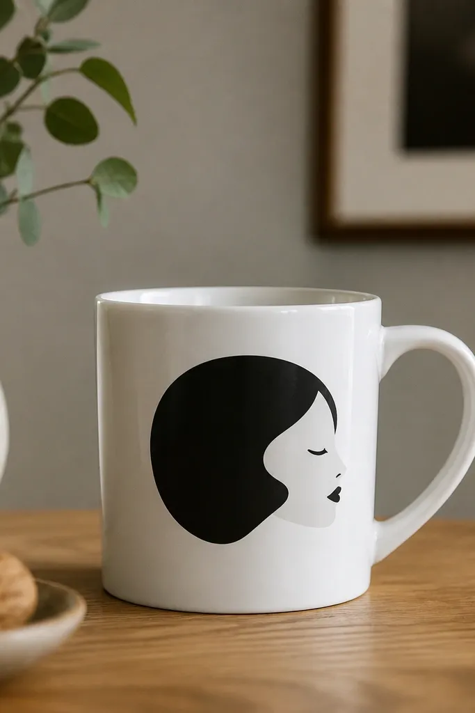
The clean edges are the win here. Transfer paper helps you place a design exactly where you want it on a curved surface, and that makes your "after" look intentional even if your hand-drawing isn't perfect. I keep the palette to black and off-white so the top coat doesn't dull it.
Print your face design on transfer paper meant for ceramics. Use a burnishing tool (or the back of a spoon) to press firmly, then peel according to the paper instructions. Paint over any light spots with black acrylic using a small brush. Seal with a heat-cure clear coat in 2 thin layers.
Pro tipTest your transfer on a cheap scrap ceramic tile first if you're using a new printer or brand of transfer paper.
AvoidOverpainting the transfer - thick paint creates a ridge that shows up after sealing.