1. Navy Linework Monogram With Gold Halo
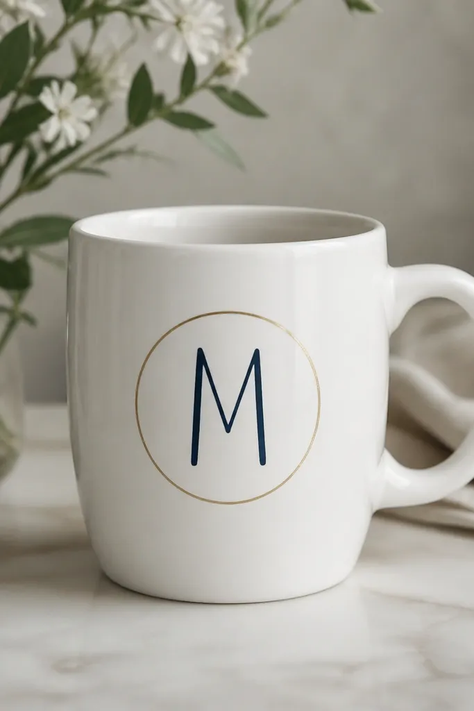
This one looks expensive because it's graphic and minimal. Dark navy linework reads clean on white ceramic, and the gold halo gives you that "stationery" feeling you see on luxury desk sets. The trick is leaving lots of empty space so the mug doesn't turn into a busy craft. I also like adding a tiny gap in the gold ring so it looks hand-painted, not stamped.
Paint your letter with a ceramic-safe navy paint using a liner brush (size 0 or 1). Add the gold ring with a metallic paint pen or metallic acrylic paint thinned with a drop of water so it flows thin. Keep the gold ring at least 1 inch above the bottom of the handle and keep it away from where your lips touch.
Pro tipDraw the letter lightly with a pencil first, then paint over your guide. If the gold pen skips, go back with a toothpick to place dots for a smooth arc.
AvoidDon't fill the letter completely - solid block letters look cheap on mugs because they hide the hand-drawn charm.
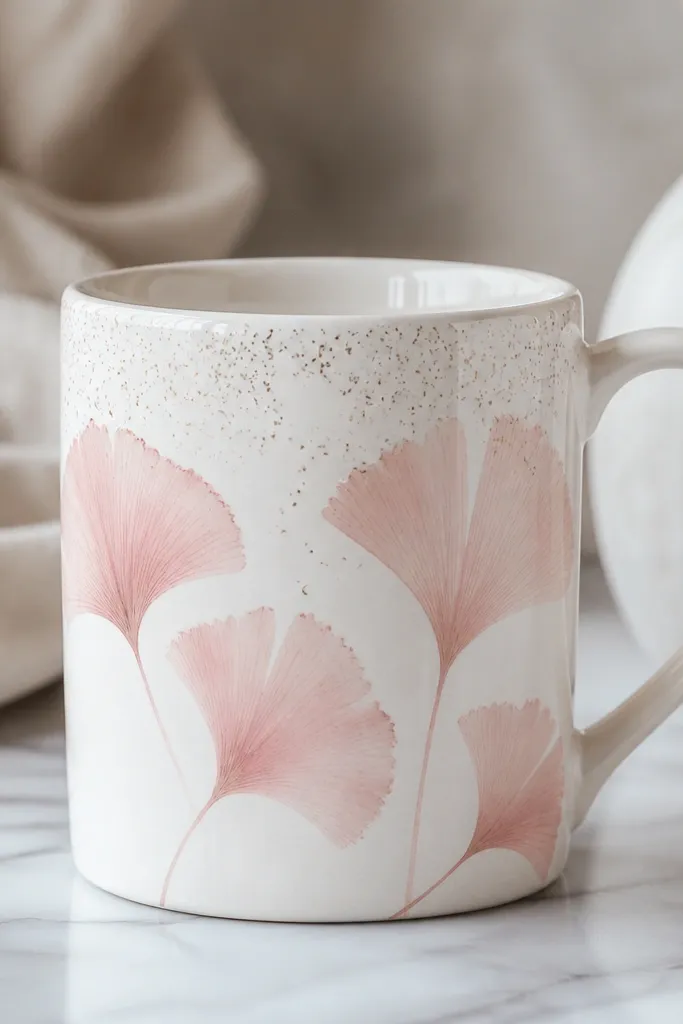
2. Terracotta Rose Cluster on Warm Cream
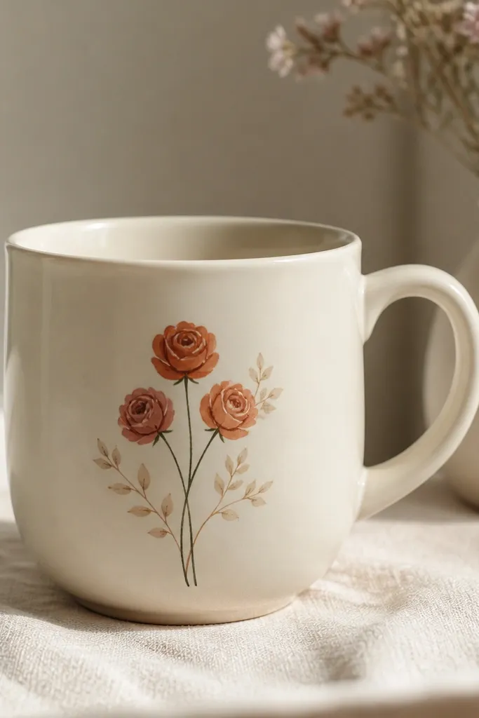
A tight rose cluster looks styled because it has repetition and spacing. Terracotta and coral petals give warmth, while the muted green keeps the palette grown-up. The expensive look comes from petal highlights - a lighter cream stroke on the top half of each petal makes it look dimensional. Keep your cluster in one "window" so it feels intentional.
Use warm cream as the base (or leave the mug white if it's bright). Paint three roses: start with a small spiral center, then add teardrop petals around it. Finish with a thin highlight stroke using a light peach or off-white. Stems should be one continuous line that curves slightly around the roses.
Pro tipMix terracotta paint with a tiny bit of white for a lighter highlight tone so the petals don't look flat.
AvoidDon't paint big, chunky petals. Scale matters - on a mug, smaller flowers read more expensive.
3. Black Ink Botanical Leaves With Clear Negative Space
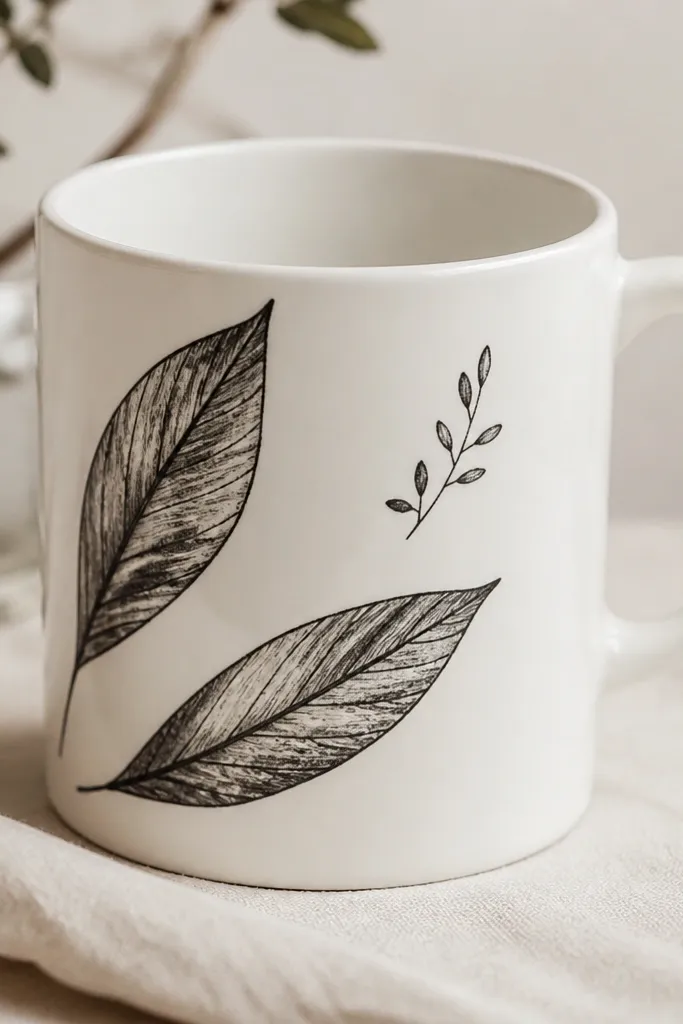
Ink-style botanicals look pricey because the lines look controlled and the design breathes. Black on white is timeless, but what makes it look like decor is the vein detail and the careful spacing. Negative space is the difference between "cute" and "expensive." When the leaves overlap slightly, the mug gains depth without clutter.
Use a fine liner brush or paint pen in black ceramic paint. Draw one main leaf shape first, then add a center vein and two or three side veins. Add a smaller sprig tucked near the handle so the design follows the mug's curve. Keep the ink lines thin enough to see the ceramic through where you leave gaps.
Pro tipLet the black dry between layers. If you blend while wet, the veins turn muddy and lose the high-end look.
AvoidAvoid thick outlines. Thick black borders read like a kids' drawing on curved mugs.
4. Soft Ombre Sunset Fade With Peach-to-Navy Gradient
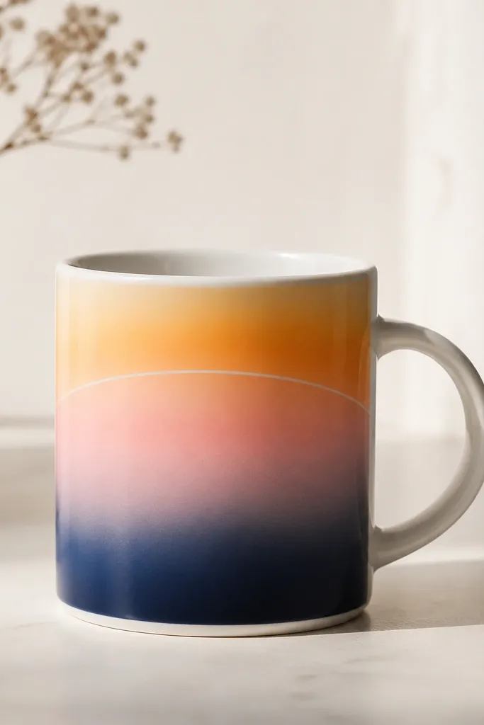
Ombre fades look expensive because they look like watercolor, not craft paint. Peach-to-navy gives you a sunset mood that still feels modern. The key is smooth transitions - expensive art looks like it was blended, not painted in blocks. Add a thin white highlight along the horizon for a glossy, light-catching effect.
Start at the top with peach, then add orange in the middle bands, then blend into navy at the bottom. Use a makeup sponge to dab and blend, working in horizontal strips. For the horizon highlight, use a small flat brush with white paint and pull one clean line across the arc. Keep your arc centered around the mug's widest part.
Pro tipUse two sponges: one for warm colors and one for navy. Cross-contamination makes the gradient look gray.
AvoidDon't overwork the gradient while it's wet. It turns streaky fast on ceramic.
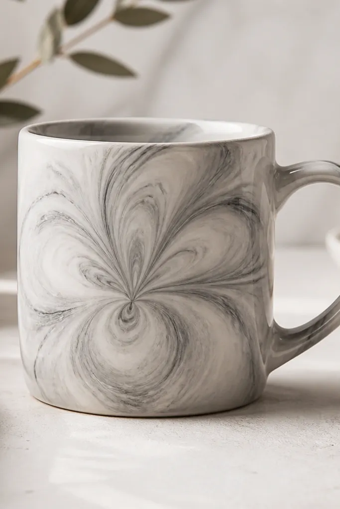
5. Champagne Marble Swirl Using Toothpick Veins
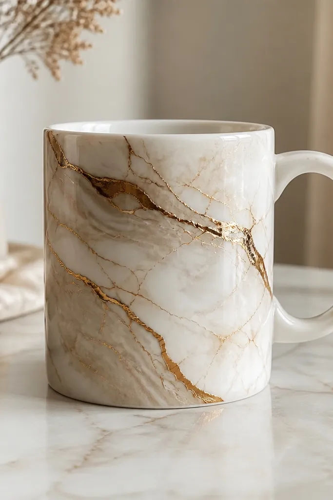
Marble looks expensive because it mimics natural randomness. The gold tone reads upscale, and the thin vein lines make it look like real stone. The trick is controlling the swirls so they're wispy, not painted thick. When the background is light and the veins are fine, it reads as decorative rather than messy.
Base coat with a light champagne paint (or mix gold acrylic with a little white). While it's still slightly tacky, drop a few dots of darker gold/brown and swirl with a toothpick. Add a second pass of thin veins by dragging the toothpick lightly through the swirls. Let it dry fully before adding any extra highlights.
Pro tipPractice on a scrap tile first. Toothpick swirls look best when you lift the tool often instead of dragging continuously.
AvoidDon't use thick marbling paste. Thick blobs look like glitter glue on mugs.
6. Cream-and-Black Geometric Bands With Faux Ceramic Glaze
Geometric bands look expensive because the lines are clean and the palette is limited. Black + cream is high-contrast, and a thin gold line between bands makes it feel like a designer piece. The "faux glaze" effect comes from painting the bands smoothly and then adding a clear gloss topcoat after curing.
Mask the mug with painter's tape to create angled bands. Paint the broad black sections first, then remove tape carefully while paint is still slightly soft for the cleanest edge. Add the gold divider with a fine liner brush. After curing, apply a thin clear gloss ceramic topcoat for that store-like sheen.
Pro tipPress tape down with a credit card so paint doesn't creep under the edge.
AvoidDon't freehand straight lines on a mug curve. If the angles wobble, it looks homemade in a bad way.
7. Pearl-Gray Dots in a Perfect Grid
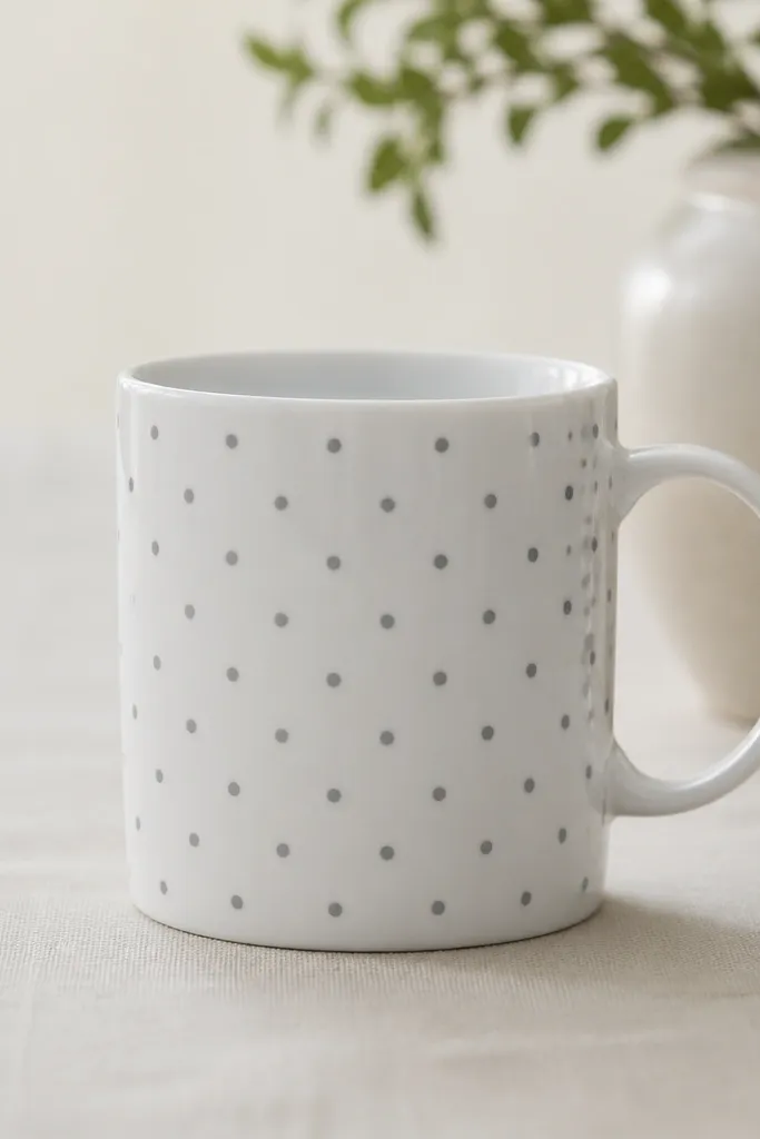
Dots look expensive when they're uniform and spaced like design typography. Pearl-gray gives softness, and a slightly larger dot cluster adds a thoughtful focal point. This is one of the fastest ways to look polished because you're not drawing - you're placing. A gloss finish makes the dots look like they're sitting on top of the glaze.
Use a dotting tool or the eraser end of a pencil for circles. Dip into pearl-gray ceramic paint thinned slightly for smooth dots. Start by marking a light pencil grid: for example, 8 dots across the visible face, spaced about 1 inch apart. Paint the cluster of larger dots near the handle and keep the rest consistent.
Pro tipIf dots spread, paint a second thin layer instead of pressing harder on the tool.
AvoidDon't make random dot sizes. Variation looks messy on mugs unless it's intentional like confetti.
8. Single-Flower Botanical With Gold Leaf Tip
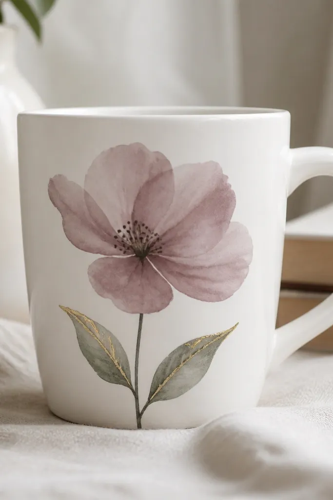
One big flower looks expensive because it reads like a statement print. Mauve petals with a deep green stem feel modern, and the gold leaf tips add a little shine without covering the whole mug. The expensive look comes from the gold being limited - a few strokes catch light while the rest stays matte.
Paint the flower petals first using a medium flat brush, then add a darker mauve shadow at the base of each petal. Add a tiny highlight line in lighter pink near the top edge. For gold leaf tips, use metallic gold paint and a small angled brush to paint two thin strokes at the leaf tips. Keep gold away from the handle grip area.
Pro tipUse a reference photo of a single flower. Copy the petal shape more than the colors for a realistic look.
AvoidDon't outline everything in black. A full outline makes it look like cartoon art.
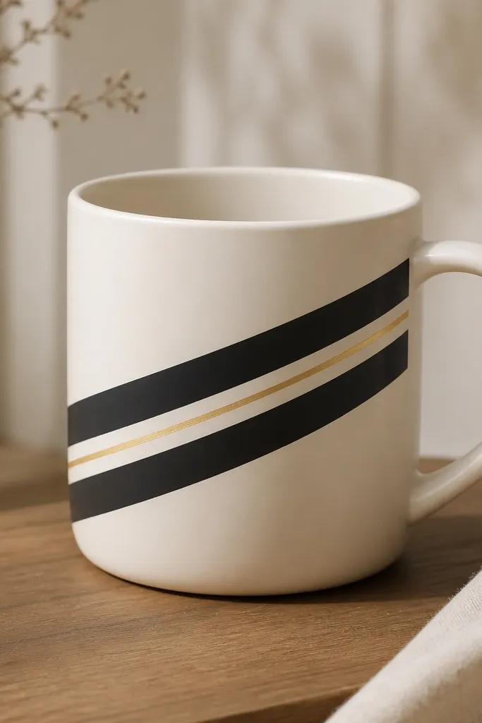
9. French Stripe Mug With Thin Multi-Color Lines
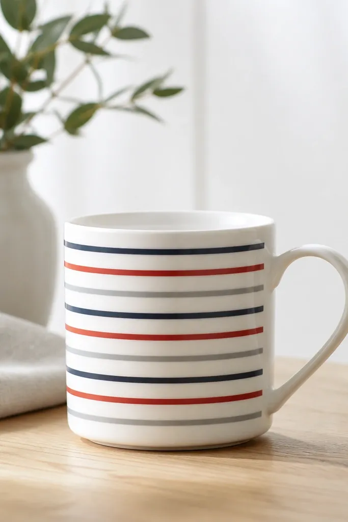
Thin stripes look expensive because they're controlled and airy. The trick is using multiple colors but keeping each stripe narrow so the pattern doesn't become loud. The gaps of bare ceramic make it feel like printed design rather than paint coverage. Add a tiny metallic line every few stripes for a "designer stationery" vibe.
Tape off stripe bands around the mug at about 1/4 inch width for the paint. Paint one color at a time, letting it dry before re-taping. For a metallic accent, paint one stripe with a gold metallic and keep it thinner than the others. Remove tape slowly to avoid peeling paint from the edges.
Pro tipUse a ruler and measure the stripe width on paper first, then transfer that spacing to the mug with light pencil marks.
AvoidDon't use thick stripe widths. Thick stripes cover too much ceramic and look like kid crafts.
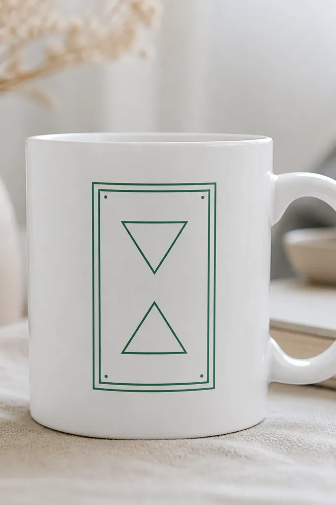
10. Art Deco Fan Pattern in Burgundy and Antique Gold
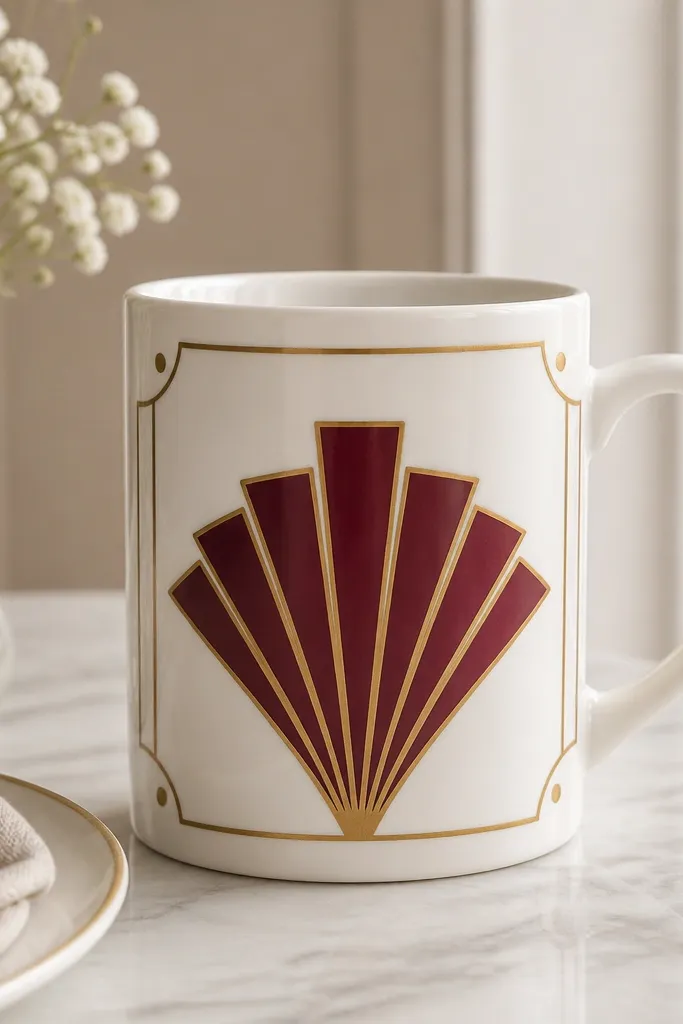
Art deco looks expensive because it's geometric, symmetrical, and it has built-in rhythm. Burgundy is deep and elegant, while antique gold makes it feel like a vintage frame. The fan motif gives you a focal point that sits perfectly on the mug's flat front area. Keep the gold lines thin so they look like metal details, not glitter.
Sketch a fan with pencil: start with a central triangle and draw parallel rays. Paint burgundy rays with a liner brush, letting the ceramic show between lines. Outline the outer shape with antique gold paint. Add small gold corner dots at the base corners of the fan for a finishing touch.
Pro tipUse painter's tape as a guide for straight rays. Peel tape after the burgundy layer dries a little so edges stay sharp.
AvoidAvoid uneven symmetry. If one side of the fan is thicker, the whole mug reads sloppy.
11. Monochrome Marble Bloom in Soft Gray
This design looks expensive because it combines marble randomness with a gentle flower shape. Soft gray stays modern and doesn't overpower the mug. The "bloom" effect comes from directing the swirls so they curl outward like petals. When the background stays light, the darker veins look crisp and intentional.
Base coat with very light gray or a diluted gray wash. Drop darker gray dots, then drag with a toothpick in petal arcs. Build two layers: one for the main swirl, then a second for a few standout veins. Finish with a tiny highlight dot at the center to suggest light.
Pro tipThin your gray more than you think. Marble needs translucency to look like stone.
AvoidDon't add lots of dark veins everywhere. Concentrate them in the bloom area.
12. Muted Botanicals Border Around the Bottom
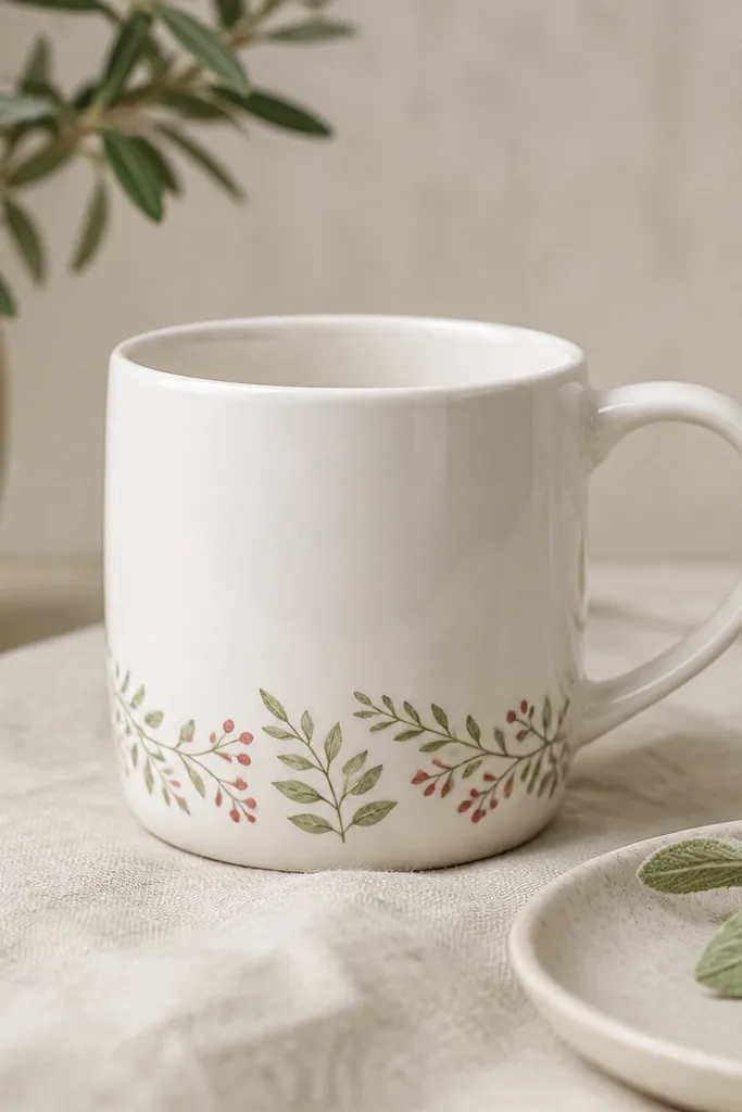
A bottom border looks expensive because it frames the mug like a printed label. The muted botanicals keep it classy, and the thin band doesn't fight with the mug handle. This also hides any tiny paint imperfections on the lower edge because it looks like decorative trim. The key is consistency: same leaf size, same spacing, repeated rhythm.
Mask a band about 1 inch tall near the bottom. Paint a repeating leaf pattern in sage green, then add berry dots in dusty rose. Use a small liner brush for leaf veins. Let dry fully, then remove tape to reveal a clean top edge for the border.
Pro tipMake a "leaf stamp" by loading the brush with paint and pressing lightly for each leaf - it keeps sizes uniform.
AvoidDon't let the border climb too high. If it reaches the middle of the mug, it looks crowded.
13. Pastel Watercolor Wash With One Clean Stem
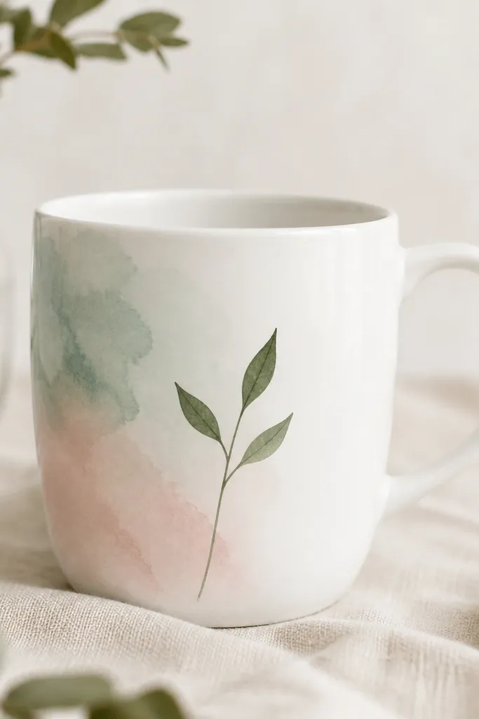
Watercolor-style washes look expensive because they look light, airy, and intentional. The expensive part is the restraint: one stem and a few leaves over a soft wash. Pale mint + blush gives a gentle contrast, while deep green brings structure. The wash should fade like it's bleeding into the ceramic, not like a flat block of color.
Lightly sponge pale mint onto one side, then add blush as a second layer and blend at the edges with a damp brush. Leave the right side mostly white. Paint one clean stem in deep green and add three leaves with simple teardrop shapes. Add a tiny gold dot near the leaf tip if you want a luxury hint.
Pro tipUse a damp brush for blending. If the brush is dry, you'll get harsh edges that don't look watercolor.
AvoidDon't paint full coverage watercolor over the entire mug. It turns into craft paint, not wash.
14. Chocolate Brown Script With Subtle Gold Underline
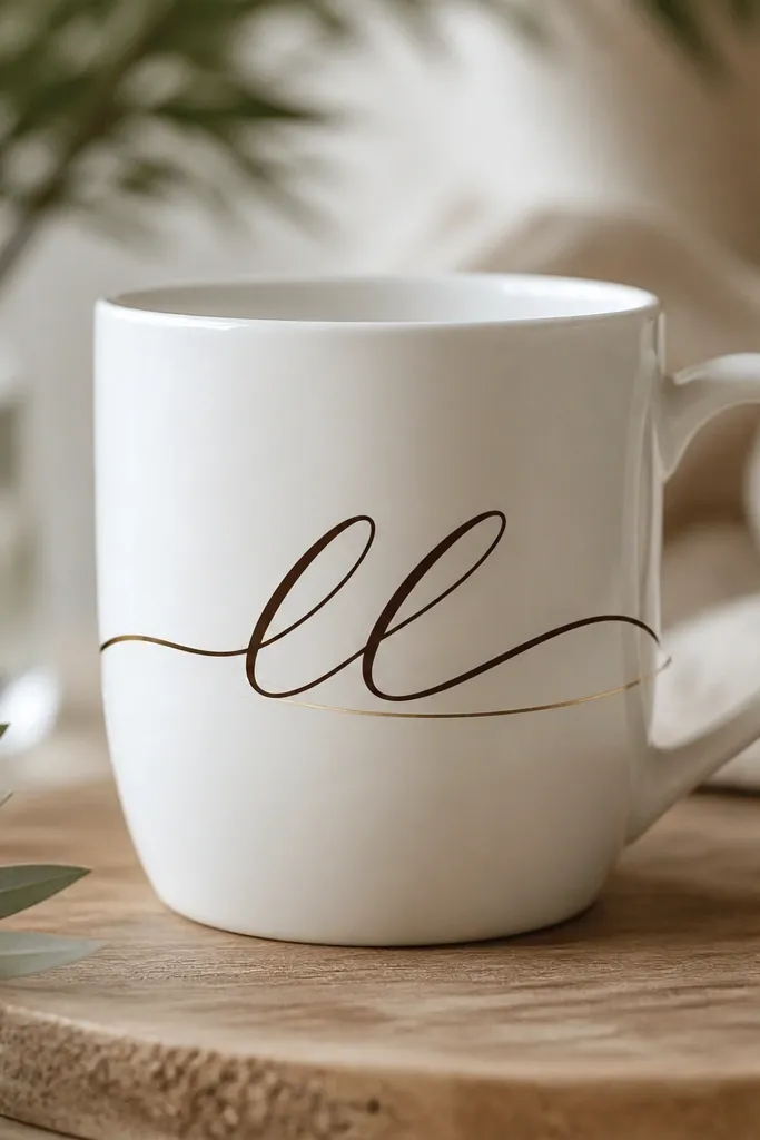
Script looks expensive when the strokes look like ink - thicker in curves, thinner on upstrokes. Chocolate brown feels warm and premium compared to harsh black. The gold underline adds polish without stealing attention from the writing. Keep the text short and centered so it looks like monogram art.
Use a ceramic paint pen or liner brush with chocolate brown paint. Write in one line across the mug's center, then go back to thicken only the downstrokes. Add the gold underline with a fine brush, keeping it straight and close to the text baseline. Let it dry before touching up any edges.
Pro tipPractice on paper and time yourself. If you rush, the letters wobble and the mug looks handmade in a rough way.
AvoidAvoid glitter gold underlining. Glitter texture looks cheap on ceramic unless it's used very sparingly.
15. Soft Sage Geometric Waves With Matte Finish Look
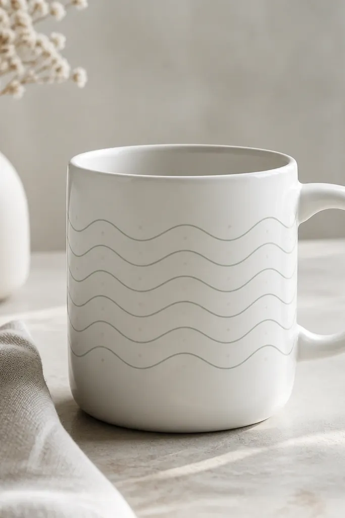
Wave patterns read clean and modern, and sage tones look calm and grown-up. The look becomes "expensive" when your waves are consistent and the spacing is even. If you want that matte designer vibe, avoid heavy metallics and use a matte clear topcoat after curing. The tiny dots between peaks add rhythm like pattern design.
Mark a horizontal guideline across the mug at mid-height. Paint wave lines with a liner brush, using equal spacing between peaks and troughs. Add a dot pattern on alternating peaks using a dotting tool. After the paint cures, apply a matte ceramic topcoat so it stops looking like wet craft paint.
Pro tipUse a ruler to keep the guideline straight. Curved guidelines make waves drift and look messy.
AvoidDon't thicken the wave lines halfway through. Consistency is what makes patterns look high-end.
16. Gold Dot Ombre Corner Fade
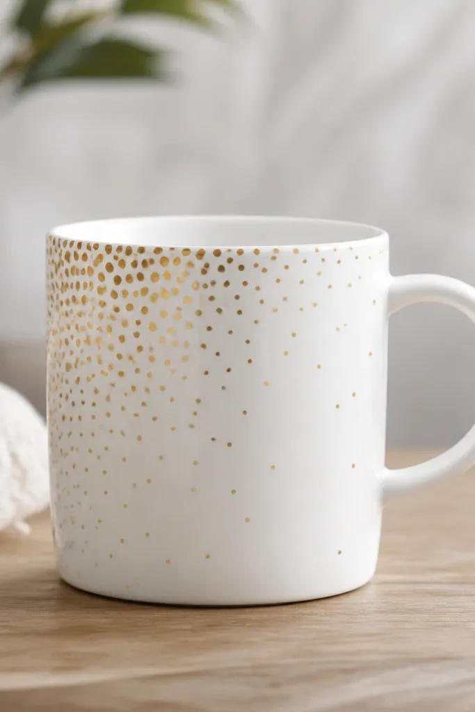
Dot ombre looks expensive because it mimics light and texture without needing detailed drawing. The gold shifts in density, so the eye reads depth even on a simple mug. This design is also forgiving - your "imperfect" spacing still looks intentional if the fade is smooth. Keep the dots small and let the ceramic show through.
Start by placing dots in the upper left area, about 1/4 inch apart. Move diagonally down and to the right, increasing the distance between dots gradually. Use a metallic paint pen so dots are consistent. Let it cure fully before using; gold paint can smear if it's not set.
Pro tipPlan the fade with pencil first. Draw a diagonal line and place a few sample dots to set your spacing before committing.
AvoidDon't make the dots too large. Big dots look chunky and lose the luxury effect.
17. Classic Blue Delft-Style Daisy Medallion
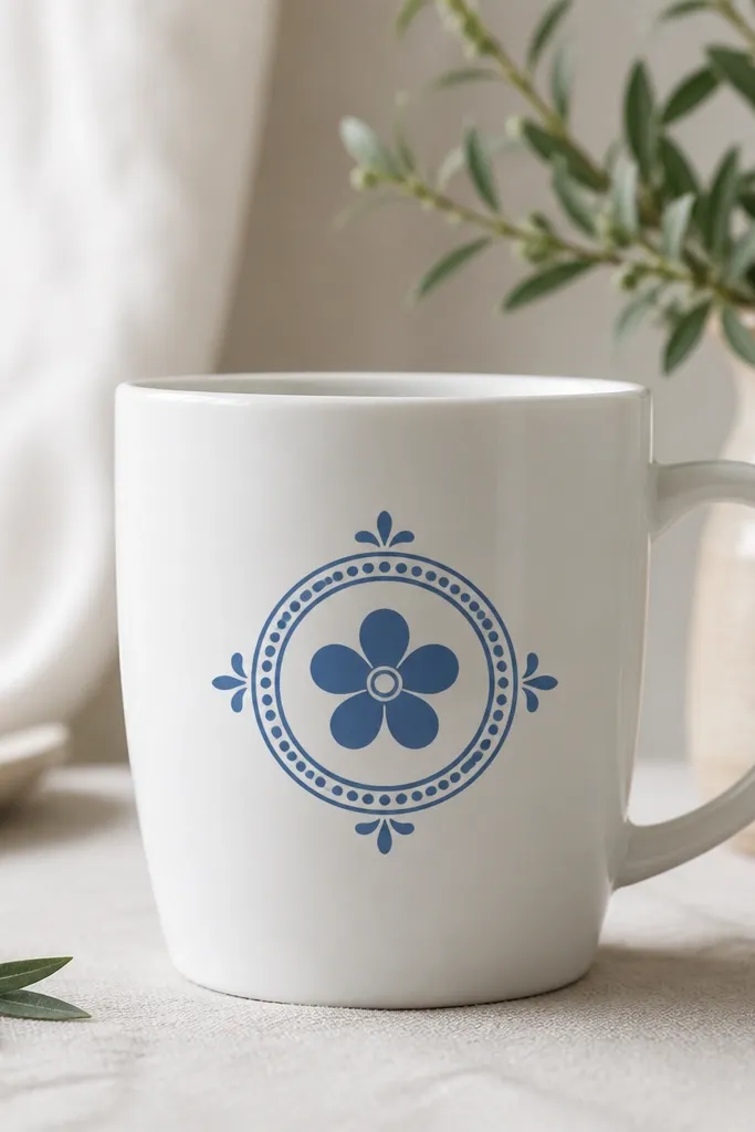
Delft-style motifs look expensive because they're structured like vintage ceramics. The blue palette is the key - it should be slightly muted, not neon. A circular medallion frames the mug face and makes the design feel like it belongs in a set. The daisy adds charm, and the tiny dots around the ring make it look decorative.
Paint a circle medallion with a stencil or a string-and-pencil guide. Use muted cobalt or delft blue acrylic paint. Add a ring of small dots around the circle, then paint a five-petal daisy center. Finish with a few tiny leaf-like accents outside the circle edge.
Pro tipUse a stencil for the circle. Freehand circles on mugs usually come out lopsided and cheap.
AvoidAvoid bright sky-blue. Neon blue makes the mug look like school art.
18. Black and White Zebra Stripe With One Red Accent
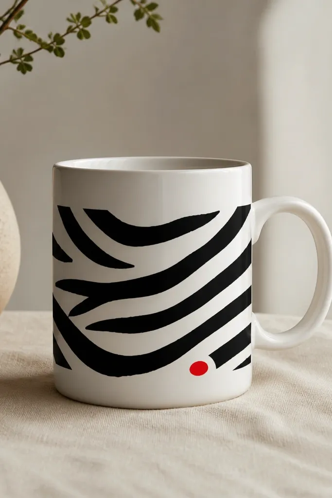
This is high contrast with one controlled pop of color, which reads expensive. Zebra stripes look graphic and modern, and the single red accent keeps it from feeling like a pattern dump. The expensive look comes from crisp stripe edges and a red accent that is small and intentional. Keep the stripes all the same thickness so it looks designed.
Use masking tape to create stripe widths, then alternate black paint and bare ceramic gaps. Peel tape after the black layer dries to avoid smearing. Add one small red oval near the bottom center using a rounded liner brush. Optionally add a tiny white highlight line on the red oval for a glossy effect.
Pro tipMake stripe widths consistent by cutting tape strips using a craft knife and ruler.
AvoidDon't add multiple red accents. Two or three scattered reds make it look like random decoration.
19. Soft Pink Fan Leaves With Antique Brass Specks
Fan leaves look elegant because they have repeating shapes that curve naturally with the mug. Soft pink keeps it feminine but still modern, especially with antique brass specks instead of bright gold. The specks give texture like vintage pottery and make the design feel finished. Keep the specks sparse so the mug doesn't look glittery.
Paint a fan of 6 to 8 leaf shapes using a teardrop brush stroke, each leaf slightly angled outward. Use two pink shades: blush for the main leaf and a slightly darker rose at the base. Add antique brass specks with a toothbrush loaded lightly with metallic paint - tap once or twice over a small area. Let dry fully before handling.
Pro tipTest the toothbrush speck pattern on paper first. You want tiny dots, not splatter blobs.
AvoidDon't cover the whole mug with specks. Concentration makes it look intentional.
20. Emerald Geometric Frames With Tiny White Highlights
Frames look expensive because they create structure and keep the design from floating. Emerald gives depth, and the tiny white highlights add the "light on glaze" feeling. You'll get the expensive look when lines are thin and evenly spaced, and when you leave clean ceramic gaps inside the frame. It's modern, but not trendy-looking - it feels like decor.
Paint a thin emerald rectangle centered on the mug face. Add two small triangles inside the frame corners, then a couple of small white dots near the triangle tips. Use a liner brush and keep line thickness consistent. After curing, apply a clear gloss topcoat if you want that glassy finish.
Pro tipIf your lines wobble, touch them up with a cotton swab dipped in water before the paint fully sets.
AvoidDon't use thick paint for frames. Thick borders overpower the mug and look like sticker outlines.